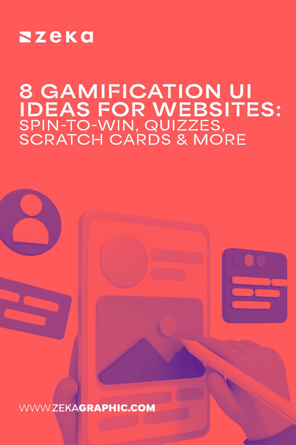
User interfaces were never meant to be silent. At their best, they respond, invite action, and adapt to user intent. Gamification pushes UI in that direction turning static layouts into interactive dialogues instead of passive email-capture mechanisms. The goal is not to “trick” users into converting, but to give them something meaningful to do.
Popups are a powerful canvas for this shift. Their limited space forces clarity and intentional interaction design. With one screen and one moment of attention, designers can introduce choice, anticipation, and feedback without rebuilding entire pages or flows. Constraint, in this case, fuels creativity.
For designers, this opens a bigger opportunity: influencing user behavior through interaction patterns, not just visual styling. Let’s break down 9 gamified UI patterns designers can actually use.
Advertisment
A gamified popup earns its place in the interface when it behaves like a natural UI element. The interaction should be self-explanatory from the first second. Shape, motion, and hierarchy must clearly signal what action is expected, without relying on instructions or copy-heavy guidance.
Effective patterns follow a simple micro-loop: a single action, a brief pause that builds anticipation, and an immediate, visible outcome. Everything happens within one screen, keeping cognitive load intentionally low. Visual feedback, whether animation, progress states, or reactive UI, confirms interaction and sustains momentum.
Equally important is restraint. A well-designed gamified popup always allows a clean, respectful exit. When users can opt out without friction, the experience doesn’t feel imposed.
The following UI ideas show how small interactive moments inside popups can drive engagement without overwhelming the interface.
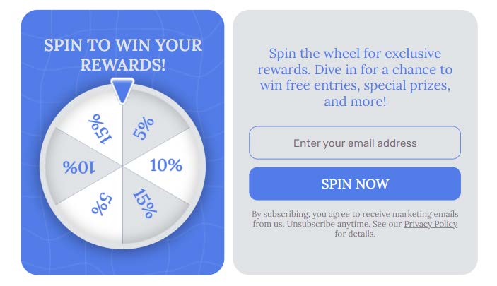
The spin-to-win popups work because it turns motion into meaning. Circular movement naturally pulls the eye, but its real strength lies in anticipation. The brief delay between clicking and the final result creates a pause that keeps users engaged longer than static offers ever could.
From a UI perspective, restraint matters. High contrast between segments improves readability, but too many bright colors or heavy shadows can make the design feel chaotic. Clean typography, balanced color palettes, and subtle depth help the wheel not to look gimmicky. Motion should stay controlled. Smooth easing and natural deceleration signal quality, while aggressive spinning feels distracting and reduces trust.
This pattern works best at key moments. Hero popups, exit-intent triggers, and seasonal campaigns provide the right context, where playful interaction feels relevant.
Popup example from Claspo’s template library
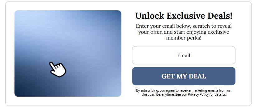
Scratch cards translate a physical gesture into a digital interface and create the illusion of touch even on non-touch devices. The appeal comes from the “hidden layer” principle. It’s a familiar graphic design concept where value is concealed beneath a surface and revealed through interaction.
In this pattern, texture does more work than the reward itself. A convincing scratch surface, subtle noise, or matte overlay makes the interaction real and intentional. The reveal animation should be smooth and progressive. Abrupt transitions break the illusion and reduce emotional payoff.
Scratch card popups work well for discounts, early access offers, or mystery bonuses. In those scenarios uncertainty enhances engagement and the act of revealing becomes part of the perceived value.
Popup example from Claspo’s template library
Advertisment
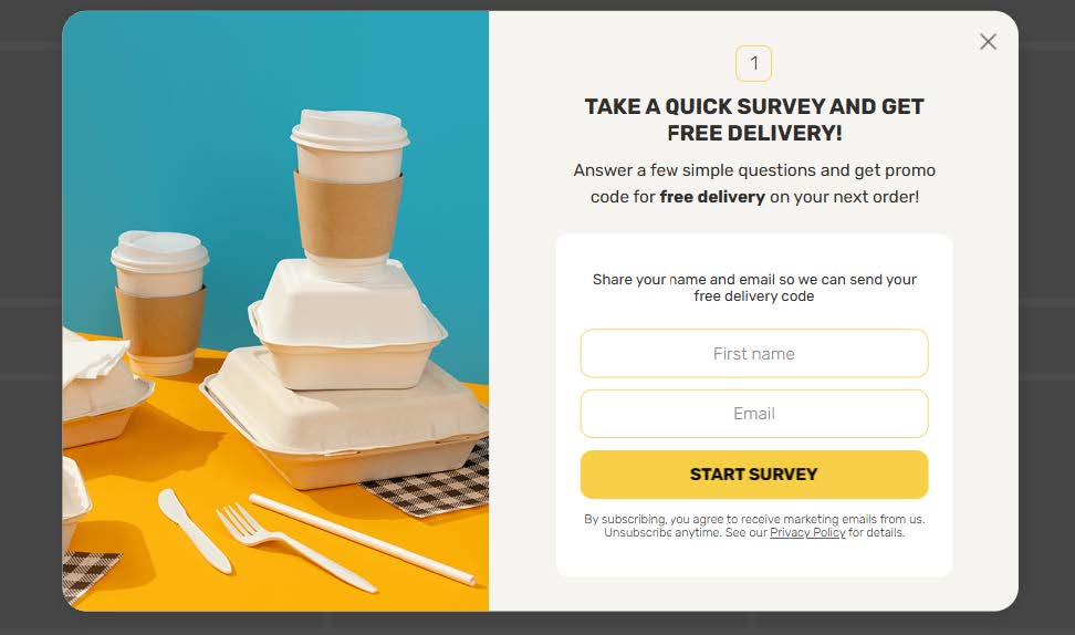
Interactive quizzes replace form-heavy interfaces with a light question-driven flow. Instead of asking users to submit information, the UI invites them to make choices. This shift increases cognitive engagement while reducing resistance, especially when visuals stay restrained and purposeful.
Strong quiz design favors clarity over decoration. One question per screen keeps focus intact and prevents overload. Progress should be communicated subtly through dots, cards, or step indicators. Each transition should reinforce momentum.
Popups work well for quizzes because they create a clear, contained experience. The interaction becomes short and intentional, with a defined start and finish. This format avoids the fatigue of long forms while still leading users toward a clear and meaningful result.
Popup example from Claspo’s template library
Pick-a-card popups use choice as the core interaction. By offering a limited set of options with controlled randomness, the UI invites participation without overwhelming the user. The result feels personal, even when the logic is predefined.
Symmetry plays a key role. Evenly sized cards suggest fairness, while subtle hover animations signal interactivity. The selection moment should feel calm and not rushed. Importantly, there are no “losing” cards, only different rewards. Revealing failure breaks trust and weakens engagement.
From a design perspective, the perceived freedom of choice matters more than the prize. When users feel in control, the interaction feels meaningful, regardless of the actual incentive.

Popup example from Claspo’s template library
Countdown-based games turn time into a visual signal. Instead of showing users how many seconds they have left, the interface shows urgency through motion and gradual change. This keeps attention focused on the interaction.
A well-designed countdown UI relies on visual cues. Circular timers or progress bars show remaining time at a glance. Subtle color shifts add urgency without creating stress. Motion should stay smooth and predictable, with no sudden jumps.
Popups work well for this pattern because urgency stays contained. Designers can introduce time pressure without changing page layouts or interrupting content. The experience remains focused, temporary, and intentional.
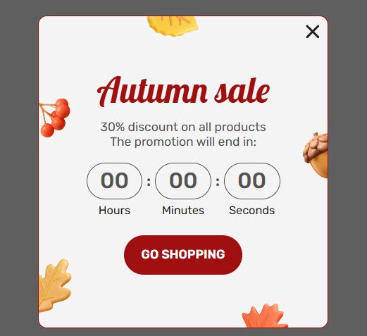
Popup example from Claspo’s template library
Memory match mini-games engage attention without demanding effort. As a UI pattern, they work best as small, self-contained challenges that reward focus.
Keeping the game to four to six cards makes it solvable in seconds and avoids cognitive overload. The winning state should be clear and easy to reach. Consistent visuals across cards help users focus on patterns rather than design differences.
This format is effective for brand storytelling. Instead of leading with discounts, designers can use imagery, icons, or messages to reinforce brand values while keeping the interaction playful and purposeful.
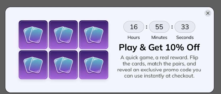
Popup example from Claspo’s template library
Progress-based reward bars tap into the natural urge to finish what has already started. By visualizing advancement, the UI turns effort into momentum and makes the next action feel smaller than it actually is.
For this pattern to work, progress must feel honest. Sudden or exaggerated jumps break credibility and reduce trust. Smooth, proportional movement reinforces the sense of real advancement. Micro-copy plays a supporting role here, framing progress in human terms and acknowledging effort without overpromising results.
In popups, this pattern shines in “almost there” scenarios. A partially filled bar signals that the user is close to completion, encouraging signups or final actions without pressure.
Popup example from Claspo’s template library
Random reward popups rely on uncertainty to spark engagement, but their effectiveness depends on control. The interaction works when surprise feels intentional and fair, never misleading. Users should sense variation, not manipulation.
From a UI standpoint, the selection process matters more than the outcome. Animating the moment of choice builds anticipation and makes the logic transparent. Reward tiers should remain visually equal, avoiding cues that suggest “better” or “worse” outcomes before selection.
This pattern fits naturally into popup design, where randomized logic can be introduced without complexity.
Popup example from Claspo’s template library
Advertisment
Gamification transforms popups from simple attention-catchers into meaningful, interactive experiences. By applying patterns like spin-to-win wheels, scratch cards, quizzes, and progress-based bars, designers can guide user behavior through engagement, anticipation, and choice—without overwhelming the interface. The key lies in balance: interactions should be intuitive, visually clear, and respectful of the user’s control. When done well, gamified UI doesn’t just increase conversions—it turns every micro-interaction into a moment of delight, making websites feel more alive, responsive, and human.
Advertisment
Pin it for later!
If you found this post useful you might like to read these post about Graphic Design Inspiration.
Advertisment
If you like this post share it on your social media!
Advertisment


Want to make your Business Grow with Creative design?
Advertisment

Advertisment