Most students learn a basic loop: brief, moodboard, sketches, final. At an advanced level, that sequence often breaks down because the hard part is not “making a design,” it is making decisions you can justify, repeat, and improve under pressure. Critique is where those decisions get tested.
If you want to level up quickly, treat critique as part of the process from day one, not a meeting you survive at the end. Even borrowing structure from writing can help here; frameworks you might see on https://writepaper.com/ can be a reminder that a clear claim, evidence, and reasoning makes your choices easier to explain and easier to refine.
This article lays out a studio-grade workflow that keeps you moving fast while still producing work that holds up in front of tough feedback.
Advertisment
Before you open a file, set the terms of the critique. Otherwise, you’ll get generic comments (or contradictory opinions) because nobody knows what “good” is supposed to mean for this project.
Write a one-page “success definition” that includes:
This is also where it helps to think like you’re framing an argument: if you have ever browsed problem solution essay topics, you’ve seen how much easier critique becomes when the problem is specific and the criteria for “solved” are clear. You are doing the same thing in design: naming the problem and defining what success looks like.
Advanced students do not need more “inspiration.” You need inputs that narrow decisions. Research should reduce guesswork, not create a bigger pile of references.
Aim for research that answers questions like:
Use your network strategically. If you have access to the ePro community, treat it like a research tool, not just a social space. Ask for targeted examples, request quick feedback on a specific question (“Does this hierarchy read in three seconds?”), and collect patterns in how people interpret your work.
When you need user insight, you do not need a full thesis. A short interview round, a quick observation session, or a handful of structured responses can be enough to shift your decisions. Picking a few qualitative research topics as prompts can keep this practical, for example: “What do people notice first?”, “What feels trustworthy here?”, or “What information do they assume is missing?” The goal is to extract usable cues that affect layout, type, and messaging.
Advertisment
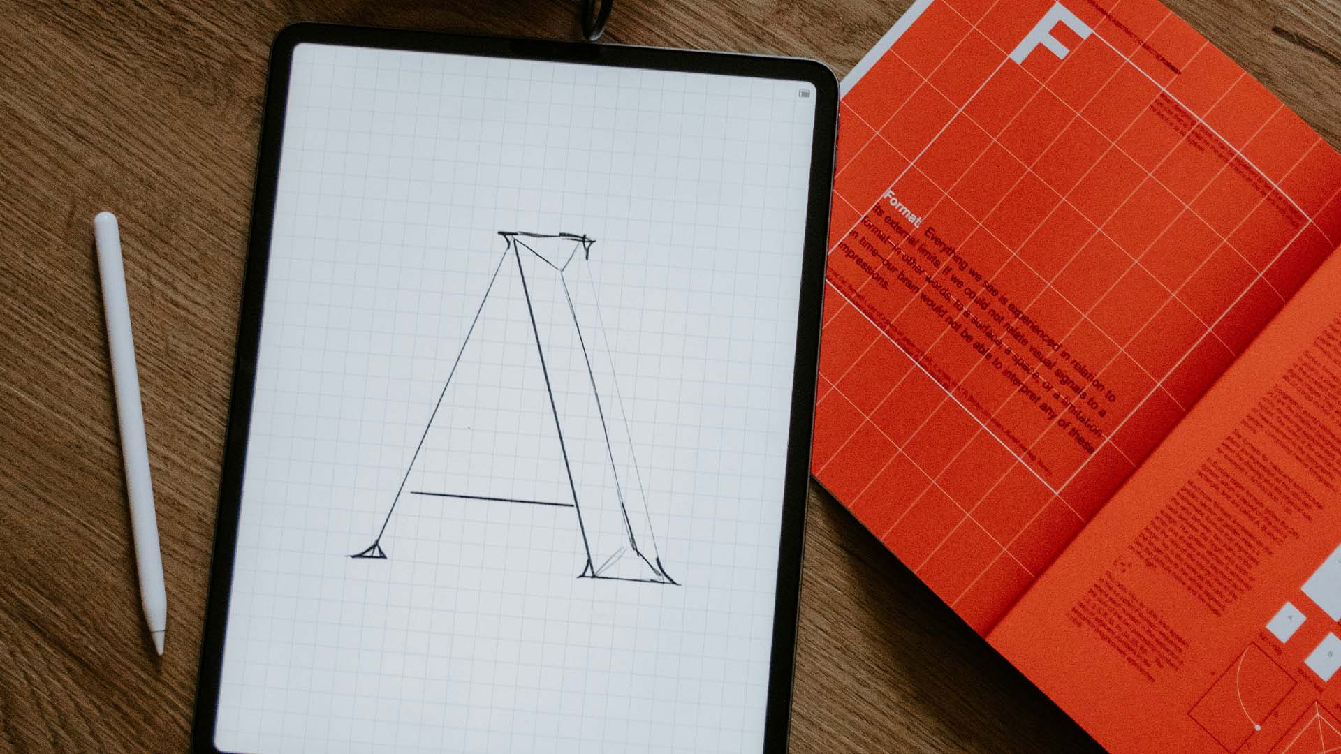
One reason critiques go off the rails is that you bring in something too finished, too early. People respond to polish instead of structure, and you lose the chance to fix the real problems.
Use three levels of prototypes to control what the critique focuses on:
Level 1: Structure
Level 2: Direction
Level 3: Near-final
Each level creates a different kind of critique. Level 1 should be about clarity and priorities. Level 2 should be about tone, consistency, and whether the visual language matches the goal. Level 3 should be about craft, edge cases, and execution under real conditions.
A good critique produces actions. A weak critique produces opinions. Your job is to make it hard for the room to stay vague.
Start every critique with a short setup:
Then use prompts that force specific observation. Here are five that consistently generate actionable feedback:
Notice what these prompts do: they move critique away from “I like it” and toward “it works” or “it doesn’t,” with a reason you can test.
A practical habit: separate diagnosis from prescription. If someone says “make the headline bigger,” ask what problem they are trying to solve. Is it not noticeable fast enough? Is the hierarchy unclear? Is the contrast weak? Once you know the real issue, you might solve it with spacing, position, contrast, or copy, not just
Advertisment
Pin it for later!
If you found this post useful you might like to read these post about Graphic Design Inspiration.
Advertisment
If you like this post share it on your social media!
Advertisment


Want to make your Business Grow with Creative design?
Advertisment

Advertisment