As a designer, you know how much a great font can shape the tone of a project. Whether you’re building a brand, designing a website, or laying out a magazine spread, the right typeface isn’t just decoration—it’s part of the message.
I’ve spent hours digging through Adobe Fonts (maybe too many) as it is one of the best websites to find fonts for graphic design, and I’ve found that some families just work better than others.
They’re flexible, beautifully crafted, and loaded with features that make your life easier—like ligatures, multiple weights, and support for different languages. If you’ve ever felt overwhelmed by all the choices, this list is here to help.
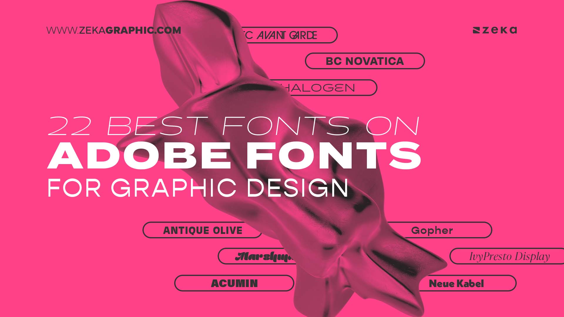
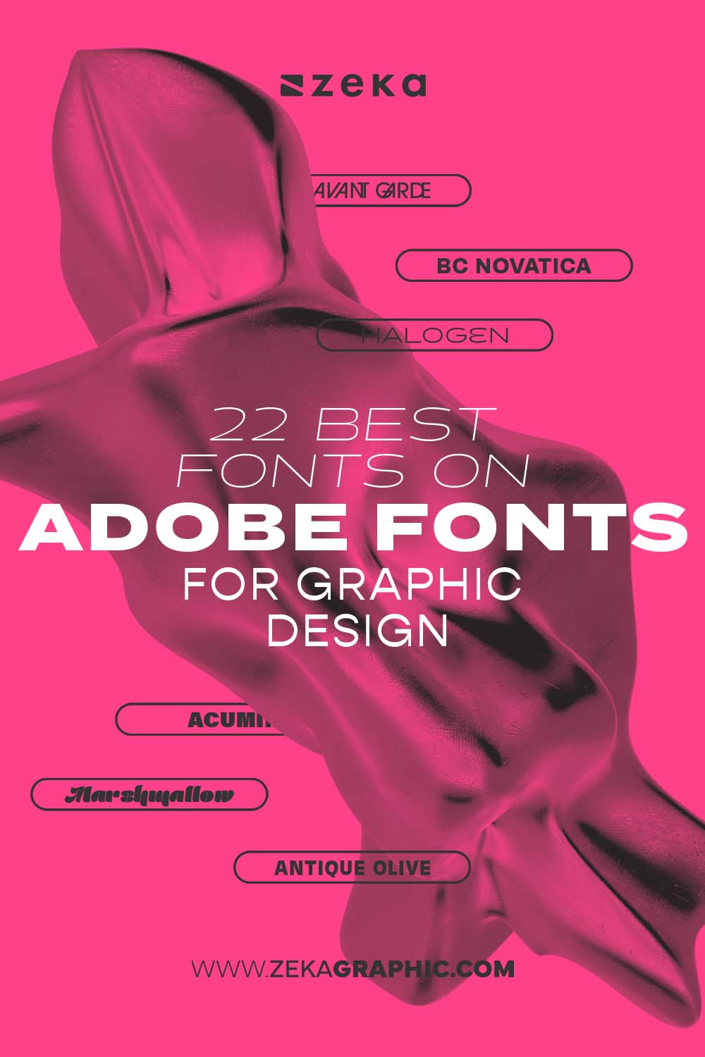
These are some of the best fonts on Adobe Fonts for graphic design:
Advertisment
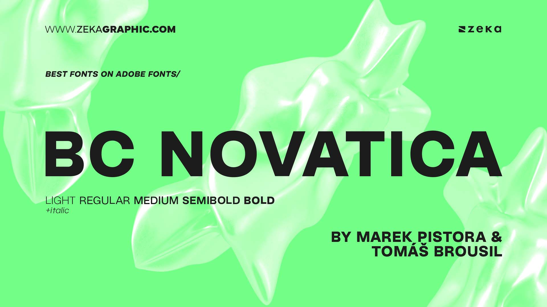
BC Novatica is a modern sans-serif typeface created by Marek Pistora and Tomáš Brousil, published by the Czech foundry Briefcase Type. Originally developed for the Czech TV station Nova in 2007, it was later refined and released for public use in 2017. Its design merges clean, contemporary grotesque geometry with subtle references to 1970s aesthetics, resulting in a highly legible and versatile font.
The typeface family includes 10 styles—Light to Bold with matching italics—and supports both Latin and Cyrillic scripts. Each style offers 494 glyphs and robust OpenType features such as ligatures, tabular figures, stylistic sets, and localized forms, making BC Novatica ideal for branding, editorial, and digital interfaces.
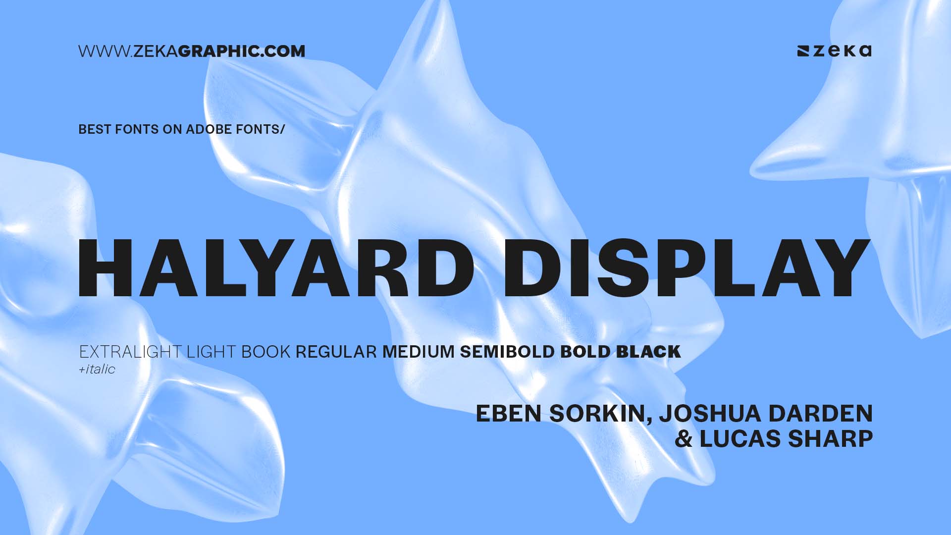
Halyard Display is a crisp grotesque sans-serif designed by Eben Sorkin, Joshua Darden, and Lucas Sharp, and published by Darden Studio. As part of the larger Halyard superfamily—which includes Display, Text, and Micro variants—it’s optimized specifically for large-size use like headlines, branding, and editorial design. Its sharp terminals, tight spacing, and subtle contrast give it a modern edge while nodding to classic American gothic styles.
The family offers 8 weights, from ExtraLight to Black with matching italics, totaling 16 styles. It supports over 90 Latin-based languages and includes 590 glyphs per style, along with advanced OpenType features like case-sensitive forms, stylistic alternates, ligatures, and tabular figures. Halyard Display is perfect for impactful, editorial-driven typography.
Advertisment
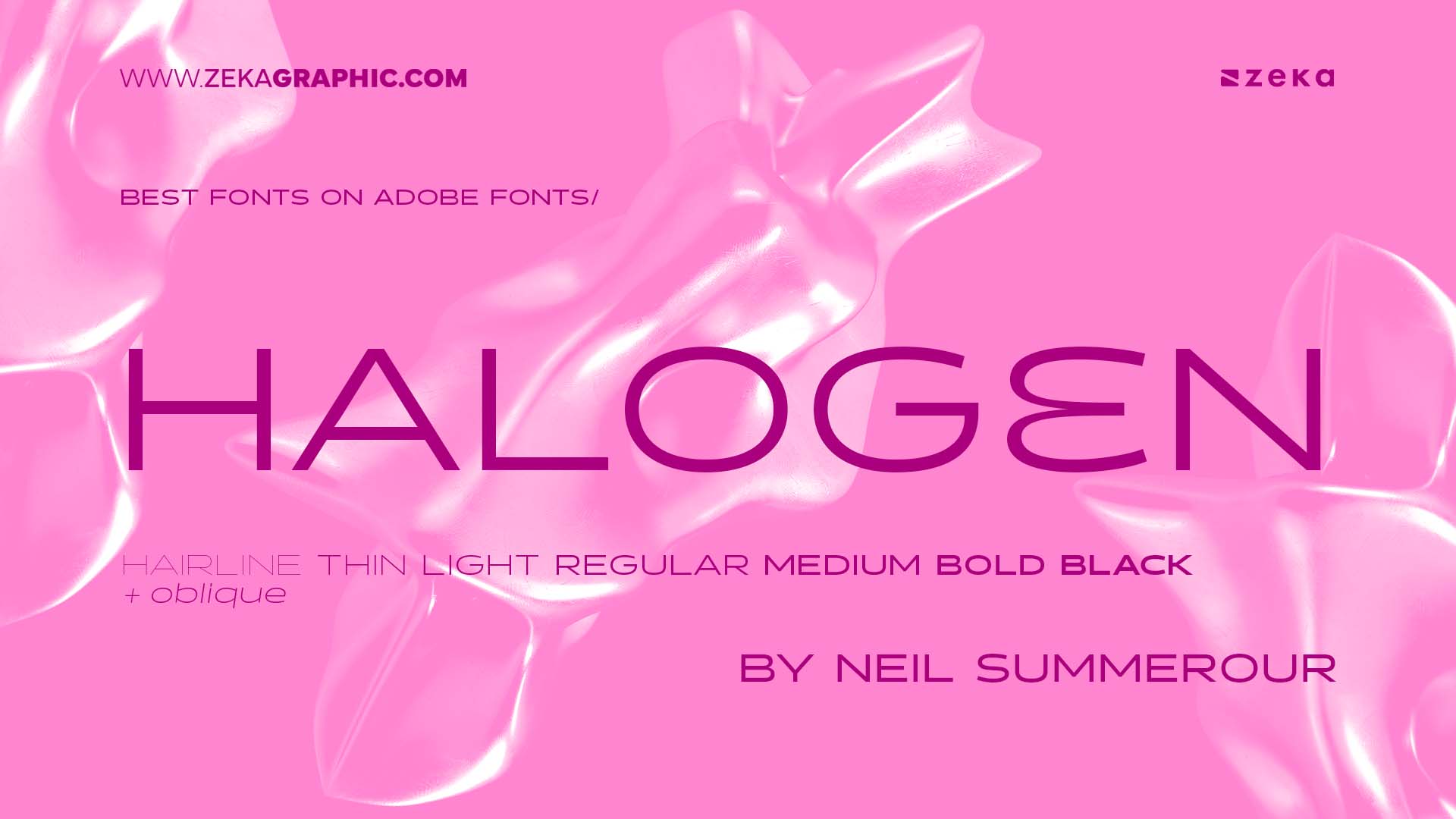
Halogen is a sharp and futuristic display sans-serif designed by Neil Summerour and published by Positype. Known for its geometric construction and sci-fi aesthetic, it features squared letterforms, pointed terminals, and tight spacing—perfect for headlines, logos, posters, and tech-inspired designs.
Halogen includes 7 weights, Hairline, Thin, Light, Regular, Medium, Bold and Black with all caps, numerals, and basic punctuation and their Oblique versions, making it ideal for minimalist layouts and bold branding.
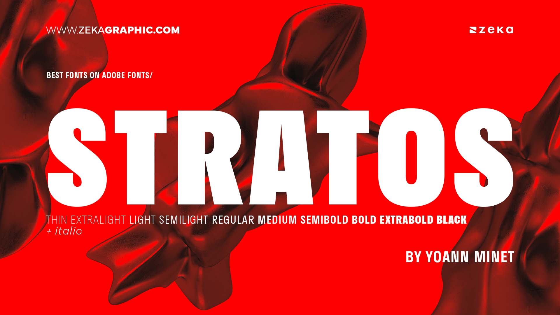
Stratos is a modern neo-grotesque sans-serif designed by Yoann Minet and released through the Paris-based Production Type foundry. What sets Stratos apart is its unconventional approach to proportions: it features wide capitals and narrow lowercase letters, creating a distinctive rhythm in both text and display settings.
It comes in 20 styles across 10 weights (Thin, ExtraLight, Light, SemiLight, Regular, Medium, SemiBold, Bold, ExtraBold and Black) with matching italics, and includes extended Latin language support, stylistic alternates, ligatures, and tabular figures. Ideal for editorial, branding, and digital interfaces.
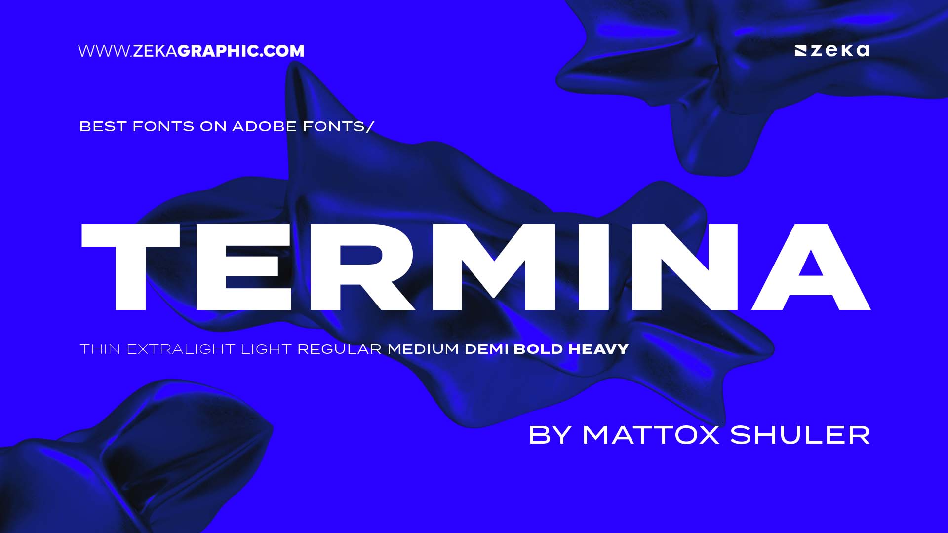
Termina is a bold and geometric sans-serif typeface designed by Mattox Shuler and published by Fort Foundry. Influenced by industrial and modernist aesthetics, Termina is characterized by its wide stance, high x-height, and squared shapes, making it perfect for impactful branding, editorial headlines, and signage.
The family includes 9 weights from Thin to Black without italics and supports an extended Latin character set. With OpenType features like fractions, stylistic sets, and numerators, Termina brings versatility and strength to bold typographic systems.
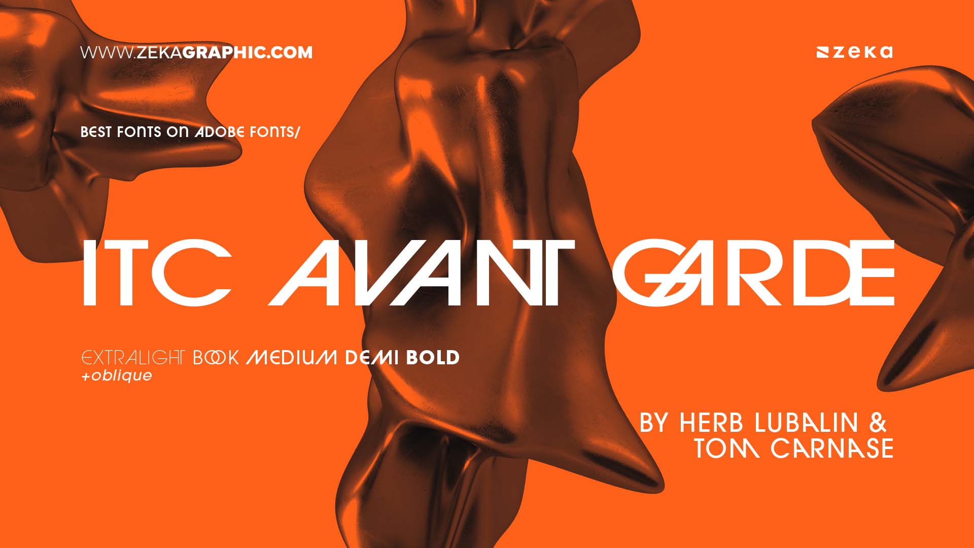
ITC Avant Garde Gothic is a geometric sans-serif typeface designed by Herb Lubalin and Tom Carnase, originally based on the logo for Avant Garde magazine. It reflects the spirit of the 1970s with bold, minimalist forms and distinctive ligatures, embodying a balance between expressive and utilitarian design.
The family includes multiple weights and widths, each supporting Latin-based languages. Its characteristic alternates and ligatures make it popular in branding, editorial, and fashion contexts. As a design icon, it continues to inspire modern reinterpretations.
Advertisment
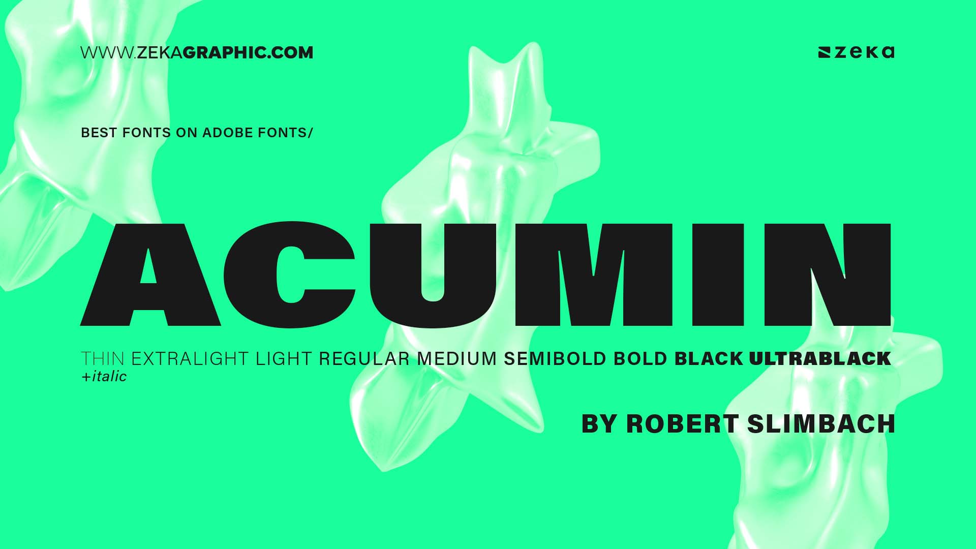
Acumin is a neo-grotesque sans-serif typeface designed by Robert Slimbach for Adobe. Crafted as a versatile workhorse font, it’s built for clarity and neutrality, excelling in both print and digital environments. It blends the efficiency of Helvetica with a more modern sensibility.
The superfamily spans 90 styles across 5 widths and 9 weights, each with italics. It supports an expansive Latin character set, making it a reliable choice for corporate, editorial, UI/UX, and multilingual projects.
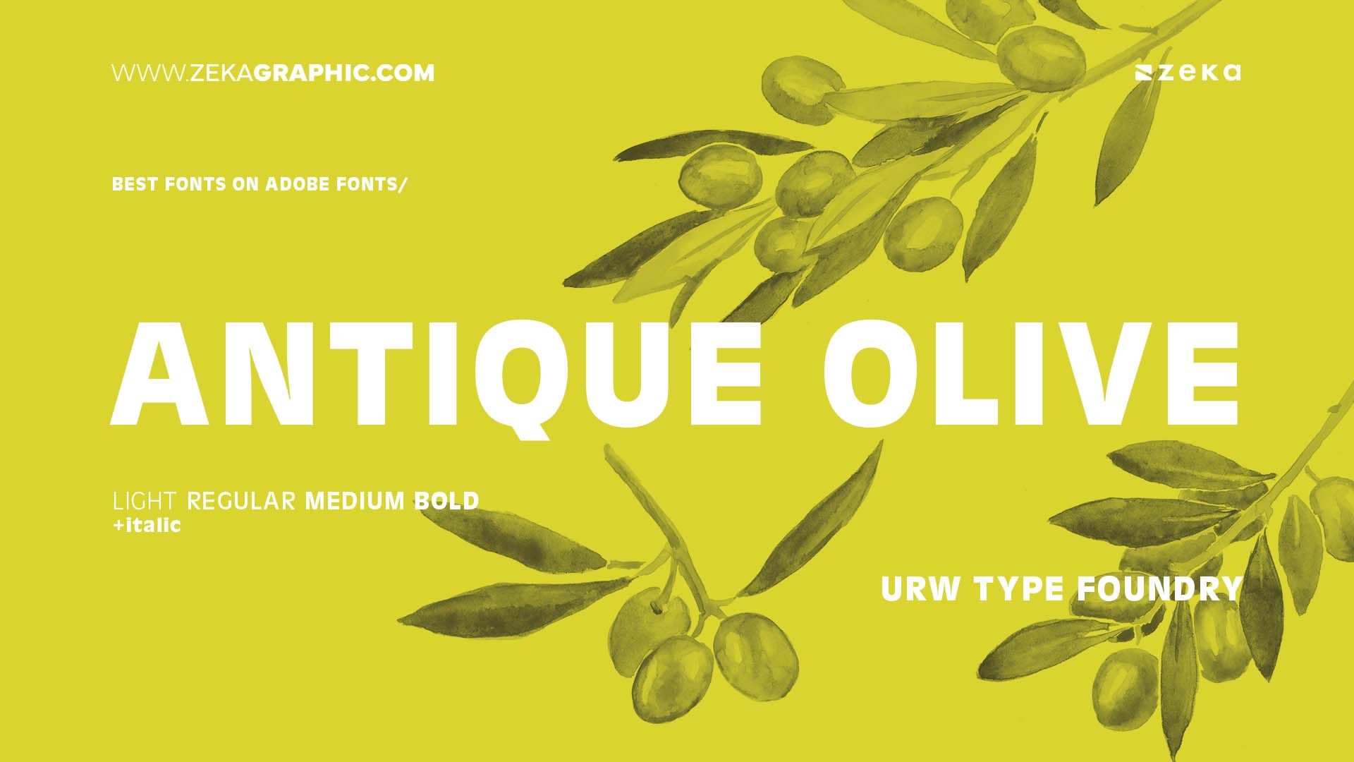
Antique Olive, published by URW Type Foundry, is a humanist sans-serif that stands out for its distinctive letterforms, especially the exaggerated oval ‘O’ and rounded terminals. It was intended to compete with Helvetica and Univers but brings more warmth and personality.
Available in a range of weights and widhts, Antique Olive shines in editorial, poster, and display typography, offering a timeless European flavor. It’s a great choice for designers who want something classic, yet unconventional.
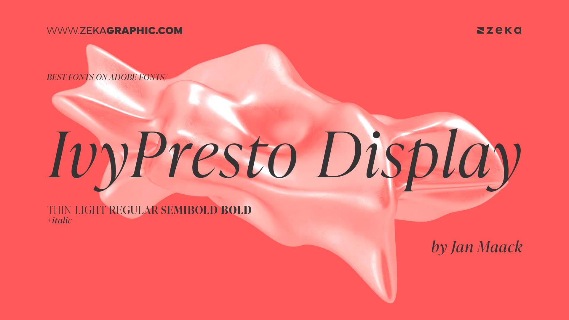
IvyPresto Display, designed by Jan Maack and published by Ivy Foundry, is a sophisticated serif with a high contrast and delicate features, ideal for luxury branding, magazine headlines, and elegant editorial use. Its expressive curves and sharp serifs create a strong visual impact.
The family offers several weights with refined detailing, optimized for large point sizes. IvyPresto Display is rich in OpenType features, supports extended Latin, and is a perfect option when you need something modern yet rooted in tradition.
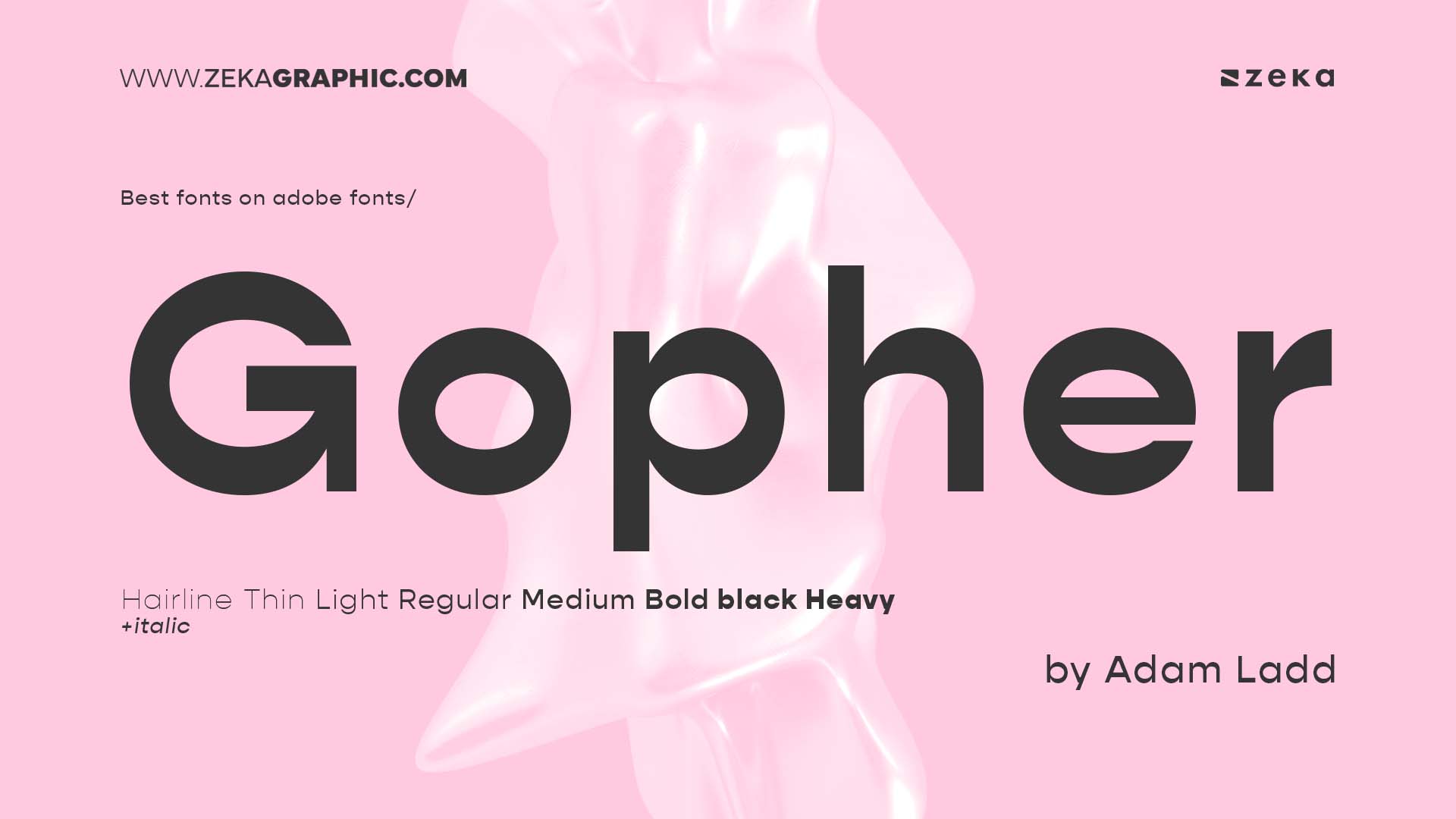
Gopher is a geometric sans-serif typeface designed by Adam Ladd. It balances clean, modern lines with slightly softened edges for a friendly tone, making it perfect for tech, branding, and editorial projects that require a human touch.
With 8 weights, italics, and support for extended Latin, Gopher includes multiple stylistic alternates, ligatures, and numeral options. It’s highly readable and versatile—great for both headlines and body copy.
Advertisment
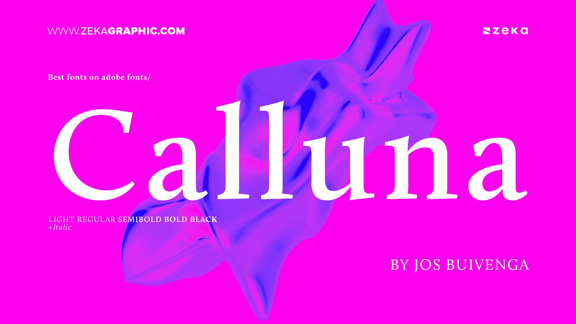
Calluna is a serif typeface created by Jos Buivenga of exljbris, blending classical serifs with a contemporary edge. Originally developed as an experiment in adding flexibility to serifs, Calluna features subtle curves that aid readability and give it a soft elegance.
The family includes 8 weights from Light to Black with matching italics, and it supports extensive OpenType features like ligatures, small caps, and stylistic alternates. Calluna works beautifully for books, reports, and sophisticated branding.
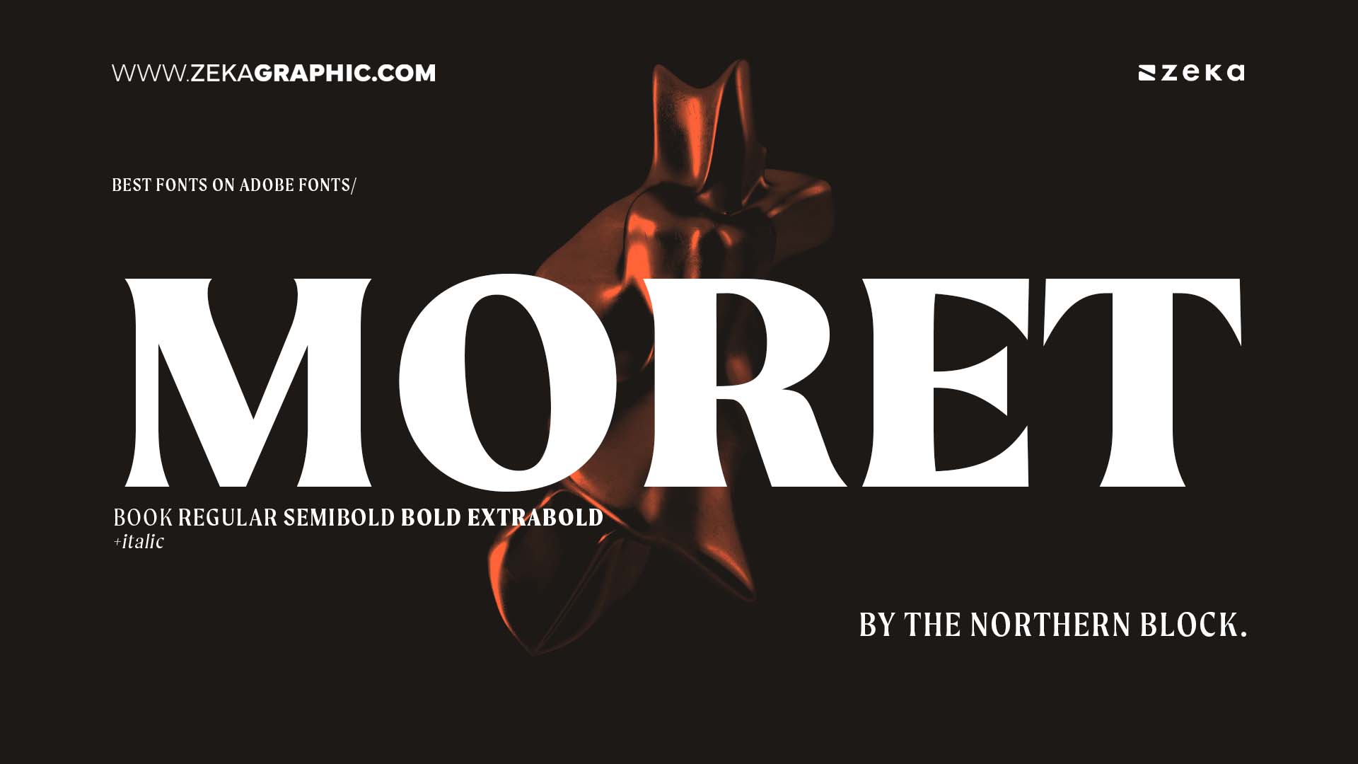
Moret, by The Northern Block, is a high-contrast serif font family inspired by early 20th-century transitional typefaces. With sharp wedge serifs and tight apertures, Moret offers a refined editorial flair, ideal for magazine design, posters, and fashion branding.
The family includes 5 weights with italics and supports over 100 languages. Its elegant proportions and rich typographic features like ligatures and oldstyle numerals make it especially strong in display and high-impact text contexts.
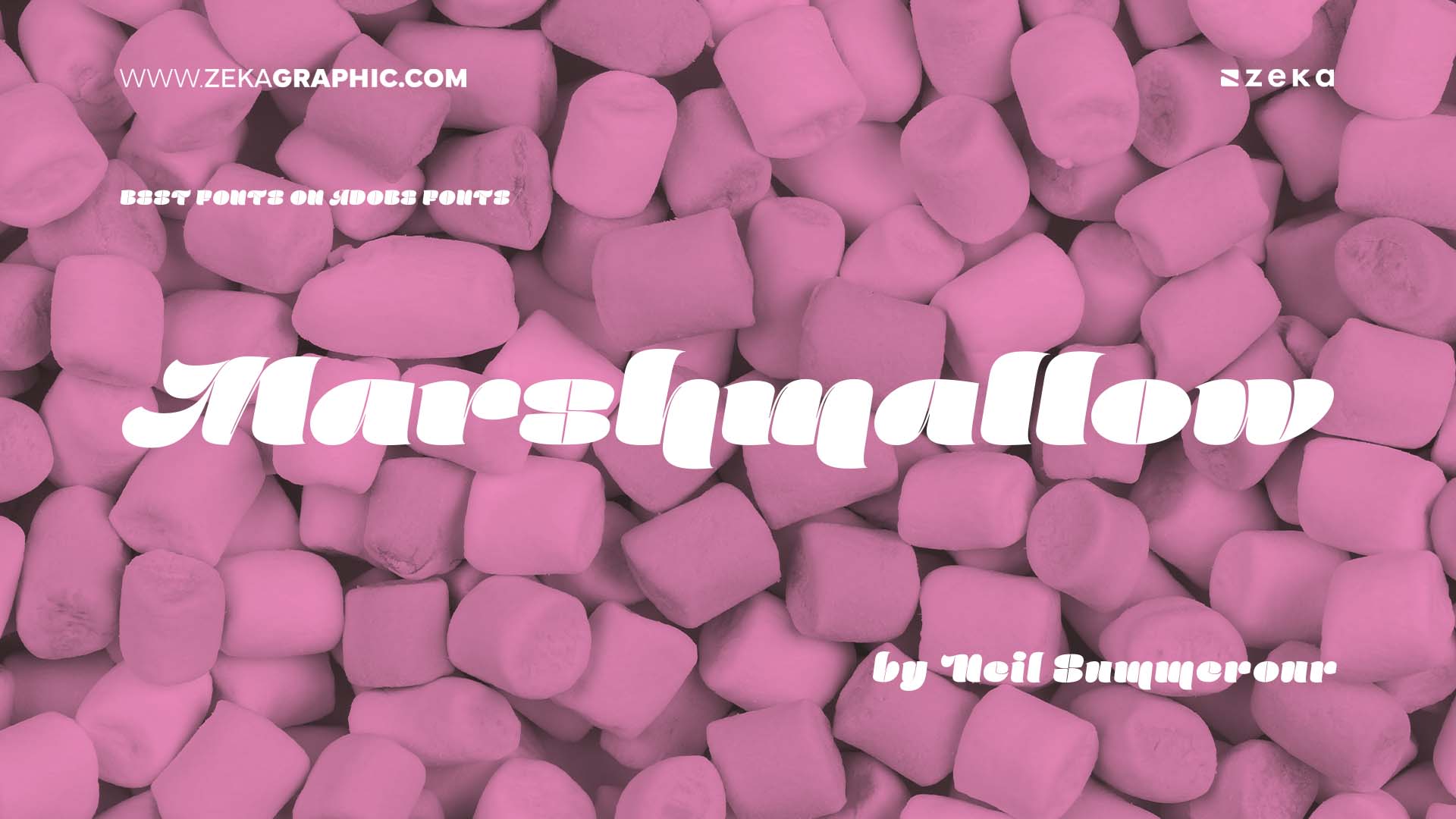
Marshmallow, designed by Neil Summerour and published by Positype, is a soft, rounded sans-serif that feels fun, fresh, and friendly. It’s great for packaging, kids’ brands, food, and tech startups looking for a warm and playful voice.
The family offers multiple weights with smooth curves and minimalist shapes. Marshmallow includes OpenType alternates and ligatures, adding personality and versatility for display use.
Advertisment
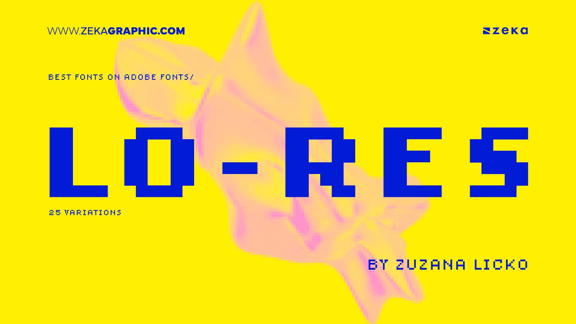
Lo-Res is a pixel-inspired typeface by Zuzana Licko, created for Emigre. It mimics the visual texture of early digital and bitmap typography, making it a perfect choice for retro, tech, and experimental projects that embrace low-resolution aesthetics.
The family includes both pixel-precise and smoothed versions, offering a range of display effects thanks to its 25 variations. Lo-Res is bold and unconventional, designed to catch attention while referencing digital history in a creative way.
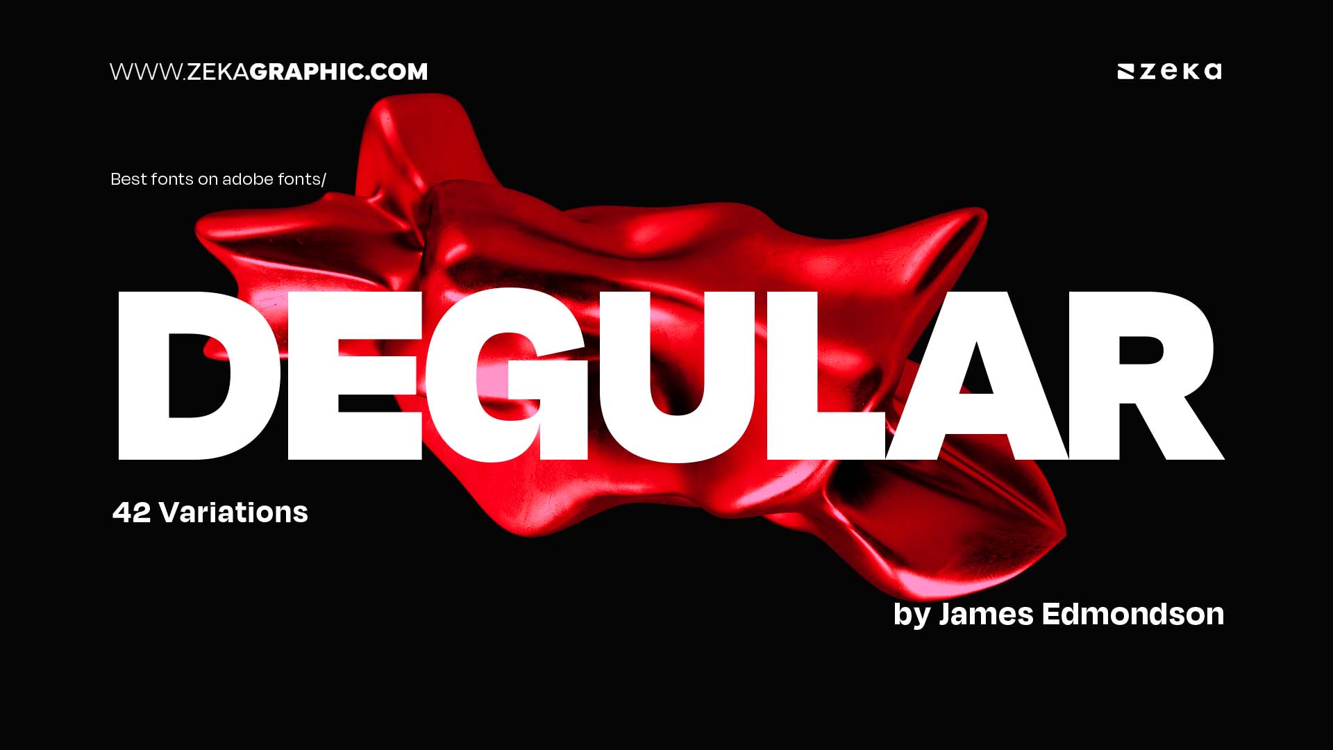
Degular, designed by James Edmondson and released by OH no Type Co., is a highly adaptable sans-serif family that balances functionality with a friendly, quirky tone. Designed to work across a wide range of sizes and use cases, Degular is clean but not sterile, making it ideal for branding, editorial, UI, and display work.
The type family comes in three optical sizes (Text, Display, and Banner), across nine weights with italics, offering excellent versatility. With extensive OpenType features, stylistic alternates, and a generous Latin character set, Degular brings personality to even the most practical design environments.
Advertisment
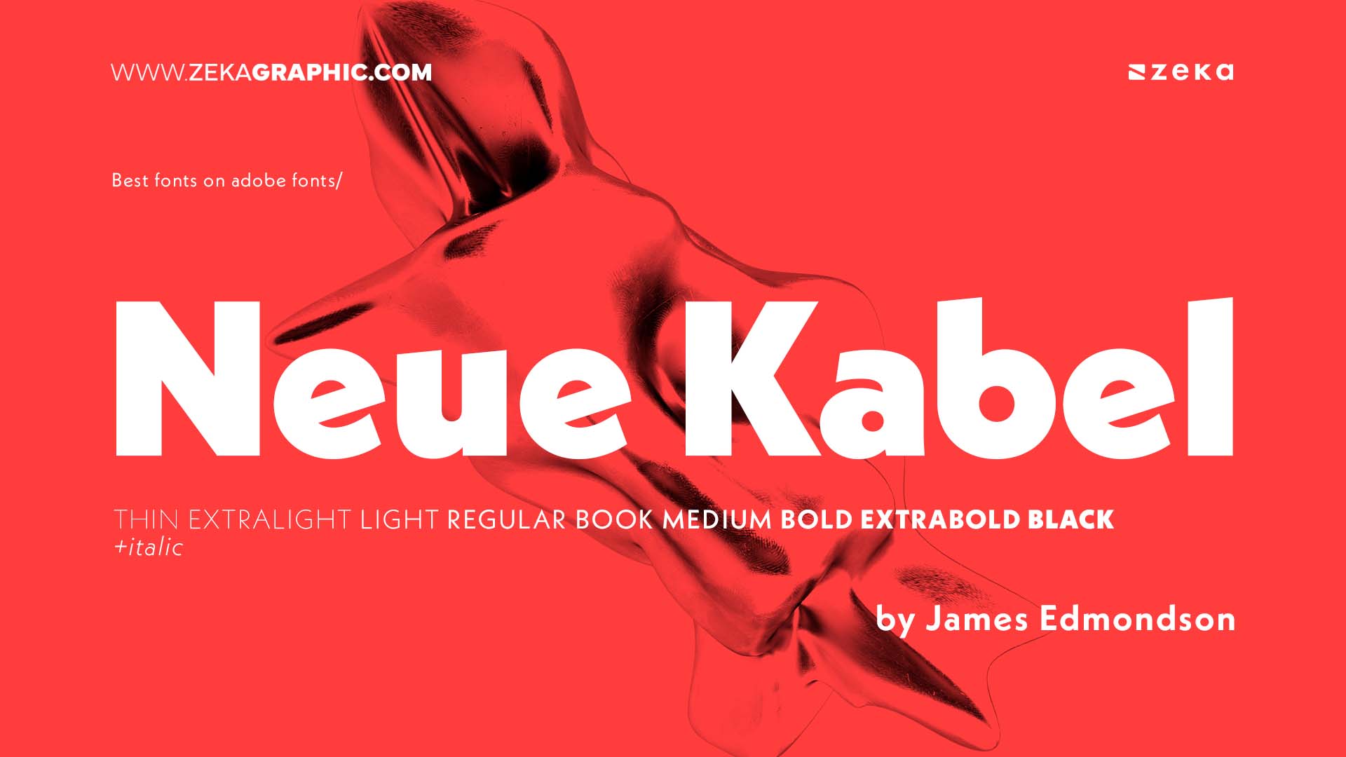
Neue Kabel, designed by Marc Schütz for Monotype, is a modern reinterpretation of Rudolf Koch’s original Kabel typeface. It maintains the geometric structure of the original while refining curves, spacing, and weight distribution for better readability and modern appeal.
The family spans eight weights with true italics, small caps, oldstyle figures, and stylistic alternates. Neue Kabel is particularly strong in branding, editorial, and packaging, where it brings a geometric yet humanistic flair.
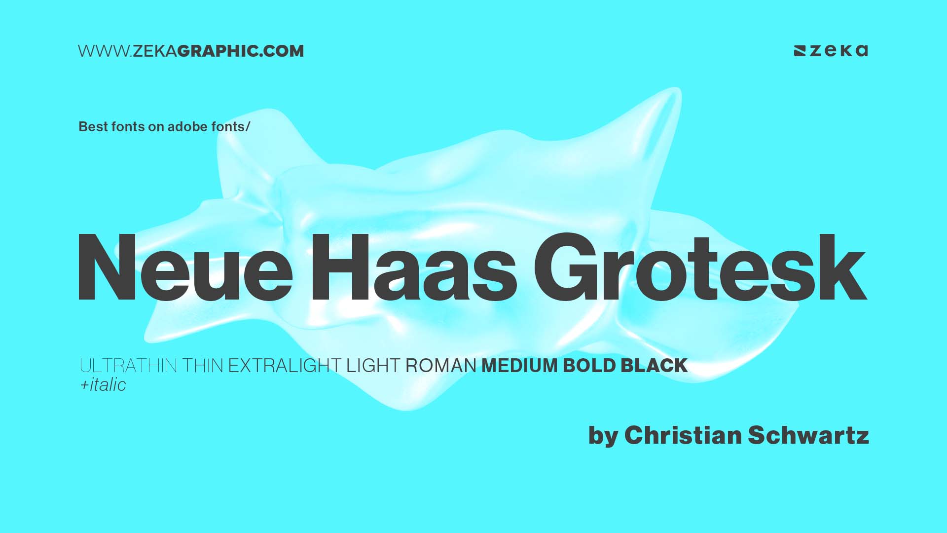
Neue Haas Grotesk, originally designed by Max Miedinger and redrawn by Christian Schwartz, is the precursor to Helvetica—restored to its original pre-Helvetica form. It delivers classic Swiss modernist style with balanced proportions, neutral tone, and clear legibility.
The family includes eight weights from Thin to Black with italics, supporting Western and Central European languages. Ideal for editorial design, branding, and corporate communications, it’s a timeless, professional sans-serif.
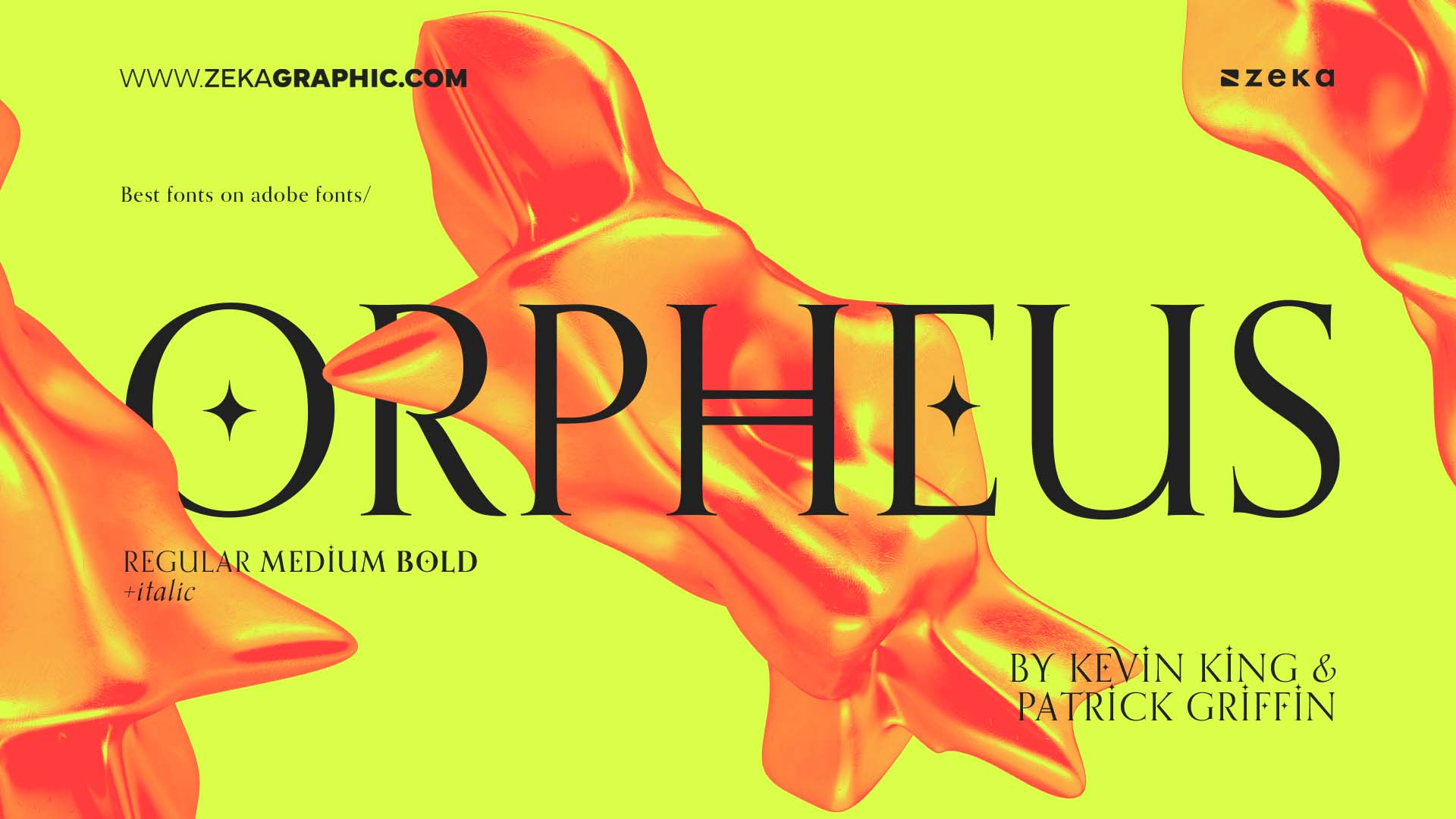
Orpheus, originally designed in the 1930s and revived by Patrick Griffin and Kevin King for Canada Type, is a refined serif font inspired by Art Deco and classical forms. With its elegant curves and stylized serifs, Orpheus brings a romantic and vintage character to any project.
The typeface includes multiple styles and swashes, making it perfect for magazine titles, fashion branding, packaging, or theatrical posters. It’s expressive without being overbearing—a great serif for drama and style.
Advertisment
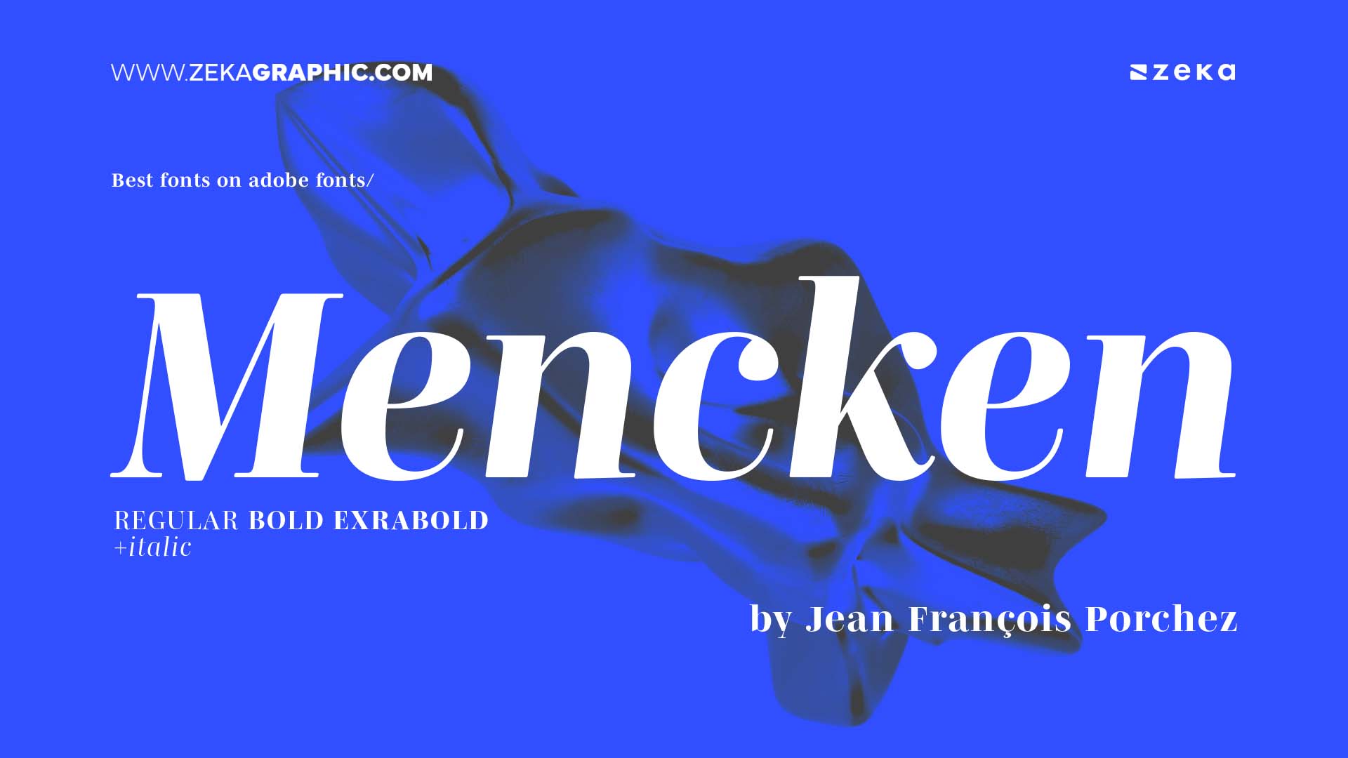
Mencken, designed by Greg Thompson, is a transitional serif family that combines traditional newspaper aesthetics with modern refinement. Originally developed for the Baltimore Sun, it offers high readability with a serious yet elegant tone.
The family includes several optical sizes and styles—from display to text—making it suitable for editorials, book layouts, and institutional branding. It supports full Latin character sets and includes typographic features like small caps and ligatures.
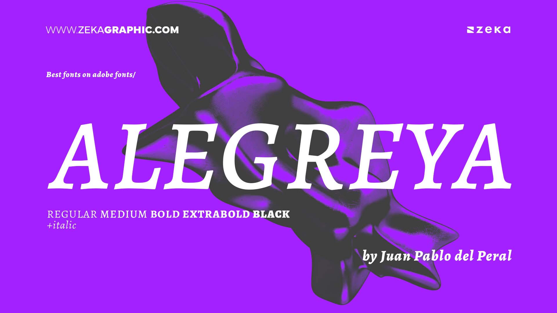
Alegreya, designed by Juan Pablo del Peral for Huerta Tipográfica, is a dynamic serif typeface created with literature in mind. Its flowing rhythm and calligraphic roots make it highly readable in long-form text, perfect for books, reports, and editorial publishing.
Available in both serif and sans-serif styles with multiple weights and italics, Alegreya supports over 150 languages and offers OpenType features like ligatures, small caps, and numeral options. It’s a favorite for serious content that still wants visual charm.
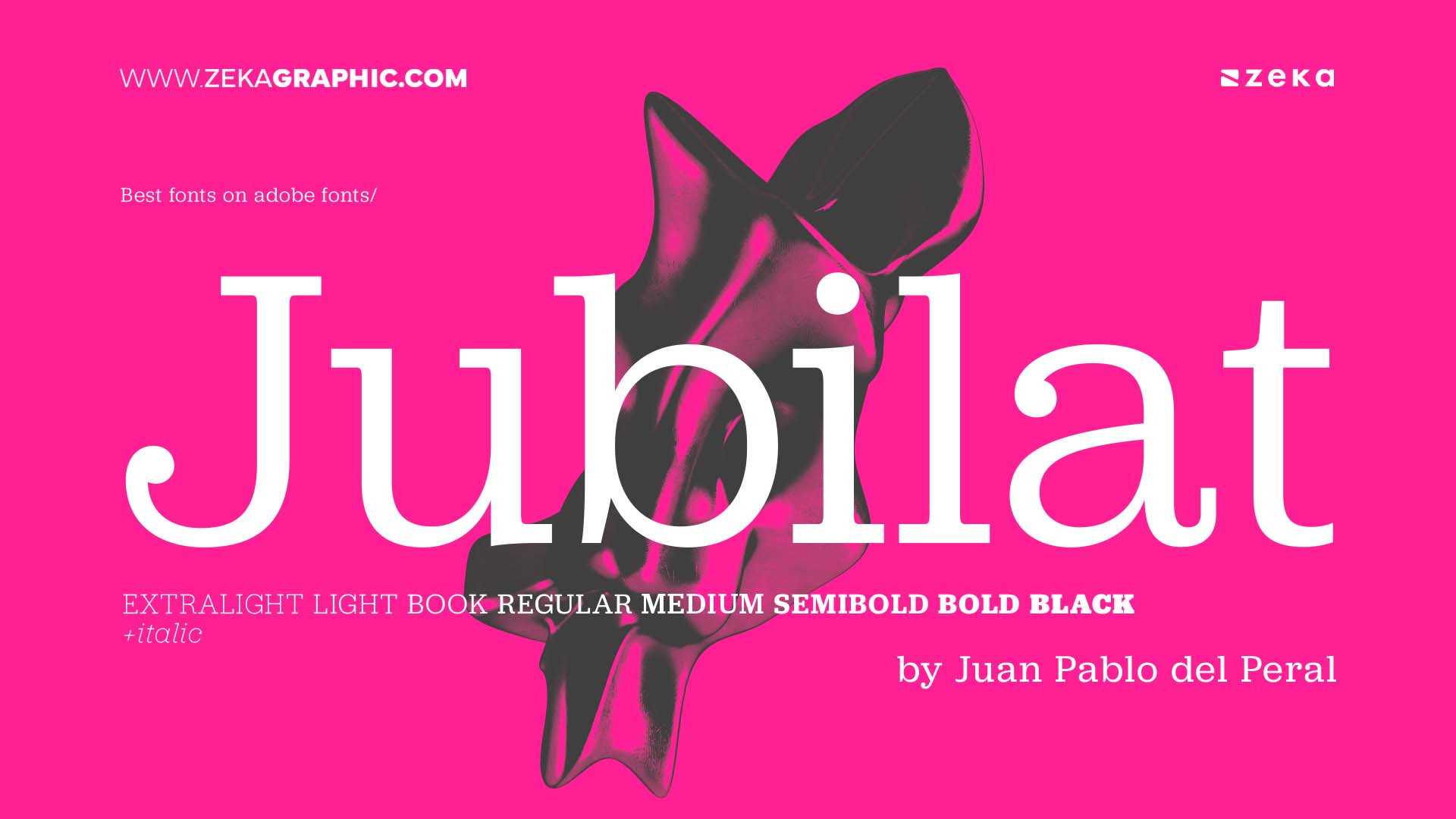
Jubilat, created by Darden Studio, is a serif typeface that blends the warmth of slab serifs with high contrast and modern proportions. Designed for both screen and print, it excels in headlines, branding, and editorial use.
With seven weights and italics, Jubilat supports extended Latin characters and includes small caps, oldstyle and lining figures, and stylistic alternates. It’s an elegant yet robust choice for serious content with a friendly edge.
Advertisment
The beauty of Adobe Fonts is that you don’t have to worry about licensing headaches or hunting down quality type—it’s all right there, built into your workflow. The fonts I’ve shared here are more than just visually appealing—they’re practical, versatile, and genuinely helpful in real-world design projects.
Some bring a clean, modern vibe, while others carry that expressive charm that’s hard to find. If you’re like me and you love finding fonts that feel like creative tools (not just pretty letters), these are solid choices to keep in your rotation. Give a few of them a spin—I think you’ll find they elevate your work in ways that really stick.
Advertisment
Pin it for later!
If you found this post useful you might like to read these post about Graphic Design Inspiration.
Advertisment
If you like this post share it on your social media!
Advertisment


Want to make your Business Grow with Creative design?
Advertisment

Advertisment