Typography is more than decoration—it’s a creative language that helps shape brand identity, convey tone, and guide the viewer’s attention across a layout. It gives your message both structure and style, turning plain words into a visual experience.
The power type holds becomes clear when you compare two versions of the same design—one with thoughtful typography and one without. A small change in font, spacing, or weight can completely alter the tone and impact of a piece, transforming how the message is received.
For designers, typography is the bridge between content and emotion. A strong layout or brand identity means little if the words aren’t readable, engaging, and purposeful. If you’re ready to treat type as the design tool it truly is—let’s dive in.
Advertisment
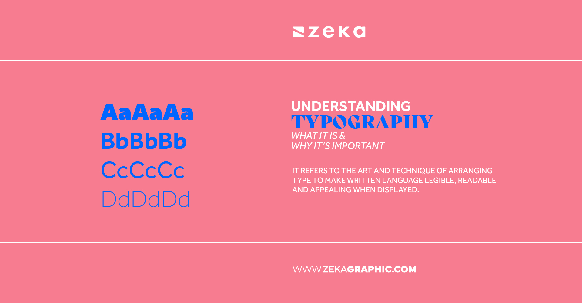
Typography is the art and technique of arranging type to make written language legible, readable, and visually engaging. It’s about more than just picking a “cool” font. In its essence, typography explained for beginners is all about structure—how letters sit together, how lines flow, and how hierarchy helps guide the reader’s eye.
In graphic design, typography plays a central role in communication. Whether you’re designing a logo, a magazine spread, or a mobile app, the typography you choose sets the mood. Typography meaning in graphic design extends to branding, emotion, function, and storytelling. Typography shapes how people interpret and respond to your message.
Key Functions of Typography in Design:
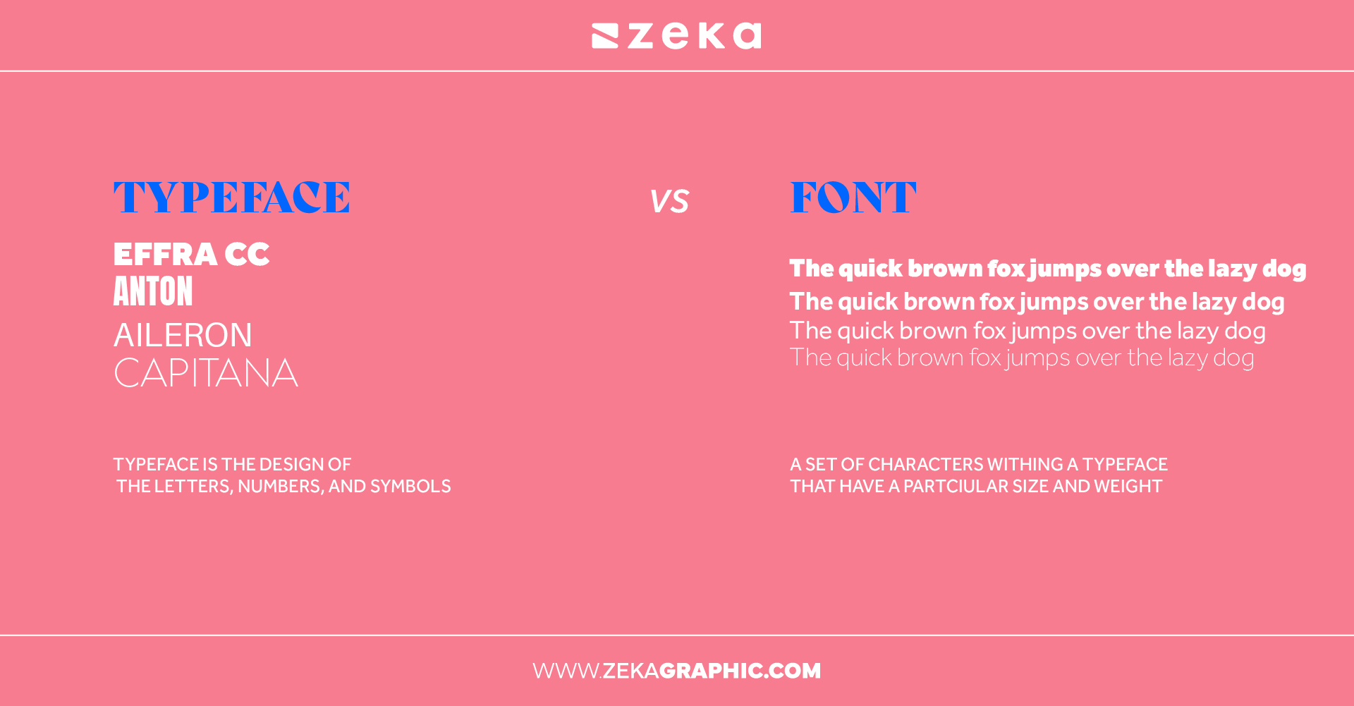
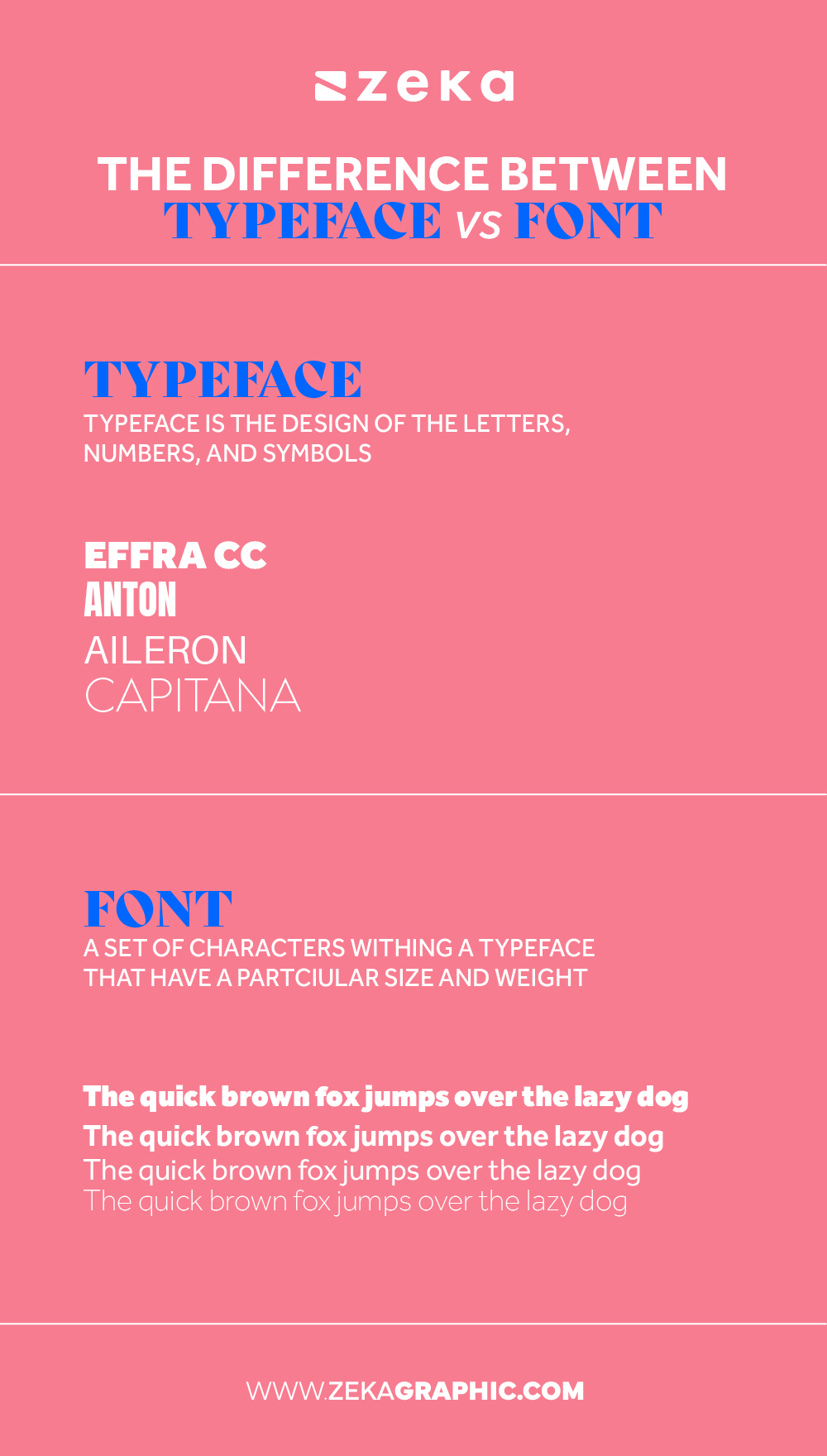
There’s a lot of confusion between the terms “typeface” and “font”—and trust me, I mixed them up a lot when I was starting out. But understanding the difference between font and typeface explained correctly will save you time, miscommunication, and even some embarrassment in professional settings.
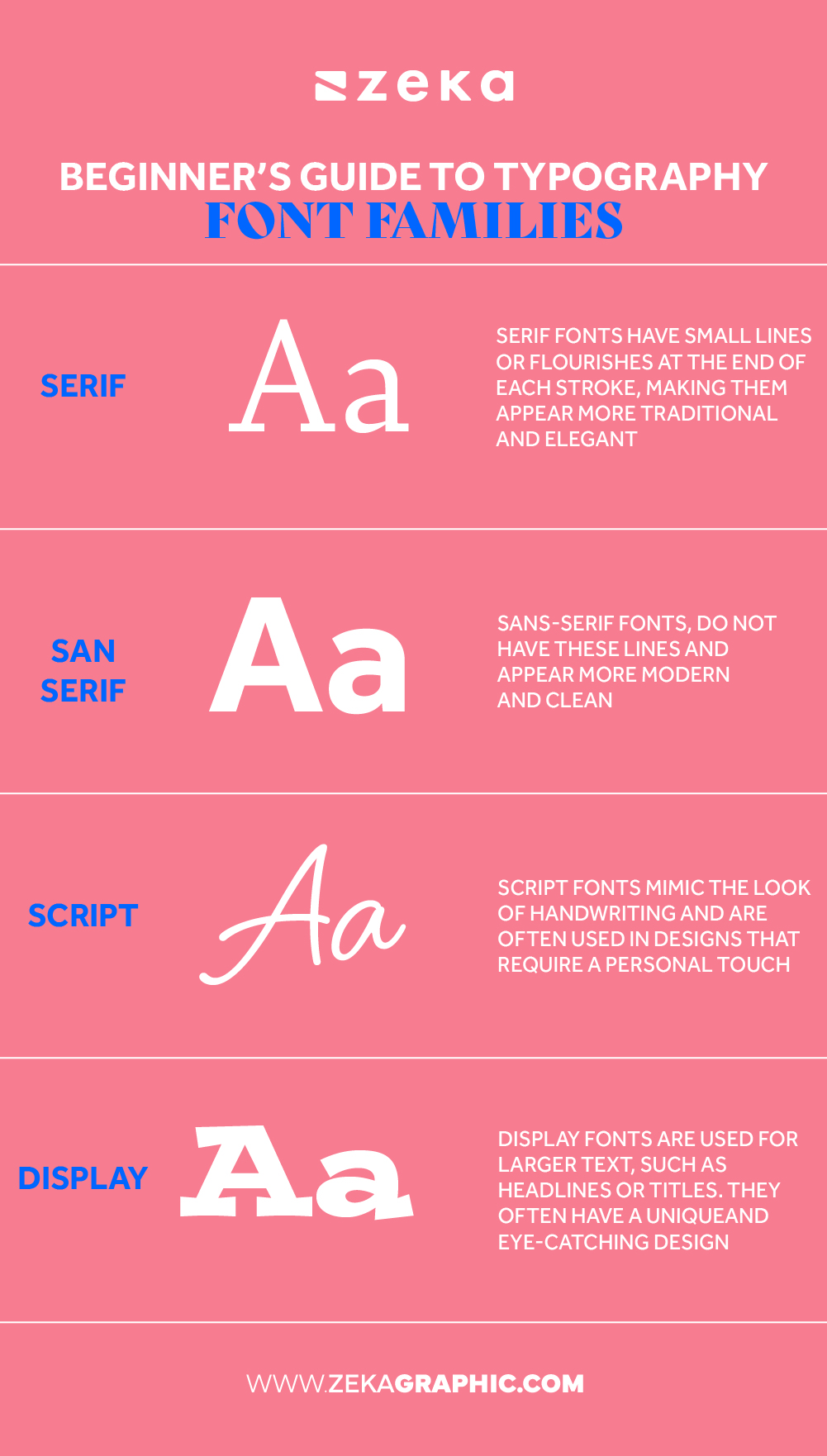
Font families are your design toolbox—they each have a unique personality, tone, and practical purpose. If you’re just learning about the different types of fonts for graphic designers, this is where your choices start to gain strategy and meaning.
Advertisment
Text spacing is the secret sauce that separates amateur designs from polished ones. Typography spacing basics involve mastering kerning, leading, and tracking—three tools that control the rhythm and readability of text. Poor spacing can make even the best font unreadable.
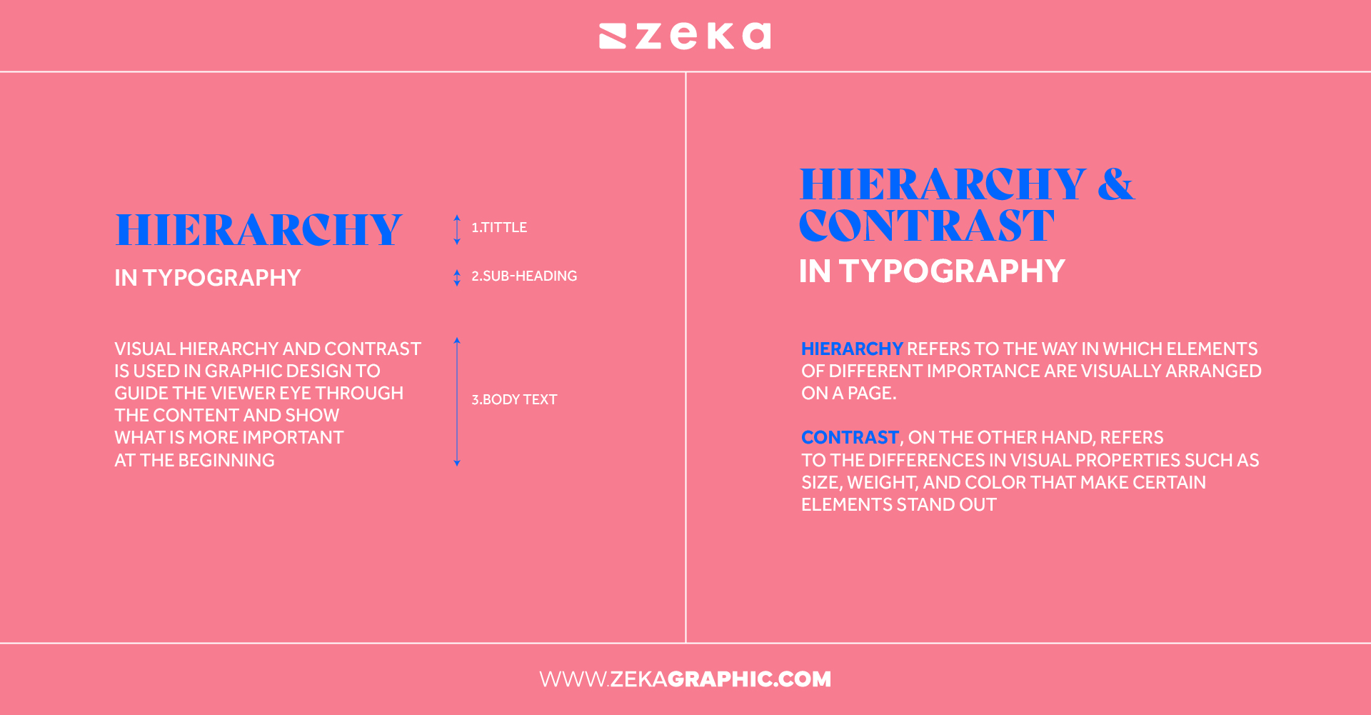
One of the most important principles in typography is visual hierarchy—the way you organize text elements so that the reader naturally knows where to look first. When hierarchy is done right, your layout flows smoothly and feels easy to read. When it’s missing, your message can get lost.
How to Use Contrast in Typography
Contrast creates emphasis and helps distinguish between different levels of information. You can achieve contrast through font size, weight, style, and even color. For example, a bold, oversized headline immediately signals importance, while a smaller, lighter body copy shows it’s meant for extended reading.
Creating Emphasis With Typography
Use variations in type (like bold, italic, uppercase) sparingly and with purpose. You want to guide the eye—not confuse it. Reserve dramatic styles or display fonts for the most important points, like headers or calls to action.
Visual Hierarchy in Graphic Design
Think of your layout like a visual roadmap. Headlines should grab attention, subheadings should support them, and body text should be easy to follow. Use consistent spacing between elements and align content neatly to avoid chaos on the page.
Typography hierarchy improves not just the look of a design, but also its usability. Readers can digest information faster when it’s well-organized, which leads to better engagement.
Pairing fonts can feel intimidating at first—but with a few smart rules, it becomes second nature. Effective font pairing helps establish tone, reinforces hierarchy, and makes your design look polished and cohesive.

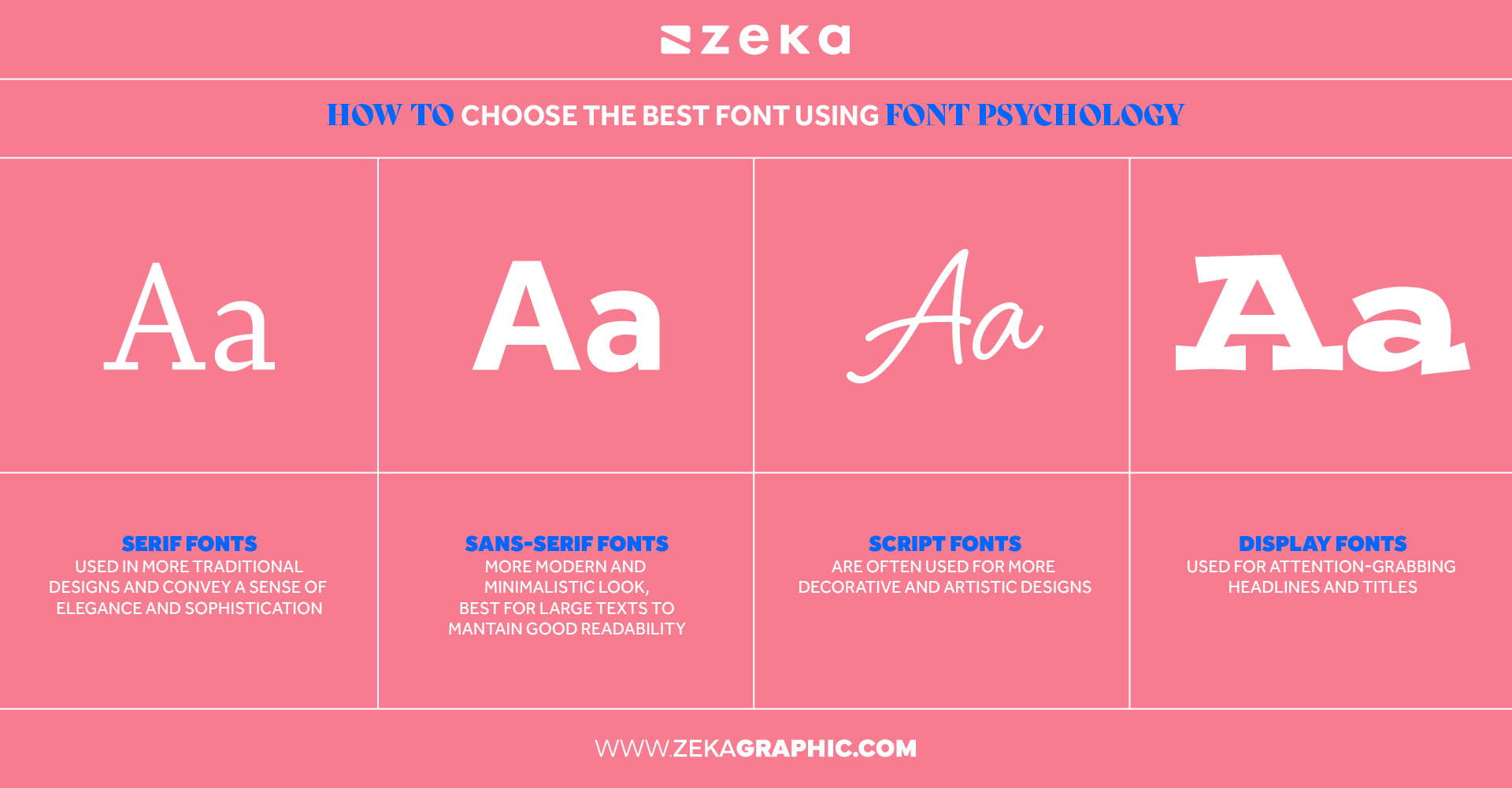
Fonts are not just visual tools—they’re emotional signals. That’s where font psychology comes in. Just like colors and images, typefaces influence how your message is perceived.
How to Choose Fonts for a Project
Start by defining the tone. Is your project serious and professional? Fun and playful? Elegant and high-end? Then match your fonts accordingly. For instance, a strong sans-serif like Helvetica communicates modernity, while a handwritten font like Pacifico feels friendly and informal.
The Emotional Impact of Fonts
Serifs often feel traditional and trustworthy, while sans-serifs suggest cleanliness and modernity. Script fonts can feel romantic or artistic, while bold geometric fonts feel powerful and futuristic. Choosing the right font helps create emotional alignment between your brand and your audience.
Fonts and Branding
A brand’s font is just as important as its logo or color palette. The right typeface reinforces identity, values, and tone. That’s why many luxury brands use elegant serifs, while tech startups lean toward clean, minimal sans-serifs.
The next time you design something, ask yourself: “Does this font feel right for what I’m trying to say?”
If you want to sharpen your typography skills, you’ll need more than just theory—you need practice. Fortunately, there are tons of typography tools for beginners to explore.
Free Tools for Learning Typography
Font Pairing Generators
Practice Typography for Free
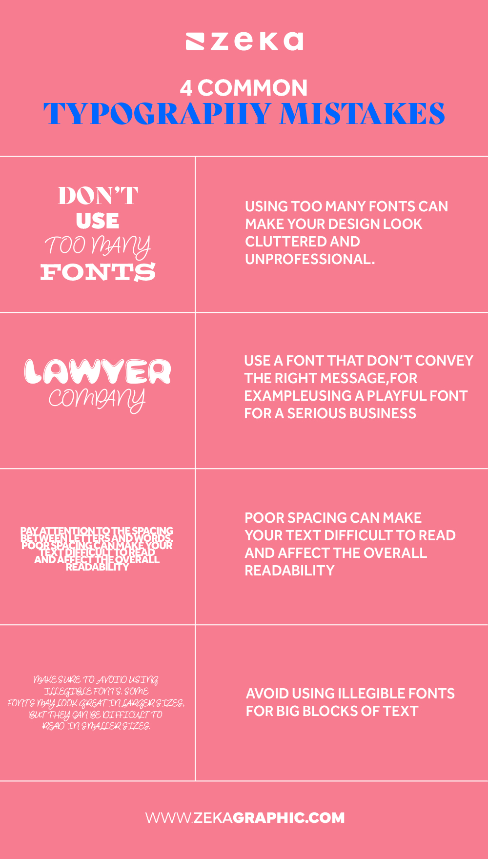
Learning typography takes time—and making mistakes is part of the process. Still, being aware of the most common typography mistakes can help you avoid bad habits early on.
Advertisment
Typography wields significant influence over content mood and readability, a crucial element for design agencies managing diverse clients. Navigating this terrain involves harmonizing typography preferences with distinct client needs, starting by grasping each project’s purpose and audience. Research-driven font curation, coupled with effective communication, ensures a cohesive design process even during client surges.
Adaptable resource allocation becomes key during peak demand, allowing agencies to efficiently manage typography requirements. Furthermore, with streamlined project management processes, design agencies can harmonize typography choices and client needs, excelling amidst changing project volumes.
Rigorous testing and stakeholder input refine typography prior to final delivery, aided by tools like Typeform or UserTesting. By adhering to best practices – selecting readable, complementary fonts – design agencies adeptly balance typography preferences and client demands, delivering standout results amid varying project volumes.
Advertisment
Typography is one of the most powerful tools in a designer’s toolkit. It influences tone, structure, readability, and emotion—all with just a few letters and spaces. Whether you’re working on logos, websites, posters, or social media graphics, mastering the typography basics will elevate your work.
Final Tips for New Designers:
Pin it for later!
If you found this post useful you might like to read these post about Graphic Design Inspiration.
Advertisment
Written by
If you like this post share it on your social media!
Advertisment

Want to make your Business Grow with Creative design?
Advertisment

Advertisment