How To Use Contrast in Graphic Design

How To Use Contrast in Graphic Design Visual Hierarchy Principles Explained

Contrast is a key principle of visual hierarchy and a fundamental element in graphic design, the contrast in graphic design is a great way to attract the viewer attention at the same time that organizes your elements in your graphic design elements by focusing the eye on most important parts of it.


When talking about contrast many people just think about color contrast, but you can apply contrast in different ways using color, size, shapes and typography, on this post I will show you how to apply Contrast principle in graphic design to make your design projects better using these graphic design tips.

Advertisment

What is Contrast in Graphic Design

When we are talking about graphic design contrast refers to a representation of two elements of the design in opposite ways, is a very useful design principle used by graphic designers to create focal points in a graphic design layout that makes your eyes naturally draw to that point.


Contrat is also used in graphic design to give shapes or objects better visual weight and balance the whole design, it is also used to organise all the graphic elements present in your graphic design project at the same time that you can use typography contrast to organise text and enhancing the most important parts of it.

What is Contrast in Graphic Design

Advertisment

How to Use Size Contrast in Graphic Design

Size contrast in graphic design consists on adding a variation of scale and size to the different graphic elements on the composition being the bigger ones the most important elements of it and where the viewers will look for the first time.


You can apply size contrast in every element from your design layout, from text or shapes, making the text or shape bigger to focus on that part of the design, usually, the bigger text is the title being the focal point.


By adding size contrast to your design makes it more interesting visually and help to assure the key ideas of the design being the big item more important than the smaller, by playing with this type of contrast you can be sure to move viewers eye on the right area of the design layout.


Size contrast is also a good graphic design element if you want to create minimalist graphic design projects, as you are lack of elements to play in your design, you can use size contrast to make your design layout more interesting and avoiding boring design by using the same size in all elements.

How To Use Size Contrast in Graphic Design

How To use Contrast in Color

Color contrast in graphic design consists on playing with complementary color schemes to drive the viewer’s eye through your design composition, usually, the first look of the viewer will be the brightest part of your design as it is more notorious than the darker color, so use it to create a focal point adding the most important element of your design with the high contrast color.


Color contrast is the most popular type of contrast in graphic design and most well-known principle for non-designers and it’s not a surprise as color theory is a key principle in graphic design. As it happens with different types of contrast is used to drive viewer attention and make your design more visually interesting.


It’s also very important to choose the right color combination to create an eye-pleasing color contrast because if you choose a wrong combination it can be irritating and frustrating to the viewer, it’s also important to avoid using colors near to each other inside the color wheel if you want to create color contrast as they look very similar and you won’t obtain that result. 


Use complementary colors to create contrast but avoid too bright combinations that can produce strain on the eyes, if you feel that the color contrast from your design layout it’s too bright and can be damaging to the eyes, try to different shades of that colors and experiment with the different tones.

How To Use Color Contrast in Graphic Design

Advertisment

How To use contrast in Shape

When you have a repetition of the same shape in your graphic design layout for example squares, it’s a good idea to add a different shape like a circle to drive the viewer attention to that specific part of the design as it’s different from the previous shapes.


Using shape contrast in your graphic design layout can help you focus the viewer’s attention to a specific point making it the most important element of the composition at the same time that makes your design idea more interesting by avoiding a monotonous use of the same shape through the layout.


Imagine a design layout formed by rectangle shapes all around, this will make it look boring and confusing by the viewer as he wouldn’t know what is the key point of the design, by adding a variation on the shapes it will make automatically the first thing people will see and it should be the key element from your composition.

How To Use Shape Contrast in Graphic Design

How To Use contrast in typography

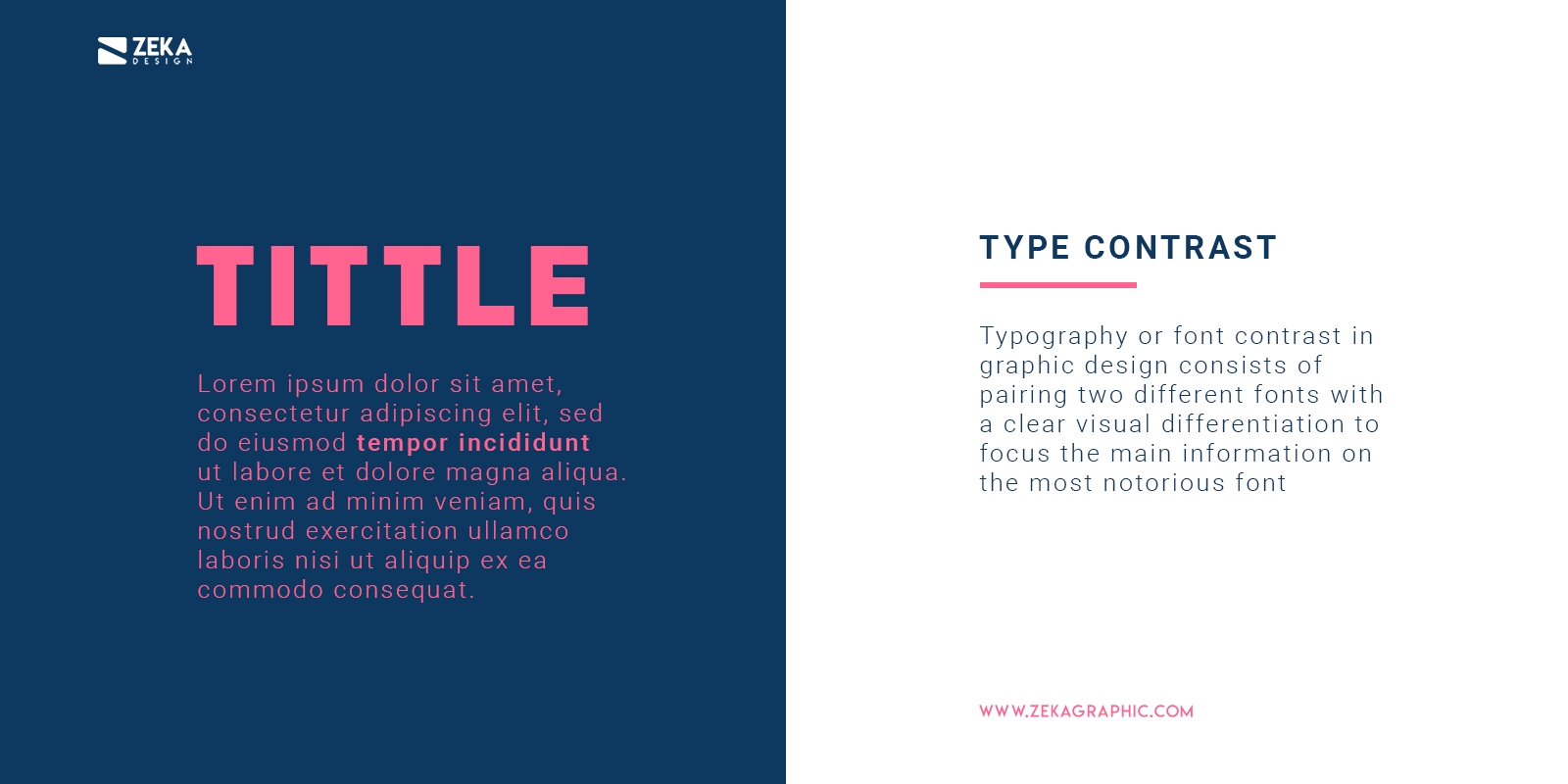
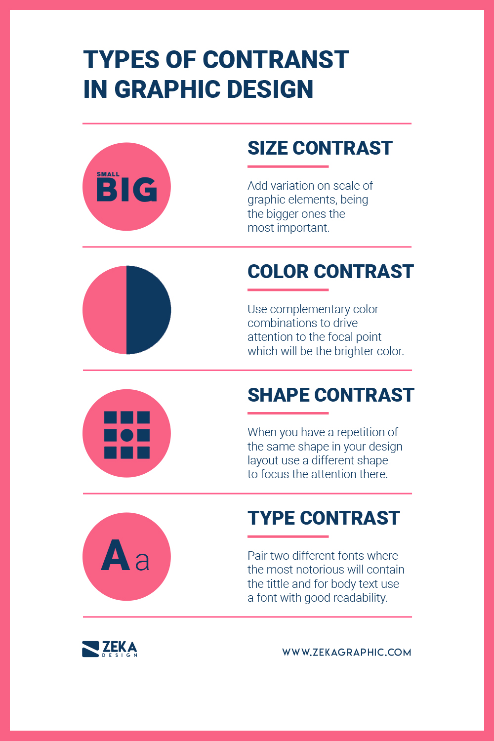
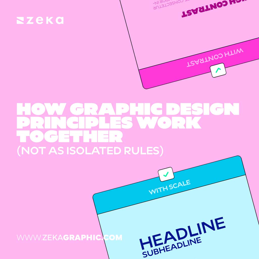
Typography or font contrast in graphic design consists of pairing two different fonts with a clear visual differentiation to focus the main information on the most notorious font, being the most important part of the text the title which will be the first thing the viewer will read followed by the body text.


It’s important to note that bold or more decorated fonts can grab viewer attention more easily but they don’t have good readability for long pieces of text, that is why only use it for tittles or small pieces of text that you want to focus by the other hand for body text, you can use less decorated fonts as the key part for long pieces of text is to maintain good readability and make the viewer easy to read.


Imagine a design layout only made by text, and now imagine that text is the same through all the design, really boring right? there are two ways of applying type contrast, ad the first one is to choose two or more fonts for your design, being the header one font that focuses more attention and the body text use a more readable font.


You also can use the same font throughout the whole design by you can apply different weights depending on the importance of the words, using bold weight for the focal points, and light or regular weights for the rest of the body text.

How To Use Font Contrast in Graphic Design

Advertisment

Conclusion

I hope you find this post useful and learn the different types of contrast in graphic design and how to apply them in your next graphic design project to make it more interesting visually and if you find this post about contrast principles interesting you might find interesting this post where I show you the 10 principles of visual hierarchy in Graphic Design!

How To Use Contrast in Graphic Design Infographic

If you found this post useful you might like to read these post about Graphic Design Inspiration.

Advertisment

Written by

If you like this post share it on your social media!

Share on facebook
Share on twitter
Share on pinterest
Share on vk
Share on telegram
Share on whatsapp
Share on linkedin

You Might Be Interested On These Articles

Latest Post