Typographic hierarchy is one of the key visual hierarchy principles in Graphic Design and it’s a fundamental element to correctly organise the information you want to transmit with your design, that is why every designer should know how to correctly structure your graphic design layout to allow the reader find exactly what he is looking for.
On this post, I will show you some useful guidelines about text hierarchy to master your skill in organising the information depending on their importance on the design, learn what are the different typographic hierarchy levels and what typographic elements you can use to create contrast in your design layout.
Advertisment
Typographic hierarchy helps you to organise the information from your design layout making for the reader easy to find the information he is looking for and focus on the most important parts of your text and which are just supporting the main point.
The big difference between an average graphic designer and great graphic designers is that the second one understands that graphic design is a visual way to communicate a message and prioritize it instead of just the visual aesthetic of the design layout.
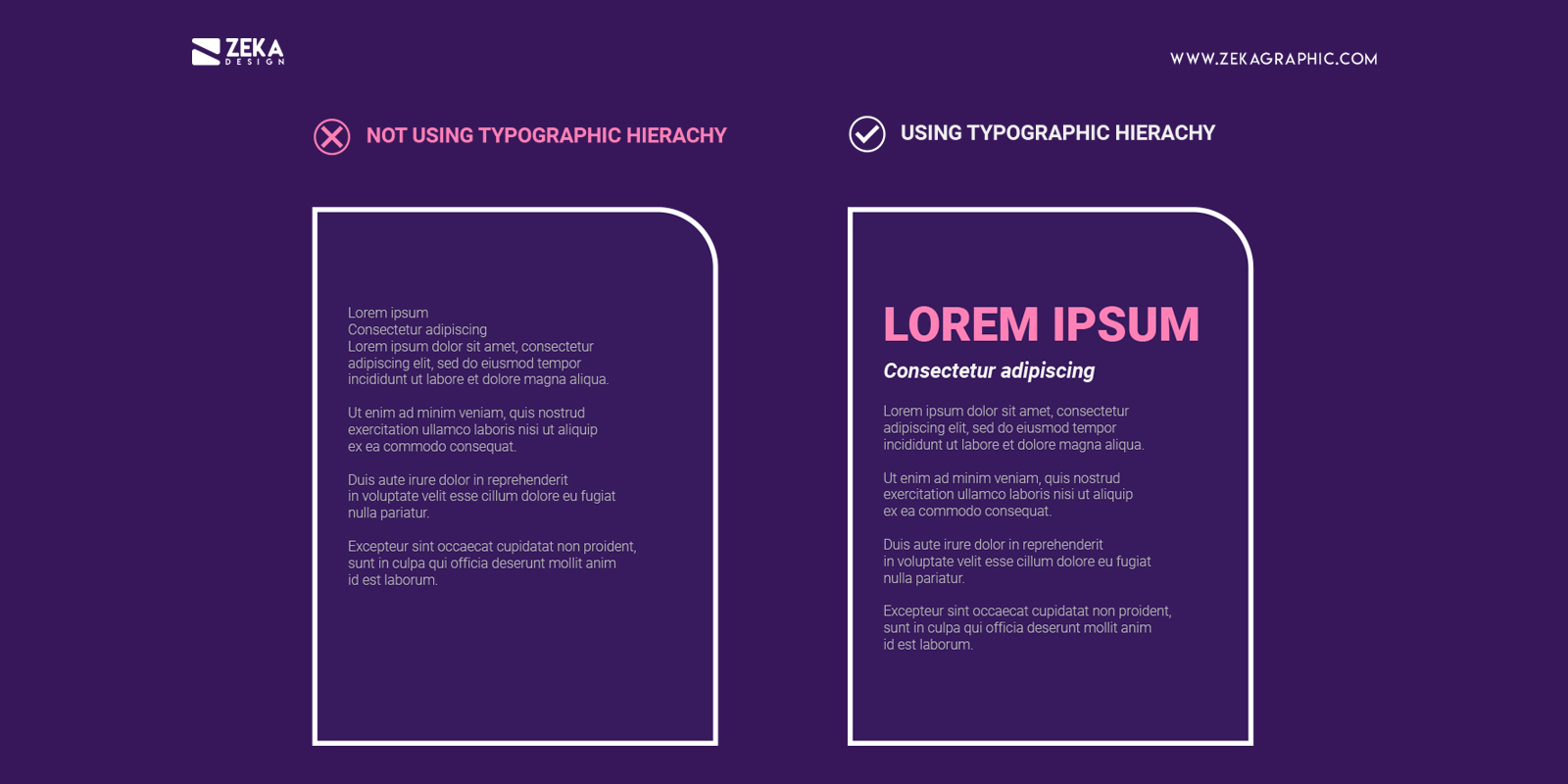
We will understand better what is typographic hierarchy with this example below where we can see two pieces of text with the same information and amount of text, yet the left version it’s impossible to distinguish what is the text about and the important parts of it, but on the right text we can easily see the title and the subheader making it easier to see what the text is about, and that is called typography hierarchy.
Now that we understand what is typography hierarchy the question is why is important in graphic design? and the answer is very simple, it’s a vital part to organise the information you want to communicate through your design by importance, being the first sentence the viewer see the title or the focal point of your design.
We can use typography hierarchy in all types of graphic design projects and web design. For example, you can use it on a business card design to prioritize the name of the business card owner or the company followed by the contact details, in UI/UX is used to make the viewer navigate through the site more easily and view the call to actions clearer and the last example is poster design, you use one word or sentence really big to grab the attention of the people and making them stop to read the rest information the poster is talking about.
Advertisment
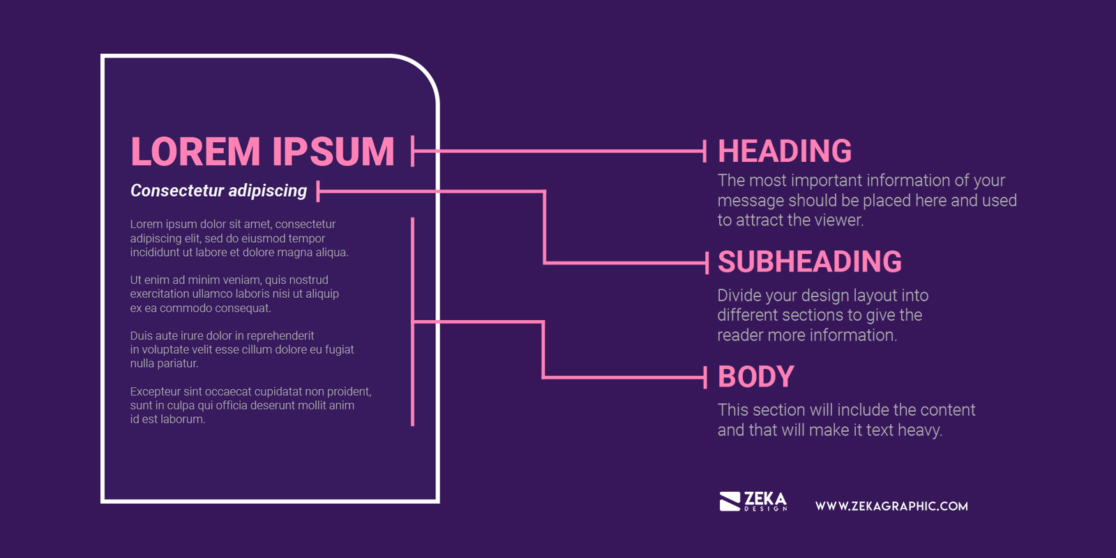
In typographic and text hierarchy there are three different sections with a clear differentiation between them and this is used to create a visual hierarchy in the text. The three sections of text hierarchy are Heading, Subheading and body, graphic designers use these sections to make the design more eye-pleasing and easy to find the information you are looking for.
The first section the viewer should see is the heading, that is why the most important information of your message should be placed here and used to attract the viewer attention. Usually, the heading is used for the title and as it contains the most important part of your text it should be the most visually stimulating element of your design using large and bold typefaces to make the viewer stop and read the information in your design.
Subheading in graphic design is used to divide your design layout into different sections to give the reader more information about what is about the body text and expand the header information. The subheading should be visible and stand out from the body text but still making the visual differentiation with the main header, as example you can use this post, and as the main header is the title of the post, the article is divided into different sections with subheadings indicating what you will read in the body text.
Lastly but not least is the body copy, this section will include the content and that will make it text heavy, as we saw the main function of heading and subheading is to grab the viewer attention and the main function of the body text is to communicate the information you want, that is why is important that you use a font with good readability for the text and the size of your body copy needs to be smaller in comparison with heading and subheading.
Advertisment
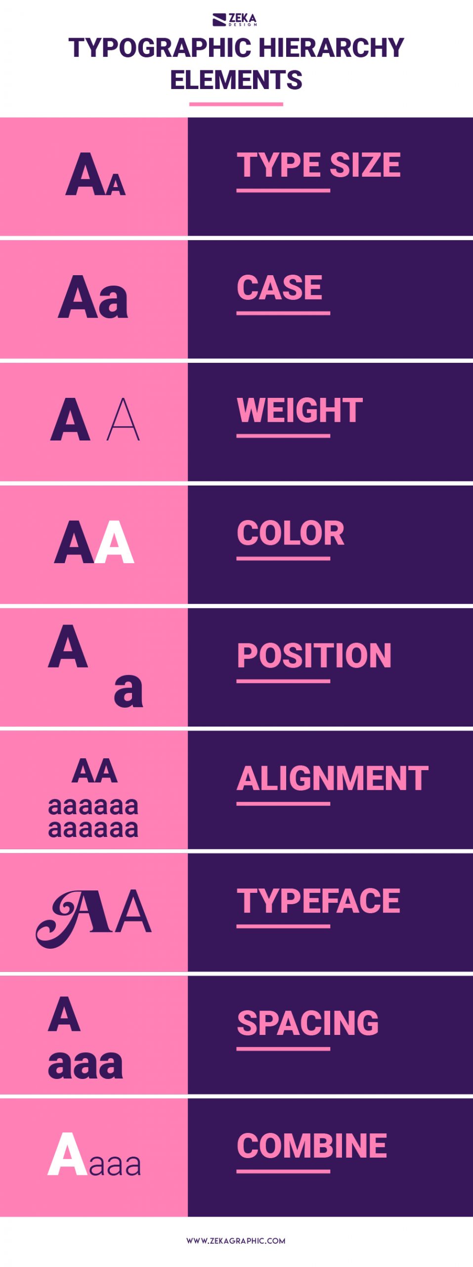
Now that we know the three levels of text hierarchy in graphic design, the next step is how we create this hierarchy in a visual way and easy to differentiate each part of the text, there are plenty of graphic design techniques to do it and let’s see the most efficient ways to create visual hierarchy in text.
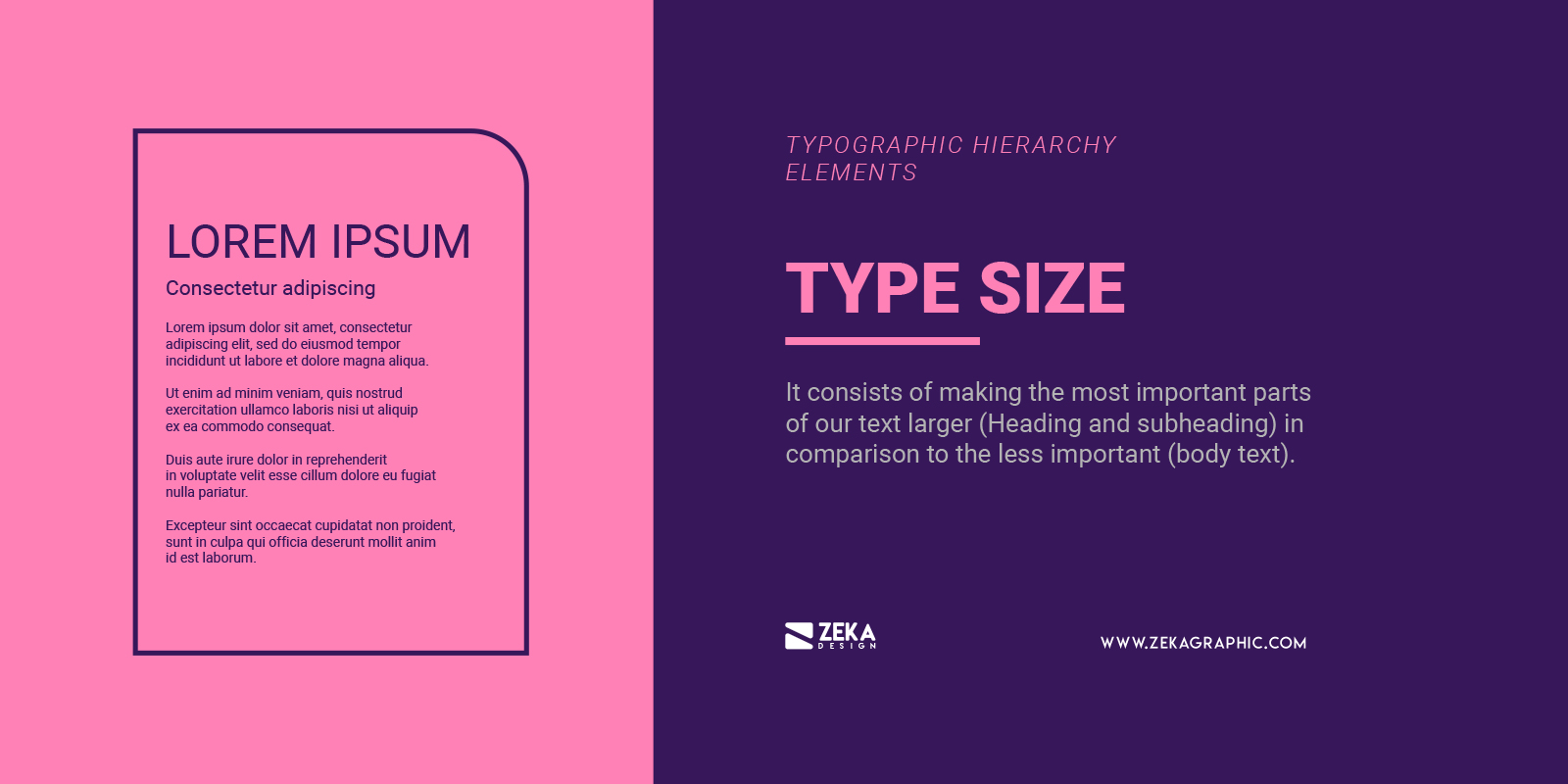
The first element to create text hierarchy that cames to our minds is type size, and it consists of making the most important parts of our text larger (Heading and subheading) in comparison to the less important (body text) making the bigger elements as a tool to grab the attention of the reader. If you want to use type size to create visual hierarchy in your design layout you can use the traditional typographic scales present in most word processing programs and it the scale is 6, 7, 8, 9, 10, 11, 12, 14, 16, 18, 21, 24, 30, 36, 48, 60, and 72.
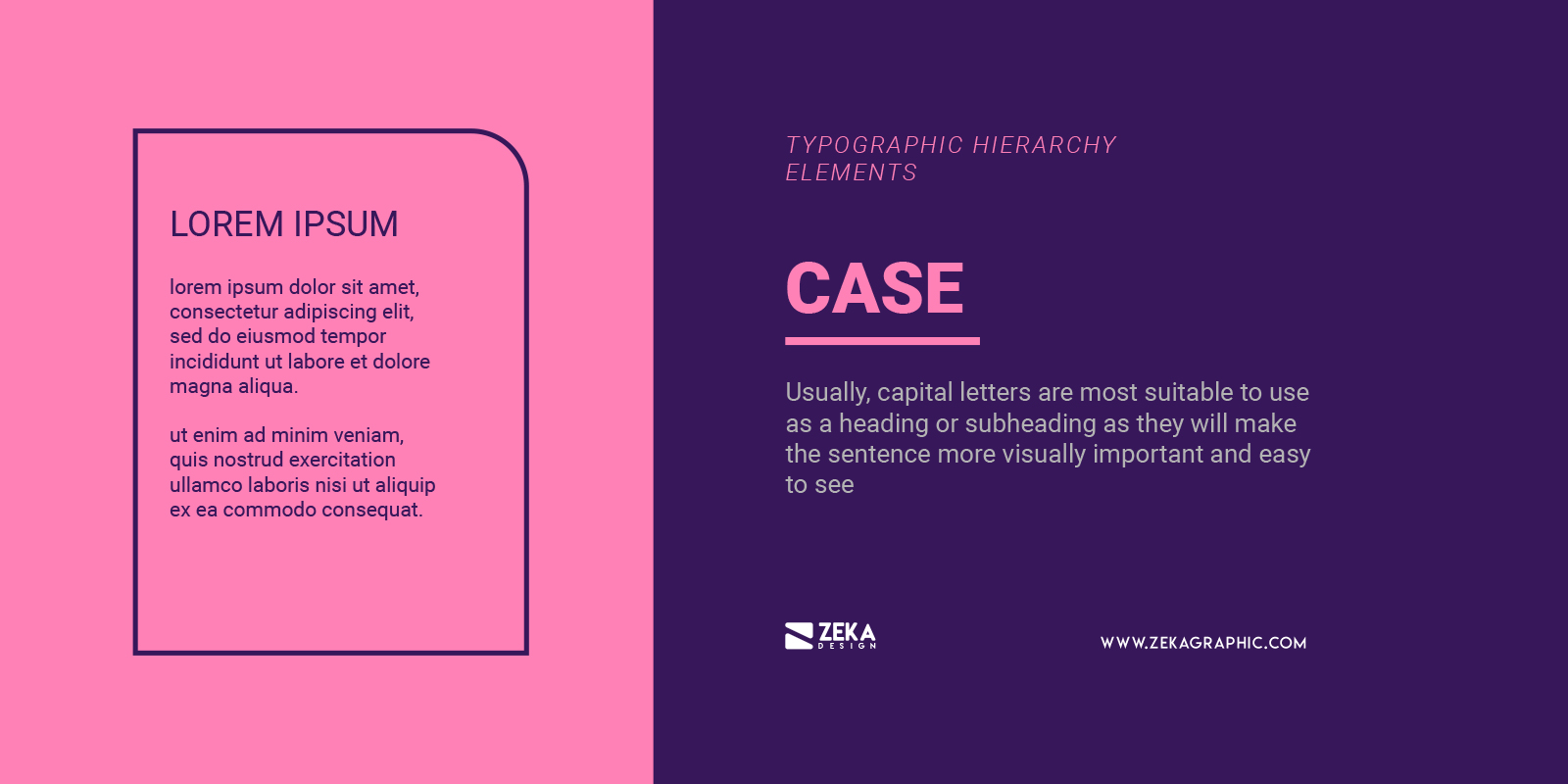
Usually, capital letters are most suitable to use as a heading or subheading as they will make the sentence more visually important and easy to see but by another hand, they are not a good idea to use in the body text as it will negatively affect to the readability of your design
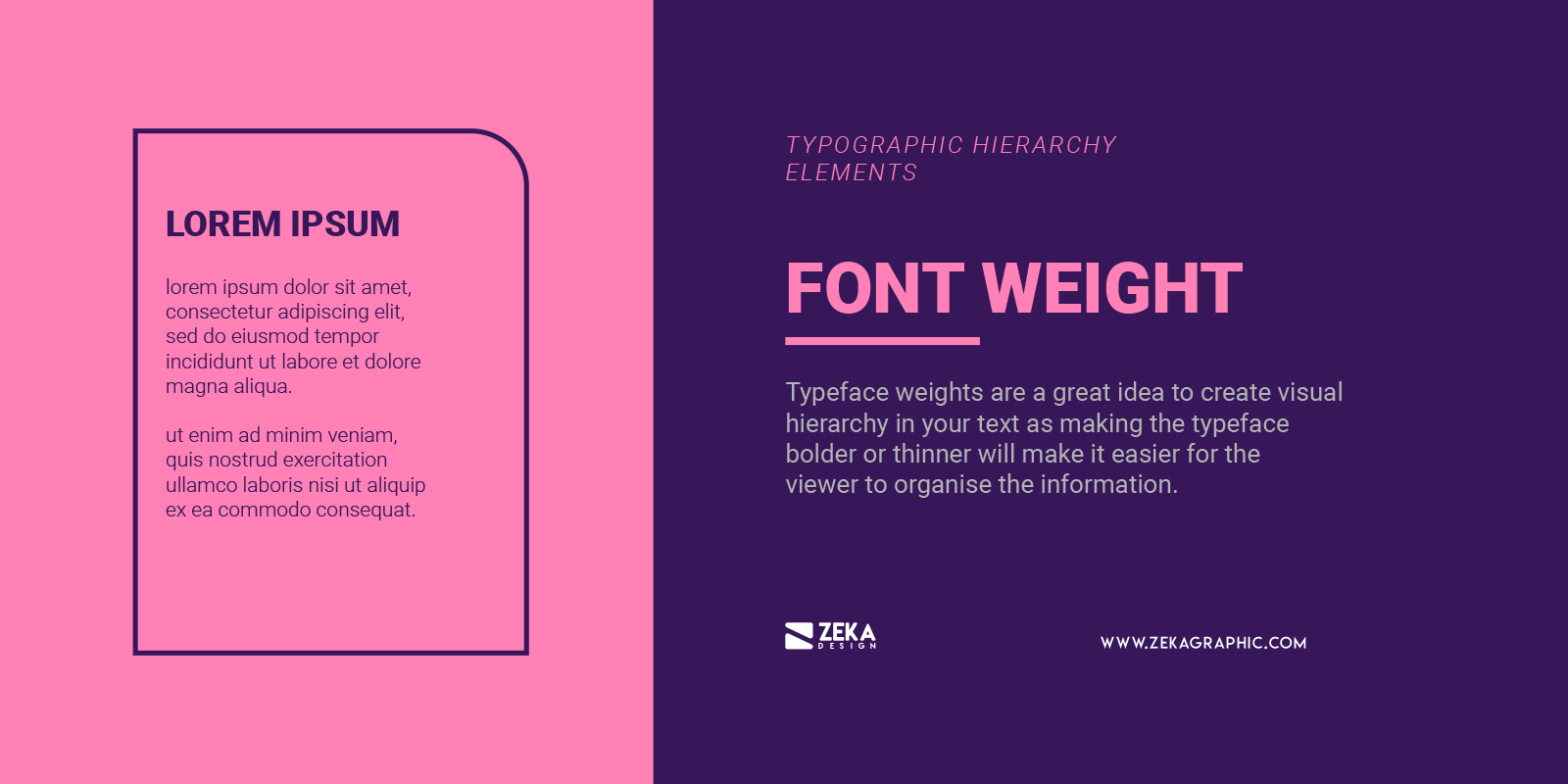
Typeface weights are a great idea to create visual hierarchy in your text as making the typeface bolder or thinner will make it easier for the viewer to organise the information in your design. It’s better to use bold typeface weight for heading and subheading as they are more suitable to grab viewer attention and use regular or thin weights for body text to increase the readability of your text.
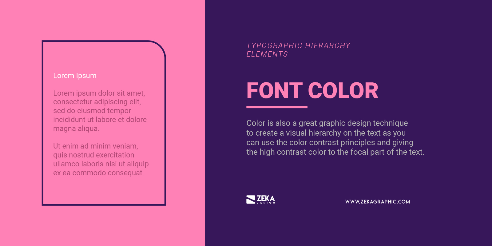
Color is also a great graphic design technique to create a visual hierarchy on the text as you can use the color contrast principles and giving the high contrast color to the focal part of the text and you can use different shades of a specific color to create this hierarchy, you can check this post where I show you how to use contrast in graphic design.
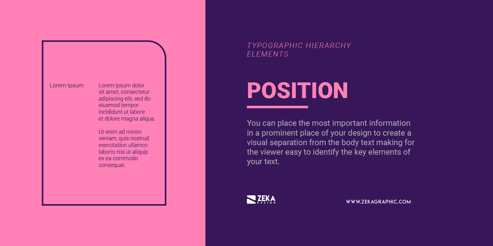
The position is also a graphic design principle that you can apply to text hierarchy to organise the information across your design layout depending on the importance of them, you can place the most important information in a prominent place of your design to create a visual separation from the body text making for the viewer easy to identify the key elements of your text.
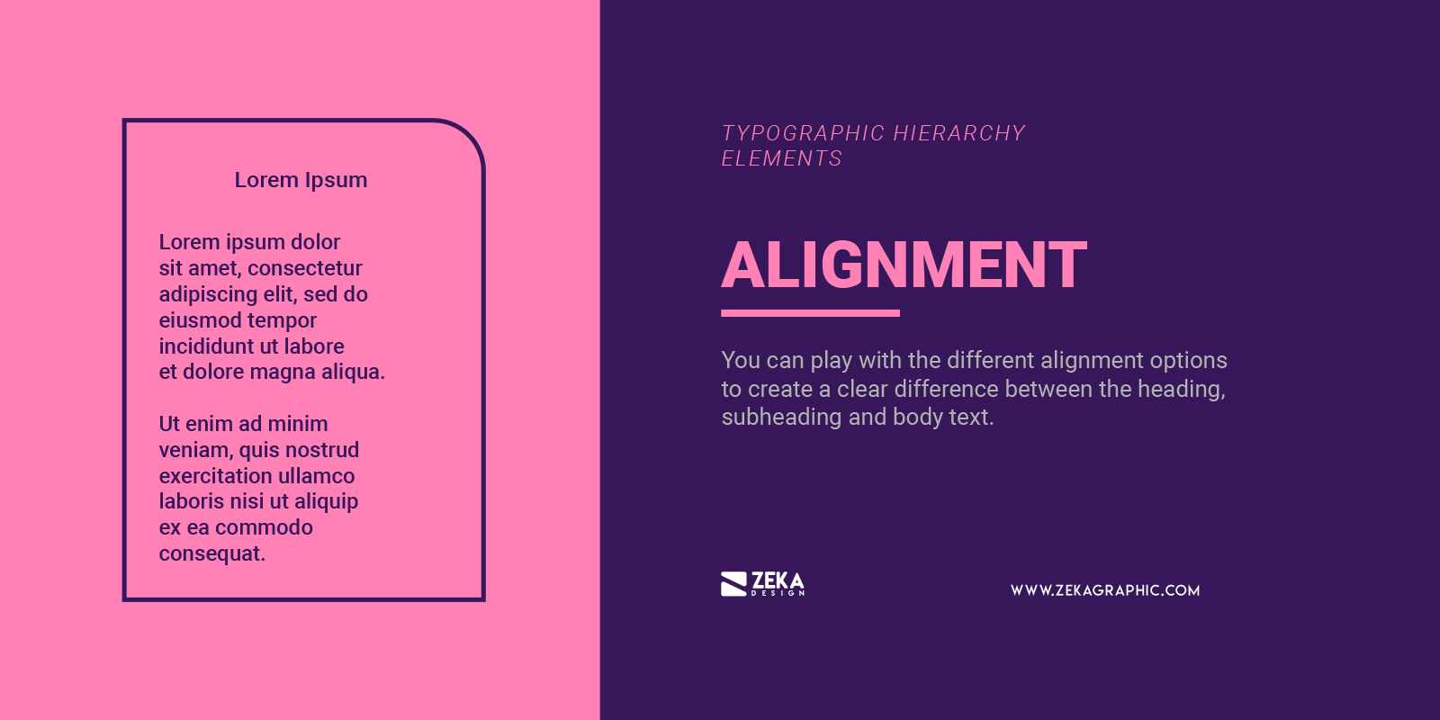
Alignment is related to position to create visual hierarchy in your text, you can play with the different alignment options to create a clear difference between the heading, subheading and body text.
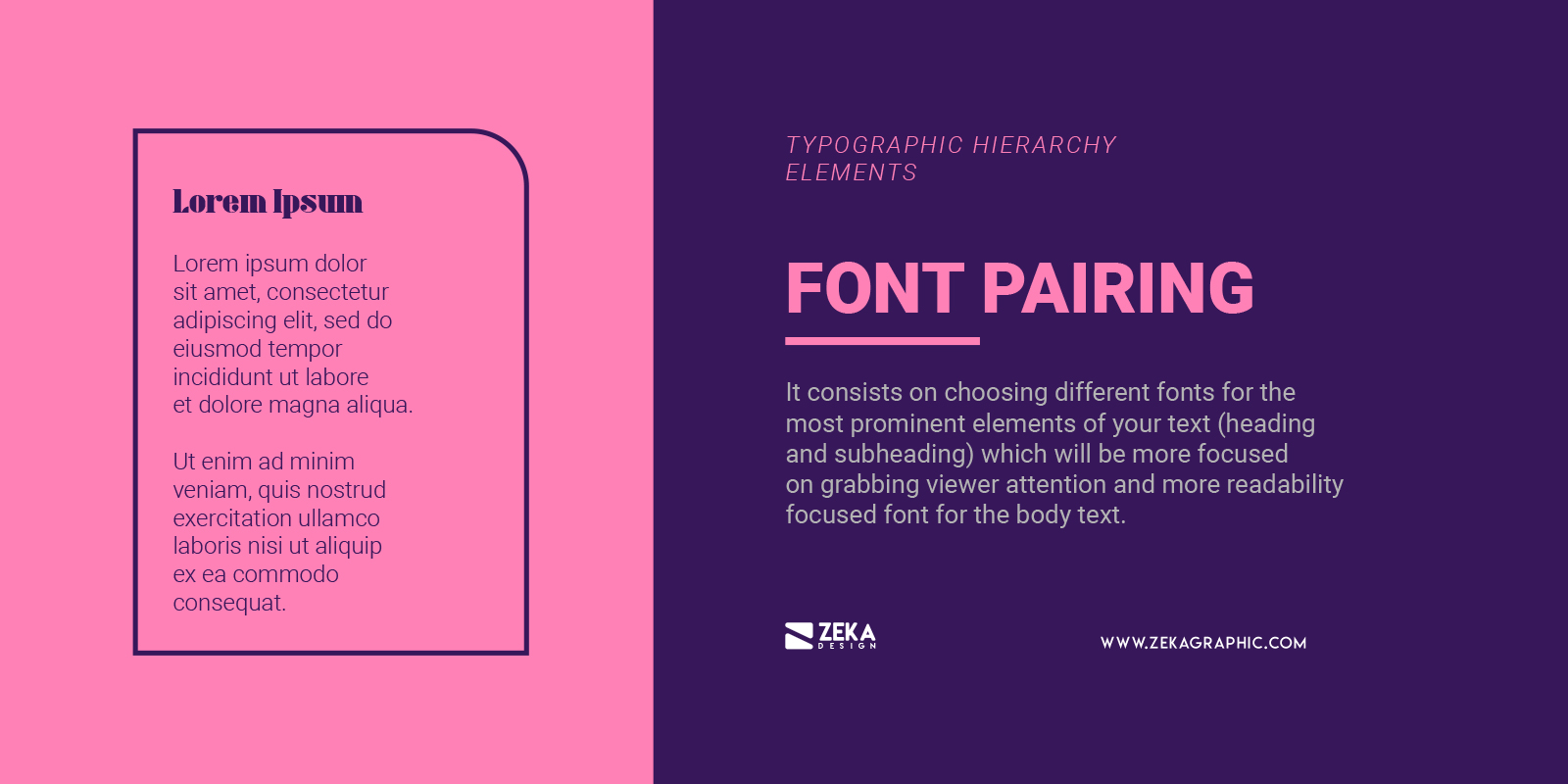
Font pairing is also a popular technique among graphic designers to create visual hierarchy in typography and it consists on choosing different fonts for the most prominent elements of your text (heading and subheading) which will be more focused on grabbing viewer attention as you can use bold and decorative fonts and more readability focused font for the body text as it will include bigger pieces of text. Make sure that the fonts that you will use for your design layout have a reason and are aligned with the context of your design.
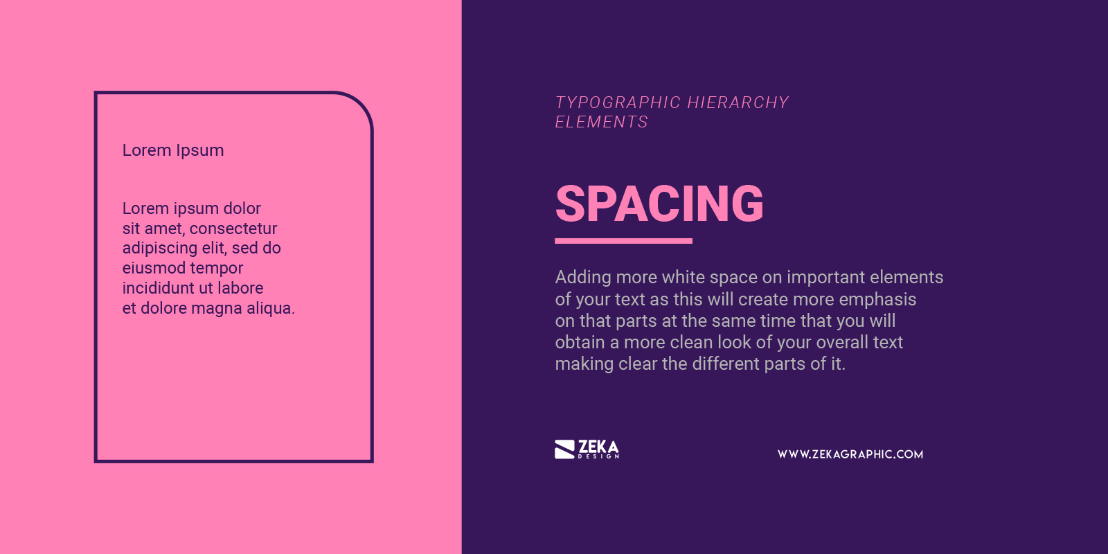
Lastly but not least you also can use spacing as a graphic design technique to create a visual hierarchy by adding more white space on important elements of your text as this will create more emphasis on that parts at the same time that you will obtain a more clean look of your overall text making clear the different parts of it.
Advertisment
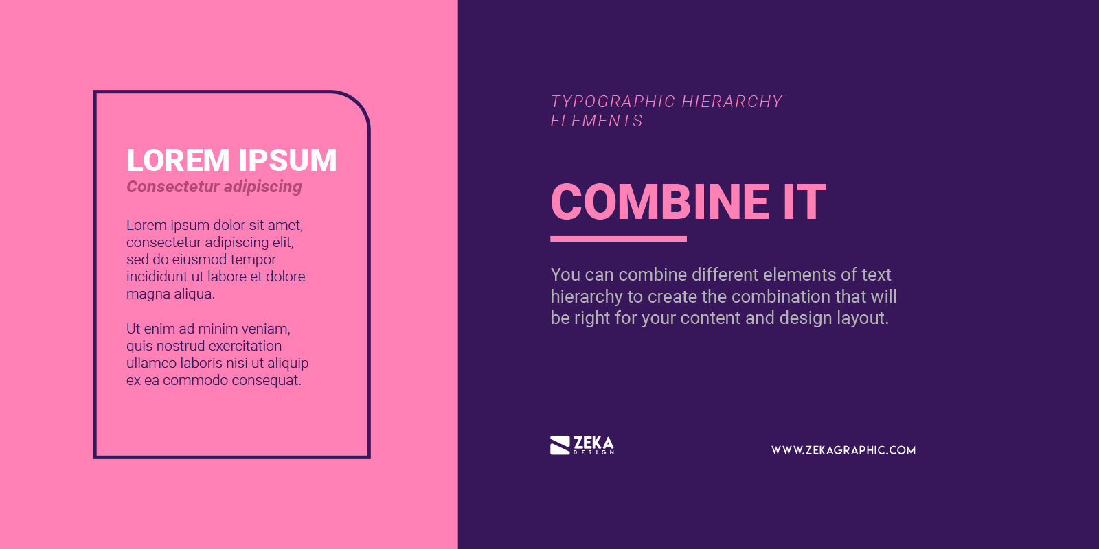
Now that you have learned the different styling techniques graphic designers have to create typographic hierarchy it’s time to play with them, that is why you can combine different elements of text hierarchy to create the combination that will be right for your content and design layout.
For example, you can combine type size, typeface weight and color as you see on the example below to create a visual hierarchy in your text organising the information according to their importance and make it look better in your overall design.
Advertisment
As we saw on this post typographic hierarchy is a key part of every graphic design project as the difference between an average graphic designer and a good one is that the good designer focus on how his design layout communicates the message he wants to transmit, and for that reason, you need to use text hierarchy to correctly organise the information of your design.
In this post, I show you the text hierarchy levels and the different graphic design techniques you can use to create that visual differentiation of text making the first sentence the reader will read the most important. Typographic hierarchy is one of the visual hierarchy principles of graphic design and if you find this post useful and want to read more about visual hierarchy I recommend you this article where you will learn all the visual hierarchy principles and if you want to make a deep look on typography design you can check this article about font psychology.
If you found this post useful you might like to read these post about Typography Design Inspiration.
Advertisment
Written by
If you like this post share it on your social media!
Advertisment
Advertisment