Typography is more than choosing pretty fonts—it’s the visual voice of your design. If you’ve ever looked at a design and felt something was “off,” chances are, the font combination was part of the problem. As a graphic designer, learning how to pair fonts effectively is one of the most impactful things you can do to improve your visual communication.
In this post, we’ll walk through essential typography basics, explore the major font categories, and break down how to choose fonts that work together harmoniously. Whether you’re creating a logo, website, social media graphic, or brand identity, mastering font pairing will give your work more clarity, polish, and emotional resonance.
Advertisment
Understanding font categories is essential for mastering type combinations in graphic design. Each font type—Serif, Sans-Serif, Script, and Display—carries distinct visual traits and emotional associations that influence the tone and readability of your design.
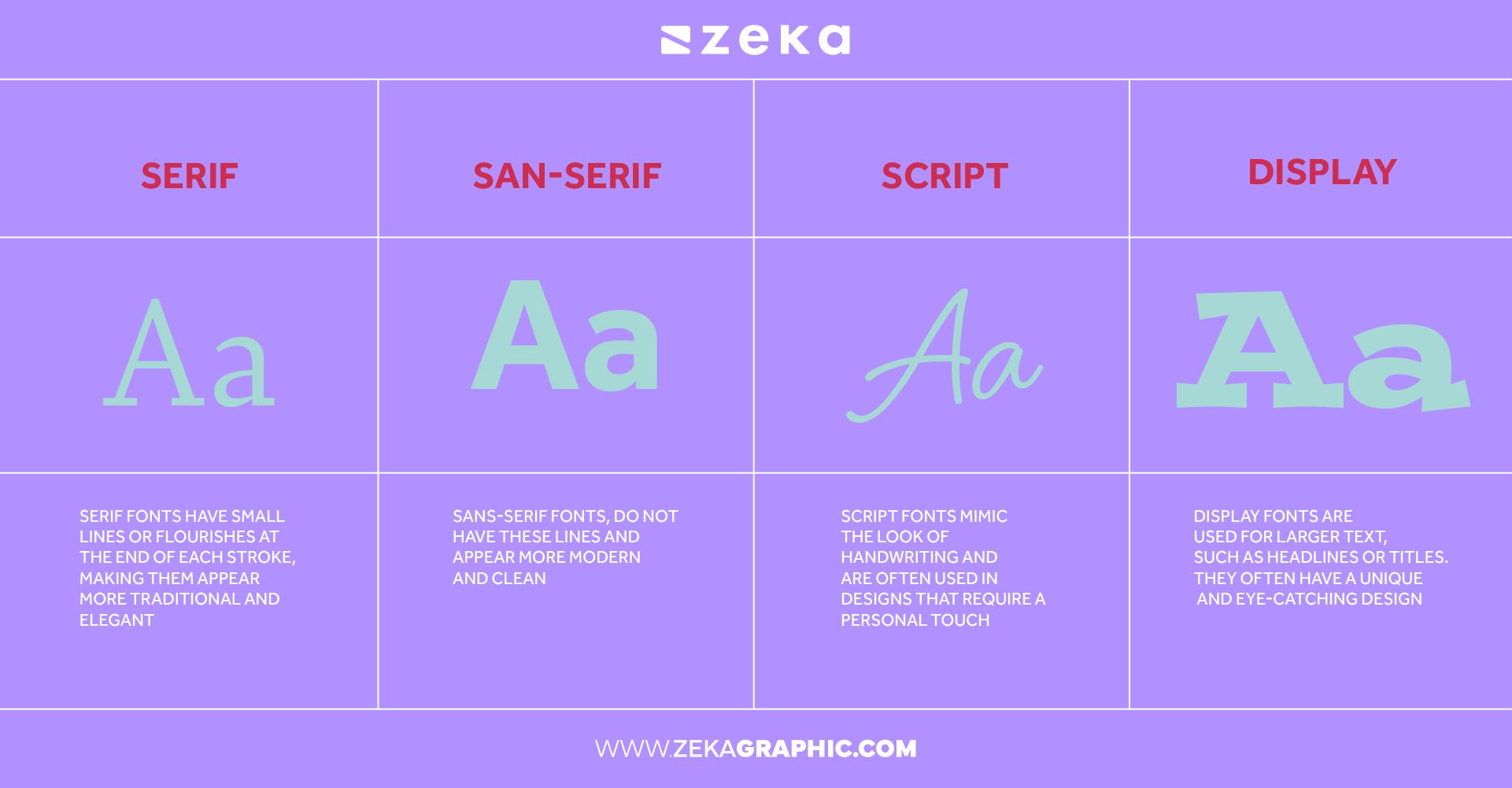
Serif fonts are known for their small strokes or “feet” at the ends of letters. These fonts communicate formality, tradition, and reliability, making them ideal for editorial layouts, professional branding, and printed materials. Think of classics like Times New Roman or Garamond—they lend a timeless, intellectual tone to any design.
Sans-serif fonts, on the other hand, are clean and modern, without the extra strokes. Their simplicity enhances clarity and usability, especially on screens. Fonts like Helvetica or Futura are often used in branding, UI/UX interfaces, and minimalist design because they convey freshness and straightforwardness.
Script fonts emulate handwriting and cursive styles, bringing a personal, decorative, or romantic flair to the message. These are best reserved for accent text, such as logos, invitations, or short headlines. Their artistic style adds emotion and personality, but should be used carefully due to legibility concerns.
Lastly, display fonts are bold, unique, and often experimental. They’re meant for maximum visual impact and are rarely used for body text. Display fonts work well in posters, hero sections of websites, and packaging where attention-grabbing headlines are key.
Knowing how and when to use each font category is fundamental to creating intentional and effective font pairings that align with your message and audience.
Advertisment
To elevate your font pairing strategy, you need to go beyond categories and look at the anatomy of individual fonts—specifically their weight, style, and spacing. These characteristics determine how a font behaves in different contexts and how well it complements others.
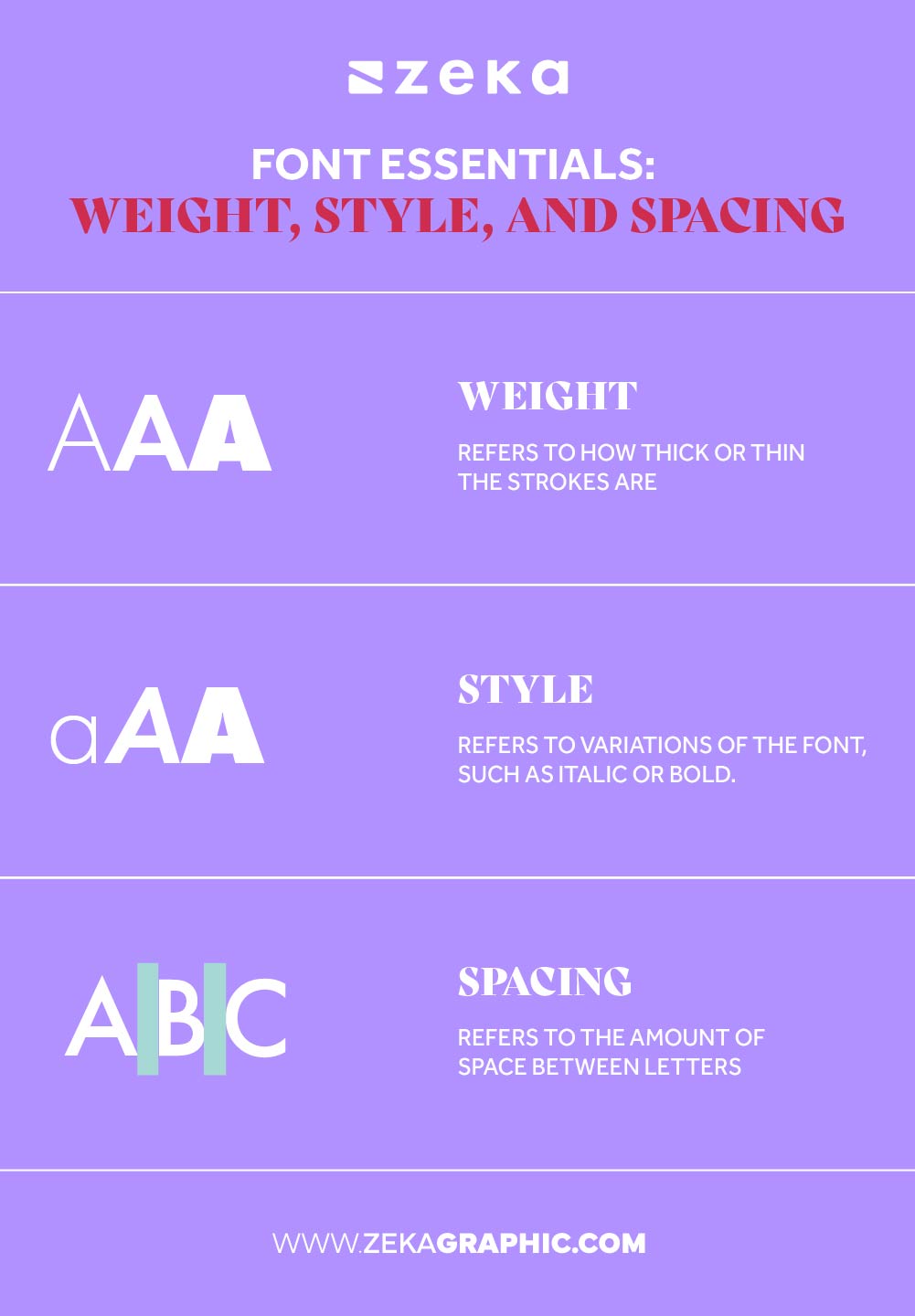
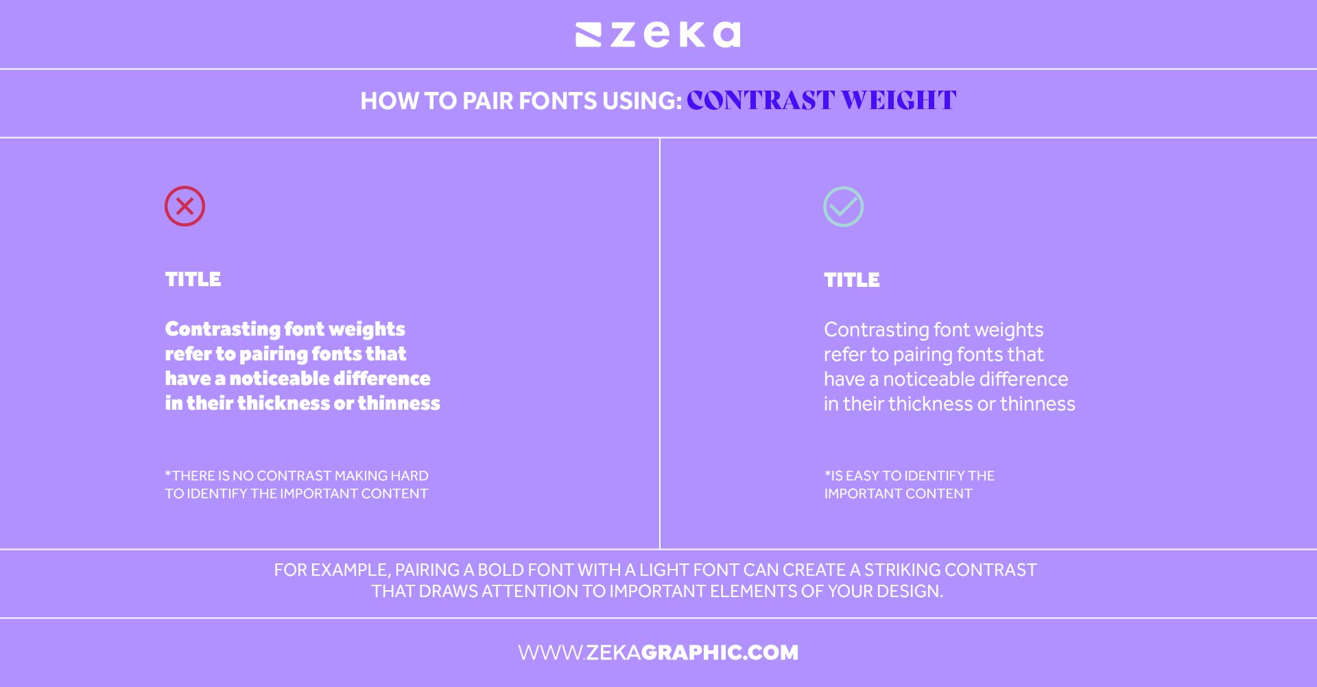
Font weight refers to the thickness of each character’s strokes, ranging from ultra-light to extra-bold. Using contrasting weights helps create hierarchy and directs the viewer’s attention. For instance, pairing a bold display font for headlines with a light or regular weight body font adds depth and structure without visual overload.
The key is balance—avoid using fonts that are too similar or too heavy together unless the design calls for it.
Font style includes features like italics, condensed or expanded widths, and case usage (uppercase, lowercase, small caps). These variations offer emotional cues and can help emphasize parts of your design. For example, an italic serif can suggest elegance or motion, while a condensed sans-serif may evoke a modern, technical feel.
Combining fonts with different styles adds rhythm to your layout and supports branding narratives.
Font spacing refers to the negative space between characters (kerning), between lines of text (leading), and the overall horizontal spread (tracking). Mastering spacing ensures better readability and a polished visual experience. Tight spacing can feel intense and compact—ideal for bold headings—while wider spacing often feels airy and elegant. Misuse of spacing is one of the most common reasons a design feels unbalanced, so always adjust it to suit your design’s tone and intent.
By learning how font weight, style, and spacing interact, you’ll gain the precision needed to create pairings that are not only visually appealing but functionally strong.
Advertisment
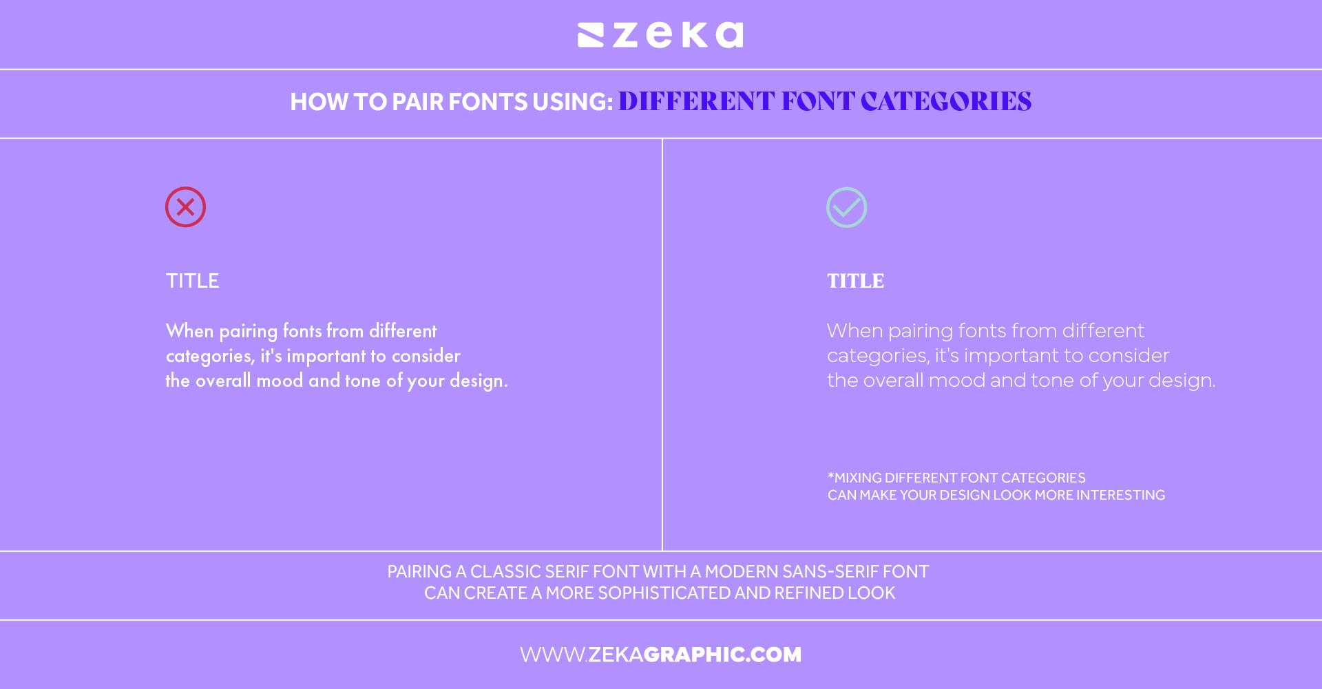
Choosing fonts that work well together isn’t about picking favorites—it’s about balance, contrast, and shared tone. Think of fonts as personalities: you want a dynamic duo, not a clash of egos.
When selecting font pairs:
For example, pair a geometric sans-serif with a modern serif to mix structure with warmth. Or combine a playful script with a clean sans-serif for personality and clarity.
Quick checklist for good font combinations:
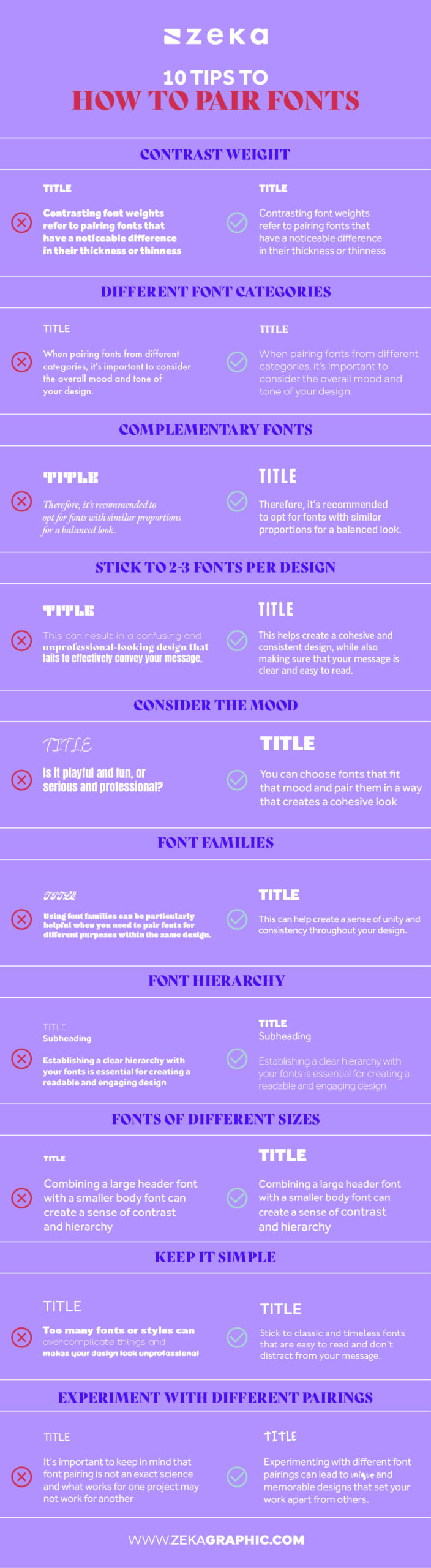
Mastering the art of font pairing means understanding more than just theory. These ten actionable font pairing tips will help you make confident, aesthetically pleasing choices across any project.
Advertisment
Combining fonts with different weights—like a bold headline and light body text—creates a clear visual hierarchy. It guides the reader’s eye and makes the layout feel more structured and deliberate thanks to contrast.
Advertisment
Mixing serif and sans-serif, or script and sans-serif, can bring natural contrast to your typography. This technique works because the eye can easily distinguish between different letterforms, improving readability and adding character.
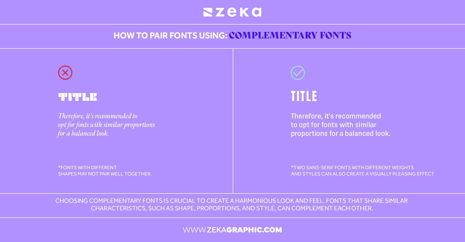
Fonts that share similar shapes, x-height, or mood will feel cohesive even if they’re from different families. Think of pairing fonts like building a friendship—compatibility matters more than similarity.
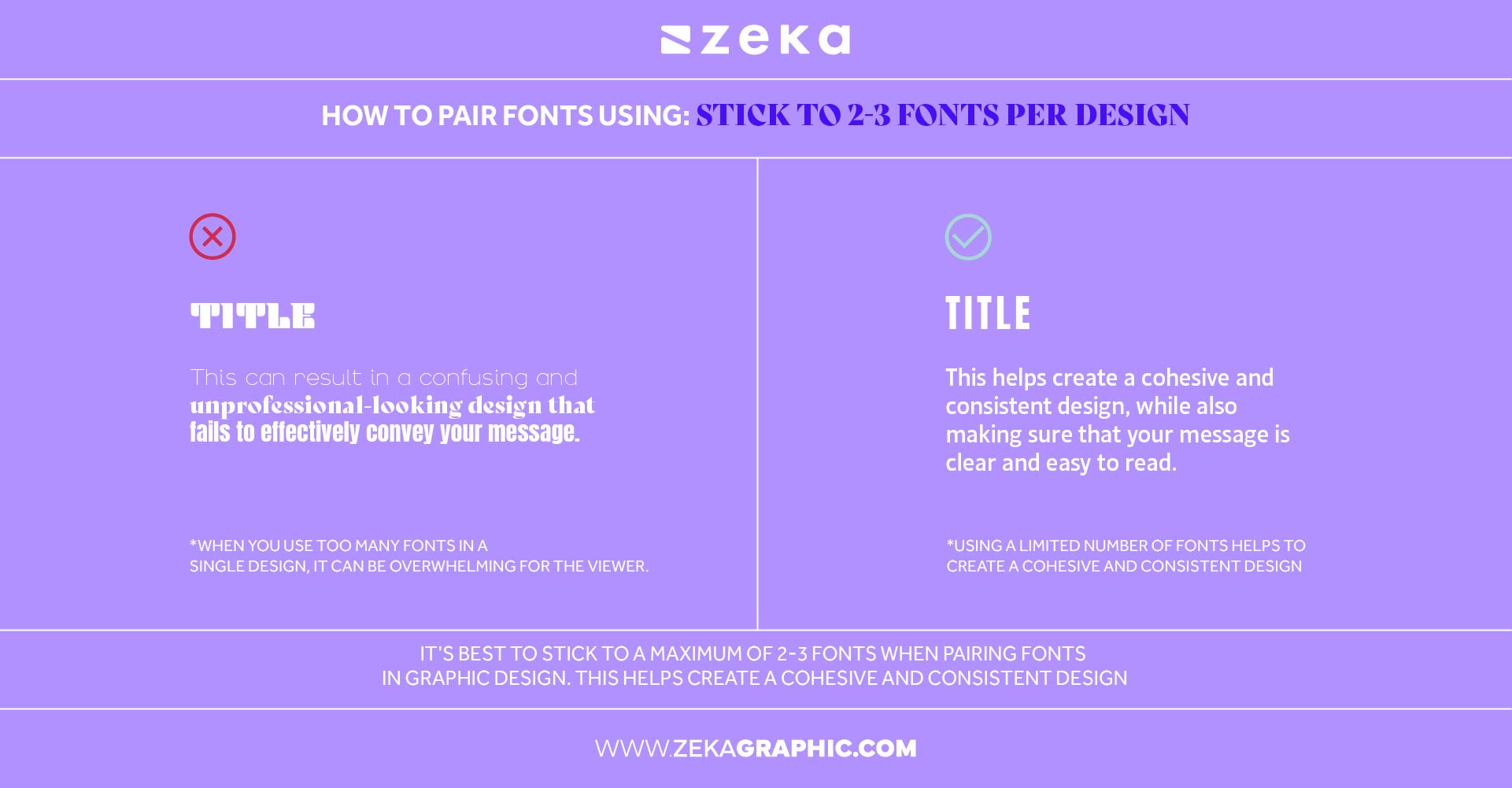
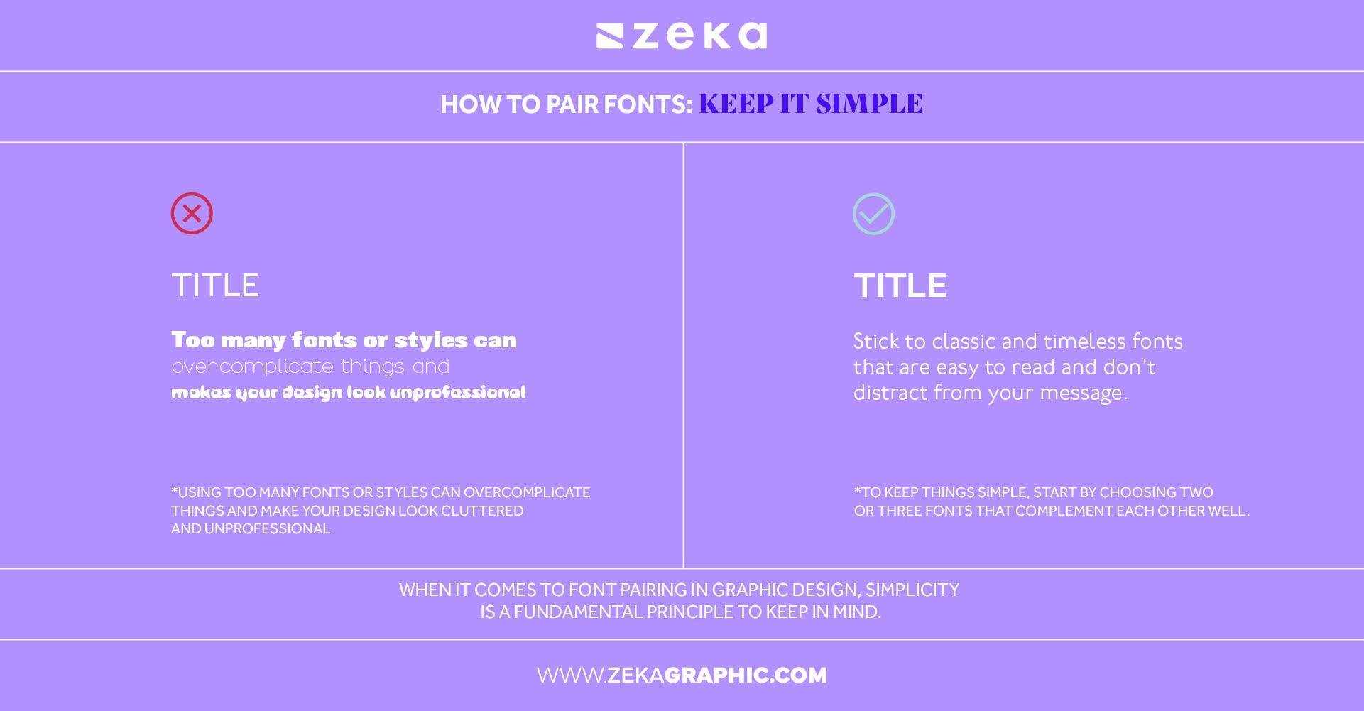
Too many fonts can overwhelm a design. Limiting yourself to two or three fonts ensures visual harmony and keeps your layout clean. Use one for headings, one for body, and one as an accent if needed.
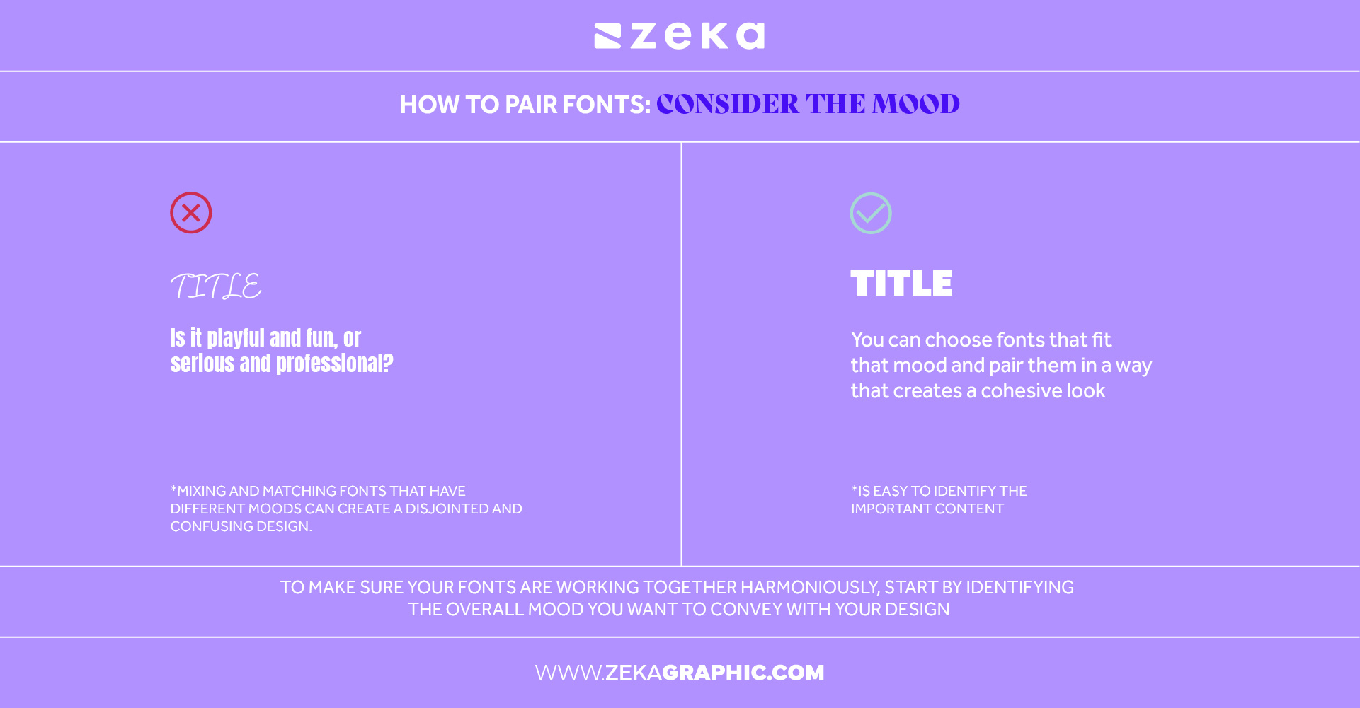
Fonts communicate tone. Choose typefaces that reflect your message—playful for kids’ brands, modern for tech startups, elegant for luxury goods. A mismatch in mood can create confusion and dilute your design impact.
Advertisment
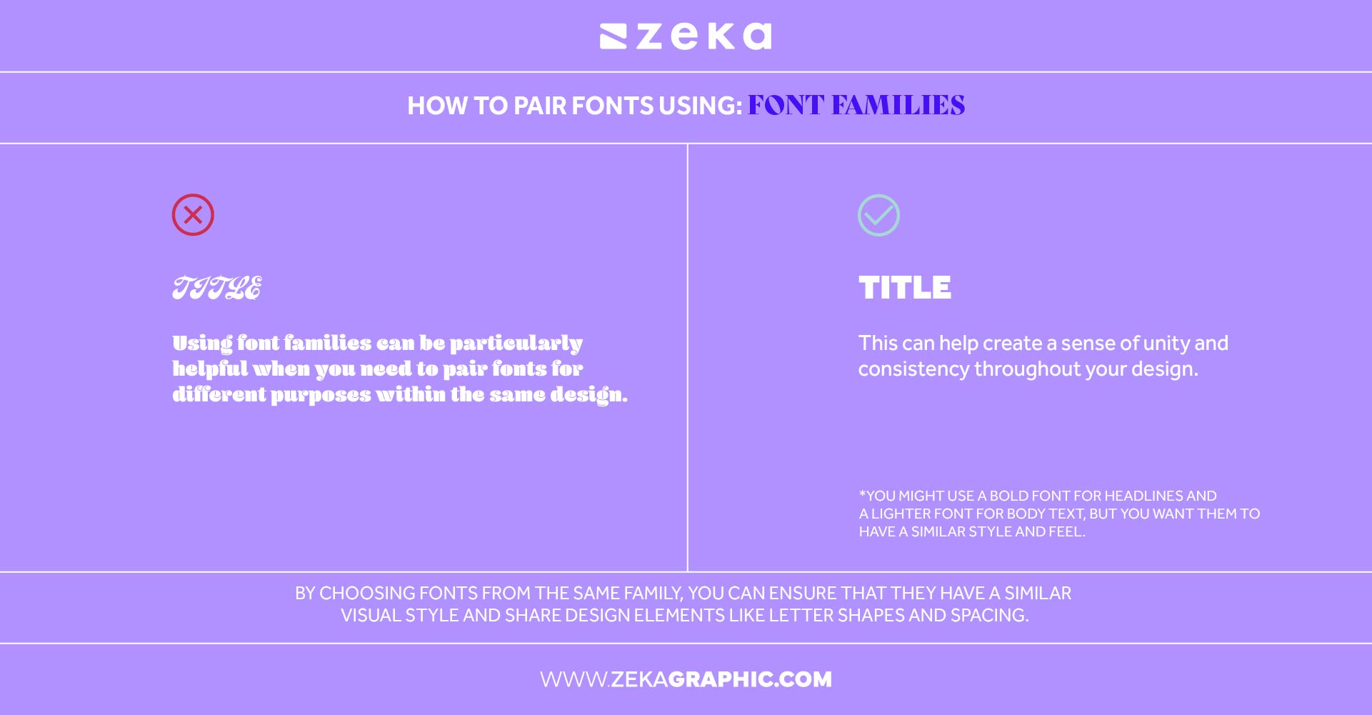
Sticking to a single font family (like Roboto or Merriweather) in multiple weights and styles gives you contrast and variety while maintaining consistency. It’s a foolproof method for beginners.
Establish a visual order using font size, weight, and spacing. A strong font hierarchy helps users quickly understand what to read first and makes the design feel intentional.
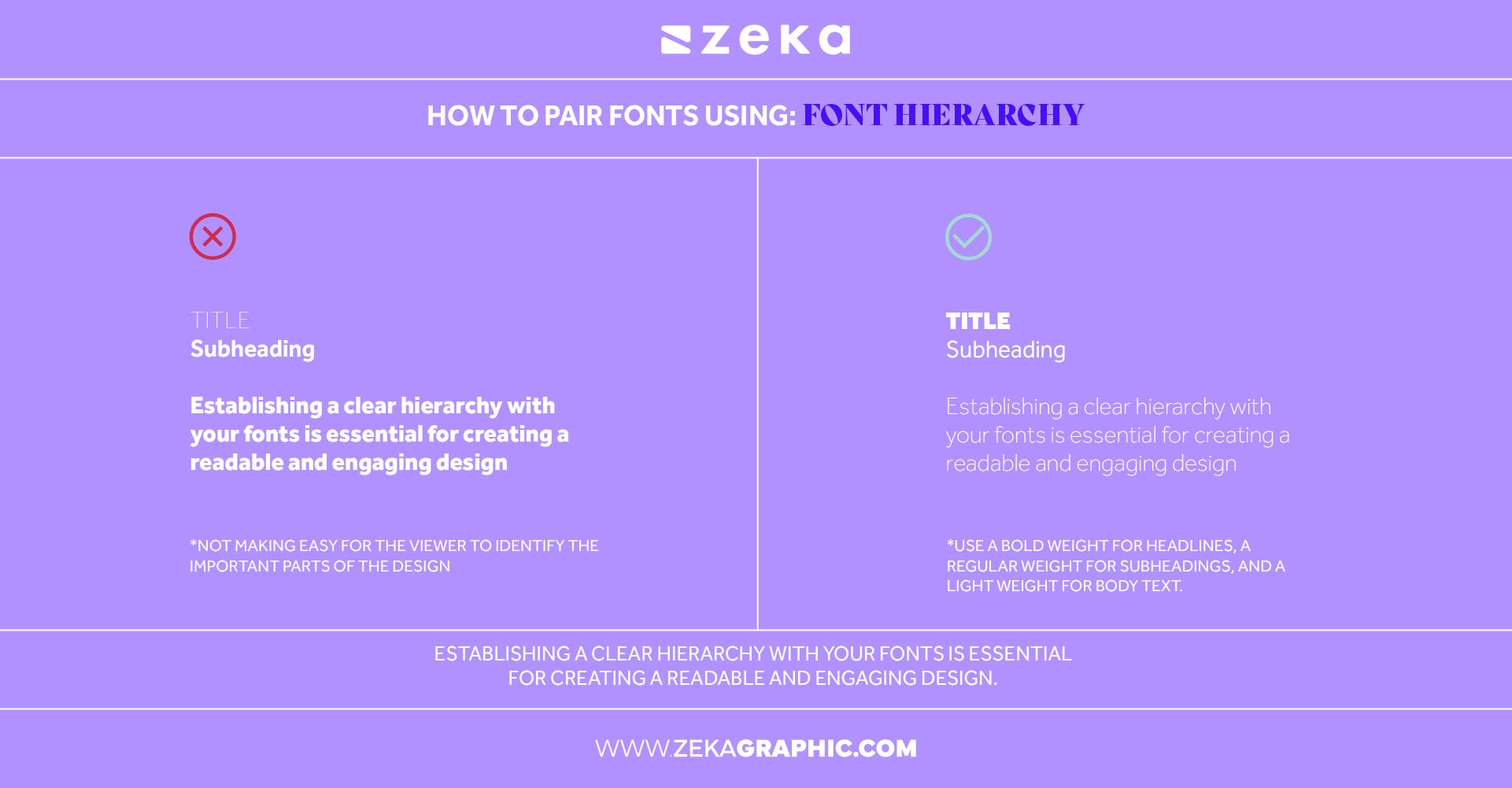
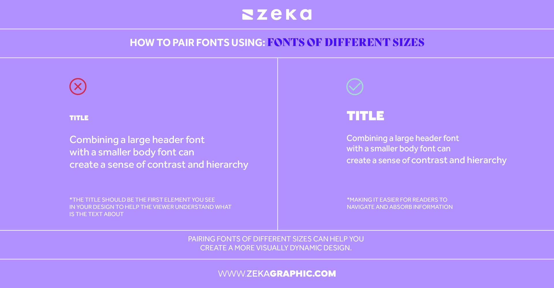
Large titles paired with small body text create contrast and rhythm in your layout. This not only draws attention to important elements but also makes your design feel more dynamic.
To keep things simple, start by choosing two or three fonts that complement each other well. Stick to classic and timeless fonts that are easy to read and don’t distract from your message. For example, a classic serif font paired with a clean sans-serif font can create a simple yet effective design. Consider using variations of the same font family as well, as they often have a cohesive look that works well together.
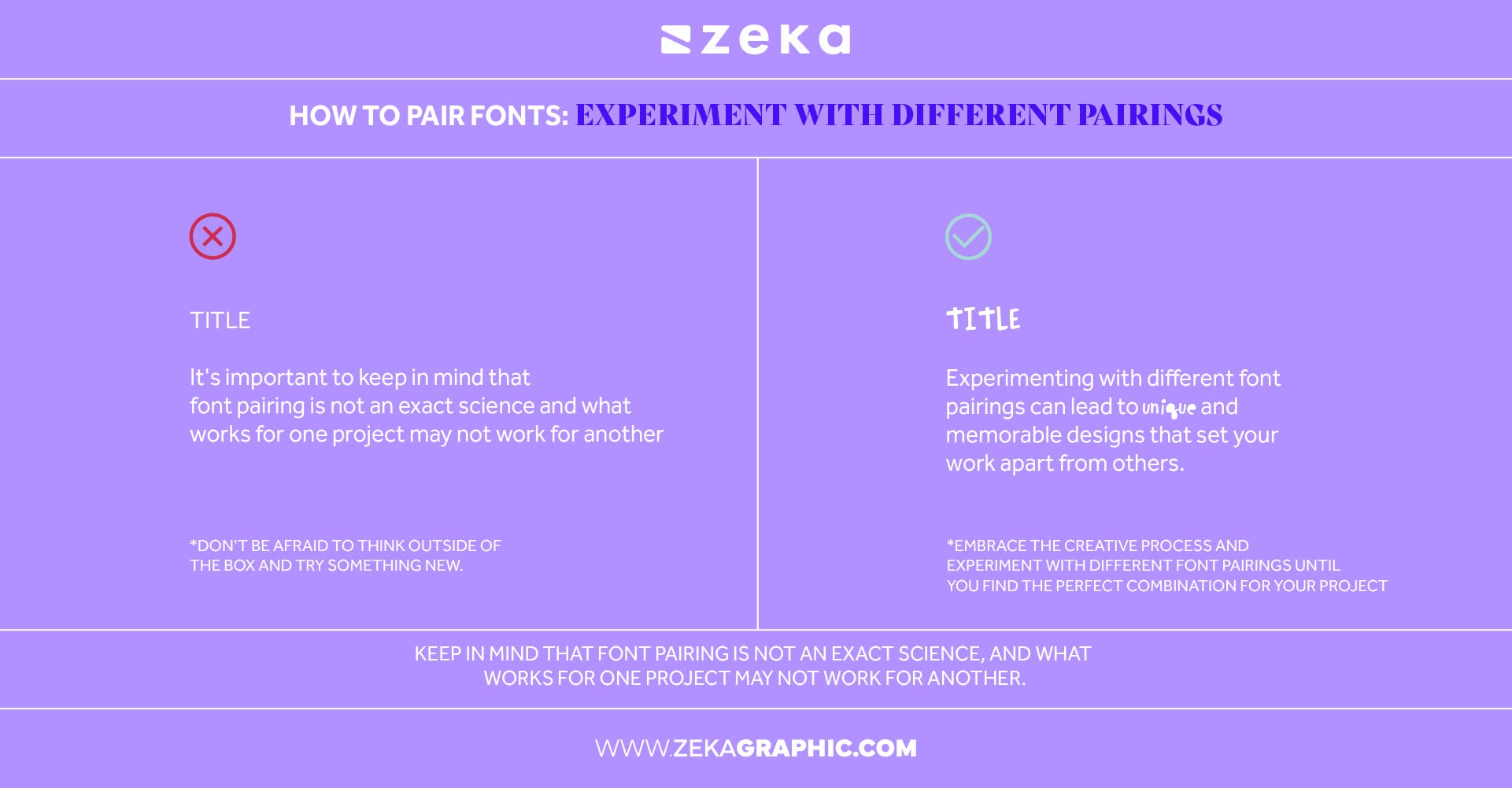
Don’t be afraid to test combinations that break the rules. Font pairing is part science, part art. Trust your designer instinct and tweak until it feels right.
Advertisment
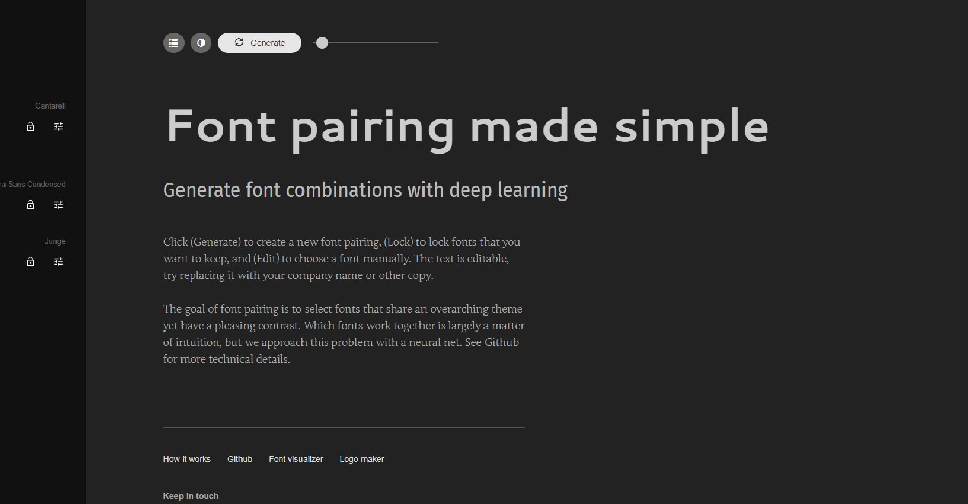
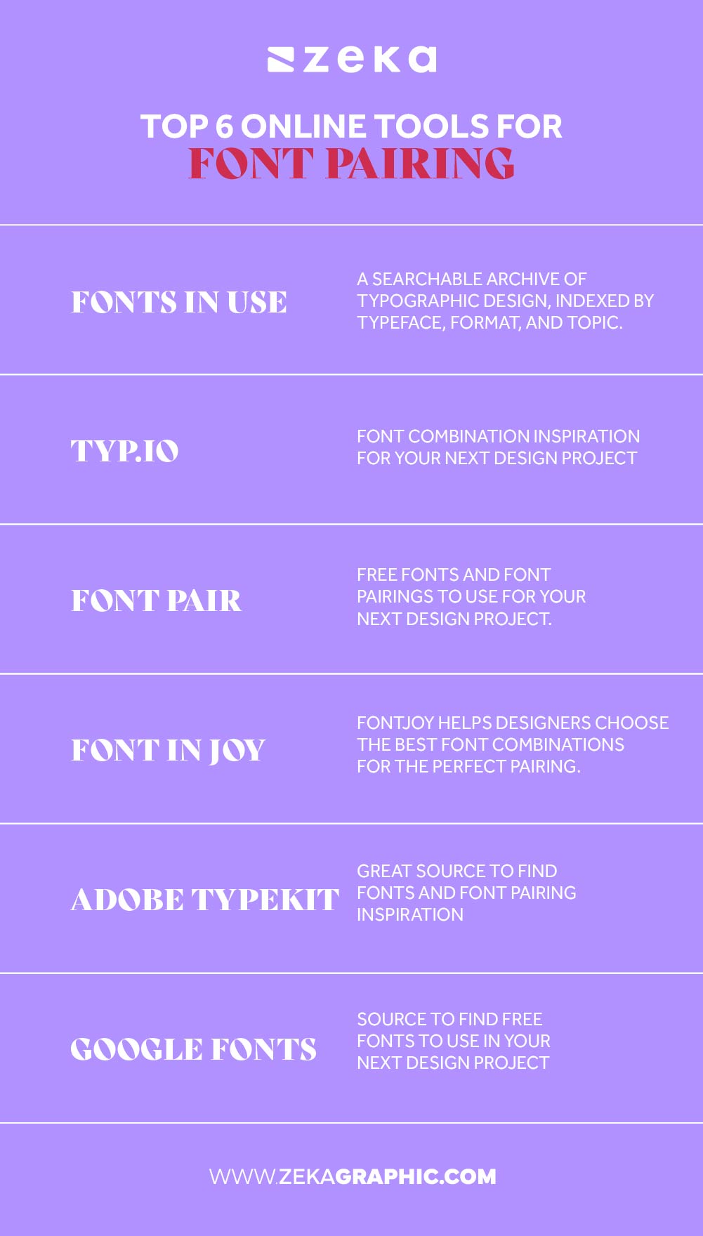
The internet is full of helpful resources that make font pairing faster, easier, and smarter. These tools are great starting points for experimenting and discovering new combinations.
Advertisment
Pairing fonts is both a skill and an art form—but the good news is, it’s one you can learn. By understanding typography basics, font categories, and how characteristics like weight and spacing affect a layout, you’re already ahead of the curve.
The best advice? Start practicing. Take inspiration from ads, websites, and printed media. Try to recreate type combinations you admire and build a swipe file or font library to reference in future projects. Over time, your instincts will sharpen.
To help you get started, you can use this infographic. The more you experiment, the more confident and intentional your font choices will become.
Pin it for later!
If you found this post useful you might like to read these post about Graphic Design Inspiration.
Advertisment
Written by
If you like this post share it on your social media!
Advertisment


Want to make your Business Grow with Creative design?
Advertisment

Advertisment