I already talked on the previous post about the importance in transmitting unconscious messages through design elements to associate your design with different feelings at the same time that you can use these traits to associate your branding elements with some emotions.
One of the key parts of minimalist design style is that every design elements used in your layout must have a function if you want to learn more about minimalism you have a post about it here, as we try to use the less amount of graphic elements we need to use wisely that design elements we already have and transmit unconscious messages using psychology, I already have written a post about shape psychology, brand colors psychology and now I made this post dedicated to font psychology.
What you will learn on this post is that every typography design and font-weight are associated with traits that we already have in mind and we as graphic designers need to play with it to create a cohesive graphic design project and use typography as a way of transmitting unconscious messages in a visual way through correct font pairing.
Advertisment
Before we start analyzing the meaning of different font categories and how to choose the right font for your brand to better transmit your brand message and inspire specific feelings to the viewer using typography design.
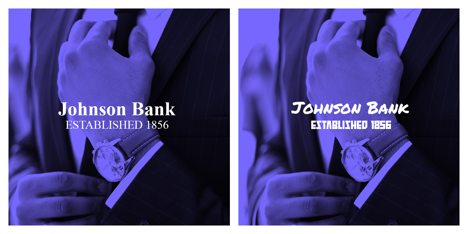
The font psychology definition is the study of how different fonts and typographic styles impact on viewers thoughts, feelings and behaviour associating the font design with unconscious emotions in the brain, that is the definition of font psychology, but to better understand what is font psychology we can use this example, if you have a bank company or financial institution, you want to transmit seriousness and trustworthiness through your font choice, if you see a bank using a Comic Sans font you will not trust on them, so they will choose a Serif font to transmit that emotions.

As we saw, every font has his own meaning and is associated with different emotions, and you need to match your brand message and personality with the font choice to create a cohesive design with the message and the visual look of this message to make your brand message stronger, we saw on the bank example that if you want to transmit a formal look and create trust on your customers you need to use a font that transmits that feelings.
The right font choice is important for any company because this will be the visual way and tone they will speak to their future customers, and by choosing the right font you will assure that your brand message is aligned with the tone you are using to speak with the viewer and reinforce the emotions and feelings you want to be associated with your brand and this will create a strong brand and identity project.
Advertisment
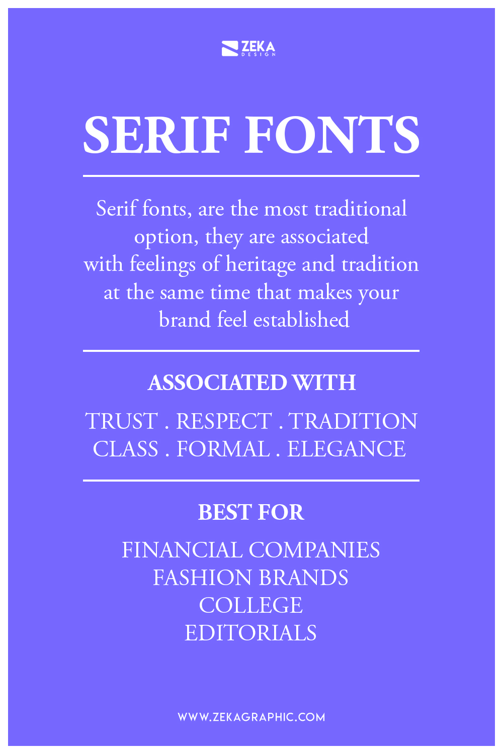
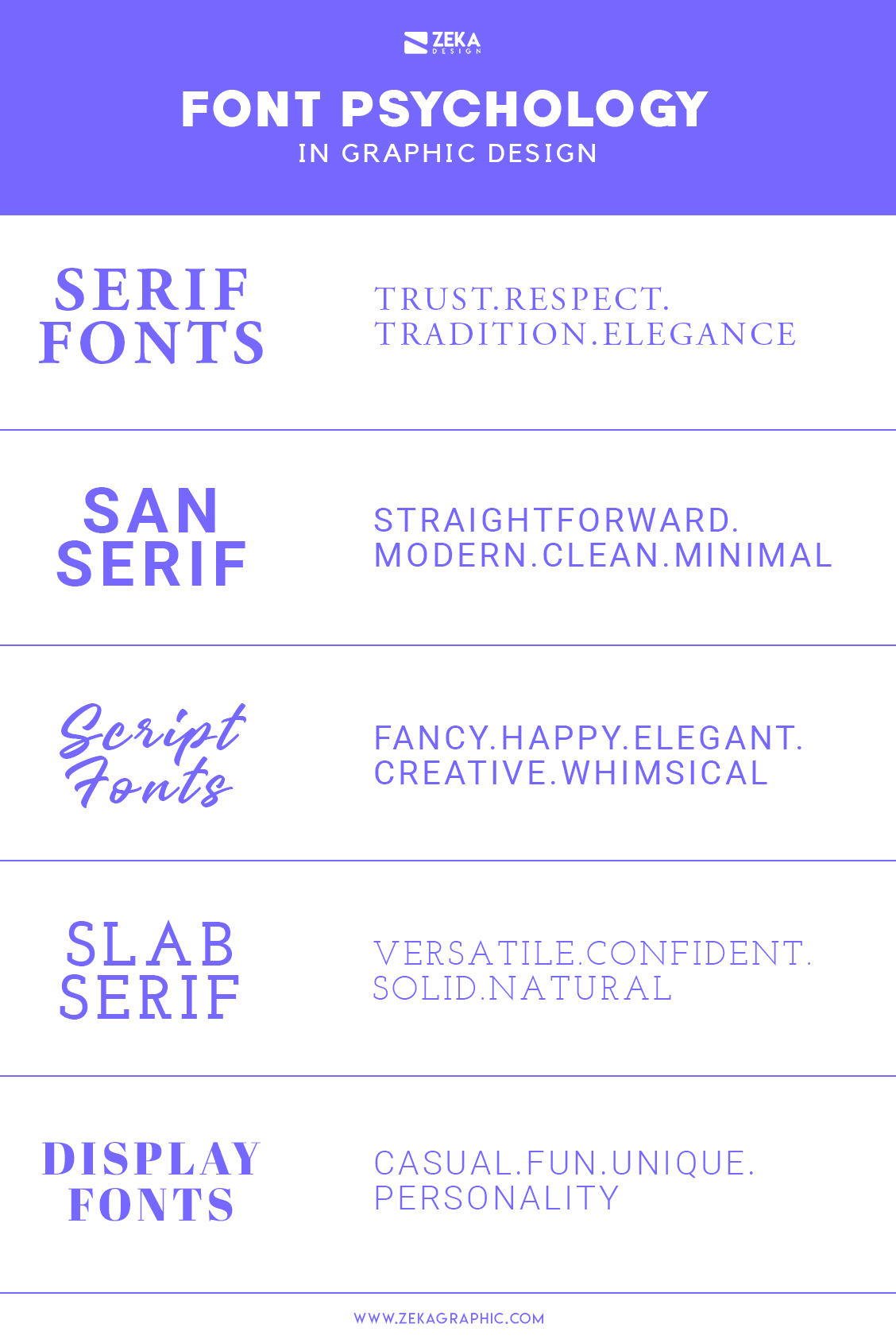
The first typography syle on this post are Serif fonts, which is the most traditional option, as these type of fonts have been used for centuries they are associated with feelings of heritage and tradition at the same time that makes your brand feel established and this quality creates trust in your potential customers.
Serif fonts can transmit the feeling of class and due to their anatomy they can be associated with high-end brands and sophisticated looks, and due to their classical nature you can associate them with trust and respectability, that is why you can see many brands use them in their brand and identity projects to transmit authority and trustworthiness.
The voice used by Serif fonts is a formal one, and it’s the perfect choice for brands who want to create brand awareness and trustworthiness across their potential clients. As mentioned these typefaces are used for a formal look and it’s very popular across financial companies, colleges, editorials and fashion brand related to associate them with trustworthiness, elegance, class and tradition in some cases.
The most common feelings associated with Serif fonts are trust, respect, authority, formality and tradition, and you can see them in some brand logos as the New York Times, Zara, ING or Vogue.
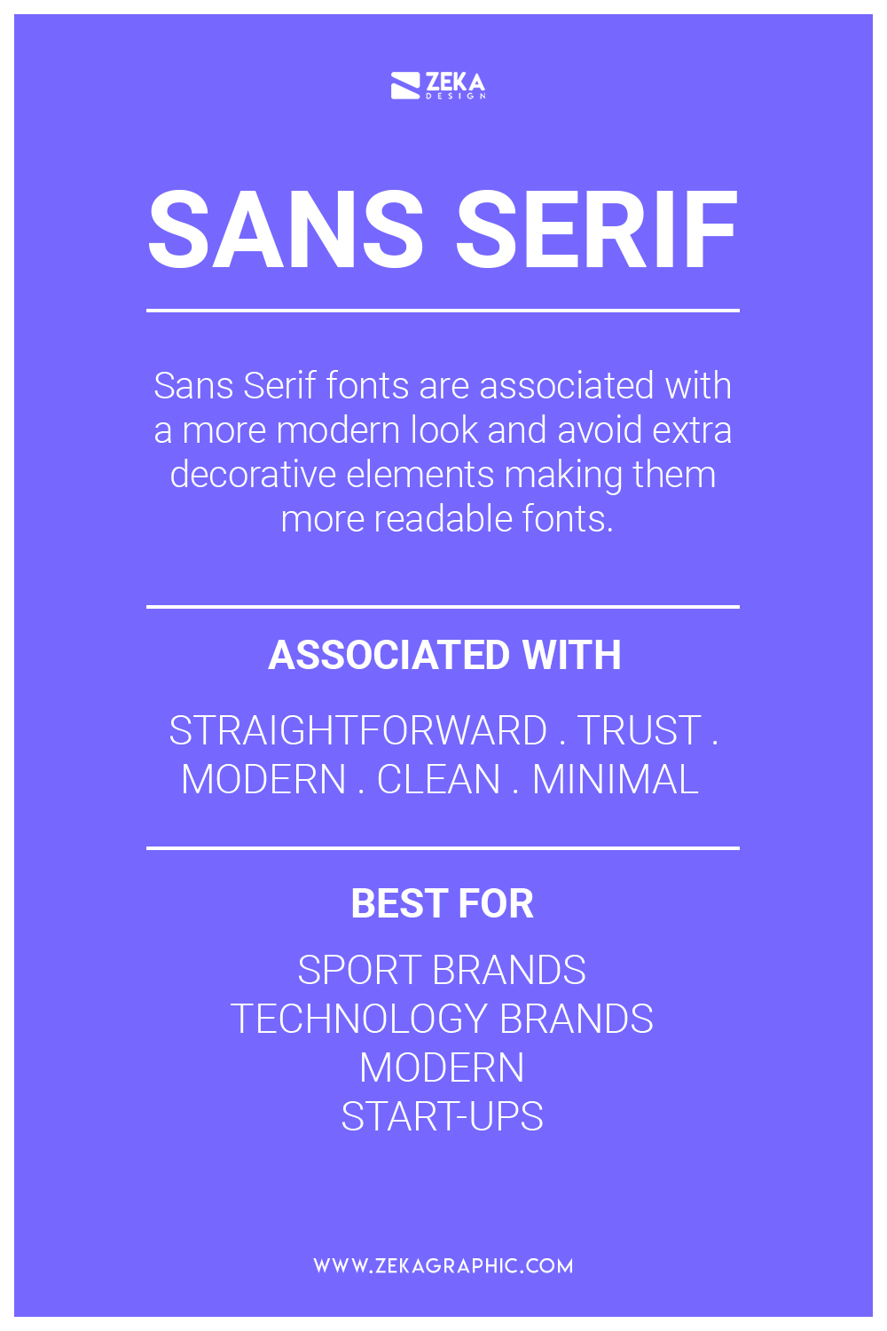
Usually, Sans Serif fonts are associated with a more modern look and avoid extra decorative elements making them more readable fonts and that quality makes them a perfect choice for minimalist design projects focused on function over visual. These attributes make sans serif fonts look clean, modern and more engaging.
San Serif fonts can be associated with honesty and sensibility because they avoid using decorative elements that can distract the viewer from the brand message. These qualities and the fact that San Serif fonts can be seen as modern, straight-forward and simple make them perfect for companies focused on forward-thinking ideas and are focused on their brand purpose.
You can see Sans serifs fonts in different company sectors due to their popularity and easy readability, but you can see them in clothing brands, business that are focused on the future, start-ups and more commonly technology companies focused on modern ideas.
The most common San serif meanings are straightforward, modern, trust, sophisticated, tech-focused and cutting-edge. As they are usually associated with technology you can see many tech brand using sans serif tons on their logo design as Google, Microsoft, Adidas and Spotify.
Advertisment
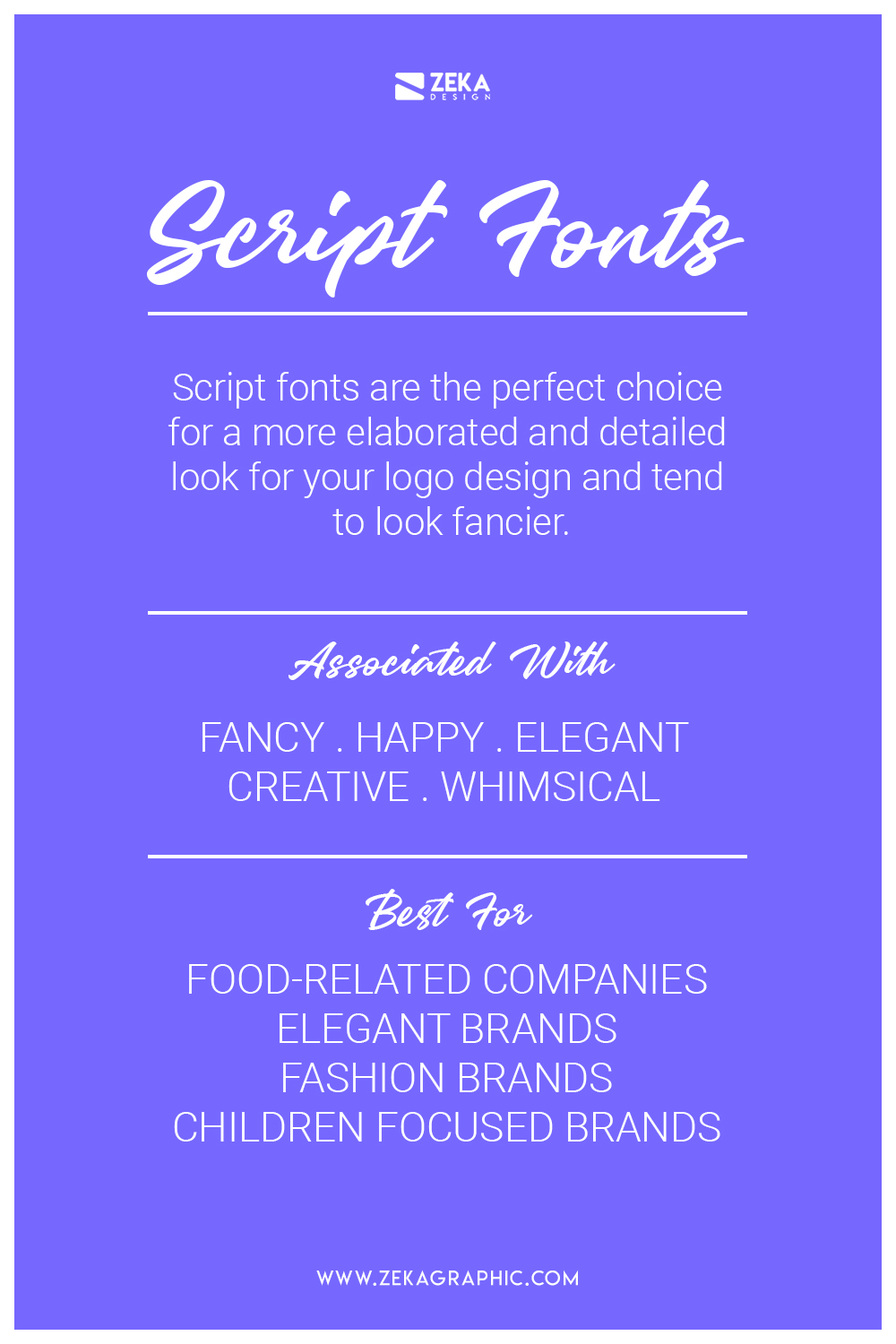
Script fonts are the perfect choice for a more elaborated and detailed look for your logo design and tend to look fancier than their serif counterparts. Usually, Script fonts can evoke feelings of creativity due to their calligraphic anatomy and can be related to the art of calligraphy.
The Hand-Written anatomy of script fonts makes them look more personal and can create more affinity with the customer. Despite the creative and personal look of script fonts you need to take care of readability and make sure that your font election is easy to read for the viewer.
Inside font psychology, script fonts are the most versatile category and depending on the font choice and the calligraphic style you can evoke a fun feeling or more traditional one. Due to their creative anatomy, script fonts are a good choice for visual focused brand to show their creative side, it’s also a very recommended font for food and beverage brands, fashion brand and children focused brand.
Due to their versatile anatomy script fonts can have different meanings, but the most common are elegance, sophistication, fancy, creative, happiness, traditional, personal and whimsical. As previously mentioned many food-related companies have used for their logo design as you can see in Coca Cola, Cadbury and more elegant focused brands like Cadillac.
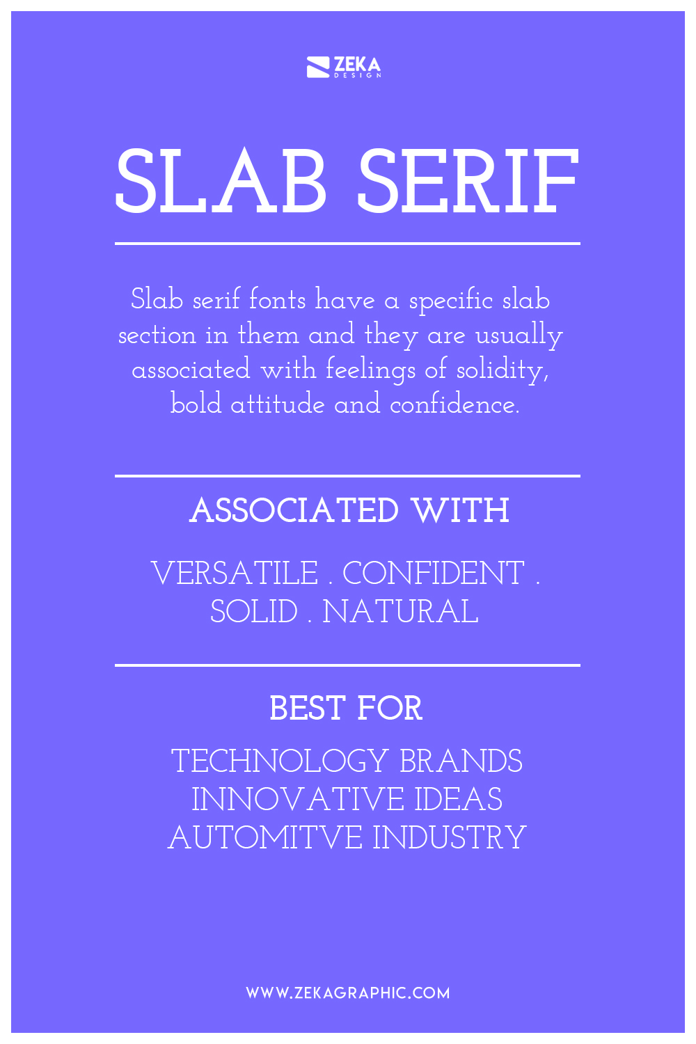
Slab Serif fonts are the between Serif and San Serif typefaces sharing similarities with both of them, and often known as sub-set of serif typefaces due to the similarity with them, but slab serif has a specific slab section in them and they are usually associated with feelings of solidity, bold attitude and confidence.
Usually, Slab Serif fonts have been used as stamp font and you can see them in factory floors, steakhouses and hand tool inscriptions. Knowing that it’s not a surprise that slab serif fonts can be associated with natural, bold and to the point feelings and are used to grab attention viewer easily.
Slab Serif is a popular option for companies that are looking to make an impact on the market with new and innovative ideas. You can see slab serif used in brand logos for technology brands that want to transmit confidence to their customers and modern creativity.
Slab Serif fonts due to their anatomy work well in increased and decreased sizes maintaining good readability. Most common emotions related to Slab Serif fonts are simple, confidence, versatile, solid, balanced, geometric and clean look, strong and usually used to grab viewer attention. You can see Slab Serif fonts used in logo designs of technology brands and the automotive industry as Volvo, Honda or Sony.
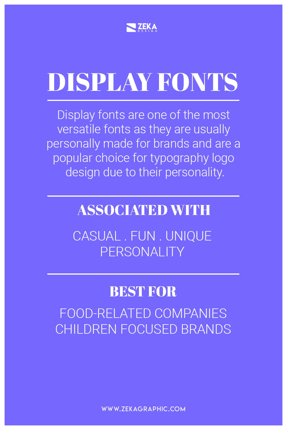
Display and decorative fonts are one of the most versatile fonts as they are usually customized and personally made for brands and are a popular choice for typography logo design due to their anatomy and personality.
These fonts are most creative choice talking about typography as they are custom made and you can get as imaginative as possible, these factor makes them the most versatile as every display font can be associated with specific emotions that the brand wants. As these fonts are very creative and have specific feelings associated with them you need to be carefully by choosing them and due their anatomy are not suitable for body copy.
Due to their creative anatomy and the fact that you can make display fonts from scratch, they can transmit different emotions depending on the design of them, some emotions that can transmit display fonts are direct, casual, fun and most of them unique. These fonts are a popular choice for food-related companies as McDonald’s and Fanta or more focused in children as Lego or Disney.
Advertisment
Advertisment
On this post, we saw the importance of choosing the right font for your company and how it can help to reinforce your brand message and create a cohesive brand and identity project for your company. As we saw on the “how to choose a brand color” and the “minimalist graphic design rules” is important to use wisely the graphic elements in our design layout and use them as a way to evoke unconscious feelings to the viewer.
For a company, it’s really important the brand message they want to transmit but it’s also important the way you do and choose the right tone for your message by choosing the most suitable font for your brand and the feelings you want to evoke on your future customer.
If you want to learn more about graphic design fundamentals you can check these posts.
If you found this post useful you might like to read these post about Typography Design Inspiration.
Advertisment
Written by
If you like this post share it on your social media!

Advertisment

Advertisment