Colors are a key principle of graphic design and it plays a huge role in branding design as people only will look at your logo design for 1 to 10 seconds and will form a first impression of your brand, that is where comes color psychology in logo design, as we need to convey the most information possible of your brand in that space of time.
It’s not a surprise that colors have a huge impact on people behaviour as they evoke different feelings and emotions in the viewer as they are usually associated with that emotions, that is called color psychology and we can use it in graphic design to associate our logo design with specific emotions, let’s see how we can use it for our brand logo!
Advertisment
Before we start to analyze the different color meanings in graphic design let’s talk about color psychology first, and how it affects consumer decisions, as mentioned in the introduction color psychology studies how different colors influence human behavior and what feelings they produce on them.
Every brand is different and that is why they need to choose a specific color scheme that better describes their brand message, that is why there is no mathematical formula to choosing a color for your logo design, instead, you need to understand what are the core values of your business and what feelings you want to transmit through your brand identity system.
Color choice by the biggest brands
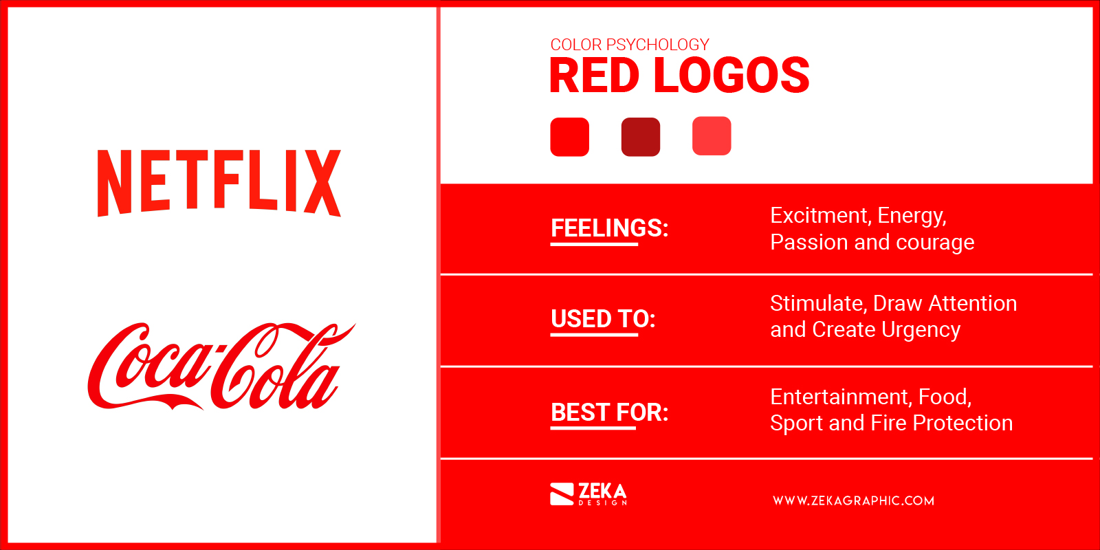
Red color is considered to represent feelings of romance and it’s universally used to show excitement passion and anger. You can use red in logo design if you want to transmit feelings of power, energy, passion, love and seduction through your brand, and if your business is loud, playful, youthful and modern red color is a good option for your logo as it makes you stand out from the crowd.
Red is a great brand color because it’s easy to use to catch the viewer attention as unconsciousness red is the first color we see when we are babies besides black and white and we have the ability to see this color better than others to make us easier to identify fruits on the trees at the same time that when humans are emotional their faces turn red.
These factors make red a strong primary color for your logo design as it’s easy to identify and many restaurants and food brands use it to stimulate the appetite of their customers, you also can see using red color for marketing campaigns to stimulate feelings of urgency.
You can use red alone for your logo design or you can pair it with white, black or other neutral colors to create your brand color scheme. Some popular brand that uses red for their logo design are Coca Cola, Netflix and YouTube.
Advertisment
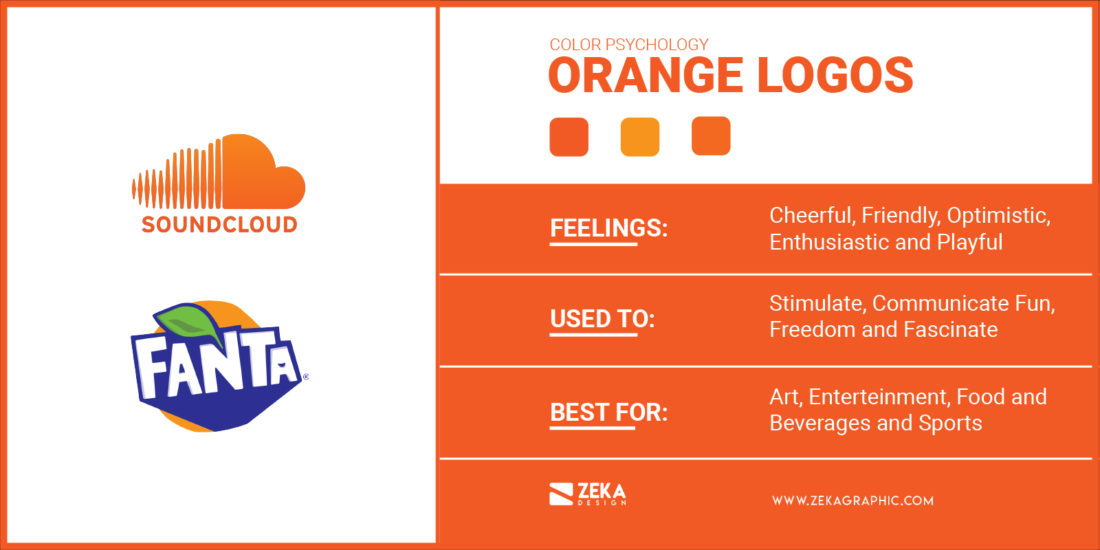
If your brand stands out for playful and innovative traits then you might think about using orange for your logo design, as this color evokes feelings of cheerful, friendly and enthusiastic. Orange is also a good option for your brand color if you want to stand out from the crowd as it is a very energetic color and can attract the viewer attention.
But be careful about what tone of orange you use for your brand logo as a very bright tone of orange can be a little harsh for the eye that is why many brands prefer to use peachier tones for their brand logo to avoid that negative effect on the eye and preserve the eye-catching effect of orange.
Orange is a warm color in the middle of red and yellow and it is usually associated with change and for that reason, many brands that want to be associated with feelings of freshness, excitement and friendly companies choose orange for their logo design.
If you choose orange as your main logo design color you can combine it with a nice neutral color to balance the contrast, and it’s perfect for entertainment, food and beverages and energetic brands as you can see orange logo examples in brands like Soundcloud, Fanta or Firefox.
Advertisment
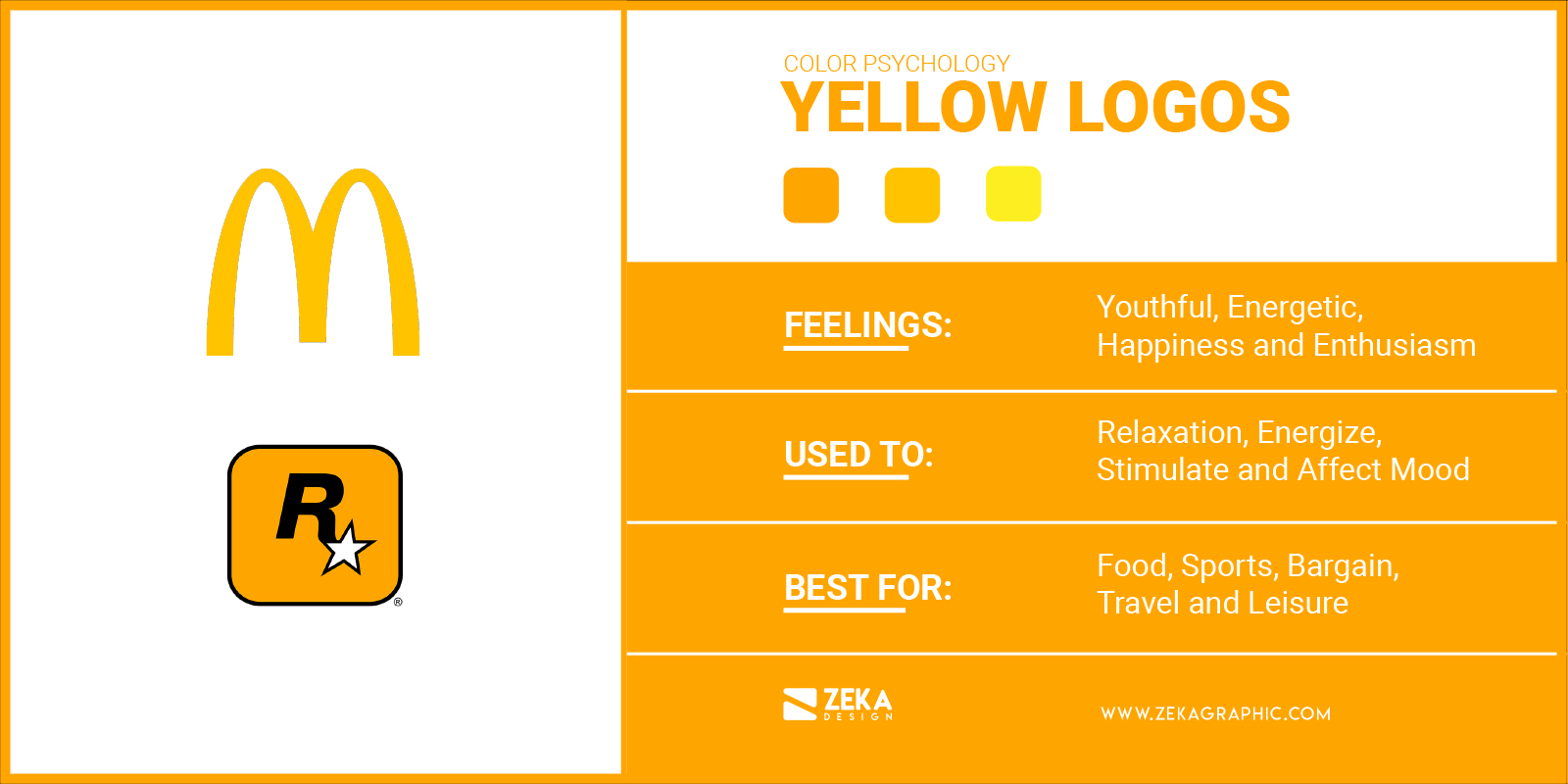
Yellow is a warm color really bright that usually is used by brands who want to transmit to their audience feelings of friendliness, cheerfulness and happiness through their brand colors. Yellow color can be associated with summer and sunshine and if your business wants to transmit youthful energy go with a yellow logo design.
If you have seen my post about color theory, you would know that yellow is a primary color in the subtractive color system and an interesting fact is that yellow was one of the first colors humans were able to mix and use in their painting.
If you are planning to use yellow color for your logo take care that it also can suggest bargain or cheap products, feelings that are not suitable for high-end brands, in that case, I would recommend you better go with gold colors for your logo as it can be associated with power and luxury. Some famous brands using yellow or gold for their logos are McDonald’s, Cadbury and Rockstar Gaming
Advertisment
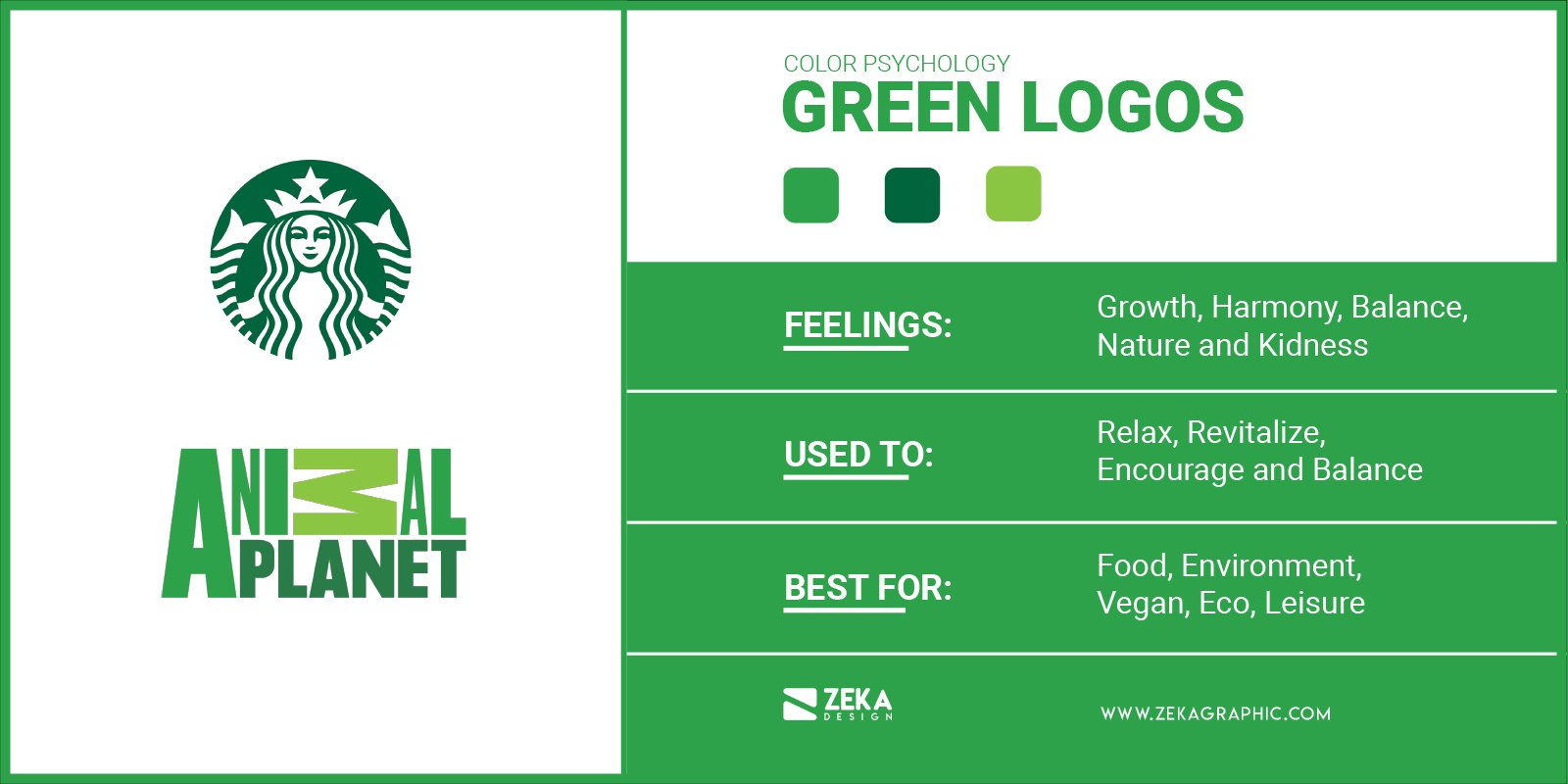
The interesting fact about green color is that is the color to which human eyes are most sensitive and humans can easily differentiate most shades of green, usually, green logos are associated with growth and new life if we talk about color psychology at the same time that can transmit feelings of harmony, rest and balance.
Most of the plants are green and that fact made this color associated with nature and the environment a green logo is a good option for environment-friendly brands and products, as you can see many vegetarian, vegan and eco-friendly brands using green as the main brand colors.
The green color in logo design is also associated with different traits depending on the culture, as for example in the US it’s associated with money and wealth because it’s the color of money. Some famous brands using green logos are Animal Planet, Starbucks and Lacoste.
Advertisment
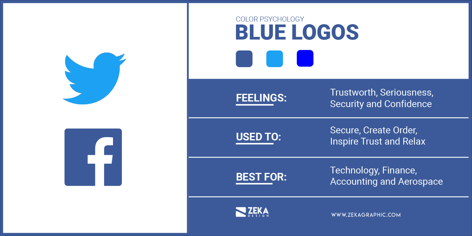
Blue color as we have seen previously is one of the favorite colors for marketers and brands as it is associated with trustworthiness and seriousness key attributes for any company. Usually, blue logos are associated with feelings of calm, control, logic, honesty, trust, security, and confidence and can help to establish trust between your brand and the viewer.
By another hand there are two problems with blue logos, the first one is due to the popularity of blue logos as many brands have used it for their brand colors, that is why if you are planning to use blue for your logo you will need to find a way to stand out from the rest and you can try to experiment with different shades of blue. The second problem that blue logos have is the fact that is a cold color that can make your brand look cold and unfriendly and can be a problem depending on the feelings you want to transmit with your brand colors.
As mentioned blue logos are associated with trust and confidence, which is why is a very popular color for finance, IT, equipment, energy, healthcare and transport brands and some famous brand using blue logos are Facebook, Twitter and Skype, so if your company is focused on IT take the blue color present for your brand color palette.
Advertisment
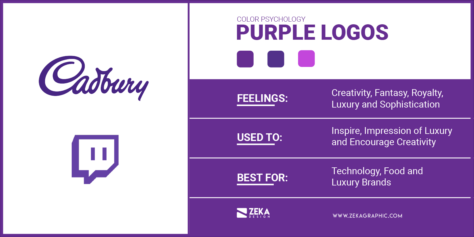
Historically purple and violet colors are associated with royalty and luxury, that is why if your brand is focused on luxury products then think about a purple logo for your brand. Purple is also associated with feelings of spirituality and can be associated with creativity, extravagance, fantasy, mystery, calm and sophistication.
Purple logos are really powerful to drive viewer attention and make your brand feel more luxurious especially when it’s combined with gold, also purple color works great for packaging design, think about Cadbury chocolate, by only looking at their purple packaging you associate it with good quality chocolate.
In modern logo design, there are not many brand using violet logos and it worked very well for those brand who have implemented violet logos, so if you want to go outside the box and outstanding from your competitors think about a violet logo or if you want to give a luxury feel to your brand purple is your color!, some famous brand using purple logos are as mentioned Cadbury, Yahoo and Twitch.
Advertisment
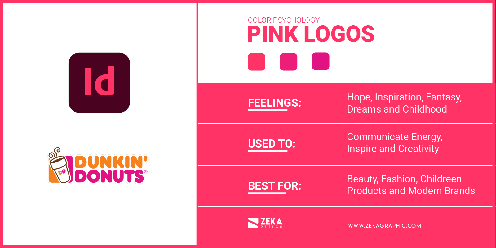
The pink color is used for brands that want to be associated with feelings of hope and inspiration as in color psychology pink is associated with calmness, fantasy, dreams, comfort, childhood and reassuring.
As interesting fact in Japanese culture pink color is associated with spring as it’s the color of the blossoming sakura and this fact makes pink used in branding that wants to be associated with sweetness and transmit feelings of fantasy.
In modern logo design pink is a really popular color that makes your brand look youthful and luxurious and it’s used for baby brands, desserts and toys factories. In the other hand pink color also can be associated with feelings of immaturity and playfulness that could not work well for some niches. Some examples of famous brands using pink logos are dribble, Dunkin Donuts and Adobe Indesign.
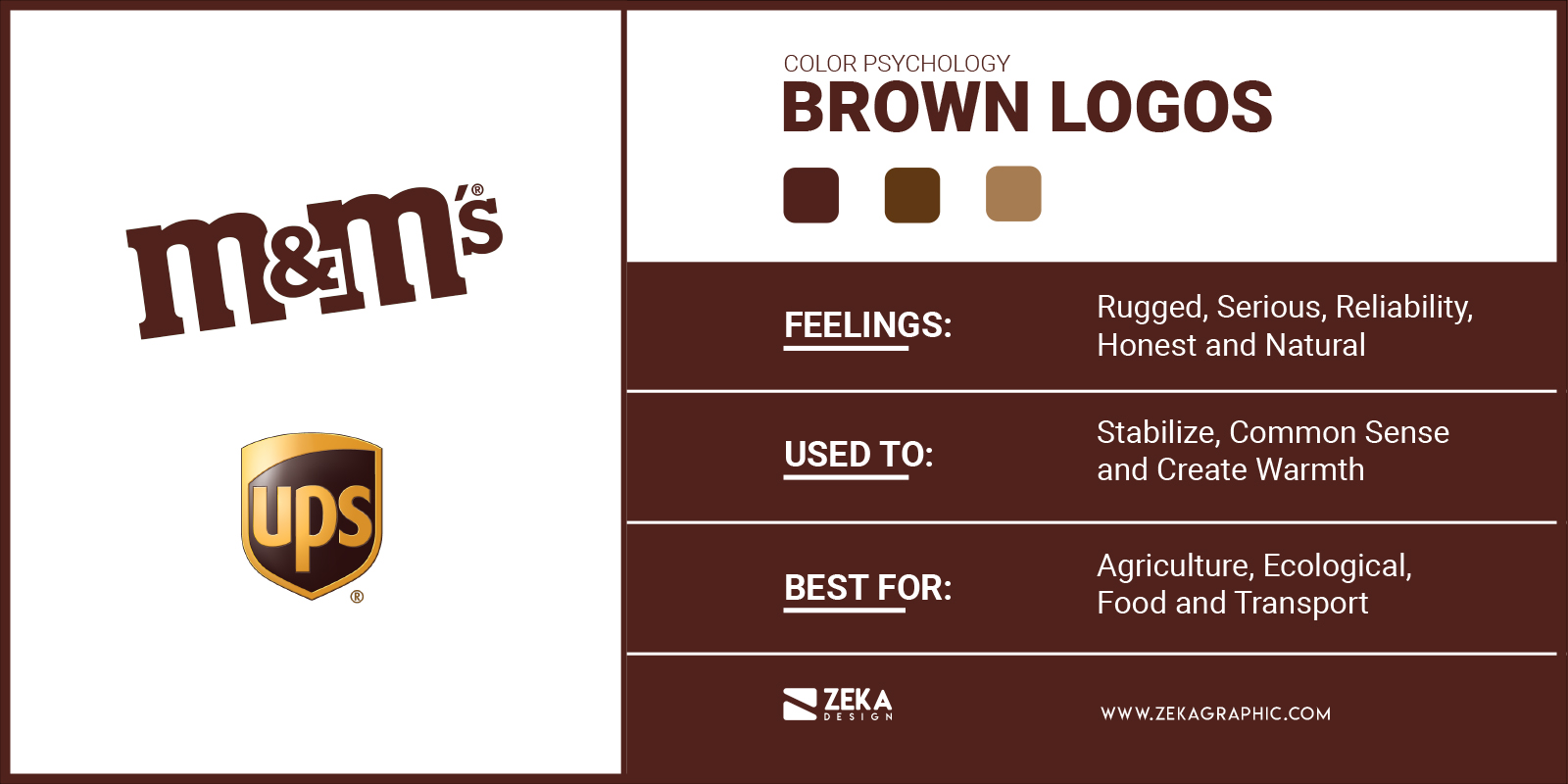
Brown color in logo design it’s not very popular for many brands as many people have associated it with rotting and decay, but by another hand, brown color can be associated with rugged, masculine and serious traits, and if your brand personality traits are these one brown logos is an option you might have in mind.
The fact that not many brands use brown logos can make your logo stand out easily from your competitor depending on what niche is your brand. Brown color can transmit feelings of strength, mature, safe and can make your brand associated with down-to-earth trait. Brown color also makes your brand look vintage and hand-made.
Brown logos are also a good option for brands that are associated with eco-awareness and organic products that want to avoid using green and brand which sell brown color food as coffee or chocolate, that is why brown is a popular color for companies in agriculture, food, family products and transport and some famous brand using brown logos are Nespresso, UPS and m&m’s.
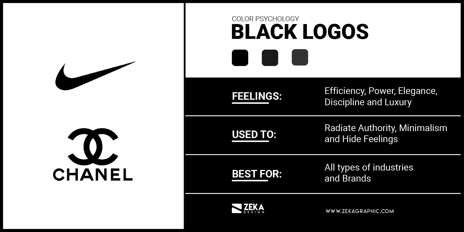
Technically black isn’t a color as it is the absence of light, but we will refer it as a color to make it easier, as black logos are always been used and it’s very popular among luxury brands as it represents feelings of efficiency, prestige, power, sophistication, elegance, luxury, protection and seduction.
Regard the color you choose for your brand logo is always recommendable for any brand and identity design project to include a black version of your logo as it will make it easier to include your logo in different designs in a more minimalist way without distracting the viewer from design.
Black logos are serious and strong and it’s the perfect choice if your brand wants to be associated with luxury. Black color in logo design is very popular for luxury, fashion, IT and equipment brands and some famous brands using black logos are Chanel, Nike or Louis Vuitton.
Advertisment
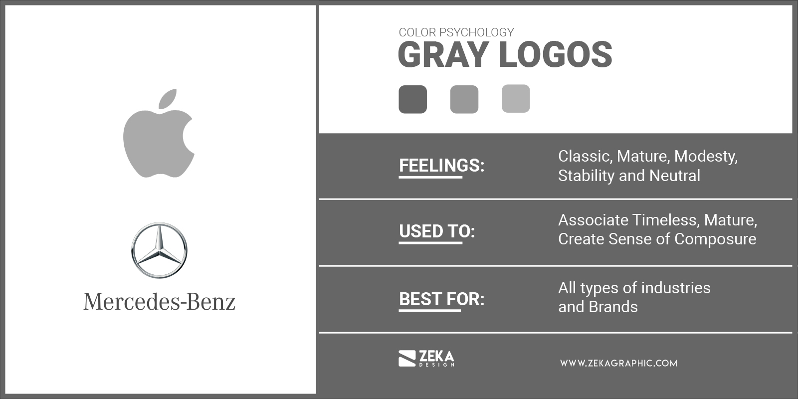
Gray logos are in the middle between the absence of light (black) and full light (white) and its a great color to have in mind for your logo if you want to be associated with mature, classic and serious attributes. Grey color in logo design can be associated with feelings of professionalism, dignity, classic, modesty and stability.
By another hand, gray logos also can be associated with boring and ordinary logos because the lack of color, that is why take care about that fact when using gray color in your logo design, and you can use the fact that gray is not warm or cold, and is not masculine or feminine, as it’s a completely neutral color and you can use it as a good brand personality trait.
Gray color in logo design is very popular among equipment, transport, IT, finance and hi-tech companies because it makes them feel serious, professional and credible, by another hand if your brand is about food an beverage gray will not be the most suitable color for your brand. Some famous brand using gray logo examples are Apple, Audi or Mercedes.
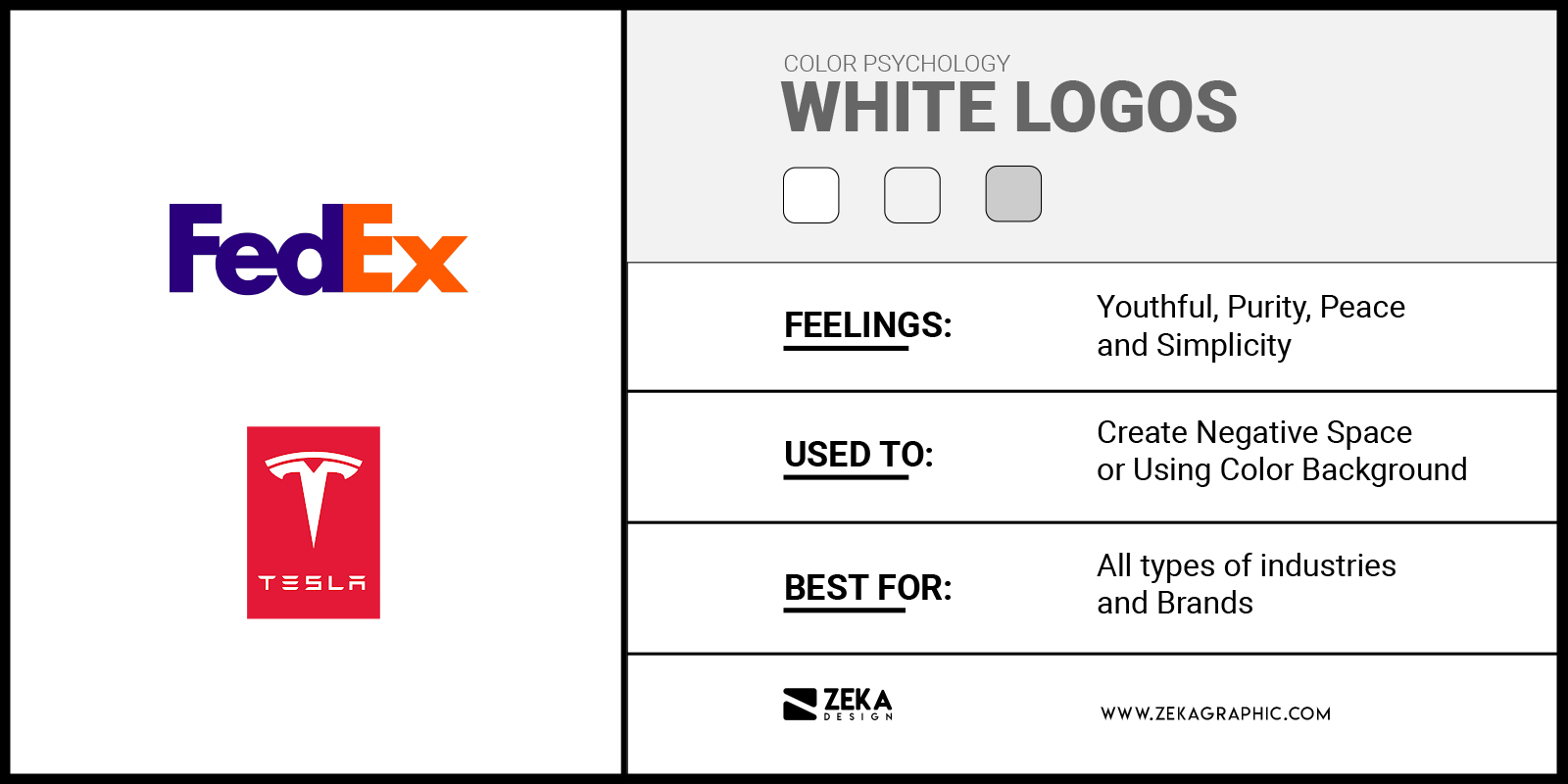
With white color happens the opposite as black, as technically white is not a color and it’s the absence of color, but if we consider white as a color in logo design, then it can be associated with youthful and economical feelings. White logos can express feelings of sincerity, cleanliness, purity, peace and simplicity.
White in logo design is more used as complementary colors or as a technique to create negative space in a logo instead of using it as the main color for logo design. Famous brand using white logos as negative space or complementary colors are FedEx, Tesla and The North Face.
Advertisment
Humans associate colors with certain feelings and behaviors and we use these associations of color in graphic design and logo design to convey the brand message in color, the science that studies how people react to color is called color psychology.
The color associations came from three different elements that made us react in a specific way depending on the color we see, these three sources are aesthetics, culture, and programmed associations, so let’s see how they affected color psychology.
After seeing the meaning of every color in logo design, the next question is how to choose the right color for your brand. and the first step to do it it’s to make clear what are the main traits of your brand and how you want your business to be perceived by your customers.
The logo design color will make a huge impact on your whole brand and identity design project to choose one, first make a clear brand identity, identify your brand traits and once you have a clear brand message and what are the qualities you want to enhance of your brand pick up the main color that is associated with that feeling.
If you want to learn more about how to choose brand colors I have a single article talking about that where I show you the complete process to choose the best color for your brand.
Advertisment
If your brand has different qualities you want to enhance through your logo design you are not limited to only using one color for your logo, you can pick up multiple colors for your brand logo if you want to enhance different traits of your company, you can take as an example eBay, Google or Instagram.
Take note that if you are planning to combine two or more colors for your logo it’s important to have in mind color theory and see how these colors work together and if they are harmonious. Another important piece of advice for multiple-color logos it’s to not go crazy with color to avoid overwhelming the viewer and make it more difficult to memorize, remember that people will only look at your logo for some seconds.
A key attribute for a good logo design is to be recognizable, and if you want to know the 7 Qualities for a good logo you can read this post!. Regarding color, you need to research in your sector what colors are using your competitor for their logo design and avoid using the most popular color from your sector, instead of it try a different color palette that conveys your brand message.
Using a different brand color in your logo design than your competitor will make your logo stand out from them and people will pay more attention to your logo, this effect comes from contrast if you see a repetition of colors or shapes your eye will look at the elements which are different automatically, and you can learn how to use contrast in graphic design with this article.
Advertisment
In this post, you have learned all the color meanings in logo design and how you can use colors to convey your brand message by using the feelings associated with colors making it easier for the viewer to associate your brand with those qualities you want to enhance.
I hope you find this post about colors in logos useful and if you want to learn more about color in graphic design I recommend you to read my post about color theory and learn how to combine different colors to create harmonious color schemes or this post where I show you how to choose your brand colors. And if you are looking to upgrade your logo design skills, in this post I show you the best Online Classes from Skillshare to learn Logo Design.
If you found this post useful you might like to read these post about Logo Design Inspiration and Color in Graphic Design
Advertisment
Written by
If you like this post share it on your social media!


Advertisment

Advertisment