Color is a key part in Graphic Design and it’s a very important element for a brand’s identity as all the graphic elements related to your company need to have a cohesive color palette to associate with your brand. To make more emphasis on the importance of color for a brand different researches show that 85% of the consumer’s actions are motivated by color and 92% of them say that visual appearance is the most persuasive marketing element.
I already have made a post talking about color theory and some ideas for color palettes but knowing how important is color for a brand I decided to make this post focused on how to choose your brand colors correctly.
Advertisment
Colors are powerful elements to transmit different emotions as every color have their own meaning and are associated with different feelings, unconsciously when we are looking to a certain image we create the first emotions by the prominent color before looking at the design itself, for example, it can be a red color and we can associate it with love or blue with trustworthiness.
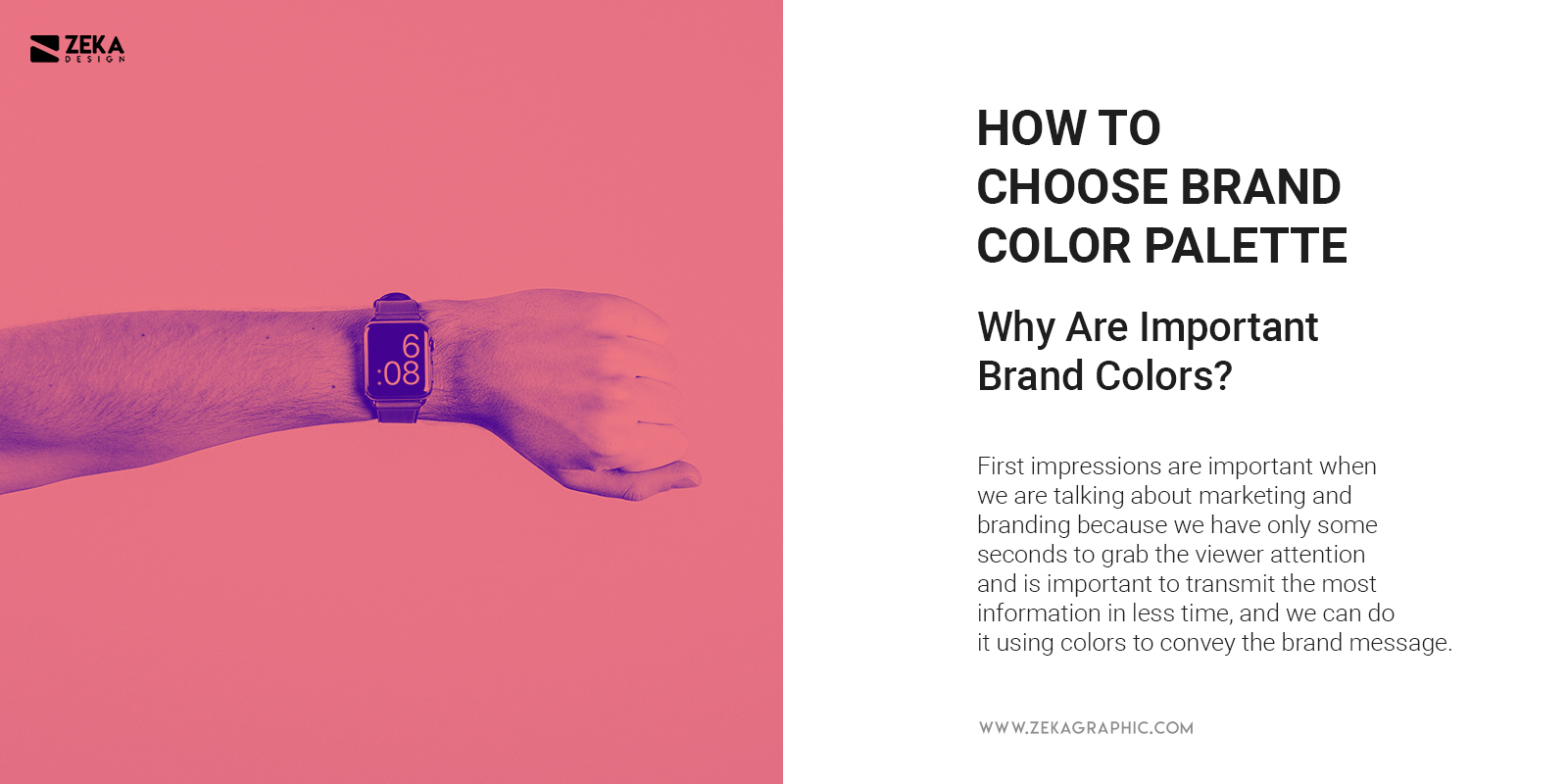
Knowing how important are the first impressions especially when we are talking about marketing and branding when we have only some seconds to grab the possible customer attention is important to transmit the most information in less time, and we can do it using colors to convey messages and transmit unconsciously emotions to the viewer to create the initial impression of the possible customers and engage them.
And answering the question on why brand colors are important, the answer is simple, for a company it’s important to have a cohesive and clear brand and identity design project to transmit their message and values with graphic elements and their brand design, as their logo design transmits the company’s message and what they do, it’s also important to use the colors as a way of message to create cohesive branding and increase brand recognition.
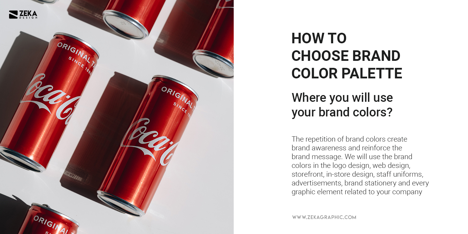
As we already know through this post, colors evoke certain emotions that is why your brand colors have the ability to impact directly on your sales or brand performance. Your brand color combination will create your brand message and philosophy and the repetition of these elements can strengthen brand awareness and reinforce the brand message.
Once we already knew how brand colors work and the impact we will use the brand colors in the logo design, web design, storefront, in-store design, staff uniforms, advertisements, brand stationery and every graphic element related to your company, and the incorporation of your brand colors in all these elements will help to reinforce your brand message.
Advertisment
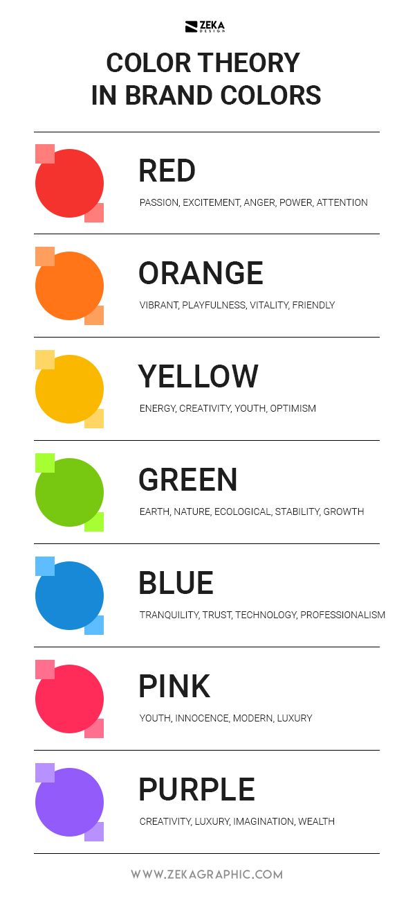
As mentioned previously in this post color are associated with different feelings as red is associated with danger or passion, at the same time that colors can be associated with real-life elements as green is associated with nature and blue with water, knowing how colors affect your perception and behavior we can use it in our advantage to transmit brand identity and philosophy.
According to different studies, 85% of the customer behavior is directly related to product color so it’s important to choose you brand color palette right to encourage the client decision to buy your product through unconscious emotions generated by your brand color scheme.

As I mention through all the post colors have different emotions and now I will show you what feeling is associated with every color.
Advertisment
On the previous point, I mentioned the different emotions colors can evoke according to color psychology, there are certain colors more suitable for different niches or topics due to the fact that these colors can evoke real-life elements and can be associated with them and the combination of brand colors can create a specific message.
It’s very common to see fashion brands using black as the main color usually for their logo design to associate the brand with sophistication and glamour, but they tend to pair it with warm colors as red, orange and pink to add passion, confidence or excitement to their brand message.

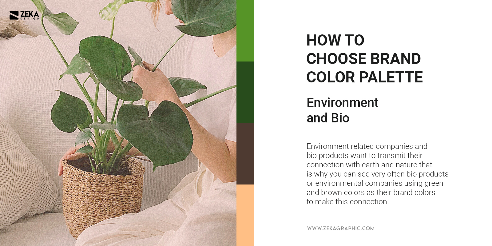
For environment-related companies and bio products want to transmit their connection with earth and nature that is why you can see very often bio products or environmental companies using green and brown colors as their brand colors to make this connection, and if the brand is related with water environment they can use blue to evoke that feeling.
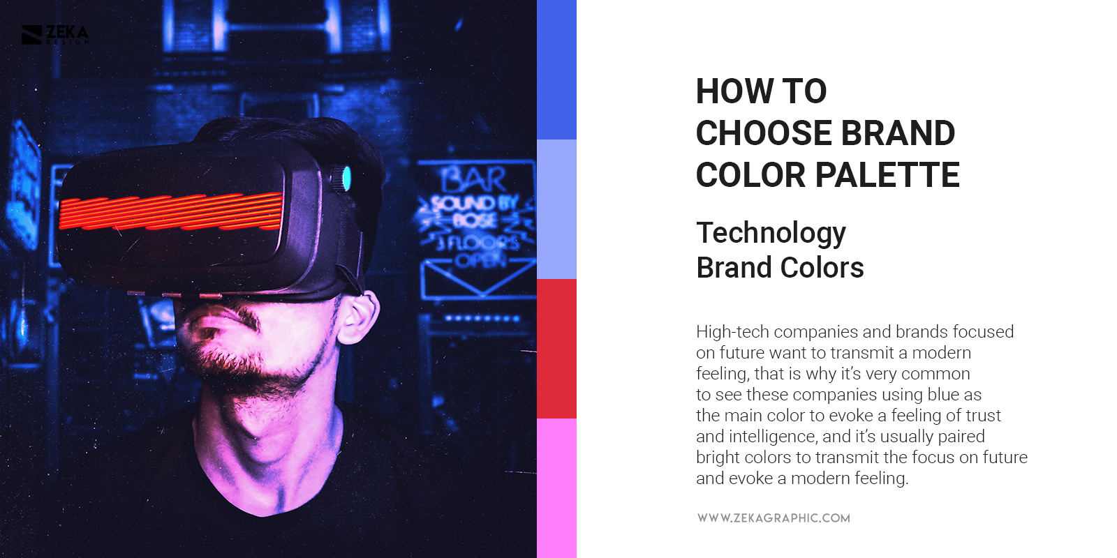
High-tech companies and brands focused on future want to transmit a modern feeling through their brand colors, that is why it’s very common to see these companies using blue as the main color to evoke a feeling of trust, intelligence and efficiency, and it’s usually paired with colors as orange to transmit friendly and optimistic look, purple to evoke quality and creativity and different bright colors to transmit the focus on future and evoke a modern feeling.
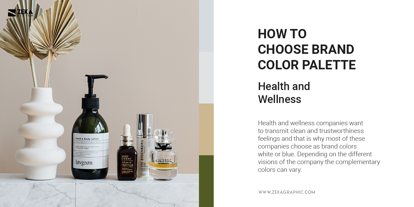
Health and wellness companies want to transmit clean and trustworthiness feelings and that is why most of these companies choose as brand colors white or blue. Depending on the different visions of the company the complementary colors can vary, as for example, more focused natural wellness company will choose as the complementary color green to connect the brand with it, it’s also very common to see orange as complementary to represent ideas of vitality and energy.
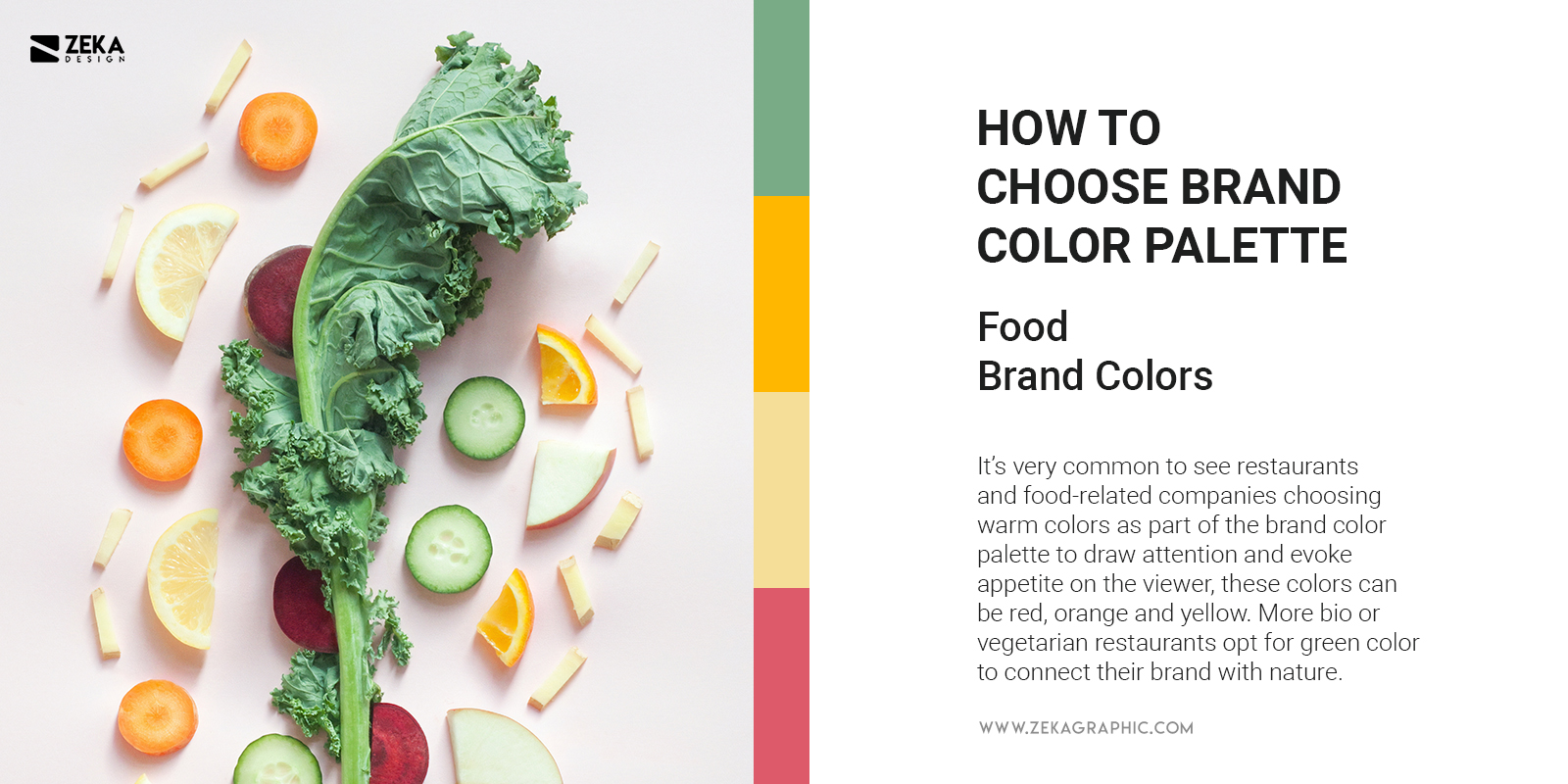
It’s very common to see restaurants and food-related companies choosing warm colors as part of the brand color palette to draw attention and evoke appetite on the viewer, these colors can be red, orange and yellow. More bio or vegetarian restaurants opt for green color to connect their brand with nature and for sweets and deserts, you can see bright tones of blue and pink.
Advertisment
Now that we already know the importance of brand colors, the meaning of different colors, and what topics are best suited for some colors, it’s time to start creating our brand color palette, and the first step is to know what is our brand about, you need to establish your brand identity to later align these qualities with colors.
As previously talked colors are a way of transmitting messages, but to use them in that purpose we need to determine what message our brand wants to transmit, to do that we need to compose a list of adjectives that will describe your brand personality and values as we were talking about a person, once we have done this step it will be much easier to determine our brand colors.
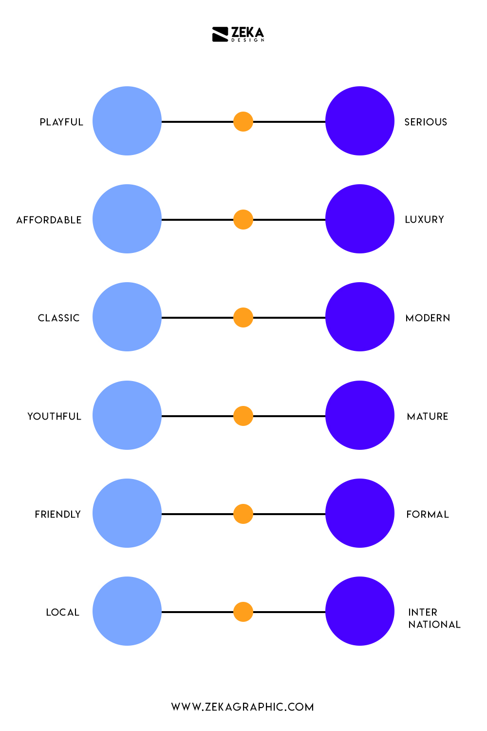
This point is directly related with the previous one, the brand essence stands for what is your company about, brand goals the main idea of your brand and how you want your target audience feel when looking at your brand colors. To make it more clear, if your product is organic you would like to use brown color to associated this idea with your product, but at the same time you also want to highlight the idea that your product is very energetic and that is how you will feel by using it, so you will opt for a yellow color, that is brand essence.
To create a solid brand essence you need to ask and answer these three questions.
Answering this question will make your brand essence more clear and the way your brand is perceived by your customers through brand colors will increase brand recognition and acceptance and the later association of your company with the color attributes.
Advertisment
The next step to set the brand colors for your company is research, now that we already know the meaning of the colors and what is the message our brand wants to transmit it’s important to find some color palette inspiration from different sources to know what color combination work well together and what your competitors are doing.
In this post, we already have seen the color theory, why brand colors are important and set up your brand identity now it’s time to create your company brand colors. There are many ways to pick your branding color scheme and all of them are valid, but it can be hard sometimes you can follow this Formula as a guide to make it easier for you.
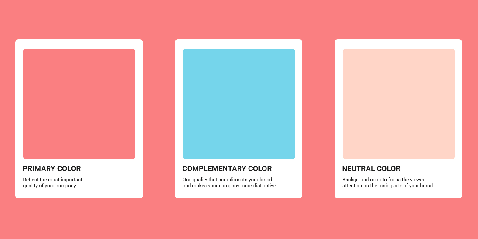
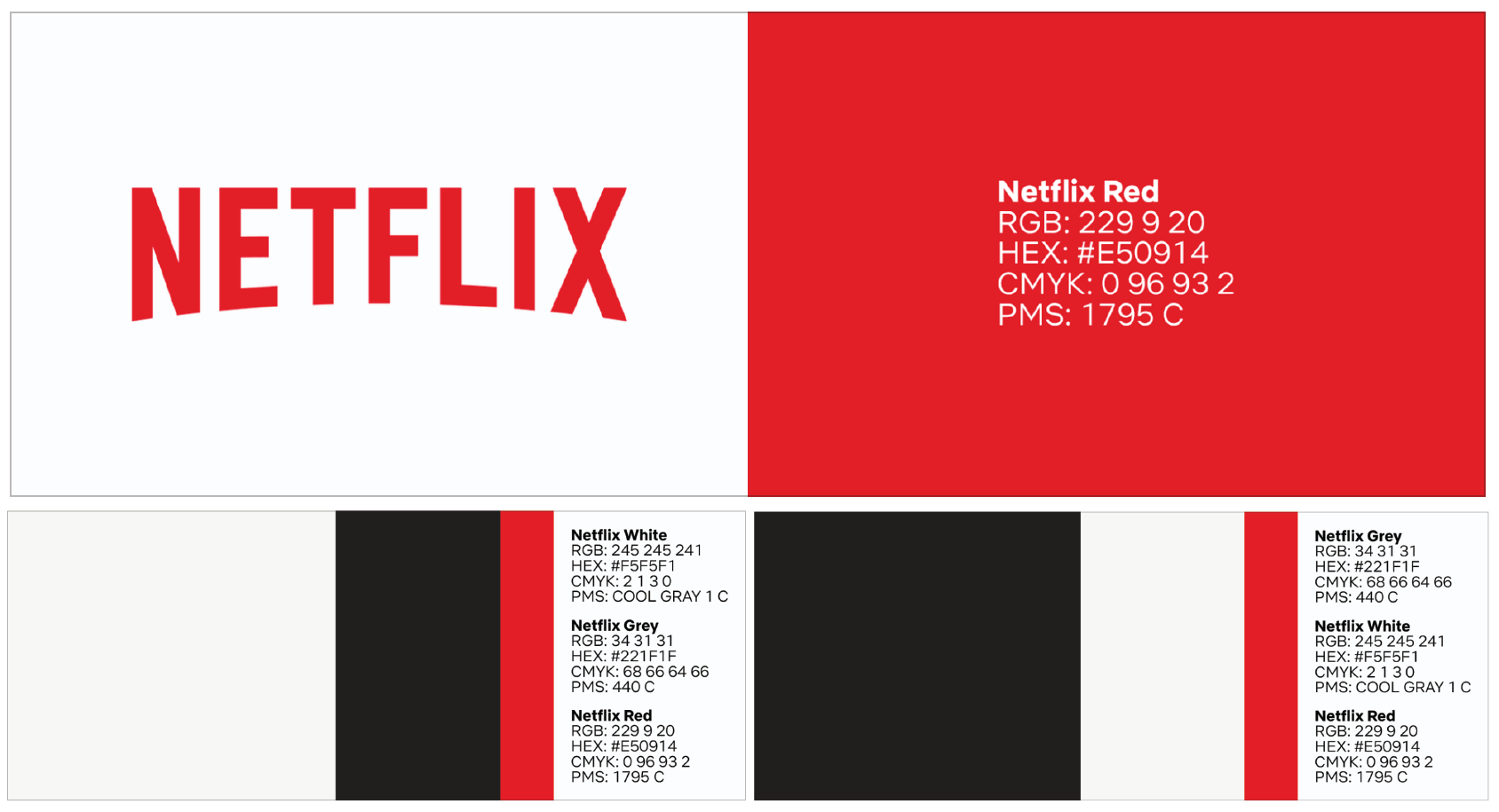
The first step is to pick up the first color, the primary color, as the name says this will be the most prominent color from your branding and it needs to reflect the most important quality of your company, think about what is the quality that makes your brand unique and the most dominant personality trait and pair it with one color that evokes that feelings, you also can play with different shades and tints of it to “create” a signature color for your brand as YouTube Red color or Facebook blue.
For a complementary color we will thing about one quality of your company that compliments the first one and makes your company more distinctive, for example if you have a clothing brand and you chose black as primary color to evoke sophistication but your clothes are organic made you can select green as complementary to reinforce that aspect of your brand.
According to color theory, there are three different ways you can choose a complementary color that visually will work with the primary one, and if you want to read more about color theory you can check this post!
Lastly but not least, you need to pick a neutral color that most likely be working as a background color and avoid viewers attention, that is why important to avoid choosing a bright color and instead you can choose different hues of gray, beige, white and off-white as neutral color and focus the viewer attention on the main parts from your brand.
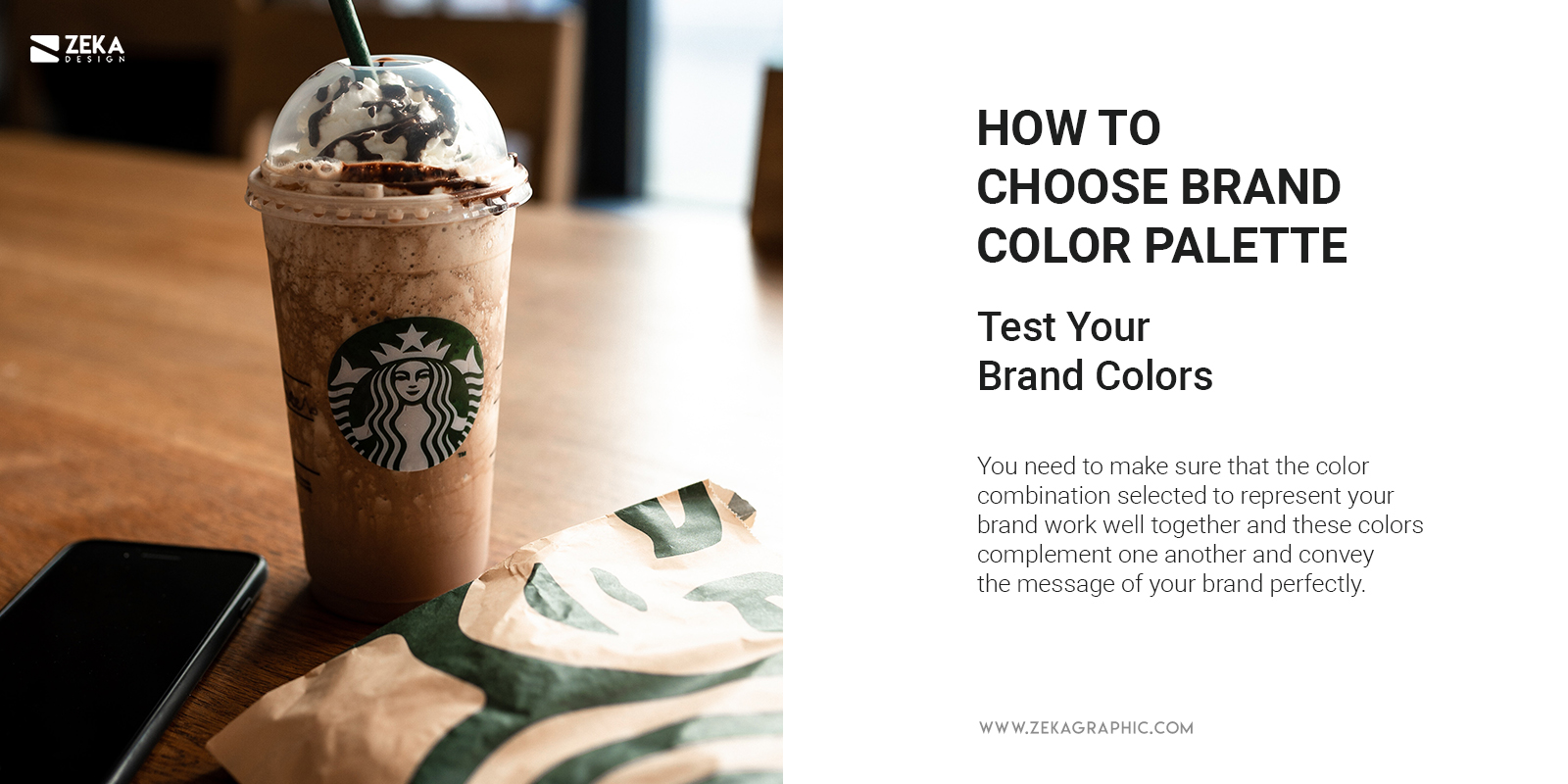
Now that we already have created our branding color palette it’s time to test it!, you need to make sure that the color combination selected to represent your brand work well together and these colors complement one another and convey the message of your brand perfectly. It also needs to be legible and accessible to different sources as printed images or online platforms as social media or web design.
Advertisment
On this post, you have learn everything about how to choose your brand colors, why they are so important, the color meaning and how to select your brand colors, and for the conclusion it’s important to make clear that colors are a visual way to communicate messages, and you need to use it to communicate your brand message and the most important elements of your company to convey this message in the less elements possible to make the viewer easy to process all the message in less time possible, this one of the most important qualities for a logo design and if you want to check the 7 qualities that makes a great logo design check this post!

If you found this post useful you might like to read these post about Graphic Design Inspiration.
Advertisment
Written by
If you like this post share it on your social media!


Advertisment

Advertisment