In this blog post, I am going to show you all you need to know about Color and color theory to help you to choose the best color palette for your designs, and yes, Color makes a huge role in Graphic Design because every Color has a meaning and transmit different feelings.
If you have seen any UI Design Project and you have thought of why the designer chose those colors, I will explain to you, they chose the primary color making research of what feeling they want to transmit with their design, but they need to choose more colors to work with their design, and those colors are chosen using the Color Wheel Theory because Not all colors work well together and it’s important to understand how Colors interact Together.
Advertisment
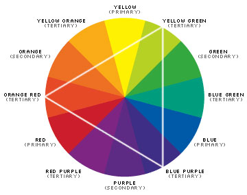
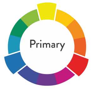
Primary colors are as I call it Prime Colors, and you can’t create primary colors by combining two colors together, and Primary colors are the source to create the other colors, so you need to think about Primary colors as Parent colors.
The three Primary Colors are
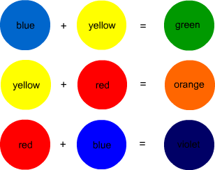
Secondary Colors are the colors created by combining two primary colors that can be the red, yellow and blue, and you need to have in mind that secondary colors only can be formed with the purest form of each primary color, and this term is known as a hue that we will see it later on this post, the three secondary colors are orange, blue and green.
You can create these three colors by combining these primary colors
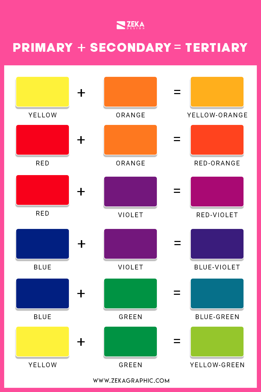
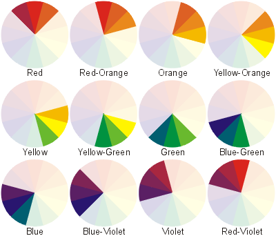
Tertiary Colors are the colors formed by combining a primary color with a secondary color, but not all primary colors can be combined with all secondary colors, you need to choose two colors that come next to them on the color wheel to can obtain a Tertiary Color.
Here You Can see All six tertiary colors and how to get them
Advertisment
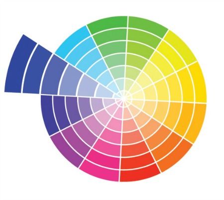
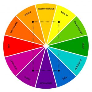
If you had studied Painting or any lesson related to art you might have seen the color wheel, which was created in 1666 by Isaac Newton in a schematic way to mix the different colors appropriately.
And what is the color wheel? A color wheel is a tool that helps you to combine appropriately the colors, and its represented by a circle formed by primary, secondary, and tertiary colors where you can see in a graphic way how the different colors interact with each other.
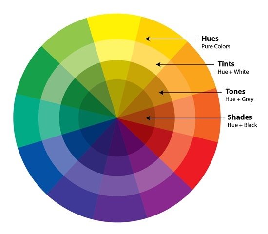
Hue is the word used to refer to the standard set of colors in their pure form and as you can find them on the color spectrum, the six primary and secondary colors have Hue, and not all colors have hue as white and black.
The shade is referred to the color that you get by adding black to any of the hues mentioned before.
A tint is the opposite of shade, and the tint is the color that you get by adding white to any hue, and any color has a range of shades and tints.
Tone and saturation are synonyms but usually, the tone is used for painting and saturation for digital images, and Tone or saturation is a color that results of mixing a pure color (hue) with any neutral/grayscale color including white and black, so by this definition, we also consider all shades and tints to be toned.
Advertisment
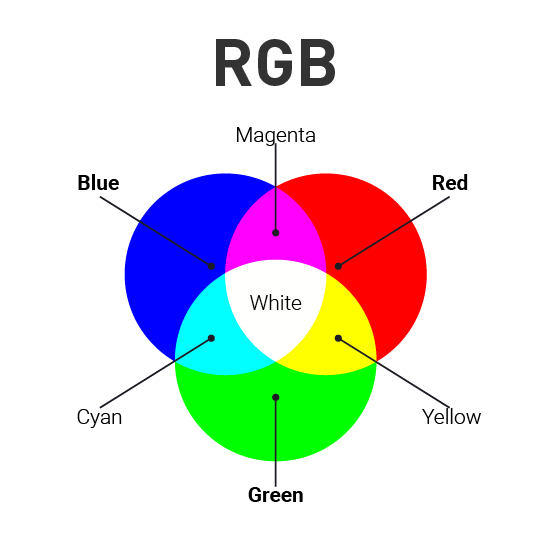
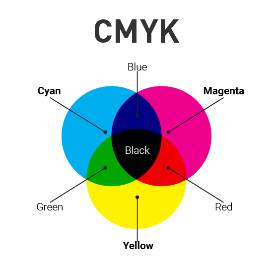
Once we already know the definition of primary, secondary, and tertiary colors and the color wheel theory, we need to understand that colors have two different natures, additive colors are tangible colors and subtractive colors that are produced by light. That is why you have heard about RGB and CMYK, now let’s explain these two color models.
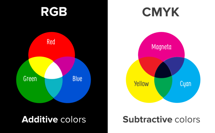
RGB Color model stands for Red, Green, and Blue and is mainly used for electronic displays including computers and smartphones, and is based on the additive color model of light waves.
RGB is created by using scales from 0 to 255 in three colors R, G, and B where 0 in all of them is the lack of light and that means the color black and where 255 is the complete light and the white color.
CMYK Color model stands for Cyan, Magenta, Yellow, and Key (Black) and it is the subtractive color model and that means that you get the colors by subtracting the light of it and it’s used in printing and that is why these colors are listed on your ink cartridge from your printer.
CMYK works on a scale from 0 to 100 on every color mentioned before, where all of them are on 0 that means that you didn’t subtract any light and you get white color, but where all of the colors are on 100 that mean that you have subtracted all the light and you get the black color.
Color harmony is an orderly and pleasing arrangement of the colors in design for users to feel more pleased and calm when they see the result because not all colors work well together and when you combine not harmony colors that give a feeling of chaos and disgust.
That is why is vital to understand how colors work together to make more attractive your design and now I will show you the best color schemes that are proved to work effectively.
The first color scheme is the easiest one because you can’t go wrong with combine different shades and tones from one color, and the monochromatic scheme as the name says combine different shades from one color to create an attractive design.
Analogous harmony scheme is based on combined colors located right next to each other on the color wheel, and this color scheme it’s used a lot when your design doesn’t need contrast and is used many times on web design and banners backgrounds.
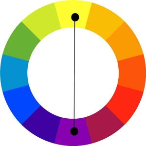
To create a complementary color scheme you need to combine colors placed in front of each other and this color scheme is used to create high contrast feeling in opposition to analogous and monochromatic schemes.
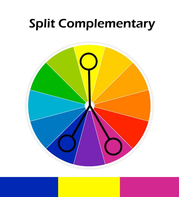
Split Complementary color schemes is also used to create contrast feeling in your design but this color scheme uses three colors instead of two as complementary, and you need to choose one color and pick the other two who are adjacent to its opposite color, split complementary color scheme allows you to use more colors in your design and create a soft contrast.
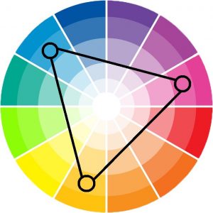
On Triadic color scheme, we use three colors which are equidistant on the color wheel, but when you use this color scheme it’s important to use one color as dominant and the other two as accents to save the balance, and this color scheme is used when your design needs more colors.
Tetradic or double complementary color scheme is the most complex color scheme to use because it uses four colors that are complementary pairs from the color wheel, this color scheme is hard to use because is difficult to balance all the four colors, but when you if you can harmonize this color schemes the results are really beautiful and your design looks very professional.
Advertisment
Now as we already know how colors are formed and how to combine them properly we can talk about the meaning of every color to help you choose what color express better your ideas for your graphic design project, let’s start!
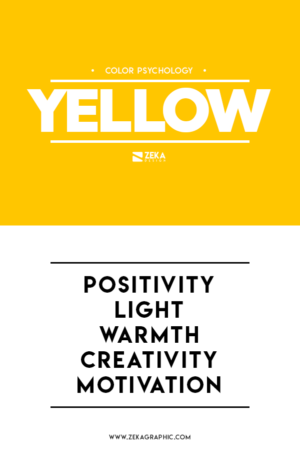
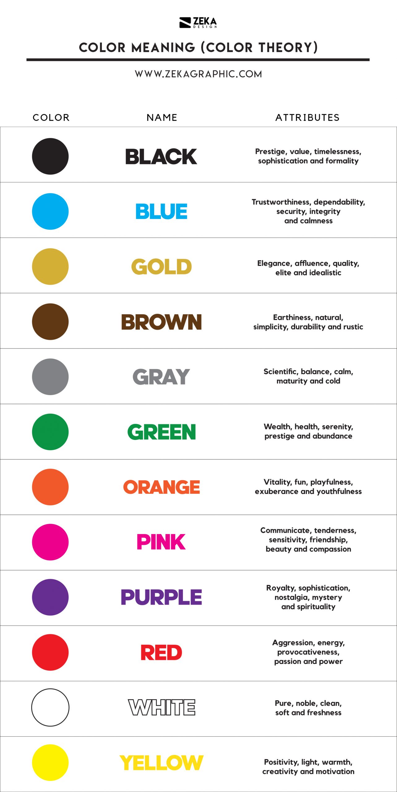
Yellow communicates hope and optimism and it’s perfect to catch the customer’s eye due to its brightness and yellow also stimulates creativity and energy.
It’s used to transmit positivity, light, warmth, creativity, and motivation.
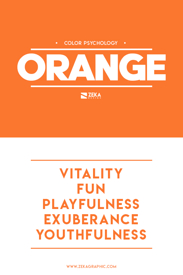
Orange is a mix of red and yellow, combining the brightness and cheer from the yellow color with the energy and boldness from the red, that combination makes orange color full of life and exudes plenty of excitement.
Color communicates vitality, fun, playfulness, exuberance, and youthfulness.
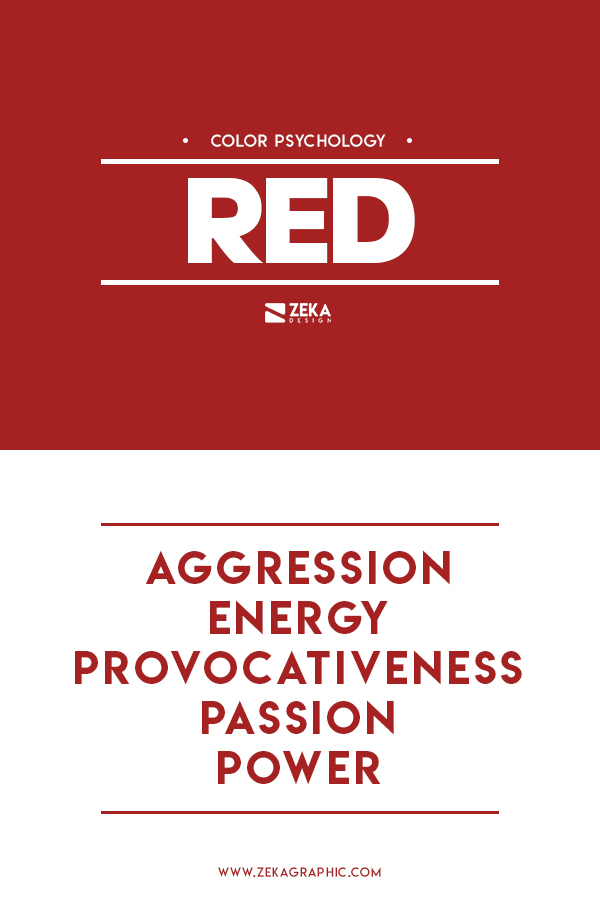
Red is a really special color because it transmits a passionate feeling and visceral response, this color increases your heart rate and breathing heavily.
Red Communicates aggression, energy, provocativeness, passion, and power.
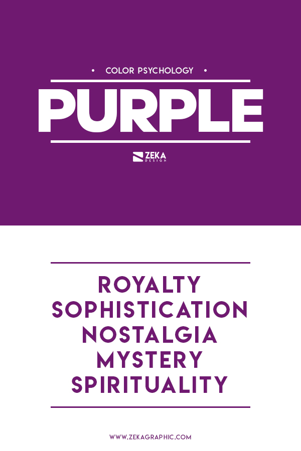
Purple color is a really sophisticated color that transmits elegance and it used to symbolize royalty through history.
Purple Communicates royalty, sophistication, nostalgia, mystery, and spirituality.
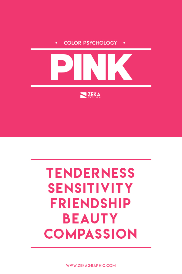
Pink is a really affectionate color that is used to transmit sensitive feelings and it’s often related to beauty.
Pink communicates, tenderness, sensitivity, friendship, beauty, and compassion.
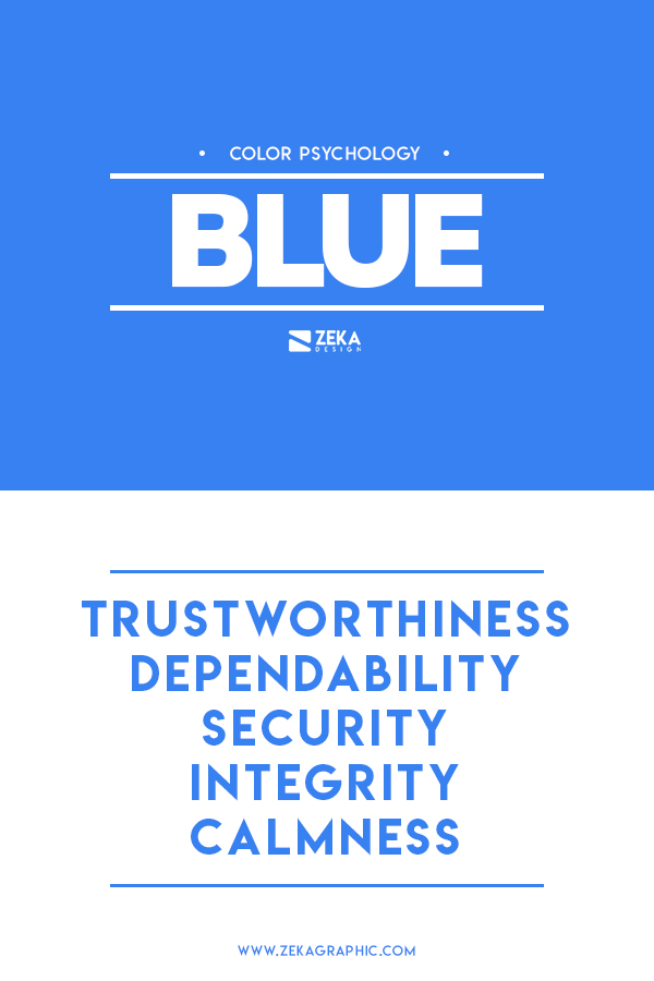
Blue it’s the king of the colors due to its popularity and many brands have used this color for their brand colors, and blue it’s often related to the sky and the ocean, and it’s very popular in brand creation and identity.
Blue communicated trustworthiness, dependability, security, integrity, and calmness.
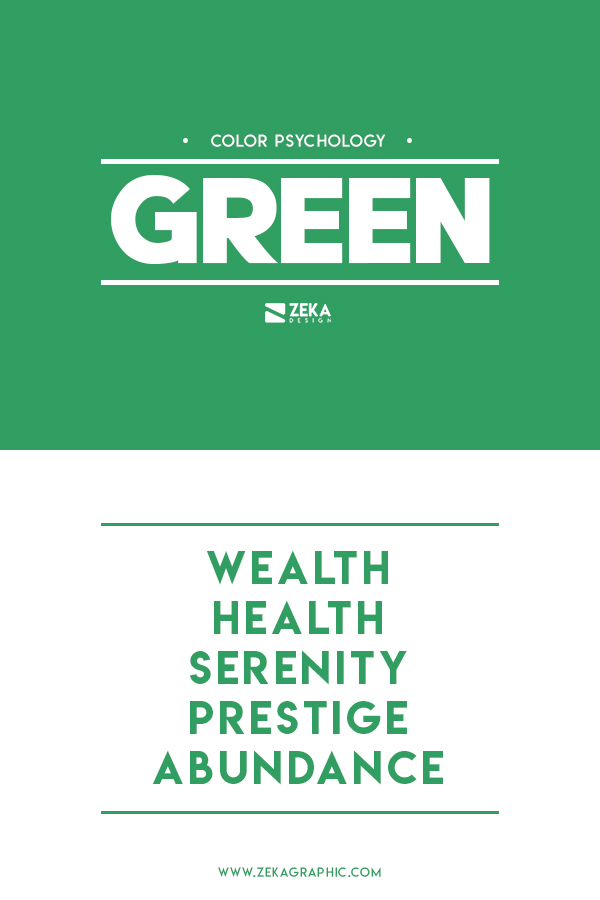
Green is often used to transmit calm, freshness, and health that is why many health products and natural products use green for their brand identity.
Green communicates wealth, health, serenity, prestige, and abundance.
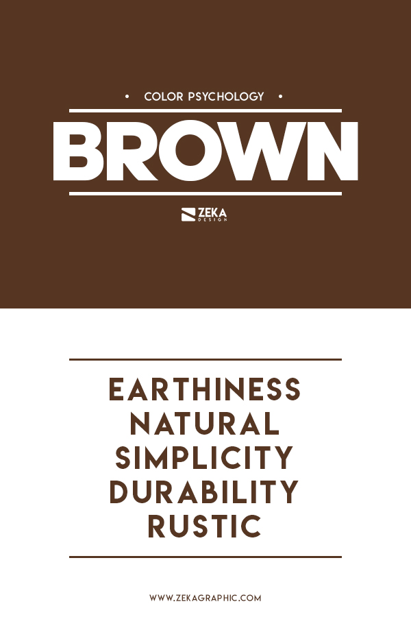
Brown, it’s not a very popular color because it can be associated with dirt, but that is not true, because brown transmits strength and durability and it’s often related to the earth.
Brown communicates earthiness, nature, simplicity, durability, and rustic.
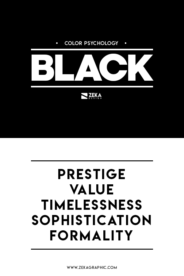
Black is also a really popular color for a brand and especially with a Clothing brand because black color evokes classic sophistication and simplicity and it is usually used to promote luxury.
Black communicates prestige, value, timelessness, sophistication, and formality.
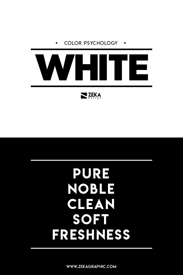
White is a very popular color for brand identities of medical, bridal, and laundry industries because it represents purity and cleanliness.
White Communicate pure, noble, clean, soft, and fresh.
Gold like black color symbolizes prestige and luxury and it’s why many luxury brands use gold for their brand identity, and it’s usually associated with royalty and refinement.
Gold Communicate elegance, affluence, quality, elite and idealistic.
Gray and silver colors are used in different industries because these colors evoke everything from balance to simplicity, cold temperatures, innovation, and science.
Gray Communicate scientific, balance, calm, mature, and cold.
Advertisment
Hope you find this post useful and learn how to use color theory in graphic design and why is so important to understand how different colors work together to create beautiful and harmonious color combinations, and if you want to learn more about color theory or graphic design you might be interested on these posts.
If you found this post useful you might like to read these post about Graphic Design Theory or Color Inspiration.
Advertisment
Written by
If you like this post share it on your social media!


Advertisment

Advertisment

Advertisment