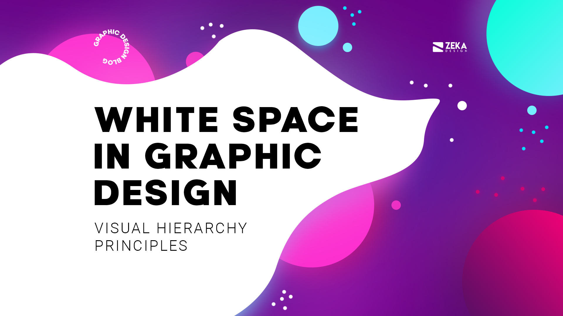
Spacing is one of the key visual hierarchy principles in graphic design used to focus on certain elements of the design layout giving them space to breathe, in this article I will show you how to use Space in Graphic Design.
One of the key graphic elements used to create space and make your design elements breathe is Negative Space or White Space, it’s a popular design technique also used for minimalist graphic design to maintain the design composition clean with limited elements.
Advertisment
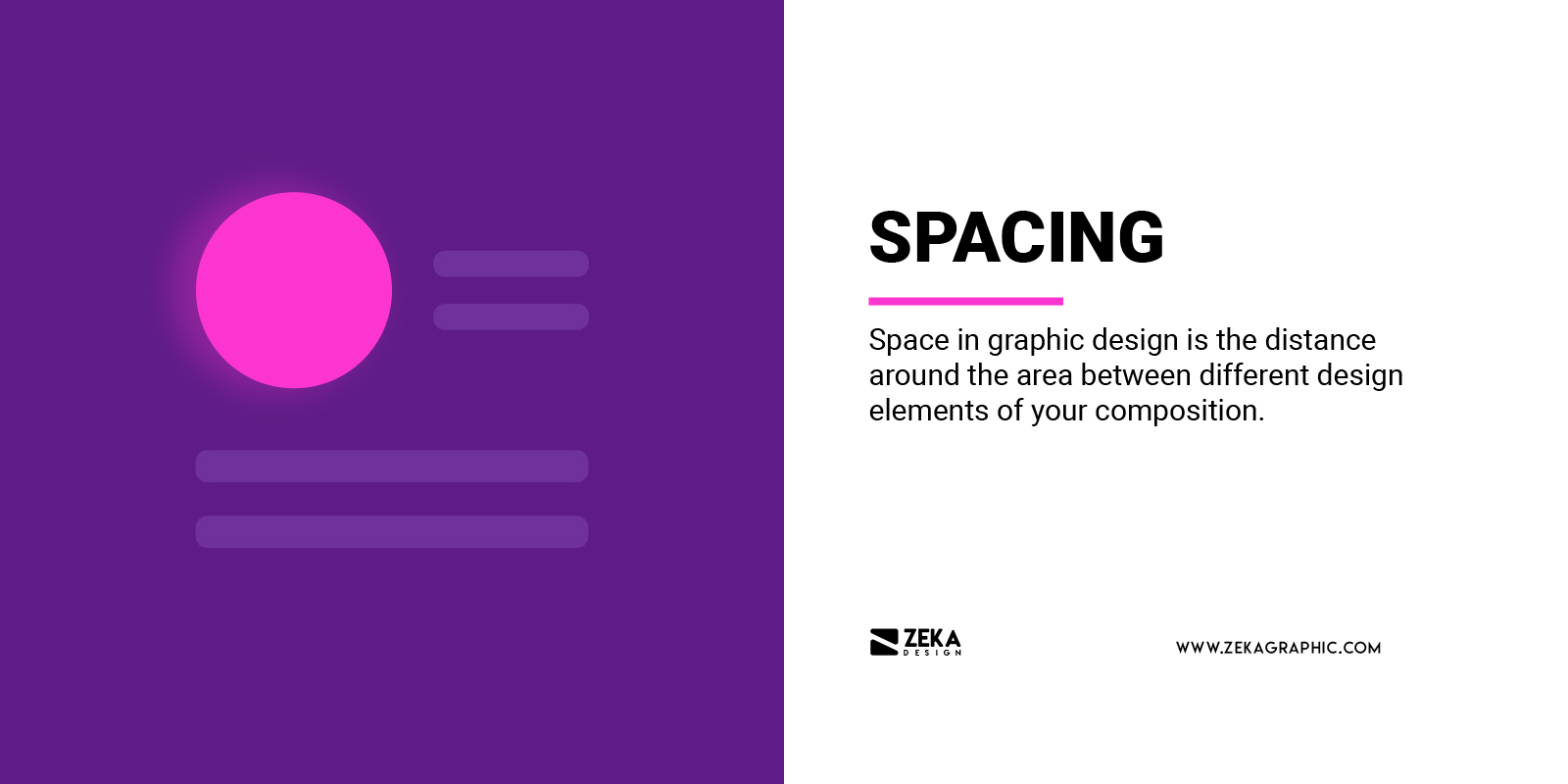
Space in graphic design is the distance around the area between different design elements of your composition, and to make it clear with an example, put an image into a page, and space refers to the area that doesn’t contain the image, also known as white space or negative space.
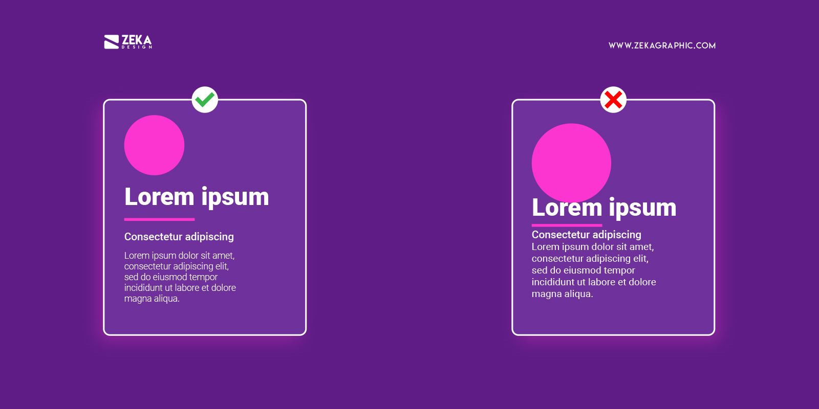
In graphic design space is used to separate or connect elements in your design layout, adding wide space creates emphasis on the difference between different graphic elements of the composition and by adding more narrower space between them creates more relationships between the elements.
Depending on the use of spacing techniques in your design layout it can help your design convey different meanings as quality, solitude, cleanliness, purity, spirituality, openness and calmness.
White Space, negative space or blank space in graphic design refers to the space between each graphic element of your composition and it can have any color, texture or patterns and it’s used by graphic designers to make breath each element of the design layout and create emphasis on certain elements of the composition.
White space is used by designers to create a visual hierarchy among the graphic elements to help the viewer scan the design and easily identify the focal points, by adding white space in your design it also increases the legibility and readability of your text and negative space can help you to create a minimalist design style.
Advertisment
Now that we already know what is white space about and how it can help to create a visual hierarchy in our design, let’s see how we can use it, but first we need to identify the different types of white space in graphic design.
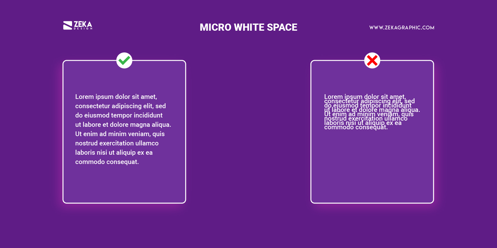
When we are talking about micro whitespace we refer to the small space between graphic elements as letters, text lines, paragraphs, buttons and icons.
Micro white space is usually used in paragraphs to improve the content legibility and help the viewer to read faster the text with better comprehension thanks to adding margins to it as if the text goes outside the paragraph’ it will make it harder to read for the viewer.
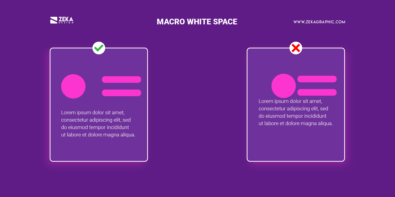
Macro white space in graphic design refers to the space between bigger graphic elements of the design composition as text columns and graphics.
Unlike Micro White Space, macro white space acts like a big picture white space helping as a container of the overall design as it is used as a major design layout element to emphasize different parts of the design composition.
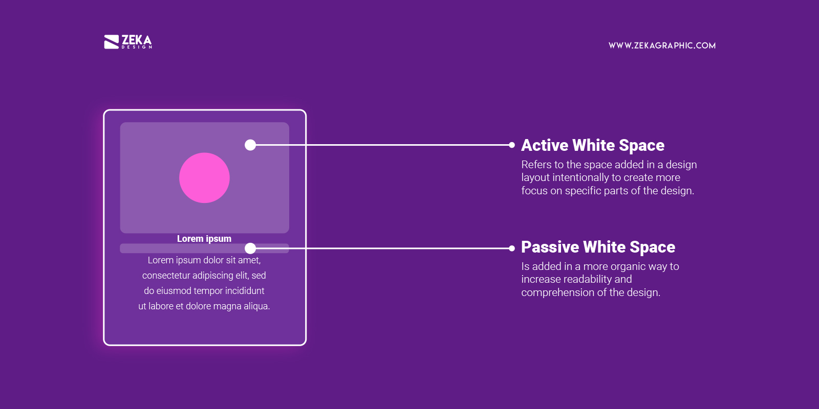
Active White Space refers to the space added in a design layout intentionally to create more focus on specific parts of the design or content from the design, it’s called active white space as the main function of it it’s to be noticed and create emphasis on specific elements.
On other hand, passive white space is added in a more organic way between words, lines or the blank space around a logo design, and in most cases it goes unnoticed as the main function of the passive white space is to increase readability and comprehension of the design.
Advertisment
White space or negative space is a really important design element used to create visual hierarchy in our design layout and can make the difference between a good design vs average design, let’s see some benefits of using correctly white space in your design composition.
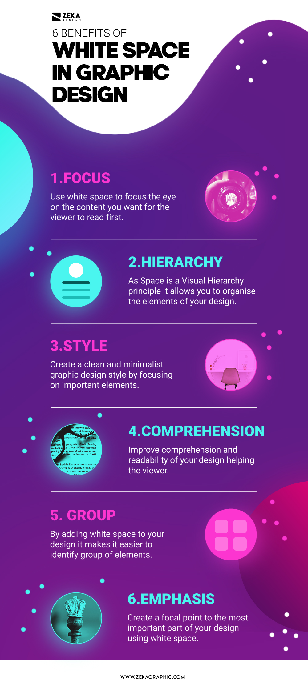
The correct use of negative space in your graphic design layout can make it easier for the viewer to identify the important elements of it, so we can use white space to focus the eye on the content we want for the viewer to read first.
As space is a visual hierarchy principle it allows white space to create hierarchy among the design elements present in our composition, making our design project easier to understand and it helps to build an eye path for the viewer to follow the content ideas in order.
As mentioned earlier on this post, white space is key design elements for different styles as it can help your design look more luxury, minimalist, premium or modernist by using the negative space and is a key principle for minimalist design style which you can read more on this post.
Many luxury brands know the power of white space in graphic design as they add a lot of negative space on the presentation of their products to give all the focus on them creating a simple design where the focus is the product adding him premium quality traits.
Minimalism is always a trend in graphic design and it’s always associated with modern style, that is why many brands that want to be perceived as modern make a huge use of negative space on their designs creating very clean graphic design layouts.
White space is a key element for graphic designers to improve comprehension and readability in a text, especially is used micro white space for that purpose as there studies that says that good use of white space between lines and correct margins can increase the comprehension of a text up to 20%.
By using white space in a graphic design layout makes it easier for the viewer to identify groups of elements and make a logical order. By adding negative space to a design composition we can easily differentiate different parts of the design that can include images, text or branding elements.
Lastly but not least white space is used in graphic design to add emphasis to certain parts of the design making that part easily identifiable and clearly visible by adding more space, for example think about logos, adding more space around it helps to add more focus on your brand.
Advertisment
This Post Contains Affiliate Links
If you want to master the use of white space in graphic design and learn more design tips I recommend these books that will help you learn more about negative space and basic graphic design principles.
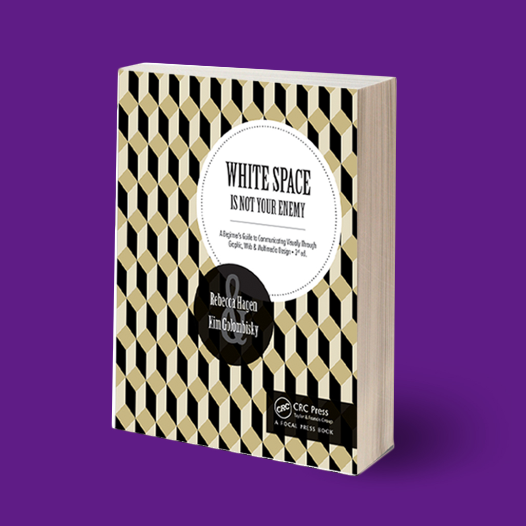
This book written by Kim Golombisky and Rebecca Hagen it’s the perfect practical graphic design and layout guide to introduce yourself to basic design concepts to create effective visual communication. With this book you will learn basic principles of design, work with color and basic typography design among other subjects.
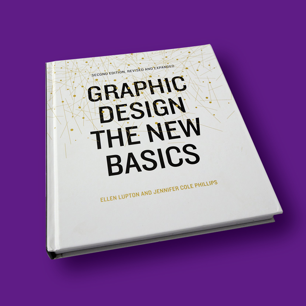
Graphic Design: The New Basics is a perfect book to learn key concepts of visual language and fundamental graphic design principles that can be used in logo design, letterhead and web design. Some of the topics you will see in this book are Hierarchy, Used of Grids, Layers and Rhythm and balance in graphic design among others.
Advertisment
As we saw during this article space and white space is a key principle of graphic design that can make your design look more professional and clean, so don’t be afraid to use negative space as another graphic element through your design and apply the design tips commented on this post.
If you find this post about space in graphic design and want to know more techniques to create visual hierarchy through your design I recommend you my post about visual hierarchy principles or these other posts where I talk about other principles of design.
If you found this post useful you might like to read these post about Graphic Design Inspiration.
Advertisment
Written by
If you like this post share it on your social media!


Advertisment

Advertisment