Visual Hierarchy Principles in Graphic Design

10 Visual Hierarchy Principles in Graphic Design Complete Guide

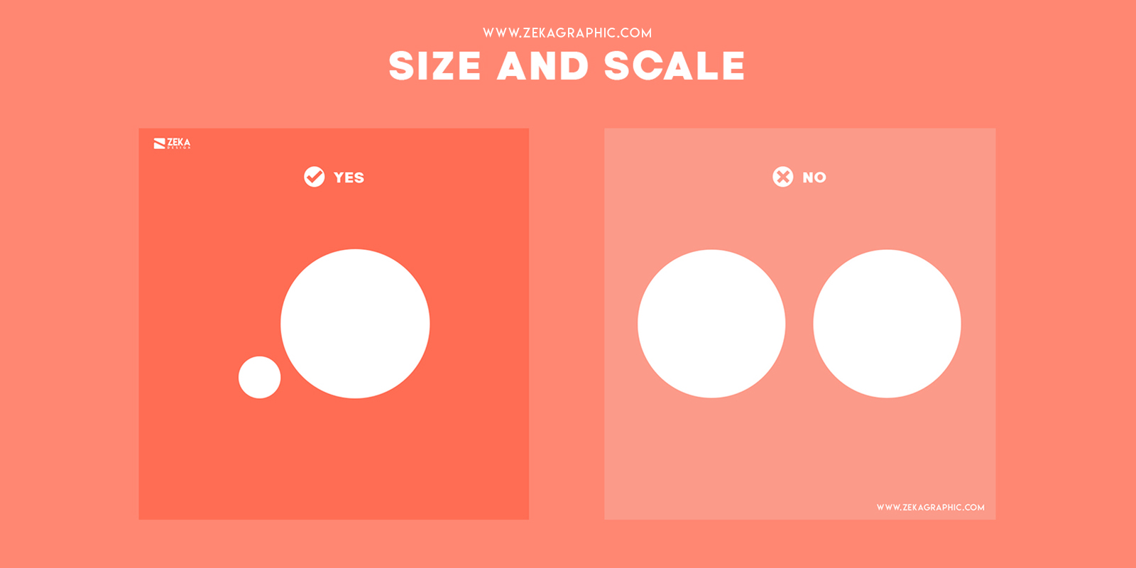
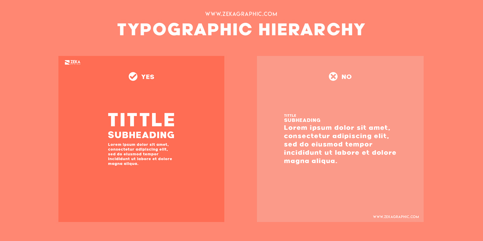
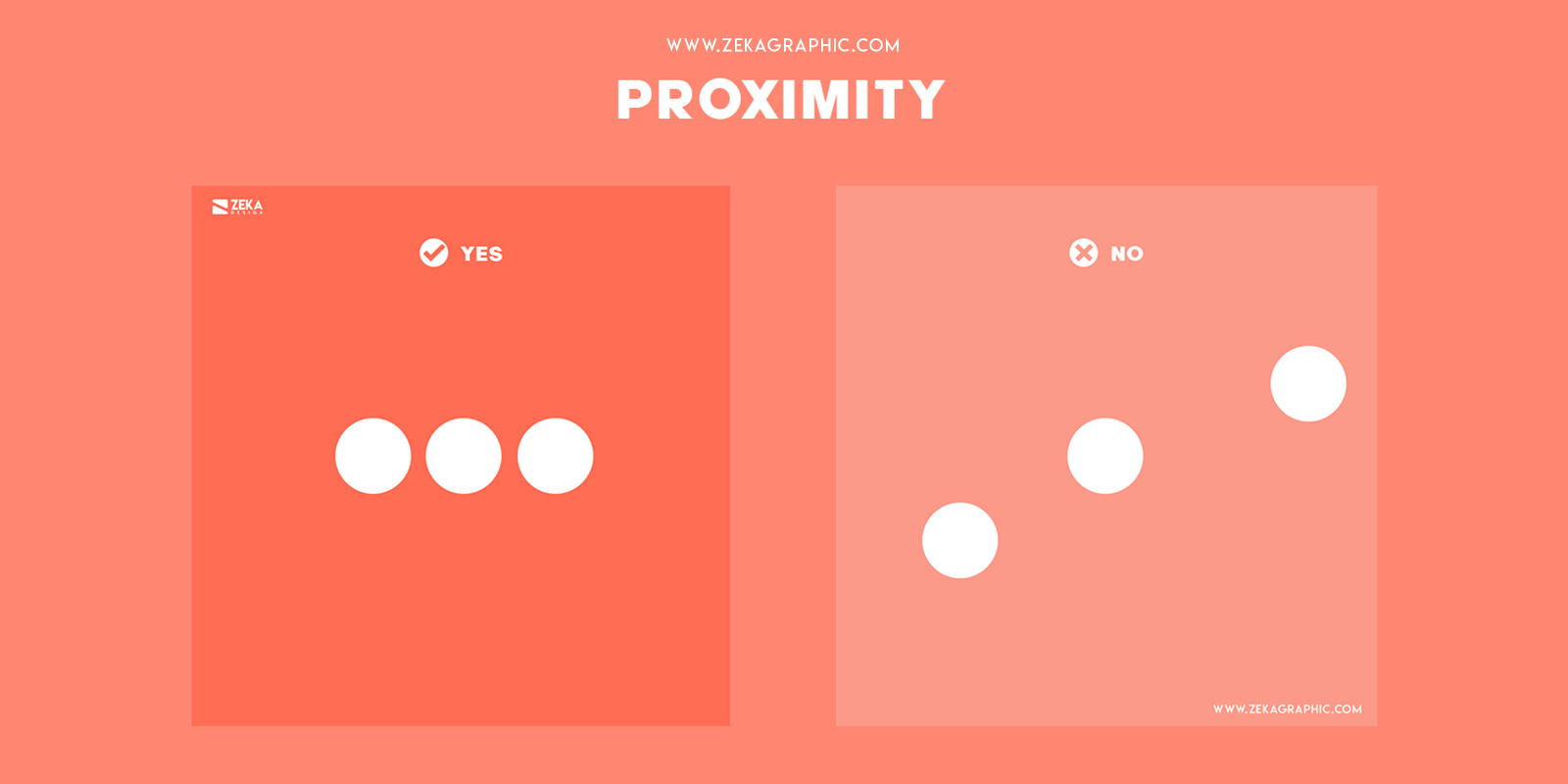
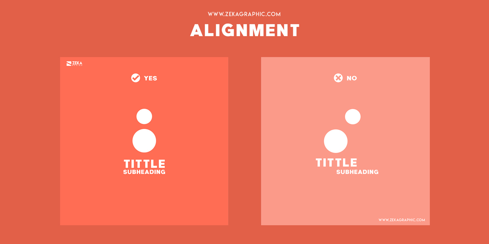
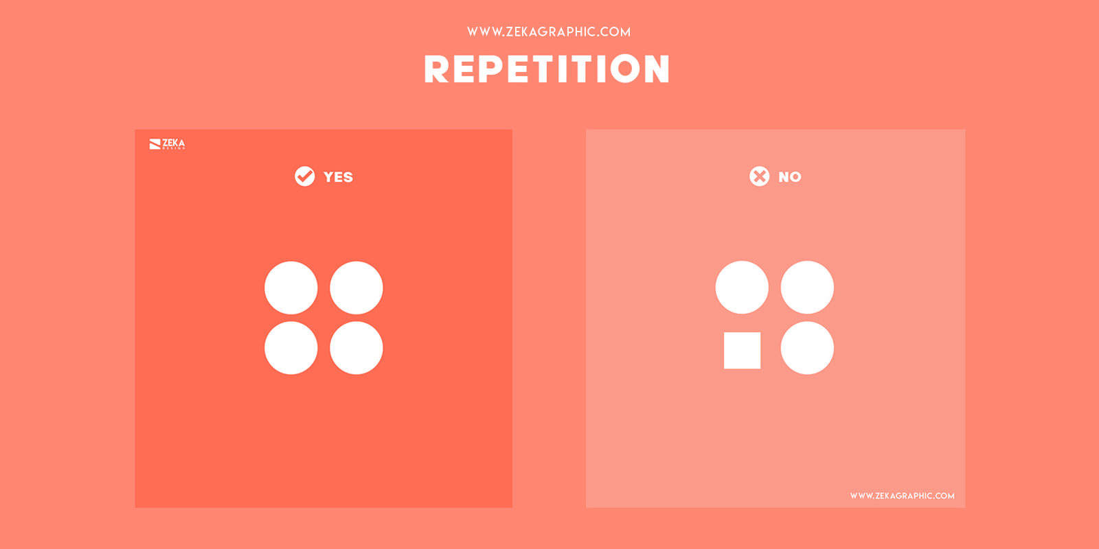
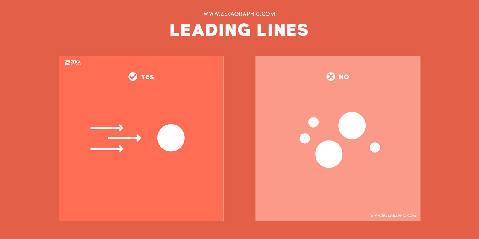
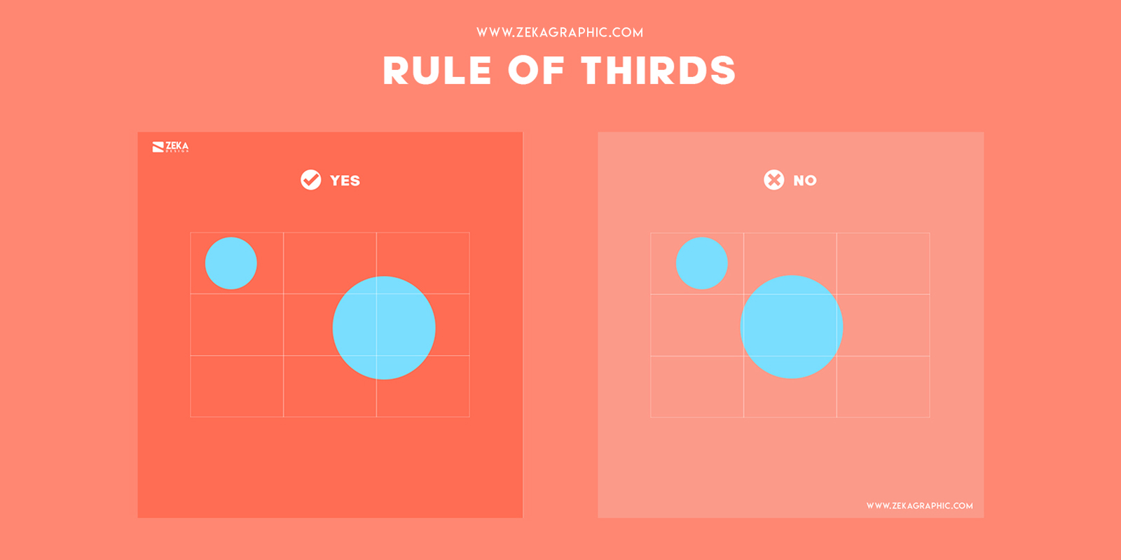
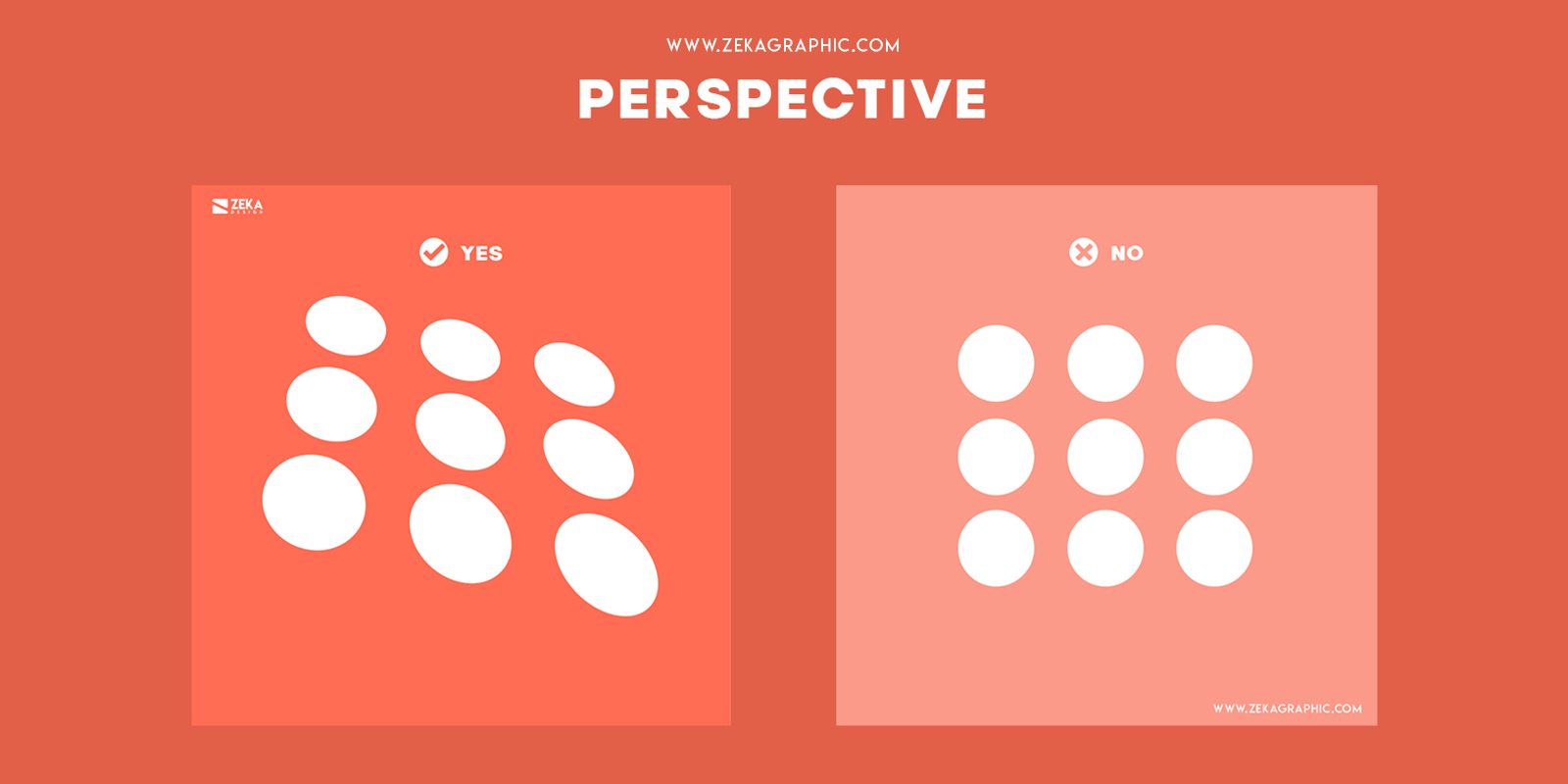
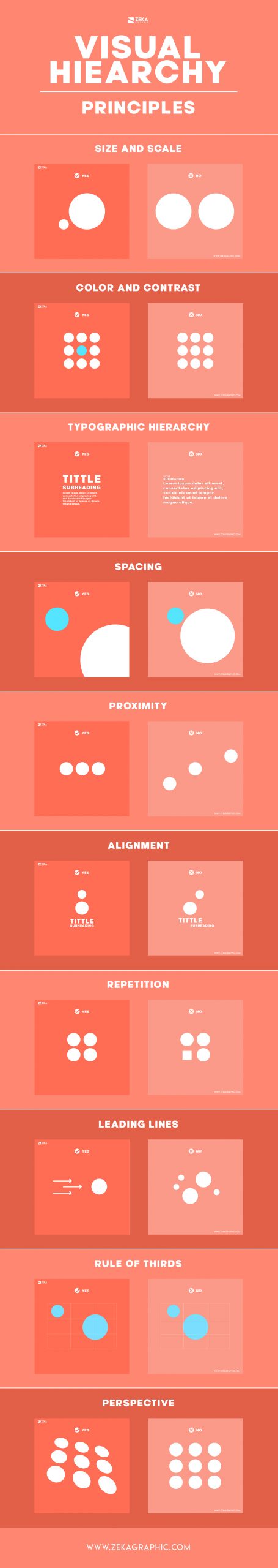
Visual Hierarchy in Graphic Design is the way we arrange all different graphic elements from the composition and create a visual order depending on their importance, being the most important information the first we saw in the design.


The average time people spend watching any design is 8 seconds, so that’s why visual hierarchy is important, we need to have in mind this time when creating a design and structure correctly all elements depending on their importance to give the viewer the main information.

Advertisment

1. Size and Scale

In graphic design Scale and proportion as design elements refer to the size of one graphic element in relation to another graphic element in design or artwork. Size and scale are one of the core principles of graphic design, and they can affect on the meaning of your design and it can help the viewer to identify easily the most important elements from your design and focus on the main information.

Size and Scale Visual Hierarchy Principles in Graphic Design

2. Color and contrast

Color is one of the key elements of Graphic Design and I have a single post dedicated to color and a full guide of color theory here!. Talking about visual hierarchy color and contrast is used in a design composition to drive the viewer’s attention to specific graphic elements through contrasting color palettes where the most important elements use brighter color.

Color and Contrast Visual Hierarchy Principles in Graphic Design

Advertisment

3. Typographic Hierarchy

Typographic hierarchy in graphic design is a system used to organize in a visual way using typography the order of importance of the information shown in the design, where the title will be the most important element, and it will be bigger than the body text, and that will help the viewer to easily identify the main topic of the design.

Typographic Hierarchy Visual Hierarchy Principles in Graphic Design

4. Spacing

Spacing in the visual hierarchy is used to give all your graphic elements in design more space and room to breathe, and this will make it easier for the viewer to identify all objects in your design and order them by importance.

Spacing Visual Hierarchy Principles in Graphic Design

5. Proximity

Proximity is one of the basic graphic design principles and proximity rules in the visual hierarchy are say that things that are related should be nearer to each other, and things that don’t have any relationship should be placed further from each other in your design composition.

Proximity Visual Hierarchy Principles in Graphic Design

Advertisment

6. Alignment

Alignment in Graphic design refers to placing graphic elements and text on a page that line up with your composition. Alignment helps you to organize your design elements and create a visual connection and make the viewer easier to detect the most important information from your design and improve the readability of it.

Alignment Visual Hierarchy Principles in Graphic Design

7. Repetition

Repetition in graphic design refers to a process of repeating different graphic elements from your design and place them through the design composition to give a more unified look to it and adding more consistency to your design.

Repetition Visual Hierarchy Principles in Graphic Design

Advertisment

8. Leading lines

Lines in graphic design are one of the basic graphic elements and they are marks used to connect two different points, in the visual hierarchy we use leading lines in the design to direct the viewer’s eye and control their attention using lines.

Leading Lines Visual Hierarchy Principles in Graphic Design

9. Rule of thirds

The rule of thirds in graphic design is a common technique designer and it consists in divide the design into three rows and three columns, and where the vertical and horizontal lines meet is where the focus points in your composition should be placed, by doing this technique helps to make more striking effect to the viewer.

Rule of Thirds Visual Hierarchy Principles in Graphic Design

10. Perspective

Perspective in graphic design refers to the three-dimensional effect given to a flat image as design composition and designers can use this technique to create an illusion of depth and in visual hierarchy objects closer to you drive more attention.

Perspective Visual Hierarchy Principles in Graphic Design

Advertisment

Conclusion and Visual Hierarchy Infographic

Hope you find this blog post about visual hierarchy useful and help you to create better graphic design projects and learn how to focus the most important elements from your design. If you want to learn more about visual hierarchy principles you can check these articles.

Visual Hierarchy Graphic Design Infography Zeka Design

If you found this post useful you might like to read these post about Graphic Design Inspiration.

Advertisment

Written by

If you like this post share it on your social media!

Share on facebook
Share on twitter
Share on pinterest
Share on vk
Share on telegram
Share on whatsapp
Share on linkedin

You Might Be Interested On These Articles

Latest Post