In this blog post I will show you the top 10 best and more creative football logo design, on this top I wanted to choose football teams from all around the world and some of them are not very known outside their countries, but their crest design is very good, creative or unique that is why they are on this list.
Advertisment
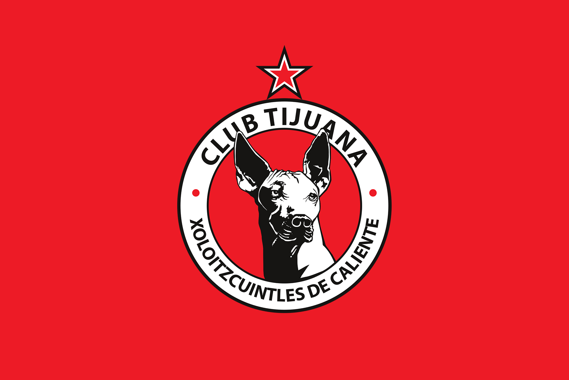
Club Tijuana is a football club from Mexico Founded in 2007, and the color palette from this Logo includes Red, Black, and White colors it, but the most special part of this logo is the dog as the main part of the logo.
And this dog breed is called “Xoloitzcuintles” and it’s an endemic breed from Mexico with more than 3000 years of history, this breed of dog is very important for Aztec and Mexican culture that is why the club wanted to portray this dog on his badge.
What makes this Logo Design so good is the illustration of the dog really well done and how the colors work together to give high contrast between the illustration on black and white and the red background.
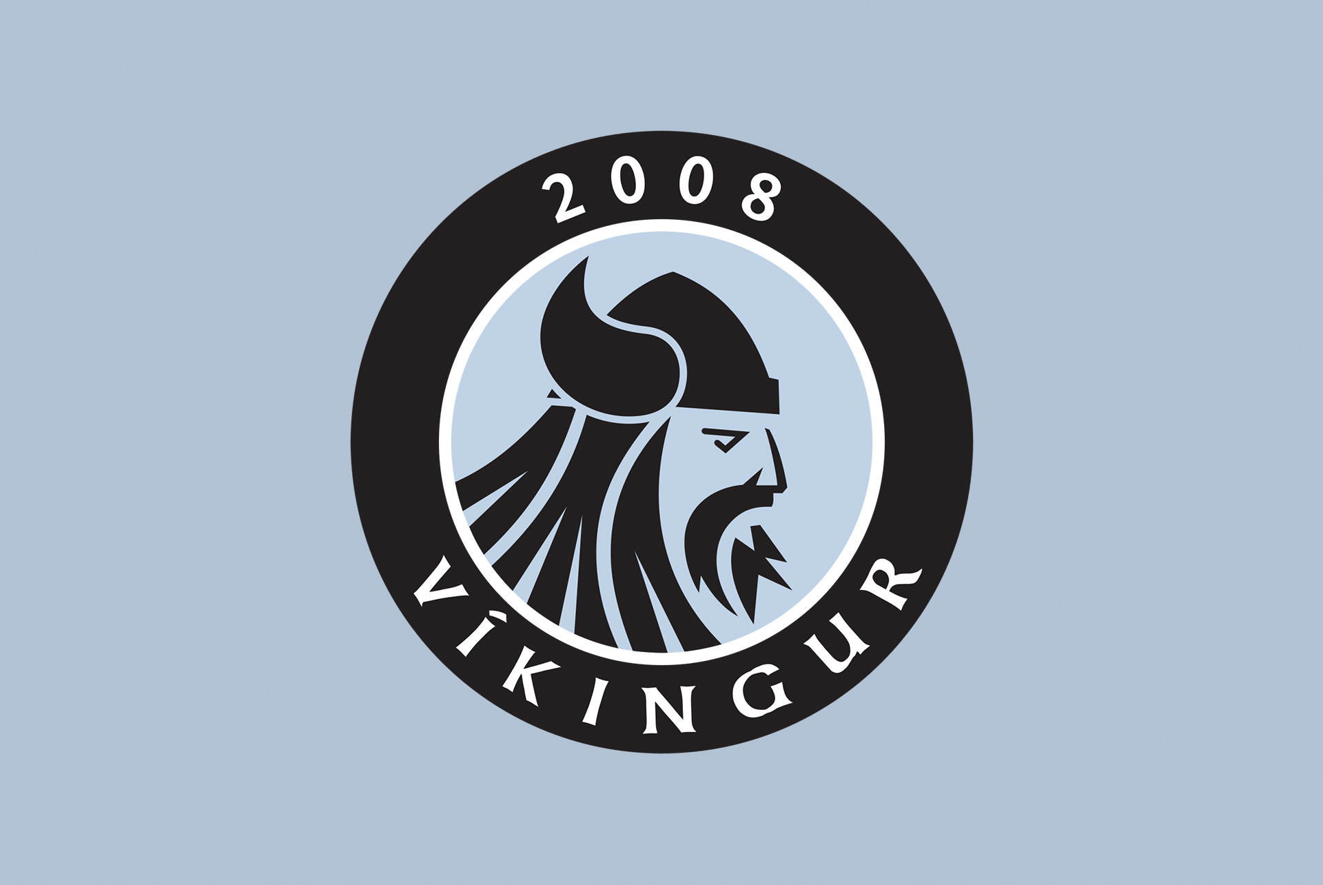
Vikingur Gota is a Football Club from Faroe Island formed in 2008 by the merge of two football clubs, GÍ (Gøtu Ítróttarfelag) and LÍF (Leirvíkar Ítróttarfelag), as the newly formed club was in need of a new logo they create a contest to design their new badge.
The winner of this contest was a Graphic Designer called Bardur Mikkelsen and he created a circular logo where we can see the year of foundation and the club’s name, but the most important part is the central elements which is an illustration of a Viking in a minimalist style using one color. The color palette used for this logo is Periwinkle, Black, and White.
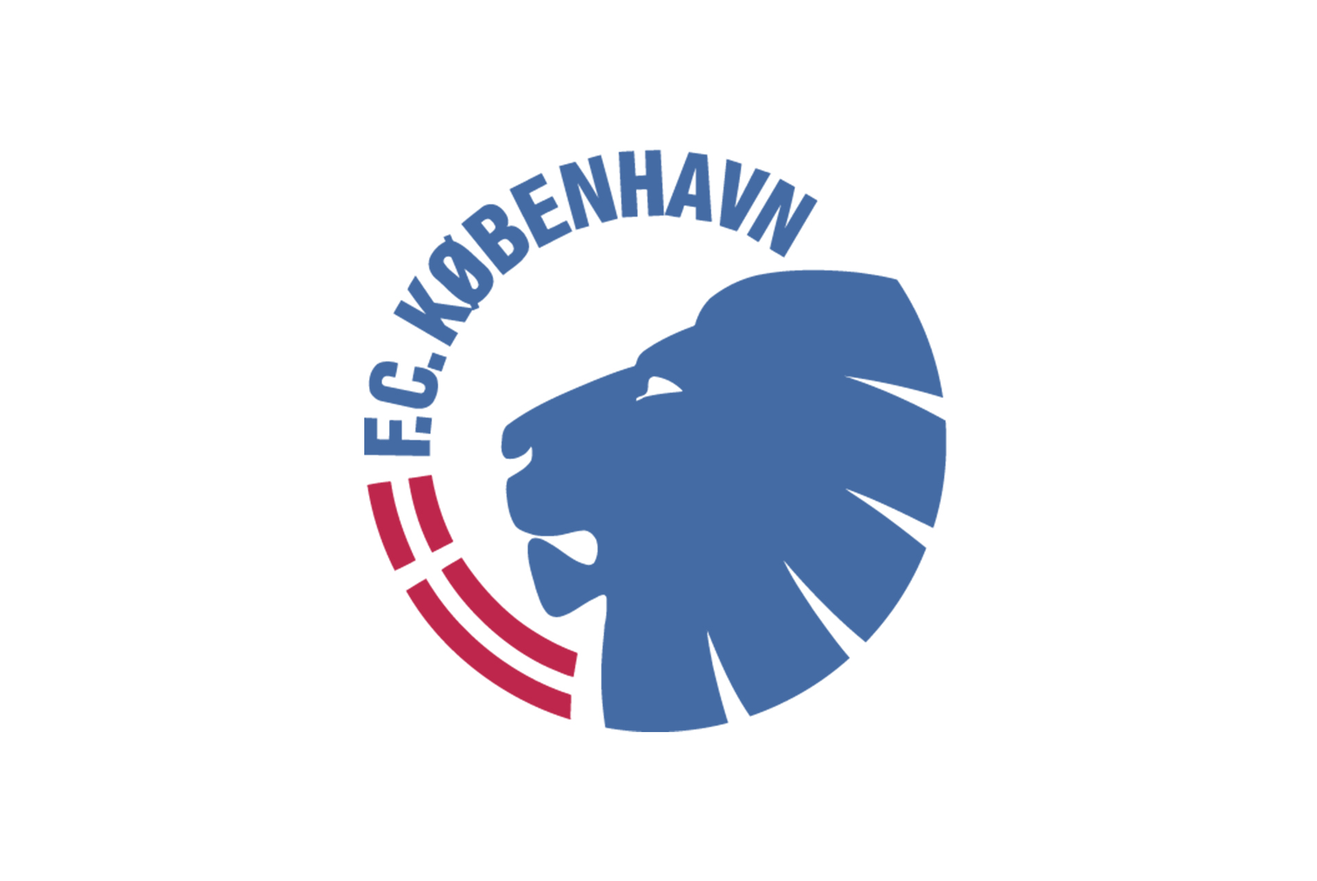
F.C. Copenhagen is the football club from the city of their name and plays in the Danish Super League, the club was formed by the merge of two already existing clubs in Copenhagen Kjøbenhavns Boldklub, and Boldklubben 1903 to focus the fandom of the city on one Club.
The actual Logo of F.C. Copenhagen was made in 1992 and the first logo design was inspired by Thorvald Bindesbøl who also worked in Boldklubben and was responsible for Carlsberg’s logo design, a company ho have a long-standing affiliation with the football club.
The Copenhagen Football Club plays in white, blue, and red colors and these colors also were reflected on the Color Palette of the Logo Design, and the club nickname is The Lions, which it was represented on the Logo Design of the Club. What I really like about this Logo Design is that is a really Minimalist Logo Design using only the important elements and iconography of the Club.
Advertisment
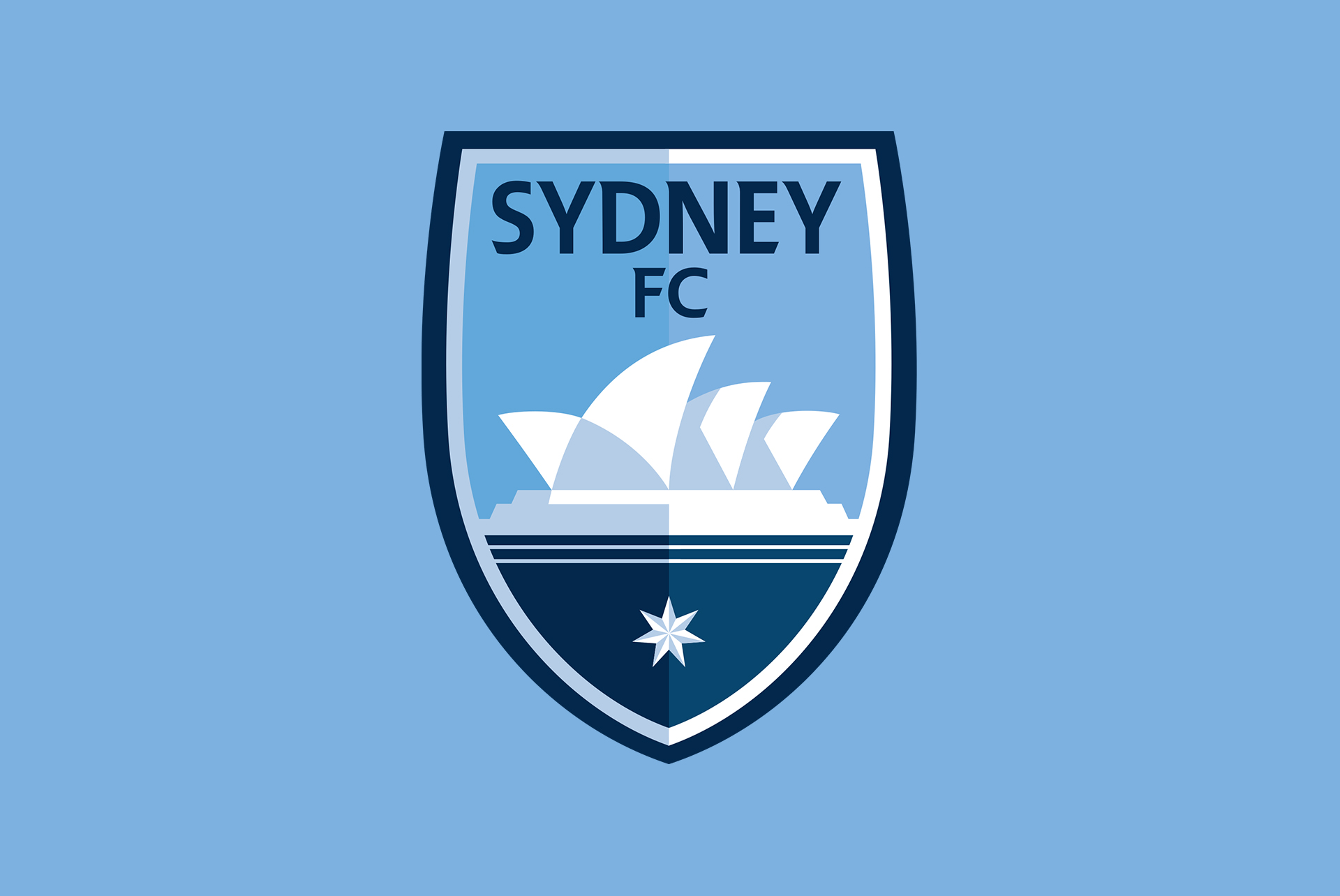
Sydney Fc is a football club from the Australian League founded in 2004 but their actual logo design was released in 2017 after a Brand and Identity rebrand of the football club.
This new logo design uses a really beautiful color palette with Sky Blue, Dark blue, and white colors and it portrays a really iconic spot of the city as the Sydney Opera House. What makes this logo design a really good rebrand is the fusion of the modern and minimalist graphic design style with the classic football crest shapes.
The process of creating this new Logo Design for the club involved Graphic Designers, The Charmain, Football players, and fans of the club and they achieved a really good crest design.
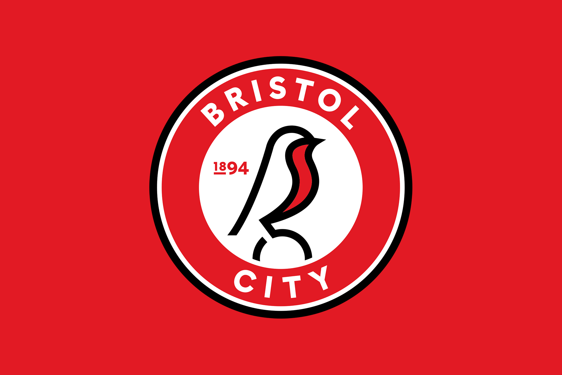
Bristol City is an English Football team that is playing on Championship, the second tier of the professional football league, and in 2019 they release a rebrand from their Logo Design and Brand and identity design made by Mr. B and Friends, a Graphic Design agency based on Bristol.
The Previous Logo Design was an interpretation of Bristol’s coat of arms which belongs to the city and Bristol City Football Club was lacking its own identity, the creative process on this Rebranding project involved the Design Agency, Club Staff, and Bristol City fans.
After they research everybody agreed on they wanted back the Robin (the bird) and modern logo Design which they achieved.
The new Bristol City Logo is really modern and What I like about it is the minimalist graphic design style on it by removing extra elements and only maintaining the important ones, as the club name, the logo of the bird over the ball, and the year of foundation.
The color palette used for this logo is Red, White and Black, and this is a really good example of good Rebranding and they create a new Identity Design for the club which fans can relate to and feel as unique for the football club.
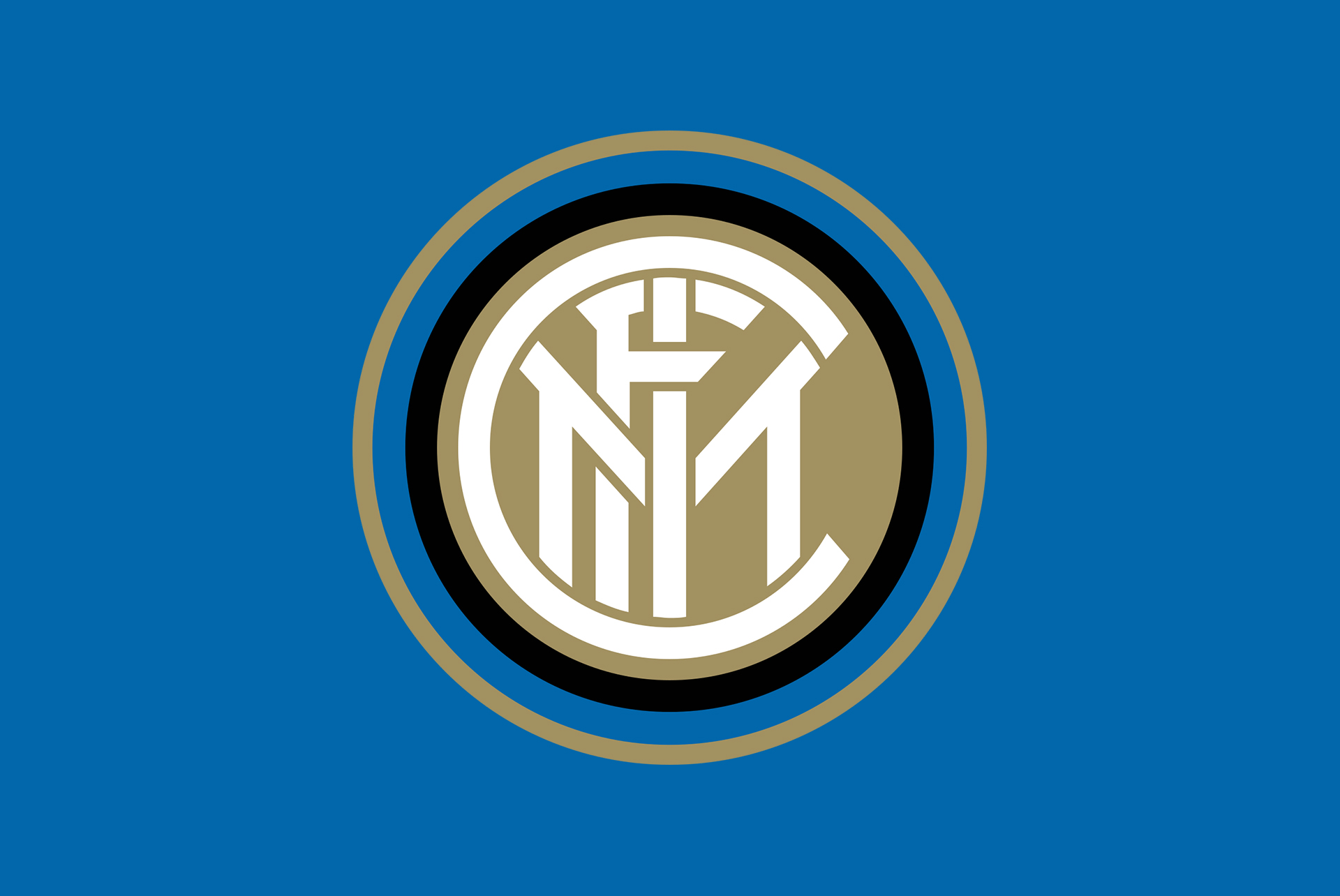
FC Internazionale Milano is one of the most important clubs from Italy and they compete on the Italian first-tier Serie A. What I like about this logo design is the use of Typography Elements to create the crest as they used the Letter I, M, F, C, and this logo is originally from 1908, something that makes it really impressive.
After some Logo variations, this logo design comes back definitely in 1988 and their last rebrand was in 2014 by Milanese Graphic Design Studio Left Loft.
The color palette from this crest Design in Blue, Black, Gold, and White, and this logo is a good example of a good Logo Design due that the original icon created with the letter was first released in 1908 and it’s still looking modern to this days because this crest fulfills the 7 qualities of good Logo Design which you can see on this post!
Advertisment
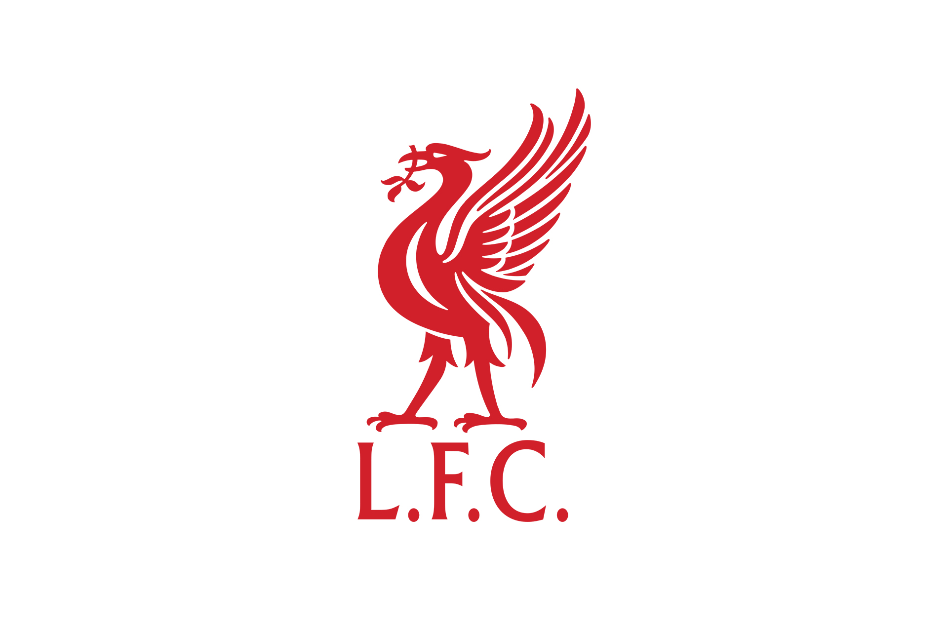
Liverpool FC is one of the most important football teams in England and it plays on Barclays Premier League, and on recent years they are using a more minimalist version of their Logo Design which I chose.
This Liverpool Logo design is a minimal design using as the main element the Liver Bird that was present on their club crest since the first years of history, the main color used for this logo is red, but it can vary depending on the color of the background. The Liver Bird is standing over Liverpool acronym L.F.C
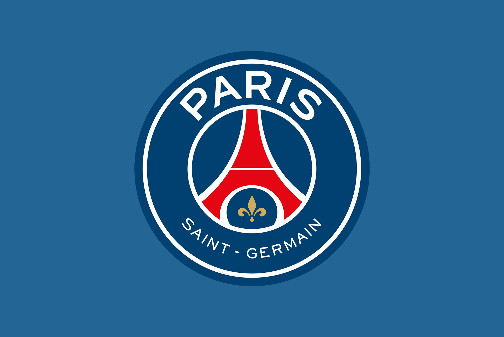
Paris Saint Germain is a French club founded in 1970 and playing in the french first football tier Ligue 1. The first time we can see a primitive version of the actual PSG Logo Design was in 1972 and during these years the logo has suffered some changes.
The actual version of the Paris Saint Germain Logo Design was released in 2013 and was made by Graphic Design Studio Dragon Rouge, this new version of the logo removed the cradle emblem and make more important the fleur de Lys symbol on it.
As the new owners want to attract more people to PSG and become more global the new logo design focus on the word “Paris” at the top of the logo bigger than the previous version and give the city more Focus, and the lettering “Saint-Germain” is moved at the bottom of the design. The main element of the Logo Design is the Eiffel Tower in the middle of the logo and these elements is still present from the original 1970 Logo.
The font used for this crest design is a custom font developed by international typographic studio Babel Fot, and they used the same color palette as the French Flag, Blue, Red and White, and the Fleur de Lys is in gold color.
Advertisment
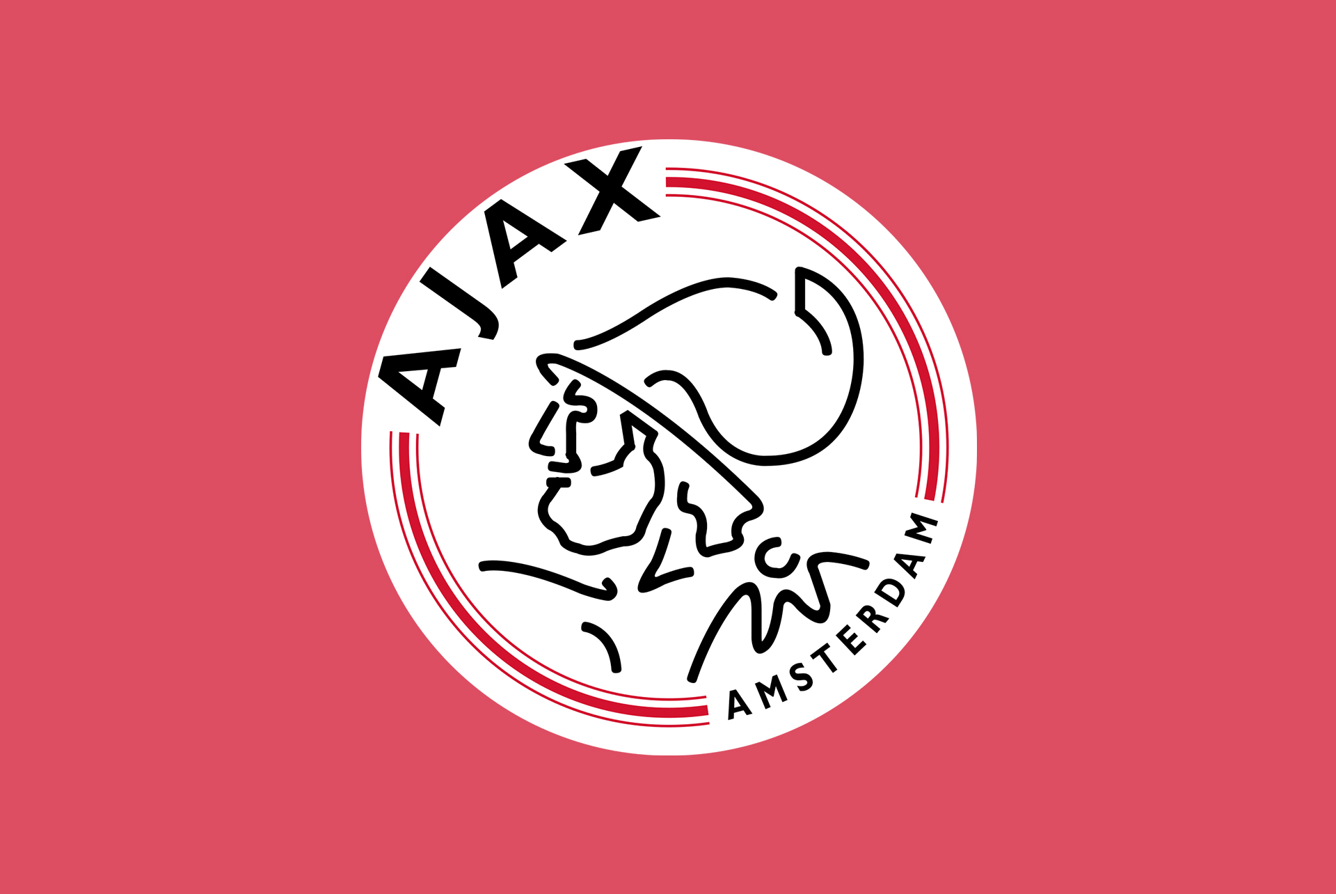
Ajax Amsterdam is a Dutch football club and one of the most important clubs in the history of the Eredivisie. The first Ajax Logo Design was released in 1900 but it was not until 1928 that we can see a primitive version of today’s logos.
In the 1928 version and today’s Ajax Logo Design, we can see a profile illustration of a Greek Hero called Ajax. The actual Ajax Crest Design was released in 1991 and the main element is the greek hero ajax illustration on a minimalist graphic design style which is contoured in eleven lines to represent the eleven football players on the pitch.
The Ajax Illustration is surrounded by the name of the club and the city “Amsterdam” and 3 red stripes. The color palette used for this logo is Red that stands for energy and passion, and black to emphasizes perfection, strength, and elegance, and if you want to learn the color meaning you can check my post about a color theory where I will show you!
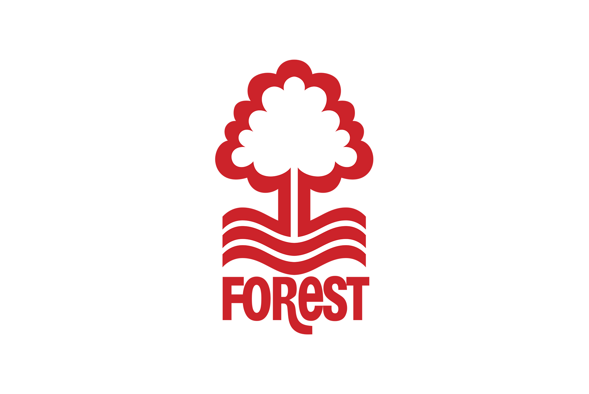
Now we have reached Number one and my favorite football logo design ever, and the winner is Nottingham Forest, an English football team who has a rich history but currently is playing in the Championship.
This Logo design was made by graphic artist David Lewis and the most surprising thing about that Logo is that it was designed in 1973 and nowadays is still looking a really modern and minimalistic logo design.
The Nottingham Crest elements are the tree that symbolizes the Sherwood forest emerging from wavy lines symbolizing the Trent River over the typographic word “Forest” and the color palette used for this badge is only red.
Advertisment
This is my top 10 of the best football logo design around the world, and it was too hard to select them because there are plenty of teams with amazing crest, and every fan thinks that their club logo is the best. For this top, I wanted to choose some unknown teams with a really creative and unique crest! And if you want to learn more about logo design I recommend you read these posts.
If you found this post useful you might like to read these post about Graphic Design Inspiration.
Advertisment
Written by
If you like this post share it on your social media!


Advertisment

Advertisment