At its core, typography is arranging type to make the text legible, readable, and visually appealing to the reader. It involves selecting typefaces, point size, line length, and line spacing, adjusting the spaces between groups of letters (tracking), and adjusting the space between pairs of letters (kerning).
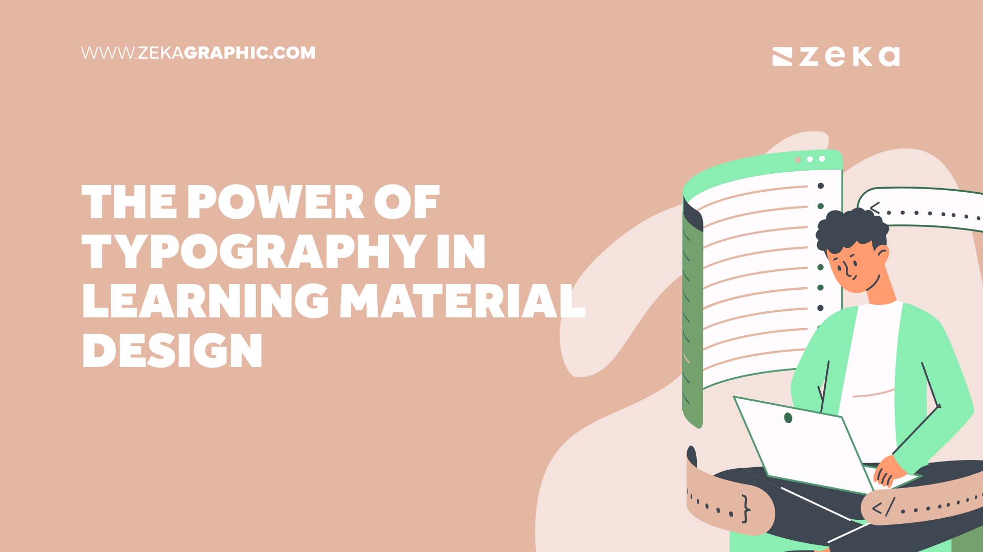
Typography plays a pivotal role in the design of learning materials. It’s not just about making content look good—it’s about enhancing readability, aiding information retention, and improving student engagement. When you pay for essay papers, you can also explore the importance of typography in academic writing and its impact on the overall quality of your essays.
Advertisment
Typefaces, often referred to as font families, are a set of one or more fonts, each composed of glyphs that share standard design features. Every font within a typeface possesses unique characteristics such as weight, style, condensation, width, slant, italicization, and ornamentation, and it is associated with a particular designer or foundry. “font” describes the tangible representation of a set of characters including letters, numbers, symbols, and more. Be it a digital file, a collection of metal pieces, as in a Linotype machine, or anything else.
Line length is the horizontal width of the text block, which plays a crucial role in readability. If a line of text is too long, the reader’s eyes will have a hard time focusing on the text. It can lead to eye fatigue and discomfort. On the other hand, a too-short line can be jarring and disruptive to the reading flow.
Line spacing, also known as leading, refers to the vertical space between lines of text. Adequate spacing is essential for readability. Too little space can make the text feel cramped and challenging to follow, while too much space can disconnect the text, disrupting the reader’s flow.
Text alignment is how text lines up along its left and right margins. There are four primary types of typographic alignment: left-aligned, right-aligned, centered, and justified. Each type of alignment has its appropriate uses and effects on readability and aesthetics.
Color and contrast in typography refer to how color choices for the text and background can impact readability and mood. High contrast, such as dark text on a light background, improves readability, while low contrast can strain the eyes. Color can also evoke certain emotions and set the tone of the content.
Advertisment
Different fonts can create different impressions and have been shown to influence our perception of information. For instance, serif fonts like Times New Roman often give a sense of respectability and tradition, making them suitable for formal or academic texts. In contrast, sans-serif fonts like Arial can feel modern and clean, making them ideal for technical or contemporary content.
Advertisment
Typography can also evoke emotions and set the mood for the reader. Bold, large fonts can command attention and convey strength or importance. Light, elegant scripts can give a sense of elegance and sophistication. Color choices in typography can also significantly impact the reader’s emotional response. For instance, red might be associated with urgency or importance, while blue can feel more calming and trustworthy.
Enhancing Readability
Typography plays a significant role in enhancing the readability of learning materials. By carefully selecting typefaces, adjusting line length and line spacing, aligning text appropriately, and using color and contrast effectively, designers can make the text easier to read. For instance, a clean, well-spaced sans-serif typeface can make reading online content a smoother experience, while adequate line length can ensure that the reader’s eyes move comfortably from one line to the next.
Reducing Cognitive Load
Well-designed typography can also help reduce cognitive load. When text is easy to read, learners can spend less mental effort on deciphering the words and more on understanding the content. It is essential in learning materials where comprehension is vital. Reducing cognitive load can also minimize fatigue and increase a learner’s time studying effectively.
Advertisment
Typography can play a crucial role in making content more memorable. By using typographic elements strategically, designers can highlight key points and make them stand out. For example, essential facts or statements can be displayed in bold, larger font or a different color, drawing the reader’s attention and aiding memory retention.
Typography can also guide the reader’s eye and create a visual hierarchy, helping to emphasize important points. For instance, headings and subheadings can be more prominent through larger font sizes or distinctive typefaces. It allows readers to identify critical sections and breaks up the content into manageable chunks, making it easier to digest and remember.
Aesthetically pleasing learning materials can encourage learners to engage with the content. Good typography can contribute to this by creating a visual appeal. A harmonious combination of typefaces and appropriate color and spacing can make learning materials more attractive, inviting learners to read on.
Typography can also impact a learner’s interest and motivation. For instance, a well-designed textbook with straightforward, attractive typography can make learning more enjoyable and manageable. On the other hand, a well-designed document with hard-to-read fonts and proper spacing can help learners. Therefore, effective typography can be pivotal in fostering a positive learning experience.
Advertisment
One great example of the effective use of typography in learning materials is found in the textbooks published by Pearson Education. They use font variations, color, and spacing to create a visual hierarchy that guides the reader’s eye. Headings and subheadings are distinguishable, key points are highlighted, and the overall design is visually appealing without being overwhelming.
Another example is the online learning platform Coursera. The platform uses clean, modern sans-serif fonts that are easily read on screen. Important information is emphasized through color and font size, making it easy for learners to identify critical points.
In the case of Pearson Education, effective typography contributes to the success of their learning materials by making them more readable and engaging. The clear visual hierarchy guides learners through the content, making it easier to understand and absorb. It can lead to better comprehension and retention of information.
For Coursera, the clean, readable typography enhances the user experience by making it easy to read and understand the course content. It can increase learner engagement and motivation, improving course completion rates.
According to the EssayPay essay writing service, consider the readability and mood you want to convey when choosing a typeface for learning materials. Sans-serif fonts like Arial or Helvetica are often recommended for online reading because they display well on screen. Serif fonts like Times New Roman can also be a good choice for printed materials, as they are often associated with formality and tradition.
Advertisment
While aesthetics are essential, readability should never be compromised. Ensure enough contrast between the text and the background and that the font size and line spacing are appropriate. Use color sparingly and strategically to highlight key points, but avoid using too many different colors, as this can be distracting.
Use different font sizes, weights, and colors to create a visual hierarchy that guides the learner’s eye through the content. More prominent, bolder text will draw the eye first, so use it for headings and key points. Smaller, lighter text can be used for less critical information. Remember to maintain a consistent typographic system throughout your learning materials to help learners navigate the content.
Advertisment
Typography plays an integral role in learning material design. It enhances readability, aids information retention, and improves student engagement. Good typography can make complex concepts easier to understand, enhancing learning.
As we continue to understand how typography impacts learning, we must keep exploring and experimenting with different typefaces, colors, and layouts. Remember, the ultimate goal of typography in learning material design is to improve the learning experience.
Advertisment
Pin it for later!
If you found this post useful you might like to read these post about Graphic Design Inspiration.
Advertisment
If you like this post share it on your social media!
Advertisment


Want to make your Business Grow with Creative design?
Advertisment

Advertisment