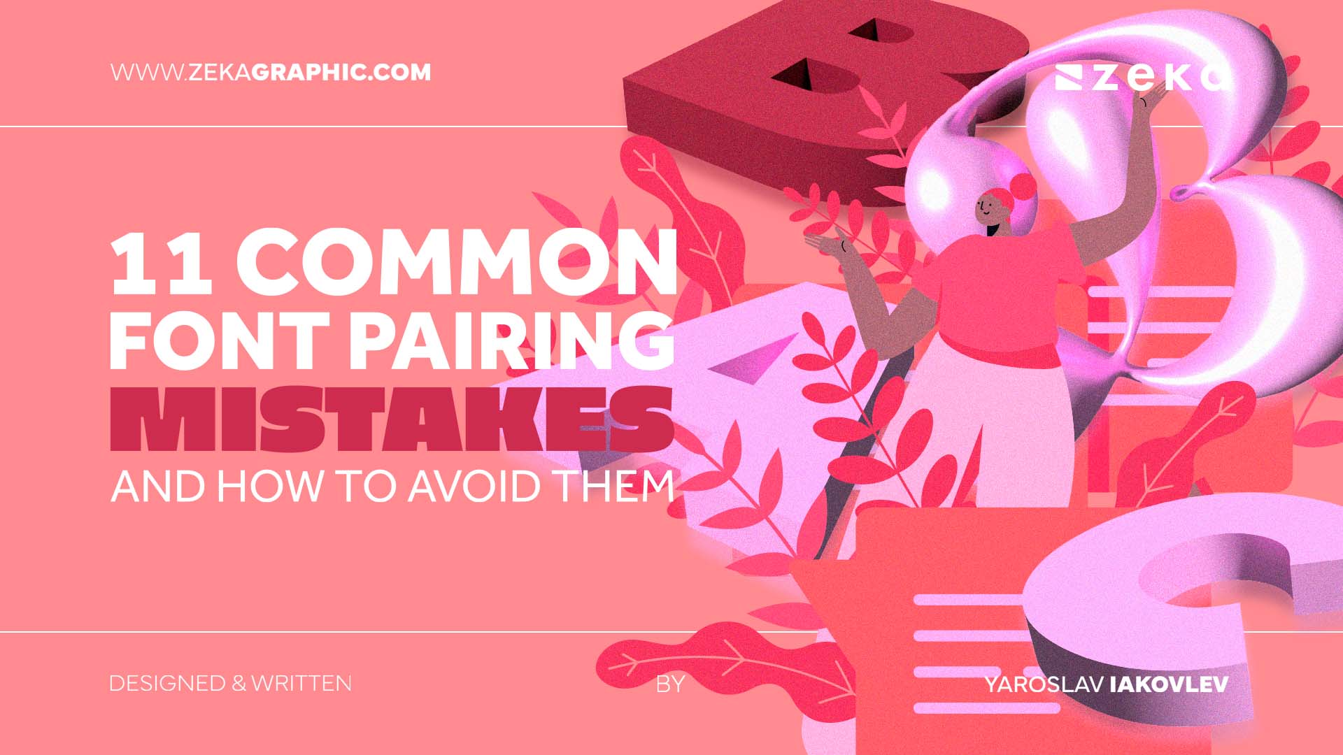
Effective font pairing is essential to creating impactful designs. As a graphic designer, you understand the importance of choosing the right combination of fonts to convey your message and emotion to your audience. However, even the most experienced designers can make common mistakes in font pairing, compromising the effectiveness of their designs.
In this article, we’ll explore 11 of these common font pairing mistakes and provide you with tips on how to avoid them, allowing you to create designs with harmonious and effective font pairing that captures your audience’s attention.
Advertisment
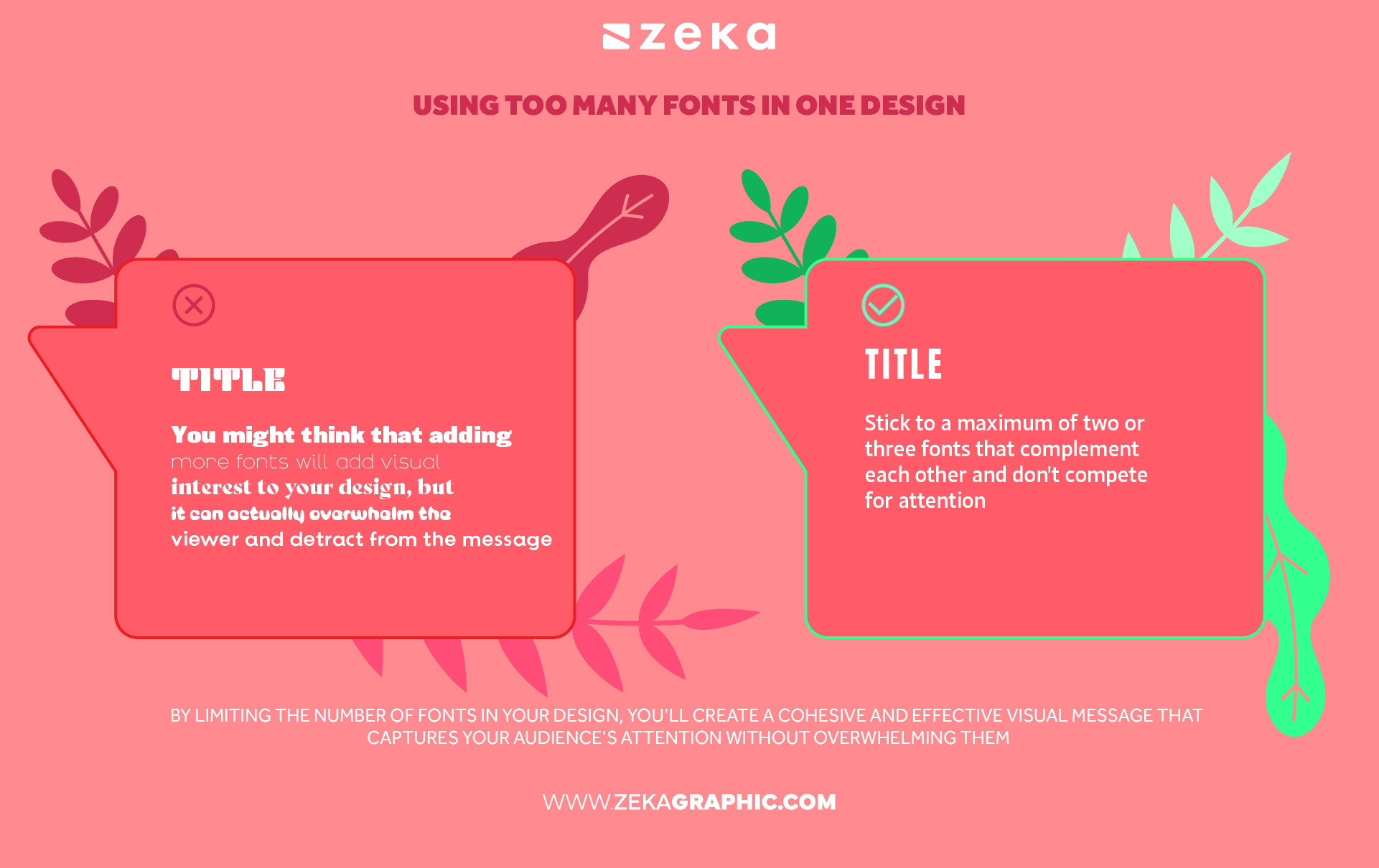
Using too many fonts in one design is a common font pairing mistake made by beginner designers as they might think that it will add visual interest to the design but the reality is that it can actually overwhelm the viewer and detract from the message. To avoid this mistake, stick to a maximum of two or three fonts that complement each other and don’t compete for attention. Choose one font for the main body text and another for headings or accents.
By limiting the number of fonts in your design, you’ll create a cohesive and effective visual message that captures your audience’s attention without overwhelming them, and remember less is often more when it comes to font pairing.
Advertisment
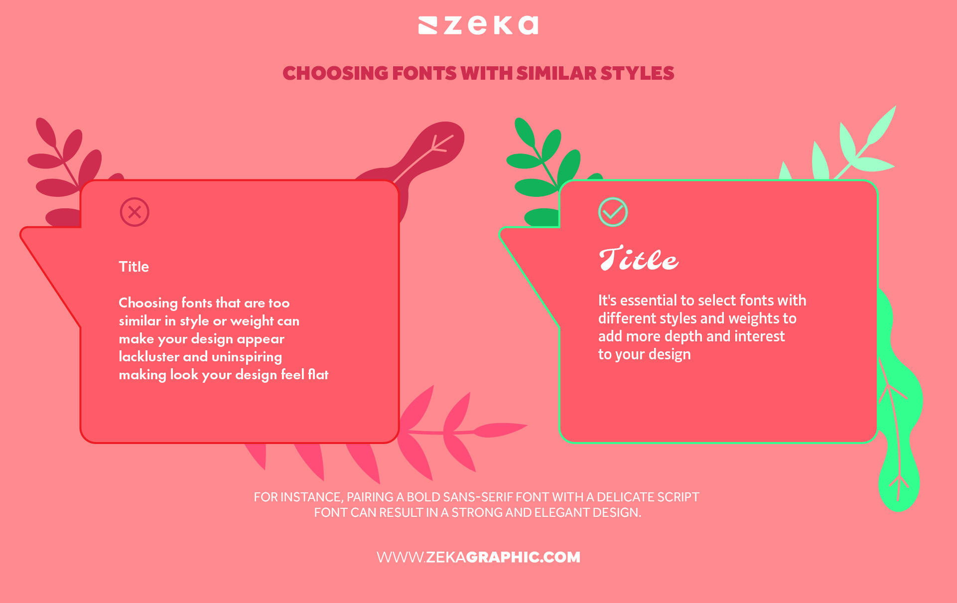
Choosing fonts that are too similar in style or weight can make your design appear lackluster and uninspiring making look your design feel flat, to avoid this font mistake, it’s essential to select fonts with different styles and weights to add more depth and interest to your design and create a visual hierarchy that draws the viewer’s attention. For instance, pairing a bold sans-serif font with a delicate script font can result in a strong and elegant design.
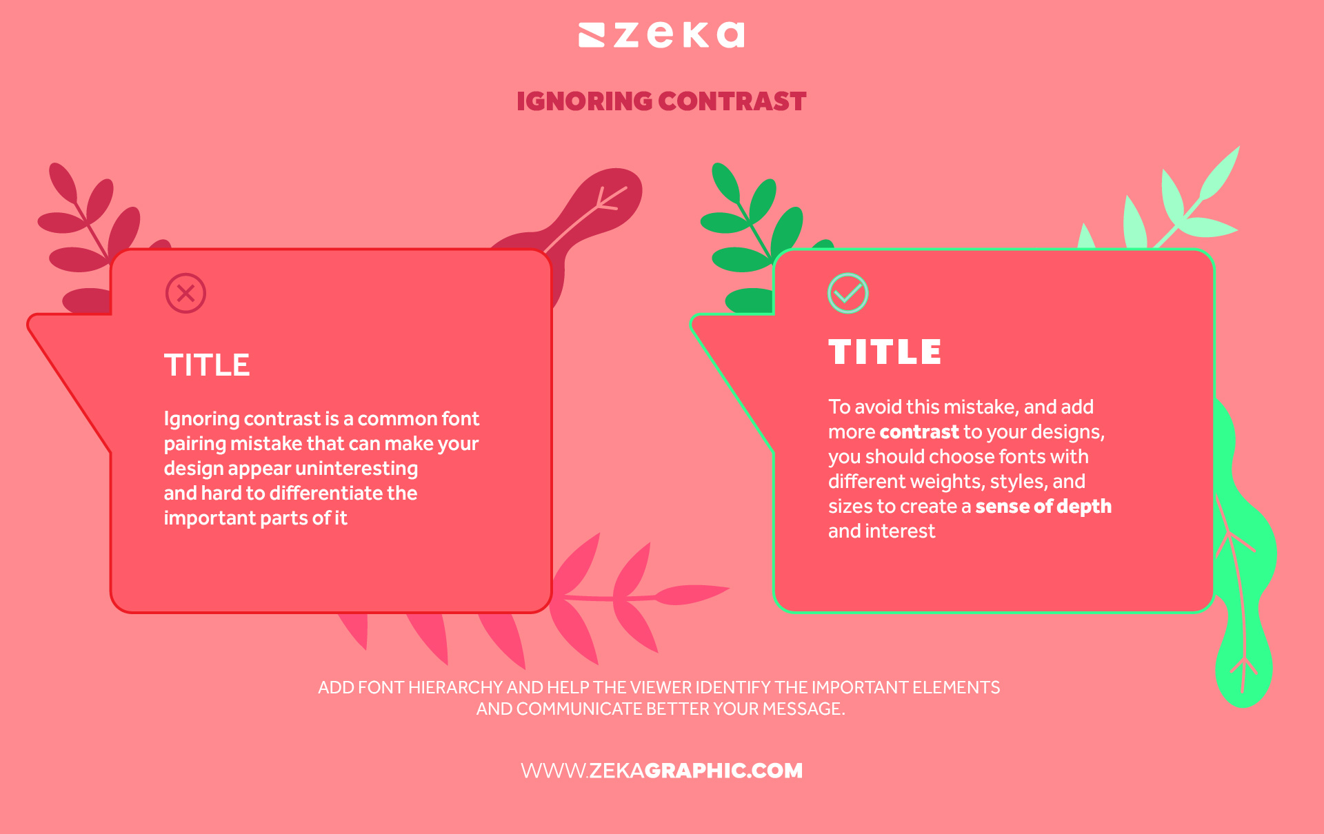
Ignoring contrast is a common font pairing mistake that can make your design appear uninteresting and hard to differentiate the important parts of it, as the body and title might look too similar and miss to add a visual hierarchy.
To avoid this mistake, and add more contrast to your designs, you should choose fonts with different weights, styles, and sizes to create a sense of depth and interest at the same time that you create font hierarchy and help the viewer identify the important elements and communicate better your message.
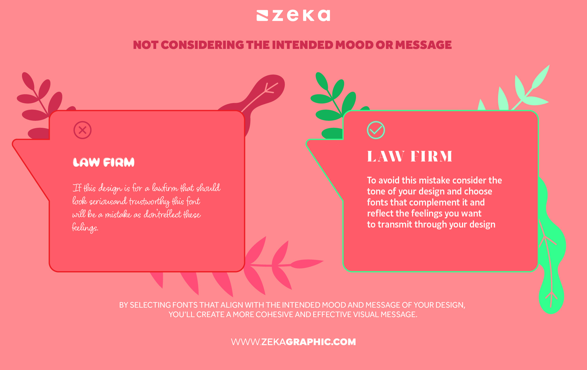
Not considering the intended mood or message is a common font pairing mistake that can lead to a design that misses the mark as different fonts can evoke different emotions and convey different messages, so it’s important to consider the tone of your design and choose fonts that complement it.
For example, if you’re designing a playful and lighthearted invitation, a whimsical script font might be a good choice. On the other hand, if you’re designing a serious business proposal, a classic serif font might be more appropriate. By selecting fonts that align with the intended mood and message of your design, you’ll create a more cohesive and effective visual message.
Advertisment
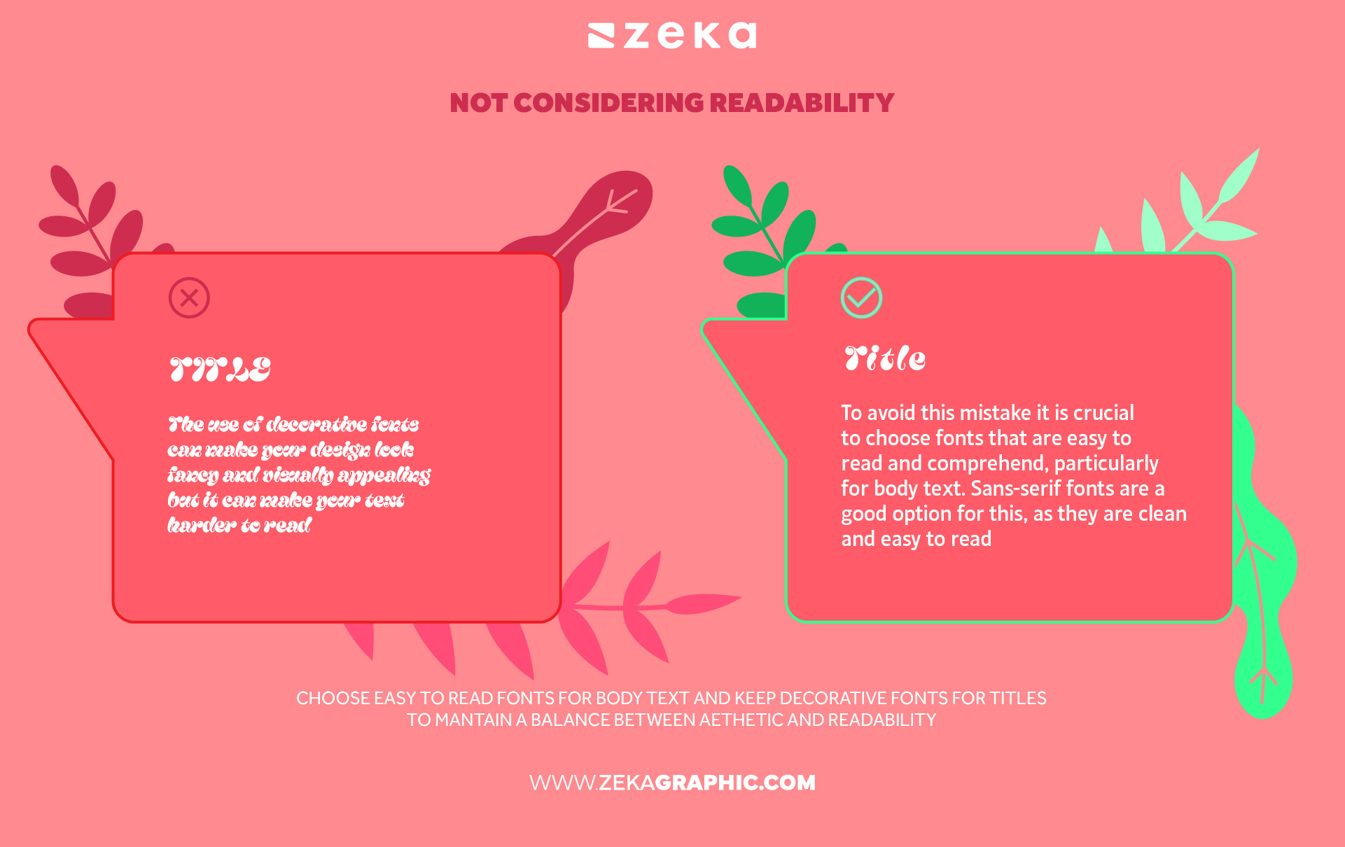
Choosing fonts that are difficult to read is a common mistake in font pairing, which can make designs harder to understand, and the use of decorative fonts can make your design look fancy and visually appealing but it can make your text harder to read missing the main purpose of the text which is to convey a message.
To avoid this mistake it is crucial to choose fonts that are easy to read and comprehend, particularly for body text. Sans-serif fonts are a good option for this, as they are clean and easy to read. Additionally, selecting an appropriate font size for the intended audience and medium is critical since fonts that are too small or too large can hinder readability and detract from the design’s overall appeal.
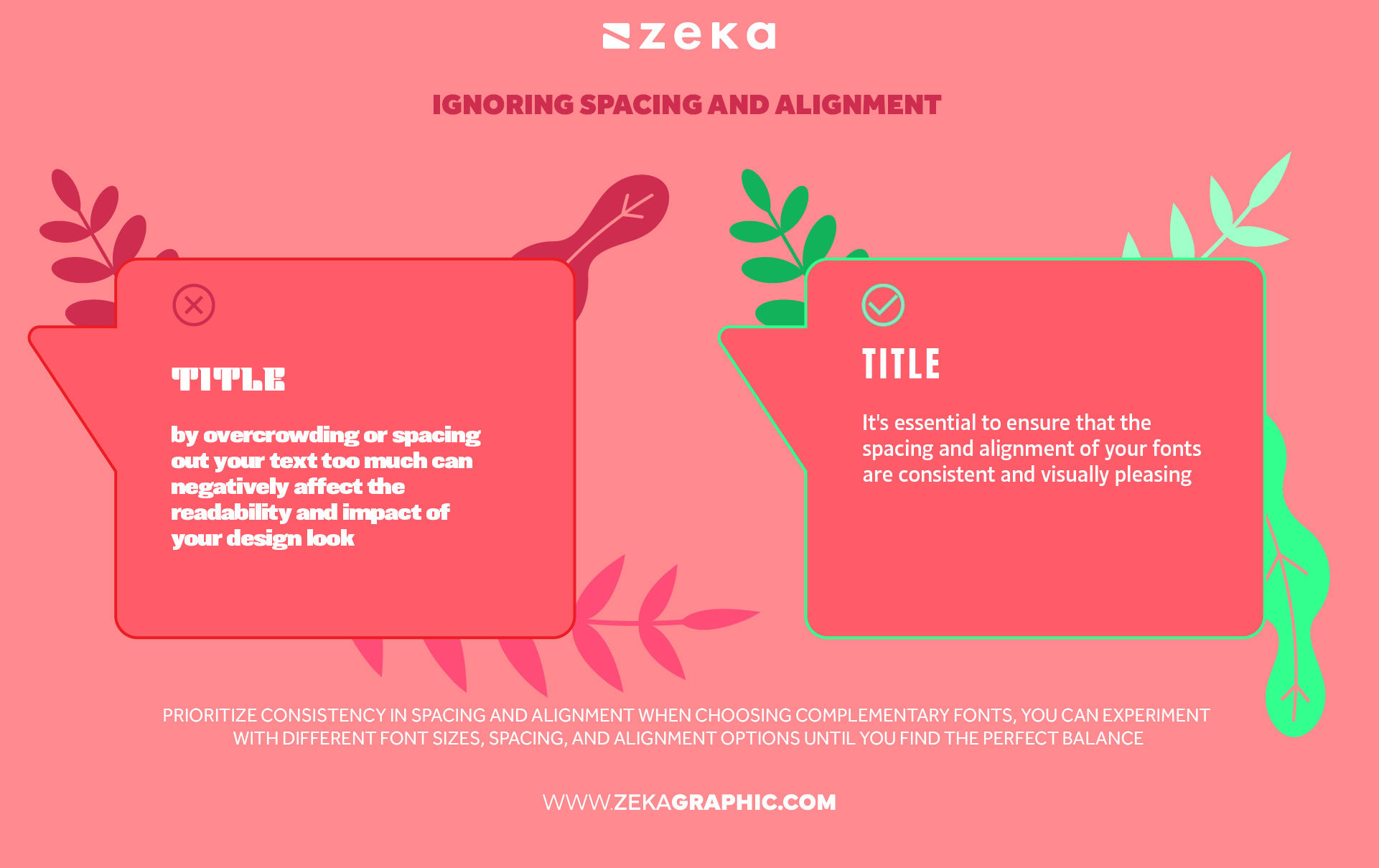
Ignoring spacing and alignment can lead to significant font pairing mistakes in graphic design by overcrowding or spacing out your text too much can negatively affect the readability and impact of your design look. It’s essential to ensure that the spacing and alignment of your fonts are consistent and visually pleasing.
To avoid this font pairing mistake, you should prioritize consistency in spacing and alignment when choosing complementary fonts, you can experiment with different font sizes, spacing, and alignment options until you find the perfect balance for your design to make your content more visually appealing, enabling viewers to engage with your message effectively.
Advertisment
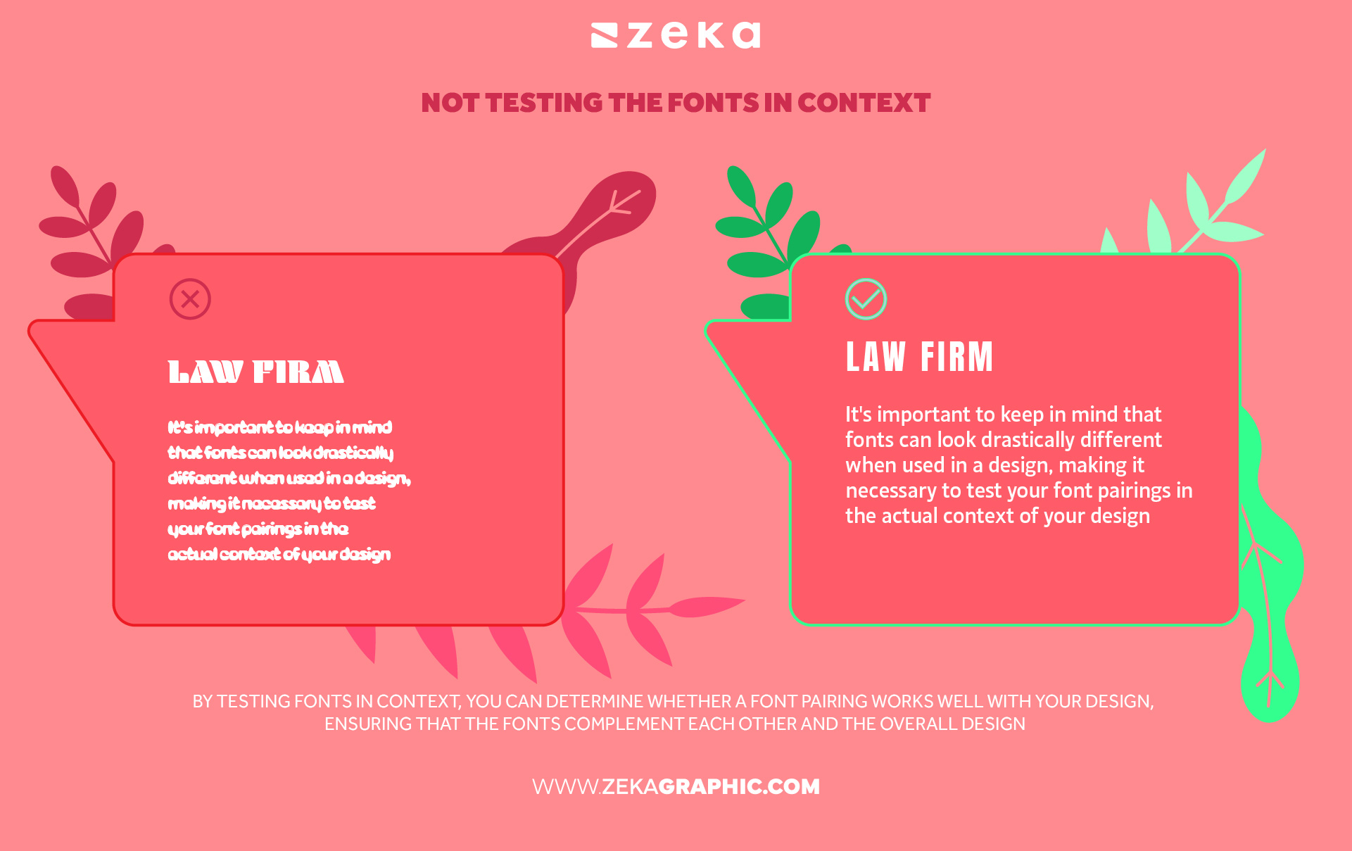
One of the most common mistakes in font pairing for graphic design is neglecting to test the fonts in context. It’s important to keep in mind that fonts can look drastically different when used in a design, making it necessary to test your font pairings in the actual context of your design.
By testing fonts in context, you can determine whether a font pairing works well with your design, ensuring that the fonts complement each other and the overall design, additionally, testing fonts in context allows you to evaluate the legibility of your design, making sure that your content is visually appealing and easy to read for your intended audience.
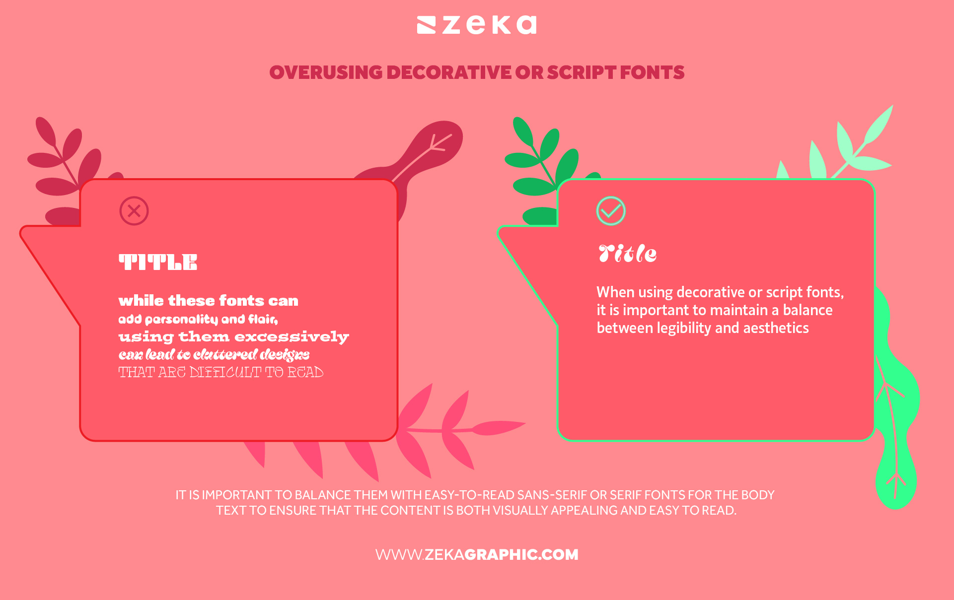
Overusing decorative or script fonts is a common mistake made by beginner designers and while these fonts can add personality and flair, using them excessively can lead to cluttered designs that are difficult to read that is why is essential to use these fonts sparingly and in the appropriate context to ensure that they complement the design.
When using decorative or script fonts, it is important to maintain a balance between legibility and aesthetics as you can learn more in my typography design guide, so a great way to use them is to use them for headlines or accents that can make the design visually interesting without sacrificing readability. Moreover, it is important to balance them with easy-to-read sans-serif or serif fonts for the body text to ensure that the content is both visually appealing and easy to read.
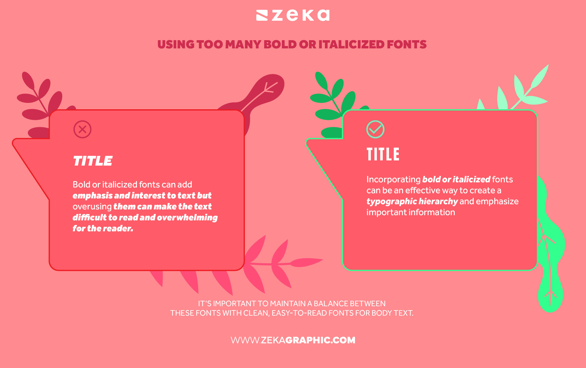
Bold or italicized fonts can add emphasis and interest to text but overusing them can make the text difficult to read and overwhelming for the reader. Therefore, it’s essential to use these styles sparingly and thoughtfully.
Incorporating bold or italicized fonts can be an effective way to create a typographic hierarchy and emphasize important information in a design but it’s important to maintain a balance between these fonts with clean, easy-to-read fonts for body text.
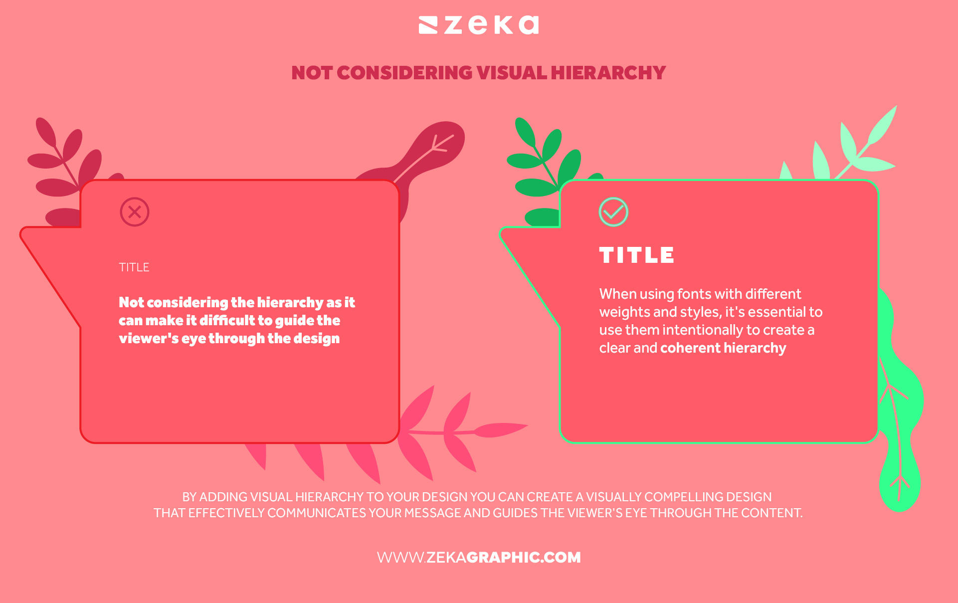
A really big mistake when pairing fonts that can really damage your design aesthetic and message is not considering the hierarchy as it can make it difficult to guide the viewer’s eye through the design. Therefore, it’s crucial to thoughtfully select fonts with different weights, styles, and sizes to create a hierarchy that effectively communicates your brand personality and enhances the overall design.
When using fonts with different weights and styles, it’s essential to use them intentionally to create a clear and coherent hierarchy. Headlines and subheadings can use bold or condensed fonts to create emphasis and draw attention, while body text should use easy-to-read sans-serif or serif fonts to maintain readability. By doing so, you can create a visually compelling design that effectively communicates your message and guides the viewer’s eye through the content.
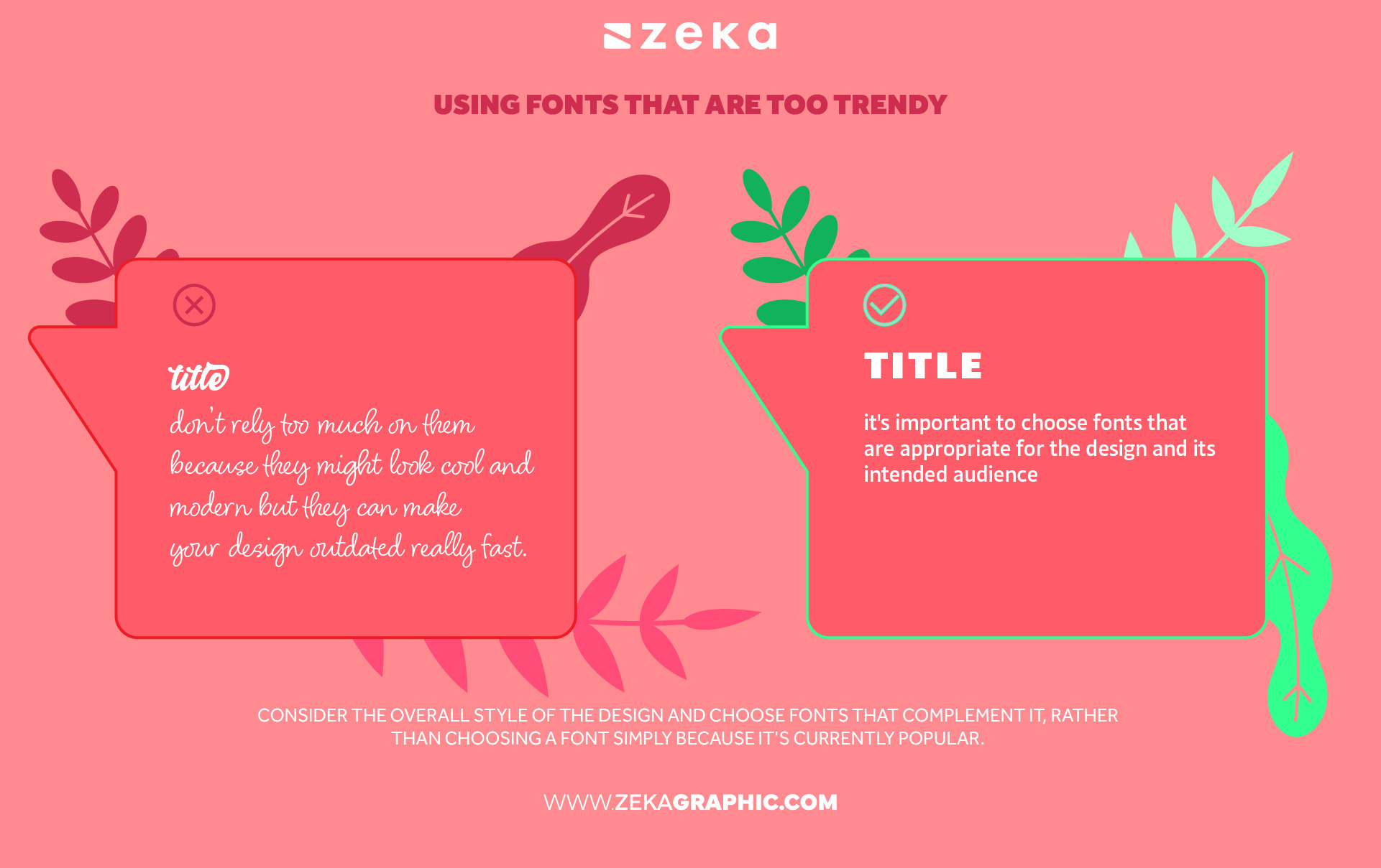
Typography is a key element in marketing and trends are great and essential for designers to stay tuned, but you should use them as an inspiration, and don’t rely too much on them because they might look cool and modern but may not have the staying power of a classic, timeless fonts, making your design outdated really fast.
To avoid the common mistake of using fonts that are too trendy, it’s important to choose fonts that are appropriate for the design and its intended audience. Consider the overall style of the design and choose fonts that complement it, rather than choosing a font simply because it’s currently popular.
Advertisment
In conclusion, font pairing is a critical component of graphic design that can greatly impact the readability and overall aesthetic of your projects, by avoiding these common font pairing mistakes, you can create designs that effectively communicate your message and engage your audience.
However, if you’re still struggling with font pairing, don’t worry! We have another post that dives deeper into the art of font pairing and provides practical tips and examples to help you create visually appealing designs. Check out our post on “How to Pair Fonts” to learn more.
Pin it for later!
If you found this post useful you might like to read these post about Graphic Design Inspiration.
Advertisment
Written by
If you like this post share it on your social media!
Advertisment


Want to make your Business Grow with Creative design?
Advertisment

Advertisment