The four key packaging secrets to sell anything are selecting premium materials, engineering custom structural silhouettes, maintaining strict color consistency, and designing highly organized interior presentations.
Physical product presentation shapes buyer confidence in ways digital assets cannot replicate.
By treating packaging as a core component of visual identity, B2B and industrial businesses can transform protective cases into powerful brand experiences.
Your logo is polished, and your website converts seamlessly. But the moment a product lands in a client’s hands, a different kind of brand communication begins.
Physical presentation shapes trust in ways that no screen ever can. The weight of a case or the resistance of a latch accumulates into a lasting brand impression.
This is the gap most brands overlook when exploring packaging as brand experience.
Whether you are designing for electronics, medical equipment, professional tools, or premium creative gear, the physical packaging surrounding your product is not neutral. It speaks volumes and is either reinforcing your brand or undermining it.
The following four packaging signals serve as a practical audit framework for any brand that takes its visual identity seriously.
Advertisment
Before a customer reads your brand name or registers your color palette, they feel your packaging. Material selection is the first sensory signal in the brand experience sequence, and it communicates brand values quickly.
Different materials carry distinct cultural and emotional associations that your audience absorbs.
Research shows material perception matters deeply for long-term brand value. In fact, studies indicate that paper packaging consistently resulted in higher perceived product quality across various product categories.
Aluminum signals precision, aerospace-grade seriousness, and premium craftsmanship.
Meanwhile, EVA thermoformed panels communicate structured care and professional-grade handling. Rugged injection molded polymers project durability, reliability, and are built for purpose and confidence.
Industrial designers evaluate multiple enclosure options, from generic catalog boxes and specialized thermoform suppliers to Royal Case Company’s custom wholesale cases, ensuring the selected polymers prove the brand has thought about real-world conditions.
Soft ballistic fabrics communicate field readiness and utility without sacrificing a sense of care. Material is a visual identity decision disguised as a basic production decision.
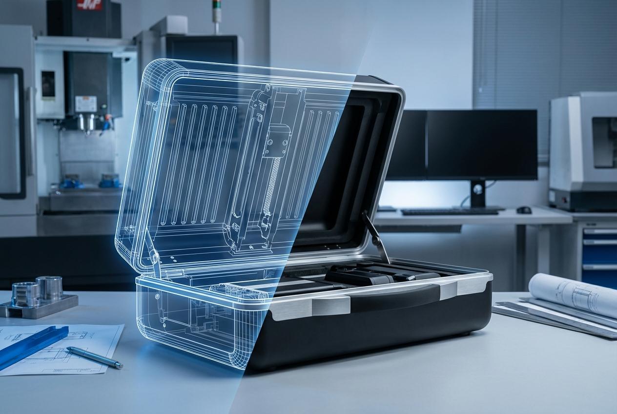
Consider an electronics manufacturer shipping its flagship device in a precision-fit hard case.
This tells the buyer that this product was designed for real-world performance rather than just shelf appeal. A medical device brand choosing sterilizable materials signals regulatory awareness and a commitment to patient safety.
Always ensure the material your product ships in reflects the quality level your brand promises everywhere else.
Key Insight: Material selection is a visual identity decision disguised as a production choice. If the weight and texture fail to reflect your premium price point, you risk losing customer trust instantly. |
Shape is a profound visual language. The proportion, construction, and structural geometry of your packaging carry meaning that color and surface finish cannot override.
A precision-engineered case with clean lines and intentional closure mechanisms communicates reliability, professionalism, and deliberate design. A loose, generic structure communicates the opposite, even when the product inside is exceptional.
The packaging form becomes the reader’s first draft of the brand story, written before the box is even opened.
For premium equipment manufacturers, a custom-fitted silhouette signals that the brand anticipated every user need. The packaging does not simply hold the product; it perfectly fits it. That precise fit communicates forethought, and forethought communicates ultimate quality.
In the creative tools sector, bespoke form factors mirror the artistry of the product itself.
A photography brand whose carrying cases mirror the same geometric precision as their camera bodies creates a seamless brand world. The case does not interrupt the brand experience, but rather extends it beautifully.
Structural consistency across a product line matters equally to build visual identity coherence.
When every product in a portfolio arrives in packaging that shares proportional logic, repeat buyers begin to recognize the brand instantly.
Every angle, edge, closure mechanism, and proportion is a distinct brand decision. Ask your team if the shape and structure of your packaging feels intentional or simply like a default offering.
Advertisment
Color and surface finish are the direct translation of a brand’s digital visual identity into the physical world. This is the most visible packaging signal and, surprisingly, one of the most frequently mishandled aspects of design.
When that translation breaks down due to mismatched finishes or generic all-black packaging, the visual narrative fractures.
Brand packaging design depends on this consistency more than most teams realize.
A customer who has spent time with a brand’s digital presence arrives at the product with established visual expectations. Packaging that meets those precise expectations subconsciously confirms trust.
Conversely, packaging that contradicts them introduces doubt, even if the customer cannot articulate why. Color consistency across packaging, product, and marketing materials builds subconscious brand trust.
Tactile finishes like matte, gloss, textured, or rubberized surfaces carry immense emotional weight.
A matte finish signals restraint and sophistication, while a textured surface signals grip, durability, and utility. Private labeling and custom color matching allow brands to maintain visual identity consistency at scale.
These options preserve unity even across large production runs or multiple product lines. Electronics brands that match case color and finish to device design create a cohesive product world.
Medical equipment brands that use clean, clinical white or cool grey finishes make a precise brand statement about sterility. Evaluate whether someone would instantly recognize your brand from the packaging alone.
Warning/Important: Avoid “close enough” color matches. Discrepancies between your digital assets and physical packaging create a visual fracture that can undermine the professional credibility you worked hard to build online. |
The exterior of a package introduces the brand, but the interior ultimately confirms it. When a client opens a case or product package for the first time, they experience an intimate touchpoint.
This specific moment reveals whether the brand cares about every detail or stops at what the world could see. Precision-cut inserts that hold each component in its exact position signal thoughtful planning.
Organized compartments and labeled slots reflect a highly thoughtful user experience design. It mirrors the kind of UX thinking that brands apply to software interfaces but rarely extend to physical packaging.
Custom tray colors, textured liners, and branded interior elements extend the visual identity system. These elements transform the interior into a space most customers never photograph but always remember.
Brands operating across demanding sectors face this organizational challenge on a significant scale.
When product lines span multiple categories and user environments, interior organization cannot be an afterthought. It must be precisely engineered alongside the exterior to maintain consistency.
Companies working in electronics, medical devices, and professional equipment align strict protection, precise interior organization, and branded presentation into cohesive solutions.
Defense contractors require every component to be secured with zero tolerance for movement or error.
Medical equipment brands use instrument slots to project clinical precision before the device is ever handled. Ensure your interior packaging delivers the same definitive quality signal as your exterior.
Pro Tip: View interior organization as the “user interface” of your physical product. Precise layouts and labeled compartments do more than protect; they guide the customer through a high-value unboxing ritual. |
Advertisment
Material, structure, color, and interior organization are not entirely independent decisions. They form a cohesive system that is either working in your brand’s favor or quietly working against it.
Branded product presentation is not merely a basic manufacturing problem. It is a fundamental brand identity challenge that requires genuine strategic conversation.
Physical brand touchpoints carry as much power to build or erode trust as any screen-based asset. Unfortunately, they typically receive only a small fraction of the design attention.
Brands that close this gap earn a level of client trust that no website or brochure can replicate alone. Start examining your assets today to ensure perfect visual identity consistency.
Conduct a quick brand packaging audit across your product line.
Audit every physical brand touchpoint and ask honestly whether it communicates quality and care. The answer will tell you exactly where your next major design opportunity lives.
Author Profile: Royal Case is the leading manufacturer of custom wholesale cases for businesses across every industry. |
Advertisment
Pin it for later!
If you found this post useful you might like to read these post about Graphic Design Inspiration.
Advertisment
If you like this post share it on your social media!
Advertisment


Want to make your Business Grow with Creative design?
Advertisment

Advertisment


