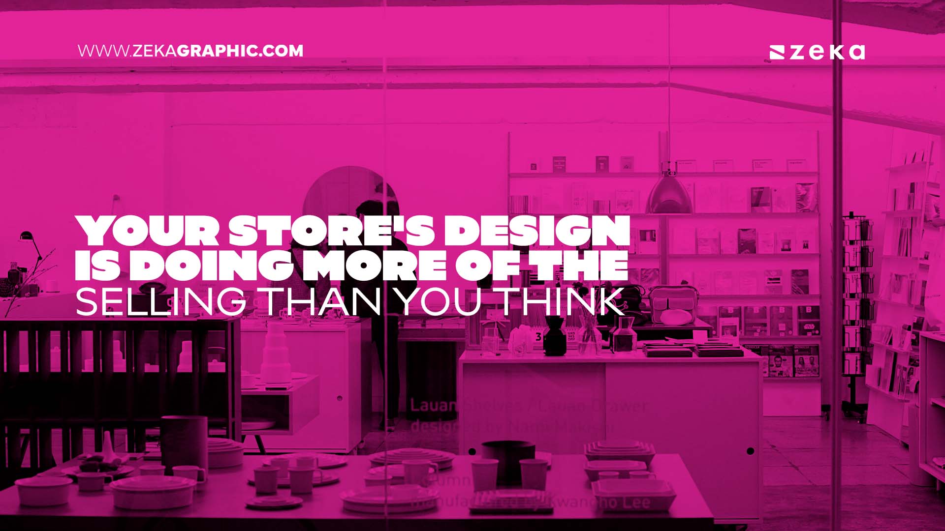
Fifty milliseconds. That’s the number that comes up whenever researchers time how fast people judge a website, and it’s a rude one, because fifty milliseconds is less than a blink. No product name has been read yet. No price checked. The visitor’s gut has already checked whether your store is trustworthy or not, and everything they see afterwards has to argue with that verdict instead of starting fresh.
Advertisment
People forgive flaws in things they find beautiful. Designers have leaned on this for decades, and Nielsen Norman Group even gave it a name, the aesthetic-usability effect: attractive interfaces get rated easier to use even when they are not, in any measurable way, easier. Great news if your store looks good. If it doesn’t… well, visitors rarely complain. They assume the products are on the same level as the website, go back to wherever they normally shop, and you never find out why.
And the owner can’t see it happening. You built the navigation, so of course it makes sense to you. The photos look sharp because you’re viewing them on the same monitor you edited them on. I’ve sat next to store owners during user tests, and there’s a particular face they make, somewhere between confusion and grief, when a tester points at the main menu and asks what it’s for.
Watch five strangers use your store. Strangers, not friends, friends lie. It’ll be the cheapest and most upsetting design audit you ever run.
Now the unglamorous part. Whatever taste you bring to a store, the platform decides how much of it survives, because a template system that won’t bend turns your best product page sketch into a sketch and nothing more. So, infrastructure first, pixels second. Commerce, the group behind BigCommerce and the visual builder Makeswift, has built its ecommerce solutions around a fairly simple idea: the marketer or designer who wants to change the storefront should be able to just… change it. No developer ticket, no queue.
Does the freedom help? Depends who’s holding it. The stores I’ve watched convert well were almost never the ones that launched pretty; they were the ones that tried a new hero layout on a Tuesday, read the numbers on Friday, kept whatever won, and did that forty times a year until the site was unrecognisable. Hand that same freedom to a team with no design sense and you get a ransom note. Some of my favourite client work happened inside ugly template limits, so constraints have their uses too.
An online store makes one promise, that the thing in the photo is the thing in the box. The shopper can’t pinch the fabric or check the stitching, the photography does that on their behalf, and blurry or obviously-stock imagery doesn’t read as a small budget. It reads as something being hidden. There’s a good piece on this site about why high-resolution graphics carry the weight they do in modern design, and product grids are where that stops being theory.
What holds up across nearly every niche I’ve worked in: shoot on consistent backgrounds, or the catalogue turns into a flea market. Get a hand or a body into at least one frame per product, since scale is the first thing shoppers misjudge (anyone who’s unboxed a “desk lamp” the size of a thumb knows this). And compress your files. That gorgeous 8 MB hero image loading in four seconds already lost to the average one that loaded in one.
Individually lovely pages, broken path between them. Happens constantly. Baymard Institute’s long-running cart abandonment research puts average abandonment somewhere around 70 percent, give or take depending on the year and whose numbers you trust, and a fat slice of it comes down to checkouts that demand account creation, or hide shipping until the final step, or sprawl across six screens. Nobody designs that on purpose. It accretes.
Untangling it is digital product design wearing a retail apron: map the route from landing page to confirmation email, work out what the visitor needs at each step, cut what they don’t.
Speaking of confirmation emails. Most ignored screen in the whole flow, and the only one with a near-perfect open rate, because the person just paid you, of course they open it. What most stores send is a grey receipt with the personality of a parking fine. An hour of work, a photo of the item, a delivery estimate you plan to honour, and the “where is my order” tickets thin out on their own.
If I could fix only one thing on a small store, checkout, every time, and it’s not close. Homepage redesigns win compliments; checkout fixes win revenue. Shipping costs shown early. Guest checkout allowed. Returns policy, payment icons, and a phone number that looks answerable, all within sight of the buy button.
Advertisment
Don’t start with a teardown. Time your site on a mid-range phone over mobile data and be honest about the result. Count the taps in your own checkout. Put your product photos next to your two strongest competitors’ photos and say the unkind thing out loud.
Type and colour are cheaper fixes than people think. Two typefaces, one job each. Body text at 16 pixels minimum, shoppers over 40 exist and they’re the ones with money. Your loudest colour gets exactly one job, the add-to-cart button. Nowhere else. When everything shouts, the button whispers.
After that, work in traffic order, the product page taking 40 percent of visits before the About page taking 2. Small weekly changes beat the six-month relaunch that shows up stale.
Nobody reviews good store design. No one has ever written in to praise a line height. They buy, they come back, they buy again. That was the point.
Advertisment
Pin it for later!
If you found this post useful you might like to read these post about Graphic Design Inspiration.
Advertisment
If you like this post share it on your social media!
Advertisment




Want to make your Business Grow with Creative design?
Advertisment

Advertisment