
Creating a clean, intuitive mobile user interface (UI) is a constant balancing act between functionality and aesthetic clarity. Even seemingly minor decisions—like adding a text field, dropdown, or button—can introduce visual noise or cognitive friction. Designers and developers who strive for minimalism often find that “simple” inputs can become the culprits that degrade the overall experience.
This issue arises from a core tension: while the user needs to interact with your app, every visible input adds visual weight, competes for attention, and risks disrupting harmony. Worse, poorly styled or placed inputs can make even the most polished designs look clunky or amateurish. Let’s explore this dynamic through key examples—starting with a particularly relevant one for modern iOS development.
Advertisment
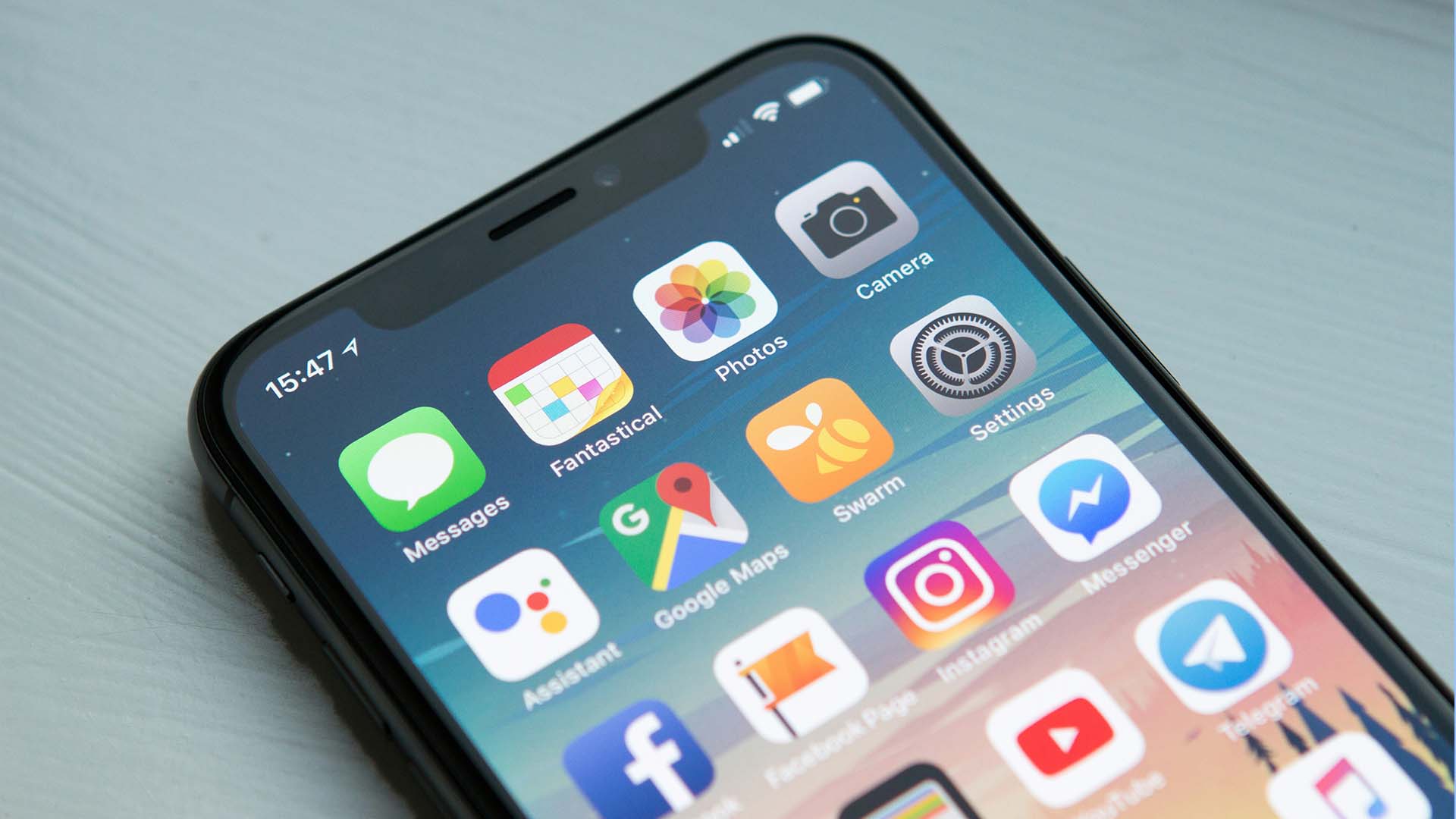
Pickers are a classic case of an input element that seems simple but can cause disproportionate disruption to a mobile UI. In SwiftUI, the Picker view provides an easy way to offer a selection interface, whether through a wheel, menu, or segmented control. On paper, it sounds perfect—lightweight, native, and versatile. In practice, though, the visual and behavioral characteristics of SwiftUI pickers often clash with a designer’s intended aesthetic.
Here’s why:
Firstly, the default styling of Pickers is rigid and varies across iOS versions. You can opt for styles like .wheel, .menu, or .segmented, but each imposes strong visual conventions. A wheel picker, for instance, dominates screen space when activated—something that can feel heavy-handed in a minimalist UI. Segmented pickers introduce bold horizontal controls that rarely blend seamlessly with subtle typographic layouts.
Secondly, graphic design principles often get overridden by platform defaults. If your app’s typography, spacing, and iconography are finely tuned to evoke elegance or spaciousness, the sudden introduction of a Picker—with its out-of-the-box Apple styling—creates visual dissonance. The line weights, shadows, and button styles may not match your aesthetic language.
Finally, Pickers also introduce behavioral UI mismatches. A clean, linear flow of content gets broken when a Picker triggers an entirely different interaction mode (wheel or popover). The user is momentarily pulled out of your intended visual rhythm—breaking immersion.
To mitigate this, designers should:
SwiftUI Pickers exemplify how a “simple” input can subtly, but meaningfully, compromise a UI’s visual harmony. They teach us to treat each input not as a neutral functional element, but as an active participant in the app’s graphic design.
Another prime offender in UI cleanliness is the text input field. Designers often envision airy layouts with generous whitespace, consistent line spacing, and balanced typography. Yet a text field—by necessity—invites user interaction and thus requires clear affordances (borders, labels, focus states) that can jar with minimalistic intentions.
A common pitfall is using default system text fields without adapting them to the design language. Rounded rectangles with heavy borders can look out of place in an app that otherwise relies on subtle dividing lines and typographic hierarchy. Similarly, placeholder text that’s too bold or off-tone disrupts the visual flow.
Even more problematic is the dynamic nature of text inputs. Once a user begins typing, line breaks, validation errors, and helper text can cause unpredictable shifts in layout, undermining visual stability. A clean static UI turns into a jumbled, twitchy experience.
To preserve design integrity:
The key is to remember that text inputs demand visual scaffolding—and that scaffolding must be carefully designed, not an afterthought.
Advertisment
Dropdown menus offer another cautionary tale. In theory, they reduce clutter by collapsing options behind a tap. In practice, they introduce their own set of visual and UX costs.
Dropdown triggers are often ambiguous unless styled thoughtfully. A down chevron next to text may be misread as a navigation link. The open menu can occlude other content or introduce awkward scrolling behavior. Worse, dropdown menus frequently adopt a different visual style than the base UI (due to OS-level rendering differences), creating a jarring contrast.
From a graphic design standpoint, dropdowns fight against spatial hierarchy. Well-designed mobile screens rely on clear content groupings and consistent alignment. A dropdown’s overlay breaks that visual grid.
To use dropdowns without compromising design:
Avoid nesting dropdowns or combining them with other interactive elements in the same visual cluster.
Dropdowns remind us that hiding options isn’t always the path to visual simplicity; sometimes it introduces new complexity.
Buttons are the archetype of a “simple input,” yet they’re often responsible for cluttered UIs. The problem arises when designers or product teams fall into the trap of over-surfacing actions to preempt user needs.
A truly clean mobile UI respects the user’s cognitive load and guides them through a focused flow. Adding too many buttons—especially in dense toolbars or floating layers—creates choice paralysis and visual noise.
From a graphic design perspective, buttons demand strong contrast and alignment to be tappable. This makes them visually dominant by nature. Overusing them fractures the visual hierarchy.
Best practices:
Remember: adding a button is never “free” in visual terms. Each one must earn its place.
Advertisment
The lesson is clear: no input is truly “simple” when viewed through the lens of graphic design. Each element introduces visual, behavioral, and cognitive costs that must be weighed against its utility.
SwiftUI Pickers show how even a well-intentioned, native component can disrupt a clean aesthetic if not thoughtfully integrated. Text fields, dropdowns, and buttons likewise demand careful treatment to avoid clutter and inconsistency.
Advertisment
Pin it for later!

If you found this post useful you might like to read these post about Graphic Design Inspiration.
Advertisment
If you like this post share it on your social media!
Advertisment


Want to make your Business Grow with Creative design?
Advertisment
Advertisment


