
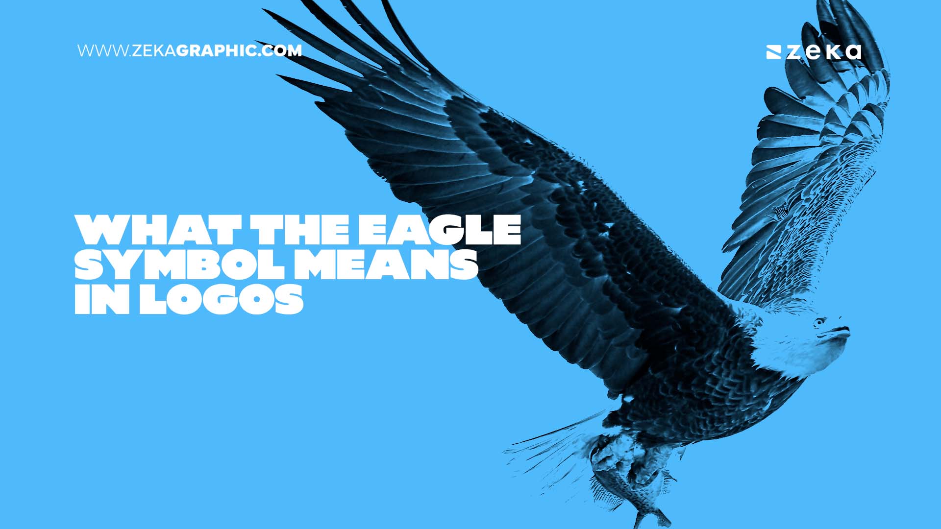
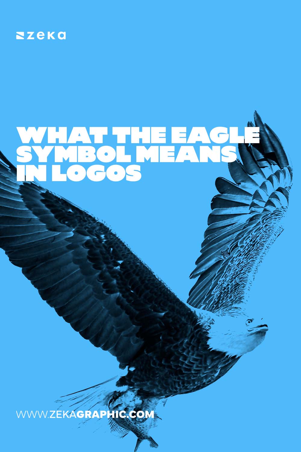
Eagle logos never really go out of style. They tap into a bundle of ideas that feel instantly familiar: authority, watchfulness, pride, and the kind of freedom people associate with open skies. But the symbol is powerful enough that it can easily turn into a cliché if it is not handled with care.
That is why modern designers are rethinking how the eagle looks, how it moves, and how it fits into clean, contemporary visual systems.
According to a breakdown by Ebaq Design, brands reach for eagle imagery when they want to show decisiveness and clear vision. There is something about the forward tilt of the head, the sharp angles, and that upward stretch of the wings that feels confident without being loud. A similar overview from LogoLook notes that even sports teams and government agencies rely on eagle silhouettes to communicate vigilance and structured discipline.
Advertisment
The eagle stands at a unique intersection of concepts. It can feel ancient or futuristic depending on how it is drawn. That is why designers often lean into exaggerated geometry or clean monoline shapes to refresh the motif.
Here is what the symbol usually communicates:
This mix of themes works across industries, everything from fintech to outdoor clothing. It is flexible enough to be regal one minute and sporty the next.
If you want to avoid clichés, it helps to study actual physical emblems and coins where eagle proportions are most carefully refined.
This is where a natural reference to the American Silver Eagle comes in. Its sculpted posture, feather taper, and wingspread balance provide surprisingly good anatomical clues for illustrators trying to build something believable. Designers who study these proportions sometimes use them as a base before simplifying them into modern shapes. Many collectors look to places where they can buy American Silver Eagle coins to examine these details closely.
Traditional heraldry shows the eagle as bold and decorated, with layered feathers, ornate shields, and purposeful symmetry. This style still inspires institutions and organizations that want a sense of legacy.
Minimalist variations, meanwhile, strip the form down to sharp planes, abstract wing bars, and simplified angles. Each approach has its strengths:
Advertisment
This version leans into history, formality, and symbolism. It is dramatic and meant for long standing identity systems.
This approach emphasizes clarity, adaptability, and the ability to work well at tiny sizes, from app icons to tiny product stamps.
The eagle does not mean the same thing everywhere. Some cultures link it to monarchy, while others see it as a symbol of resistance or national rebirth. In some places it can even carry sensitive political associations.
When creating a brand, always check how the eagle is viewed in your audience’s region. And if you enjoy design topics like this, you might appreciate exploring more branding breakdowns and visual studies on your favorite creative blogs.
Advertisment
Pin it for later!

If you found this post useful you might like to read these post about Graphic Design Inspiration.
Advertisment
If you like this post share it on your social media!
Advertisment
Want to make your Business Grow with Creative design?
Advertisment
Advertisment
Advertisment