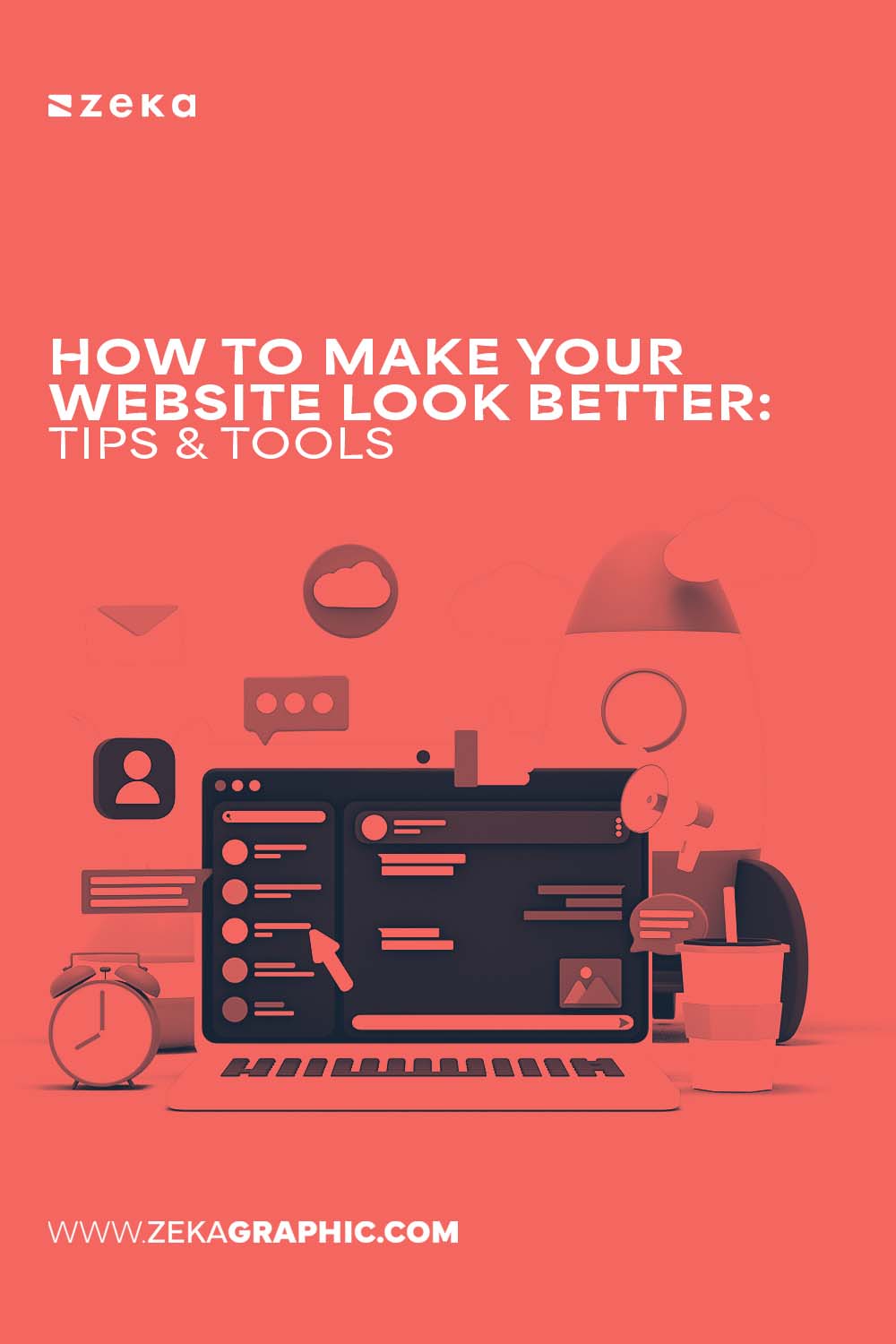
So, you’ve built your website. Maybe it’s been up for a while, or maybe you just hit “publish” yesterday. Either way, something’s nagging at you. You’re proud of the content, but visually… something feels a bit off. Maybe it looks a little outdated. Or too plain. Or just not as sleek as the websites you admire. Whatever the case, the good news is this: you don’t need to tear it all down and start over. Sometimes, small changes can make a massive difference.
In this guide, I’ll walk you through simple, hands-on ways to make your website look more polished, up-to-date, and inviting—without needing a degree in design. We’ll go over practical ideas and tools that are user-friendly (even if you’re not a tech wizard). Now let’s get started!
Advertisment
Let’s face it—images are often the first thing people notice when they land on your website. You could have the most compelling words ever written, but if your visuals fall flat, visitors might not even read them. The solution? Give your pictures a polished look.
Even basic adjustments like increasing the brightness, tweaking the contrast, or boosting the color saturation can make a world of difference. It doesn’t have to be complicated either. An automatic tool like PhotoDiva lets you edit your images quickly without needing Photoshop-level skills. Want to blur a messy background or smooth out a portrait? You can do all of that in just a few clicks. There are also AI-powered retouching tools and trendy filters. Plus, PhotoDiva lets you crop pictures and remove unwanted objects from them. It’s fast, beginner-friendly, and gets the job done.
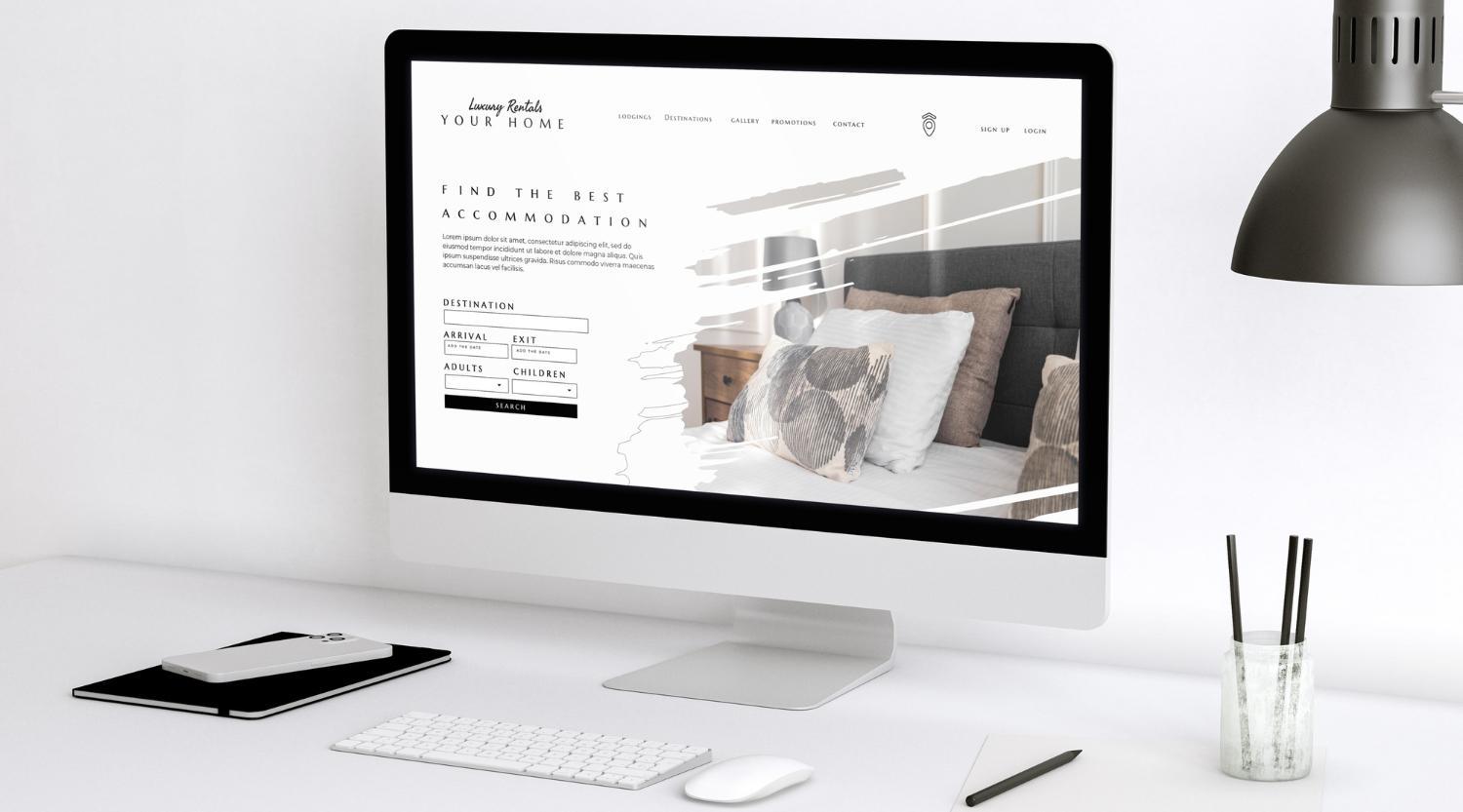
Ever seen a website with grainy, stretched-out images? It immediately feels unprofessional. Don’t let that be your site.
Whenever possible, use high-resolution, sharp images. If you’re not a photographer or don’t have a collection of original pictures lying around, don’t worry. Platforms like Unsplash, Pexels, and Pixabay are absolute lifesavers. They offer beautiful, free-to-use photos that look like they came straight out of a professional portfolio. Just make sure the images you choose match the overall tone of your brand or message.
Advertisment
Let’s talk text. You might have written pure gold, but if the font is too small or cramped, or the lines are way too long, readers will bail before they get to the good stuff. Here are a few readability tips that really work:
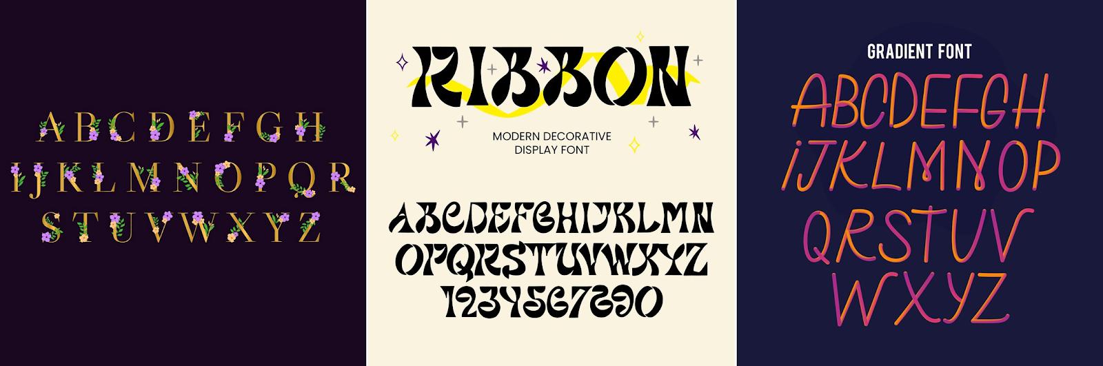
Fonts do more than just display your text—they set the mood for your entire site. Think of them as your site’s tone of voice. Playful? Serious? Elegant? Your typography should reflect that.
Try limiting yourself to two fonts: one for headings and one for the body text. You can find excellent (and free!) font combinations on Google Fonts. Here are a few pairings that just work:
Also, skip the overly fancy fonts—they may look cool for a second, but they’re tough to read and can make your design feel chaotic.
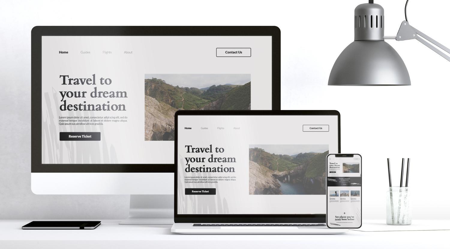
We all know it—people browse the web on their phones a lot. So if your website doesn’t play nice on smaller screens, that’s a problem. A big one. Besides, mobile website design is also a baseline requirement for good performance in search. Here’s a quick checklist to make your site more mobile-friendly:
Some people think they need to fill every pixel with something, but that’s usually a mistake. White space helps your content feel calm, clear, and organized. It draws attention to the important stuff and stops everything from blurring together. Try this: after you finish designing a page, take a break, then look at it with fresh eyes. Does it feel cramped? If so, you can increase the spacing around text blocks, between images, or around headings.
Sometimes it’s the little touches that make a site memorable. Well-placed icons or simple illustrations can add personality and help guide users through your content without overwhelming them. Need to show your contact info? Instead of just writing “Phone,” add a small phone icon. Want to highlight a product feature? Use a custom illustration that matches your brand.
Adobe Illustrator is the gold standard for creating custom visuals, but it has a learning curve. If you don’t want to draw them yourself, don’t hesitate to use resources like Flaticon (for icons), Undraw (for illustrations), and Canva (for DIY graphics). Just make sure to keep your design style consistent—don’t mix sleek flat icons with old-school gradients, for example.
Here’s a secret most people overlook: great design starts with planning. Before you dive into rearranging layouts or changing fonts, take a step back. Sketch out your ideas. Think about the structure of each page, how your content flows, and how you want users to interact with your site.
A tool like Figma is perfect for this. It’s free, cloud-based, and widely used by pros and beginners alike. You can create rough wireframes, share ideas with teammates, and experiment before making any real changes. Trust me—spending an hour planning can save you ten fixing things later. Plus, it helps you see the big picture before getting into the details.
Advertisment
You don’t have to start from scratch or hire an expensive web designer to give your website a visual glow-up. Often, just paying attention to the little details—images, fonts, spacing, layout—can completely change the way your site feels. With the right tools and a little time, you can transform your site from “okay” to “wow.”
Once you start making these changes, you’ll likely notice something else too: your site becomes more fun to work on. When your visuals align with your message, everything clicks. It feels like your website is finally working with you, not against you.
So, go ahead—pick one of these ideas and start today. You’ll be amazed how even the smallest change can breathe new life into your digital space.
Advertisment
Pin it for later!
If you found this post useful you might like to read these post about Graphic Design Inspiration.
Advertisment
If you like this post share it on your social media!
Advertisment


Want to make your Business Grow with Creative design?
Advertisment

Advertisment