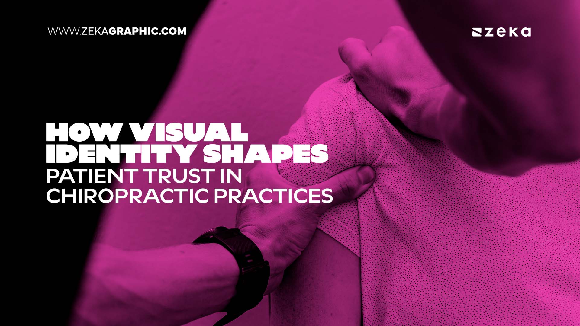
Picture this: A patient with chronic back pain searches for a chiropractor online. Two practices offer similar services, comparable reviews, and equivalent expertise. One website feels warm, organized, and calming. The colours are soothing, the layout is intuitive, and the imagery shows real people in genuine moments of care. The other feels generic, visually inconsistent, with harsh colours and stock photos that could belong to any healthcare business.
Which one gets the call?
In most cases, it’s the first. And the decision happens in seconds, long before the patient reads about treatment techniques or qualifications.
This split-second judgment isn’t superficial. It’s deeply rooted in how our brains process visual information and assess safety. In chiropractic care, where patients often arrive with pain, anxiety about adjustments, and questions about treatment effectiveness, visual identity becomes a silent but powerful form of communication.
Advertisment
Chiropractic care occupies a unique space in healthcare. Many potential patients don’t fully understand what chiropractors do, have concerns about manual adjustments, or feel uncertain about whether chiropractic treatment is right for their condition. This makes first impressions even more critical.
When someone seeks chiropractic care, they’re often dealing with pain, limited mobility, or chronic discomfort. They’re making decisions about their physical well-being while feeling vulnerable and uncertain. The stakes feel personal and immediate.
Patient experience research consistently shows that how patients feel from their first impression to their final follow-up influences not just satisfaction scores but also treatment adherence, perceived quality of care, and willingness to return or refer others.
Visual identity sits at the foundation of that emotional journey. Before a patient meets your team, reads your credentials, or walks through your doors, they’ve already formed an impression based on what they’ve seen. Your website, your Google Business Profile, your social media presence, even your intake forms. All of these visual touchpoints are shaping trust or eroding it.
This is why strategic chiropractic website design has become essential for practice growth. A well-designed website that incorporates calming colours, clear typography, and authentic imagery doesn’t just look professional. It actively reduces patient anxiety, answers unspoken concerns, and builds confidence before the first phone call. The visual foundation determines whether potential patients feel safe enough to take the next step.
Beyond website design, implementing effective marketing ideas for chiropractors requires a strong visual identity as the foundation. Strategies like Google Business Profile optimization, local SEO campaigns, and review generation all perform significantly better when supported by consistent, trust-building visuals. When patients encounter the same professional, calming tone across all platforms, they perceive your practice as more established and reliable.
This connection between visual identity and patient trust becomes especially clear in competitive chiropractic markets. Patients often arrive with both physical discomfort and uncertainty about treatment approaches. Some have never visited a chiropractor before. Others may have misconceptions based on what they’ve heard. The visual environment needs to simultaneously educate, reassure, and invite action.
Practices that invest in cohesive visual systems see measurable improvements across their marketing channels. Well-designed websites that prioritize reassuring messaging, aligned colour palettes, clear typography, and authentic imagery don’t just look more professional. They fundamentally change how patients interact with the practice online. Service pages hold attention longer, contact forms feel less intimidating, and new patient specials convert at higher rates because the visual foundation supports decision-making rather than creating friction.
A clear, consistent visual system does several things simultaneously. It lowers cognitive load during an already stressful decision-making process. It signals professionalism and attention to detail. It creates emotional continuity across multiple interactions. It builds familiarity, which neurologically translates to safety.
When these elements align, patients feel like they’ve already started the care relationship before they ever pick up the phone.
Advertisment
Colour isn’t decorative. It’s neurological. Our brains process colour faster than text or shapes, and certain hues trigger predictable emotional and physiological responses. The field of colour psychology has documented how different tones can evoke calm, alertness, warmth, or even agitation.
In chiropractic care, where patients often arrive anxious about treatment or skeptical about effectiveness, colour choices become a form of environmental care that can ease concerns before the first conversation even begins.
Blues and teals are associated with stability, trust, and calm. They lower heart rate and can reduce feelings of anxiety, which is particularly valuable for patients nervous about spinal adjustments. Soft, muted blues work especially well because they don’t feel sterile or cold.
Greens connect to nature, healing, and balance. They’re restful for the eyes and align perfectly with the holistic, wellness-focused approach many chiropractors emphasize. Sage, seafoam, and olive tones feel grounded without being overly clinical.
Warm neutrals like sand, cream, taupe, and soft grey create a sense of warmth and approachability. They soften the clinical edge and help position chiropractic care as accessible and welcoming rather than intimidating.
Earth tones such as terracotta, warm browns, or muted clay colours add gentle warmth. They feel human and organic, which reinforces the hands-on, natural approach to healing that chiropractic care represents.
Bright reds and oranges can increase heart rate and evoke urgency or alarm. While they might work for emergency medical services, they can feel overstimulating for chiropractic practices where the goal is to help patients relax and trust the treatment process.
Harsh blacks or stark whites in large amounts can feel cold, clinical, or institutional. This is exactly the opposite of the warmth and personal care most chiropractic patients are seeking.
Highly saturated or neon tones create visual noise that can overwhelm anxious patients or those already dealing with sensory sensitivities from pain or discomfort.
The goal isn’t to eliminate all boldness or fall into the sea of cliche medical care colours, but to use colour intentionally. A visual system that prioritizes regulation over stimulation helps patients feel safer from the moment they encounter your brand.
This colour strategy becomes particularly important on your digital presence, where most patient journeys begin. Patients researching chiropractors are often in pain, comparing multiple practices, and looking for signals that you’re the right choice.
When websites incorporate these colour psychology principles effectively, the impact is measurable. Calming colour palettes paired with clear visual hierarchy keep visitors engaged longer, make service explanations more digestible, and help conversion actions feel less intimidating. The colours aren’t just aesthetic choices. They’re strategic tools that lower patient anxiety and build confidence in the care they’re about to receive.
Advertisment
Most people don’t consciously notice typography, but they absolutely feel it. The fonts you choose, how you space them, and how you organize information all affect how easily patients can absorb what you’re saying about chiropractic treatment.
When someone is researching chiropractors while dealing with pain or discomfort, cognitive load matters even more. Typography that’s hard to read, inconsistent, or visually cluttered adds friction. Typography that’s clear, calm, and predictable removes it.
Sans-serif fonts with rounded edges like Poppins, Nunito, or Quicksand feel friendly and approachable. They work exceptionally well for chiropractic practices that want to emphasize warmth and accessibility, particularly those focused on family care, wellness, or holistic health.
Clean, modern serif fonts like Merriweather, Lora, or Georgia convey professionalism, stability, and trustworthiness. They’re effective for practices that want to balance warmth with authority, particularly those specializing in sports injuries, rehabilitation, or evidence-based treatment approaches.
Overly stylized or script fonts can be beautiful, but they increase cognitive effort. When used as body text or in critical navigation, they make information harder to process, especially for patients with high-stress levels, pain-related cognitive fog, or visual impairments.
First, stick to two primary typefaces. One for headings, one for body text. This creates rhythm and hierarchy without visual chaos, making it easier for patients to find the information they need quickly.
Second, prioritize readability over personality. Line height, or spacing between lines, should be generous, around 1.5 to 1.7 times the font size. This makes text easier to scan and reduces eye strain, particularly important for patients who may be researching while uncomfortable.
Third, create clear contrast. Text should be easy to read on any background. Avoid light grey text on white backgrounds or white text on pale colours. Patients in pain don’t have the patience for hard-to-read text.
Fourth, establish a consistent hierarchy. Use the same heading sizes, button styles, and text formatting across all pages. Predictability reduces mental effort and builds trust, especially when explaining complex topics like subluxations, spinal alignment, or treatment plans.
When typography feels effortless, patients can focus on what matters. Understanding their treatment options, making informed decisions about their care, and feeling confident in choosing your practice.
Advertisment
Imagery is where your chiropractic brand becomes human. Photos, graphics, and visual elements set the emotional tone faster than words ever could. They answer unspoken questions: Will this be painful? Will I be heard? Do people like me receive care here?
Generic stock photos, especially the overly polished, staged variety, create emotional distance. Patients can tell when an image is inauthentic, and it breaks trust. When every photo looks like it could belong to any chiropractic practice, anywhere, your practice itself starts to feel interchangeable.
Worse, many stock photo libraries show outdated or stereotypical representations of chiropractic care. Images of aggressive adjustments, overly clinical settings, or lack of diversity can actually reinforce the concerns and misconceptions patients already have.
Invest in original photography. Even a small set of authentic images of your actual team, treatment rooms, and patient interactions with proper consent will outperform an entire library of stock photos. Patients respond to real faces, real environments, and real moments of care.
Use natural lighting and soft colour grading. Harsh lighting or overly edited photos can feel artificial. Natural light, soft shadows, and warm tones create approachability and make your practice feel welcoming rather than intimidating.
Show moments of care, not just treatment. Capture genuine interactions like consultations, explanations, gentle assessments, and patients showing relief or improvement. Avoid photos that focus solely on dramatic adjustments or make treatments look scary. Real, calm moments resonate with anxious first-time patients.
Represent your community. If your practice serves families, show families. If you work with athletes, show athletes. If you specialize in elderly care, show older adults. If your community is diverse, your imagery should reflect that. Representation isn’t just ethical, it’s strategic. Patients need to see themselves reflected in your care.
Be mindful of accessibility. Use alt text for screen readers, ensure sufficient colour contrast in graphic overlays, and avoid flashing or rapidly moving images that can trigger sensitivities, particularly for patients dealing with headaches or neurological symptoms.
Imagery that feels authentic, inclusive, and calm creates a sense of predictability, and predictability is deeply comforting for patients navigating uncertainty about chiropractic care.
You don’t need a complete rebrand to improve patient trust. You need a framework, a clear set of intentional decisions that guide every visual element across every touchpoint your patients encounter.
Start by identifying three to four core feelings you want patients to experience when they interact with your brand. These become your guiding principles.
For chiropractic practices, examples might include calm, confidence, warmth, relief, safety, empowerment, or clarity.
Write them down. Refer back to them with every design decision. If a colour, font, or image doesn’t support those feelings, it doesn’t belong in your system.
You don’t need a dozen colours. You need a focused palette that works together harmoniously and reinforces the emotional tone you’ve defined.
Choose one primary colour. This is your core brand colour, used in logos, buttons, and key visual elements. For chiropractic practices, blues, greens, or warm earth tones often work well.
Add one or two supporting colours. These add depth and flexibility without creating chaos. Consider how these colours work together to create the feeling you want patients to experience.
Create a neutral palette. Greys, creams, or soft whites for backgrounds, text, and breathing room. These neutrals should feel warm and welcoming, not stark or clinical.
Document the exact hex codes and create simple rules for when to use each colour. Consistency is what transforms individual design choices into a recognizable brand that patients remember.
Create a simple typographic system that covers heading sizes like H1, H2, H3, body text size and line spacing, button text styles, and link formatting.
Apply this system everywhere. Website, forms, emails, signage, printed materials. When typography is consistent, patients subconsciously recognize your voice even before they read the words, building familiarity and trust.
Document your approach to photography and graphics specific to chiropractic care. Include lighting style such as natural or warm, composition preferences like showing full treatment context versus close-ups, showing patient faces versus focusing on techniques, representation guidelines around diversity and age ranges, colour grading or filters if any, and contexts to show like consultations, gentle assessments, treatment success stories, and wellness activities.
This guide ensures that even as you add new photos over time, they’ll feel cohesive with everything else and consistently reinforce your practice’s values.
Visual identity isn’t just your website. It’s your Google Business Profile photos, social media graphics showing patient education content, email templates and appointment reminders, intake forms and patient handouts, office signage and waiting room materials, and printed business cards and brochures.
Patients notice when the visual tone shifts between platforms. Consistency across touchpoints creates the sense that the same thoughtful, reliable team is behind every interaction, from first Google search to ongoing care.
This consistency becomes especially powerful when it aligns with broader marketing efforts. For instance, many effective marketing ideas for chiropractors, such as Google Business Profile optimization, local SEO strategies, and review generation campaigns, perform significantly better when supported by consistent, trust-building visuals. When patients encounter the same professional, calming visual tone across search results, social media, and the website itself, they perceive the practice as more established and reliable. The marketing tactics work harder because the visual foundation amplifies their effectiveness rather than creating confusion.
A strong visual identity doesn’t replace marketing strategy. It amplifies it. When your brand foundation is clear and consistent, every marketing effort performs better because the visuals reinforce trust rather than creating confusion.
For example, chiropractic practices with cohesive visual identities often see improved performance across service pages, where clear layouts and calming visuals keep potential patients engaged longer and reduce bounce rates. Local SEO improves as Google Business Profiles with consistent, high-quality imagery tend to generate more clicks and engagement. Review generation benefits because patients who feel emotionally connected to a practice are more likely to leave thoughtful, positive reviews. Email engagement increases as branded reminder emails and newsletters with consistent typography and colour systems feel more trustworthy and get higher open rates.
In competitive chiropractic markets, visual identity becomes a differentiator. Two practices might offer similar services, use similar techniques, and have comparable credentials, but the one that feels more emotionally coherent will often win the patient’s trust and their business.
This is particularly true when patients are choosing between multiple chiropractors. They’re not just evaluating expertise. They’re evaluating how safe, understood, and comfortable they expect to feel during treatment.
If a full brand refresh isn’t in the budget right now, start with these focused improvements specifically for chiropractic practices. Each one creates immediate impact without requiring months of work.
First, refine your homepage hero section. This is often the first thing potential patients see. Use a calmer colour palette, a single clear call-to-action focused on new patient appointments or consultations, and better typography. Remove visual clutter that distracts from your core message.
Second, replace three to five stock photos with authentic images. Even a small update shifts the emotional tone dramatically. If you don’t have professional photos yet, use well-lit smartphone photos of your actual team, treatment rooms, and if possible, willing patients showing positive outcomes. Avoid scary adjustment photos.
Third, tighten your colour usage. Audit your website and remove any off-brand accent colours that create visual confusion. Reinforce your primary palette throughout to create a cohesive feel.
Fourth, add a “What to Expect” section specifically about your treatment approach. This reduces fear of the unknown, one of the biggest barriers for first-time chiropractic patients. Describe the first appointment step by step, what adjustments feel like, and how gentle your approach is in calm, clear language.
Fifth, align your Google Business Profile imagery with your website. Potential patients often compare what they see on Google with what they find on your site. When the visuals match perfectly, trust increases immediately and you appear more established.
Sixth, update email templates to reflect your visual identity. Ensure appointment reminders, wellness newsletters, and follow-ups use consistent fonts, colours, and imagery. Every patient touchpoint is a trust-building opportunity that reinforces your brand.
Advertisment
Chiropractic patients don’t form trust based solely on credentials, years of experience, or advanced techniques. They form it through emotion, clarity, and consistency across every interaction with your practice.
When your colours calm anxious patients, your typography guides them through complex treatment information, and your imagery invites them into genuine moments of care, you create an environment where patients feel safe before the first appointment ever begins. You answer their unspoken questions: Will this be painful? Will I be heard? Is this place organized and professional? Do I belong here?
A strong visual identity doesn’t replace high-quality chiropractic care. It removes the barriers that prevent patients from accessing it. It says, through every visual decision, “You can trust us. We’ve thought about your experience. We understand your concerns. We’re ready to care for you.”
And in chiropractic care, where patients often arrive with both physical pain and emotional uncertainty, that message matters as much as any adjustment technique.
Advertisment
Pin it for later!

If you found this post useful you might like to read these post about Graphic Design Inspiration.
Advertisment
If you like this post share it on your social media!
Advertisment


Want to make your Business Grow with Creative design?
Advertisment

Advertisment