The four tricks to perfect brand design consistency are building a unified design system, calibrating displays for color accuracy, standardizing team hardware, and deploying on-brand physical display technology.
Implementing these automated systems prevents subtle visual mismatches across digital platforms and physical customer touchpoints. By establishing these standards once, teams maintain strict visual alignment without constant manual intervention.
Fixing this does not require a complete brand overhaul or a dedicated quality control team. Instead, it requires smart upfront investments that do the consistent work for you on autopilot.
For example, standardizing your team’s environment through a provider like PCLiquidations for identical refurbished desktop computers ensures every designer sees the same visual output, regardless of their workstation.
Similarly, extending that control to the physical world, by utilizing professional enclosures and tablet POS hardware from specialists like VidaBox, prevents beautiful digital assets from looking cheap or washed out on a generic store display.
These low-friction systems quietly keep every visual output aligned, protecting the brand’s integrity without the need for constant manual oversight.
Advertisment
The single most powerful consistency tool available to any design team costs nothing to create.
A unified design system is a documented reference that defines exactly how your brand looks, sounds, and behaves across every output. Often called a brand style guide, it serves as the ultimate source of truth.
Without one, every designer on your team is making micro-decisions independently. One interprets the brand blue as slightly warmer, while another uses a font weight one step heavier than approved.
A third selects an icon style that feels close but does not quite match. Over time, those choices accumulate into visible brand drift that no single designer caused.
Implementing these rules requires documenting every detail meticulously. A complete design system includes several critical components.
By organizing these elements, you create a reliable foundation for all future projects.
Building this system requires one focused audit of every current brand asset across every output channel. You must document inconsistencies and consolidate approved versions into a single source of truth.
A style guide that lives in a private folder does not protect brand consistency. It must live in a shared workspace and be linked in every project brief.
Key Insight: Brand drift isn’t caused by one big mistake, but by hundreds of tiny, undocumented decisions. A unified design system automates these choices, ensuring your brand remains cohesive without constant manual oversight. |
A design system tells your team what the brand colors are. Display calibration ensures that what your team sees on screen actually matches those approved colors.
It also guarantees that what appears on one monitor looks the same on every other monitor in your workflow.
Uncalibrated displays introduce two types of error that silently corrupt design work. The first is color temperature drift, where a monitor reads slightly warm and shifts neutral grays toward yellow.
The second is gamma variation, where differences in midtone rendering change perceived contrast and saturation. Combined across a team of five designers working on different screens, these create five subtly different interpretations of the same brand color.
Color profiles add another layer of complexity to visual accuracy. The sRGB profile covers the standard web color gamut and is the correct choice for digital deliverables.
Conversely, Adobe RGB extends the gamut further for print production workflows.
Working in mismatched profiles means a color that looks correct on screen can shift noticeably when printed. The practical solution is straightforward and highly effective. Implementing these steps protects your visual assets.
Teams should adopt the following workflow practices.
One calibration session repeated monthly closes the gap between what your design system specifies and what your team sees. This simple routine prevents minor color discrepancies from becoming major production errors.
Avoided reprints, eliminated client revision rounds, and protected brand fidelity compound well beyond the time invested.
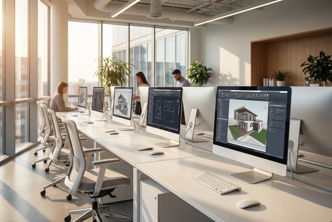
Even with a complete design system and calibrated monitors, a team working on mismatched hardware will still produce inconsistent output. This is one of the less obvious sources of visual drift in creative workflows.
It is also one of the most persistent issues to troubleshoot because the differences are baked into the system architecture.
The problem begins with how different machines handle font and graphic rendering. Operating systems smooth typefaces differently based on varying hardware generations and GPU configurations.
A headline that reads crisply on one machine can appear slightly heavier or softer on another. When designers work on different machines in different states of configuration, they are effectively working in entirely different rendering environments.
Hardware standardization solves this by equipping the team with equivalent machines running the same operating system version.
For growing agencies managing tight budgets, smart procurement strategy is critical. Sourcing brand new workstations for an entire design team represents a significant capital outlay that many organizations defer.
This hesitation is precisely how hardware mismatches accumulate over time.
Extending the productive lifecycle of enterprise-grade equipment through certified refurbishment reduces electronic waste without compromising capability.
This approach aligns daily operational practices with broader corporate sustainability goals. To execute this effectively, teams should follow a structured rollout plan.
Warning/Important: Don’t ignore hardware mismatches. Differences in GPUs and operating systems can subtly alter font rendering and color output. Standardizing your team’s workstations is the only way to guarantee visual parity across every project. |
Advertisment
The preceding strategies handle everything that happens inside your digital design workflow. This final approach addresses what happens when your brand meets customers in the physical world.
The gap between digital brand investment and physical brand delivery is a commonly ignored consistency failure.
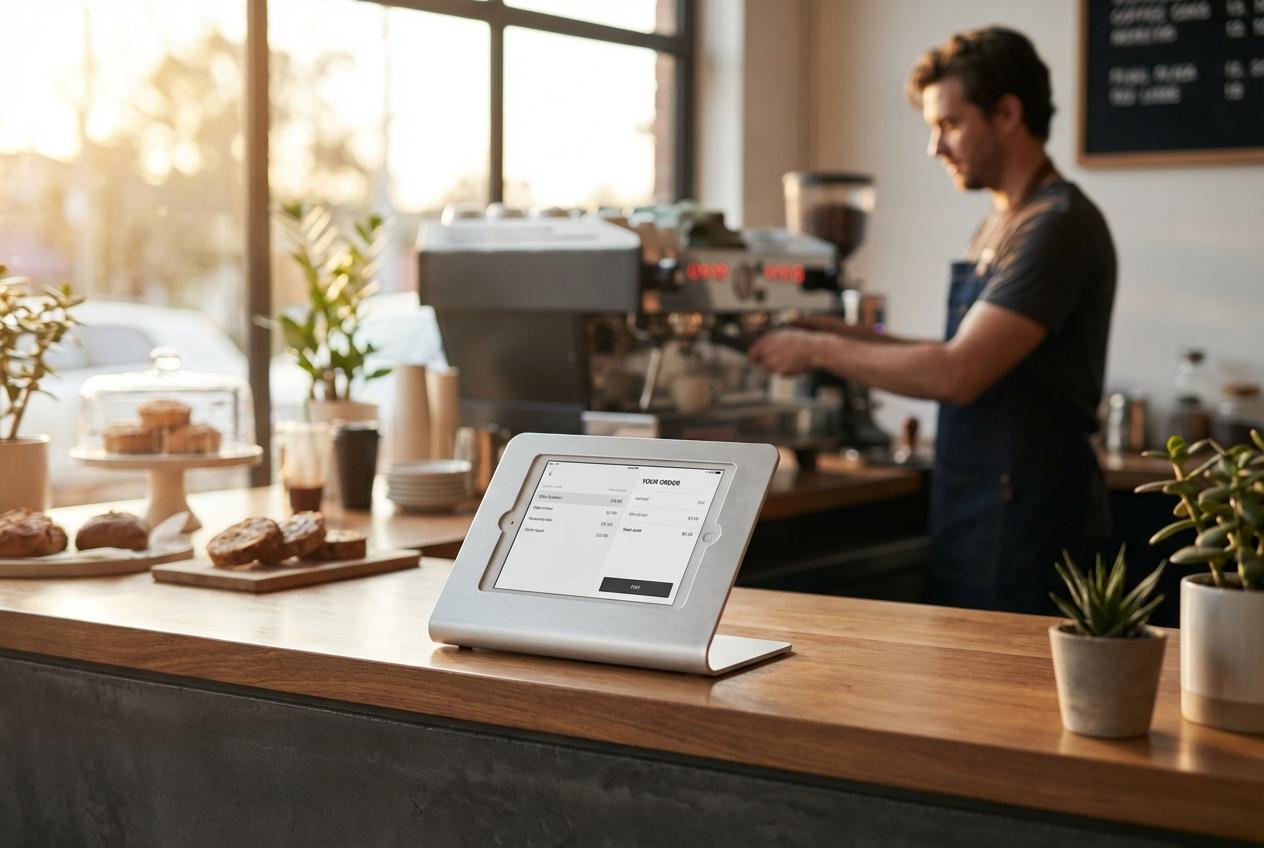
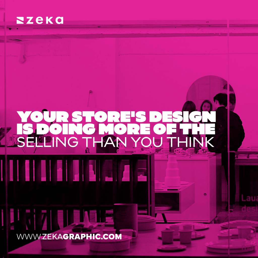
Every customer-facing screen in a physical environment must function as an intentional brand touchpoint. Hospitality and retail brands typically invest heavily in their digital presence and precisely documented style guides.
However, a customer often encounters a consumer tablet in a generic plastic stand running default system backgrounds. This mismatched presentation signals an improvised operation rather than a professional enterprise.
Closing this gap starts with a site audit of every point of sale terminal and reception display.
Businesses deploying tablets in customer-facing roles must treat the enclosure as part of the brand statement.
A professional hardware enclosure communicates the same care and quality that your meticulously designed website does. These durable solutions ensure that the high-end positioning of your digital brand translates seamlessly to your in-store interactions.
Once the physical infrastructure is securely in place, the on-screen configuration completes the visual presentation. Teams must treat these public-facing screens with the same strict editorial control as a flagship website.
This involves applying specific interface settings across the board.
Pro Tip: Extend your digital standards to the physical world. Using professional tablet enclosures like VidaBox ensures that your in-store touchpoints reflect the same quality and design integrity as your high-end digital assets. |
These four strategies work individually, but they function significantly better as a complete operational ecosystem.
A unified design system creates the visual rules for your entire organization. Display calibration keeps the actual output of those rules accurate across every screen.
Standardized hardware guarantees that designers operate in an equivalent rendering environment.
Each of these strategies requires a genuine upfront investment of time and resources. You must build the design system, establish a calibration routine, audit hardware, and evaluate physical touchpoints.
However, each front-loaded effort permanently removes ongoing manual oversight from your workflow. Once these operational systems are running smoothly, visual consistency becomes an automatic default.
Start with the operational system that addresses your most visible pain point today. You can build toward the complete ecosystem gradually over time.
Controlling every touchpoint from the design workstation to the storefront kiosk builds deep customer recognition. That resulting brand trust compounds with every single interaction.
Advertisment
Pin it for later!
If you found this post useful you might like to read these post about Graphic Design Inspiration.
Advertisment
If you like this post share it on your social media!
Advertisment


Want to make your Business Grow with Creative design?
Advertisment

Advertisment