A common mistake many designers make is treating design principles like a checklist.
The layout has contrast. Alignment looks clean. Spacing feels consistent. Hierarchy is technically there.
And yet, something still feels off.
The problem usually isn’t missing principles. It’s treating them as isolated rules instead of connected decisions.
Good design happens when principles support each other. Contrast shapes hierarchy. Spacing affects balance. Alignment influences movement. Every adjustment changes how the whole composition behaves.
Experienced designers don’t think in rules.
They think in relationships.
That shift—from checking boxes to understanding systems—is what makes layouts feel intentional instead of mechanical.
Advertisment
Graphic design principles are not fixed formulas. They describe relationships between visual elements as for example contrast only exists because something differs. Balance depends on visual weight. Emphasis only works when other elements become secondary.
Everything depends on context.
That’s why rigid rule-following often produces lifeless layouts. A design can be:
The goal isn’t technical perfection.
It’s clear communication.
Professional designers adjust principles based on what the layout needs—even if that means breaking “rules” to create tension, calmness, or personality.
Design principles rarely work in isolation, change one part of a layout, and the rest of the composition responds.
A single adjustment often creates multiple visual effects at once. For example:
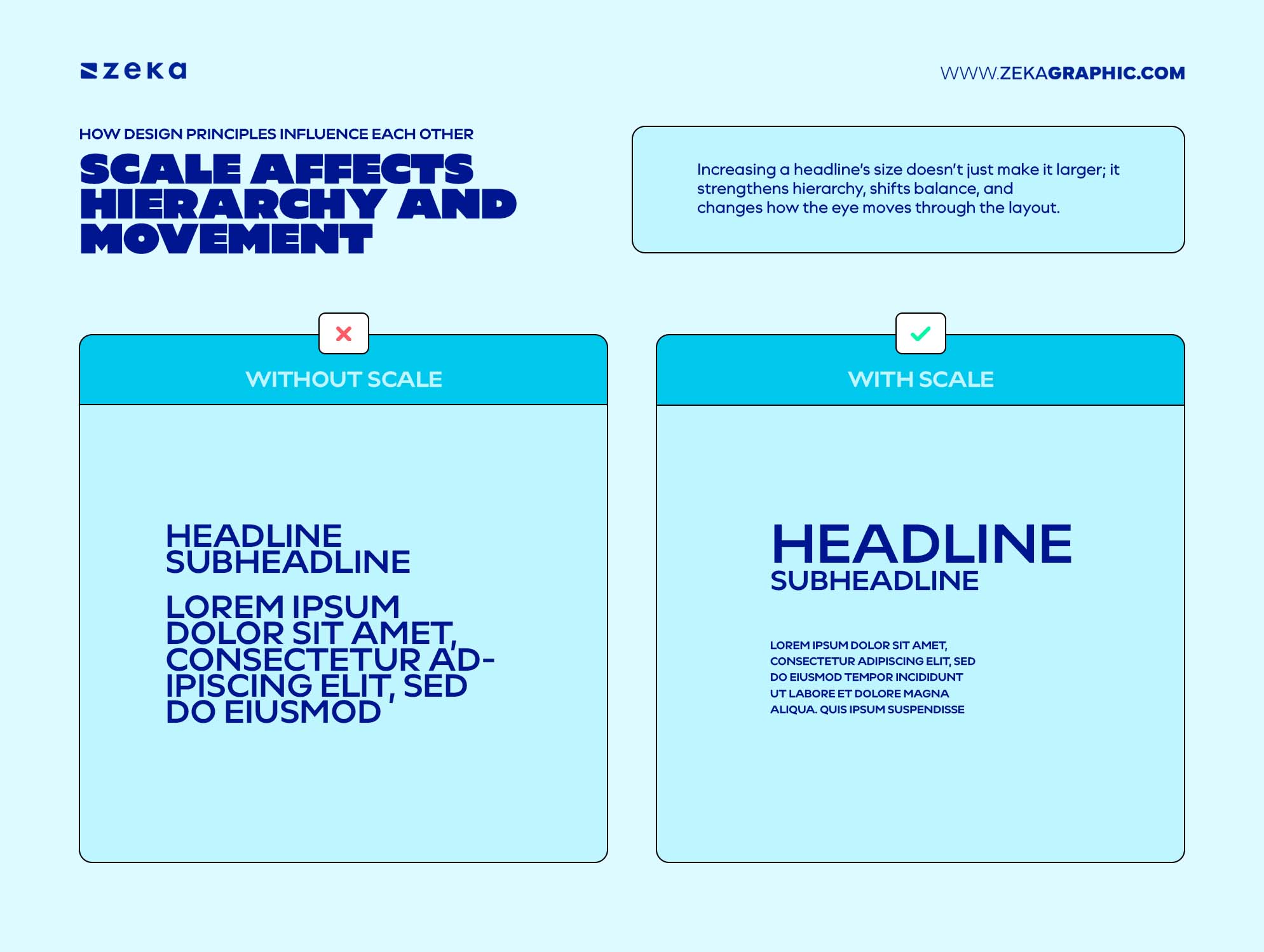
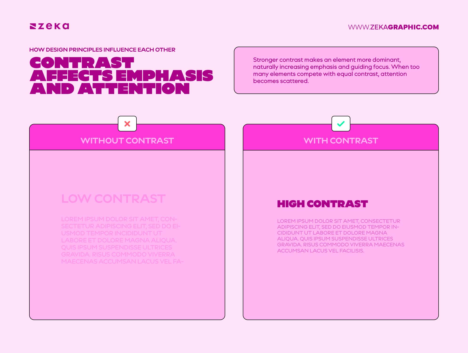
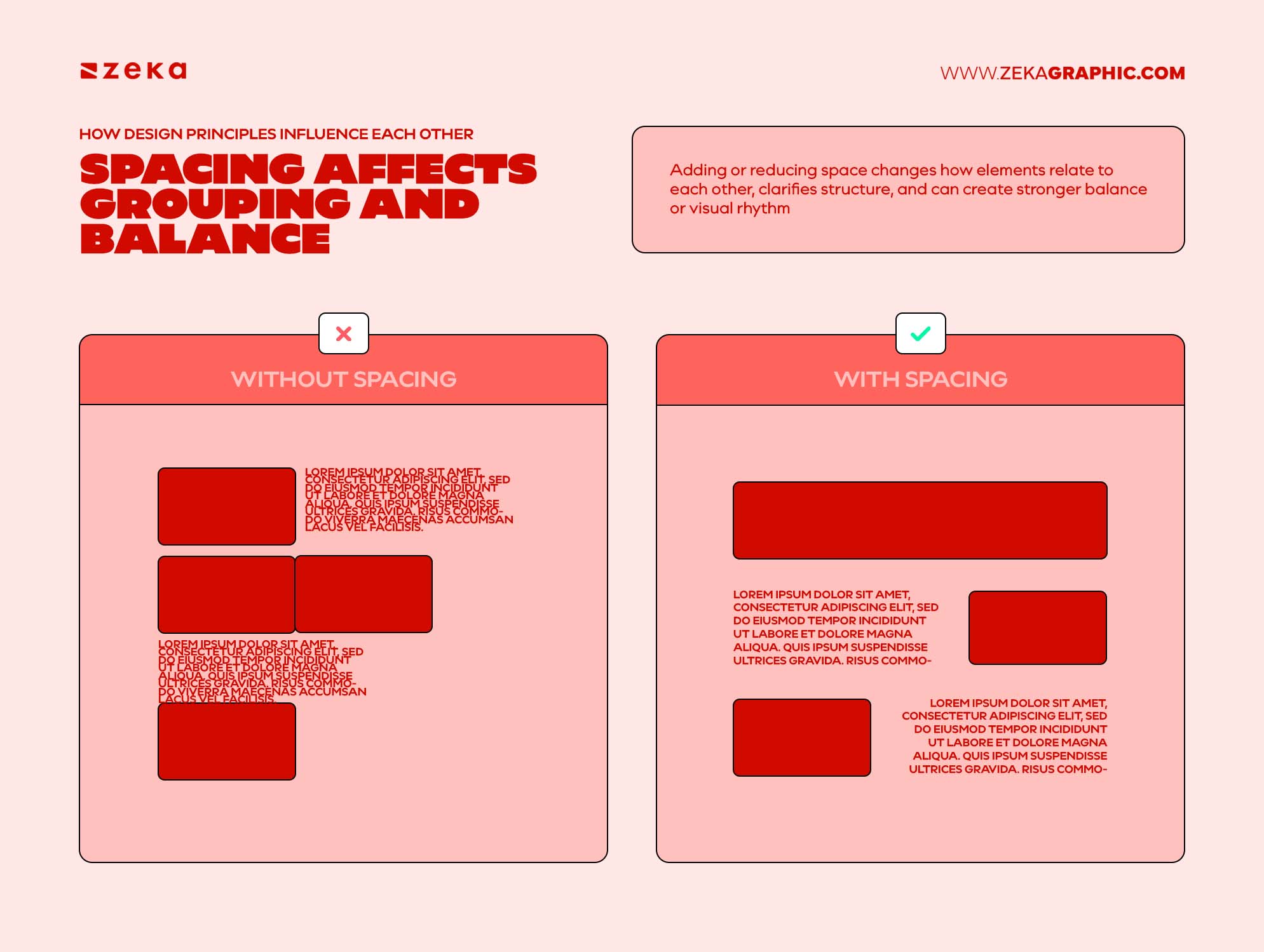
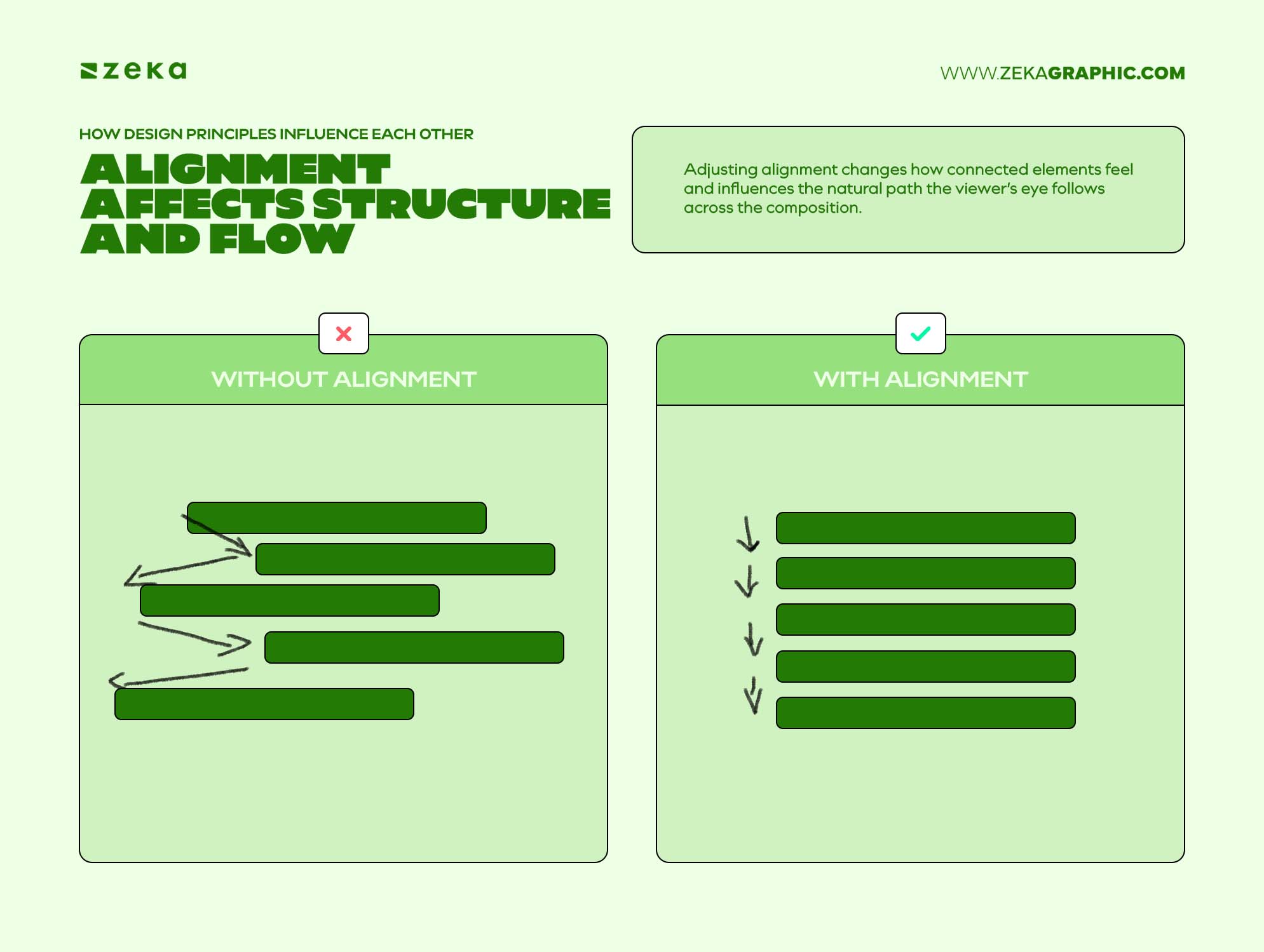
This is why experienced designers rarely think about fixing a single principle in isolation. Every adjustment creates a chain reaction across the layout.
That relationship between principles is what makes design feel like a connected system rather than a set of separate rules.
Advertisment
Trying to consciously apply every design principle at once usually creates cluttered thinking.
A better approach is to work in layers, solving one design problem at a time.
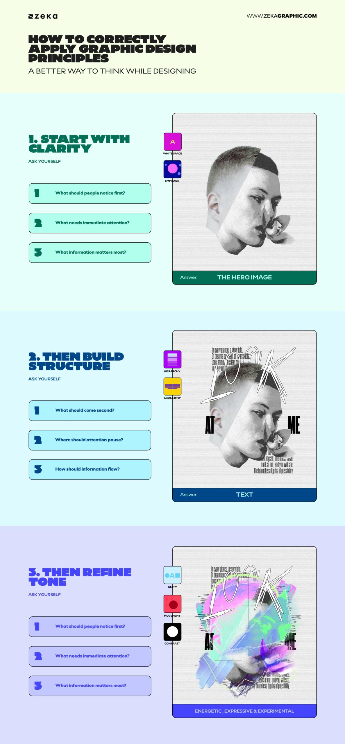
Before thinking about principles, decide what matters most.
Ask yourself:
This is where hierarchy begins. You’re not applying theory yet—you’re defining priority.
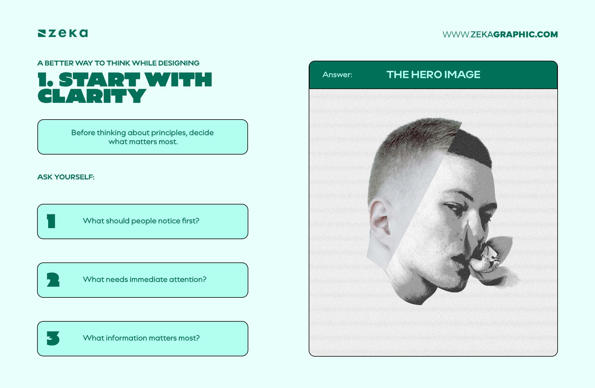
Once priority is clear, shape how the eye moves through the layout.
Ask:
This is where alignment, spacing, grouping, and rhythm begin working together. The goal isn’t decoration—it’s navigation.
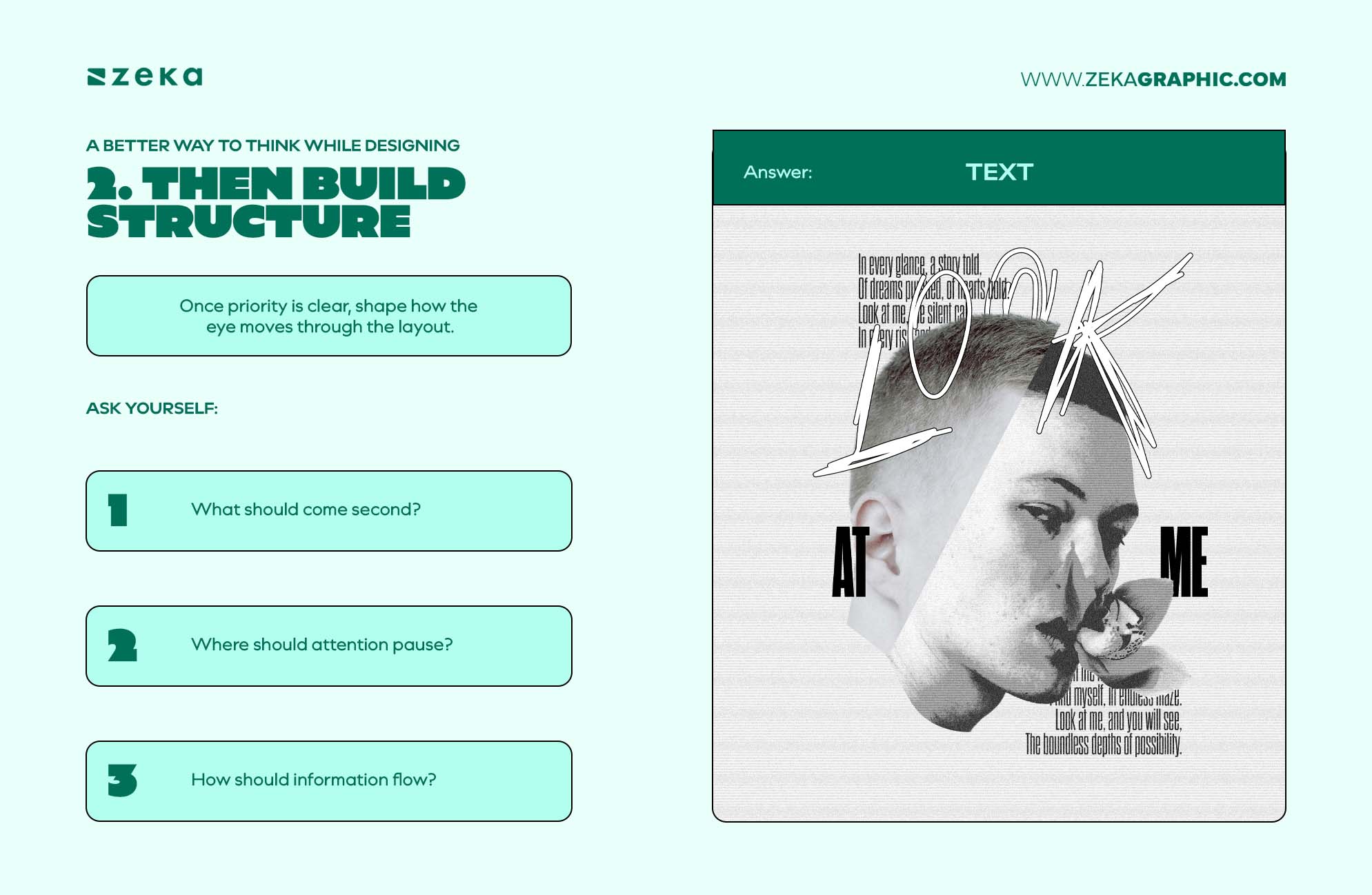
Once clarity and structure are working, shape the emotional feel of the design.
Ask:
This is where principles become more flexible. Slight imbalance can create tension, softer contrast can create calmness, and looser alignment can introduce movement.
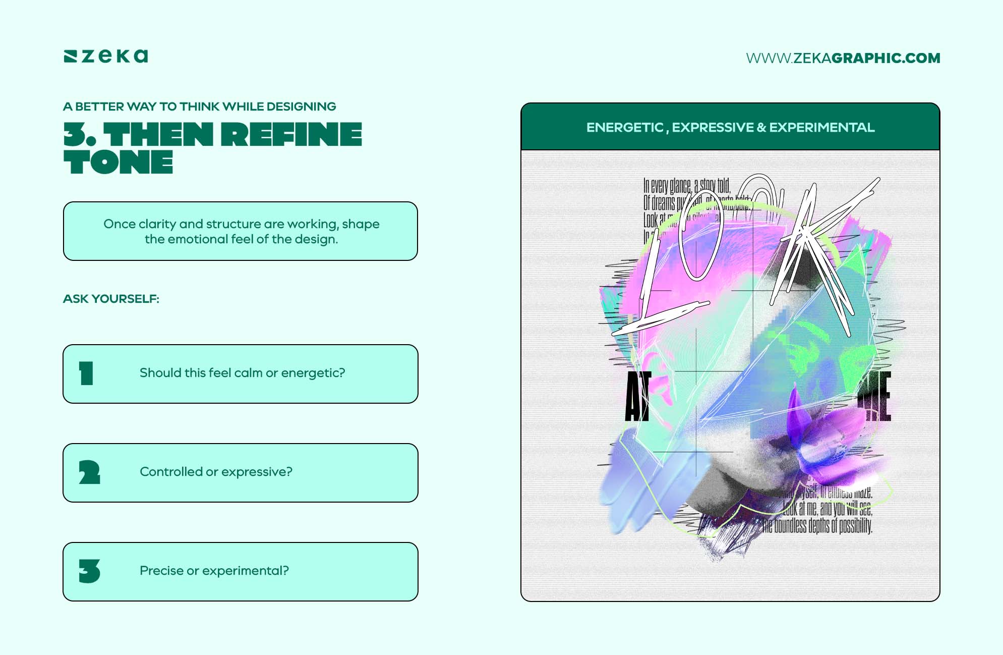
This layered thinking simplifies complexity. Instead of trying to apply every principle at once, you solve one communication problem at a time.
And often, one smart adjustment improves several principles at once. Better spacing can strengthen hierarchy and balance, while cleaner alignment can improve rhythm and flow.
That’s why experienced designers often seem intuitive—they’re not thinking about more principles, just clearer priorities.
A common mistake developing designers make is treating design like a checklist. The layout has contrast, alignment is clean, spacing feels consistent—yet something still feels off.
The problem is usually context.
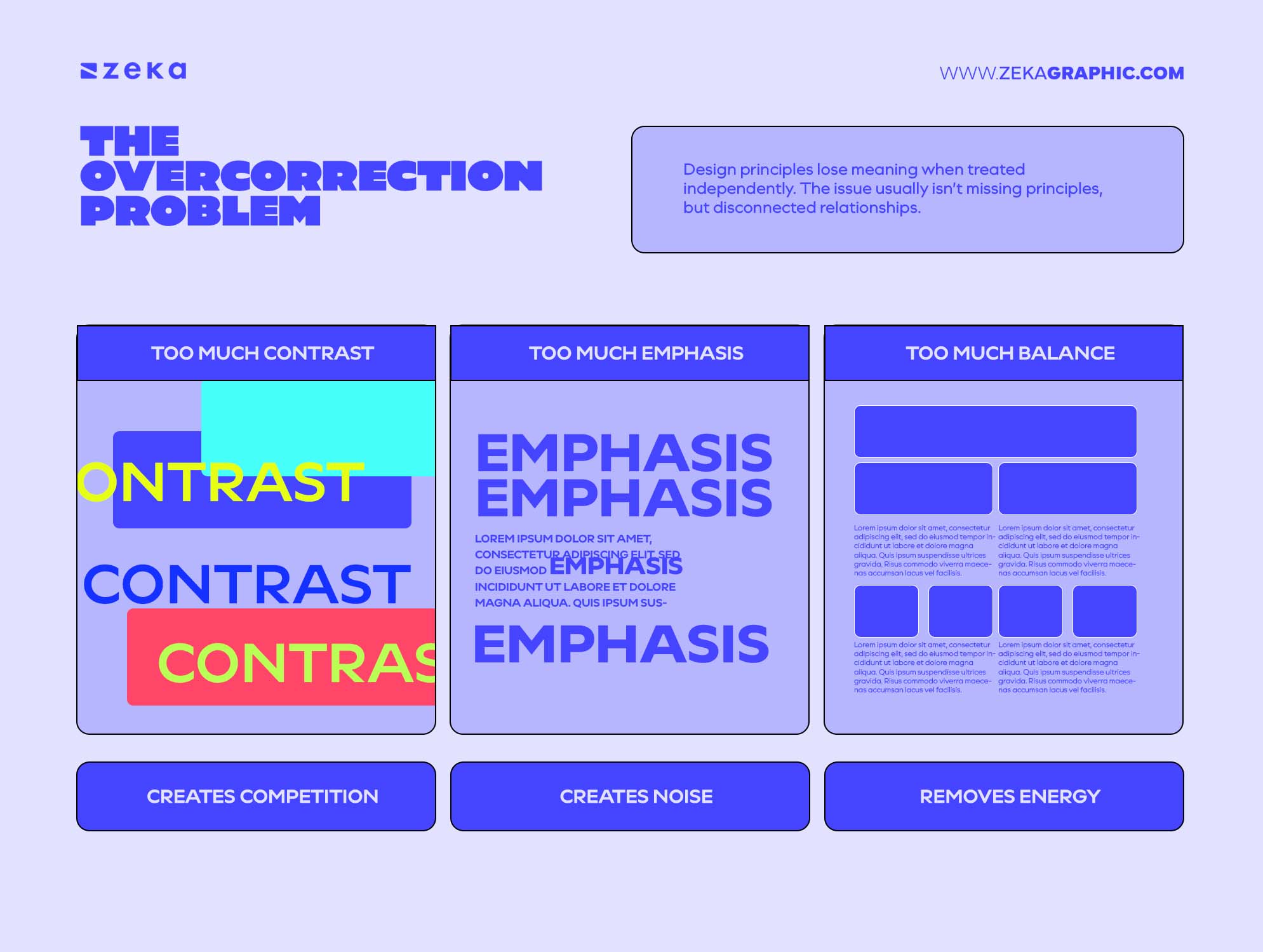
Design principles lose meaning when treated independently. A layout can have strong contrast but weak hierarchy, or feel balanced while still lacking focus. The issue usually isn’t missing principles, but disconnected relationships.
This often leads to overcorrection:
Every principle depends on restraint elsewhere. Emphasis works when secondary elements step back. Movement works when structure supports it. Balance works when visual weight is distributed with purpose.
Without context, principles become decoration instead of communication tools—and that’s why technically “correct” layouts often still feel wrong.
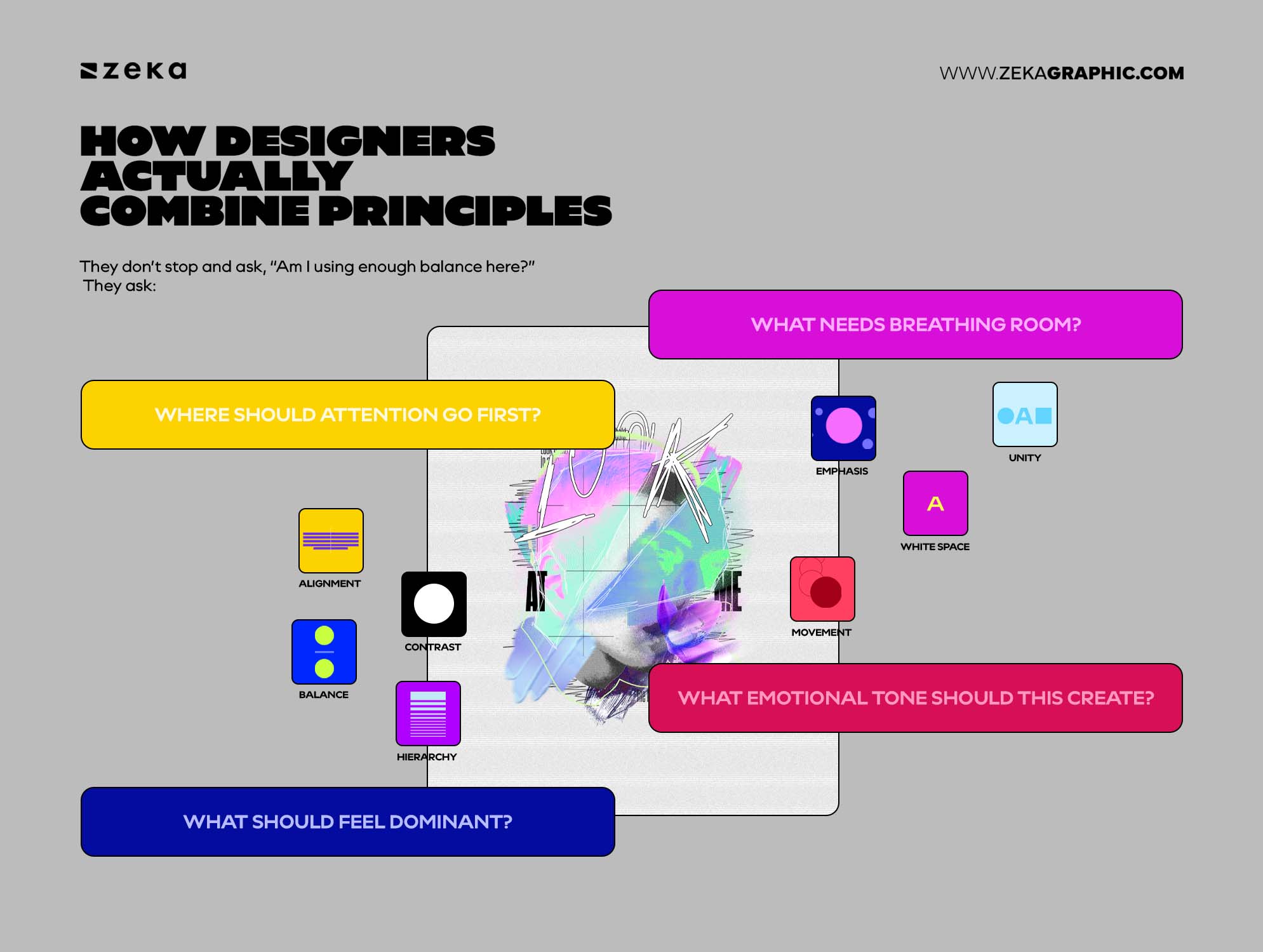
Professional designers rarely think in isolated categories while working.
They don’t stop and ask, “Am I using enough balance here?”
They ask:
The principles emerge from those decisions.
A designer shaping hierarchy might adjust scale, spacing, contrast, and alignment at the same time because the layout is treated as one connected system.
This is where design instinct develops.
It isn’t guesswork—it’s pattern recognition built through repetition. The more layouts you create, the faster these relationships become visible.
That’s the shift from theory to design thinking.
Advertisment
Graphic design principles were never meant to be followed one at a time. They work as a connected system, where every decision affects hierarchy, balance, spacing, movement, and emphasis.
Strong designers understand these relationships intuitively. They don’t focus on applying every principle equally—they prioritize the ones that best support the message.
That’s the difference between following rules and designing with intention.
Once you stop treating principles like a checklist, layouts become clearer, more purposeful, and more natural to navigate.
That’s when design stops feeling assembled—
and starts feeling designed.
If you found this post useful you might like to read these post about Graphic Design Inspiration.
Advertisment
Written by
If you like this post share it on your social media!





Advertisment

Advertisment