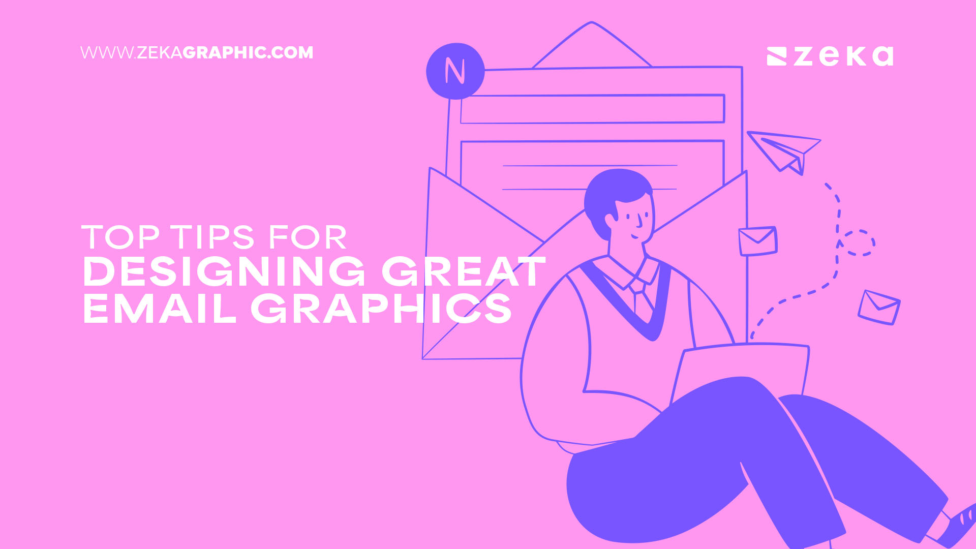
When it comes to the ‘top’ marketing options of the moment, email marketing probably isn’t top of your list. Sure, it’s still technically tech-based, but isn’t this old hat as outdated by now as traditional fliers?
Definitely not.
Email marketing is still right up there as one of the top marketing channels, and it may actually offer your brand more than social media when handled right. After all, emails land directly in client inboxes, and with most of us now linked to our email accounts via our smartphones, that means notifications with your brand name, right to consumer pockets. Will they all click on your email offerings? Probably not, but even those who don’t will spend at least a second thinking about you whether they want to or not.
For those who do take the email clickbait, you’ll be centerstage and given a direct opportunity to impress. And, what’s the best way to get them onside at a glance? Graphics, of course! But, what makes graphics great in modern email marketing? Keep reading to find out.
Advertisment
‘Good’ email open rates rest at around 15-25%. That’s not bad news when you put it in context, but it does mean email readers are rare enough that you’ll want to ensure they stick around. And, messy graphics that make it difficult to even see the content of your email without scrolling are no way to achieve that goal.
Of course, done well, graphics can be one of the best email selling points. You simply need to consider optimizing the graphics you use with specific email layouts in mind. That means thinking about both accessibility and the appearance of your email in general. Too many images too early will leave your text swamped. Too much text at the beginning could stop readers from instantly recognizing your brand or wanting to read on.
As such, optimizations should include simple graphic headers, well-integrated text, and compressed images that don’t take two hours (or, at least, what feels like it) to load.

While it’s important to design specifically email-optimized graphics, don’t make the mistake of thinking that this is a good place to get experimental. We can categorically tell you that it isn’t.
After all, email isn’t necessary to catch the eye of passing trade – you’re already preaching to the choir here. Keeping it consistent ensures immediate recognition, and can also build a sense of trust across your emails over time.
Quite simply, that means you need to keep email graphics consistent with your brand colors, existing typography, and the same logo at all times. Even something as simple as using the same models across different photo shoots, etc., is going to help you become a brand readers know and recognize, rather than just another spammy name in their inboxes.
Advertisment
Visual hierarchy is a design principle that relates to where on the page graphic-based elements appear. It’s a clear, if sometimes complex, device that can be used to draw the user’s eye in a certain way across a piece of content. And, it’s going to make an inevitable appearance in your email campaigns.
Ultimately, you want your graphics to tie in with the natural eye movements of your readers, ensuring that your email flows well and remains captivating in the best ways. All the better for helping to ultimately highlight a ‘buy now’ button at the end.
We won’t delve into the depths of visual hierarchy here, but a few hierarchical techniques that will be useful for your email graphics include –

Not every brand loves email background images, but these graphic additions can really help your email to stand apart. Plus, they’re not that difficult to implement. As the name suggests, these additions are simply graphics that appear in the background of, or behind, your email, and they only require you to tackle simple coding.
The benefits of background images are tenfold. At the very least, they make your emails a little more interesting/visually appealing. In a far more useful sense, they also reinforce your brand identity in ways that a white background never could.
That said, it is possible to go very wrong when implementing noisy background images that could be more offputting than anything else. That’s why it’s important to approach with ‘design harmony’ in mind.
Your best option is to trial email backgrounds that complement rather than compete with the body of your email. Keep designs simple, relevant, and ultimately tailored towards email content. It’s also key to compress background images that could lead to slow loading otherwise, and ensure responsiveness to keep background graphics looking great on all devices.
Advertisment
While it’s tempting to direct your modern graphic prowess at platforms like web and social media, sources like Forbes state that email marketing is more important now than ever. And, in an increasingly visual age, graphics are a key part of that.
Consumers simply won’t bite for bland, text-based email designs anymore. Instead, you should use graphics to fuel everything from brand recognition to general interest, and ultimate sales.
Advertisment
Pin it for later!
If you found this post useful you might like to read these post about Graphic Design Inspiration.
Advertisment
If you like this post share it on your social media!
Advertisment

Want to make your Business Grow with Creative design?
Advertisment

Advertisment