This Post Contains Affiliate Links
Swiss Design — also known as the International Typographic Style — changed how we see visual communication. Its influence reaches from mid-century posters to Apple’s interface design and every elegant sans-serif logo in between.
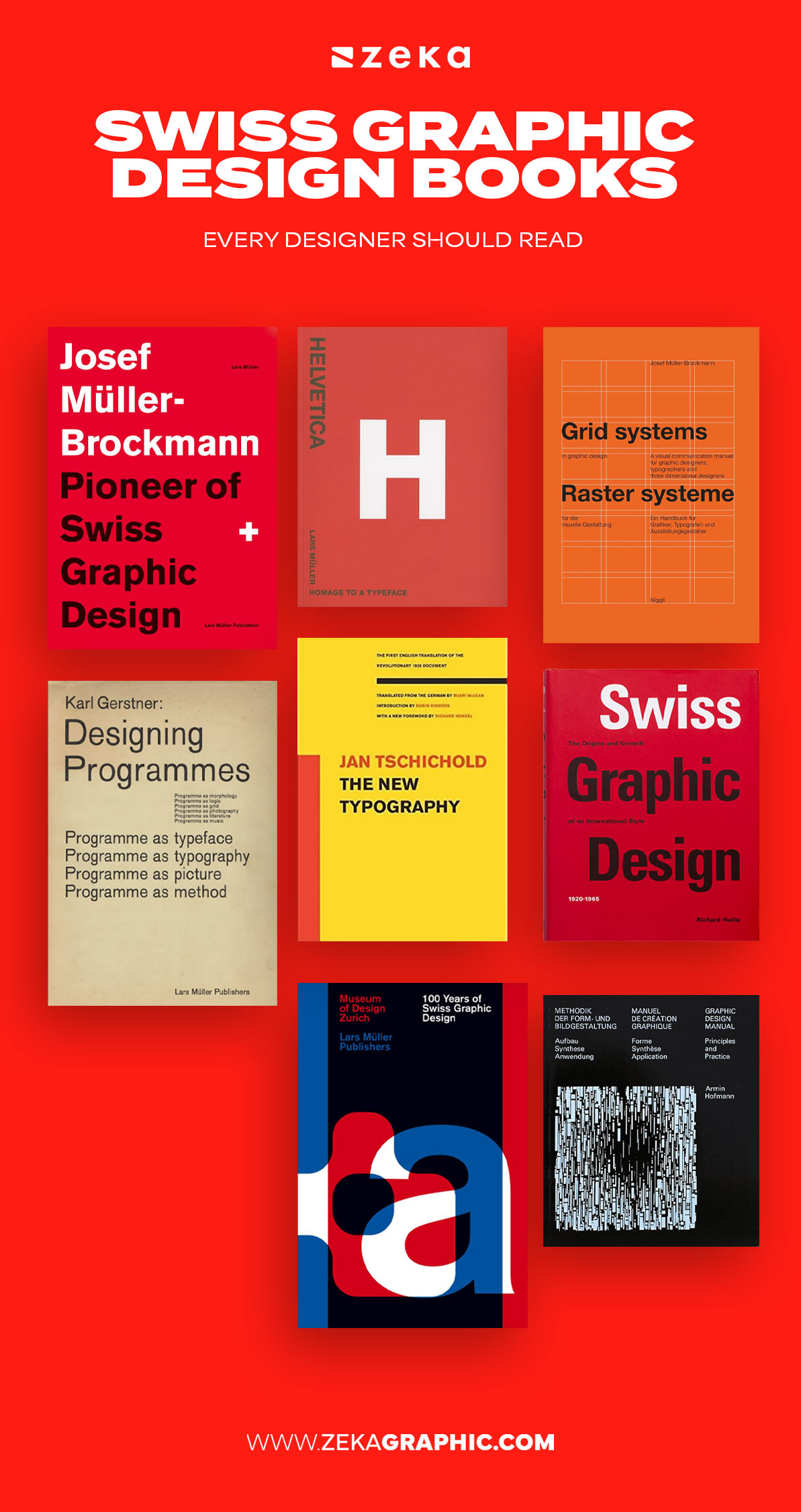
As a designer, I’ve always admired how Swiss Design teaches discipline through simplicity — how it uses the grid not as a cage but as a framework for freedom. This article curates the most essential Swiss Design books that teach clarity, hierarchy, and timeless form.
Whether you’re a student exploring typography or a creative director refining brand systems, these books will help you understand why Swiss Design still defines modern visual order.
Advertisment
Swiss Design emerged in post-war Switzerland during the 1950s, when clarity and function became essential values in rebuilding communication. Designers like Josef Müller-Brockmann, Armin Hofmann, and Max Bill developed a design system rooted in rational structure, mathematical grids, and typographic precision.
The core principles are simple yet profound:
Even in today’s digital era, Swiss Design’s logic shapes UI layouts, branding systems, and editorial grids. It’s not nostalgia — it’s the DNA of modern design clarity.

If you read only one book on Swiss Design, make it this one. Josef Müller-Brockmann’s Grid Systems in Graphic Design is more than a manual — it’s a visual philosophy.
He demonstrates how grids enable coherence, rhythm, and purpose, using both real-world projects and geometric diagrams. Each chapter reveals how constraints create freedom when applied intelligently.
Designers who master grid logic develop a natural eye for balance, alignment, and flow — the invisible structure that gives order to beauty.
Why it’s essential:

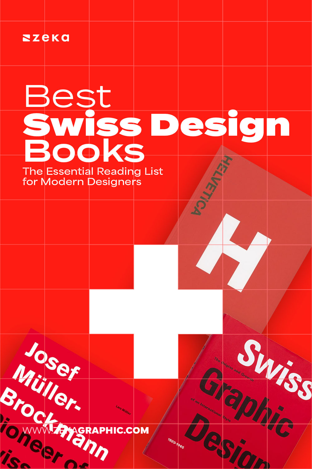
Helvetica is more than a font — it’s a global design language. Published by Lars Müller, Helvetica Forever explores the story behind the most famous typeface of the 20th century.
This book documents how Helvetica symbolized neutrality, universality, and clarity, embodying the Swiss belief that typography should never distract from meaning.
Designers will love the detailed visuals showing how the typeface evolved from the 1957 Neue Haas Grotesk to a timeless icon found in logos like BMW, American Airlines, and the NYC Subway.
What you’ll learn:
Advertisment
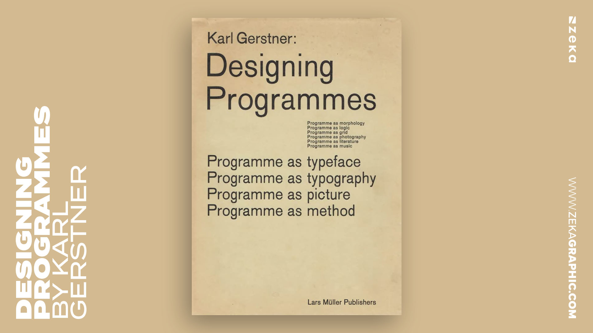
Karl Gerstner was not just a designer — he was a systems thinker. In Designing Programmes, he proposes that a designer’s job is not to create one solution, but to design a method capable of generating many.
This approach became the foundation of today’s design systems, UX frameworks, and even generative art logic.
Gerstner transforms the Swiss grid into a dynamic engine of possibilities, teaching that rational design can be deeply creative.
Why you’ll love it:
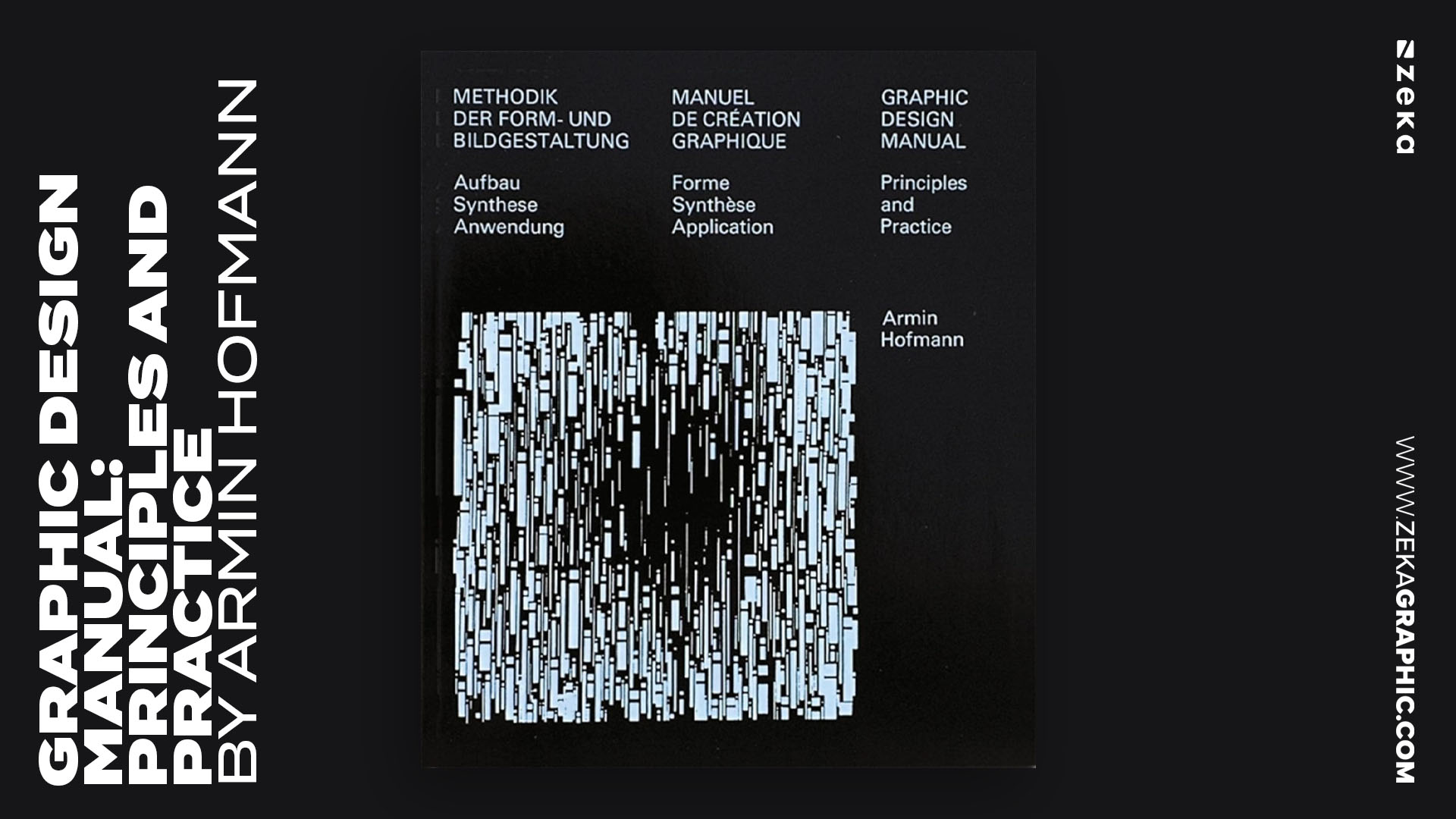
Armin Hofmann’s Graphic Design Manual: Principles and Practice remains one of the most influential design education books ever written. Rooted deeply in Swiss Design philosophy, it balances academic rigor with creative experimentation, making it indispensable for anyone studying or teaching visual communication.
Hofmann breaks down design into its fundamental elements: typography, contrast, rhythm, proportion, and form. Each page feels like a Bauhaus workshop refined through Swiss precision — where every exercise builds your eye for balance, tone, and space.
This isn’t a book to skim — it’s one to study, repeat, and master.
Through carefully constructed visual assignments, Hofmann teaches how simplicity becomes strength and how restraint reveals expression.
Why it matters:
Advertisment
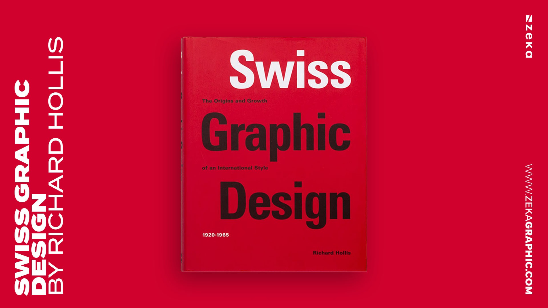
Richard Hollis’ Swiss Graphic Design: The Origins and Growth of an International Style, 1920–1965 is a masterclass in visual history. Through rich imagery and academic commentary, Hollis maps how Swiss Design evolved from local experimentation into a worldwide design movement that defined corporate identity and visual communication in the 20th century.
He highlights the interplay between art, education, and politics, tracing how institutions like the Basel School of Design shaped a generation of designers. The book explores how rationality, neutrality, and typographic order became cultural symbols of progress and internationalism.
For designers and historians alike, this book offers perspective — reminding us that every clean grid and sans-serif typeface has deep cultural roots.
What you’ll learn:
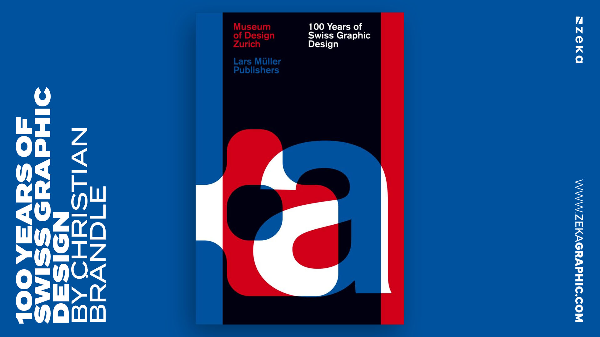
The book 100 Years of Swiss Graphic Design is one of the most comprehensive works ever produced on the subject—almost like a museum condensed into a single, beautifully ordered volume. When I first read it, I felt as if I were walking through a century of visual evolution, guided by Christian Brändle’s precise and academic yet accessible voice. The structure of this Swiss design anthology mirrors the clarity and restraint that made Swiss Style so influential, presenting posters, type specimens, corporate identities, and teaching methods in a chronological flow that feels almost musical in its pacing.
This century-long overview does more than celebrate iconic works; it reveals how Swiss visual culture shaped—and was shaped by—social, commercial, and artistic forces. From early modernist experiments in the 1920s to corporate identity manuals of the 1960s and contemporary minimalism, Brändle demonstrates how designers consistently returned to clarity, typography, and grid-based logic as anchors of expression. For graphic designers today, the book offers not just inspiration but a structural understanding of why Swiss aesthetics remain timeless.
Why This Book Matters
Advertisment
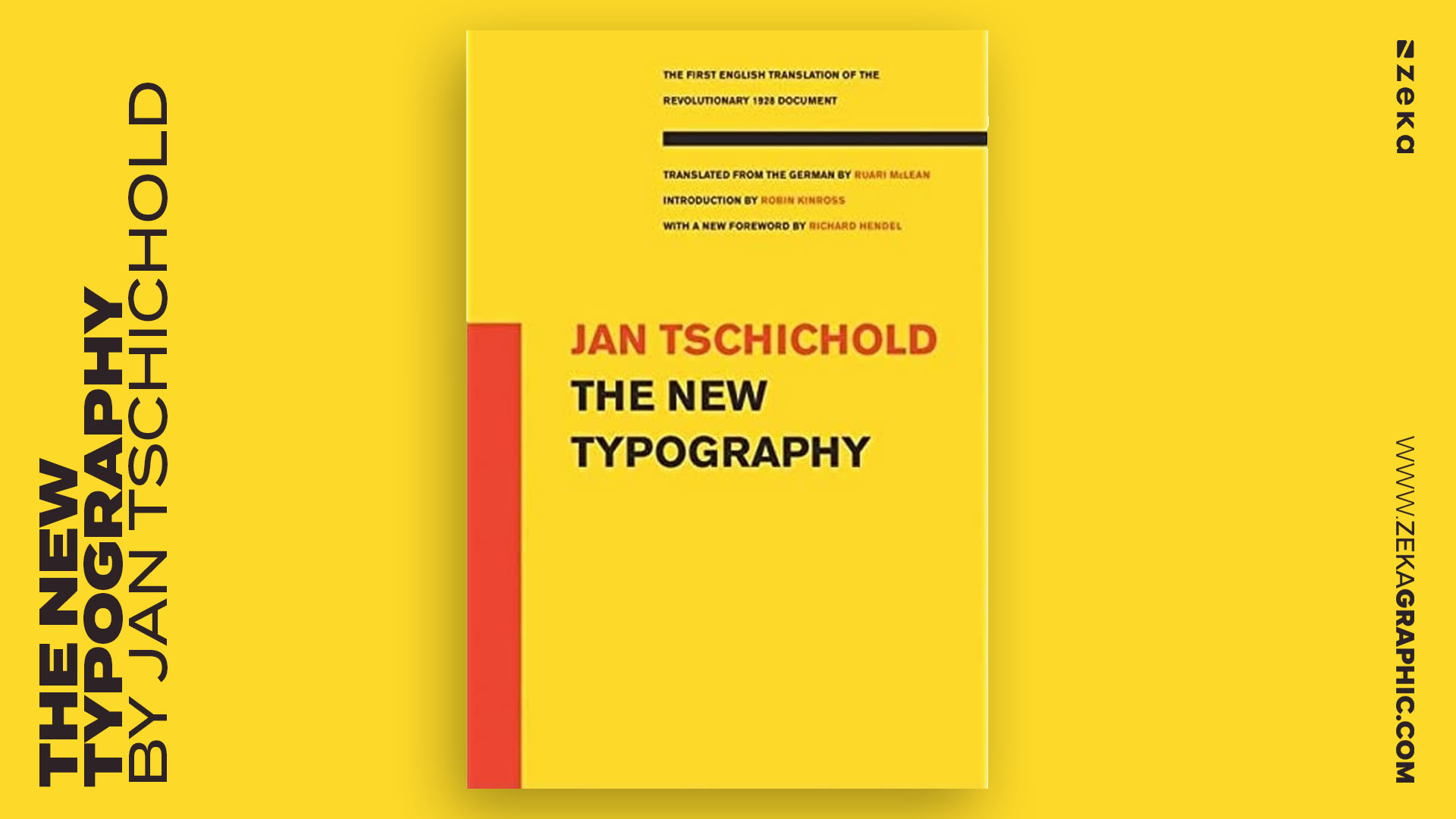
Few books have reshaped typography as radically as The New Typography by Jan Tschichold. Although published in 1928—before the Swiss Style fully matured—its ideas became the foundation upon which Swiss modernists built their visual logic. Personally, reading Tschichold’s typographic innovation manifesto felt like discovering the blueprint for modern graphic design. He argues for functional, asymmetrical, sans-serif typography that prioritizes clarity above ornament, echoing principles that later Swiss designers refined through systemic grids and strict hierarchies.
What makes this book essential for anyone exploring Swiss graphic design books is how directly it influenced the movement’s core philosophy. Tschichold rejected decorative conventions, championing the idea that typography should be a tool of communication rather than expression. As a graphic designer, I often return to his concepts when refining layout decisions—his principles are a reminder that less is not emptiness, but intention.
What You’ll Learn
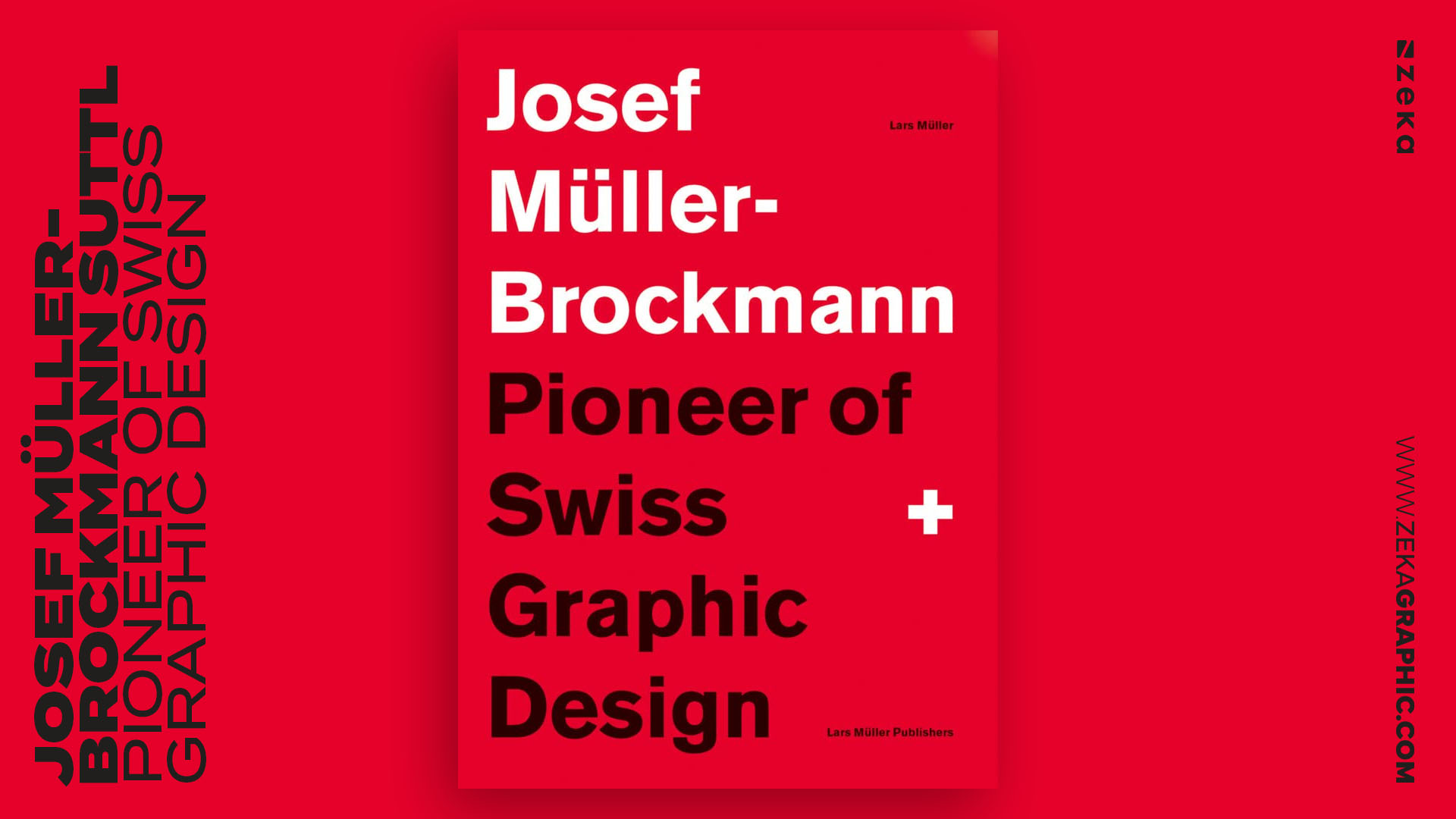
No exploration of Swiss graphic design books is complete without a work dedicated to Josef Müller-Brockmann, one of the most influential designers of the 20th century. This book—Suttl: Pioneer of Swiss Graphic Design—is both a biography and a visual analysis of the designer who elevated the grid system from technical tool to artistic philosophy. Müller-Brockmann’s posters, publications, and corporate systems demonstrate an extraordinary balance between mathematics and emotion, clarity and expression. Reading this book feels like sitting beside a disciplined modern master explaining why order can be liberating.
What I appreciate most is the insight into his creative logic—how he approached composition from a place of restraint, purity, and intentionality. The authors highlight not just his famous works, but also his unpublished sketches and teaching methods, revealing how deeply he believed in the grid as a framework for visual harmony. For designers who want to understand why Swiss Design became synonymous with precision, this book offers unmatched clarity.
Highlights of the Book
Q1: What are the main principles of Swiss Design?
Swiss Design is based on clarity, functionality, and typographic precision. It values asymmetrical layouts, mathematical grids, and objective communication over decoration or emotion.
Q2: Which typefaces define the Swiss Style?
The icons are Helvetica, Univers, and Akzidenz-Grotesk. Each reflects the Swiss pursuit of neutrality and legibility.
Q3: Is Swiss Design still relevant in the digital age?
Absolutely. Every responsive grid, UI framework, and minimalist brand identity borrows from Swiss Design principles. The logic that once shaped posters now structures websites and mobile interfaces.
Q4: How can I apply Swiss Design to my portfolio or brand identity?
Start with a grid system, focus on typography hierarchy, and reduce every element to its essential purpose. Remember: clarity is the ultimate form of beauty.
Advertisment
Swiss Design remains more than a historical style — it’s a philosophy of precision and purpose that continues to define how designers think, see, and communicate.
The books in this list are not static manuals but creative frameworks. They teach us that every successful layout — whether for print, web, or motion — begins with clarity, hierarchy, and balance.
In 2026, as AI and automation accelerate visual production, Swiss Design offers what machines can’t replicate: intentionality. Its focus on structure and simplicity reminds us that timeless design isn’t about doing more — it’s about doing only what matters.
If you found this post useful you might like to read these posts about Brand Design Inspiration.
Advertisment
Written by
If you like this post share it on your social media!


Advertisment

Advertisment