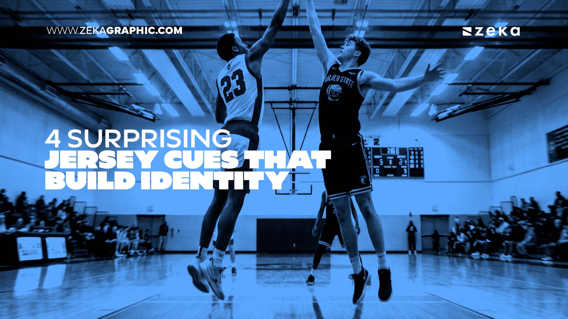
The four jersey cues that command respect and solidify visual identity are unambiguous hierarchy, deliberate color blocking, consistent typography, and strategic logo placement.
These ensure readability across variable lighting and movement. The most memorable identities extend beyond digital screens into physical apparel, where environmental conditions test every design choice.
Structured elements prevent logos from disappearing into fabric folds, keeping team aesthetics sharp from the upper deck to the court.
Brand strategists often dread the moment a visual identity meets the real world. On screen, the hierarchy is clean and the palette balanced.
Then, the garment ships. Under fluorescent gym lighting, moving at full speed, a logo can suddenly vanish, or numbers can fight for space.
A jersey is a demanding stress test; it must communicate authority from thirty feet away in seconds, without the luxury of animation or hover states.
Because flat files cannot simulate these dynamic conditions, physical prototyping is essential. Testing typography and layout on real garments ensures a seamless translation from sketch to wear.
By utilizing the professional production standards of Sports Gear Swag, designers can accurately stress-test their concepts on custom basketball jerseys.
Advertisment
Visual hierarchy is the principle that governs which elements in a composition the eye sees first, second, and third. On a brand mark or a web layout, hierarchy is established through size, contrast, weight, and placement.
On a jersey design, exactly the same rules apply, except the margin for error shrinks dramatically. Studies emphasize that proper legibility requires a specific contrast ratio.
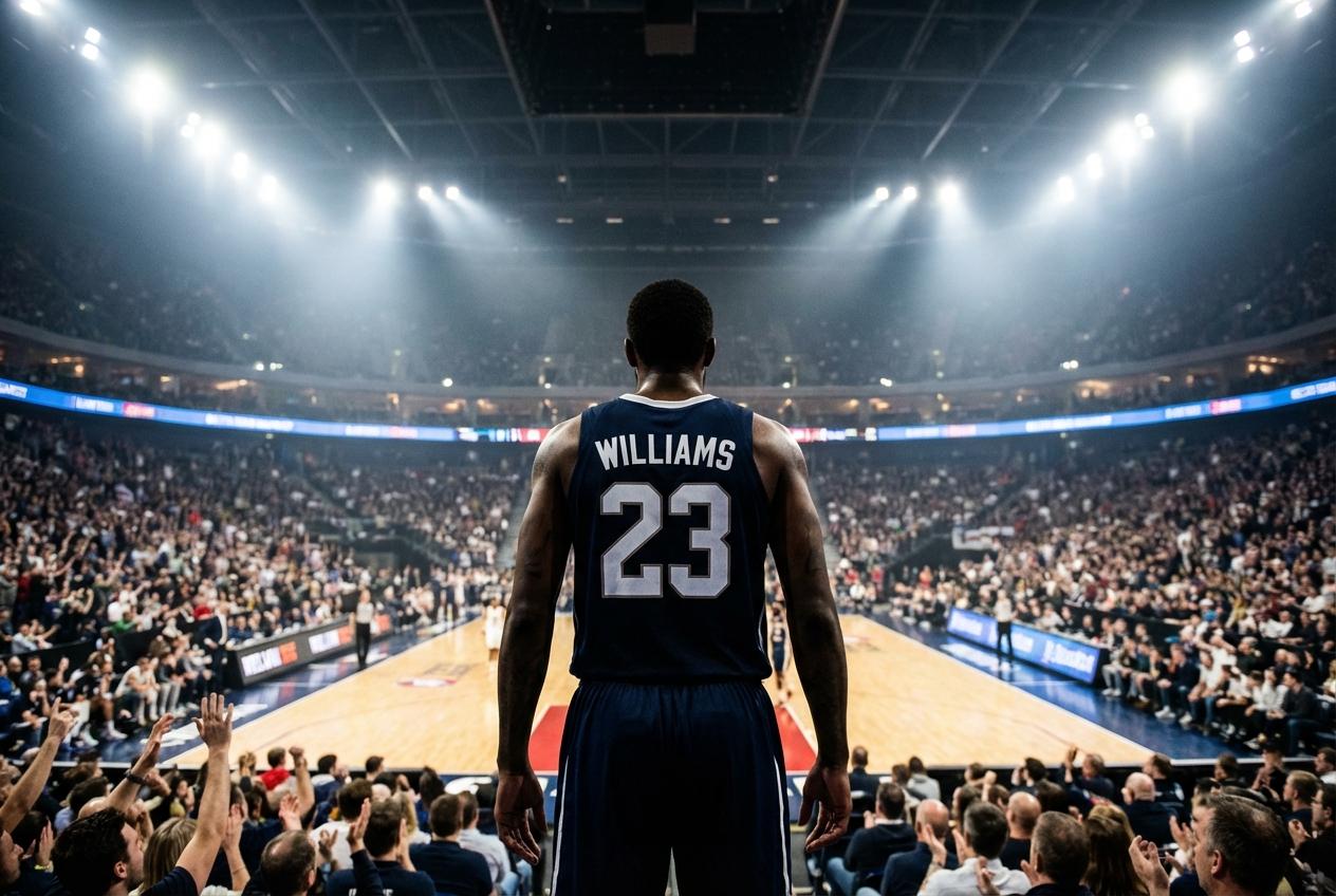
Consider two basketball jerseys to understand this dynamic in action on the court. On the first, the player number is large, high-contrast, and anchored centrally on the chest. The player’s name sits above it in a supporting scale, present, legible, but clearly secondary.
From the upper stands, that jersey reads instantly with the number first and team affiliation implied by color.
On the second jersey, the number and name are rendered at nearly the same scale. Both elements are competing for the same visual real estate with similar contrast values.
From a distance, neither wins, and the eye does not naturally know where to focus. The jersey reads as visual noise, which is ultimately a brand problem rather than an apparel problem.
The hierarchy principle that makes a well-structured logo mark trustworthy at a glance is the same principle that makes apparel readable from the nosebleeds. Scale relationships communicate a clear intention to the viewing audience.
An oversized, high-contrast number says that the organization knows exactly what it is doing. Equal-weight elements competing for dominance say the exact opposite.
Pro Tip: Maintain a 2:1 size ratio between the player number and name. This scale relationship ensures the eye identifies the most critical information first, even when viewed from the furthest stadium seats. |
Color blocking, the deliberate use of high-contrast color zones across a garment, is one of the most powerful and underused tools in sports apparel identity. Its primary function is not mere decoration, but rather instant visual recognition.
Color psychology research consistently supports what most experienced designers already sense intuitively. Color combinations carry emotional weight that immediately precedes cognitive processing.
A red and white blocked jersey reads as bold, energetic, and aggressive on the court. Navy and gold signals tradition, authority, and institutional legitimacy to viewers.
Black and neon communicate modernity and edge, built from how colors have been used across culture and media over decades.
The structural benefit of blocking is just as important as the psychological impact. A single-color jersey under gym fluorescents can flatten out and entirely lose dimensional impact.
A two-tone blocked design with a contrasting side panel or shoulder insert creates visual dimension. It separates the silhouette from the background and holds its identity firmly across changing lighting conditions.
Advertisment
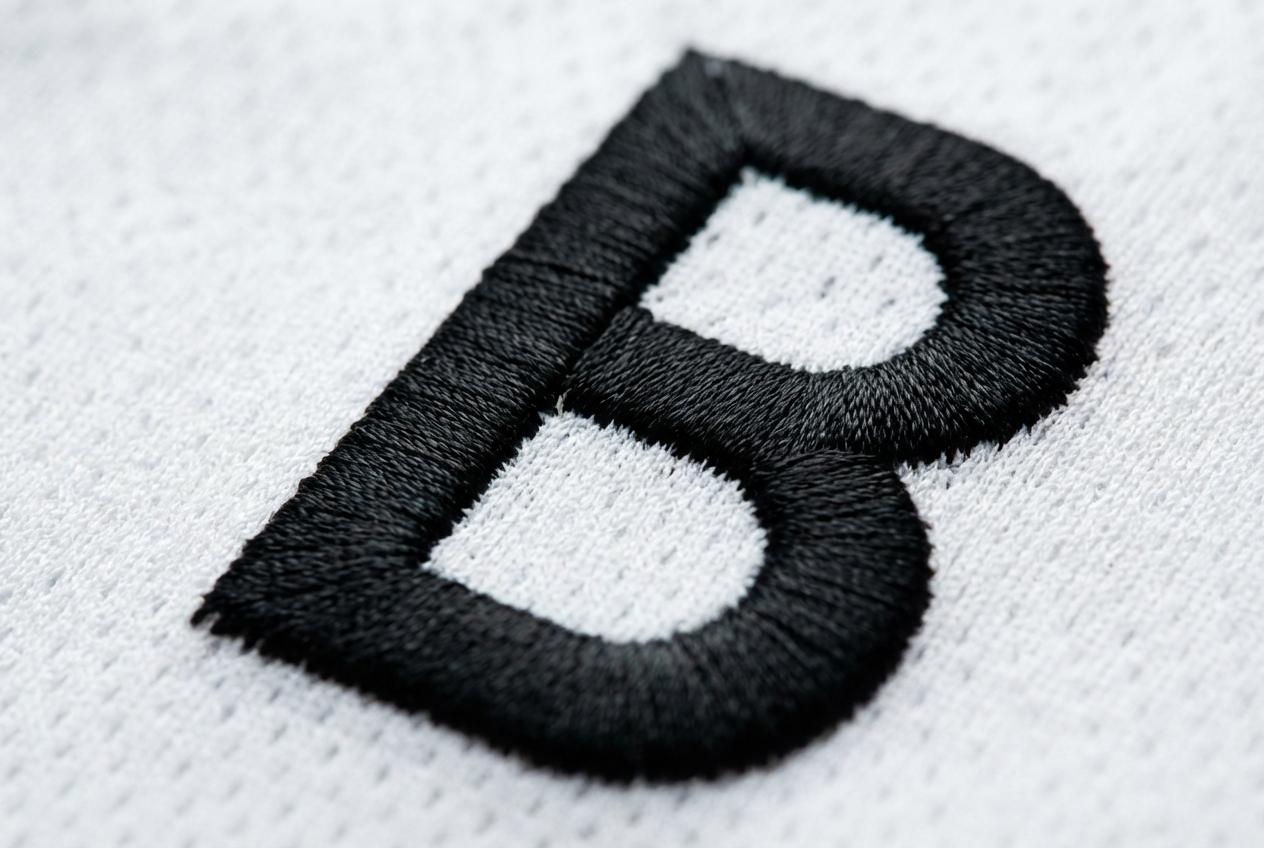
Typography in branding is one of the most underestimated identity levers available to modern designers.
A typeface is not just a straightforward vehicle for information; it is a personality signal. It serves as a positioning statement and a cultural reference compressed into distinct letterforms.
On a physical jersey, that critical signal gets amplified significantly.
Type is rendered at scale, applied to a physical surface, and read under variable conditions by audiences absorbing information quickly. Two basketball jerseys can carry identical player information and still communicate completely different identities based on typeface alone.
Just as digital platforms demand careful contrast, physical apparel requires sharp tonal differences to remain readable.
This mirrors digital accessibility standards that explicitly require level AA compliance. A condensed, bold sans-serif with tight letter spacing reads as competitive, energetic, and undeniably modern.
A serif or slightly wider letter form with character in the stroke weight reads as storied, deliberate, and prestigious. The principle that matters most here is absolute consistency. Typography in branding works best when properly applied as a holistic system.
Key Insight: Type consistency across physical and digital touchpoints signals a mature brand. If your jersey font clashes with your website, it creates a visual disconnect that undermines your organization’s professional authority. |
A brand mark designed for a digital application is built for a static, strictly flat surface. A jersey moves, stretches, folds, and wrinkles during standard gameplay.
Logo placement on a garment requires an understanding that the fabric has its own specific geometry. It features high-visibility zones and unpredictable movement patterns that affect visual integrity.
A centered chest placement creates a strong visual anchor for the observer. The chest is the natural focal point of a standing or moving athletic figure.
A logo placed there, at an appropriate scale, holds steady even when a player is mid-motion. That strategic placement effectively communicates permanence and overarching confidence.
Conversely, a logo placed near a side seam disappears into the fold every time an arm drops. A mark scaled directly from a digital file without adjustment often looks oversized when printed on fabric.
It ends up losing the vital breathing room that gave it authority at smaller digital sizes. Thoughtful scaling ensures the design commands respect from any viewing angle.
Warning/Important: Don’t rely solely on digital mockups for final approval. Fabric moves, stretches, and reacts to light differently than a screen, making physical prototyping an essential step to avoid costly design errors. |
Advertisment
Before closing out a comprehensive brand guidelines document, run the identity system through a few key questions. Determine if the number and name can be accurately read from thirty feet away.
Evaluate whether the color blocking creates immediate recognition under variable lighting, or if the palette flattens when it leaves a calibrated screen.
Ask if the mark holds authority on fabric, in motion, and under real lighting conditions.
The distinct difference between those two outcomes is the deliberateness of four small decisions involving hierarchy, color, type, and placement. The next time a brand identity is thoroughly audited, extend that rigorous audit to the apparel layer.
A brand that survives the physical test is readable, recognizable, consistent, and highly authoritative. It proves to be an enduring identity built to last well beyond the initial mockup file.
Author Profile: Sports Gear Swag is the leading online retailer of custom sports apparel and gear for teams, schools, and organizations of all sizes. Specializing in team jerseys, uniforms, and athletic apparel with a wide range of customization options. |
Advertisment
Pin it for later!
If you found this post useful you might like to read these post about Graphic Design Inspiration.
Advertisment
If you like this post share it on your social media!
Advertisment


Want to make your Business Grow with Creative design?
Advertisment

Advertisment


