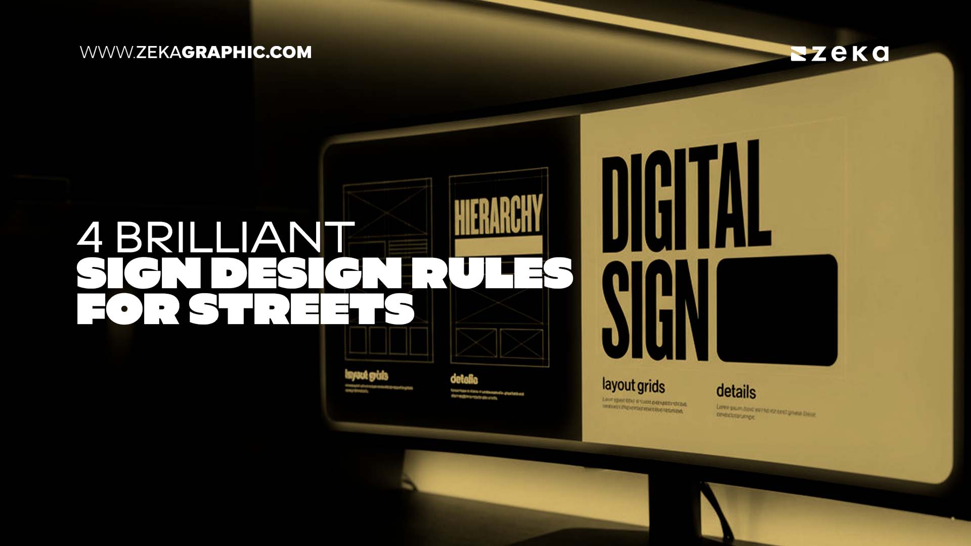
The four rules for effective outdoor sign design are prioritizing one single message, building a high contrast visual hierarchy, designing for long distance legibility, and maintaining consistent brand elements.
Applying these specific techniques ensures that your street-facing signage communicates instantly to viewers in motion.
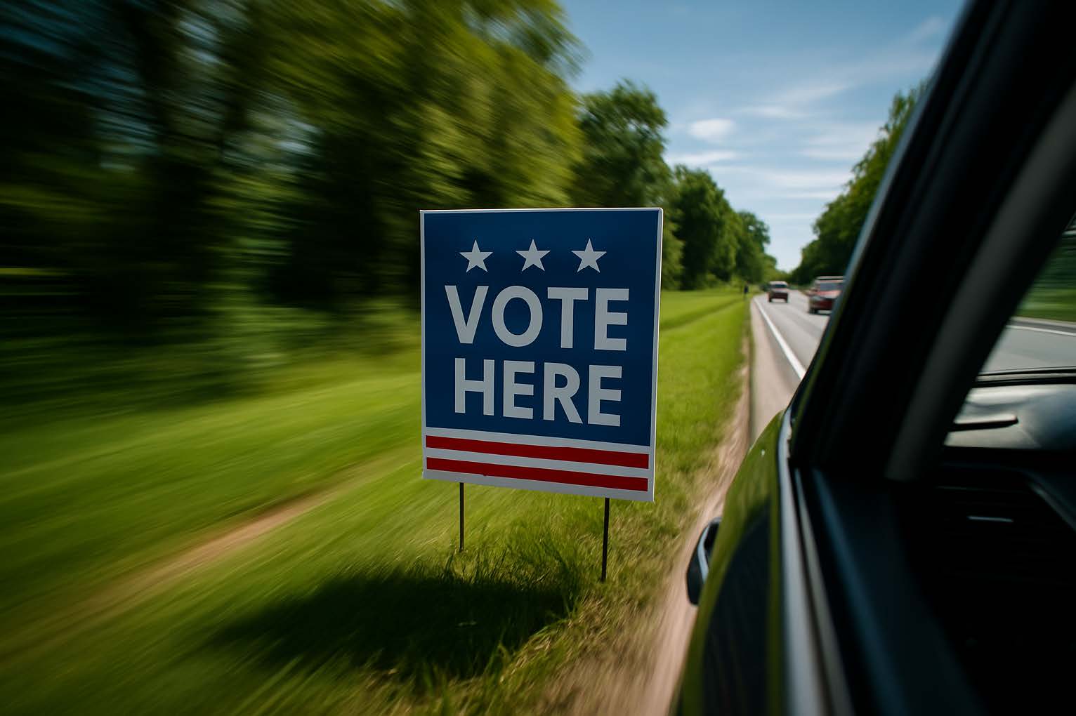
Because the average outdoor touchpoint receives two seconds of attention or less, readable signage requires strict editing to maximize local business branding and visibility.
There is a well-known figure in advertising research that should make every business owner pause. The average outdoor brand touchpoint receives two seconds of attention or less.
No hover states, no pinch to zoom, and no scrolling back up to re-read the headline. A passerby makes a snap judgment, and the visual either lands or disappears completely.
That reality makes street-facing displays one of the purest and most unforgiving tests of graphic design clarity in existence.
A physical display planted at a busy intersection gets one shot per viewer.
Whether you are a designer producing digital assets for a massive campaign, a community organizer working with a local print shop, or a business owner sourcing professional yard signs for business from YardSigns.com, the medium demands absolute clarity.
Specialized production services help translate these digital visuals into durable, high-impact outdoor formats.
What follows is a practical framework built around one core idea. Effective visual communication is an editing discipline, not an addition exercise.
Advertisment
Every effective layout answers exactly one question for the viewer. It forces the creator to decide what they want the audience to know right now.
Before opening a design file, write down every piece of information you want on the canvas. Then, cross off everything except the single most important line.
The contrast between a cluttered layout and a clear one is easy to illustrate. Imagine a grand opening concept that reads all details about fresh tacos, social handles, daily hours, and family history. Now compare that to a version that simply reads about fresh tacos today.
The second version registers in under a second because the brain does not have to sort the information hierarchy on its own.
The designer made that prioritization decision in advance, and the viewer benefits from it instantly. Readable signage always begins with a single committed message, making everything else secondary noise.
Visual hierarchy is the invisible grid that tells a viewer exactly where to look first, second, and third. In outdoor sign design, hierarchy relies heavily on two foundations involving size contrast and color contrast.
Size contrast means the most important word or phrase should be at least twice the size of any supporting text. Scaling down secondary information does not diminish it, but actually makes the primary message louder.
Color contrast means pairing values that hold their distinction in natural light. Combinations that consistently perform well outdoors include black on yellow, white on deep red, and navy on white.
Research indicates that adding the property of fluorescence can yield a slight increase in legibility distances. Conversely, combinations like medium gray on light blue tend to collapse and flatten under overcast light or direct sun.
Consider a real estate promotion that places the agent’s name, brokerage logo, phone number, and primary label all at roughly equal visual weight. The viewer has no entry point, so they enter nowhere and exit immediately.
Redesigning that layout so the primary label dominates at three times the size creates immediate brand visibility from a moving car.
Key Insight: Visual hierarchy isn’t just about aesthetics; it is about sequence. By making your primary message significantly larger, you guide the viewer’s eye exactly where it needs to go in under two seconds. |
Advertisment
Screen design and street design share a foundational vocabulary but operate in entirely different conditions. The specific variables to design around include viewing distance, viewer movement speed, and lighting shifts across morning, noon, and overcast conditions.
Each of these variables degrades legibility in a different way, and the layout needs to account for all of them simultaneously.
Designing physical media without accounting for those conditions is one of the most costly mistakes in local business branding.
Typography choices matter enormously at a distance. Sans-serif typefaces typically outperform decorative or script fonts in outdoor contexts because their letterforms remain distinct when scaled down or viewed at an angle.
Guidelines suggest using a maximum legibility index of forty feet of distance per inch of letter height. A font that feels warm and expressive in a brand identity document can become completely illegible when viewed from thirty feet away.
Spacing directly amplifies legibility, as tight kerning and compressed leading collapse at a distance, causing individual letters to blend.
Open letter spacing and generous line height give each element room to register independently.
Studies note that glances away from the road exceeding two seconds are associated with elevated crash risks, proving the absolute necessity for quick reading. If a mockup feels slightly too airy on a computer monitor, it is probably calibrated correctly for the street.
There is a meaningful difference between brand presence and brand noise. Consistent brand elements across a campaign build recognition, but too many elements applied simultaneously create visual static.
A complete brand system should be distilled down significantly for outdoor use. Include one logo version placed deliberately, one primary brand color, and one typeface family.
Designers should leave off multiple logo lockups competing for the same space and social handles placed at equal prominence to the primary call to action.
Decorative borders or graphic patterns that add a frame without adding information should also be removed. These elements feel like valuable additions in the digital file, but function as subtractions on the installed physical piece.
The power of restraint becomes particularly clear in neighborhood campaigns.
When a series of visual assets is placed across multiple locations using the same layout and hierarchy, the viewer learns to recognize the brand instantly.
The brain pattern matches the visual, allowing the medium to do a portion of its communication work before any text is processed. That kind of recognition is built through consistency rather than complexity.
Pro Tip: Treat white space as a functional design tool, not empty air. Generous margins and spacing prevent visual “bleeding,” ensuring your text remains crisp and readable from a fast-moving vehicle. |
Advertisment
Signs operate in seconds, and those seconds represent the entire opportunity to connect with a viewer. The rules covered here are editing instructions rather than addition instructions.
They demand one message instead of several while requiring contrast that sequences information logically. They rely on typography and spacing calibrated for physical distance, not for a desktop presentation.
Furthermore, they use brand elements to build recognition through consistency rather than through volume. The most effective outdoor display is the one that does not make the viewer work to understand it.
A passerby who has never encountered the organization before should comprehend the message before they pass it. They should not figure it out after they circle back, and they should not have to squint to process the details.
That is the ultimate standard for effective visual communication. The design choices, and the production quality supporting them, either meet that standard or they do not.
Author Profile: YardSigns.com is the leading online retailer of custom yard signs for businesses, political campaigns, real estate professionals, and special events. |
Advertisment
Pin it for later!
If you found this post useful you might like to read these post about Graphic Design Inspiration.
Advertisment
If you like this post share it on your social media!
Advertisment


Want to make your Business Grow with Creative design?
Advertisment

Advertisment


