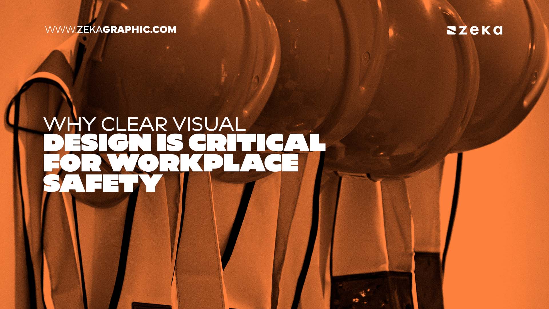
Great graphic design isn’t just about making things look pretty; in an emergency, it saves lives. Clear visual cues, strong typography, and intuitive layouts reduce panic and speed up reaction times. For designers, mastering safety communications opens doors to lucrative corporate B2B contracts.
Have you ever been handed a creative brief for a corporate safety manual and thought, “Wow, this is going to be incredibly dry”? Most of us have. Designers naturally tend to view emergency signage and policy graphics as tedious checklist items.
But here is the truth. The graphics you create for these documents might be the only thing standing between a quick, safe response and total chaos. Think about it. When an emergency actually hits, people don’t have the time or the mental capacity to read thick paragraphs of text. They need clear, immediate visual cues. It’s a lot like the hands-on muscle memory you build by enrolling in Coast2Coast CPR training in Hamilton—theory only matters when you can successfully apply it under pressure. Good design does the exact same thing for the human brain. It guides action when it matters most.
Advertisment
Imagine someone collapsing in a busy corporate office. A panicked coworker grabs the company’s emergency response manual off the wall. But instead of clear, step-by-step icons showing them what to do, they are staring at a massive wall of size 10 Arial font.
Panic quickly sets in. They can’t find the section on AED locations fast enough. They freeze.
Bad design in this moment isn’t just an aesthetic failure. It is a literal safety hazard. Your job as a visual communicator is to strip away the noise. You have to guide the viewer’s eye directly to the action they need to take. If a user has to think about what a graphic means, the design has failed.
When human beings panic, our cognitive load drops drastically. We simply can’t process complex information. This means your safety graphics need to be incredibly simple and heavily focused on universally recognized concepts.
Color psychology plays a huge role here. Red, yellow, and green are your best friends. They already have built-in psychological associations with danger, caution, and safety.
When it comes to typography, you need to ditch the fancy, thin serifs. Go with clean, highly legible sans-serif fonts like Helvetica, Roboto, or Open Sans. You want the text to be readable from across a busy room, not just perfectly kerned on a high-resolution retina monitor.
Advertisment
Corporate HR teams and safety managers are usually the ones requesting these materials. They know the corporate regulations inside and out. They understand WSIB and OHS compliance. But here is the catch—they usually don’t know how to visualize any of it.
That is exactly where you step in. Sit down with them and ask real questions. Ask them what the most common workplace injuries actually are. Find out where the physical bottlenecks happen during routine fire drills.
By asking these operational questions, you position yourself as a strategic problem-solver, not just an order-taker. You help them translate dense regulatory jargon into visual systems that employees can actually understand. This makes you a highly valuable asset to large B2B clients, opening up entirely new revenue streams for your freelance business or agency.
If a company’s fire exit map looks totally different from their first aid instructions, you are going to confuse people. Visual consistency builds trust and speeds up recognition.
Use the exact same icon style, color palette, and layout structure throughout the entire safety package. If a company uses a specific shade of blue for their main corporate branding, you can certainly incorporate it gently to keep the brand team happy. But never let brand guidelines override safety guidelines.
Safety always wins. Period.
If you are looking for first aid training near Downtown Hamilton, the bustling area around Gore Park, or right off Hughson Street, then you may reach out to Coast2Coast First Aid/CPR – Hamilton in that area.
Advertisment
What is the most important element of emergency graphic design? Clarity. Above all else, the viewer must instantly understand the action they need to take without having to read long blocks of text.
How can I make safety manuals less boring to design? Treat them as an exercise in extreme UX (User Experience). Challenge yourself to communicate a complex medical or safety procedure using the fewest visual elements possible.
What colors are best for workplace safety signage? Stick to high-visibility, universally understood colors: Red for danger/fire, Yellow or Orange for caution, and Green for safety equipment or first aid stations.
Why should freelance designers care about corporate safety? Every mid-to-large company is legally required to have emergency procedures and safety manuals. Offering to redesign these into clear, modern formats is a fantastic way to win steady B2B clients.
How does bad design affect emergency response times? Poor layout, confusing icons, and dense text force the brain to process information slowly. In an emergency, this hesitation increases panic and delays critical actions like performing CPR or finding an exit.
Advertisment
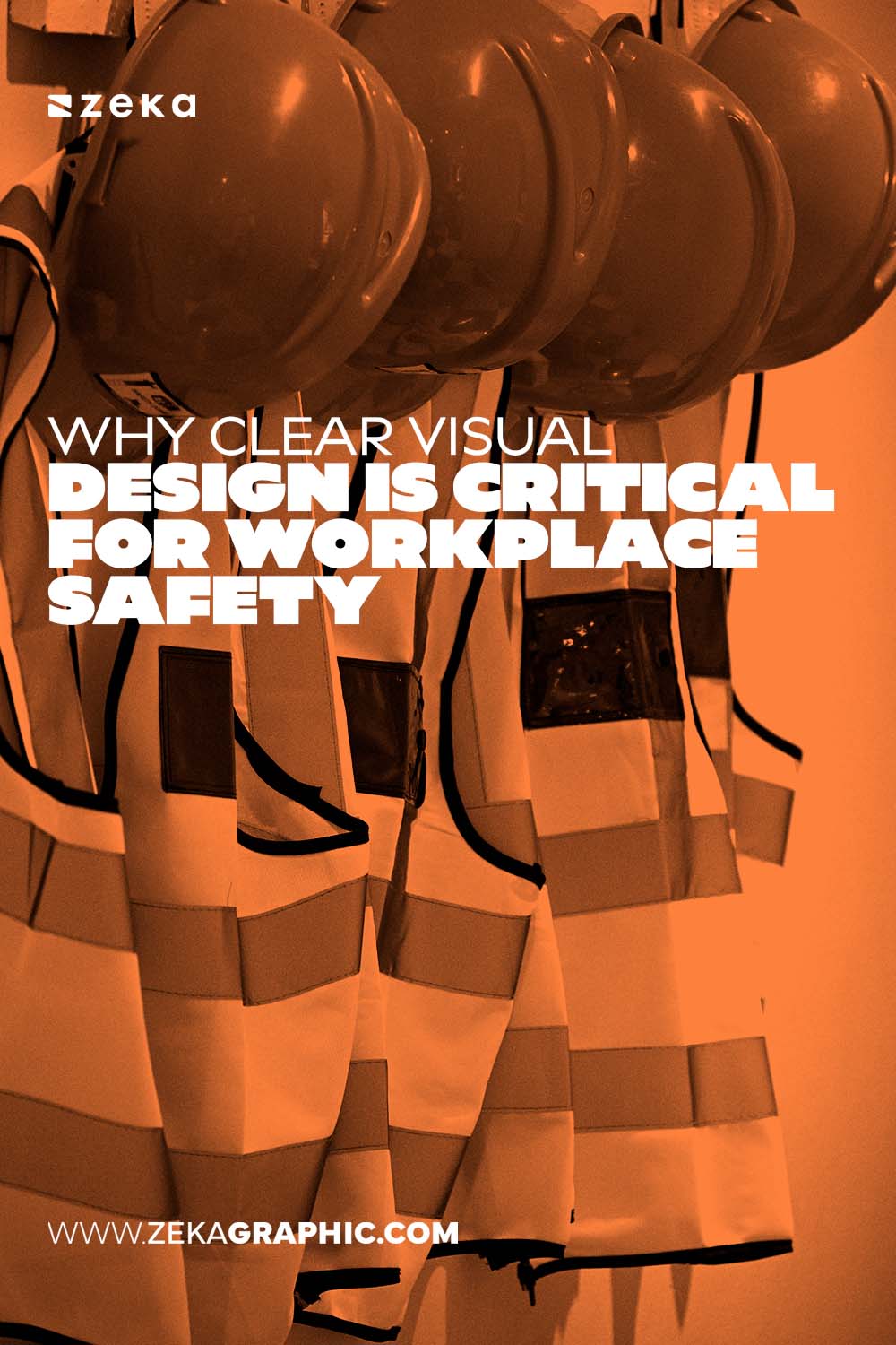
Pin it for later!
If you found this post useful you might like to read these post about Graphic Design Inspiration.
Advertisment
If you like this post share it on your social media!
Advertisment

Want to make your Business Grow with Creative design?
Advertisment

Advertisment