For a graphic design audience, typography is not a finishing touch. It is the part of a brand system that decides whether a logo feels intentional, a landing page feels trustworthy, and a social graphic still works after it leaves the designer’s artboard. Zeka Design often covers branding, logo design, typography, marketing, and design education, so the useful question is not “which font looks nice?” but “which font keeps the brand clear across real assets?”
Advertisment
The proof sheet method starts with real deliverables: a logo lockup, a homepage hero, a product card, a social template, a newsletter header, and a small-print legal note. If the type family works across those pieces, it is much more likely to work in the full brand identity.
“A good type choice is not the one that wins the moodboard; it is the one that survives the boring parts of the brand system.”
A designer can use the proof sheet as a stress test. Put the same font through different pressure points: a short brand name, a long headline, a mobile button, a caption, a price, a date, and a paragraph. This turns font selection from taste into evidence.
Table 1. Proof sheet checkpoints for brand typography
Checkpoint | What to test | What can go wrong |
Logo lockup | Short and long brand names | Kerning looks unfinished or the wordmark feels generic |
Landing page | Headline, body, buttons, captions | Display style overwhelms readable text |
Social template | Fast scanning and small-screen crops | Decorative type loses clarity |
Style guide | Rules, labels, examples, license notes | The system is hard for other teams to repeat |
The following graph is an illustrative design audit model. It shows why a font should be evaluated across multiple asset types instead of approved from one attractive mockup.
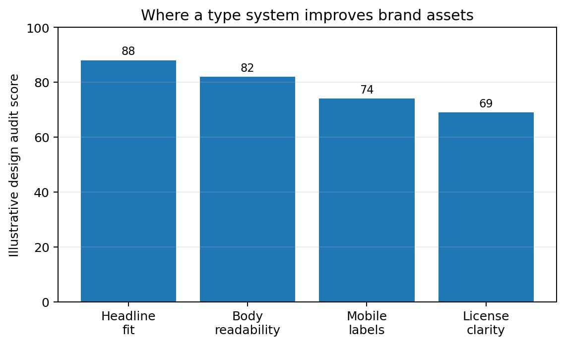
Figure 1. Illustrative audit scores for headline fit, body readability, mobile labels, and license clarity.
Advertisment
The fastest way to weaken a brand identity is to make one expressive font do every job. A dramatic display face can be excellent for a poster or campaign line, but it may fail in UI labels, legal notes, long paragraphs, or case-study captions.
A useful brand type system usually separates roles:
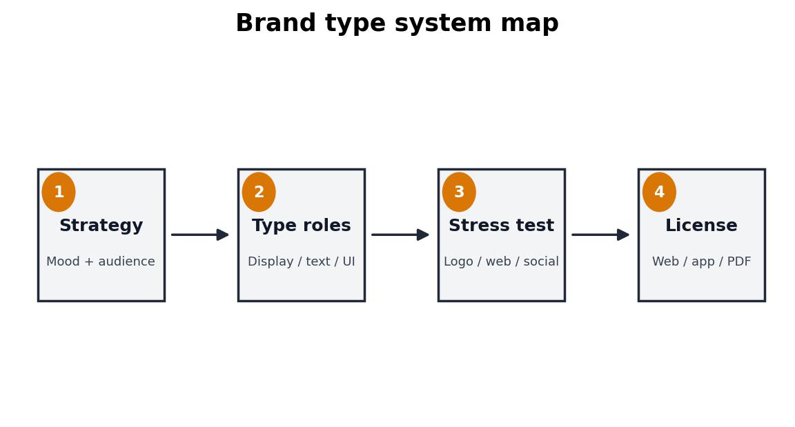
Figure 2. A practical flow for moving from strategy to type roles, testing, and licensing.
Advertisment
Custom type projects are useful because they show how typography behaves beyond one polished presentation slide. Domino’s Pizza customized TT Commons™ Pro into Dominos Sans Display and Dominos Sans Text. The design lesson is consistency: menus, apps, packaging, and advertising need one recognizable voice. Rocket uses WNTL, based on TT Commons™ Pro, and Bowtie, based on TT Livret, which shows how one identity can balance accessibility with a more trust-building editorial tone. SHIFTBRAIN Norms Variable, based on TT Norms® Pro, points to another lesson: variable typography can support digital-first, responsive brand experiences.
For designers comparing commercial families, variable fonts, or custom typography, a foundry such as TypeType can be reviewed as part of a wider proof-sheet and licensing process rather than as a decorative shortcut.
Common typography mistakes often appear when a brand is judged only from a logo presentation. Real brand systems are messier: long names, small captions, mixed content, legal notes, multilingual characters, and files shared with clients or contractors.
Table 2. Font sourcing options for brand designers
Option | Best use | Strength | Risk |
Free font | Early moodboards | Fast and low cost | Unclear commercial rights |
Commercial family | Client brand systems | Quality and style depth | Requires license tracking |
Variable font | Responsive digital assets | Flexible weights or widths | Needs implementation testing |
Custom font | Mature brand ecosystems | Distinctive and ownable | Higher cost and timeline |
Fonts are software. A license defines whether a typeface can be used on a website, inside an app, in a logo, in a PDF, across social campaigns, or inside editable client templates. A strong brand guide should list the font name, weights, use cases, license owner, allowed channels, and rules for contractors.
Advertisment
Great brand typography does not simply look stylish. It proves that a visual identity can communicate under pressure. When the proof sheet works, the logo, website, social graphics, case studies, and brand guide begin to feel like one system instead of separate design moments.
Pin it for later!
If you found this post useful you might like to read these post about Graphic Design Inspiration.
Advertisment
If you like this post share it on your social media!
Advertisment



Want to make your Business Grow with Creative design?
Advertisment

Advertisment