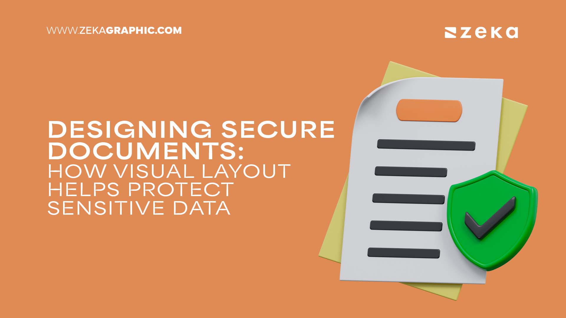
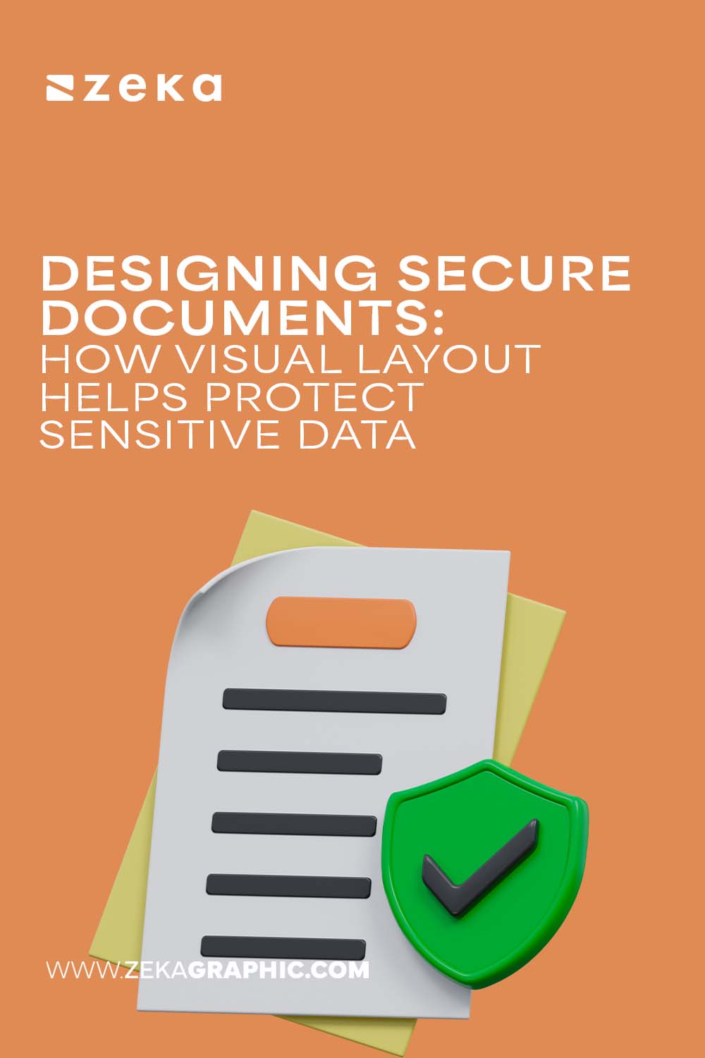
While some years ago, security was all about passwords and firewalls, things have changed. Well, unfortunately. Today, it is about presentation. Yes, guys. The point here is that even the visual layout of your document can be a stealthy guardian of your most sensitive information. We would recommend thinking of it as the haute couture armor of your doc. It is strategic, sleek, and extremely essential.
Below, we’ll discuss how savvy design takes your doc’s security game to the next level with a runway-ready edge. You’re welcome to check out our top visual tricks. They aren’t just about looking good, but about keeping your data 100% safe.
Advertisment
We recommend thinking of your doc as a runaway. Just like the eye is drawn to the star piece in a fashion show, your reader’s gaze always checks all the visual cues. When you’re working on secure documents, it is crucial to use hierarchy to spotlight what matters and blur out things that you do not want to be in the spotlight. Your task here is to strategically place sensitive info in visually subtle spots that are less obvious. This simple technique will help you reduce the risk of accidental exposure.
Think of the PDF redaction tool as a concealer that works just perfectly! It erases sensitive info like a surgeon at the hospital. And the best part about these tools is that they don’t just hide data. What they actually do is destroy it, ensuring confidential details vanish completely from your PDFs. You can use the following PDF redactor online when working with all kinds of issues:
As you can see, it’s a real must-have in the security arsenal that helps you make sure all of your secrets remain, well, secrets.
Advertisment
Why? First of all, it is your invisible statement. A faint watermark running through your document screams, “This is my exclusive work, and it is 100% protected!” In other words, you should take it as some kind of a signature scent for your paper. Something that is impossible to ignore and impossible to replicate without notice.
The point here is that white space is not just something chic or trendy. It is a real tactic, and you are welcome to benefit from it. Some generous white space around sensitive data can serve as a buffer zone. Use it to create a visual area called “Do Not Disturb.” This subtle separation helps keep confidential details discreet. White space directs focus. But at the same time, it never hooks users. That is what we call a subtlety. The latter is a pure genius in the doc’s security.
Advertisment
The good news is that both can be your secret weapon. Opt for styles that are elegant but difficult to replicate or skim quickly. Combining this with muted color palettes—think soft greys or muted blues for sensitive sections—adds a layer of stealth. The goal? To make sensitive text stand out only to the trained eye, like a covert message hidden in plain sight.
Whatever document you are working on, make sure to organize it into clear, bite-sized sections. Not only does this boost readability, but it also lets you isolate sensitive content. Use instruments like borders, shading, or boxes that are your best friends in creating physical and visual barriers. Keep in mind the simple rule: the clearer the divisions, the less chance of accidental oversharing.
How about moving beyond paper and PDFs and letting interactive layouts do the job? Things like collapsible sections or hover-to-reveal text are our top recommendations since they add a modern twist to security. If you try this approach, you will be able to keep the most sensitive data hidden, providing users with control and adding a sleek, tech-forward vibe to your design.
Advertisment
This simple strategy will enable you to emphasize necessary sensitive points without making them scream for attention. In other words, this part is all about finding the perfect balance. It is like you use a pop of lipstick that instantly boosts the whole look without stealing the show.
Using various document layout tools, you can control how exactly users can use your content. For example, if you make sure to restrict things like copying, printing, or editing, you reduce the risk of sensitive data being exposed, reused or shared without permission. Clear visual indicators, such as lock icons or disabled fields, help users understand these limits. At the same time, the document will still be easy to navigate.
In order to make sensitive text less prominent without hiding it completely, you are welcome to let the contrast do the job. For example, low contrast can disguise data from casual glances, while still keeping it accessible when needed. Think of it as a…sleek evening gown that reveals just enough. Sounds nice?
If you are ready to try the tips and tricks above, we recommend checking the main taboos before:
Advertisment
As you can see from everything said above, protecting sensitive data in documents is not only about encrypting text or password-protecting files. It is also about providing a visual experience that naturally discourages prying eyes. Just like in the world of haute couture, every element of your doc’s layout should work in harmony, balancing elegance with protection. That is when style truly becomes a security.
Advertisment
Pin it for later!
If you found this post useful you might like to read these post about Graphic Design Inspiration.
Advertisment
If you like this post share it on your social media!
Advertisment


Want to make your Business Grow with Creative design?
Advertisment

Advertisment