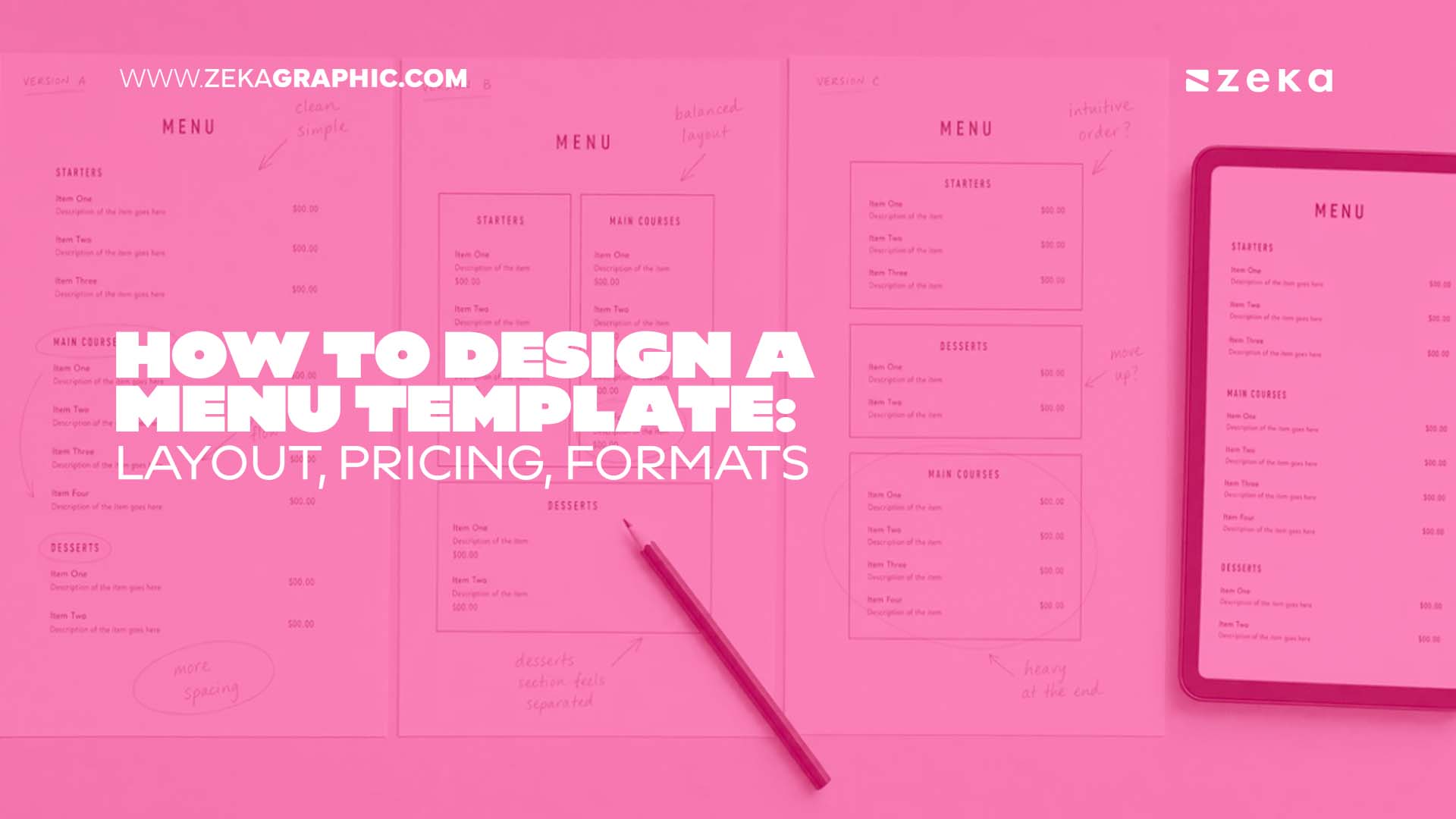
A menu is the only piece of marketing a guest reads with a decision already in progress. It has seconds to organise a kitchen’s output into something scannable, steer attention toward the dishes that carry margin, and do it again next season without a full rebuild. That last part is what separates a menu from a menu template. This guide covers the sequence in the order it actually happens: item count, profitability, layout, wording, pricing and format.
Advertisment
A menu template is a finished layout with fixed design and replaceable content. It exists because the composition problems that make a menu readable are not obvious until the menu is already wrong — a column that scans badly, a header hierarchy that flattens at arm’s length, a price alignment that turns the page into a comparison chart. Building from a blank page means solving all of that from scratch. Starting from a gallery means replacing text and photography inside a grid that already resolves it.
That difference compounds once the same layout has to reach more than one surface. A print file is re-exported every time a number moves. The gallery of free digital signage menu templates at deckerapp.com/digital-menu-boards/templates/ shortens that publish cycle to seconds, with editable layouts in portrait and landscape and a price edit that redraws only the affected field. Because the same menu template also exports a print-ready PDF, one menu format can cover the table card, the site and the board above the counter without three separate design passes.
Whichever route you take, the sequence below does not change. A template decides how the work gets executed. The six steps decide what goes into it.
Fewer than most operators expect. Cognitive research on short-term recall — the classic finding that people hold roughly seven pieces of information at once — is the usual reference point, and it translates into a practical rule: keep each category between three and seven items rather than capping the menu as a whole.
Category structure does the rest. Quick-service and fast-casual concepts tend to work at around six items per category. Full-service and fine dining can carry up to seven starters and desserts alongside ten main courses. A total ceiling of 30 to 40 items covers almost everything below the banquet scale. Past that, two costs appear at once: guests slow down at the point of decision, and unused inventory starts spoiling in the walk-in.
Inside that ceiling, balance matters as much as the total. A workable split runs three to five appetisers spanning light to substantial, eight to twelve mains covering different proteins and dietary needs, three or four desserts including at least one signature item, and a drinks section curated rather than exhaustive. Categories that swell past their neighbours pull the whole page out of proportion, and a section with two items reads as an afterthought.
Screen menus tighten the number further. A board read from eight to fifteen feet holds five or six items comfortably; anything denser is split across a run of screens or across dayparts rather than compressed into one layout.
A menu matrix plots every item on two axes — how often it sells and how much margin it carries — and the four quadrants that result decide what the layout emphasises. It is the step that turns a list of dishes into a design brief.
Quadrant | Profile | What the layout does with it |
Stars | High margin, high popularity | Feature position in the golden triangle, plus an eye magnet |
Cash cows | Low margin, high popularity | Keep visible, test a price adjustment before redesigning |
Puzzles | High margin, low popularity | Rename, rewrite the description, move it up the column |
Duds | Low margin, low popularity | Rework the recipe or the price, or cut the item |
Pricing sits underneath the matrix. Cost of goods, labour and overhead each account for roughly a third of revenue in a typical operation, which leaves a net margin between two and six percent per sale — thin enough that a food cost target of 28 to 35 percent is a working constraint rather than an aspiration. A dish costing $8 to produce at a 30 percent food cost lands at about $27 on the page.
Advertisment
Layout is the point where the matrix turns into money. Attention on a single page starts near the centre, then moves to the top right and the top left — the golden triangle. Specials and limited-time items belong in the centre, mains in the top right, appetisers in the top left. On a two-page menu the pattern shifts: the centre of the right-hand page becomes the sweet spot, followed by the first and last item in every column.
Eye magnets reinforce those positions. A box, a border, a differently coloured panel, an illustration or a photograph pulls the eye out of the scan pattern — but the effect dilutes with repetition, so one magnet per category is the working limit. Photography follows the same logic. One image per page can lift that item’s sales by as much as 30 percent according to menu engineering practice, while a photo beside every item reads as a low price point and crowds out the white space that makes the rest legible.
Colour works underneath all of it. Warm reds are the traditional appetite cue, greens signal freshness and lighter cooking, gold and deep neutrals code as premium, and blue is the one family most menus keep away from food photography because it reads as unappetising against most plating. Whatever the palette, it should come from the brand rather than from the page — a menu that looks unrelated to the room it sits in undercuts both.
Typography carries the rest of the hierarchy: a readable body face at 12 points or larger, a decorative face reserved for headers, and no more than two families on the page. On a screen the constraint becomes distance rather than point size — roughly one inch of text height for every ten feet of viewing distance, at a contrast ratio of at least 4.5:1.
Descriptions run between 15 and 25 words. Shorter withholds information a first-time guest needs; longer slows the read and the table turn. Inside that window, three things earn their place: the preparation method, the ingredient a guest already recognises, and the origin when it means something. “Slow-braised short ribs with truffle-infused mash” justifies a price that “beef with potatoes” does not.
Sensory adjectives do the work that photographs otherwise would — crispy rather than fried, tender rather than cooked, flame-grilled rather than grilled — used in moderation, since a page where every item is described in superlatives flattens back into noise.
Price presentation is a design decision, not a finance one. A currency symbol triggers the cost frame and pushes guests toward the cheaper option, so most menus drop it. Prices set in a single right-aligned column turn the page into a comparison chart, which is why placing the figure at the end of the description works better. Charm pricing follows the concept: figures ending in nine read as value, whole numbers read as quality, and $19.99 reads as neither in a dining room. A deliberately expensive item placed next to the dish you want ordered — the decoy — makes the target look reasonable by comparison.
Format decides how often the whole process repeats. Print sizes cluster around 8.5 × 11 inches for lunch and dinner, 8.5 × 14 or 11 × 17 for larger dinner layouts, and 4.25 × 11 for drink and dessert inserts. A run of roughly 200 menus at 8.5 × 11 costs somewhere between $150 and $200, which sets the real price of a mid-season price change: the reprint plus the design pass that precedes it.
Screen formats change the arithmetic rather than the design rules. Landscape 16:9 suits combo grids and photo-forward boards; portrait 9:16 suits narrow item lists beside a counter. A layout built once in both orientations covers a mixed run without a second design pass, and the update cost after that is a field edit rather than a print order. Most operations end up running both — a printed card at the table, a screen above the counter — which is the argument for keeping one template family across surfaces instead of maintaining two unrelated designs.
Whatever the format, the last step before committing is a proofread by someone who has not been looking at the file for a week. A misplaced decimal or a stray comma is cheap to fix in the layout and expensive to fix in a 200-copy print run. It is also worth checking that the template still has room to breathe: if adding two seasonal items forces a reflow of the whole page, the layout will not survive its second season without a redesign.
Advertisment
A menu template is judged on its fifth version, not its first: the layout that absorbs a seasonal swap without a reflow is the one that stops costing money. Version one is where the item count, the matrix, the golden triangle and the price presentation get decided, and almost every operator gets that far. Version five is where the shortcuts surface — a grid with no slack, a column that breaks when a category grows from four items to six, a photograph sized for one aspect ratio and nothing else. Most menus are not redesigned because the design failed. They are redesigned because the template underneath could not carry the next change.
Advertisment
Pin it for later!
If you found this post useful you might like to read these post about Graphic Design Inspiration.
Advertisment
If you like this post share it on your social media!
Advertisment



Want to make your Business Grow with Creative design?
Advertisment

Advertisment