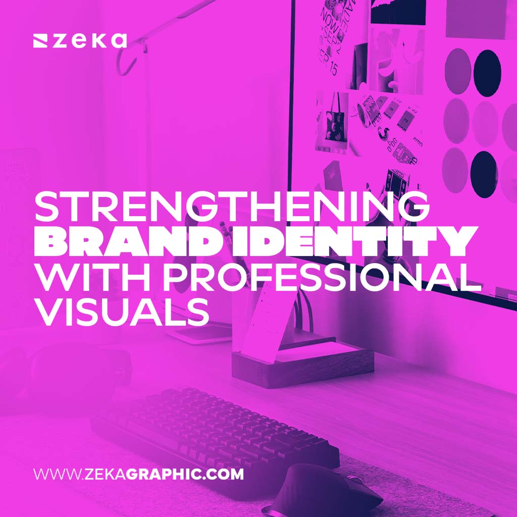
When you hear the word minimalism, what comes to mind? White walls, empty rooms, maybe a black turtleneck? In design, though, it’s something a little different, and a lot more interesting. Minimalist logos, the kind you see from some of the biggest brands in the world, aren’t plain or boring. They’re sharp, intentional, and surprisingly expressive.
Designers at Rabbit understand this balance well. Their approach shows that even the most pared-down marks can carry personality when crafted with care. By playing with negative space or pushing typography in creative directions, they’re able to make logos that feel simple on the surface yet distinct enough to stick in your mind.
Advertisment
Minimalism in logos isn’t about emptying out a design until nothing’s left. It’s more like reducing a sauce: boiling things down until you’re left with the richest flavor. Every line, curve, or angle has to earn its place.
Think of the Panasonic wordmark. It’s just blue letters, no fuss, no icon. Yet, that same wordmark has been stamped on televisions, cameras, and even airplane parts for decades. Nothing about it screams for attention, but it still does its job brilliantly—consistent, trustworthy, and easy to spot in a crowded marketplace.
That’s why minimal logos thrive. They scale without breaking. Put them on a billboard, they hold up. Shrink them to the size of a phone icon, they’re still legible. No shading to blur, no extra detail to lose. Just clarity.
Some of the most iconic minimalist logos boil down to just a couple of letters. Monograms have been around for centuries, on coins, royal crests, designer handbags—and they’ve never lost their punch.
Take Lando Norris’s logo. It’s a mashup of the letters “L” and “N,” all sharp, geometric lines that instantly feel fast and precise. And tucked between those letters? The number 4, his racing number, carved out of negative space. It’s subtle enough that you might miss it the first time, but once you notice it, you can’t unsee it. That’s minimalism at its cleverest, no decoration, just smart design.
Luxury fashion houses have mastered this too. Think of Louis Vuitton’s LV or Chanel’s interlocked C’s. Those aren’t just logos; they’re cultural shorthand. With nothing but two letters, they’ve managed to anchor entire brand legacies.
Of course, some brands don’t bother with symbols at all. They let their name be the star. Wordmarks are a minimalist favorite because they take what’s already there—the letters—and elevate them.
Look at Skims. The logo is nothing flashy, just rounded, chunky letters that feel a little irregular. And that’s the point. Those imperfections make the wordmark feel warm, inclusive, human. It whispers, “This brand is about real bodies,” without spelling it out.
Then there’s Alo Yoga. All lowercase, monochrome, no gimmicks. Just the calm, centered vibe you’d expect from a yoga brand. Sometimes the most minimalist move is simply to step back and let the font speak.
Advertisment
Minimalism doesn’t live only in letters. Some of the most recognizable logos in the world are built on a single shape.
Nike’s swoosh is the obvious one. Just a curve. That’s it. But somehow that one stroke manages to carry the idea of motion, ambition, even athletic spirit. Under Armour took a similar route. Their “U” and “A” interlock to form a symmetrical emblem that feels strong and sturdy, like actual armor.
Even Lululemon’s logo, born from a brand name that didn’t even survive, ended up becoming a timeless symbol. Abstract enough to spark curiosity, clean enough to sit comfortably on a yoga mat or hoodie.
None of these logos need words to explain themselves. That’s the magic of minimalism at work.
Minimalist logos don’t always mean black and white. Color can play a huge role, but it has to be handled with restraint.
Classic monochrome will always be reliable, especially for brands that want longevity. But modern minimalist design is playing with muted palettes—earth tones, soft greens, warm neutrals. Those choices say something subtle: sustainability, calm, balance.
There’s also a newer wave, called neo-minimalism, where designers keep the structure simple but add a bold color accent. One pop of neon or a surprising shade of blue can shift a logo from “safe” to “memorable” without cluttering it up. The rule of thumb? Less is still more, even with color.
If you’re thinking of going minimalist with a logo, a few guiding principles can help steer the process:
Simple on paper, harder in practice. Which is why the best minimalist logos often look effortless, but only after a lot of refinement.
The real beauty of minimalist logos is staying power. While trendy designs come and go, a clean, stripped-back logo avoids aging itself. It adapts easily to new platforms, whether that’s social media, augmented reality, or plain old print.
They’re also confident. A brand with a minimalist logo isn’t screaming for attention; it’s calmly stating, “Here we are. You’ll remember us.” And often, people do.
Advertisment
Minimalist logos prove that you don’t need bells and whistles to make a lasting impression. With just a few shapes, a handful of letters, or a smart use of space, they manage to be bold, memorable, and adaptable all at once.
Done right, these logos don’t just represent a brand, they become part of cultural memory. Think of the swoosh, the interlocked C’s, or even that blocky Panasonic typeface. Simple on the surface, yet powerful enough to stick with us for decades.
Minimalism in logos isn’t about less design. It’s about the right design. And when everything unnecessary is stripped away, what’s left often turns out to be unforgettable.
Advertisment
Pin it for later!
If you found this post useful you might like to read these post about Graphic Design Inspiration.
Advertisment
If you like this post share it on your social media!
Advertisment


Want to make your Business Grow with Creative design?
Advertisment

Advertisment