Let’s be honest, who actually gets excited about presentations? We’ve all been there, trapped in a dimly lit room, watching slide after slide of bullet points. It’s enough to make anyone’s eyes glaze over. But it doesn’t have to be that way! What if your presentations could be engaging?
The secret weapon is graphic design. It’s not just about making things pretty, it’s about crafting a visual experience that captivates your audience and helps them actually remember what you’re saying. So think of your presentation as a conversation. You’re trying to connect with people, share ideas, and hopefully, inspire them. Here are 10 tips to transform your presentation from a sleep-inducing lecture into a dynamic, attention-grabbing show:
Advertisment
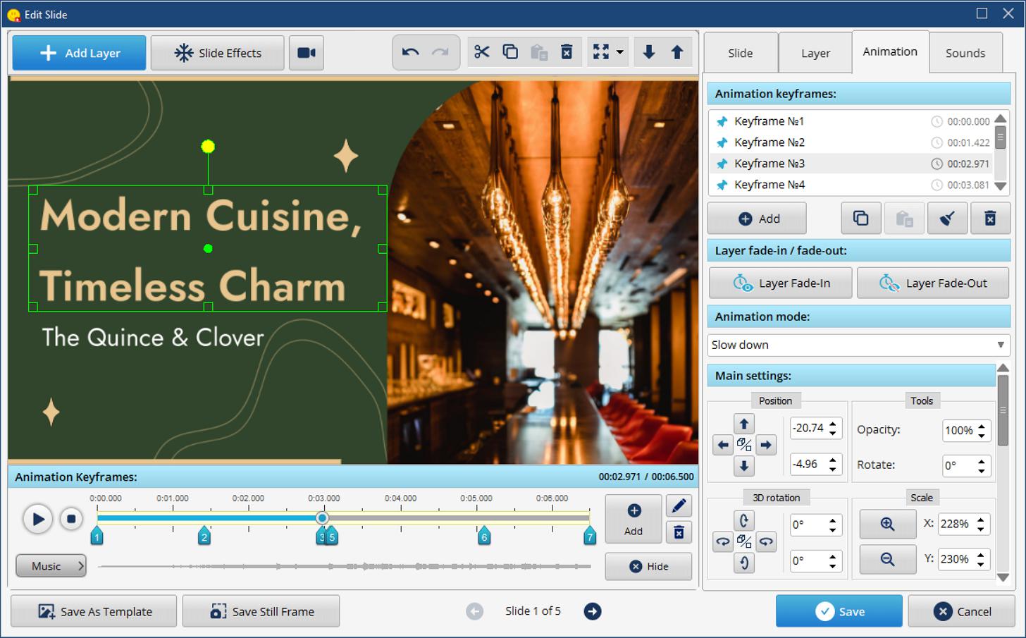
Imagine a key quote gently fading into view, drawing everyone’s attention. Or perhaps a crucial statistic subtly pulsing, making it stick in their minds. Text animation, used tastefully, can be a game-changer. But tastefully is the key word! We’re not talking about cheesy, flashing neon signs. We’re talking about subtle, impactful movements that enhance your message, not distract from it.
Want to explore the possibilities? SmartSHOW 3D for text animation on PC could be your new best friend. It offers a ton of options for creating elegant and effective text animations. Just try keeping it subtle without too much zoom or spins and you’ll be surprised by how much of a difference it makes. And the best bit? You can use the built-in templates prepared by designers to make your colors, fonts and animations look incredible without any extra work!

Think of each slide as a mini-masterpiece. Where do you want people to look first? What’s the most important thing they should see? Use size, color, and placement to create a visual path for your audience to follow. Make your key takeaways HUGE and bold, and supporting details can take a back seat, visually.

Advertisment
Color isn’t just decoration. It evokes emotion and sets the tone. What kind of feeling do you want to create? Choose a color palette that reflects your brand and your message. A splash of bright color can highlight a crucial point. A calming blue can create a sense of trust. But remember, less is often more! Keep your palette limited to prevent visual overload whether you want to make it dynamic, calming, serious, or fun.
Seriously, the fonts you use actually matter. A playful, scribbly font? Super cute on a birthday card, no doubt. But will it inspire confidence when you’re presenting your quarterly sales report? Probably not. You want fonts that are easy on the eyes, and that vibe with the overall message you’re trying to convey. Your font is essentially the voice of your presentation, so what’s it saying about you and your business? A little contrast can be cool – pairing a bold heading font with a simpler body font – but make sure they work well together. Avoid using too many fonts unless you want your slides to end up looking like a ransom note.
Advertisment
We’ve all seen them… the forced smiles, the staged handshakes… Ugh. Stock photos can be a necessary evil, but try to find images that feel authentic and relevant. Better yet, use your own photos or illustrations. Even better, pay for one. Nothing is worse than seeing that photo of some serious-looking coworkers you have seen over and over.
Don’t cram everything onto one slide! White space, also known as negative space, is your friend. It gives your content room to breathe, making it easier to read and less overwhelming. Think of it as a visual breathing room for your audience.
Data can be a snooze-fest but it doesn’t have to be. Use charts and graphs to visualize your data in a clear and compelling way. What are the key insights? Make sure to show them! You could also try and use icons to make them better.
Advertisment
It’s all about that consistency. To show professionalism. It’s about the colors, fonts, and layouts. Pick a style and commit to it. Your audience will thank you.
Don’t just dump information. Weave a narrative. Connect with your audience on an emotional level. Share stories, anecdotes, and real-world examples to bring your points to life. What personal stories or real examples have you seen related to your subject matter? Use this!
Before you stand up and present, don’t just assume you’ve nailed it. Get some honest feedback from trusted sources. Ask a colleague, a friend, even your grandma (okay, maybe not grandma, unless she’s a design guru!) to take a look. “Does this make sense? Is anything confusing? Does the design distract from the message?” Use their insights to tweak, refine, and polish your presentation until it’s the best it can be. Remember, even the pros get feedback! It’s all part of the process.

Advertisment
Presentations can be a drag. But they don’t have to be. Think of these graphic design tips as your escape route from “PowerPoint Purgatory.” They’re not about becoming a design guru overnight, but about making your message actually land. So go ahead, put these ideas into practice, and create presentations that people will actually remember. The world has enough boring presentations, let’s make sure yours isn’t one of them.

If you found this post useful you might like to read these post about Graphic Design Inspiration.
Advertisment
Written by
If you like this post share it on your social media!
Advertisment
Advertisment