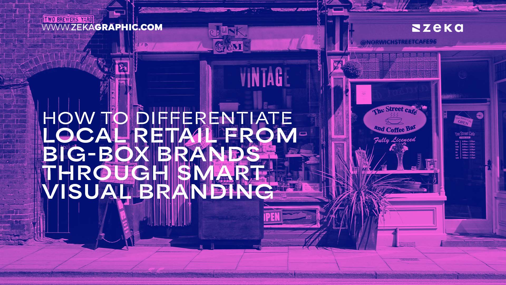
Did you know that one in three shoppers now prefer to buy local, simply because it feels more authentic and connected? When competing against the slick visuals and massive budgets of national chains, local retailers might feel outmatched at first glance. But here’s the thing: you don’t need to win on scale — you can win on story, on place, and on personality.
With the right mix of authentic imagery, thoughtful color choices, and community-driven design, even the smallest shop can turn visual branding into its biggest competitive edge.
Advertisment
Big-box brands flood every channel with polished visuals, massive ad budgets, and flawless consistency. Their shelves, websites, and billboards all follow the same pattern — clean, predictable, and engineered to feel safe. That uniformity builds recognition, but it also creates distance. The more “perfect” these visuals become, the less they feel human.
Local retailers don’t have to match that perfection. They have something the big players don’t: character. Smart targeting and creative presentation can close the gap, even in paid campaigns. Insights from automotive PPC advertising show how aligning visuals and messaging with local intent stretches limited budgets while boosting click-through rates. Authenticity and a sense of place make customers stop scrolling, lean in, and care.
Big-box stores sell convenience. Local brands sell belonging — and that emotional connection can’t be mass-produced.
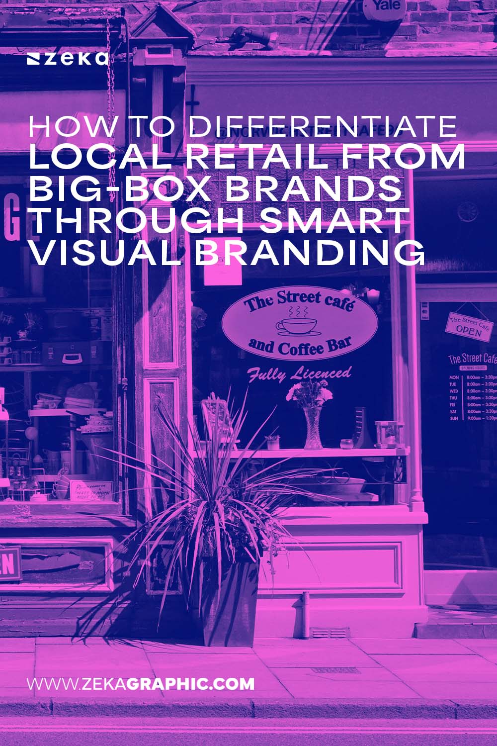
Every neighborhood has a rhythm — the colors, faces, and textures that make it feel alive. When local retailers mirror that rhythm through their branding, they do more than sell; they tell a story that people recognize as their own. Authentic visual identity doesn’t come from templates or trends. It’s built from what makes a community unique.
Advertisment
Look around your town. What do the streets, murals, and storefronts say? Maybe it’s the weathered brick of old buildings or the bright coastal tones of a nearby beach. Borrow from those details. Use local architecture, colors, and materials to shape your store’s visuals. The goal is to feel like you belong — not as a franchise, but as part of the local landscape.
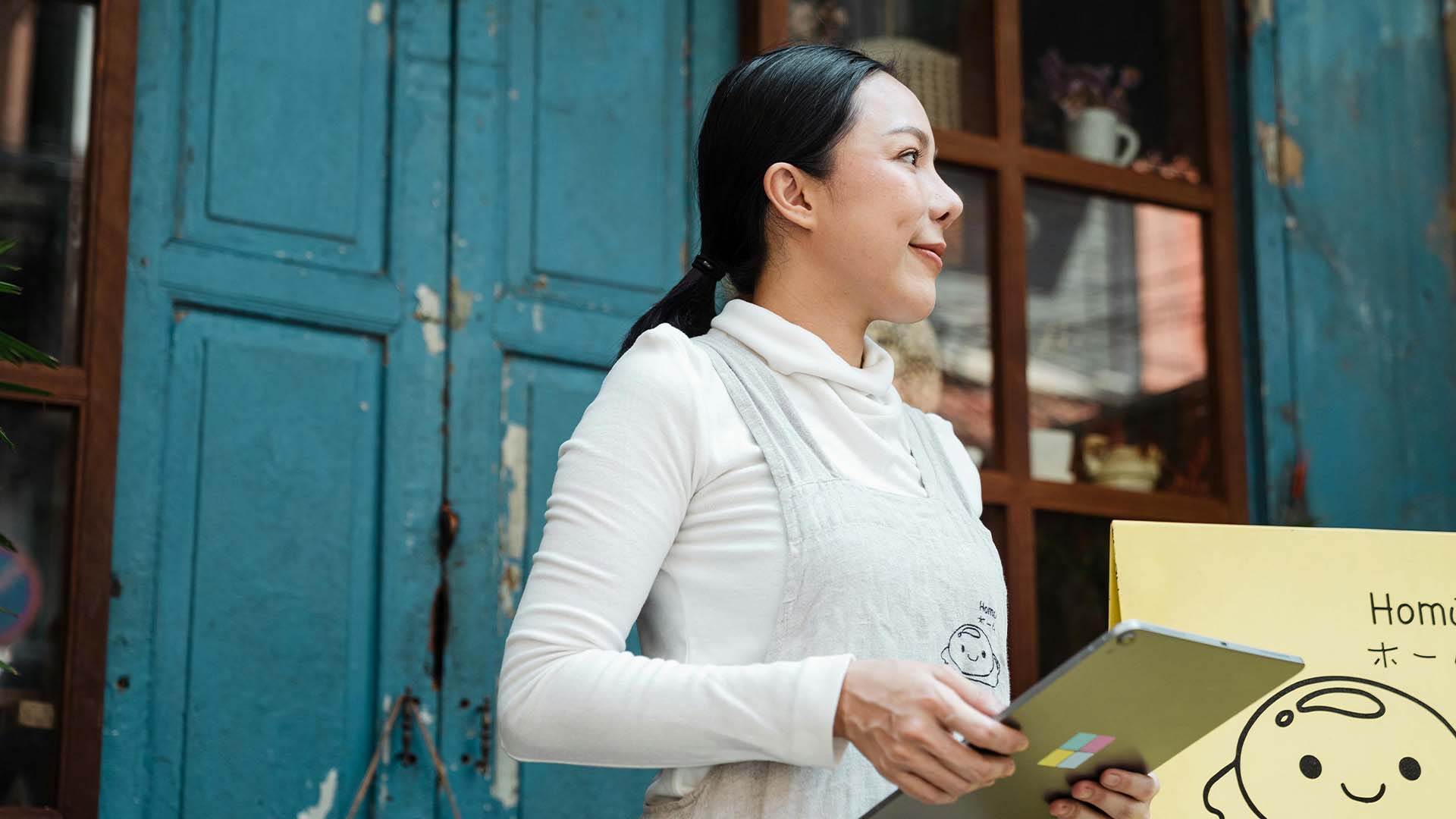
Skip the polished stock photos. Feature your team, your customers, and familiar spots from around town. People trust what feels real. Those faces and scenes don’t just humanize your brand — they perform better across social media and paid campaigns because they resonate with real viewers. Authentic imagery invites connection, turning casual browsers into loyal customers who see themselves in your story.
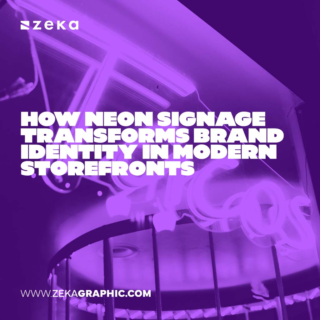
Big brands aim for universal recognition, but that often means sanding down every edge until nothing feels personal. Local retailers can go the opposite way — create visuals that feel handcrafted, specific, and unforgettable. When customers can recall your colors, logo, or signage instantly, you’ve built more than awareness — you’ve built emotional memory.
Forget the corporate blues and sterile grays that dominate big-box branding. Choose a color palette that reflects your store’s personality and the vibe of your community. Earthy neutrals can signal craftsmanship and trust; brighter hues can capture youth and energy. Every color choice tells a story. When that palette stays consistent across your storefront, bags, and social posts, it becomes your signature.
Think of those tiny, distinctive details that customers start to associate with your shop — a pattern on your packaging, the curve of your signage, or a logo that feels drawn by hand. These touches make your brand easy to recognize even from a distance. Use them everywhere: on receipts, delivery boxes, and online ads. Familiarity builds trust, and trust keeps people coming back.
Advertisment
A great visual brand doesn’t stop at the logo or color palette — it extends into the space customers walk into. The store itself becomes a three-dimensional expression of your identity. Every texture, sign, and scent can reinforce who you are and why your brand feels different from a big-box chain.
Your shop layout should tell a story the moment someone steps inside. Lighting, flooring, shelving — even handwritten signs — all shape the experience. A boutique might use reclaimed wood and soft lighting to evoke craftsmanship, while a surf shop could lean on bold murals and natural textures. These choices invite people to feel something, not just buy something. When your space reflects the heart of your brand, every visit becomes memorable.
Visual branding isn’t only what people see; it’s how they move and feel in the space. Thoughtful color contrast and clear signage guide customers naturally, creating a rhythm that feels intuitive. Add small, sensory cues — background music, texture changes, subtle scents — that make the visit immersive. When the space feels genuine and photo-worthy, shoppers share it online, turning their experience into an organic promotion that money can’t buy.
Visual identity loses power when it changes from one touchpoint to another. A shop that feels warm and personal in person but generic online creates confusion. Consistency builds familiarity, and familiarity builds trust — especially when customers move between physical and digital spaces.
Use the same tone, palette, and imagery across everything: packaging, signage, website, and social feeds. Even small retailers can keep things aligned with a simple brand kit — a folder of logo files, fonts, and color codes. When every visual feels connected, customers instantly recognize your brand wherever they see it.
That same consistency should carry into your advertising. Keep your ad visuals aligned with your store experience — the same colors, mood, and style. It helps audiences recognize you in crowded feeds and search results. Unified visuals not only boost click-through rates but also improve how algorithms interpret your content. When your organic posts and paid campaigns share a cohesive look, you appear established, reliable, and real — no matter how small your business.
Advertisment
Big-box brands can outspend any local retailer, but they can’t out-authentic you. What sets small businesses apart is the ability to look and feel human — to show personality instead of polish. When visuals tell a story rooted in community, people remember.
A distinct logo, a meaningful color palette, and imagery that reflects real faces all add up to something powerful: belonging. That sense of connection transforms one-time visitors into regulars who proudly share your brand with others.
The smartest local retailers treat every design choice as strategy. Each photo, color, and layout becomes a signal that says, this place knows me. In a world of algorithms and mass marketing, that kind of authenticity is what truly stands out — and keeps customers coming back.
Advertisment
Pin it for later!
If you found this post useful you might like to read these post about Graphic Design Inspiration.
Advertisment
If you like this post share it on your social media!
Advertisment


Want to make your Business Grow with Creative design?
Advertisment

Advertisment