There was a moment when digital design felt… optimistic.
Early 2000s interfaces, ads, and visuals had this unmistakable energy—glossy gradients, soft reflections, bright skies, and clean typography that made technology feel approachable. Almost human. That visual language is what we now call Frutiger Aero.
For a while, it disappeared. Replaced by flat design, minimal grids, and stripped-down interfaces. But now it’s coming back—and not as nostalgia alone. Designers are revisiting it because it brings something we’ve been missing: depth, warmth, and a sense that digital spaces can still feel alive.
You see it in the details.
Light passing through glass.
Bubbles floating in open space.
Green tones that hint at nature inside a digital world.
It’s less about decoration—and more about how design feels again.
Advertisment
At first glance, Frutiger Aero looks like a style. Glossy. Clean. Bright.
But it’s really a way of thinking about design.
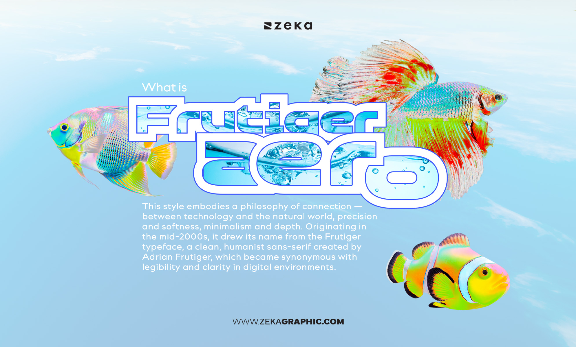
Frutiger Aero is a graphic design aesthetic from the mid-2000s that combines glossy skeuomorphic visuals, soft gradients, and nature-inspired elements to create an optimistic, human-centered vision of technology.
It sits somewhere between technology and nature. Between precision and softness. Between clarity and atmosphere. The name comes from the Frutiger typeface, known for its readability and human touch—something that quietly shaped how digital interfaces communicated.
Visually, it blends depth with lightness. Transparent layers. Smooth gradients. Airy compositions. Nothing feels heavy or aggressive. Everything flows.
Where Y2K design was chaotic and metallic, Frutiger Aero feels calm. Controlled. Almost optimistic about the future.
And that’s probably why it resonates again today.
After years of ultra-minimal, flat interfaces, this aesthetic brings back something simple—but powerful: a sense of space, light, and emotion inside digital design.
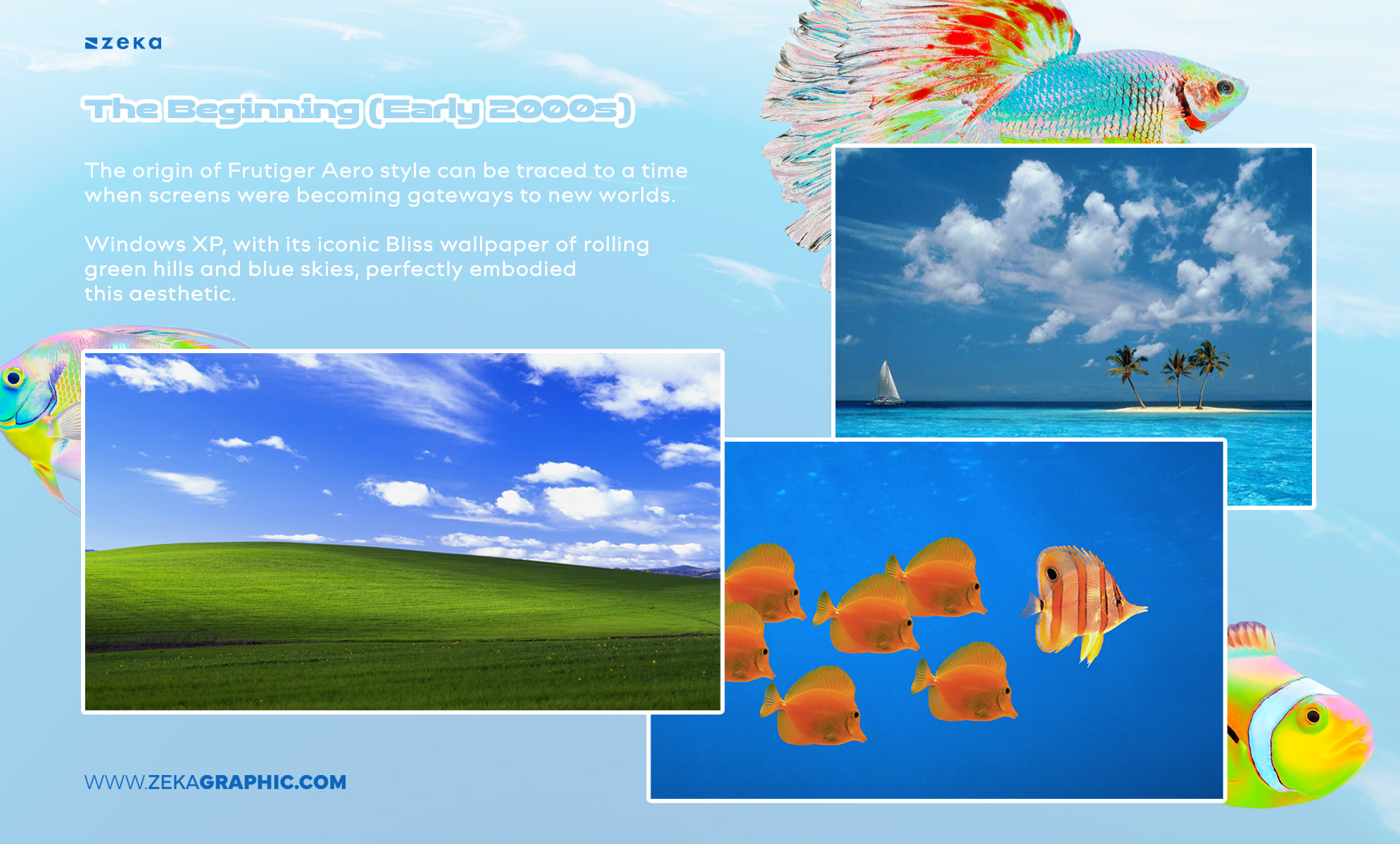
The early 2000s marked the birth of digital optimism. The origin of Frutiger Aero style can be traced to a time when screens were becoming gateways to new worlds.
Windows XP, with its iconic Bliss wallpaper of rolling green hills and blue skies, perfectly embodied this aesthetic.
Designers leaned into natural textures, curved shapes, and luminous gradients to symbolize growth and innovation — a reflection of society’s faith in technology’s power to improve life.
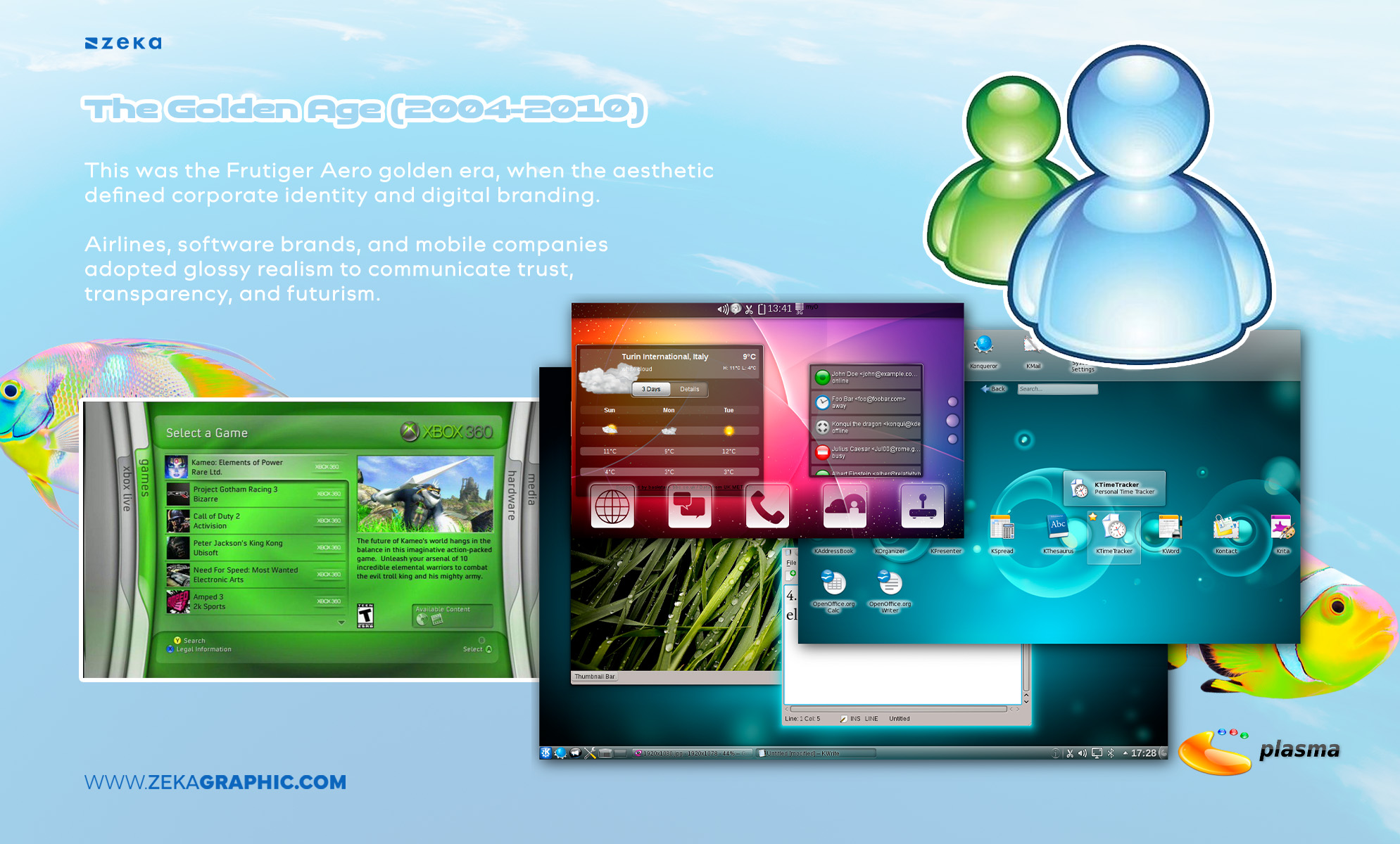
This was the Frutiger Aero golden era, when the aesthetic defined corporate identity and digital branding. Airlines, software brands, and mobile companies adopted glossy realism to communicate trust, transparency, and futurism.
The Frutiger typeface, with its modern legibility, became a visual shorthand for progress.
This period saw sleek UI buttons, reflective logos, and vibrant gradients dominate tech culture, mirroring the optimism of a world connected through new digital networks.
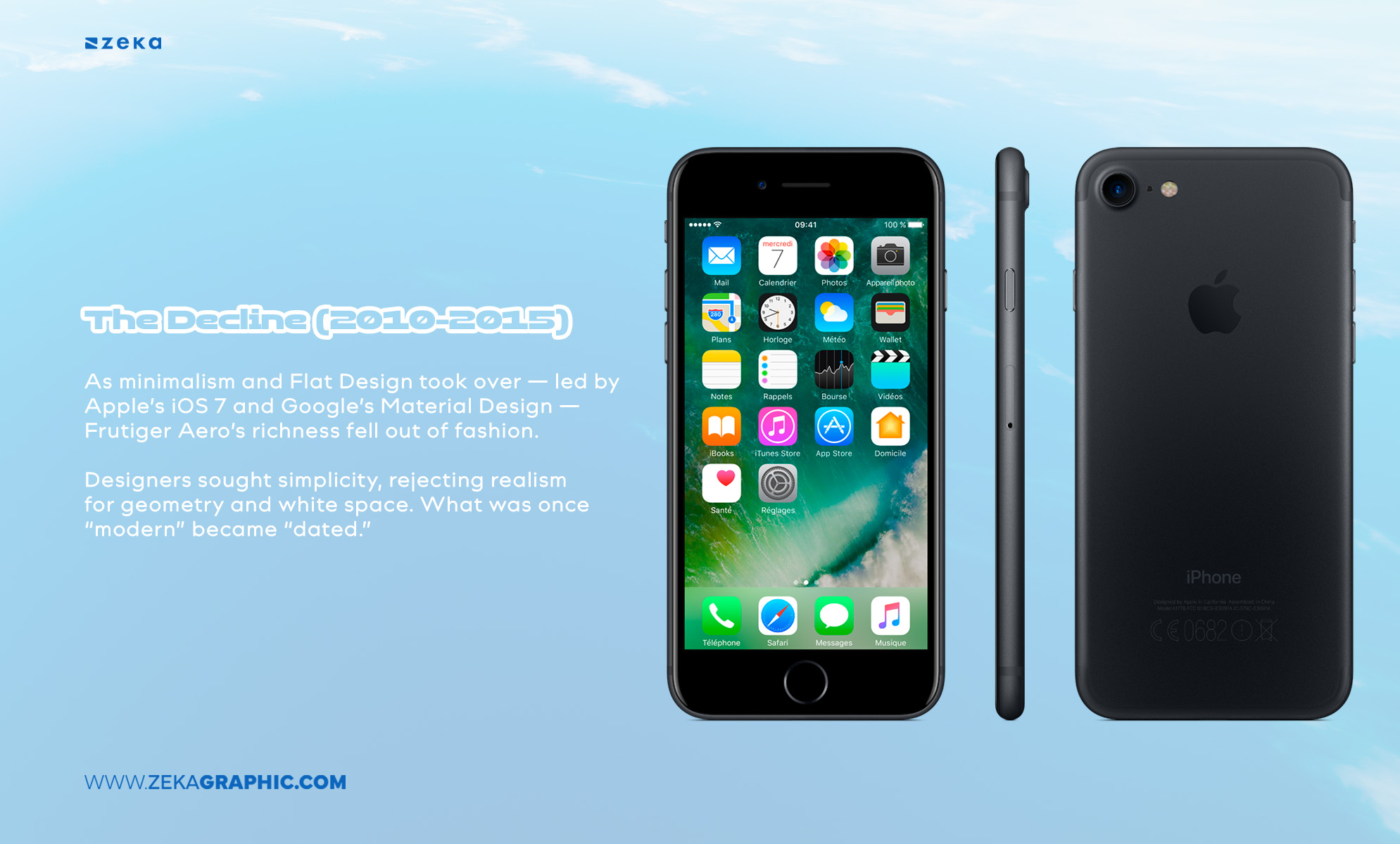
As minimalism and Flat Design took over — led by Apple’s iOS 7 and Google’s Material Design — Frutiger Aero’s richness fell out of fashion.
Designers sought simplicity, rejecting realism for geometry and white space. What was once “modern” became “dated.” Yet, as design often does, what fades eventually returns — reinterpreted, refined, and revitalized.
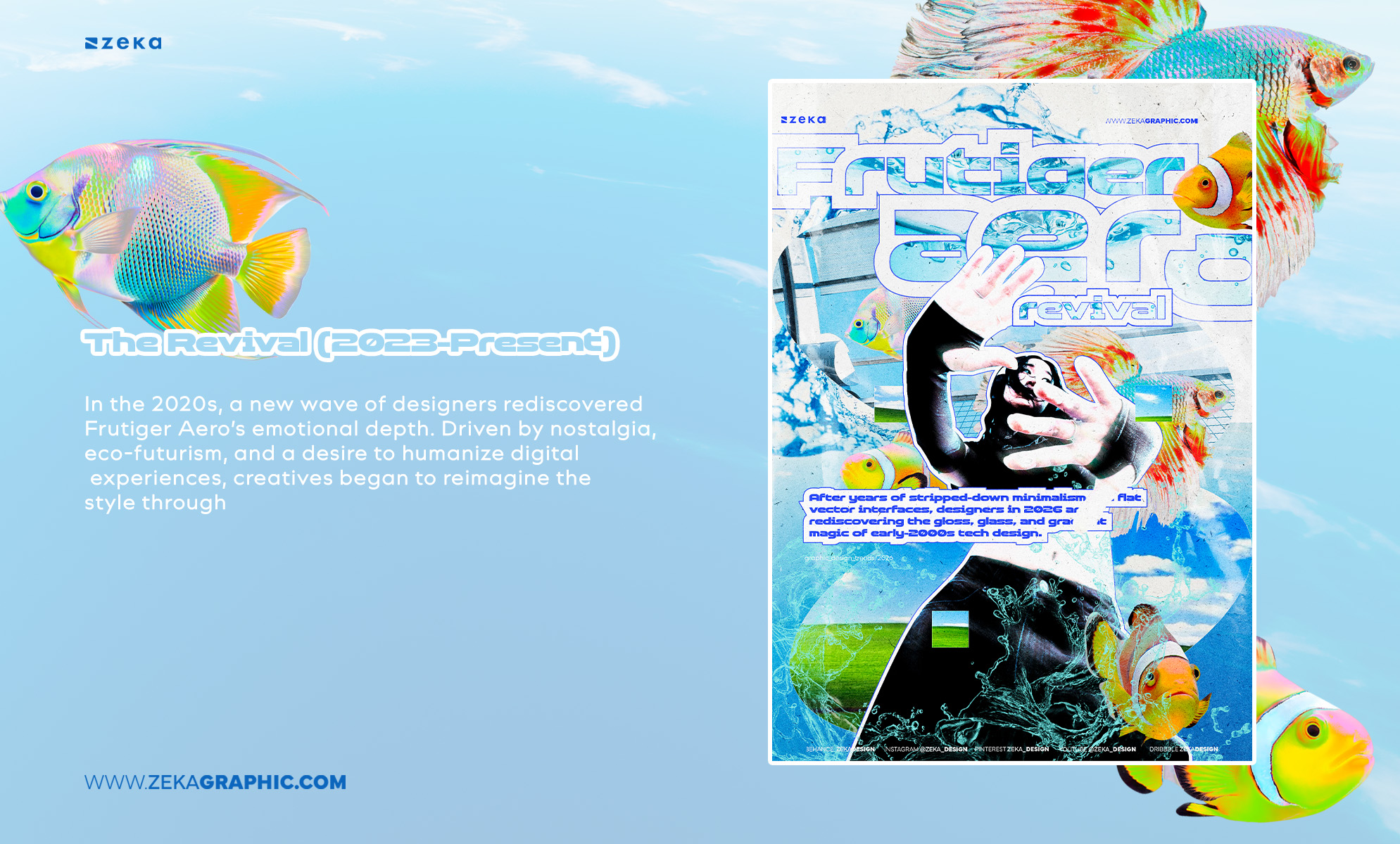
In the 2020s, a new wave of designers rediscovered Frutiger Aero’s emotional depth. Driven by nostalgia, eco-futurism, and a desire to humanize digital experiences, creatives began to reimagine the style through AI art, 3D compositions, and immersive branding.
The trend now lives at the intersection of sustainability and surrealism — a soft-tech aesthetic that feels both retro and visionary.
Advertisment
The Frutiger Aero aesthetic is instantly recognizable for its luminous, tactile, and almost meditative sense of clarity. It’s the visual embodiment of digital optimism — where technology meets the purity of nature.
As a designer, understanding these Frutiger Aero design elements helps you see how this aesthetic can be both nostalgic and forward-thinking.
Here are the core traits that define this trend:
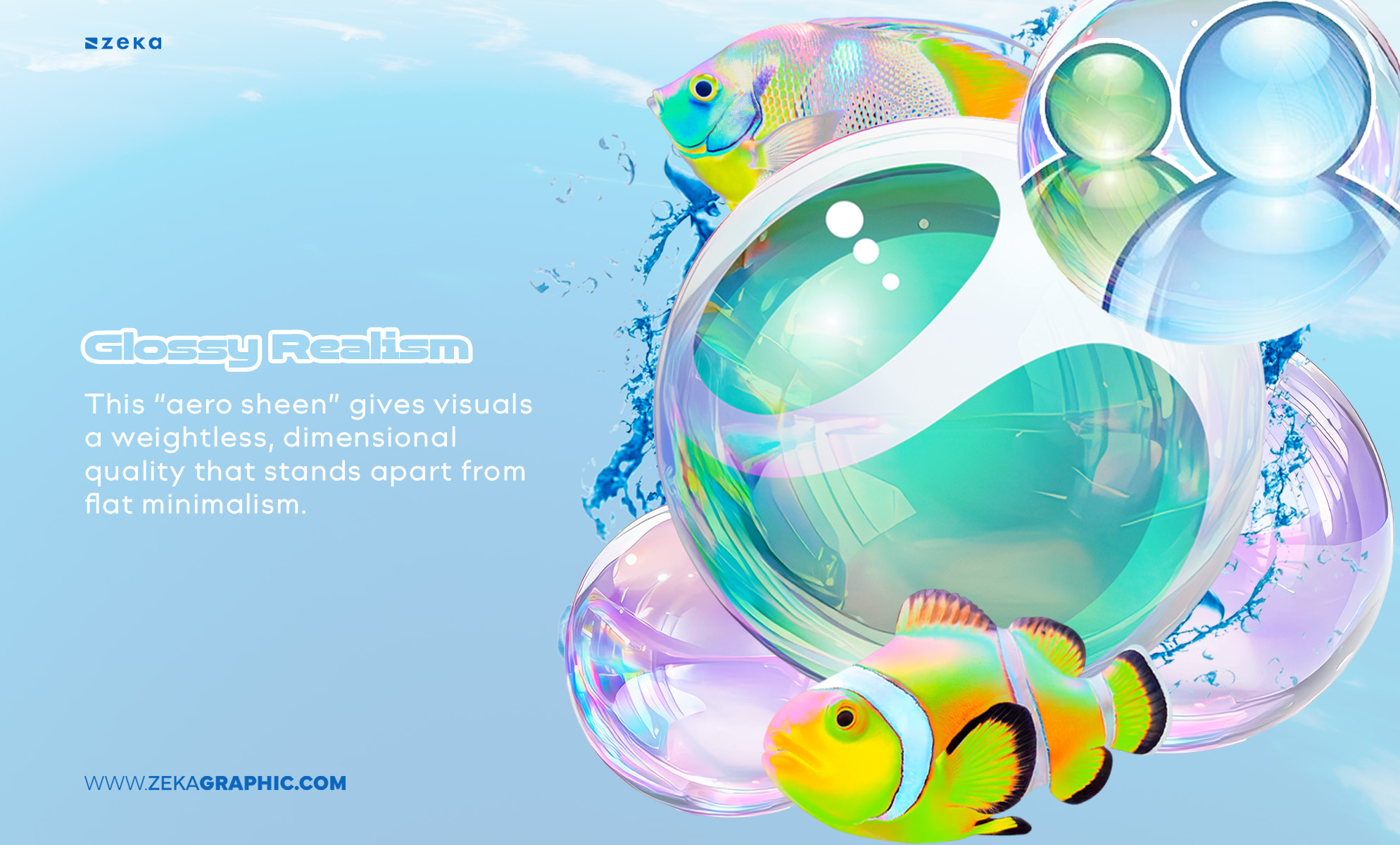
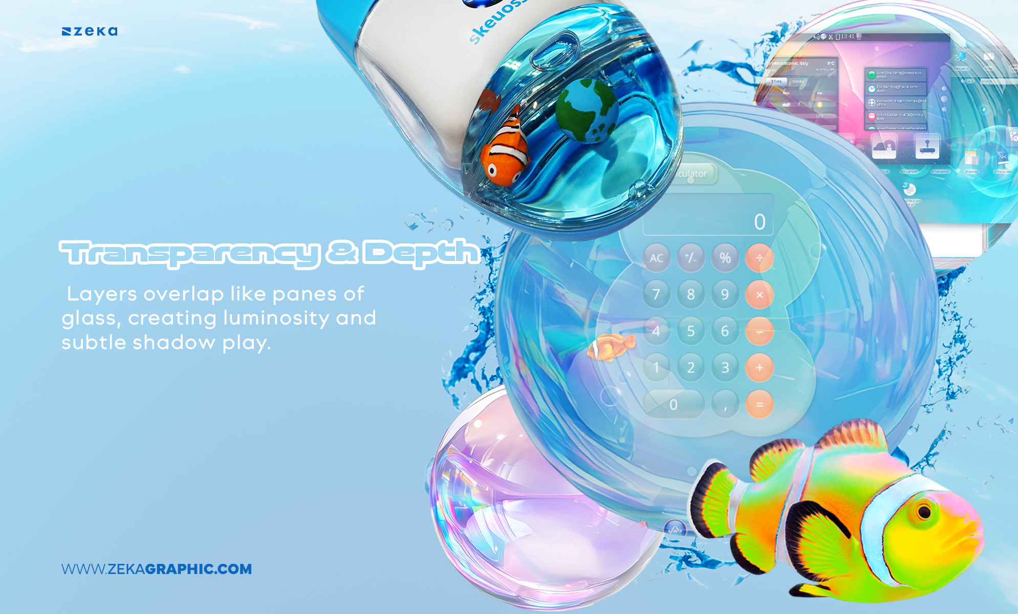
Think glass-like reflections, liquid textures, and surfaces that feel alive under light. This “aero sheen” gives visuals a weightless, dimensional quality that stands apart from flat minimalism.
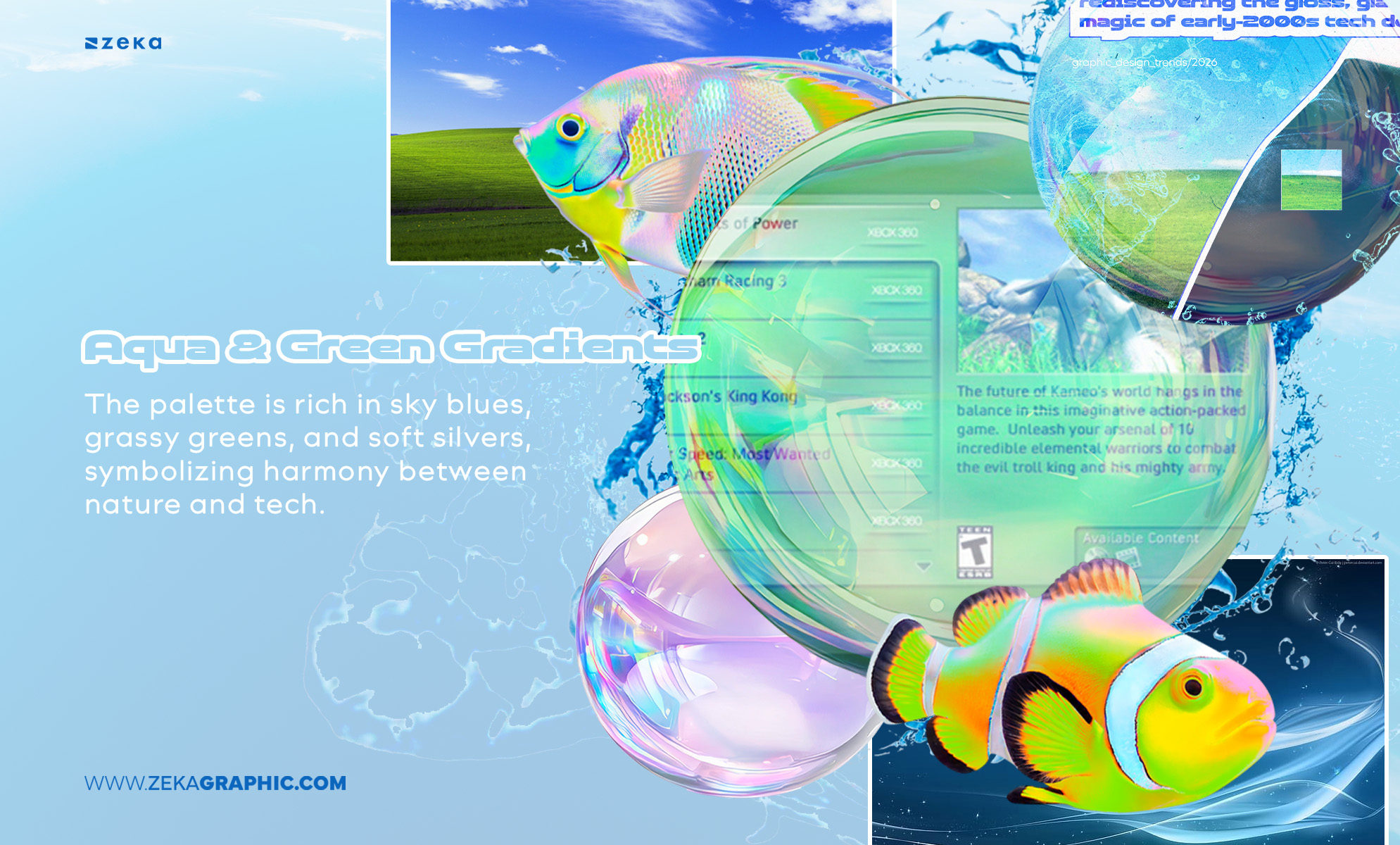
The palette is rich in sky blues, grassy greens, and soft silvers, symbolizing harmony between nature and tech.
Advertisment
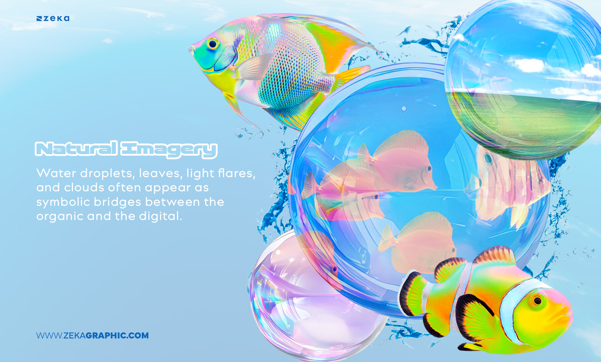
Water droplets, leaves, light flares, and clouds often appear as symbolic bridges between the organic and the digital.
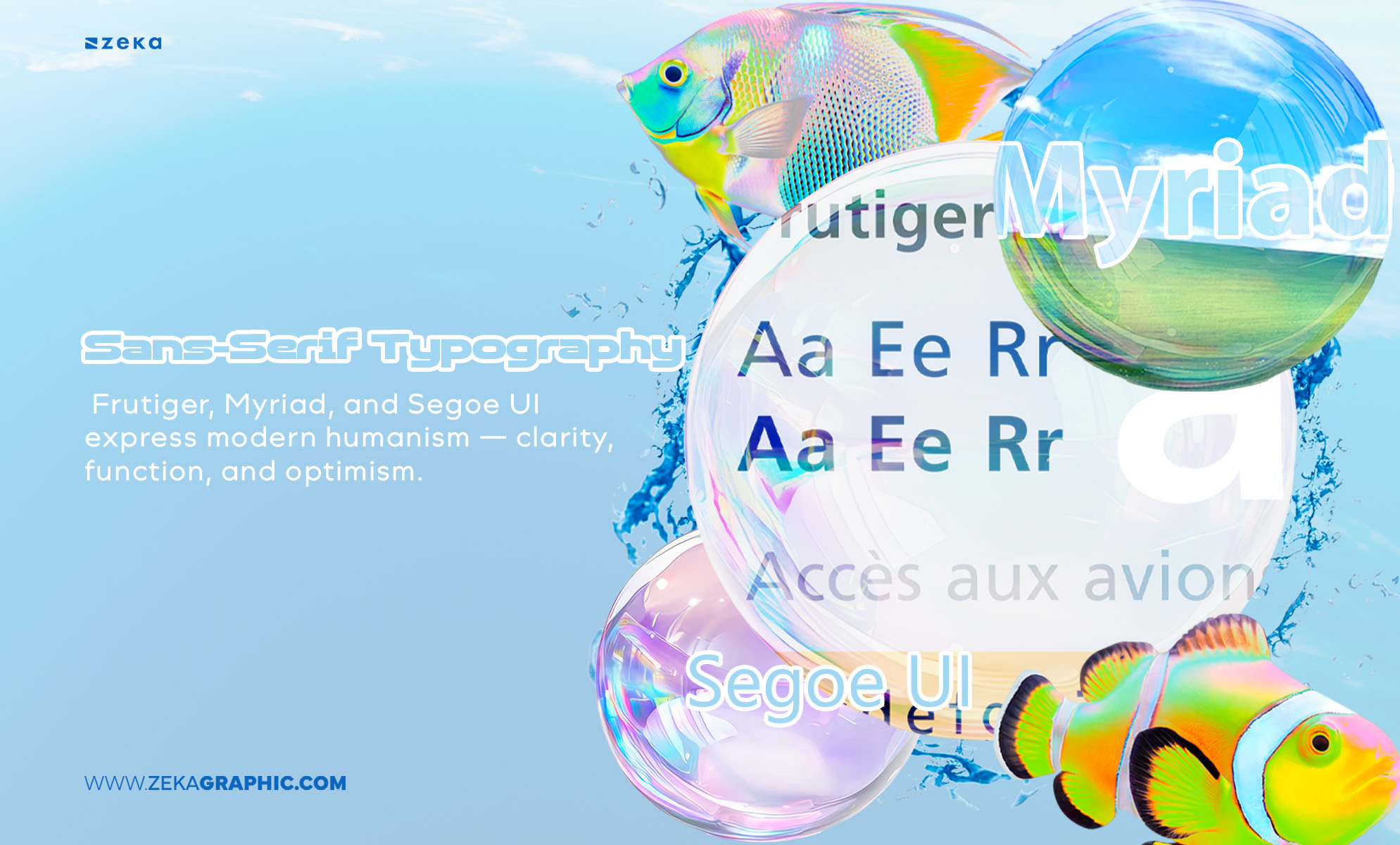
Frutiger, Myriad, and Segoe UI express modern humanism — clarity, function, and optimism.
Rounded elements create movement and friendliness, reinforcing the “digital purity” vibe.
Layers overlap like panes of glass, creating luminosity and subtle shadow play.
Advertisment
Frutiger Aero is not a single fixed style, but a spectrum of visual directions that reinterpret the same idea: optimistic, human-centered technology. Across branding, UI, and digital art, designers adapted this aesthetic into multiple substyles — each emphasizing different moods, from nature and calmness to futurism and energy.
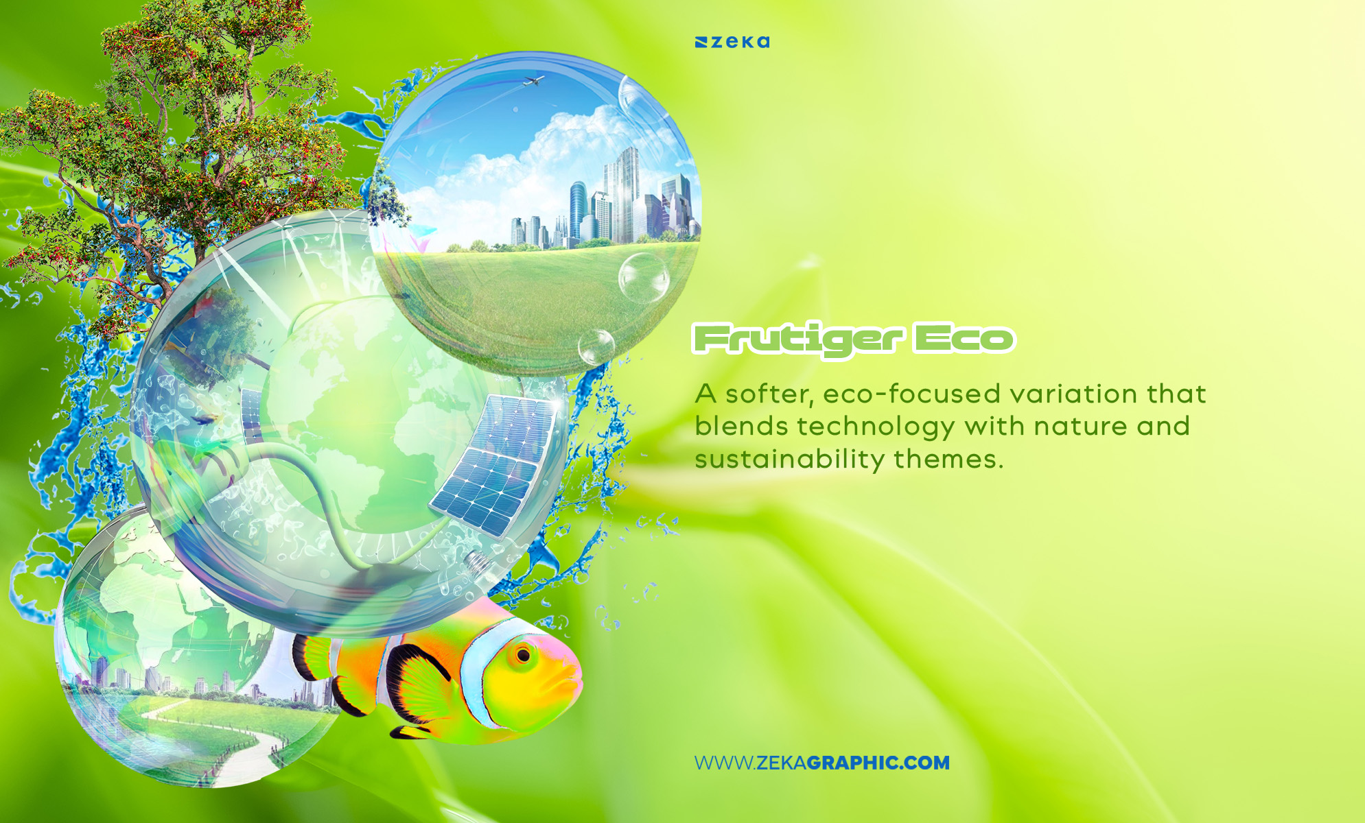
A softer, eco-focused variation that blends technology with nature and sustainability themes.
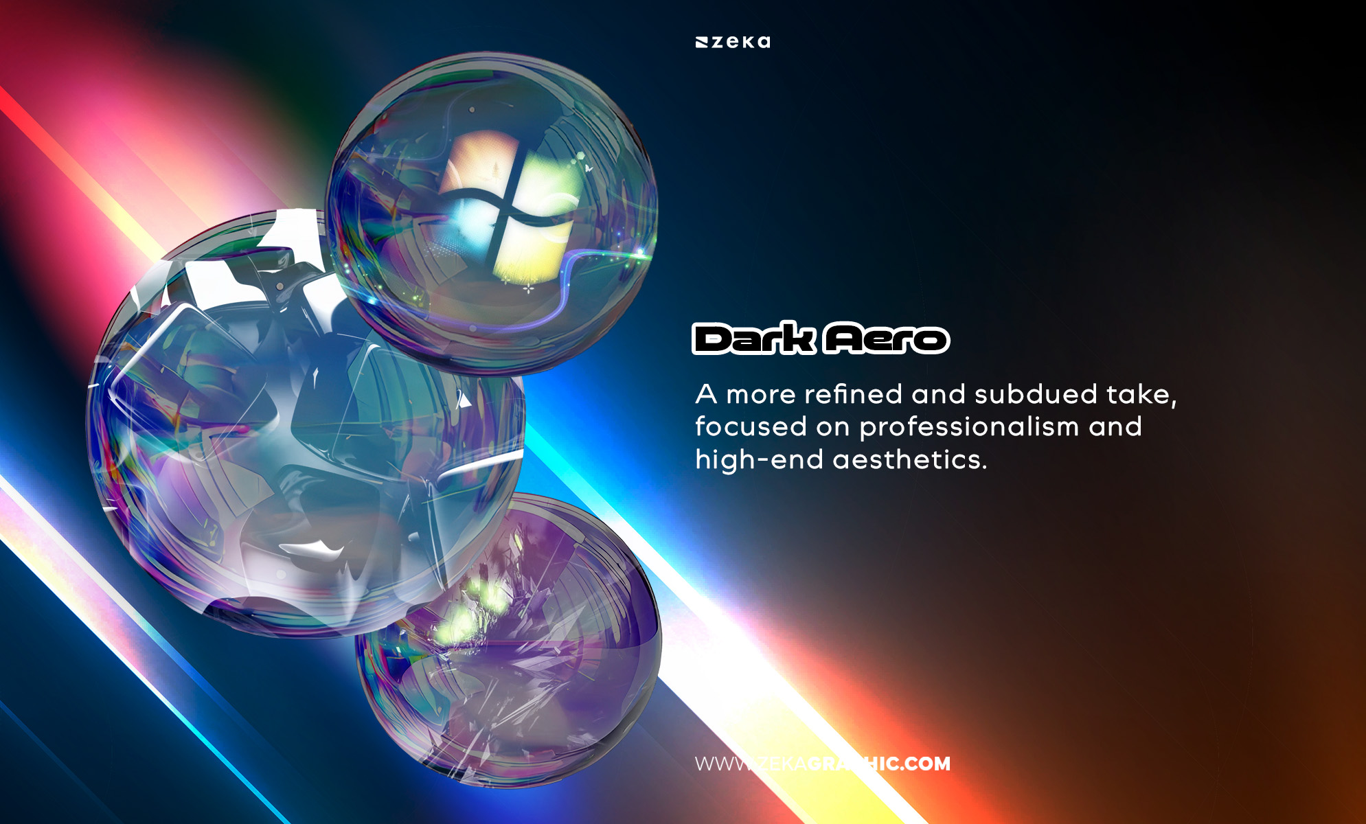
A more refined and subdued take, focused on professionalism and high-end aesthetics.
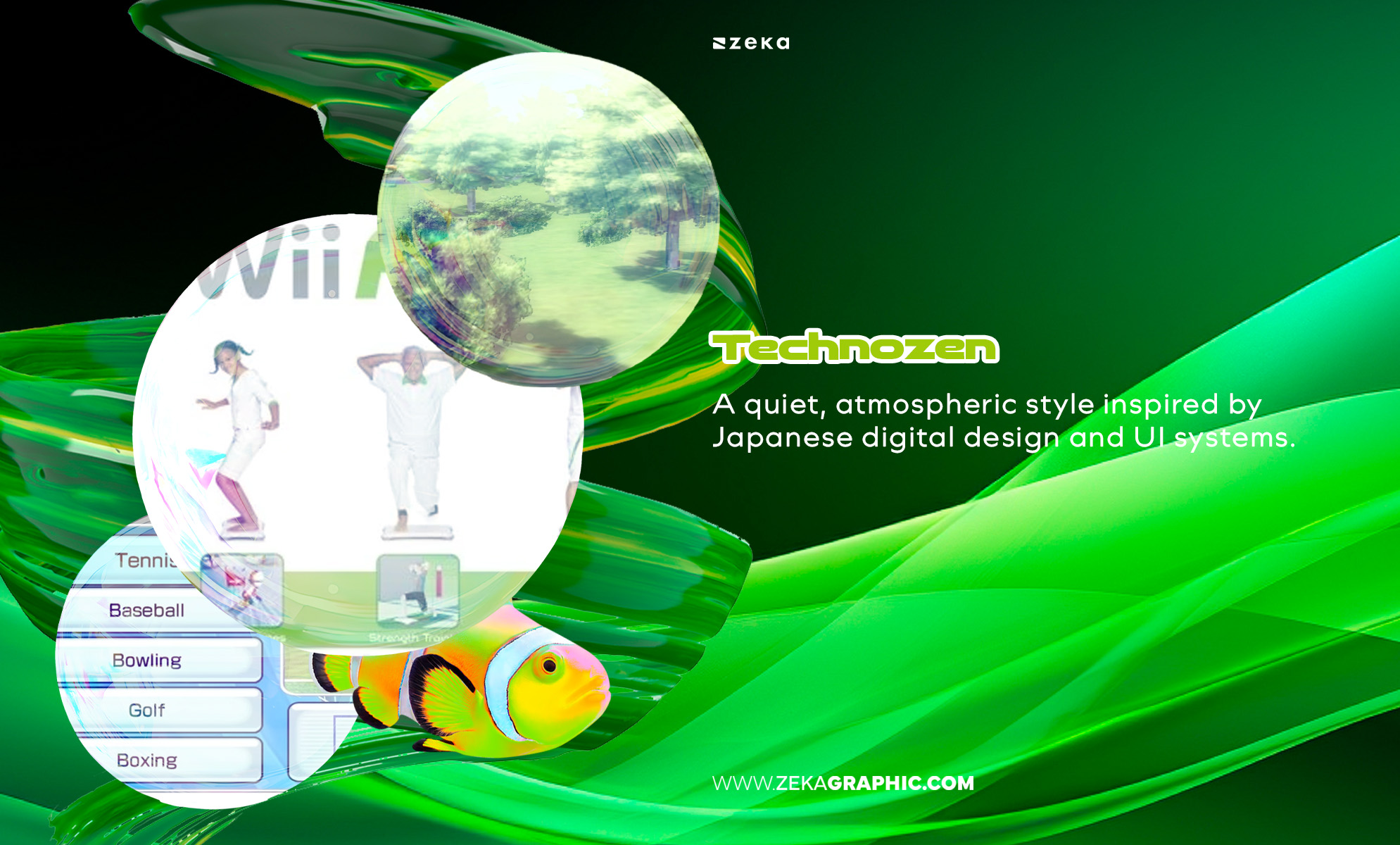
Technozen is a quiet, atmospheric style inspired by Japanese digital design and UI systems.
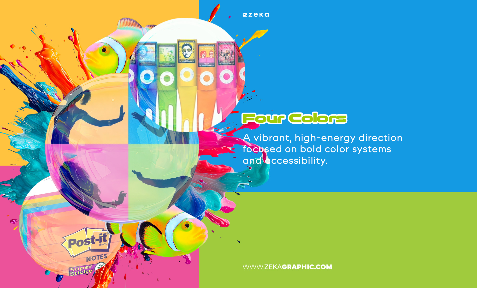
A vibrant, high-energy direction focused on bold color systems and accessibility.
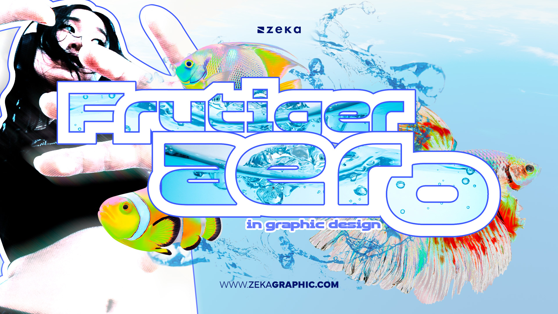
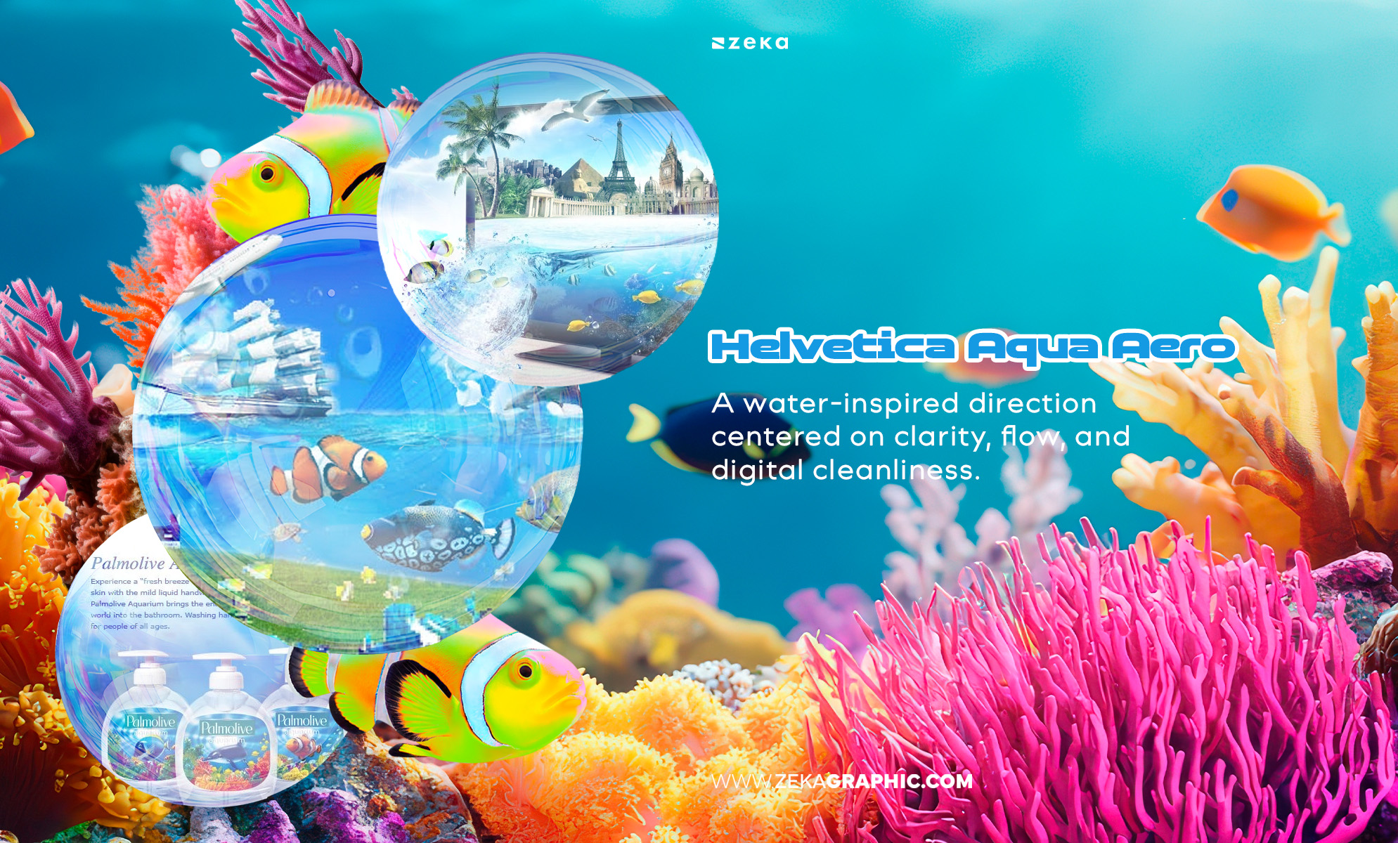
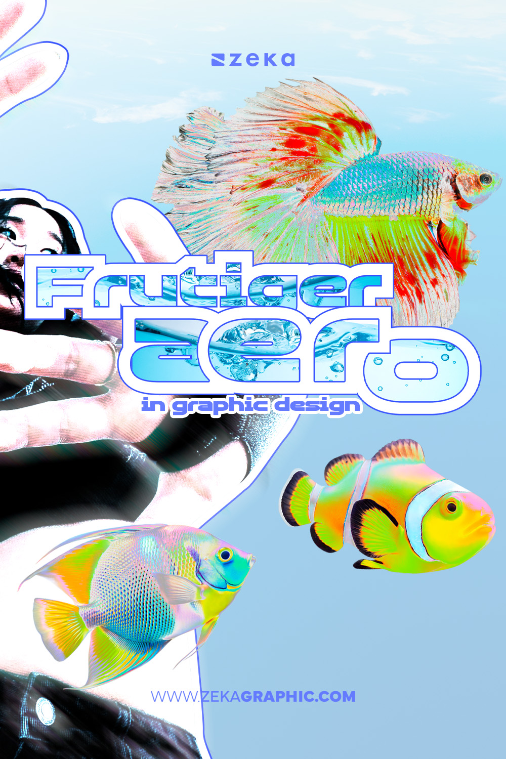
A water-inspired direction centered on aquatic life, bubbles, aquatic colors and other elements related to the ocean, being one of the most iconic types of Frutiger Aero movement.
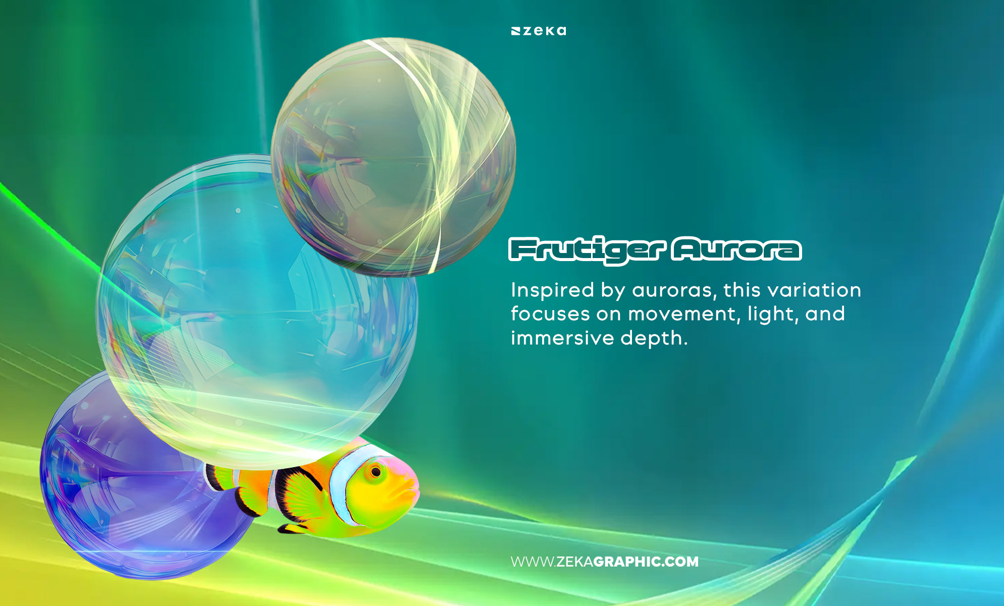
Inspired by auroras, this variation focuses on movement, light, and immersive depth.
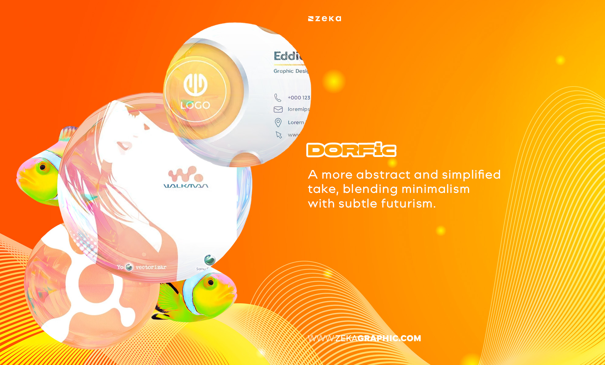
A more abstract and simplified take, blending minimalism with subtle futurism.
Advertisment
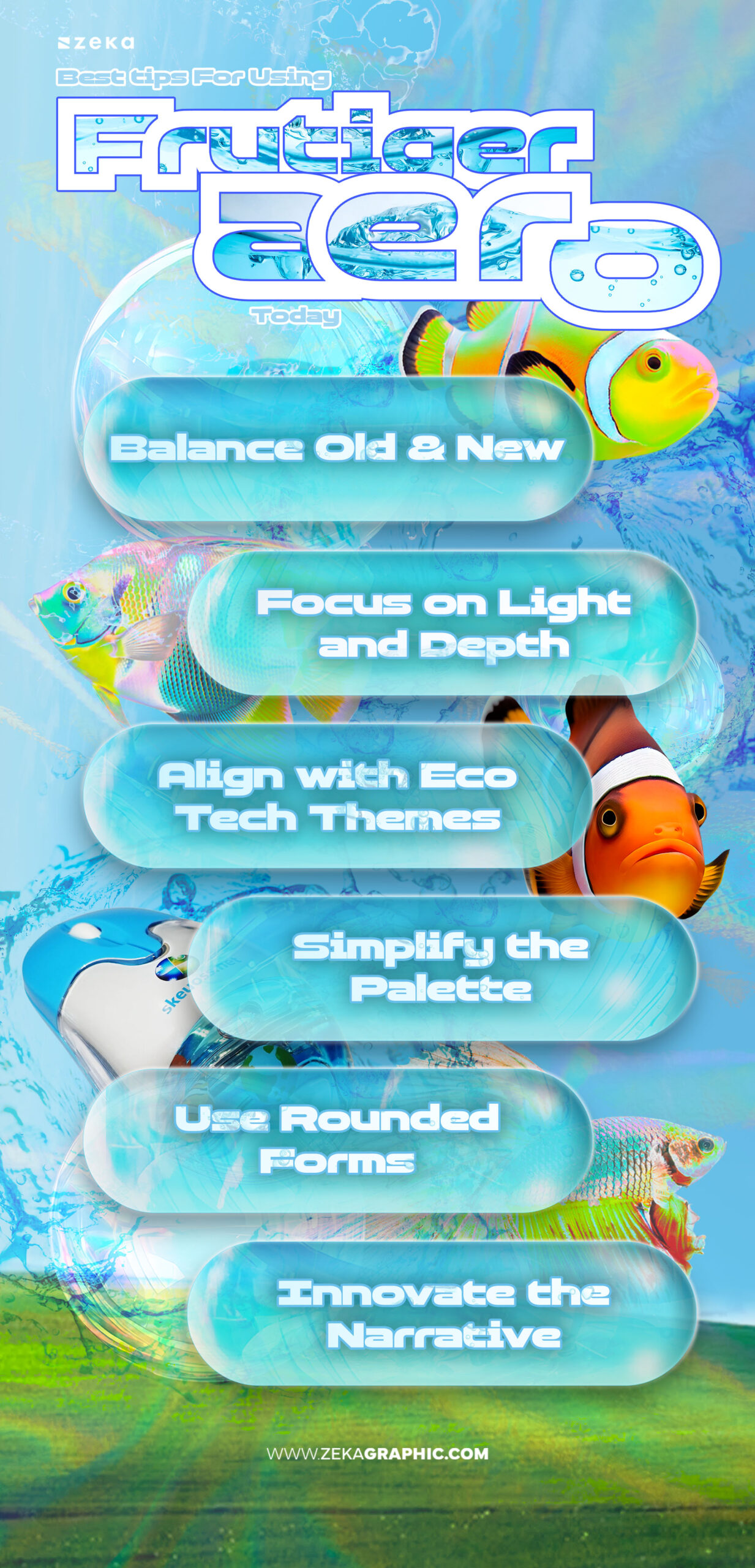
The key to using Frutiger Aero in modern design lies in reinvention, not replication. This trend isn’t about nostalgia alone — it’s about translating that early-2000s optimism into sleek, eco-futurist design languages.
Here are a few practical tips to help you apply the aesthetic effectively:
This approach keeps your work aligned with 2026’s design values — emotion, clarity, and connection.
Advertisment
The Frutiger Aero movement didn’t emerge from a single creator but from a cultural moment — the optimism of digital design before minimalism took over. Still, several figures and teams played defining roles in shaping its aesthetic identity.
Notable influences include:
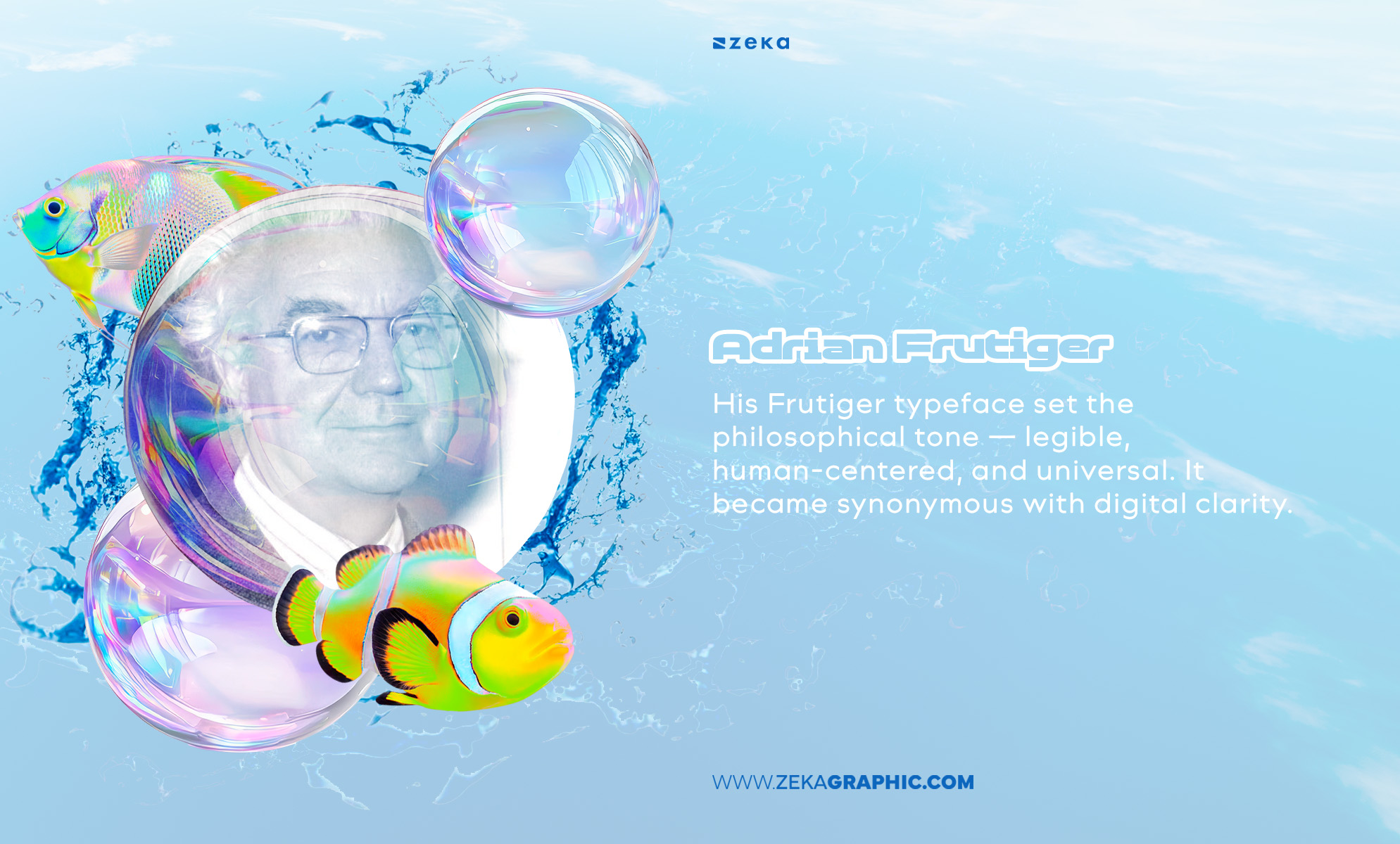
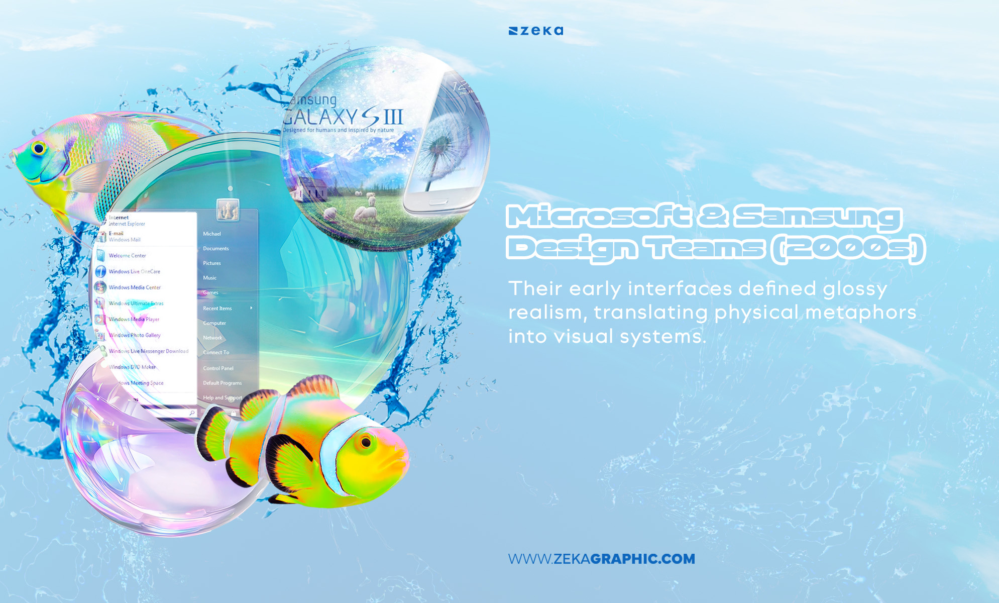
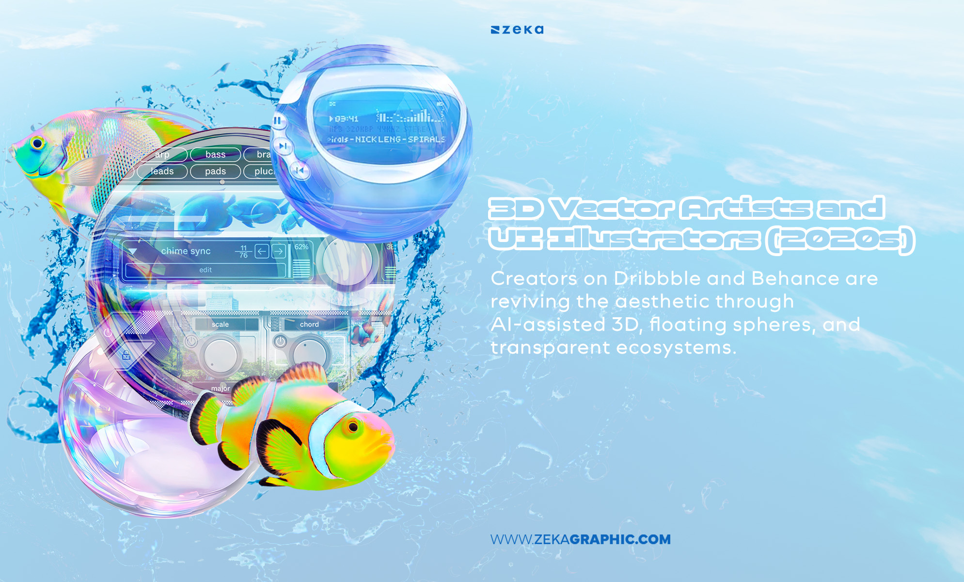
These influences prove that Frutiger Aero isn’t just nostalgia — it’s an evolving philosophy rooted in visual clarity and cultural hope.
Advertisment
Contains Affiliate Links
For designers wanting to dig deeper into the roots of Frutiger Aero, these resources blend theory, visual history, and contemporary analysis. They’ll help you understand not just how to design in this style — but why it mattered and still resonates.
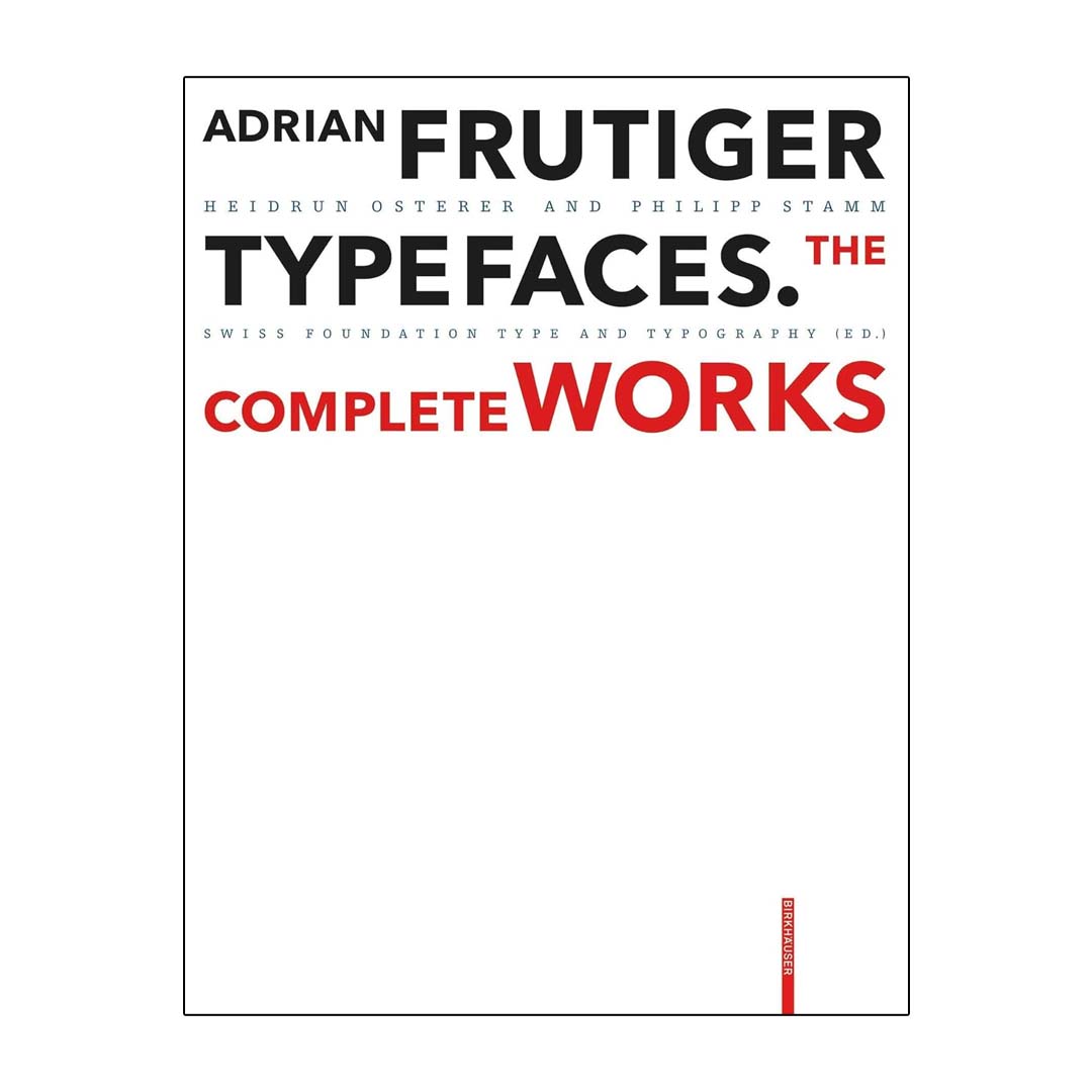
Frutiger Typefaces: The Complete Works — Adrian Frutiger
A must-read for understanding type, legibility, and digital clarity.
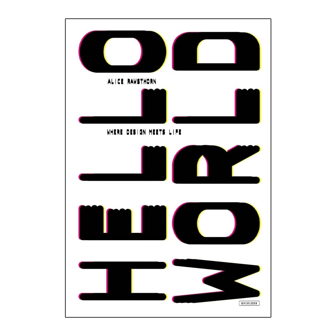
Hello World: Where Design Meets Life — Alice Rawsthorn
Contextualizes how cultural optimism and tech aesthetics intertwine.
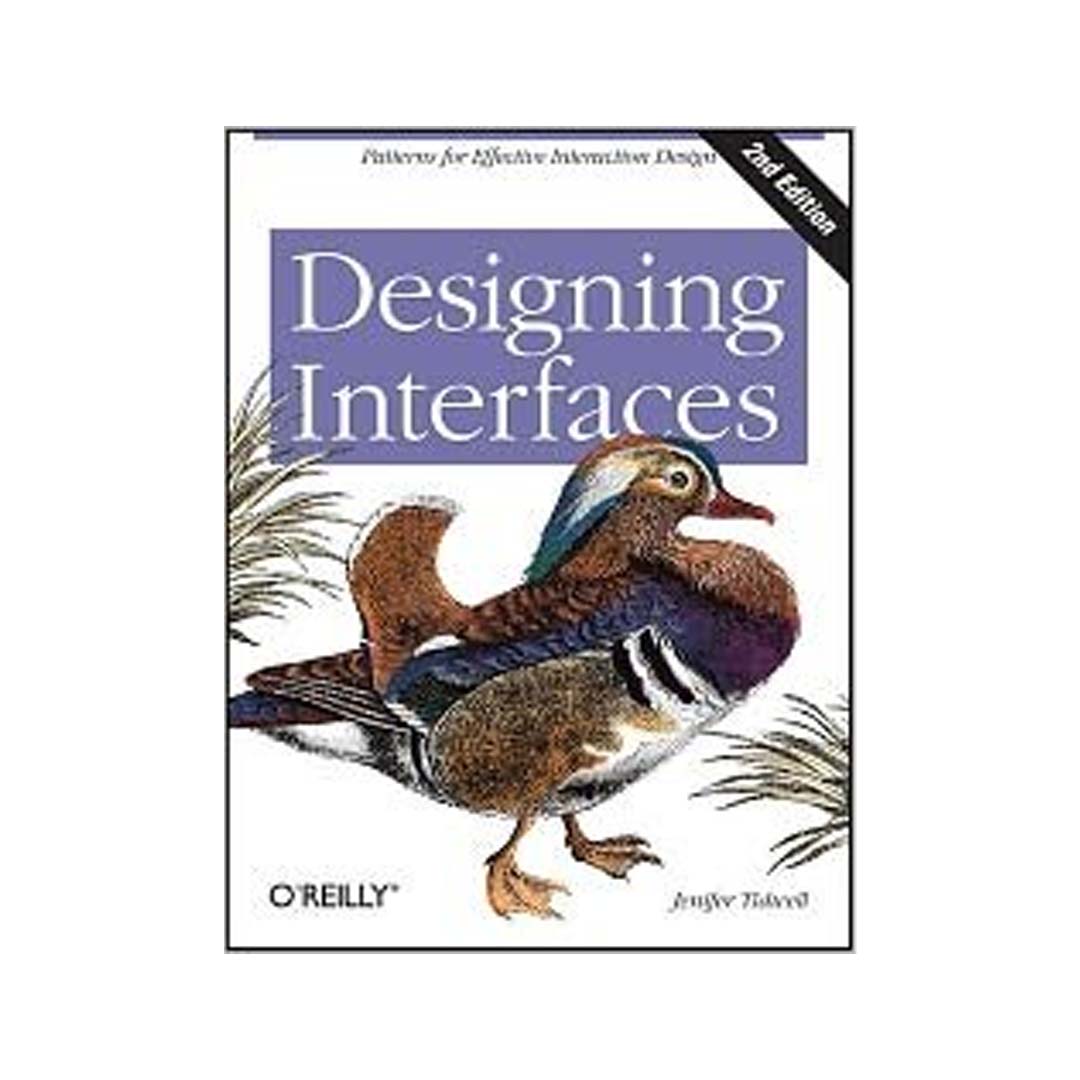
Designing Interfaces (2nd Ed.) — Jenifer Tidwell:
A functional look at skeuomorphic and layered interface design principles.
Online Archives: Explore Pinterest and Behance boards dedicated to Frutiger Aero Revival for moodboards and visual inspiration.
Q1: What colors define Frutiger Aero?
Typically aqua blues, greens, whites, and silvers — evoking freshness, purity, and life. They symbolize the natural world harmonizing with tech.
Q2: Is Frutiger Aero the same as Y2K design?
Not quite. Y2K design is metallic, chaotic, and maximalist, while Frutiger Aero is smoother, cleaner, and more organic — it’s the zen side of the 2000s aesthetic.
Q3: Why is Frutiger Aero trending again?
After years of sterile minimalism, designers are seeking warmth, tactility, and emotion. Frutiger Aero delivers all three — a visual antidote to algorithmic coldness.
Q4: Can Frutiger Aero work in branding today?
Absolutely. Especially in eco-tech, AI wellness, and sustainable innovation brands. The look conveys trust and humanity — values increasingly vital in digital storytelling.
Advertisment
In 2026, Frutiger Aero’s comeback feels both inevitable and refreshing. It represents more than aesthetic nostalgia — it’s a visual metaphor for human-centered digital optimism. Where Y2K celebrated chaos, Aero celebrates clarity. Where minimalism erased tactility, Aero brings texture and emotion back.
For modern designers, it’s a chance to bridge the past and future, blending handcrafted sensibility with AI-enhanced creativity. The result? A renewed belief that digital design can once again feel alive, hopeful, and beautifully imperfect.
✨ “Frutiger Aero reminds us that design’s future isn’t just flat — it’s alive, luminous, and breathing with possibility.”
Advertisment
Pin it for later!
If you found this post useful you might like to read these post about Graphic Design Inspiration.
Advertisment
If you like this post share it on your social media!
Advertisment


Want to make your Business Grow with Creative design?
Advertisment

Advertisment