Iconic Typefaces and Typography from 1950s

50s Typography Design History Blog Post Graphic Design Inspiration

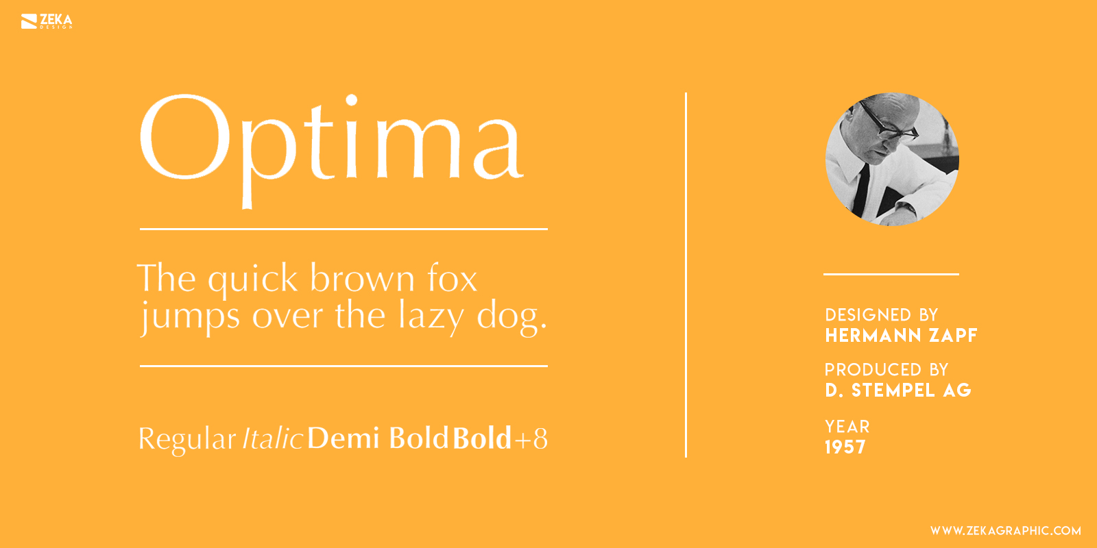
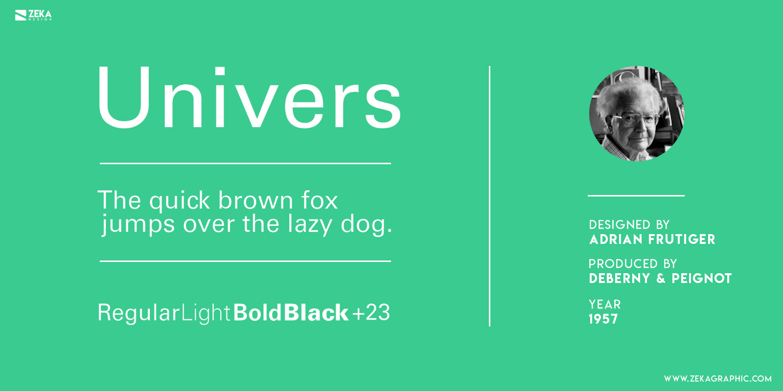
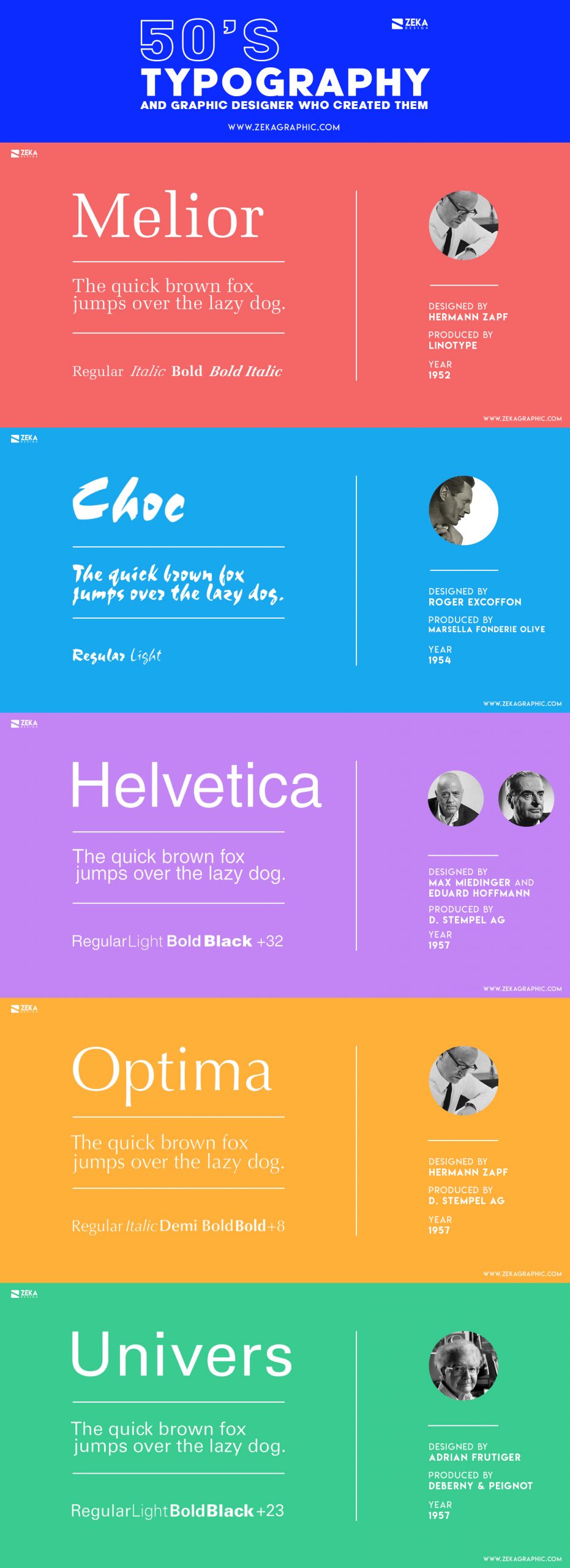
In this post, I will show you some of the most iconic typefaces designed in the ’50s, and some of them are still used in many graphic design projects.


At the beginning of 1950, the world’s economy started to recover from the second world war including the Graphic Design sector. Due to the technology upgrade, the design business and advertising were looking for new ideas and solutions.


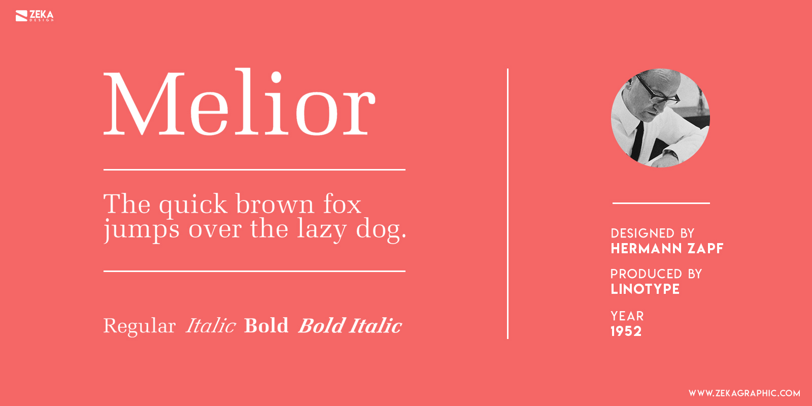
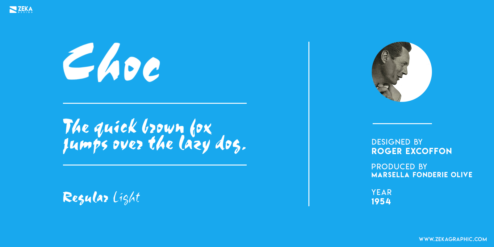
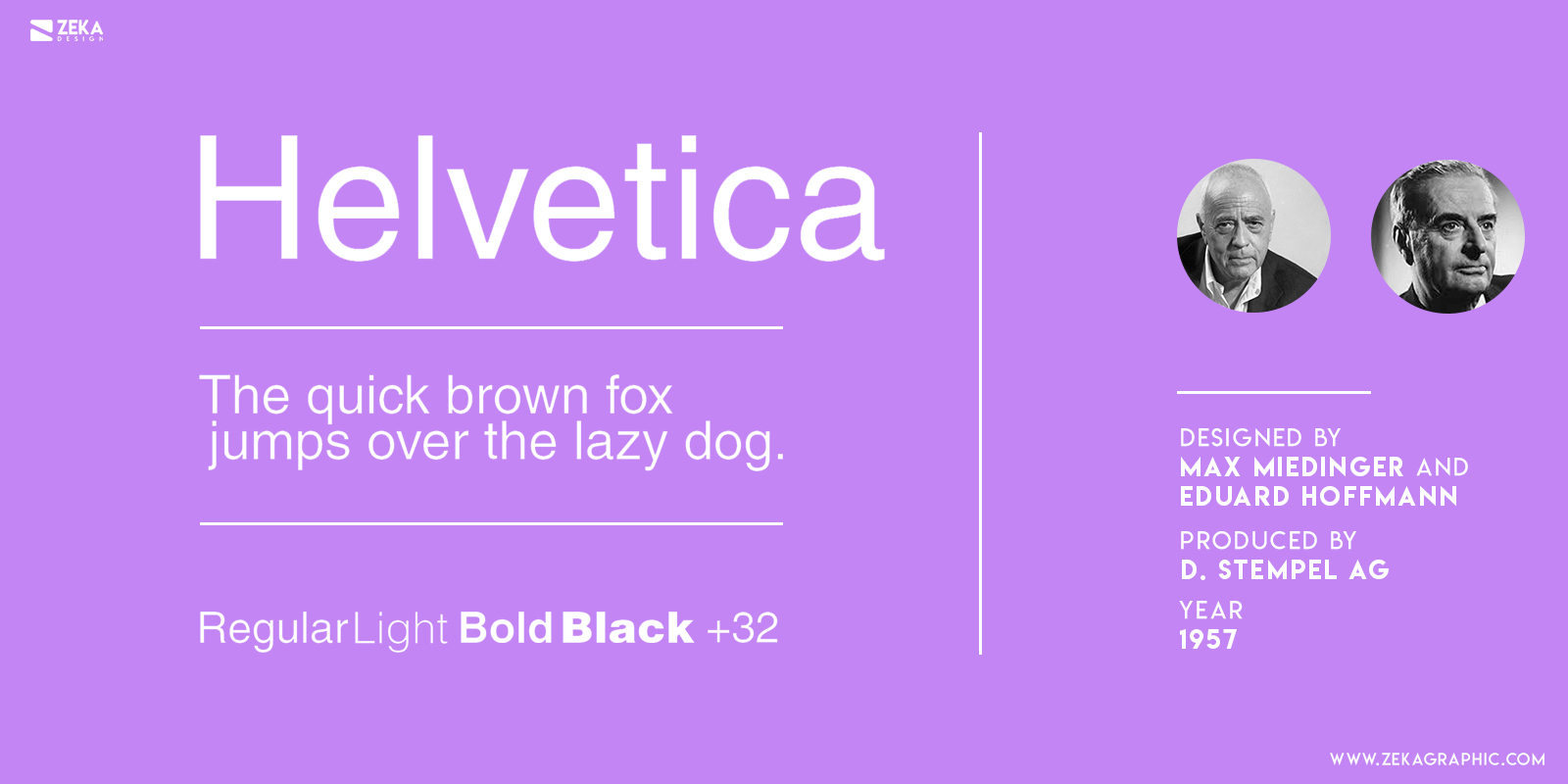
During these years there were made the first progress in photo composition and these help many typographic designers to create new and iconic typefaces as Palatino, Banco, Helvetica, or Courier.

Advertisment

Melior Typeface

Melior typeface was designed by Hermann Zapf in 1952 for Linotype and is one of the few typefaces serifs with rounded letters based in a shape known as superellipse, which is more common to see in San Serif fonts. Zapf wanted to create a typeface adapted to narrow columns of the newspaper and small pieces of text, and the legibility of Melior accomplish that goal.


This typography was created in the 50s and fulfill the standards of that years, and if we use it nowadays Melior could be an antiquated election for today’s graphic design standards, but if you want to Evoque nostalgia and 50s vibe then Melior typeface is a great choice!

Melior Typography History 1950 Typefaces Hermann Zopf

Advertisment

Choc Typeface

In the 50s the calligraphic style in typography made a comeback and was very popular among the advertisement companies, and is really interesting to know that one of the main suppliers of these typefaces styles was the French designer Roger Excoffon and french agency Marsella Fonderie Olive.


Roger Excoffon during the 50’s decade designed 5 famous calligraphic typefaces which were: Banc, Mistral, Diane, Calypso, and in 1954 the typeface we are talking about Choc. All these typefaces excluding Diane were produced by french agency Marsella Fonderie Olive and they were born to supply the french advertising sector where they had high acceptance and popularity giving the graphic design of that period a strong french look with these typefaces.

Choc Typography History 1950 Typefaces Roger Excoffon

Helvetica

Helvetica is easily the most known and popular typeface in Graphic Design, but what not many people know is that Helvetica is not their first name, originally this typeface was called Neue Haas Grotesk until 1960, when it started the commercial production of this font by D. Stempel AG. The name Helvetica comes from Helvetia which is the Latin name of Switzerland.


Helvetica typeface or Neue Haas Grotesk was designed by Swiss designers Max Miedinger and Eduard Hoffmann and it was a modernization from Akzidenz Grotesk typeface. The popularization of that font came during 1960-1970 where it was used in many graphic design projects of swiss design style. Nowadays this font is still popular but today’s graphic designers are using a font called Neue Helvetica which is a review from the original font released in 1983 by D. Stempel AG and produced by Linotype and this typeface unifies all the different styles of Helvetica in a numerical classification.

Helvetica Typography History 1950 Typefaces

Advertisment

Optima Typeface

Optima typeface was designed by the iconic typographic designer Hermann Zapf who was mentioned earlier in this post talking about the Melior typeface. Hermann Zapf started to design this font in 1952 but it was not until 1958 were it was released commercially by D. Stempel AG (who also released Helvetica font).


Optima font was designed as a statement against people who said that San serif typefaces were boring and difficult to read. The variable thickness and calligraphic style of Optima produces a warm feeling and manuscript effect, which make this font a little bit san serif and a little bit serif. The font flexibility makes it work really well as Title Header or as body text.

Optima Typography History 1950 Typefaces Hermann Zapf

Univers

Univers typeface was designed by a Swiss designer based in Paris Adrian Frutiger in 1954, Univers is a San Serif typeface and it is the first mega font family designed because it covered 21 different font weights. Frutiger expanded the font variation from Italic, Bold, and Round and create a whole weight system identified by numbers.


Univers typography included an expanded and condensed version of the typeface and the commercial distribution of Univers lasted for 3 years and it was made by French company Deberny & Peignot in 1957. As it happened with Helvetica typeface, Univers also get popularity by swiss graphic design style during the 50s.

Univer Typography History 1950 Typefaces

Advertisment

Conclusion

Hope you find this post useful and discover new typefaces and whose you already know learn their history and who designed them. The idea of this post is to show you Graphic Design history and let you know the designer behind some of the most iconic typographies, and if you want to learn more about typography design I recommend you to read this post where I will show you the most useful graphic design terms about typography.

If you found this post useful you might like to read these post about Graphic Design History.

Advertisment

Written by

If you like this post share it on your social media!

Share on facebook
Share on twitter
Share on pinterest
Share on vk
Share on telegram
Share on whatsapp
Share on linkedin

You Might Be Interested On These Articles

Latest Post