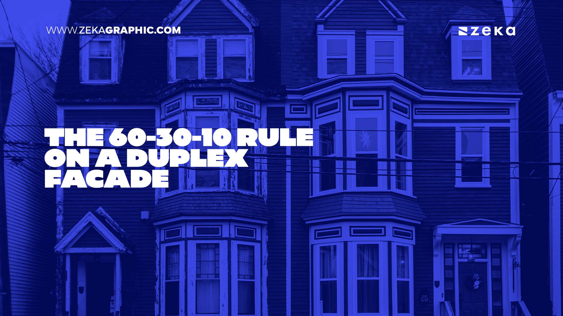
The 60-30-10 rule is one of the first color tricks designers learn. You give 60% of a layout to a dominant color, 30% to a secondary color, and 10% to an accent that pulls the eye.
It works on posters, websites and brand kits. It also works on something much bigger: the front of a house. And right now, in Australia, there is one type of house where it matters more than ever. The duplex.
Two homes, one building, one street view. That is a lot of facade to get right, and a simple ratio can do most of the heavy lifting.
Advertisment
For decades, the Australian dream looked like a single house on a wide block. That picture is changing fast.
In New South Wales, dual occupancies became permitted in low-density zones statewide from 1 July 2024. The state expects its low and mid-rise reforms to deliver up to 112,000 homes over five years.
The national numbers point the same way. Approvals for dwellings other than houses reached 80,006 in 2025-26, the highest level since 2017-18.
What does that mean for designers? Streets are filling with taller, wider, two-in-one facades. And every one of them is a composition problem.
That is exactly where a color system earns its keep.
A duplex facade behaves a lot like a well-structured layout. It has large background areas, clear secondary panels and a handful of focal points.
Builders now offer duplex designs that range from single to double story, including narrow-block and dual living layouts. Browse a range like that with a designer’s eye and you will notice something. The facades that look calm and expensive almost always follow a dominant, secondary and accent split, whether anyone called it 60-30-10 or not.
The rule simply gives you language for what already works.
Pro Tip: Before you choose a single swatch, print the front elevation of your plan in grayscale. Shade the areas you think will be 60%, 30% and 10%. If the proportions look wrong in gray, no color will save them.
Here is how the ratio translates from screen to street.
Advertisment
This is the main wall surface. Render, brick or cladding that covers most of the building belongs here.
On a duplex, the base should usually run across both homes. That shared color is what makes two dwellings read as one confident building.
This is your supporting color. It belongs on the roof, garage doors, window frames, feature cladding or an upper-level band.
The secondary color is also where you can add a little variation between the two sides without breaking the whole.
The accent is the call to action of a facade. On a house, that usually means the front door.
Pro Tip: Keep the accent to fewer than four elements. If everything is an accent, nothing is.
Many duplexes are symmetrical. One side is a mirror of the other, and that can look either elegant or eerily repetitive.
The NSW design guide for low-rise housing notes that side-by-side dual occupancies tend to be symmetrical, and that architectural expression can vary between dwellings to add individuality. The same guide asks for each front door to be directly visible from the street.
That is a gift for color planning. Here are three ways to use it:
The goal is a building that reads as one composition from across the street, and as two distinct homes up close.
Colors on a screen are not colors in the sun. Australian light is strong and bright, and it pushes everything paler and flatter at midday.
A tone that looks balanced in a swatch book can wash out completely on a north-facing wall. Always test large samples outside, at morning, noon and late afternoon.
Heat matters too. Dark exterior surfaces absorb more of the sun’s energy. NSW sustainability rules classify roof colors by solar absorptance, with anything above 0.7 treated as dark.
That makes a practical case for the 60-30-10 rule:
Good design and good thermal sense end up pointing in the same direction.
Even with a clear ratio, a few traps catch people every time.
Advertisment
The 60-30-10 rule was never only for screens. On a duplex, it turns a large, potentially overwhelming facade into a clear visual hierarchy.
As Australian suburbs keep going vertical, more homeowners and designers will face the same question. How do you make two homes look like one good idea? A simple ratio is a great place to start.
Remember:
Advertisment
Pin it for later!
If you found this post useful you might like to read these post about Graphic Design Inspiration.
Advertisment
If you like this post share it on your social media!
Advertisment





Want to make your Business Grow with Creative design?
Advertisment

Advertisment