eCommerce UX is the difference between a store people happily buy from and one they nope out of in 3 seconds. Most owners put everything into traffic and ads. Then they leave the actual experience to chance. Which is mad, since that is the bit that decides whether a visit turns into money. And it is usually where the online sales are lost.
So let’s actually pin it down. First, what eCommerce UX means in plain English. Then 6 solid reasons it matters to your revenue. Then 8 practical ways to make your eCommerce UX a whole lot better.
Advertisment
Quick definitions first, since people sling the term around. eCommerce UX is just short for user experience, and it is all about how it actually feels to shop with you. Not how slick your site looks. Whether the whole thing feels easy and trustworthy, start to finish.
Picture walking into a really well-run shop. You spot what you need without collaring a staff member. The layout just makes sense. Checkout is quick, and nobody guilt-trips you into a warranty. eCommerce UX is that same feeling, rebuilt for a screen.
People toss UX and UI around as if they are identical. They aren’t. UI is the stuff you can see, the buttons and colors. UX is the feeling underneath, whether using it is actually nice. You can have a gorgeous user interface built on a smart color system and still deliver awful UX, because the checkout makes people scream.
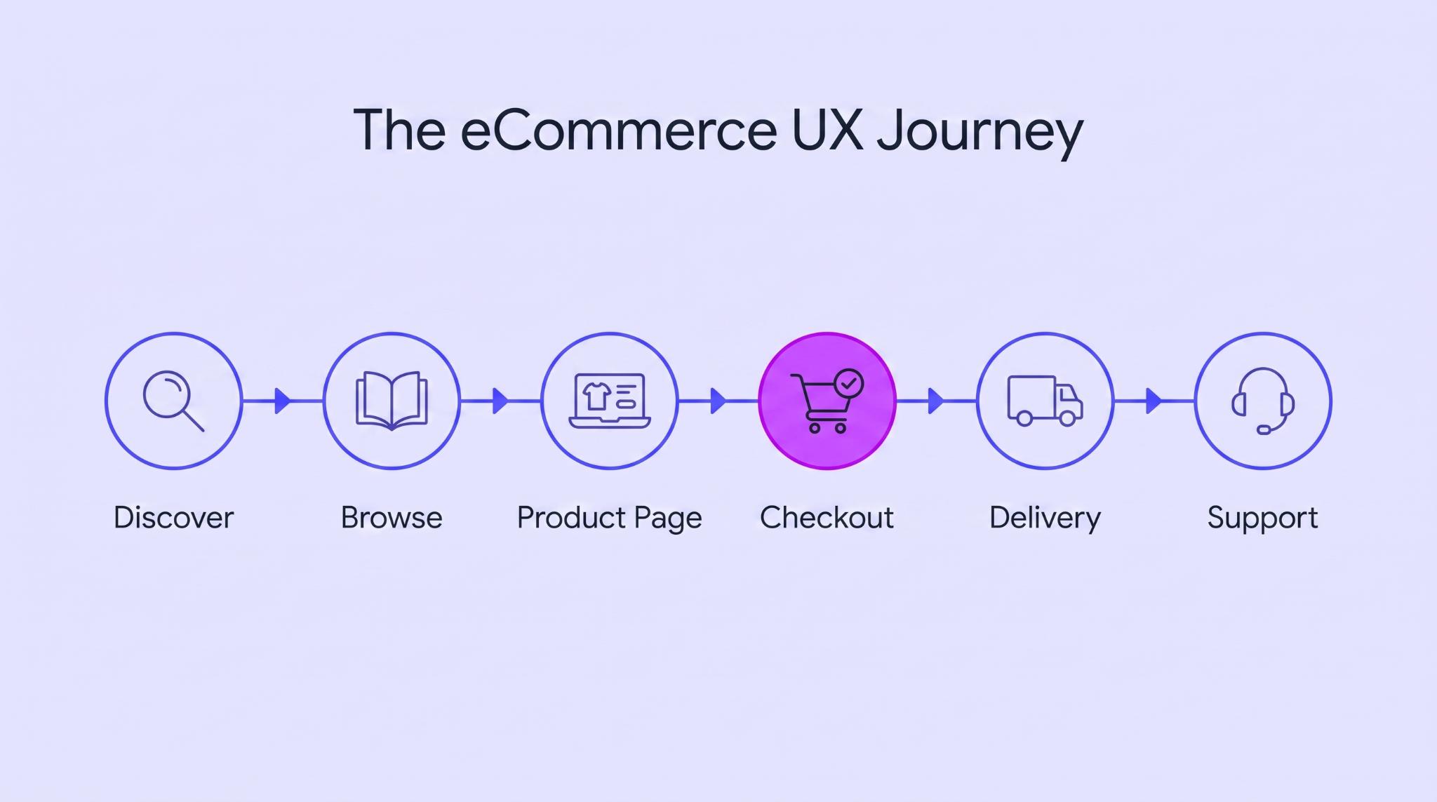
This is where people get it wrong. eCommerce UX isn’t only your website. It is every single touchpoint in the entire user journey, from the ad someone taps to the shipping email and even the return. One clumsy step anywhere along that chain can destroy everything else you got right.
And it is hardly ever the big stuff that breaks it. A tracking link that goes nowhere, or a form that rejects your address for no reason. Small cracks like that slowly bleed away the goodwill you worked hard to earn.
People are ruthless about it, too. Emplifi found that 24% of online shoppers will drop a brand after one bad experience. Just one. That is all it takes to lose a good chunk of them.
Advertisment
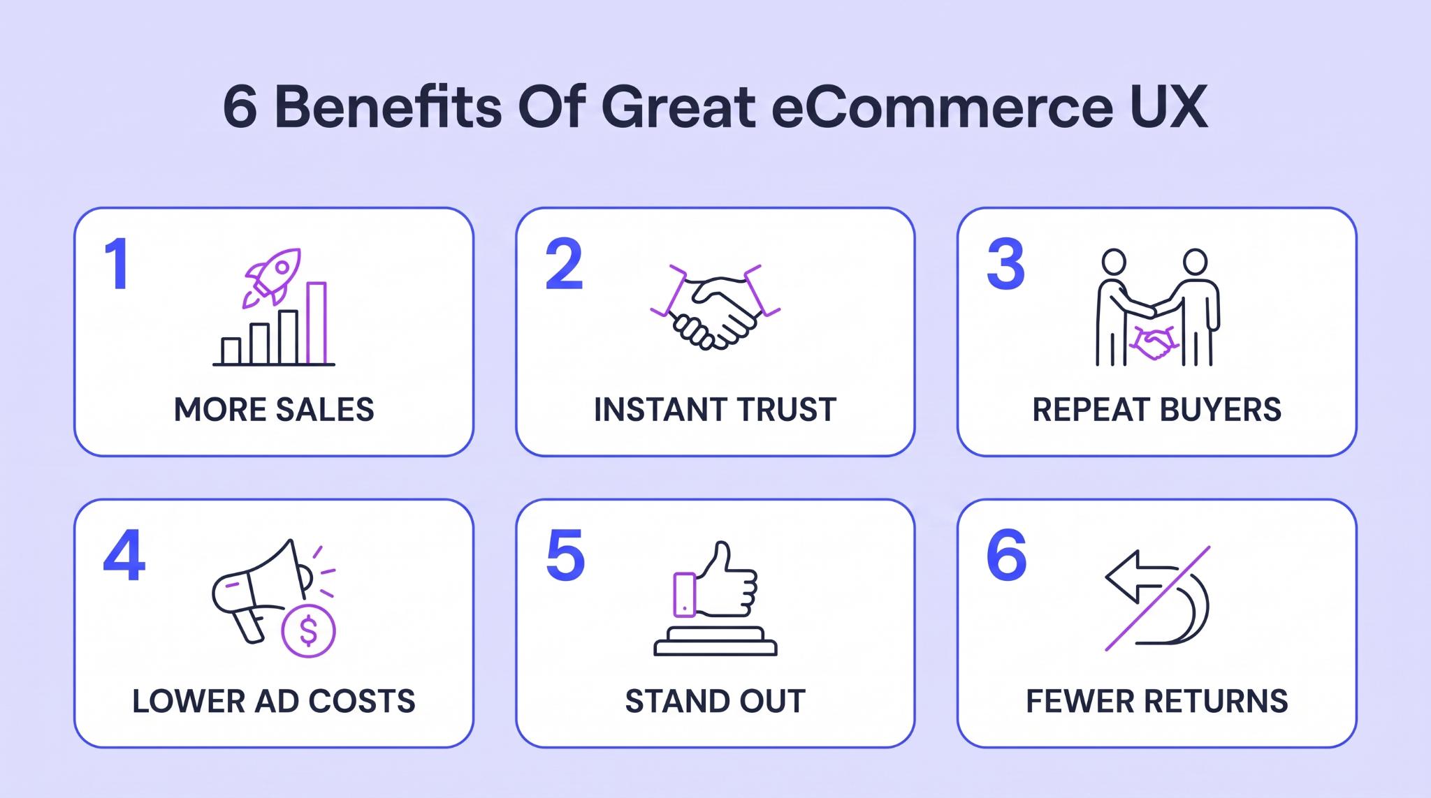
So here’s why it is worth sweating. Good eCommerce UX pays you back, in 6 pretty concrete ways.
This is the big, obvious one. Every awkward step hands someone a reason to bail with a full cart. Smooth that path, and more of the traffic you already pay for turns into orders. Baymard clocks the average cart abandonment rate at 70.22%. Loads of that is fixable friction, not people who were never buying.
Chew on that for a second. You already paid to get those potential customers to the cart. Fixing the eCommerce user experience is usually way cheaper than buying a brand-new visitor to replace the one you just lost. You are not buying more traffic here. You are just wasting a whole lot less of it.
A first-timer shows up with their guard fully up. They have never heard of you, and they are about to type in card details. A clean, easy experience does something huge here. It tells them you are legit before you have said a word. It also shows that you understand basic customer expectations around shopping online.
A janky one shows the opposite, and that flicker of doubt sends them running to a name they know. It is the little stuff that makes the difference. A clear returns policy, a checkout that looks properly secure. Each one says the same thing. There is a real eCommerce business behind this screen, not some fly-by-night operation.
The first sale costs you a fortune. The second one is where the actual profit hides. When shopping with you felt genuinely nice, people just remember the positive user experience. And that kind of experience increases customer satisfaction.
They come back on their own, no ad spend needed to drag them in again. A painful experience blows that up. They buy the one thing and forget you exist by dinner.
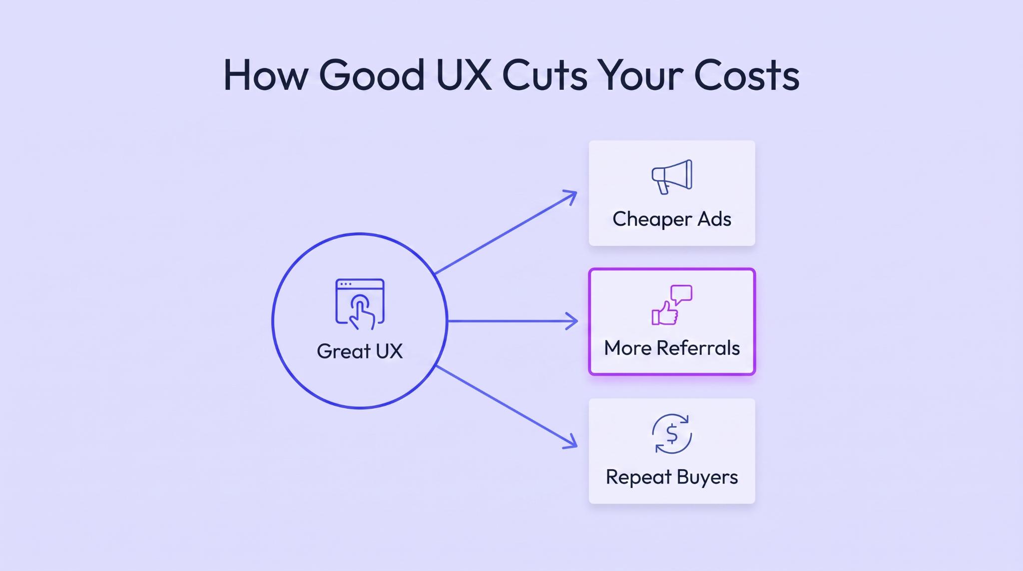
This one is sly, since it works in the background. Good UX makes your ads cheaper, because platforms reward site pages people stick around on. It turns happy buyers into people who tell their friends, which is free traffic. And it pushes your search rankings up, since Google watches how people behave on your eCommerce site.
The compounding is the good bit. A store that keeps people happy needs less ad money every year. A leaky one has to keep buying traffic just to stay in the same place.
In most niches, the products are near enough identical. Same product details and similar prices, with nothing much between them. So the experience becomes the thing people choose on. A store that is effortless stands out next to 10 clunky competitors. Wrap that in a distinctive brand identity, and great UX turns a commodity into somewhere people prefer to shop.
A confused customer costs you twice over. First they send the thing back, then they email asking why it didn’t fit. Great UX heads off a load of that upfront. Clear sizing and honest photos mean fewer nasty shocks.
A product page that answers the real questions does the same. Fewer shocks means fewer returns and a calmer support queue. It shows up on the balance sheet, too. Every return eats shipping both ways plus restocking, and every ticket takes someone’s time. UX that kills the confusion kills the bill along with it.
Advertisment
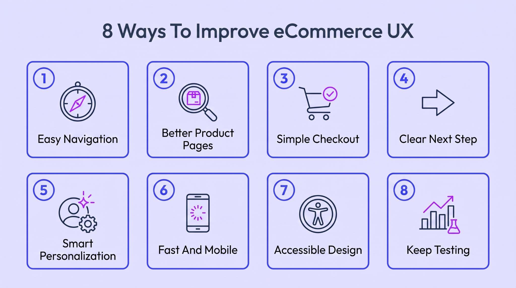
Right, the fun part. Here are 8 ways to genuinely improve your eCommerce UX, each aimed at a different leak. Go top to bottom, or just start wherever yours is bleeding the most.
If people can’t find the thing they want, nothing else you do matters. They won’t look around for long. A baffling menu or a search bar that spits out junk sends them straight to a rival who makes it easy. Good navigation is basically invisible. When it works, nobody notices it. When it is broken, it is the only thing they see.
Most people arrive already knowing roughly what they are after. Your job isn’t to wow them with a clever mega-menu. It is to match those user expectations and let them get there fast.
The product page is where the yes or no happens, so it has to make a strong case. It stands in for a salesperson who isn’t in the room. It answers every wobble a hesitant buyer has before they ask. The best ones walk your eye down a clean path, from hook to buy button. Solid visual balance holds it together.
This one matters most for stuff people research hard before buying. Supplements are the poster child. Buyers have been burned before, and the internet is full of wild claims. Nobody wants to waste cash on a tub of powder that does nothing. So the page can’t just look pretty. It has to win the argument with proof.
Performance Lab does a good job of this on its Pre Lab Pro page. It is basically a doubt-demolishing machine. Every ingredient is listed out with no proprietary blends, so a skeptic can check the formula. There are Informed Sport and vegan badges for the box-tickers. A pro boxer’s testimonial reassures the on-the-fence crowd, and a 30-day guarantee covers the nervous.
The layout walks you from the benefits down to one clear subscription button. It even breaks the price into a cost per day, so the number feels small. By the time you reach the bottom, there is nothing left to worry about. Any store selling something people scrutinize should sweat its product pages this hard, from skincare to pricey electronics.
Advertisment
You have done the hard part, and they are at checkout. This is where a shocking number still walk out. Every extra field and surprise charge is one more reason to ditch the cart. A long, fiddly checkout becomes frustrating just as they are about to pay. Boring is the goal. Fewest steps possible, zero nasty surprises.
There is a head game to it as well. By the time someone hits checkout, the wanting is mostly done and the doubting kicks in. Every extra second of hassle just hands that doubt more room to grow.
Here’s where it bites hardest. When the decision is emotionally difficult, a surprise charge or an extra field at the final step doesn’t just niggle; it can break the person completely. And we found the cleanest example of getting that right well outside eCommerce.
Consider this Denver-based in-home pet euthanasia. Its page is built for someone facing one of the hardest calls of their life. A distraught owner, deciding fast with grief already maxed out, is the last person who should meet a hidden fee or a baffling form.
So the page removes every ambush. Pricing is stated upfront, starting at $275, with aftercare and cremation itemized beside a plain “what’s included” list, so nothing surprises them later. There is no account to make first, just a single “find availability” step, with a visible phone number and an urgent option for when minutes matter.
Your checkout’s stakes are lower, but the discipline is identical. Anywhere the last step carries real anxiety, from high-ticket gear to health purchases, show every cost early and strip out the surprises this ruthlessly.
Every page should make one thing dead obvious: what to do next. Give someone 5 equally shouty options, and they freeze and pick none of them. One clear main action kills that hesitation stone dead. It’ is not about stripping everything else off the page. It is about making the action you actually want impossible to miss.
Funny thing is, the sharpest example of this turns up nowhere near eCommerce. It is on high-stakes service sites, where the visitor is stressed and has to act right now. Someone in a panic has zero patience for a busy page full of options. They need one thing to do, spelled out and impossible to miss. Waffle, and they are gone.
This Wyoming-based motorcycle accident lawyer does this brilliantly. Their visitor usually got hurt yesterday and is in no state to hunt around a website. So the page refuses to make them think. The next step is dead simple. It is a phone number that says call for a free case evaluation, repeated down the page.
No unnecessary menus fighting for attention. No 10 buttons of equal weight. Just one action, matched to what a frightened person needs. Your store’s version is add to cart rather than a phone call, but the discipline is identical. Any anxious or rushed visitor should meet a next step this blunt.
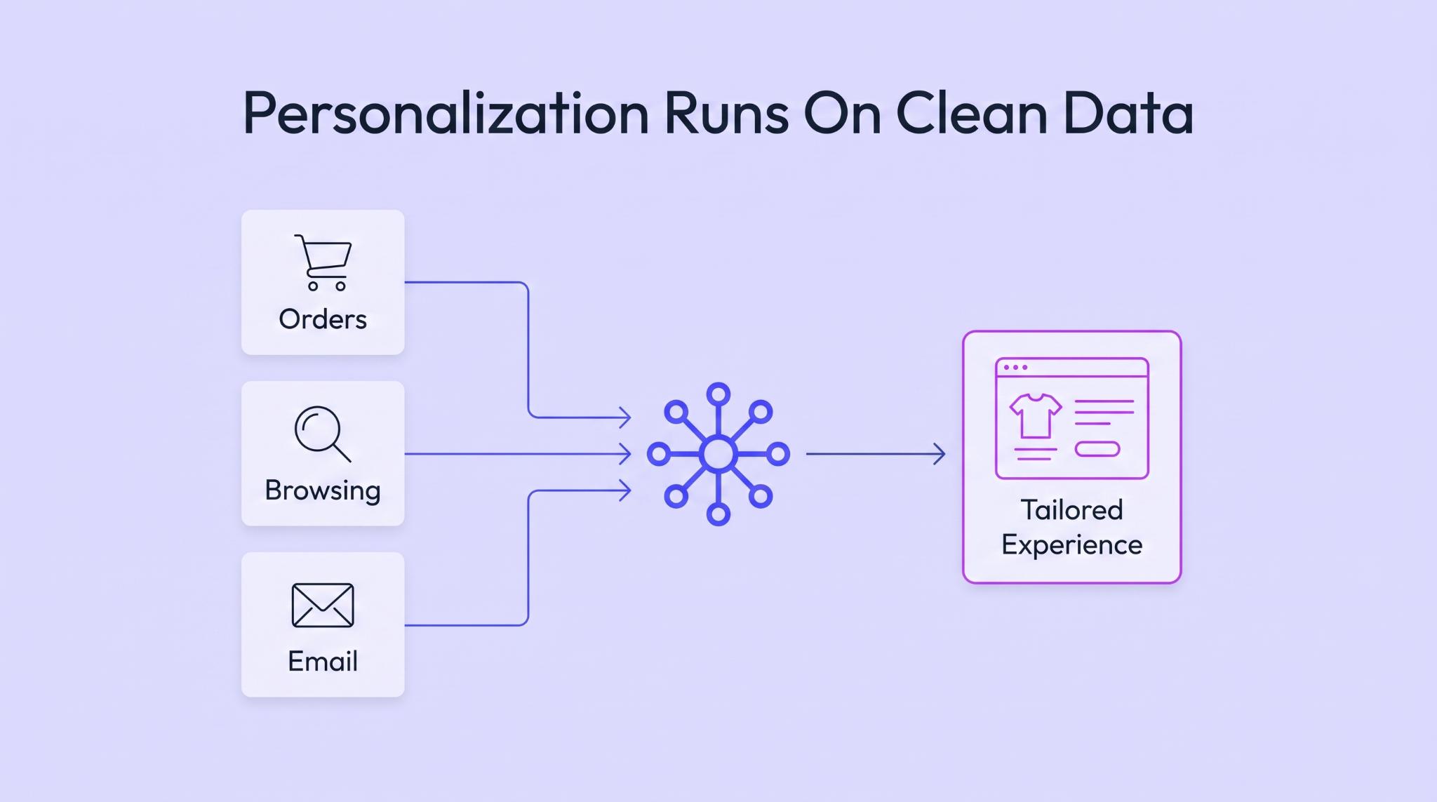
Personalization is brilliant when it is right and deeply creepy when it is wrong. Pushing someone toward the thing they nearly bought is helpful. Pushing winter coats at somebody in Australia in January is not. The whole thing depends on the quality of the data underneath. Get that right, and it feels like magic. Get it wrong, and it just annoys everyone.
The honest problem is the data itself. It is almost never in one place. Your orders are in one system and your site behavior in another. Your email tool does its own thing entirely. To pull it together, plenty of teams reach for Microsoft Fabric. It is built to unify scattered sources into one connected foundation.
The issue is that Fabric is a beast to set up properly. It is a sprawling platform with its own capacity model and governance rules that confuse teams. Configure it badly, and you get a pricey tangle that still doesn’t give you clean data. Getting real value takes proper expertise, not a weekend of tutorials.
That is exactly why teams bring in Microsoft Fabric consulting services, so the platform gets set up right the first time instead of turning into a money pit. They connect your scattered sources into one foundation your orders and behavior finally agree on.
Once that groundwork is solid, every personalized touch rests on the full picture of each customer. No more half-broken guesses stitched from three disconnected tools. That is the gap between recommendations that are spooky-accurate and ones that just annoy people.
Site speed is basically your first impression, before anyone has even seen a product. A slow store leaks people before your best stuff loads. And since most shopping happens on a phone now, a site that only really shines on desktop is losing most of its target audience. Fast and thumb-friendly isn’t the polish on top. It is the floor everything else stands on.
The numbers about website speed are rough. Contentsquare found slow-loading pages shoved 53% of people out after a single page. Half your website visitors, gone after a couple of seconds of loading. And none of it matters if the text is a strain to read. On a phone, legible typography and thumb-sized tap targets are part of the exact same job
Accessibility gets written off as a legal requirement, which sells it short. Designing so a disabled person can shop easily makes it better for everyone. Strong contrast helps the person squinting in bright sun as much as someone with low vision. Captions help the commuter on mute. It is not charity, just better eCommerce UX design that sells to more people.
Your UX is never done, and treating it like it is the biggest trap of all. What you assume works and what really works are usually two different things. The only way to know is to watch real people use your eCommerce store and let the numbers settle it.
Small, steady tweaks based on real user research compound into a store the hands-off crowd can’t touch. The online stores that win treat their UX like a garden, not a statue. There is always something to weed or trim as customers change and their habits shift under you.
Advertisment
Strip it back, and eCommerce UX is really just respect for the person on the other side of the screen. Make their visit easy and pleasant, and they repay you with sales and the kind of loyalty ads can’t buy. You don’t have to fix all 8 things this week. Find the spot that frustrates people most and start there.
This is the corner I work in at Zeka Design. I build brand identities and visual systems from research up, the kind of thoughtful design that makes a store feel trustworthy and easy to buy from. If your shop works fine but doesn’t feel like somewhere people want to linger, that gap is almost always design. And it is very fixable. Get in touch to know more.
Advertisment
Pin it for later!
If you found this post useful you might like to read these post about Graphic Design Inspiration.
Advertisment
If you like this post share it on your social media!
Advertisment






Want to make your Business Grow with Creative design?
Advertisment

Advertisment