Most of the time it is not. By the time a color reaches a designer, several other industries have already graded it, named it, standardized it and decided it was commercially viable.
The Dutch flower trade is the clearest worked example I know, and it is worth understanding because the logic transfers to every other color system we use.
Advertisment
The first thing to grasp is that horticulture solved the naming problem long before software did.
Describing a flower as pink is useless commercially. A grower, a breeder, an auctioneer and a buyer in another country all need to mean the same thing, and everyday language cannot do that.
The trade’s answer is the Royal Horticultural Society Colour Chart. Research documentation held at Wageningen notes that the RHS chart was developed to cover the range of colors found in horticultural taxa, and that a survey of color charts recommended it as the best available for biological description.
It is a substantial system. Contemporary discussion among taxonomists has described it as the international horticultural standard containing over 800 colors, with a noted bias toward some color groups over others.
That bias is the interesting part for us. A standard built by a British horticultural society carries the preferences of its origin, differentiating heavily where its users cared and thinly where they did not.
Every color system does this. Pantone carries print-industry assumptions. RAL carries German industrial ones. Nobody builds a neutral standard, and knowing whose priorities are embedded in yours changes how you use it.

I am usually skeptical of the idea that designers need to travel to see color. Screens are good and reference is abundant.
The bulb fields are a genuine exception, and the reason is specifically about scale rather than beauty. Celebrity Cruises groups its spring sailings through the Netherlands into a set of bloom itineraries, and a spring tulip river cruise of that kind passes the commercial fields between Leiden and Haarlem rather than only the display gardens, which is the difference between seeing color samples and seeing color blocking executed across hectares.
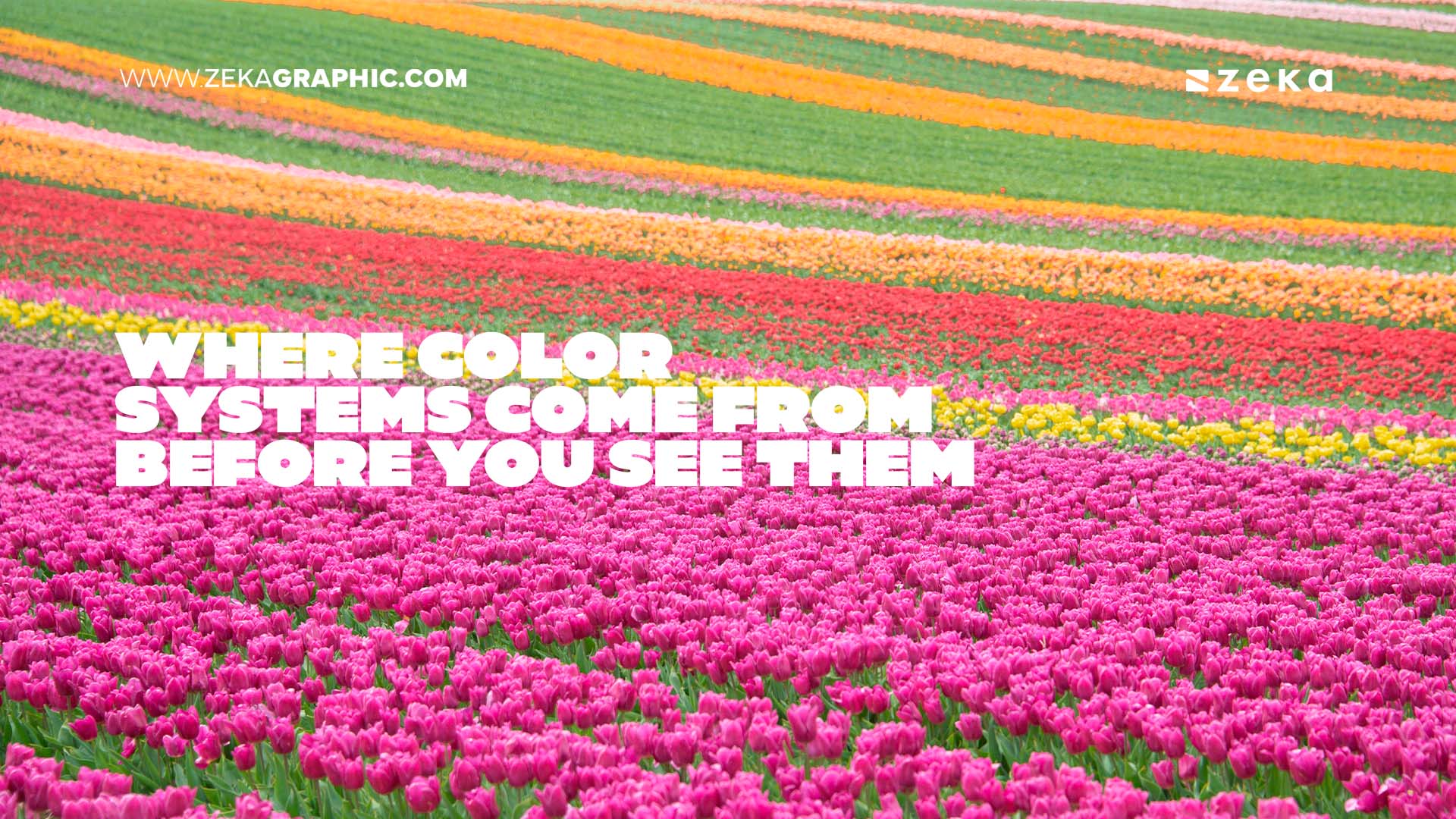
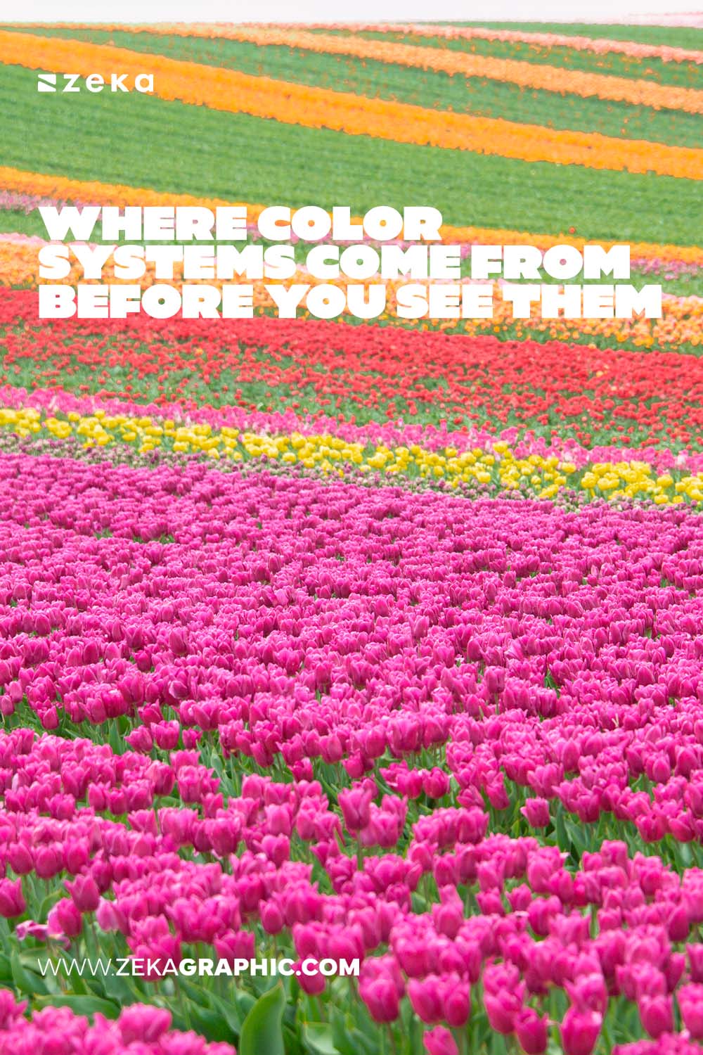
Those fields are planted in solid rectangular blocks by cultivar. Single hue, no gradient, hard edges, adjacent blocks in unrelated colors.
It is the most literal color blocking I have ever stood in front of, and it does something a swatch cannot. It shows you how a hue behaves at scale, under real light, next to another hue with no transition between them.
That is information about saturation and adjacency that no screen delivers, because a screen is small and backlit and a field is neither.
Advertisment
Here is the fact that reframed this whole subject for me.
A new tulip variety takes an extraordinarily long time to reach market. Published horticultural research from Cluj-Napoca, indexed in DOAJ, states that creating a new cultivar by crossing normally takes around twenty years.
Extension reporting from a study tour, published by Missouri Extension, puts it further out still, noting that seeds take five years to develop into flower buds and that it can take 25 years before a bulb is ready for commercial sale.
Twenty five years.
Which means the color of a tulip available this spring was selected by a breeder in the late 1990s or early 2000s, on a judgment about what the market would want a generation later.
That is not trend-following. That is trend-committing, on a timescale no design agency operates on.
The consequence is that the flower colors currently circulating in editorial photography, packaging references and seasonal branding were chosen before those trends existed. Not derived from them. Preceding them by decades.
Scale is the reason this one country’s decisions propagate globally.
A USDA report on the Dutch horticulture market puts the Netherlands as the world’s leading exporter of floriculture with roughly a 50 percent share of the global market, and notes that according to Statistics Netherlands, tulips are grown on almost half of all flower bulb fields.
Half the world’s cut flowers, bulbs and live plants moving through one small country’s grading and naming conventions.
So when a florist in Valencia or Toronto orders a specific pink, they are ordering against a Dutch standard, applied to a variety bred twenty years ago, in a color category defined by a British horticultural chart.
None of those four decisions was made by anyone in design.
Advertisment
Three things have changed in how I work.
I check whose standard I am using. A fan deck is not neutral, and knowing its origin tells me where it will be precise and where it will be coarse.
I photograph color at scale rather than collecting swatches. A single sampled hex value tells me nothing about how that hue behaves across a large area or next to its neighbor.
And I have stopped treating trend colors as current. They are usually the visible end of a supply chain decision made years earlier, which is a more useful way to think about why a palette feels available at a given moment.
The greenhouse is a long way upstream from a brand guideline. It is still upstream of it.

If you found this post useful you might like to read these post about Graphic Design Inspiration.
Advertisment
Written by
If you like this post share it on your social media!
Advertisment
Advertisment