Most brand guidelines documents cover the obvious things: logo usage, a color palette with exact values, approved typefaces, maybe some rules about tone of voice in written material. What they often leave out is anything physical — and office signage tends to fall into that gap.
The result is a company that can produce a pixel-perfect slide deck or a consistent website across five offices, but whose actual physical spaces look like they were signed by five different people with five different opinions about what the brand should look like on a wall.
Advertisment
Brand guidelines are usually written by a marketing or design team focused on the materials they produce most often — digital assets, print collateral, packaging. Office signage isn’t something that gets ordered often enough to earn its own section by default. It comes up once, when an office opens or moves, gets handled as a one-time project, and then doesn’t get revisited until the next office opens.
That pattern is exactly why signage drifts. Each new office signage order becomes its own small design decision, made by whoever is managing that particular buildout, often without a documented reference to check against.
None of these individual decisions look wrong in isolation. The problem only becomes visible when someone compares two offices side by side.
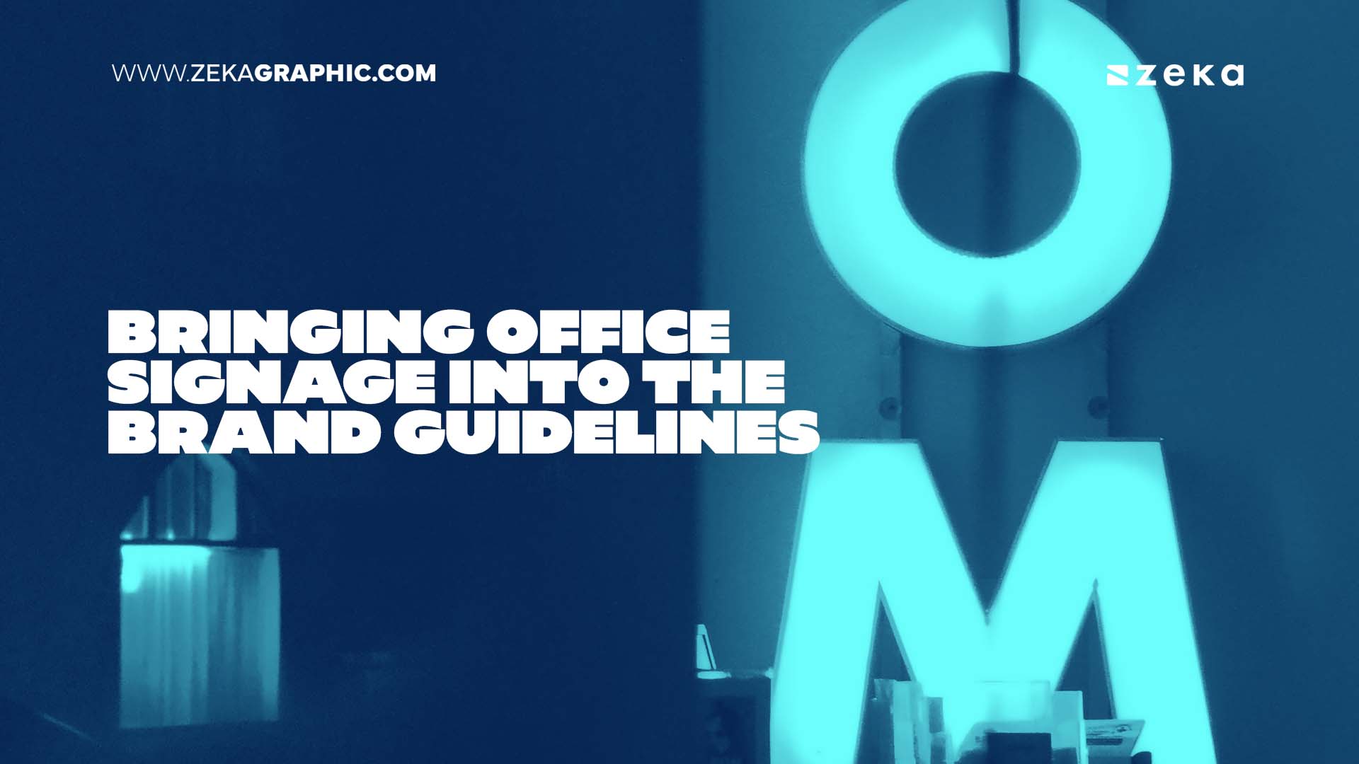
Workplace brand guidelines can also cover office signs, giving teams a documented reference for typography, colors, and materials across locations.
A useful signage section doesn’t need to be exhaustive on day one. It needs to answer the questions that actually come up when a new office is being signed: which typeface is approved for signage use, and at what minimum size does it stay legible. Which colors from the brand palette are approved for physical materials, since a color that reads correctly on a screen doesn’t always translate the same way in acrylic, wood, or stainless steel. Which materials and finishes are the standard, and whether there’s room for variation by space type — a different treatment for private offices versus shared meeting rooms, for instance.
It also helps to specify the basics that are easy to assume everyone already knows but rarely are: sign format for room numbers versus room names, mounting height, and whether personalized nameplates follow a separate format from fixed room signs.
A brand’s primary typeface is usually chosen and tested for digital and print use — screens, business cards, packaging. Signage is a different medium, viewed from a distance, sometimes at an angle, often in a corridor with mixed lighting. A typeface that reads cleanly in a logo lockup can lose legibility at the character sizes typical for a door sign, particularly if it has fine details or unusual letterforms.
This is one of the more common places a signage program deviates from formal brand rules because nobody tested the primary typeface at signage scale before specifying it. Including a signage-specific typography note in the guidelines, even if it’s simply confirming that the primary typeface works at the required sizes, closes that gap before it becomes a recurring issue.
Advertisment
Multi-location companies often want two things that pull in slightly different directions: a consistent brand presence across every office, and some flexibility for each location to feel like it fits its own building and city. Signage guidelines can accommodate both without treating them as a contradiction.
The core elements — typography, primary brand colors, the overall proportions and layout logic of the sign system — can stay fixed across every location. What varies is usually material choice within an approved range, informed by the building’s own interior rather than a strict, one-size-fits-all specification. An office in a building with warm wood interiors and an office in a glass-and-steel commercial tower can both use the same typography and color system while landing on different base materials that suit their respective spaces.
Documenting which elements are fixed and which are flexible, rather than leaving the whole decision open each time, is what keeps that flexibility from turning into inconsistency.
Larger organizations often have internal naming or identity needs that sit underneath the main company brand — department names, internal team names, a sub-brand for a specific business unit operating out of a shared office. Signage guidelines benefit from addressing this directly rather than leaving each department to interpret the main brand rules on its own.
A workable approach usually keeps the base signage system — material, mounting, overall format — consistent across the whole office, while allowing department or team names to appear within that system. This keeps a floor with multiple teams from looking like several unrelated offices stitched together.
Brand identities get refreshed periodically — a new color palette, an updated typeface, a revised logo. When that happens, digital assets usually get updated quickly because they’re easy to replace. Physical signage is slower and more expensive to update, which means a brand refresh often leaves signage as the last place the old identity is still visible.
Assigning ownership of the signage guidelines to a specific role — often whoever manages facilities or workplace experience, working from specifications the brand team maintains — helps signage stay on the list when a refresh happens, rather than being treated as out of scope because it isn’t a marketing deliverable. It also means new offices opening between refreshes have a single current reference to work from, instead of an outdated one that nobody flagged as superseded.
Advertisment
The real test of a signage guidelines section is whether it actually gets used the next time an office opens. That depends less on how thorough the document is and more on whether whoever is managing the new office buildout knows it exists and checks it early, before a local design decision gets made independently.
Referencing the signage guidelines at the same point a new office’s room schedule is being built — rather than after signage is already being quoted — keeps the new location’s signage aligned with the rest of the company from the start, instead of requiring a correction once someone notices the mismatch.
Advertisment
Pin it for later!
If you found this post useful you might like to read these post about Graphic Design Inspiration.
Advertisment
If you like this post share it on your social media!
Advertisment





Want to make your Business Grow with Creative design?
Advertisment

Advertisment