
A layout can look polished and still feel weirdly hard to read. That usually means the page isn’t telling your eyes where to go first. The main point blends into the supporting bits, headings don’t pull their weight, and everything starts competing for attention.
Hierarchy fixes that, but it has to survive edits, new pages, new teammates, and the classic “can we add one more line?” moment. The good news is you don’t need a new font to solve it. You need a few repeatable decisions that hold up under pressure and keep the reading path obvious.
Advertisment
Before you pick any type styles, write a one-page reading plan. This is the fastest way to stop everything from feeling important.
Include:
This step matters even more when the content is dense or research-heavy. If the draft is still messy, teams sometimes ask experienced essay writers to tighten the structure first, so the hierarchy you design is based on clear priorities.
When the reading path is clear, your layout decisions become faster and easier to defend in reviews.
Most teams already have a hierarchy. It’s just accidental. Prove it by collecting what you currently ship.
Do a quick inventory:
Now you know what you are actually using. This step also gives you a baseline for improvement without vague opinions.
Advertisment
If the content is messy, hierarchy turns into makeup. It may look better, but the reading experience stays hard.
Start by tightening the structure:
Once the structure is clear, you can design type relationships that guide reading. If you’re designing long-form pages like guides, course lessons, or even content that sells services like dissertation writing help, this ladder keeps readers oriented when they scroll back up to find a section. It’s about making the relationships between sizes predictable.
If hierarchy lives only in one designer’s head, it disappears the moment a new page is built. Put it into the system:
This is where visual hierarchy in typography stops being a design principle and becomes infrastructure. Your UI library, templates, and docs now enforce consistency.
Advertisment
Pages change, but components repeat. If you define hierarchy at the component level, it scales.
For each core component (card, pricing table, feature block, FAQ item), document:
This is how you avoid re-solving hierarchy on every new page. You also get a consistent heading hierarchy across layouts because the same component title behaves the same way everywhere.
A hierarchy can look perfect with perfect copy. Then, the typical copy arrives. Stress tests keep you honest.
Run these checks:
If the hierarchy collapses under stress, consider it fragile. Strong systems handle real-world variability without turning into noise.
All in all, stress tests are cheaper than redesigns. They also prevent last-minute hacks that wreck consistency.
People copy what they see. Give them good things to copy.
Create a small internal gallery of approved patterns:
Label each example with when to use it. This gives your team reliable typography hierarchy examples that reduce debate and speed up production.
Design reviews drift into taste talk. A scorecard pulls it back to function.
Use this checklist:
When something fails, you don’t “tweak fonts.” You adjust the system or the component rules. This is also where you sanity-check font size hierarchy decisions, since unclear jumps show up immediately in scanning tests.
Some layouts, such as policies, reports, knowledge bases, case studies, and research summaries, are naturally demanding. Give them special guardrails:
And yes, you still need readability basics to stay under control. If your layout relies on tiny, tight text, people burn out.
Your guardrail document should explicitly cover line spacing typography and when the team is allowed to compress it, because “just make it fit” is how readability dies. The same applies to contrast in typography for small labels and secondary information, since low contrast plus small size turns into a usability problem.
Advertisment
If you want typographic hierarchy to survive production, treat it like a system. Start with a reading path brief, then clean up the content structure. Inventory what you already ship, convert your best patterns into tokens, and write component rules that repeat across pages.
Stress-test layouts with longer copy and smaller screens, then review with a scorecard that measures scanning and comprehension.
Finally, add guardrails for dense documents so readability is maintained under pressure. That’s how hierarchy becomes dependable.
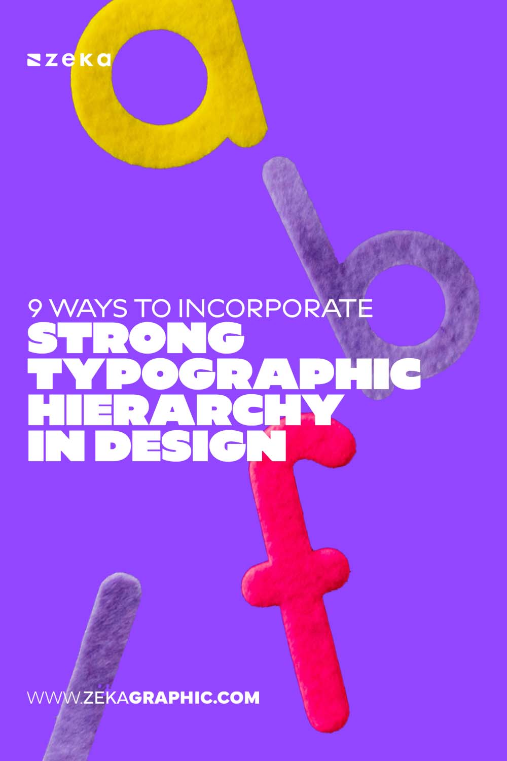
Pin it for later!
If you found this post useful you might like to read these post about Graphic Design Inspiration.
Advertisment
If you like this post share it on your social media!
Advertisment


Want to make your Business Grow with Creative design?
Advertisment
Advertisment


