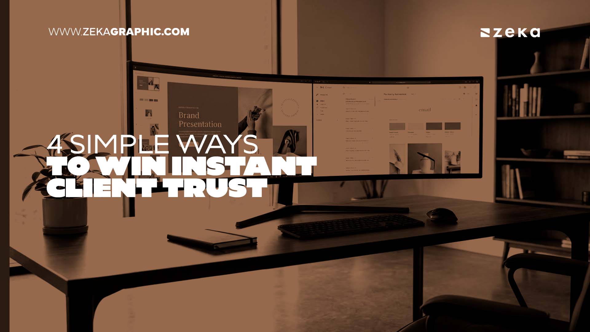
Winning instant client trust as a designer requires establishing visual identity consistency, creating clear client portal access, streamlining feedback workflows, and securing sensitive handoffs.
These four touchpoints transform a standard delivery into an exceptional designer-client experience. By applying rigorous design thinking to your communication processes, you signal unmatched professionalism before a single file is opened.
There is a moment every freelance designer knows well. A client emails you early in the morning asking for the latest logo proof. They also request the brand style guide when you get a chance.
You have the files ready. The work is strong. In the few seconds it takes them to open your email, scan the layout, and click the first attachment, they are forming an opinion. This opinion is not about the logo, but about you.
Client trust is accumulated through every touchpoint in the delivery experience. The email template you use and the way your folders are named all play a crucial role.
A recent study highlights that 67% of consumers say they must trust a brand before they’ll continue buying its products or services. Great design work can easily be undermined by a careless delivery experience.
The good news is that the same design thinking you apply to client projects applies directly here. Here are four trust signals to build into every client interaction.
Start applying these principles with the next file you send.
Advertisment
Consistency equals confidence in the eyes of your client. Picture having just finished a tight logo variation PDF featuring a clean grid, precise color swatches, and an elegant typographic hierarchy.
You attach it to an email using a system default font, an unformatted signature block, and a messy subject line. The client opens the email before they open the file and immediately questions your standards.
Visual identity consistency is a crucial communication standard. Every surface the client touches should feel like it came from the same visual mind. Your email signature should reflect your typographic system, and your PDF cover slides should use your grid.
Even technical delivery mechanisms must demonstrate care. Every surface the client touches should feel intentional and cohesive.
When handling sensitive files alongside unlinked standard file transfer tools, platforms like Trustifi encrypt email let you send high-res brand assets securely, preserving your visual hierarchy and color psychology without workflow disruptions.
These mechanisms ensure that early concepts are delivered safely and beautifully. File naming conventions count here, too, as a messy folder name signals disorganization immediately.
One practical starting point is creating a master delivery template. This can be a simple, well-structured PDF wrapper you use for every brand board, logo proof, or style guide you send.
Let that template itself be a demonstration of your design thinking. When a client receives a beautifully typeset document housing their brand assets, they already trust the contents.
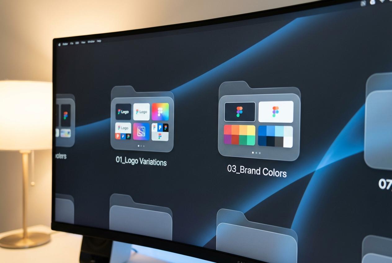
Clarity is a fundamental design decision. Imagine a client receiving a shared folder link and clicking through to find numerous files and overlapping subfolders.
They see no preview thumbnails and version names that range wildly in consistency. They spend precious minutes trying to figure out which file is the current one.
By the time they find the right file, they have lost confidence in you. Effective client portal design shapes how clients experience your professionalism.
Using standard naming conventions enables the design objects and the design file names to be consistent with the associated alignment. This simple framework works beautifully across any shared drive setup:
When each folder contains labeled preview images that match the actual deliverable, clients can orient themselves immediately.
They know what they are reviewing before they download anything at all.
That prevents confusion, saves back and forth messages, and communicates something important. It shows you thought about their experience rather than just your own workflow.
Color accurate thumbnail previews are worth the extra few minutes to create. A client can see the exact brand color in the preview image rather than a compressed, washed out version.
This attention to detail signals that color integrity matters to you at every stage. It proves your commitment extends far beyond the inside of the final file.
Key Insight: Design thinking shouldn’t stop at the canvas. Applying architecture to your folder structures and file previews transforms a potentially chaotic download into a curated, professional experience that reinforces client trust. |
A smooth process is an integral part of the design itself. You send three logo variations for review, and the client responds with scattered feedback.
They send a short email, a voice memo, and a screenshot with red arrows drawn over it. Days pass, and you are still uncertain about which direction they truly want to go.
Approval friction acts as a massive trust eroder during a project. When clients feel uncertain about how to give feedback, that uncertainty quickly spreads. The solution is not downloading a new app, but rather implementing a better structure.
Build a simple, typography-led approval form directly into your delivery documents that guides the client through four decision points:
Keep the options limited to three words per choice to remove all ambiguity. The client circles or checks off their choices, adds a brief comment, and returns a single document.
You instantly have everything you need to move forward with the next phase. This structured feedback form signals to the client that you have a highly tested system.
Advertisment

Trust the process and take active steps to protect it. The final deliverable email is completely ready with high resolution logo files in every format.
You compress everything into a folder, attach it to an email, write a quick note, and hit send. There is no confirmation of receipt and no access controls to keep things private.
Final brand assets are much more than just simple design files. They contain proprietary visual identities, unreleased brand positioning, and sometimes confidential business strategy embedded in the messaging guidelines.
Prioritizing secure brand communication is increasingly a professional standard among top-tier creative firms. When you deliver this same level of care, it elevates your perceived positioning immediately.
For the actual file handoff, dedicated secure platforms let you send high-res brand assets seamlessly. There are no portals to log into and no keys to exchange, just a clean and protected handoff. This frictionless protection is what makes the final delivery truly work.
When the final delivery feels as polished as the brand identity inside it, the client walks away feeling completely taken care of.
Warning/Important: Treat final deliverables with the same security as financial documents. Using encrypted delivery for brand assets protects your client’s intellectual property and signals that you are a high-level partner, not just a vendor. |
These four trust signals form one cohesive statement about how you work as a professional designer. Visual consistency says you apply your own strict standards to absolutely everything you touch.
Transparent access proves you have made navigation completely effortless for the client. Streamlined approvals show you respect their time, while secure delivery ensures their assets are protected.
Together, these elements form an exceptional designer-client experience that is remembered long after the invoice is paid.
Clients do not just remember the typography choices, but they remember how working with you felt. That positive feeling is what ultimately drives referrals, repeat projects, and enduring professional trust.
Pull up your most recent client handoff and walk through it like a brand new client. Ask yourself honestly if every touchpoint reflects the same high standard as the design work itself.
If something feels off, take the time to tighten up your workflow this week. Your communication process is a vital part of your portfolio, so you must treat it that way.
Author Profile: Trustifi is a cloud-based email security platform providing data loss prevention, advanced threat protection, encrypted email communication, and compliance solutions for businesses. |
Advertisment
Pin it for later!
If you found this post useful you might like to read these post about Graphic Design Inspiration.
Advertisment
If you like this post share it on your social media!
Advertisment


Want to make your Business Grow with Creative design?
Advertisment

Advertisment