Nobody is ever going to tell you your visual identity cost them the deal. They won’t email to say your brand looked a bit cheap, so they hired the other firm. They just vanish, and you are left wondering what went wrong. That lost work never shows up in any report you get to read.
Which is exactly why it is worth a hard look. We will show you what visual identity actually is and the specific ways a shaky one bleeds clients, then a plan to sort it out and let your visuals do the talking.
Advertisment
Your visual identity is everything people see when they come across your brand, rather than what you say or how you make them feel deep down. It is the look. And when it is working, you are instantly recognizable and tough to muddle up with anyone else.
The thing most people get wrong is treating it as a logo with a few colors thrown nearby. It is really a set of choices that all pull in the same direction, so your Instagram, your invoice, and your shopfront obviously belong to the same business. When those visual cues don’t match up, people notice it, even if they can’t say why.
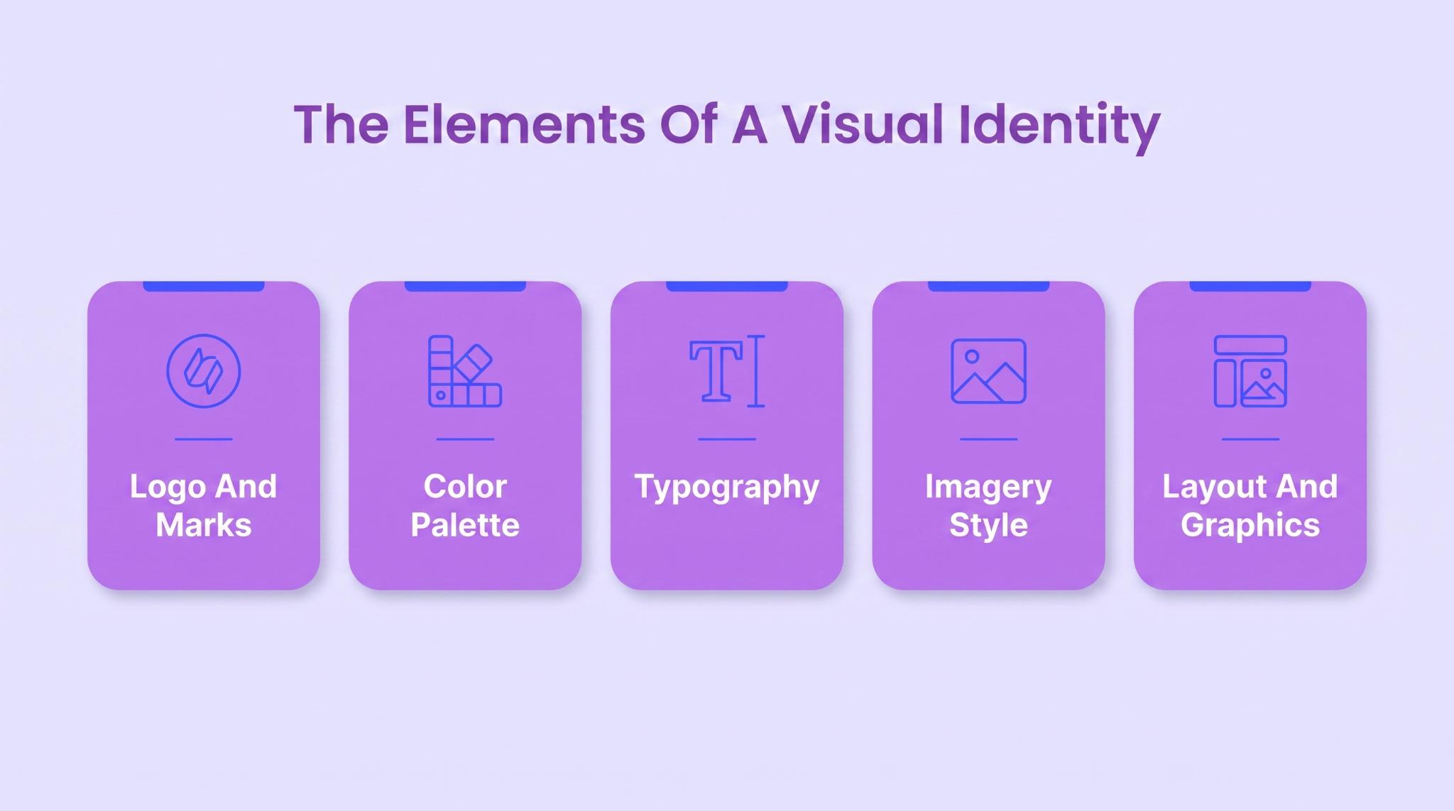
Nearly every brand look is built from the same short list of design elements. You won’t use all of them at full volume, but the strong ones make each one count. Worth running through the building blocks before you start judging your own.
Your logo and any marks are the bit people recognize first. Color sets the mood and helps you get spotted in a busy feed. Type, the fonts you pick, carries way more personality than most people ever expect.
Then there is your imagery, and the layout that pulls everything together on the page. On their own, none of these do much. Put together properly, they become a form of visual communication that tells people what kind of business they are looking at without spelling it out.
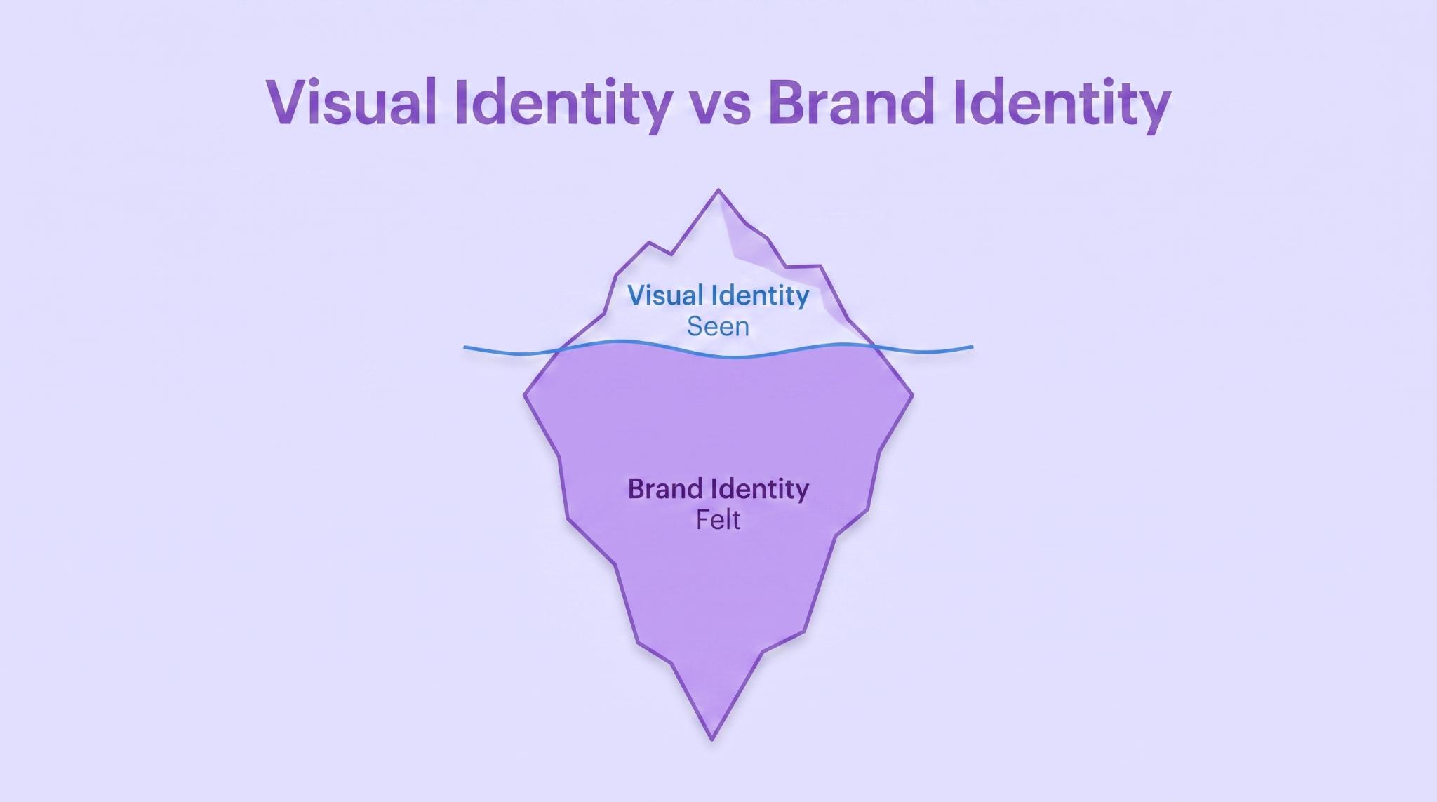
People swap these two terms around constantly, and it confuses everything. The brand identity refers to the whole brand story: what you stand for and the promise you make. Yours is only the part of that you can point at and see.
Picture an iceberg. The visible layer is the tip poking out of the water, the part everyone spots straight away. The brand values underneath are the huge chunk nobody sees, the things people slowly come to feel. That is where your brand promise lives: the expectations you create about what customers will get from you. You need both, but the tip is what earns that first glance.
That gap matters more than it sounds. You can have a genuinely great business underneath and still lose people over a scruffy-looking surface. This whole guide is about that surface, the layer doing your first impressions while the deeper brand takes its time.
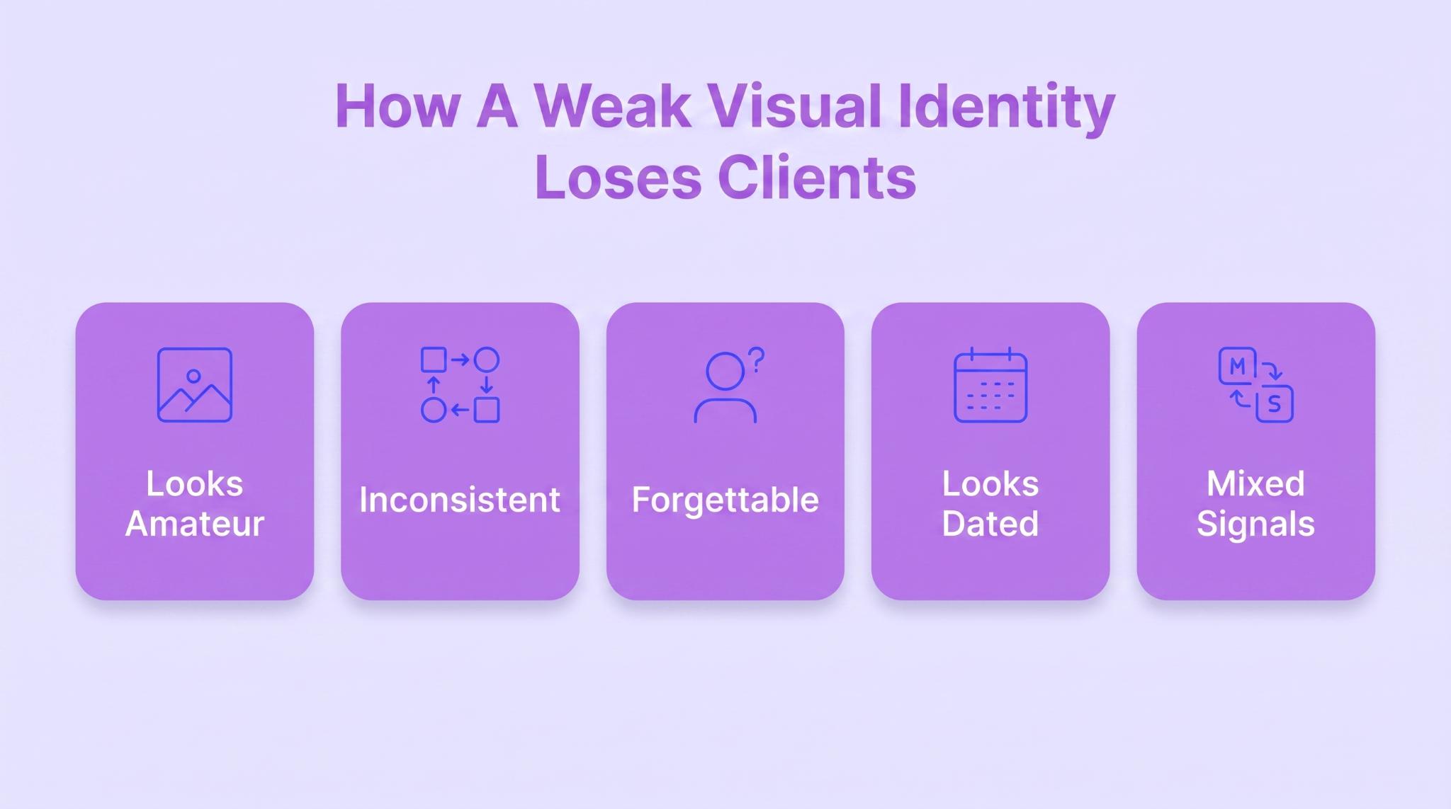
A weak look doesn’t crash the business. It just leaks clients in ways you will never trace – a pitch that goes cold, a message nobody replies to. So let’s get specific, because you can’t mend a hole you haven’t found yet.
Advertisment
First impressions are visual, and they happen stupidly fast. Before anyone reads a word of your pitch, they have sized up how you look and already decided whether you seem legit. Stanford’s research on web credibility found nearly 46% of people judged a site’s trustworthiness on its design and consistent branding first, ahead of everything else.
So when your stuff looks cobbled together – mismatched fonts and a squashed logo – people just assume the actual work is cobbled together too. Harsh, but that is how brains work. Cheap-looking reads as cheap, or careless, and you rarely get a second shot to argue otherwise.
This matters even more in industries where the customer is buying something they need to see before they can really judge it. Outdoor lighting is a good example. A plumber can explain what is wrong with a pipe. An accountant can talk through the numbers.
But an outdoor lighting company is asking you to picture what your home or property will look like after dark. That is where a weak visual identity can hurt more than it would in some other industries.
Take this Canton-based outdoor lighting company as a useful example. They address that problem by making the visual result a big part of how the brand is presented.
Across the site, the imagery focuses heavily on finished properties after dark rather than relying on generic product shots. The gallery is especially useful here – it shows different illuminated parts of a property, which gives visitors a much better idea of the kind of work they produce.
The wider site also keeps the presentation consistent: the logo and orange-and-gold mark, clean navigation, simple typography, and uncluttered layouts let the project photography do most of the work. That matters in this niche. When the product is a finished visual transformation, your own presentation becomes part of the proof.
Say your blue is one shade on the website and a slightly different one on your invoices, then something else again on LinkedIn. On its own, no single slip matters. Add them up, though, and they show that you are a bit disorganized. And disorganized is the last thing anyone wants from someone they are about to pay.
Trust is carrying a lot right now, too. A Brand Trust report found that 68% of people say they trust brands in general, up from 56% back in 2022. People are ready to trust you; they just read the signals first, and a steady look is one of the earliest ones they get.
It builds brand loyalty well after the first sale, as well. When you look the same everywhere someone runs into you, they start to recognize you, and that strong brand recognition is a big part of what gets a buyer coming back around. A scattered look keeps hitting reset, so you are forever re-earning ground you already covered.
Put your competitors’ sites next to yours. Same safe blue, the same stock handshake photo, right down to the same rounded font. Congratulations, you are a commodity now. And commodities get picked on exactly one thing: price.
A look that is genuinely distinctive is what makes someone remember you a week later. It doesn’t need to be loud, just yours – a color palette and a style nobody would mistake for the shop next door. Blend in, and you don’t lose to a better company. You lose to one people can actually remember.
This problem matters even more in home-service industries because customers are usually choosing between several companies that offer almost identical services. If someone needs AC repair, they are looking for a company that feels established, trustworthy, local, and capable of showing up when things go wrong.
If an HVAC company looks like every other contractor online, there is very little to help a homeowner remember it or feel confident enough to call. This air conditioning repair service in Suwanee, GA shows how to avoid that problem. They use the same recognizable logo and brand treatment across their site, and keep the navigation, service pages, CTA, and supporting content within the same visual system.
They also immediately establish the local connection with “Near Suwanee, GA” and reinforce the brand with its “Holtkamp Way” messaging. That brand consistency matters because an HVAC customer may discover the company through an AC repair search, then jump to the main air-conditioning page, check reviews, look at another service, and finally schedule. Each step still needs to feel like the same company.
Design gets old whether you are paying attention or not. A logo and site that looked slick in 2014 can seriously age you now, and people take a dated look as a fair question about whether you have kept up. In fast-moving industries, it is worse because looking behind makes them wonder if your thinking is behind too.
What hurts is that the work itself might be brilliant. You have just let the packaging fall behind what is inside it. A tidy-up that drags the look into the present, a more current logo and cleaner type, can change how sharp you seem almost overnight.
Your look is a filter whether you meant it to be or not. A premium feel attracts people who expect premium and happily pay for it. A cheap and cluttered one pulls in bargain-hunters who pick at every line of the invoice. Neither is wrong, but the wrong match gets pricey.
So if you are chasing high-value clients while your brand reads like a discount flyer, you will keep pulling the wrong briefs and wondering why nobody respects the price. The look sets the expectation before you open your mouth. Aim it at the people you actually want, and the whole conversation shifts.
Advertisment
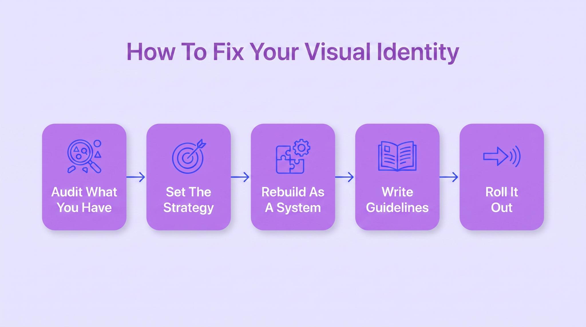
Right, enough doom. Every problem about a brand’s visual identity I just listed is fixable, and no, you don’t have to set fire to everything and start over. Because it is a system, fixing it is a sequence, not a lucky redraw of the logo. This is roughly the order I would go in.
Before you touch a thing, get honest about what you have already got. Drag every branded item you own into one place and look at it the way a stranger would, all at once. Most of your consistency problem outs itself the second it is lined up on a single screen.
Design with no strategy behind it is just decoration, which is the exact trap you are climbing out of. Before you pick a single color, get clear on who you are for and what you want them to feel.
Every visual call should trace back to that. A real brand design process kicks off here, not in the design app. And your marketing strategy should inform that decision too, so the visual direction supports how you actually plan to reach customers.
Now the actual design. The trick is building the pieces together, not one at a time. Don’t finish the logo, then go looking for brand colors and other graphic elements to add on after.
Make them for each other, so the whole set looks deliberate. Figuring out the type hierarchy alone drags a lot of it into line. Done consistently, those choices increase brand awareness because people start associating the same look with your business.
A look that only exists in your head, or your designer’s, fails the moment someone else has to build a slide. Guidelines are just the rulebook that keeps everyone on the same page. And honestly, it is the step most people skip.
The data is pretty grim on this. Marq’s research on brand consistency found 85% of companies have brand guidelines, but only 30% actually stick to them. A rulebook nobody follows is just a good-looking PDF gathering dust in a folder.
A half-done rollout can look worse than never starting, because now you clash with yourself. Once the new system is ready, push it out everywhere at the same time, so people meet one joined-up brand wherever they find you. Staying consistent across every channel is the whole point, and it runs right down to the search bar design and other interface details on your site.
Advertisment
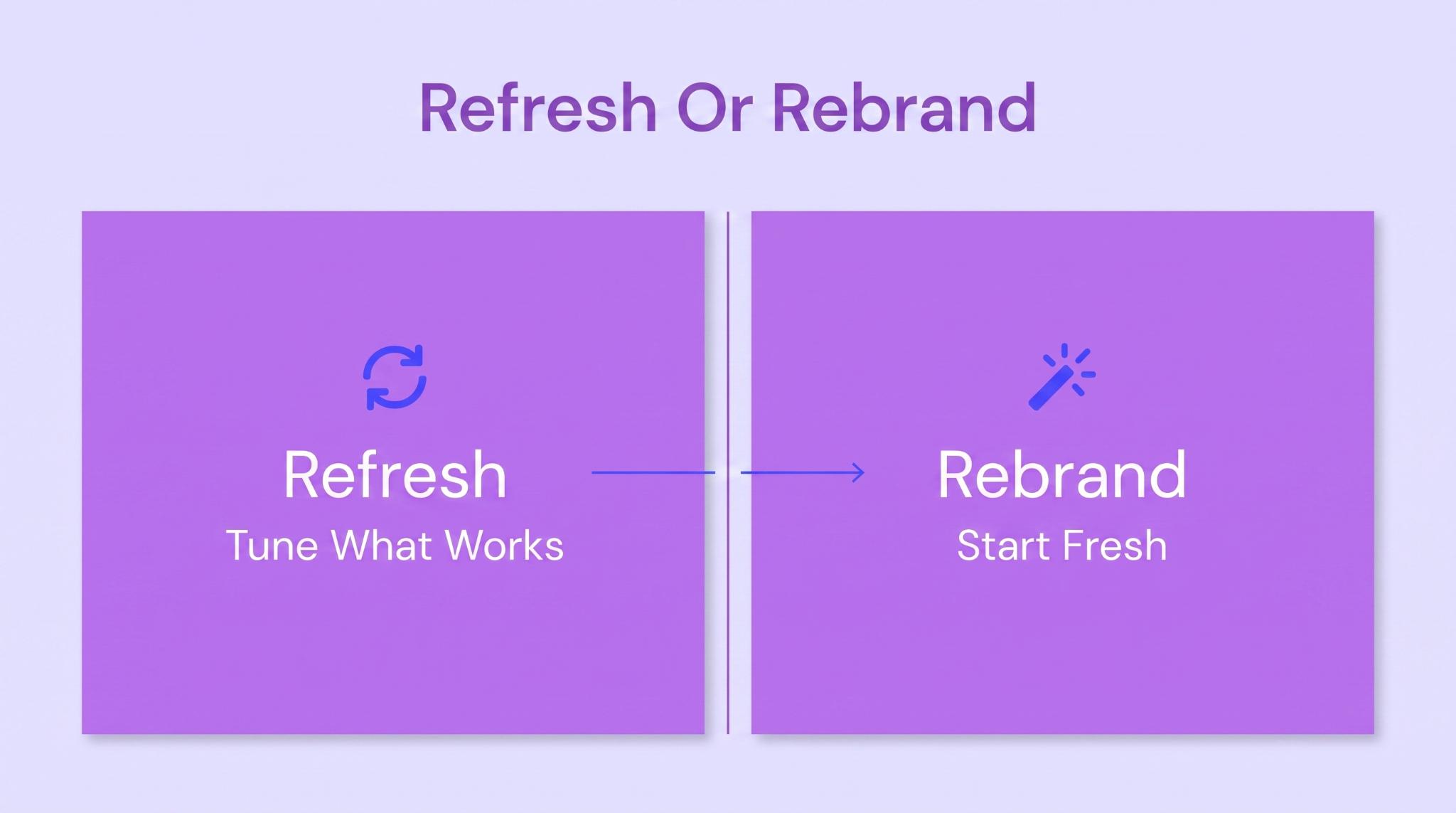
Last call, and it is a money one. Not everything needs a teardown. Sometimes a tune-up does the job, and sometimes a tune-up is just lipstick on a much deeper problem. Here’s how to tell the two apart.
If the core still feels right and people do recognize you, you are probably in refresh territory. The foundation is solid; the look has just aged or wandered off-course a bit. You keep what is working and modernize the rest of it.
A refresh might be cleaning up the logo and tightening the palette, all while holding onto the recognition you have built. Lower risk, lower cost, and your regulars still know you the next morning. When the bones are good, you really don’t rip them out.
Some situations need more than fresh paint. If the core identity is actively working against you or the business has changed so much the old look just doesn’t fit anymore, a refresh only polishes the wrong thing. That is when a full rebrand is worth what it costs.
You are in rebrand territory when you are going after a totally different client than before, or when a merger or a hard pivot has changed who you even are. Same goes if the current look is simply beyond saving. It is a big investment, so treat it like one. Done right, it can reset how the market sees you.
Advertisment
Your visual identity isn’t a coat of paint you apply once the real work is done. It is a working part of the business, the thing making a silent first impression on everyone who finds you, well before you ever meet. Weak, it costs you without making a sound. Strong, it sells for you while you sleep.
If yours is doing more harm than good, that is fixable, not a life sentence. Work the audit and the strategy first, then rebuild every piece as one system, and you are most of the way there.
And if you would rather hand it to people who do this all day, that is exactly what I do at Zeka Design, turning a scattered set of visuals into a strong visual identity that finally works for you. Get in touch and see the magic happen.
Advertisment
Pin it for later!
If you found this post useful you might like to read these post about Graphic Design Inspiration.
Advertisment
If you like this post share it on your social media!
Advertisment



Want to make your Business Grow with Creative design?
Advertisment

Advertisment