Visual identity has always been the most immediate form of brand communication. Before a customer reads a headline, watches a video, or speaks to anyone on a sales team, they’ve already formed an impression from what they’ve seen.
The design decisions behind that impression – color, type, shape, texture, motion – determine whether a brand registers as credible, memorable, or forgettable. The trends shaping brand design reflect how audiences have changed and what earns their attention and trust now.
Advertisment
For most of the last decade, the dominant visual direction in brand design was reduction. Clean. Minimal. Sans-serif. Neutral palette. The logic was that simplicity conveyed professionalism and scaled well across all digital surfaces. It worked – until everyone did it.
By the early 2020s, the generic premium look had spread so far that it stopped doing any real work. When everything looks trustworthy and minimal, nothing stands out as trustworthy and minimal.
What’s been growing since is a pull back toward specificity. Handmade textures, expressive type, illustration, color choices that feel like someone made a decision – not a safe one, a real one. Sources like https://news.designrush.com/ track this in real time. The brands cutting through aren’t the most refined. They’re the most recognizable.
What this means practically is that the design brief for a strong visual identity in 2026 asks genuinely different questions than it did five years ago. Not “how clean can we make this?” but “what does this brand actually look like when it has a point of view?”
Design choices that communicate character rather than just competence:
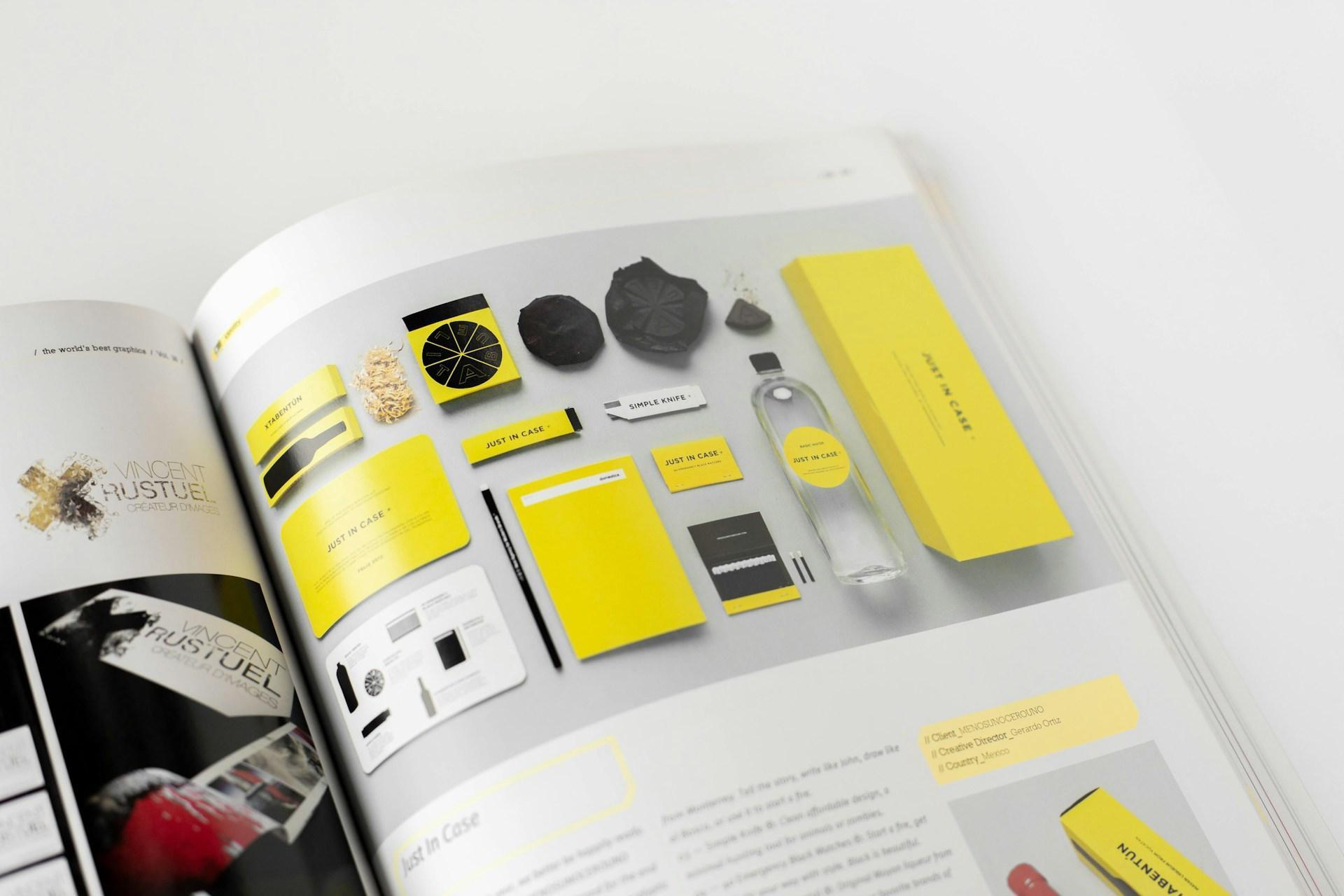
Static identity systems are increasingly being supplemented by motion – not as a production afterthought but as a designed element that’s considered from the beginning.
A logo that has a deliberate animation, a color palette that transitions in a specific way, a typographic system that behaves consistently in motion – these extend the identity into contexts that static design can’t reach.
Short-form video, social stories, animated digital ads, and interactive web experiences all require brands to have clear answers to the question of how their identity moves. Brands that only have a static logo and a PDF brand guide are under-equipped for the current media environment.
The brands getting this right are the ones that brief motion directly into the identity system from the start, not the ones that hand a finished static identity to a motion designer afterward and hope it translates.
Advertisment
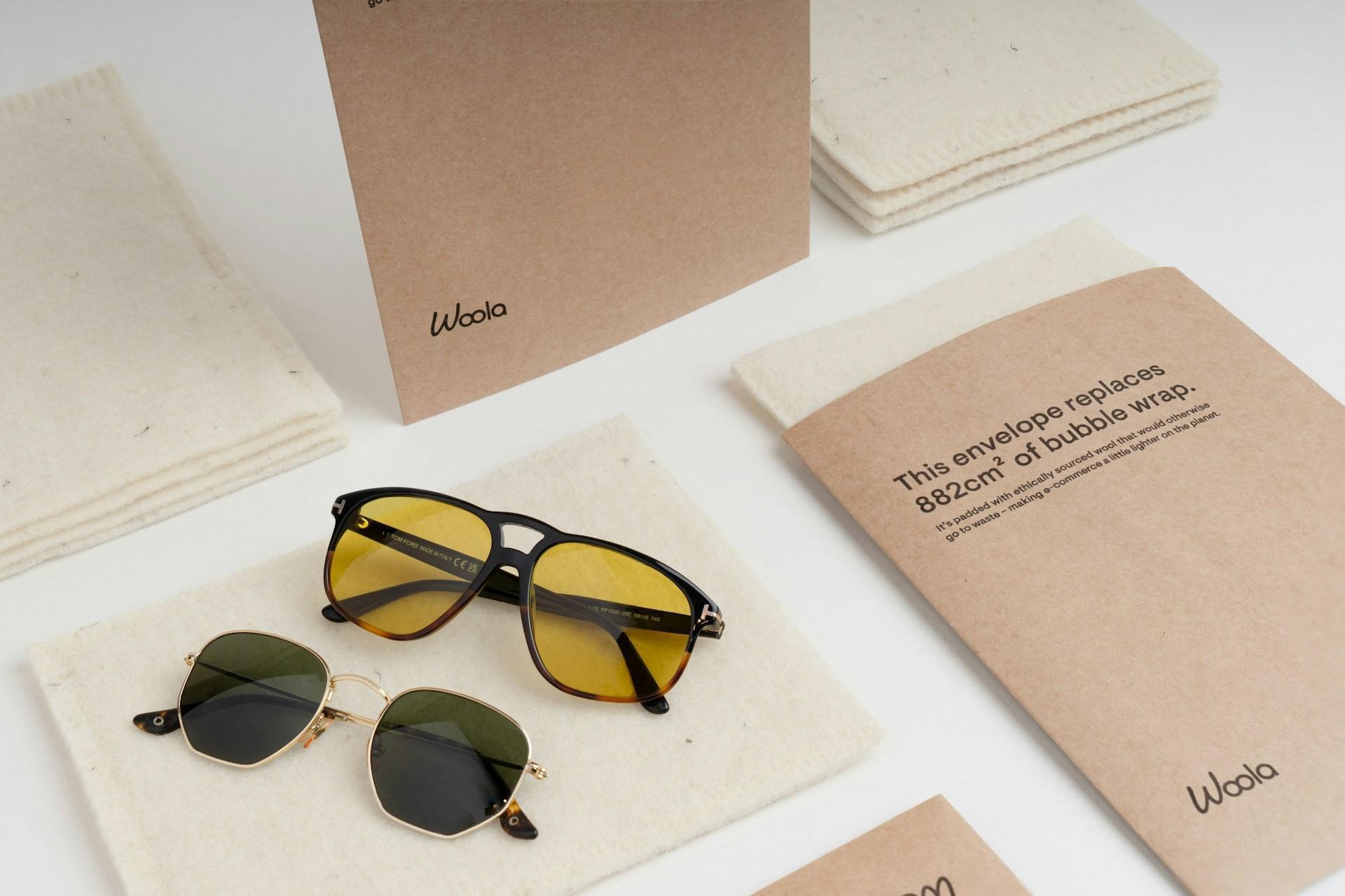
In packaging and print, a visible and growing trend toward material honesty has emerged. Recycled paper with visible texture, uncoated stocks, minimal ink coverage, and printing techniques that celebrate the material rather than trying to hide it.
This direction connects to broader consumer interest in sustainability but also taps into the same appetite for texture and authenticity that’s driving the visible shift toward character in digital design.
For brands with physical touchpoints, the question of how the design system works in print and packaging is increasingly important. A visual identity that only works on screen – flat, high-saturation, optimized for backlit displays – misses the opportunity that physical materials create.
Advertisment
The practical challenge for brand design in 2026 is maintaining consistency across a wider range of contexts than any previous generation of identity systems had to address.
A brand now needs to be recognizable across a website, a mobile app, a TikTok video, a physical product, an email header, a podcast thumbnail, an outdoor billboard, and a print piece – and all of these contexts have different rules.
What makes a brand system strong enough to hold across that range:
A strong visual identity is the difference between a brand people recognize immediately and one they keep encountering without retaining. The design trends that matter right now are the ones that help brands build the former.
Advertisment
Pin it for later!
If you found this post useful you might like to read these post about Graphic Design Inspiration.
Advertisment
If you like this post share it on your social media!
Advertisment

Want to make your Business Grow with Creative design?
Advertisment

Advertisment