Why do some designs linger in memory the way physical objects do, while others vanish moments after you scroll past them?
The problem isn’t creativity. It’s disposability. In an environment optimized for speed, clarity, and instant comprehension, most designs are built to be understood—not kept. The trinket design aesthetic challenges that logic. Instead of asking for immediate attention, it invites attachment. Instead of being consumed once, it encourages return, inspection, and recognition over time.
This shift reframes memorability as a structural and emotional decision, not a stylistic one. Designs become collectible when they feel personal, layered, and worth revisiting—more like objects than messages.
That’s why trinket and charmcore design is emerging as one of the most distinctive visual languages inside Graphic Design Trends 2026, especially among designers frustrated by work that looks polished but leaves no residue.
Advertisment
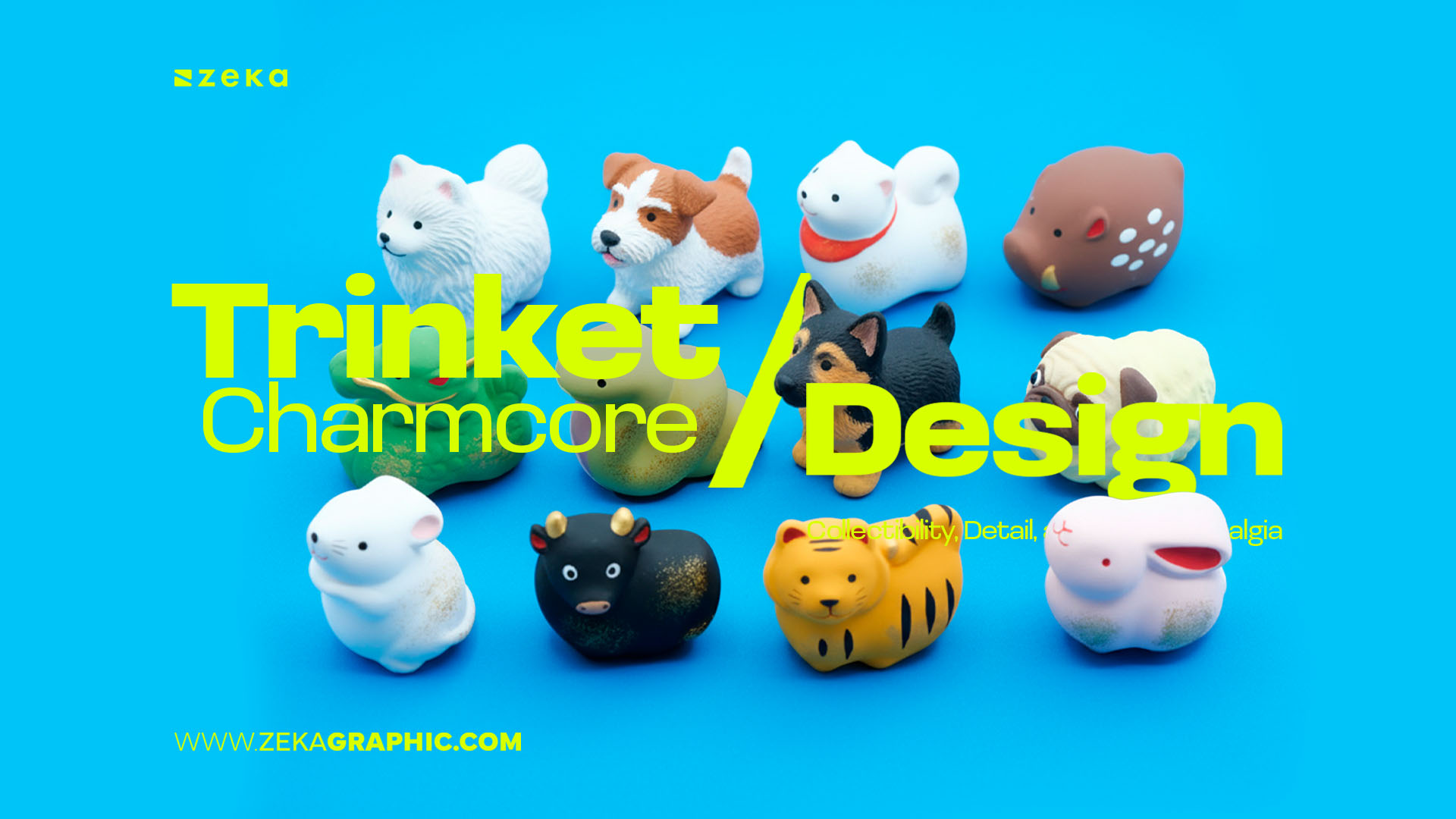
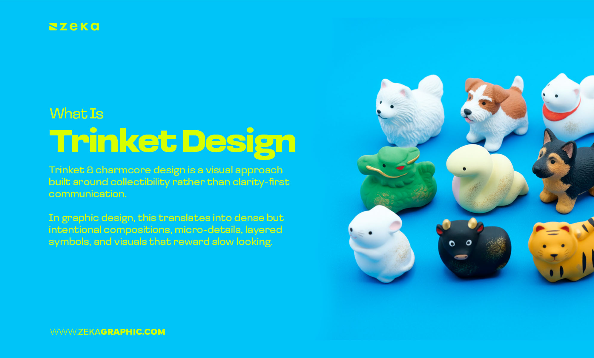
A trinket is a small, often inexpensive object that holds personal or emotional value — a charm, souvenir, sticker, token, or keepsake. Its importance isn’t functional; it’s symbolic. Meaning builds through memory, repetition, and attachment.
Trinket (or charmcore) design applies this logic to graphic design. Instead of prioritizing instant clarity, it builds visual value through accumulation. Small symbols, layered elements, and dense compositions create a sense of collectibility. The layout feels gathered over time, not perfectly optimized in one pass.
This style invites slow viewing. Details reveal themselves gradually. Elements may overlap or cluster, but they aren’t random — each carries intention, even when the meaning is personal or subjective.
Trinket design is often mistaken for loud maximalism. In reality, it’s curated density. The goal isn’t decoration or chaos — it’s emotional connection.
It doesn’t try to be instantly understood.
It tries to be worth returning to.
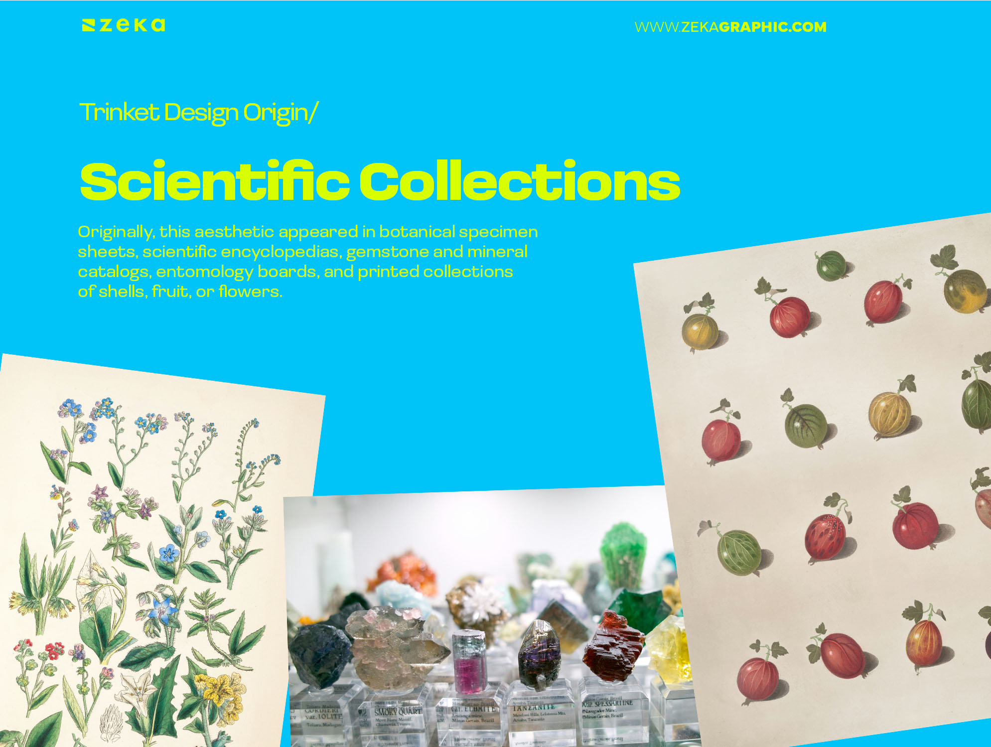
Trinket design didn’t start as a trend — it started as collection culture.
Originally, this aesthetic appeared in botanical specimen sheets, scientific encyclopedias, gemstone and mineral catalogs, entomology boards, and printed collections of shells, fruit, or flowers. Objects were carefully arranged, labeled, and grouped. Meaning came from accumulation and proximity.
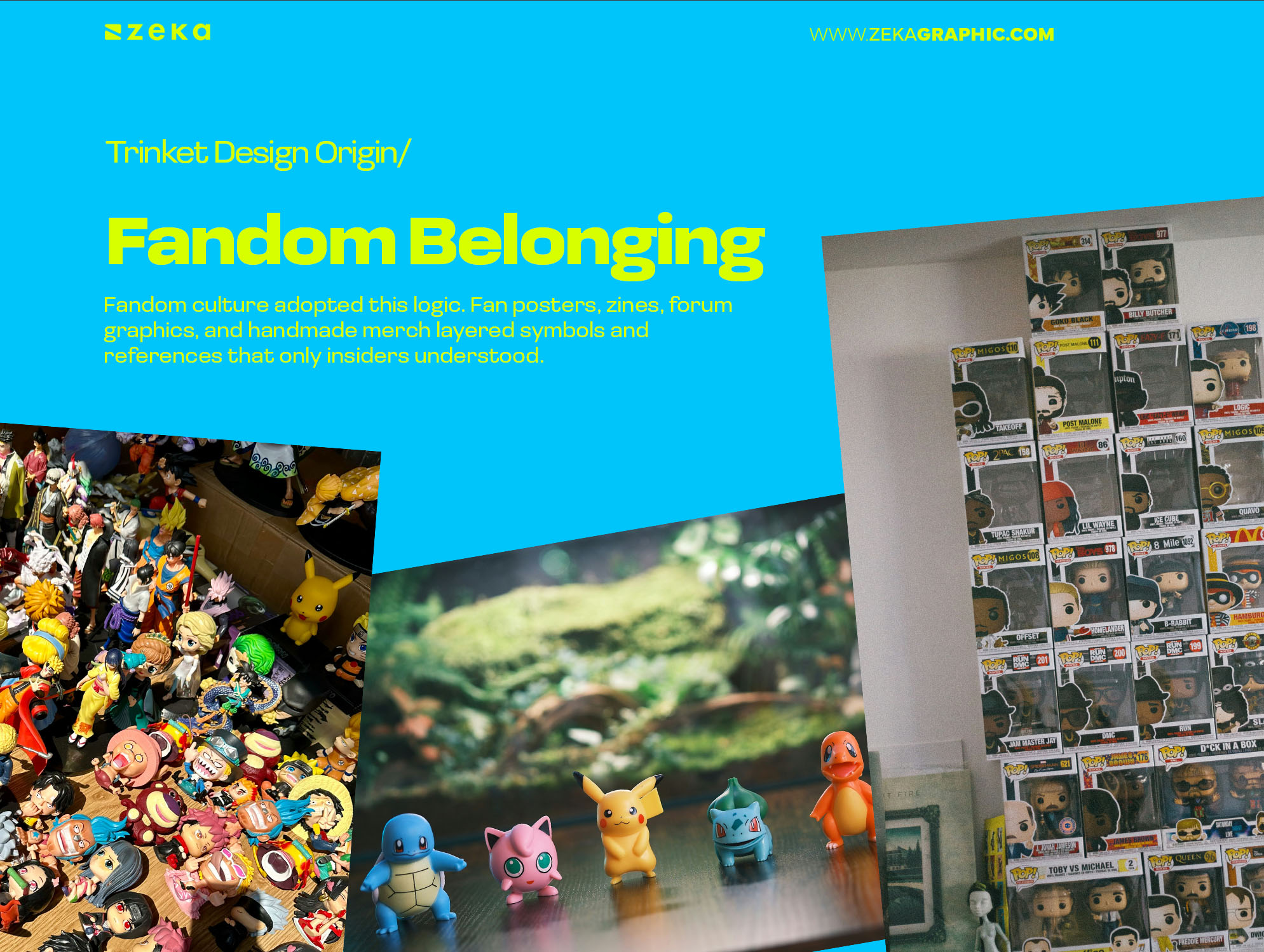
Later, fandom culture adopted this logic. Fan posters, zines, forum graphics, and handmade merch layered symbols and references that only insiders understood. The design wasn’t for mass clarity — it was for belonging. Small icons acted like badges. Recognition mattered more than explanation.
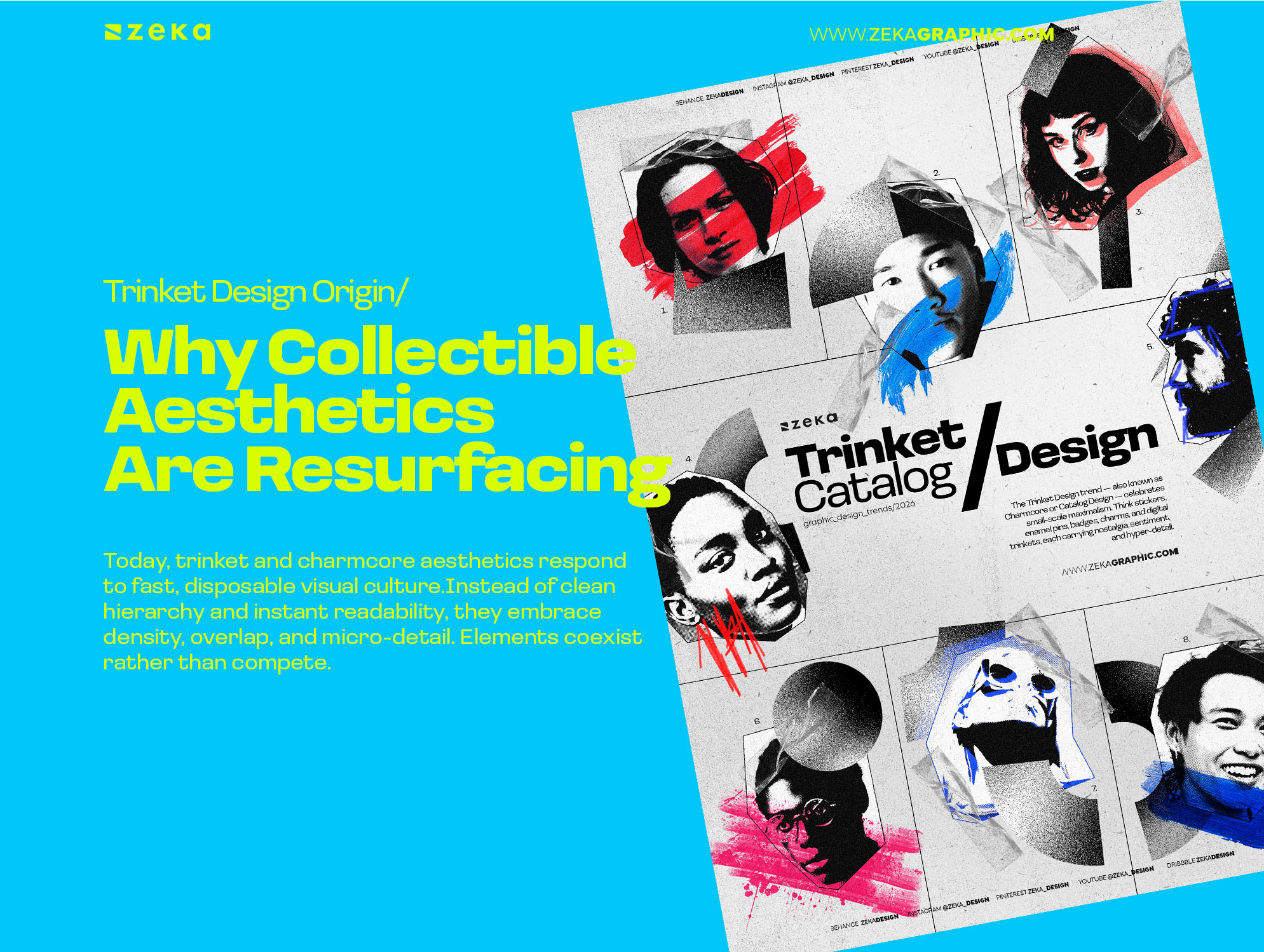
Today, trinket and charmcore aesthetics respond to fast, disposable visual culture.
Instead of clean hierarchy and instant readability, they embrace density, overlap, and micro-detail. Elements coexist rather than compete. Meaning builds through repetition and closeness — like a scrapbook assembled over time.
What makes this powerful now is behavior: you don’t absorb it in one glance. You return to it. You notice new details. In a culture optimized for speed, trinket design slows the viewer down — and that resistance is exactly why it resonates.
Advertisment
This is where the trinket design aesthetic becomes functional, not decorative.
Trinket and charmcore design doesn’t rely on novelty. It relies on how attention is distributed, how meaning accumulates, and how viewers are invited to stay.
These characteristics explain why the style feels rich without collapsing into noise — and why it works when others don’t.
How can a design feel rich without becoming chaotic?
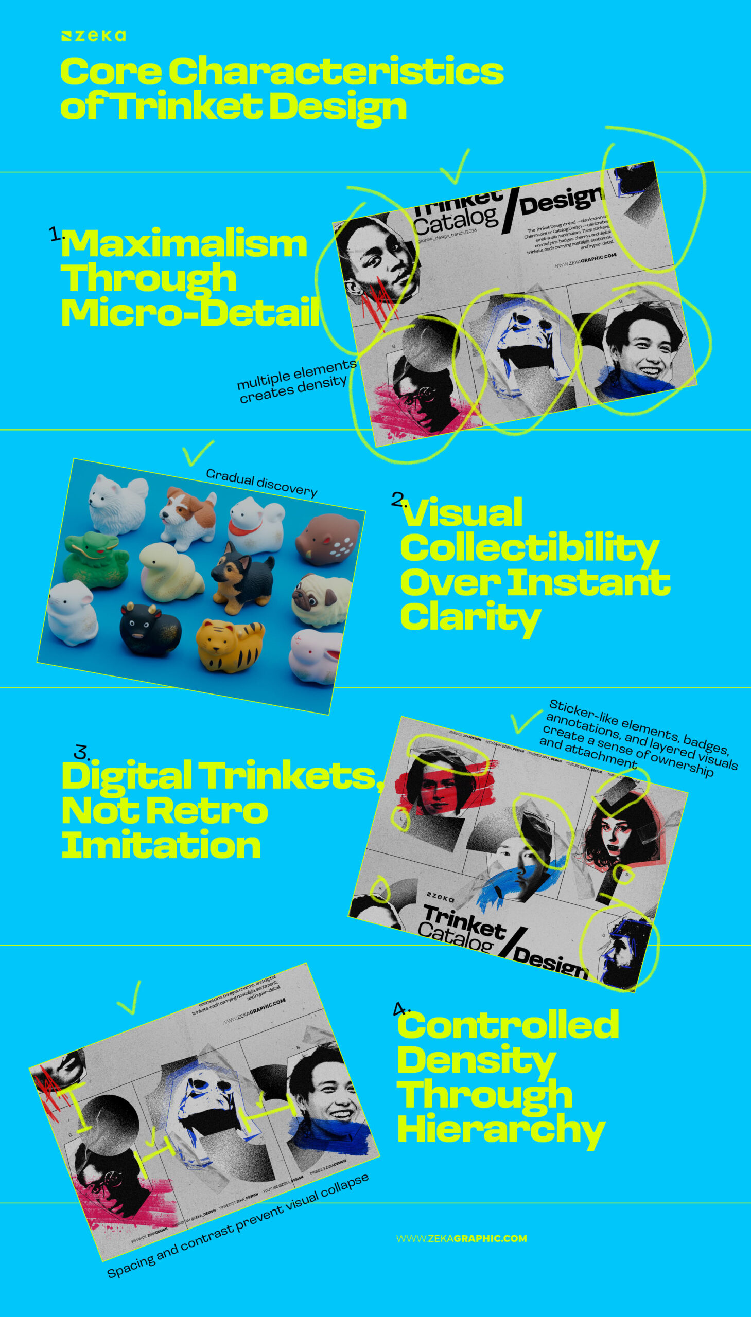
Trinket design creates density by distributing meaning across many small elements — icons, stamps, symbols, textures, annotations. No single element dominates. Instead of one bold gesture, depth comes from accumulation.
This isn’t traditional maximalism. It’s controlled richness. Details stay visually quiet and gain importance through repetition and placement, not size or contrast.
What feels dense at first becomes readable over time — and that slow discovery is the point.
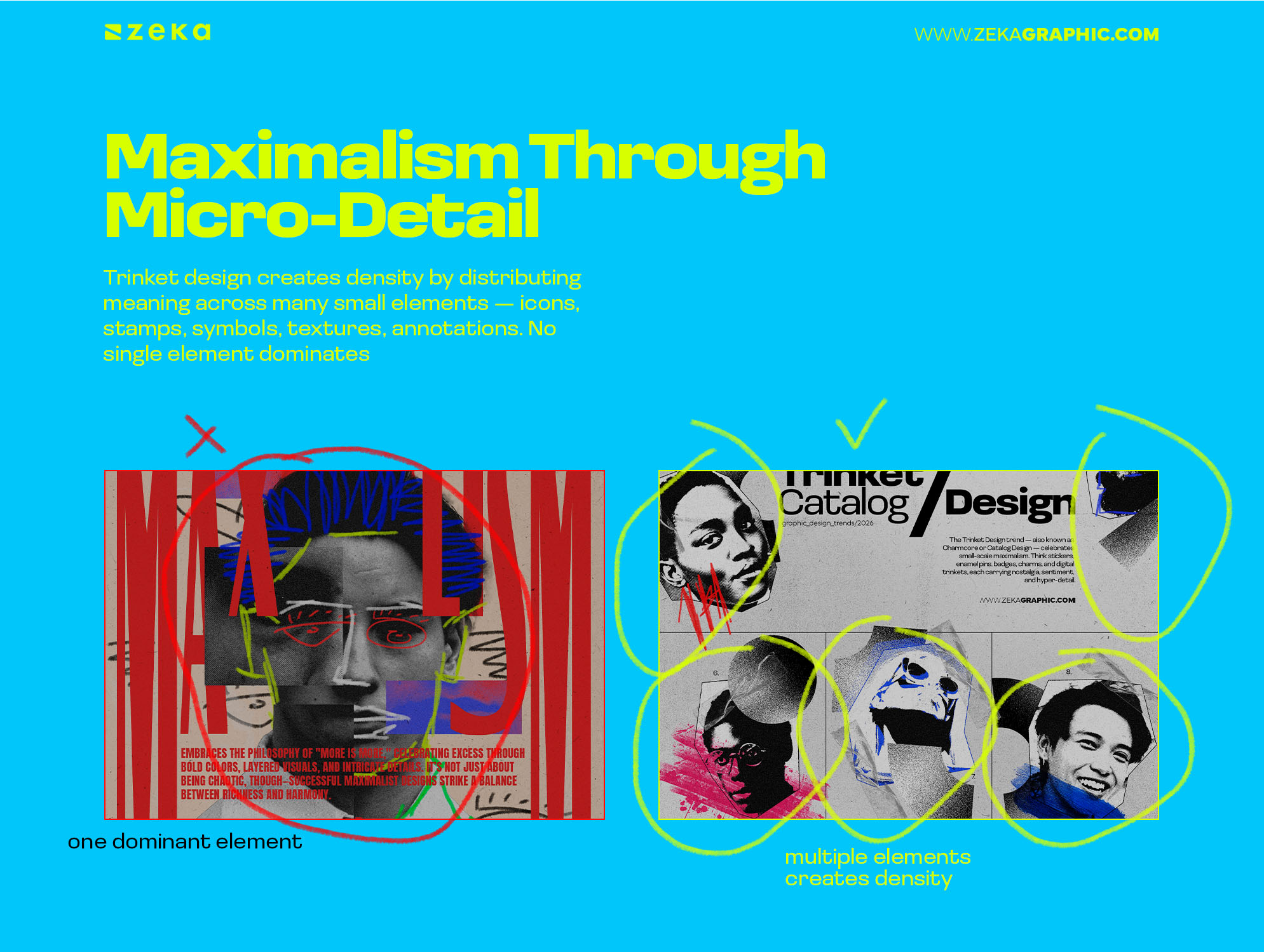
Why do trinket designs invite repeated viewing?
Most design aims for immediate understanding. Trinket design allows gradual discovery. It doesn’t reveal everything at once — it rewards attention.
Layered symbols and small references unfold over time. The viewer explores instead of scans.
Clarity isn’t removed — it’s delayed. Hierarchy still exists, but it doesn’t force a single, fast reading path.
The result feels collectible rather than consumable.
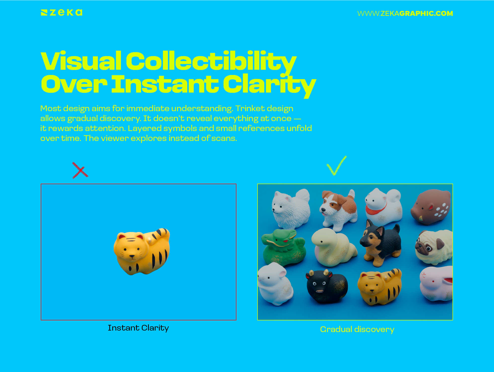
How does this work in digital design?
Trinket aesthetics don’t copy physical objects — they translate collectible behavior into digital space. Sticker-like elements, badges, annotations, and layered visuals create a sense of ownership and attachment.
The goal isn’t nostalgia for its own sake. Successful digital trinket design feels contemporary in execution but emotional in tone.
It’s not skeuomorphism.
It’s about creating visual attachment in digital environments.
How does trinket design avoid overload?
Structure makes it possible.
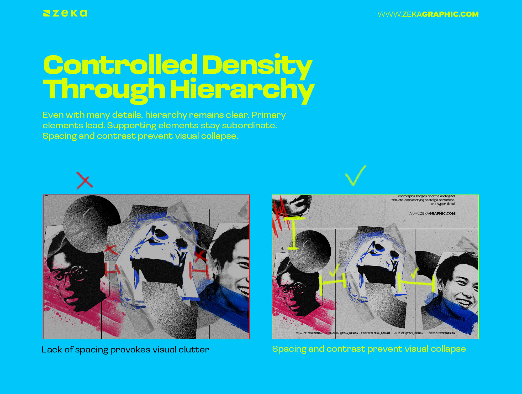
Even with many details, hierarchy remains clear. Primary elements lead. Supporting elements stay subordinate. Spacing and contrast prevent visual collapse.
Trinket design fails when detail expands endlessly. It succeeds when density is contained and structured.
The solution isn’t removing detail.
It’s organizing it.
Advertisment
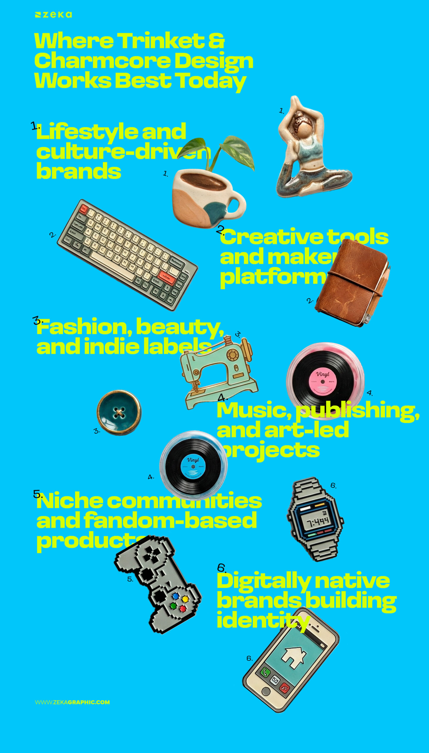
Trinket and charmcore design works best when emotional recall matters more than speed. It supports brands and projects built on long-term affinity, where visuals are meant to be revisited rather than consumed once.
It’s most effective in contexts that reward exploration and recognition over instant clarity, such as:
In these environments, visual density becomes a strength. Micro-details give audiences something to return to, helping brands stand out in spaces flattened by minimalism.
Where it fails is equally clear. Trinket design struggles when interaction must be fast, transactional, or high-stakes. Interfaces that prioritize speed, usability, or immediate comprehension don’t benefit from layered discovery.
This style isn’t universal — it’s context-sensitive. Used strategically, it builds memory and attachment. Used without intent, it becomes visual noise.
Advertisment
Trinket and charmcore design is not about decoration, nostalgia, or visual excess. It’s about how designs stay with people after the screen is closed or the poster is no longer in view.
At its core, the trinket design aesthetic is a way of thinking. It treats visuals as objects of attachment rather than disposable messages. It accepts that not everything needs to be understood instantly — and that meaning can accumulate through detail, repetition, and time.
In a design culture optimized for speed, clarity, and constant replacement, trinket design pushes back quietly. It prioritizes emotional residue over impressions, recognition over novelty, and memory over visibility.
Designs that last are rarely the loudest.
They’re the ones people remember without trying.
Advertisment
Pin it for later!
If you found this post useful you might like to read these post about Graphic Design Inspiration.
Advertisment
If you like this post share it on your social media!
Advertisment


Want to make your Business Grow with Creative design?
Advertisment

Advertisment