You’re building a brand, not just a business. You know that how you look is just as important as what you say. But between logos, websites, and social media, it’s easy to feel overwhelmed. How do you create visuals that feel cohesive, professional, and you?
The answer lies not in chasing trends, but in understanding the timeless visual design principles that form the bedrock of every great brand identity.
Think of it this way: You wouldn’t build a house without a foundation. Similarly, you can’t build a strong brand without a foundation in design. These principles are your blueprint. They transform a collection of visual design elements and principles—like color, shape, and typography—into a compelling visual story that your audience gets instantly.
Advertisment
Before we dive into the “what,” let’s talk about the “why.” In a crowded digital marketplace, your visual identity is your first handshake. It’s what makes a stranger pause their scroll.
Good design, guided by solid principles, does three critical things for your brand:
Simply put, visual design principles are important because they are the framework for making intentional choices, not just pretty accidents.
Different sources slice this differently. Some UX experts group visual design into five big ideas like scale, hierarchy, balance, contrast, and Gestalt. Others list seven or more principles, including emphasis, repetition, and white space.
The point isn’t the exact number. What matters is using a shared vocabulary so your team can design and critique work more objectively.
Here’s a practical, brand-friendly set of core visual design principles you can rely on:
Advertisment
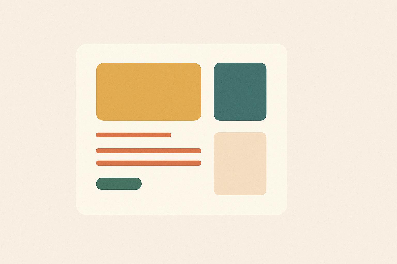
What it is: The distribution of visual weight in a design.
For your brand: You want your designs to feel stable, not like they’re going to topple over.
Practical Application: A “symmetrical” balance (like a centered logo and navigation) feels formal and orderly. An “asymmetrical” balance (like a large image on one side balanced by bold text on the other) feels dynamic and modern. Use it on your website layout or social media graphics to create either calm or energy.
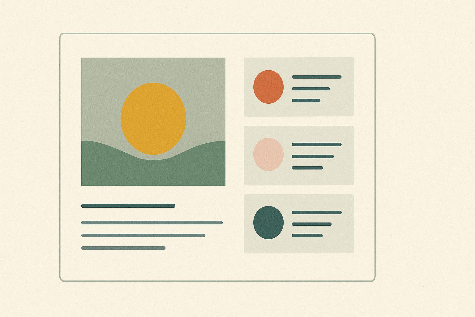
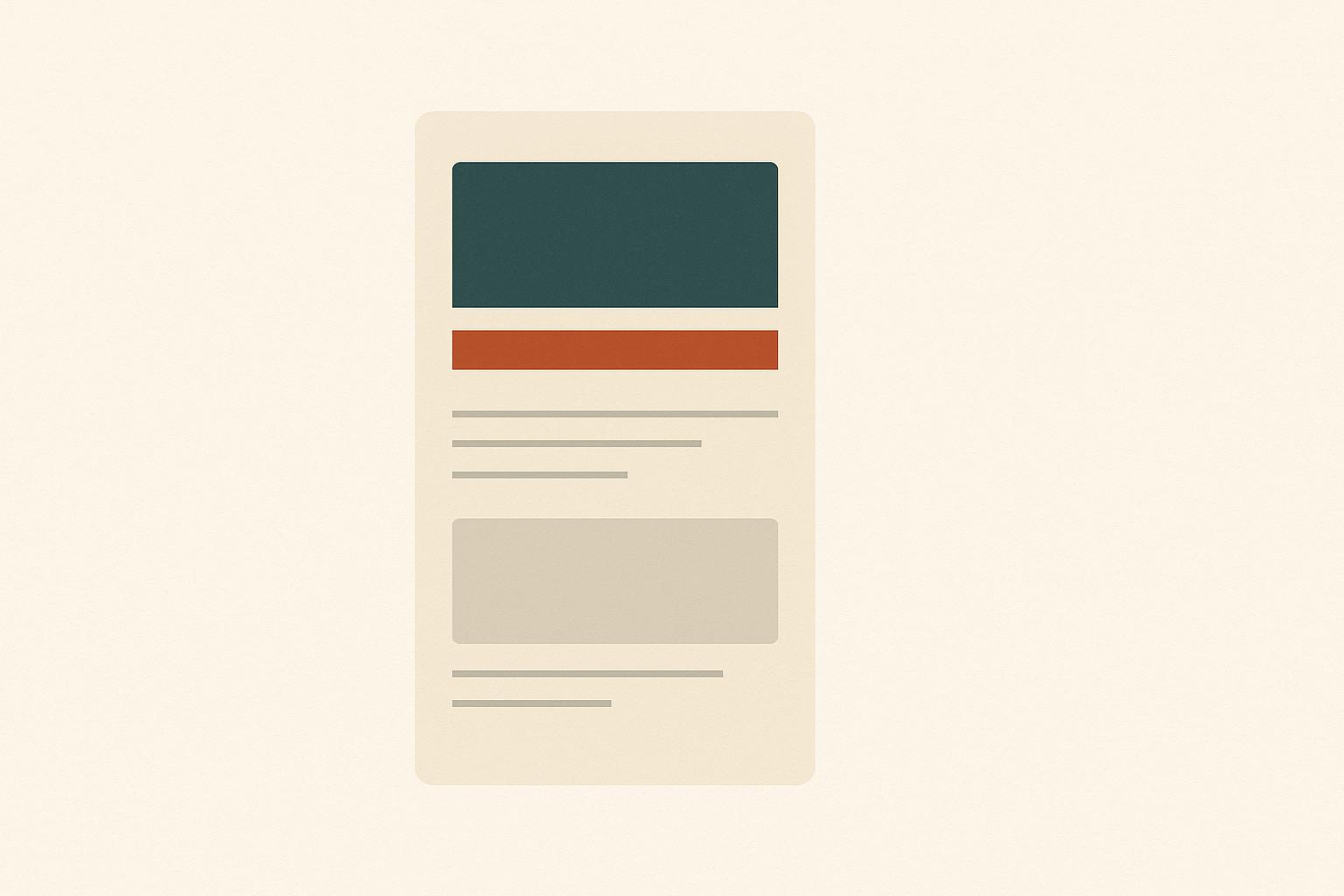
What it is: Organizing elements to show their order of importance.
For your brand: You need to tell people where to look first, second, and third. Don’t make them guess.
Practical Application: On your website’s homepage, your main headline (H1) should be the largest and boldest text. Your subhead (H2) should be smaller, and body text smaller still. Use color or contrast to make your primary call-to-action button the most prominent element on the page.
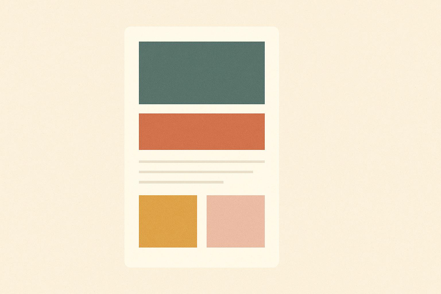
What it is: The juxtaposition of opposing elements (light vs. dark, thick vs. thin, large vs. small).
For your brand: Contrast creates excitement and makes critical information unmissable.
Practical Application: Use a bright, contrasting color for your “Add to Cart” button against a neutral background. Pair a bold, heavyweight font for headlines with a light, airy font for body copy. This prevents your designs from feeling flat and monotonous.
What it is: Reusing the same or similar elements throughout your designs.
For your brand: This is how you build familiarity. When people see the same colors, fonts, and logo treatment across your Instagram, website, and packaging, they begin to know it’s you without even seeing your name.
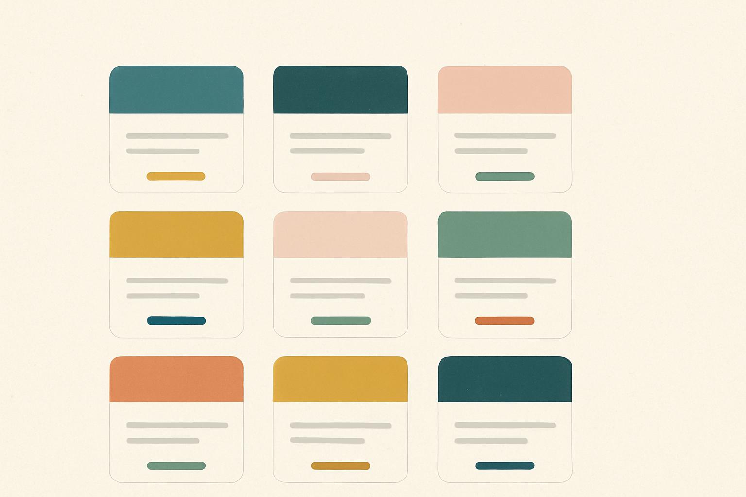
Practical Application: Create a strict brand style guide. Define your primary and secondary color hex codes, your headline and body fonts, and your logo clearspace. Then, use them consistently, everywhere.
What it is: The empty space between design elements.
For your brand: This is not wasted space. It’s a powerful tool that gives your content room to breathe, reduces cognitive load, and makes your message feel luxurious and clear.
Practical Application: Don’t cram every inch of your landing page with text and images. Increase the line spacing (leading) in your paragraphs for better readability. Use generous margins around text blocks to let them stand out.
Whether you handle design in-house or collaborate with specialists like OWDT web design company in Houston. TX, the same core principles apply across every touchpoint.
Let’s translate this from theory to practical use cases you probably work on all the time.
Use visual design principles to:
Social is fast and noisy — visual design principles keep your brand readable and recognizable in a scroll.
Packaging and print rely heavily on proportion, balance, and white space.
Prioritize clarity from shelf distance: strong contrast and simple hierarchy.
Let your primary brand elements (logo, color, key visual) repeat across formats for a cohesive family look.
Advertisment
To make visual design principles stick, bake them into your design system:
This turns principles into defaults, not constant decisions.
Here’s a practical checklist you can use during reviews or before handing off files:
Use this as a lightweight framework to give feedback that’s specific and actionable.
Advertisment
Visual design isn’t a checklist you complete once — it’s a language you refine over time. As a designer working with modern brands, your job isn’t just to know the visual design principles, but to translate them into systems that your team can use across channels.
If you treat contrast, hierarchy, alignment, and the rest as shared tools rather than personal preferences, you’ll:
If you found this post useful you might like to read these post about Graphic Design Inspiration.
Advertisment
Written by
If you like this post share it on your social media!


Advertisment
Advertisment


