Color is a fundamental element in graphic design as it plays a huge role in design process as they can transmit different feelings and convey messages that the viewer can feel related.
There are popular graphic design terms about color that many designers use it wrong, that is why I made this post where I show you the 16 most used terms about color and how to use them correctly.
Advertisment
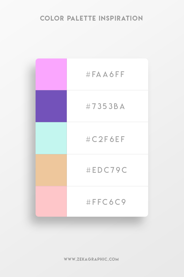
Color Palette
Color Palette in Graphic Design refers to a selection of colors that you will use in your design, you can check this blog post where I show you 5 different tools to create your color palette!
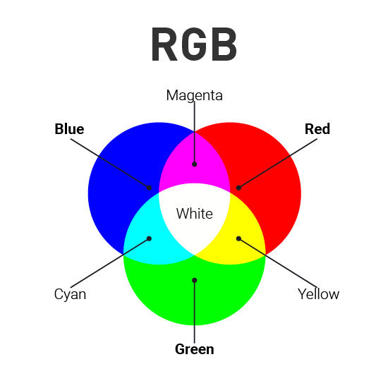
RGB refers to “Red, Green, Blue” and this color model is used for digital formats and it works by mixing these 3 colors to obtain different tones. RGB Color model is an additive model. When these three colors have 100% value we obtain white light, and when each color is 0% no light is generated and you obtain black.
Advertisment
CMYK Role Model
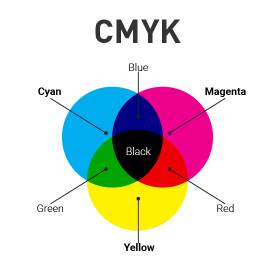
CMYK refers to “Cyan, Magenta, Yellow, Key” and this color model is used for Print purposes due to CMYK is a subtractive model, and that means that colors get darker as you blend them together.
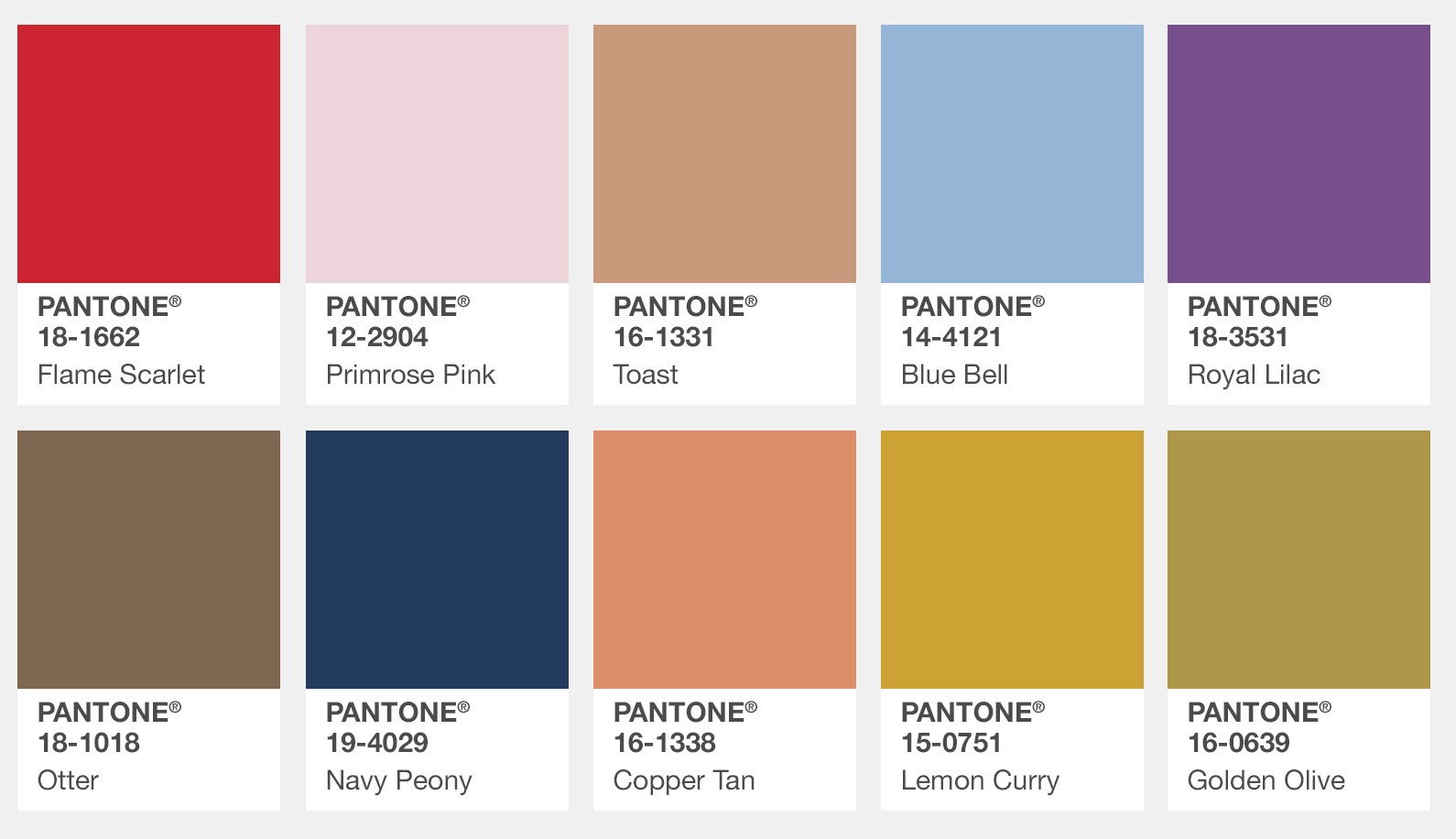
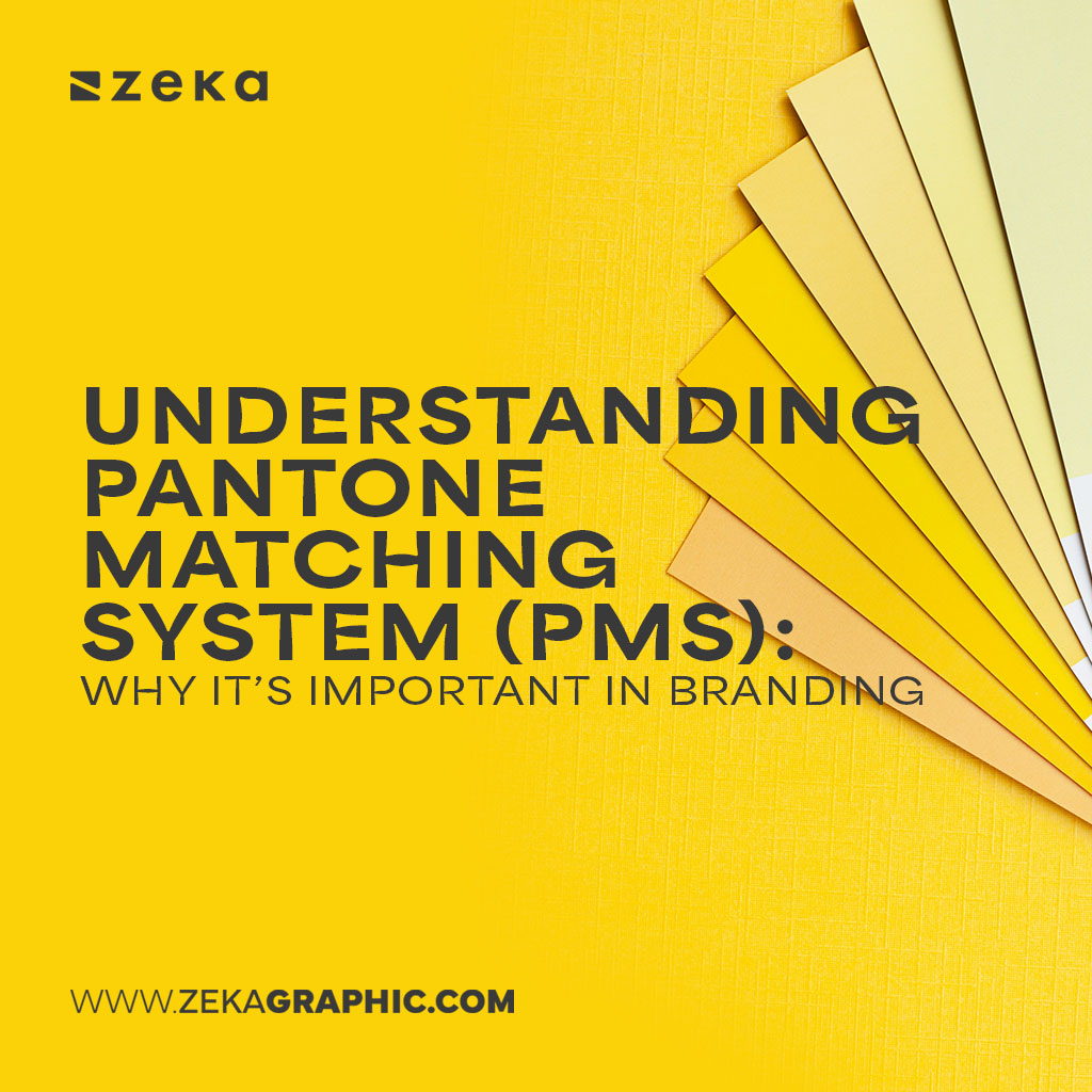
Pantone
Pantone Matching System is the system used to identify every color for printing purposes. Every color has different shades and all of them have a unique number to make it easier for people to identify the exact shade of color.
Advertisment
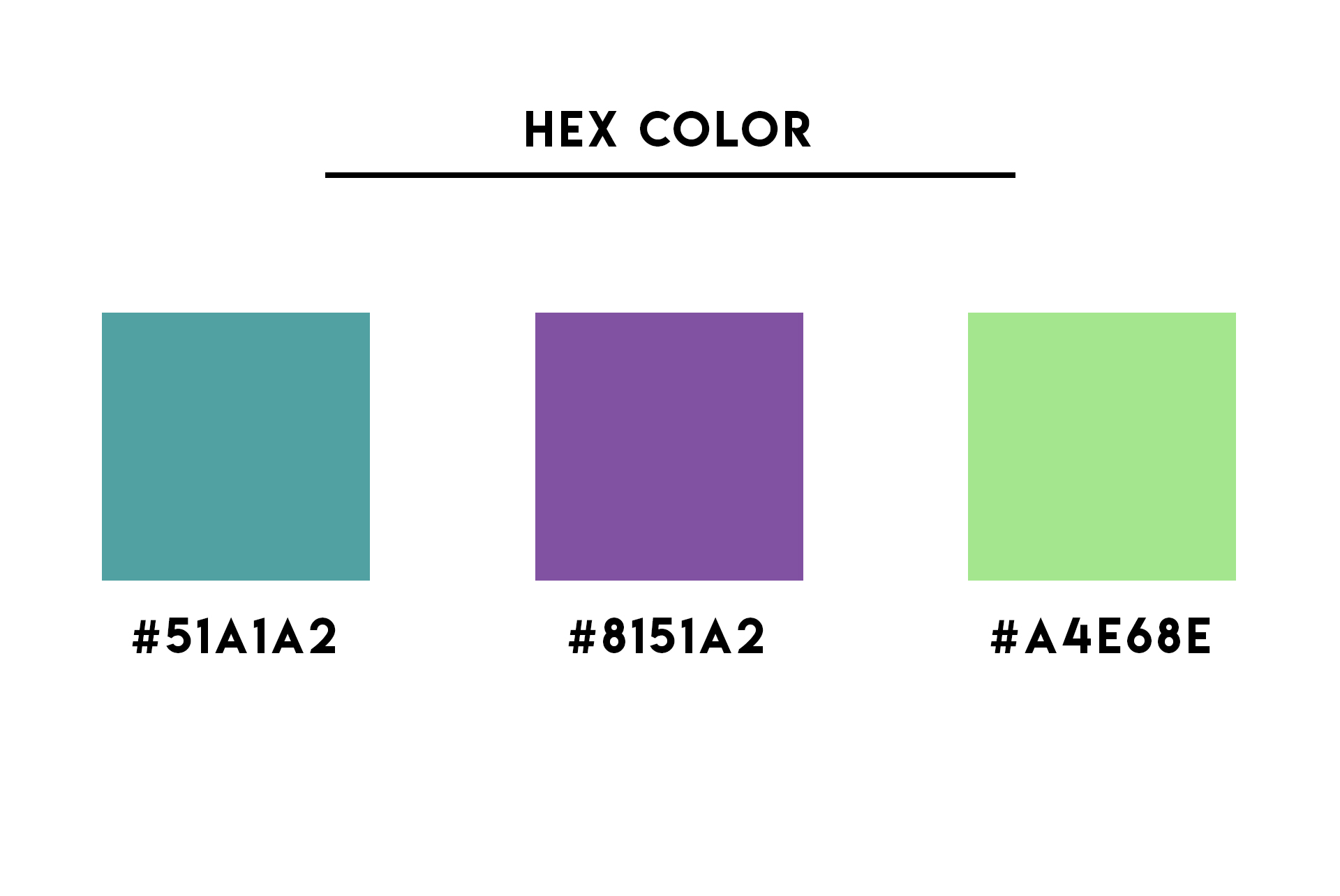
HEX
HEX colors are a six-digit combination of numbers and letters and this code is a translation from RGB combinations for digital uses as Web Design and make it simple.
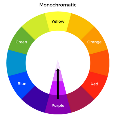
Monochrome
Monochrome is a simple color scheme built by only one color including lighter and darker tones from the selected color.
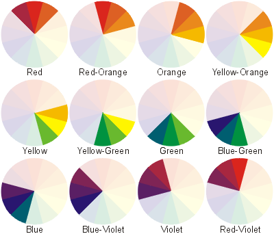
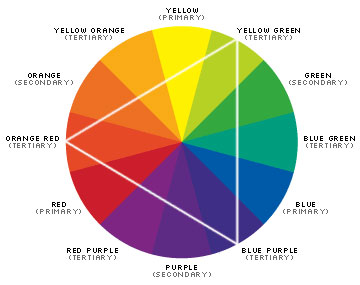
Analogous is a color scheme where we combine three colors that are next to each other on the color wheel.
Complementary
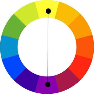
The complementary Color scheme is one of the most used because is the combination of two colors that sit opposite each other on the color wheel and its used to create more contrast in the design.
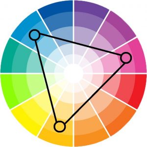
Triadic Color Scheme
The triadic color scheme is built by three colors that have the same amount of space between them in the color wheel.
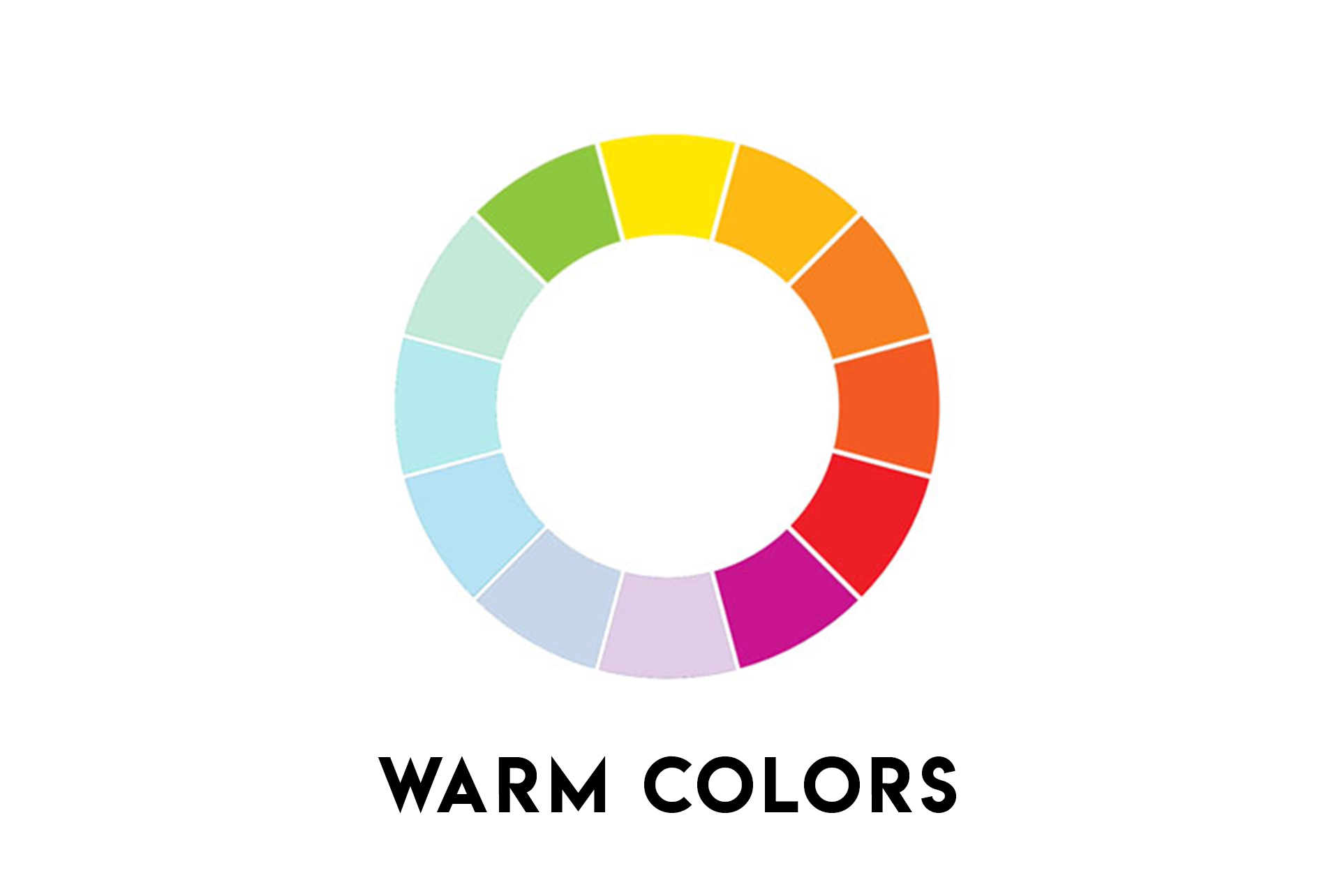
Warm Colors
This is very simple, warm colors define a selection of colors that make you feel heat or warm by seeing them, these colors are usually defined by been more friendly, cozy, and cheerful. Some of these colors are reds, yellows, or oranges for example.
Advertisment
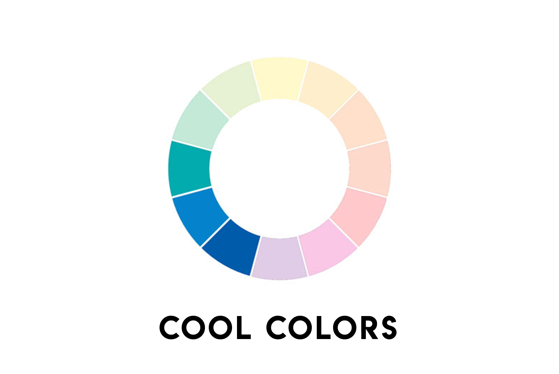
Cool Colors
Cool Colors are completely the opposite of warm colors, cool colors define a selection of colors that make you feel cold temperatures, and these colors make you feel calm or soothing. Some of these colors are blues, greens or violets.
Color Theory
Color Theory is a term used for the psychological study of colors, color theory studies how colors make people feel by seeing them and what thoughts come to your mind by seeing them, for example, blue is related to trust or red with passion. In this blog post, I talk everything about what is Color Theory.
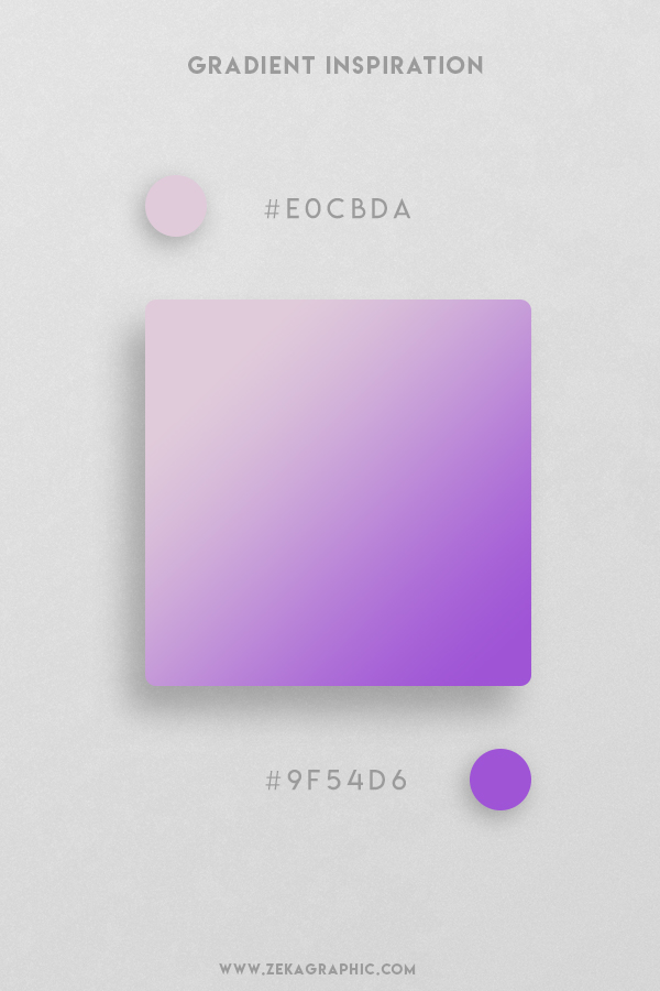
A gradient is a gradual change from one color to another, the most common gradients are linear gradient where each color sits on opposite sides and radial gradient where one color place in the middle and the other one in the edge.
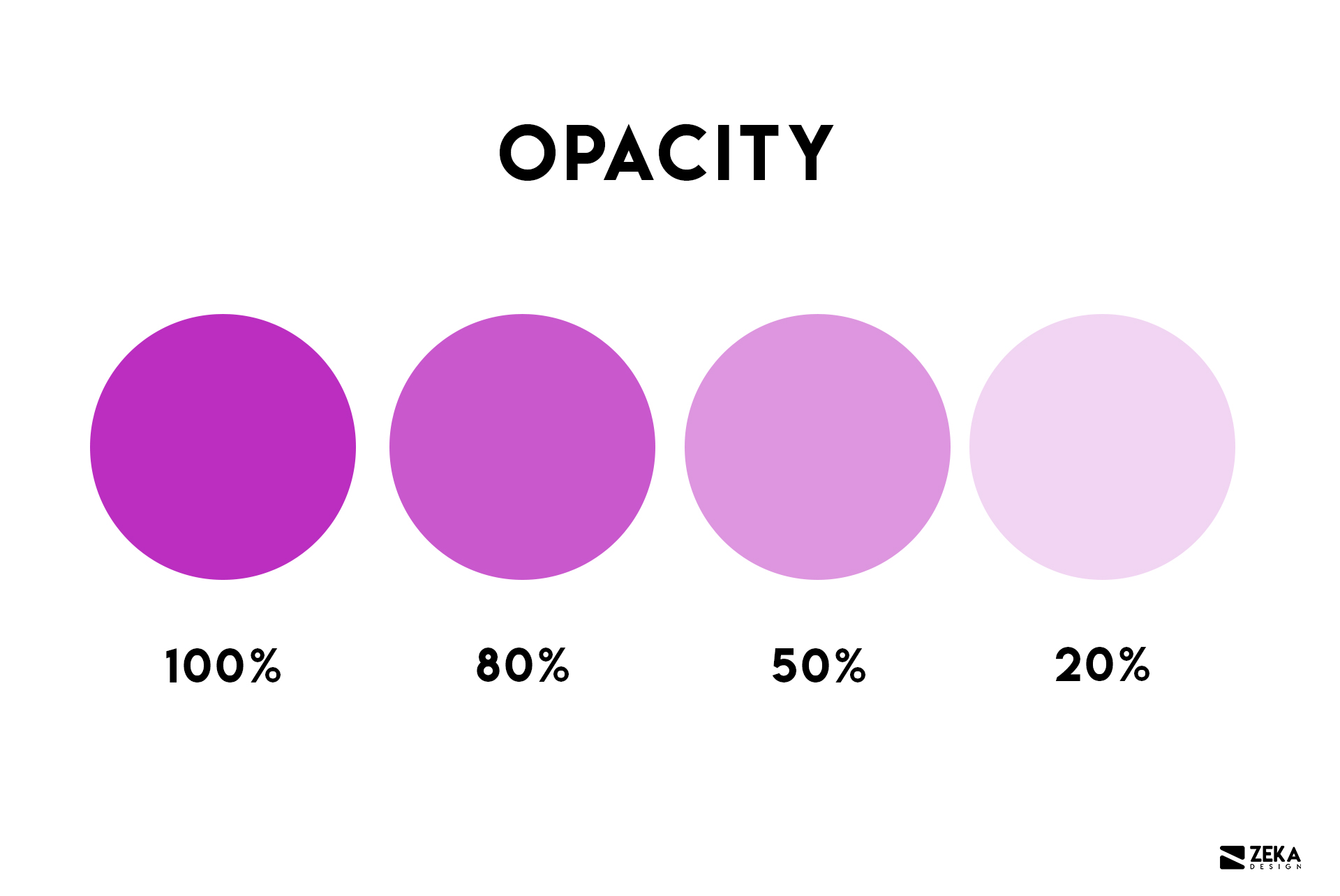
Opacity is the amount of transparency an element has, when the opacity is lower, the object is more transparent.
Hue
Hue is the dominant color family of the specific color also known as pure color, take note that White, black, and grey are never referred to as a hue.
Tint
A tint is a mixture of a color with white to create a different version from the pure color.
Advertisment
Conclusion
Hope you find this post useful and learn how to use correctly this graphic design terms, and if you want to learn more about color in graphic design I recommend you read these other articles.