In graphic design, there is a big glossary of terms and sometimes some of these words can be confused by amateur graphic designers or experienced designers due to the similarity of meaning of different design terms, this factor makes that some terms become interchangeable and used wrongly.
Let’s see in this post the 15 graphic design terms most graphic designers get wrong and what are they correct meaning and use.
Advertisment
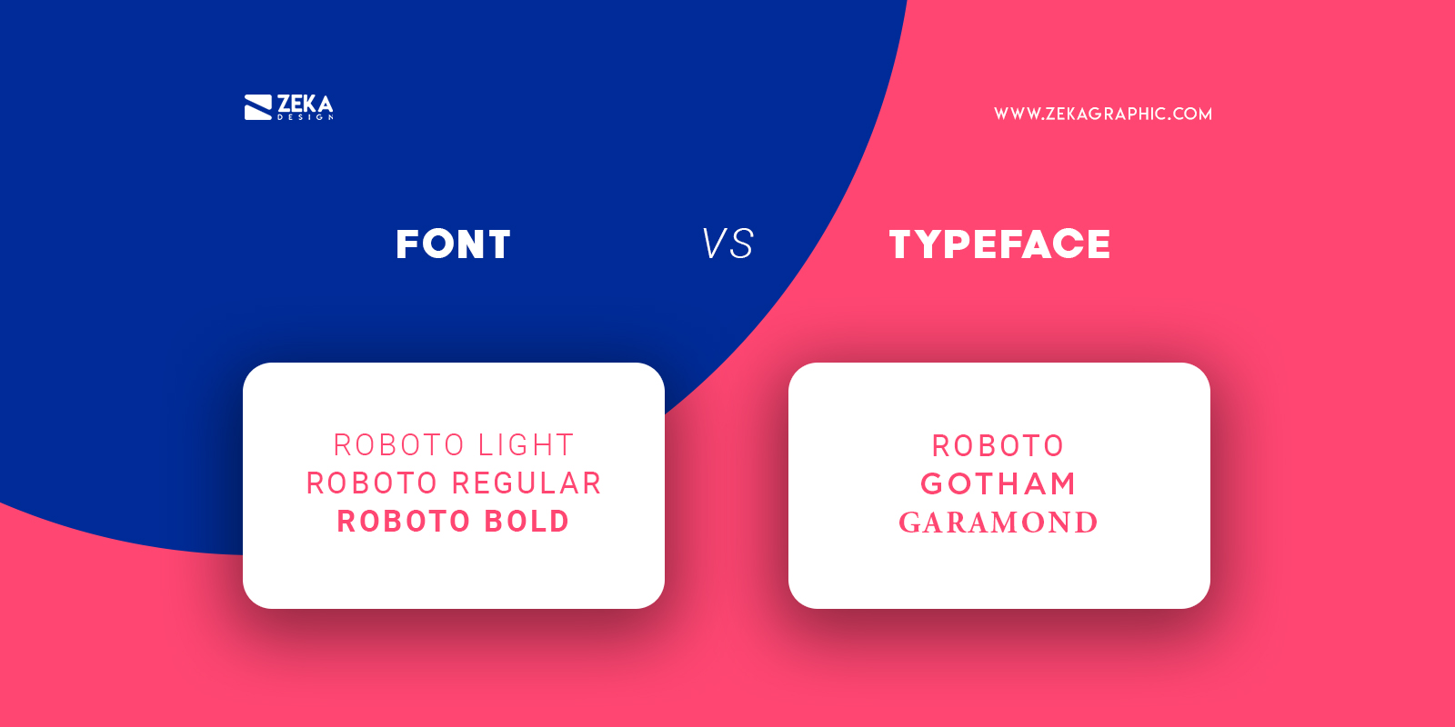
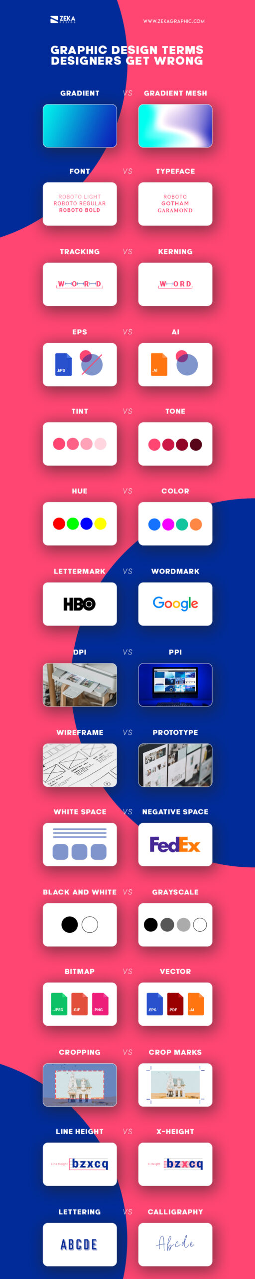
Font refers to a variety of weight or styles from a typeface, it can be Bold, Italic, Thin, etc, and font is used to refer to a particular style very specific from a typeface family, for example, Helvetica Bold or Helvetica Thin.
On another hand, typeface refers to a family or group of different fonts with a particular shape of letters, for example, Helvetica Bold and Helvetica Thin fonts will be part of Helvetica Typeface.
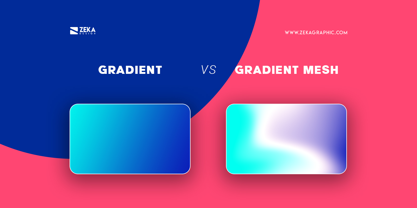
Lately, we have heard a lot of times about gradients and it’s not a surprise as it is a great graphic design trend and is very popular among designers, but sometimes designers could confound gradient between gradient mesh.
Gradient refers to a smooth transition from one color to another across a surface, this function is made gradual.
On the other hand, gradient mesh refers to a tool that creates a mesh on a shape making it able to add color and edit the points helping you create a 3D effect using colors.
Advertisment
Some graphic designers can confuse these two design terms as they can have some similarities.
Tracking consists of the space between all the letters in a word, being this amount of space the same between all the letters in the word.
Kerning on the other hand is a technique used by graphic designers to adjust the space between two single letters from a word, being the rest of the space between the other letters unaltered.
Advertisment
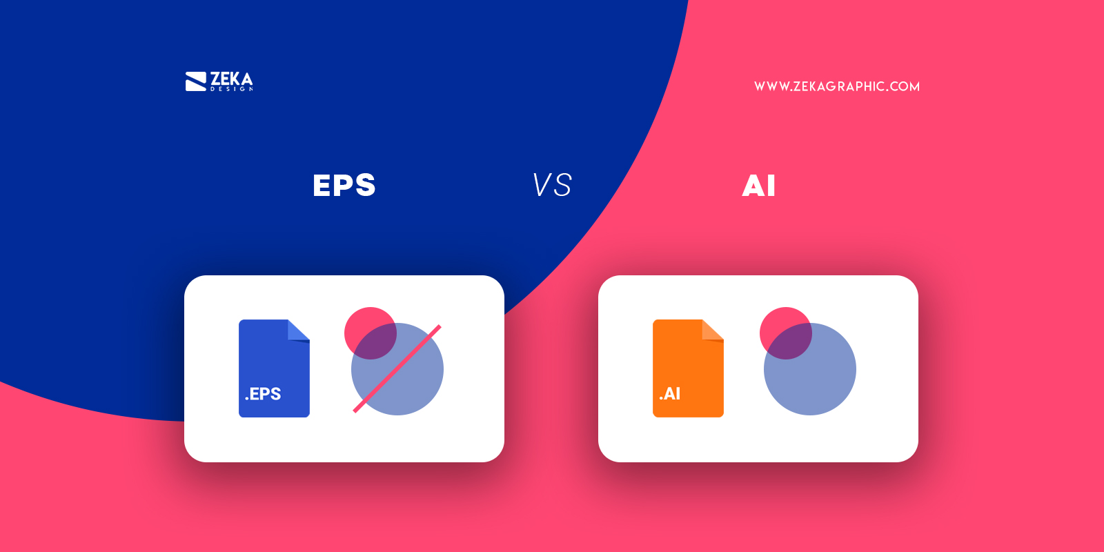
Both files are used to save vector images, but they have some differences being the EPS (Encapsulated PostScript) files able to save vector graphics but they don’t support transparency.
AI files are the file format used by Adobe Illustrator and they are completely editable as it saves your Illustrator Artwork.
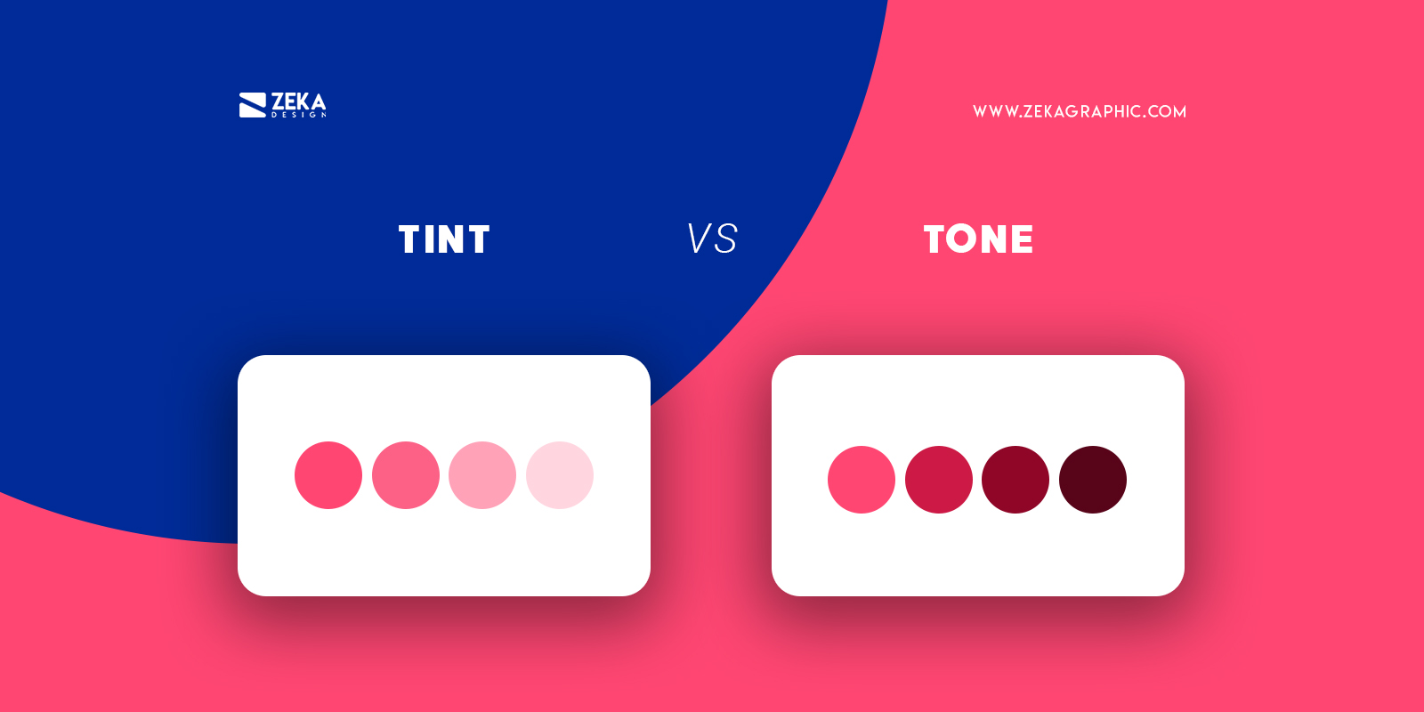
When we are talking about color design terms they are always some confusions and some designers use these terms wrong.
A tint is produced by adding white or light to a pure color increasing the lightness of it creating softer versions from the original color.
Tone consists on modify the primary color by adding to it gray, this process makes the original color look darker.
Advertisment
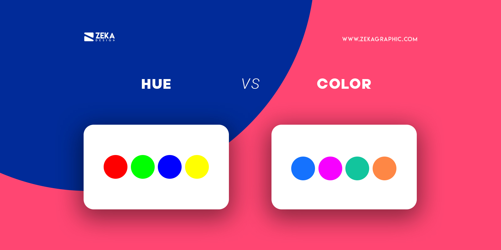
When we refer to a hue we are talking about the purest forms of color, this means the primary colors without adding shade or tints, the primary colors are red, orange, yellow, green, blue, and violet.
We use the color term to refer to all hues, shades, tints or tones in any of their values, that is why all the hues can be considered as color, but not all colors can be hues as they are only the primary colors.
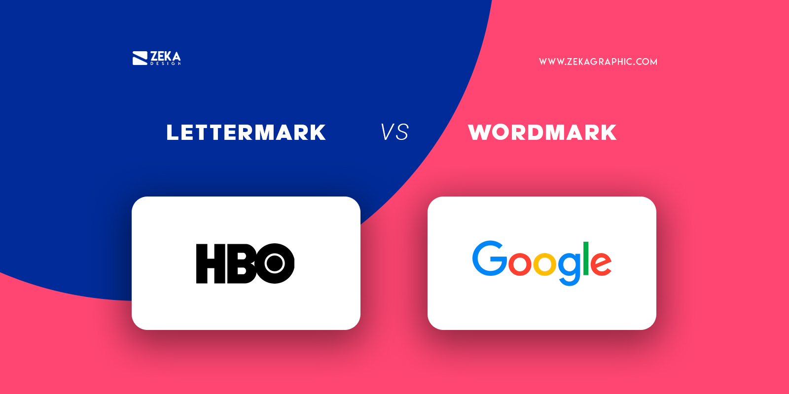
These two types of logo design share some similarities as they are both based on typography that is why some designers can confuse them, but let’s see the differences.
Lettermark as mentioned are logos based on typography but they only show letters such as abbreviations or letters.
Wordmarks by the other hand are logos based on typography but they show the name of the company or a word.
Advertisment
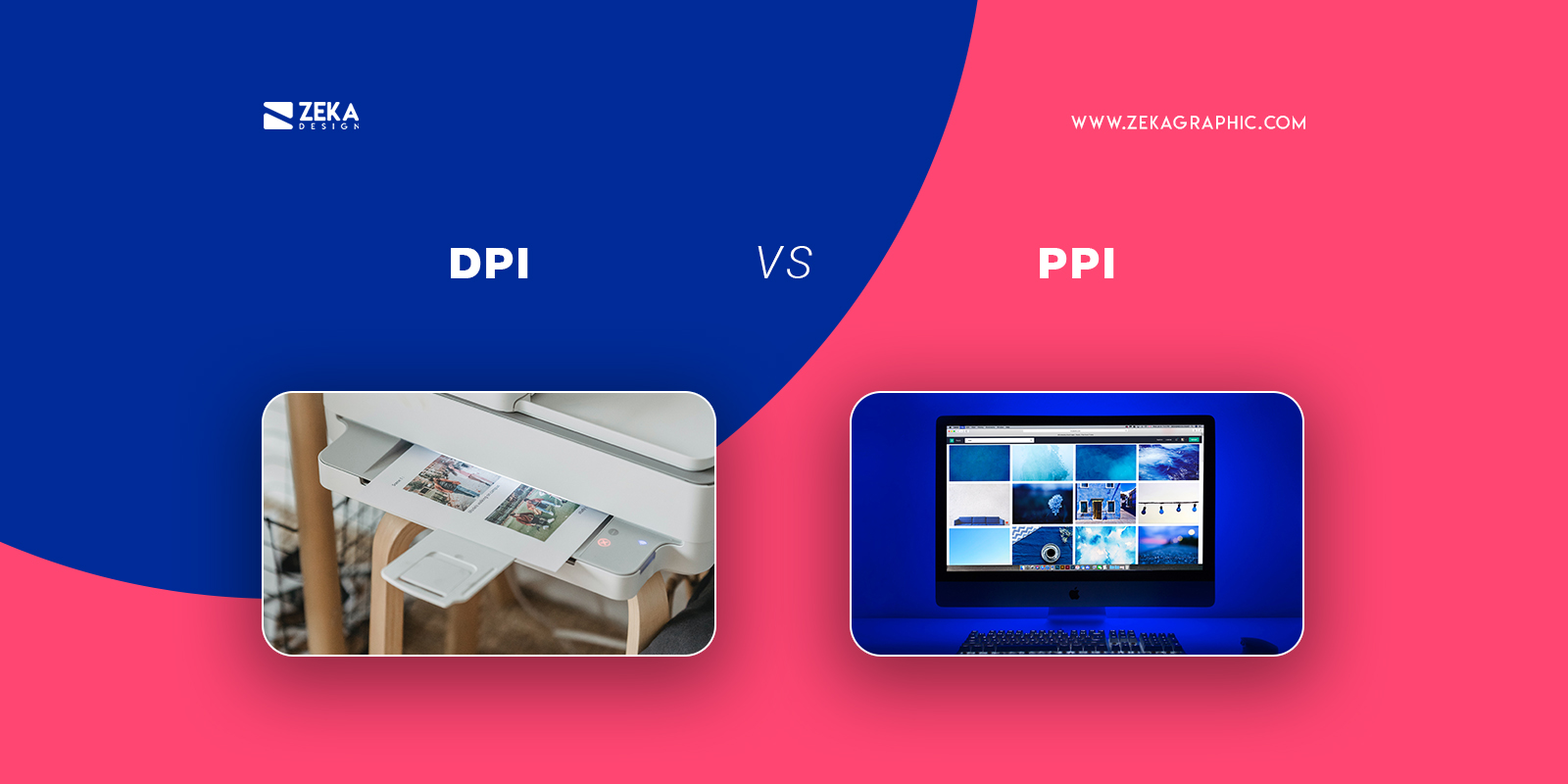
DPI and PPI are two design terms that control the quality of an image, making it easy for some designers to get confused sometimes, but these terms have their differences.
DPI refers to the number of dots per inch on a printed design or image when the image has more DPI this means that the quality of it is higher.
PPI or pixel per inch refers to the pixel density of an image in a digital environment, when there are more pixels in an image the quality of it will be higher, and when it has a really small number of pixels the image will be seen as pixelated.
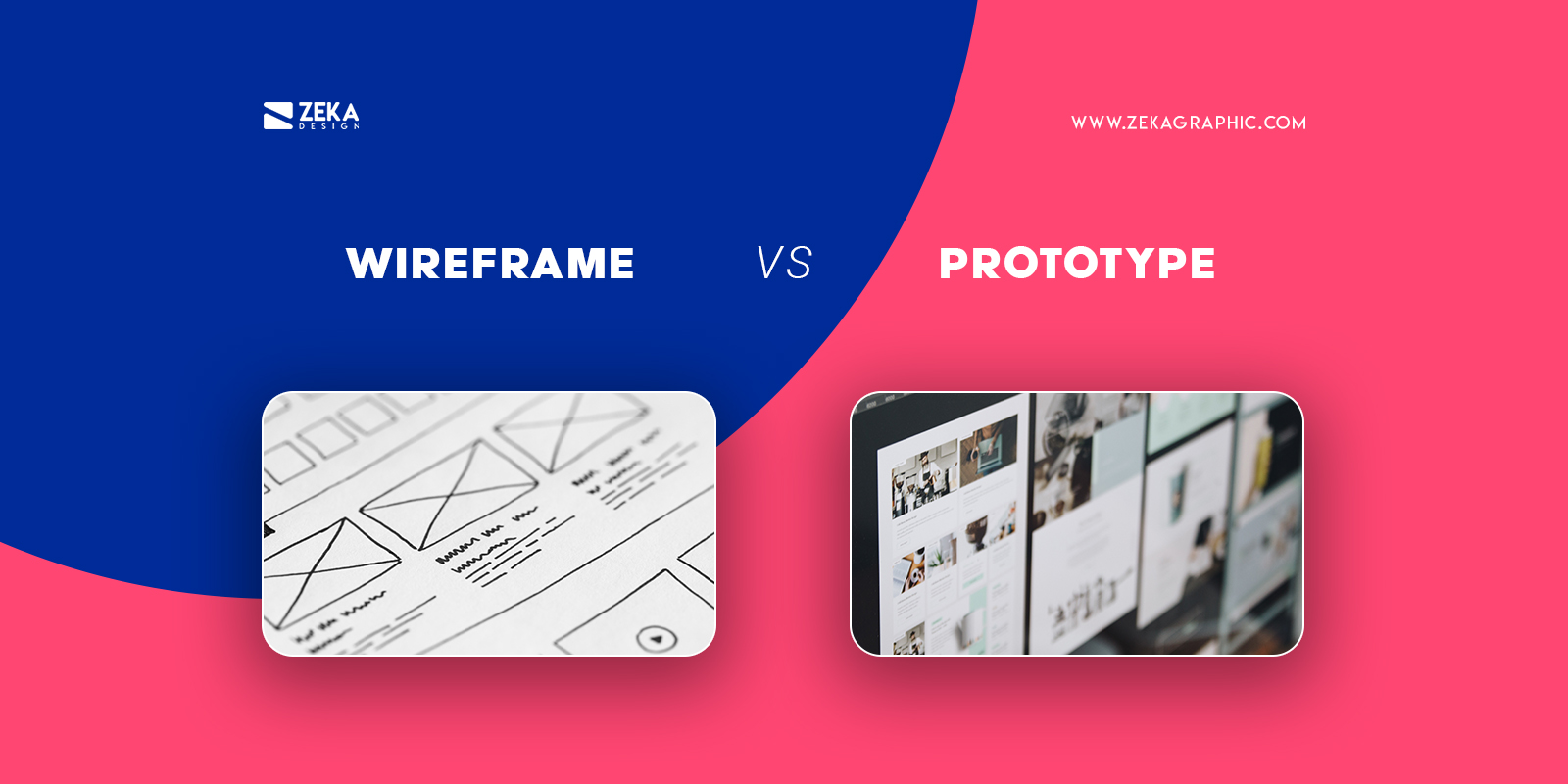
A wireframe is a blueprint or first sketch of what will be your design project, it’s the first idea that helps you structure all the elements in an initial phase.
Prototype refers to the first representation of your design idea, already incorporating the elements you want in your design and you will see how the design will look to improve it.
Advertisment
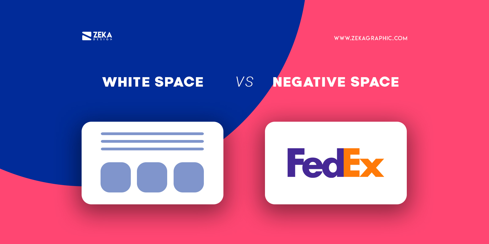
White space and negative space are design terms that some designers can get confused with because both refer to adding space to give more importance to your design, but let’s see what is the difference.
White space is usually referred to space between different elements in your design layout printed or digital, by adding more white space to your design will create more room for your elements to breathe and it helps you to add focus on some elements.
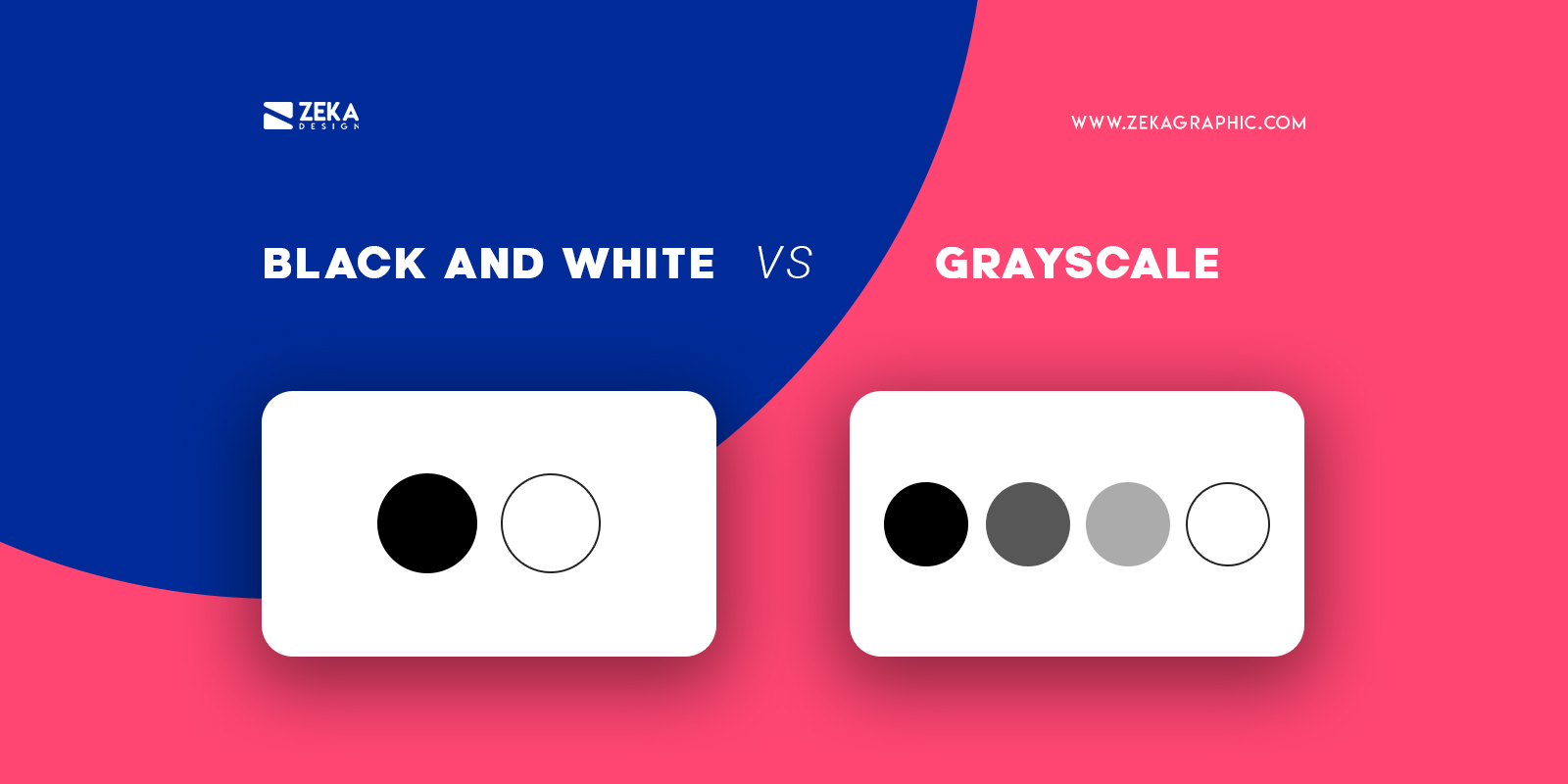
Black and white images in graphic design refer to design only using the purest forms of white and black.
Grayscale by the other hand lets you use a wider range of tints and shades between white and black.
Advertisment
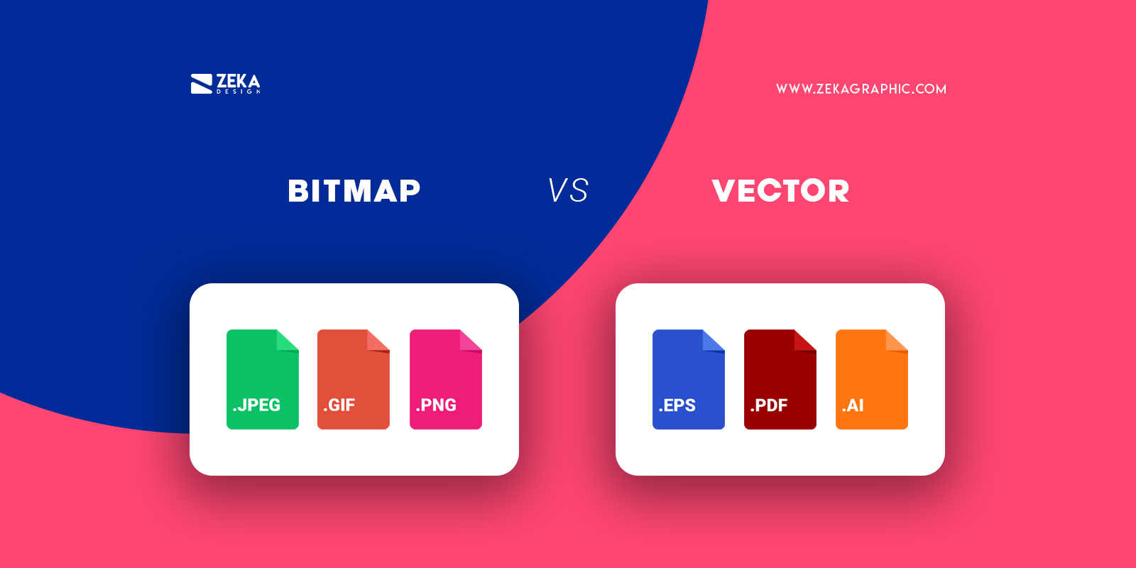
Bitmap images are also known as raster images, these type of images are made by a pixel grid, this means that you can’t resize those images without losing quality.
On another hand, there are Vector images, formed by mathematical formulas giving them the ability to resize them without losing quality, also these types of images are editable.
Advertisment
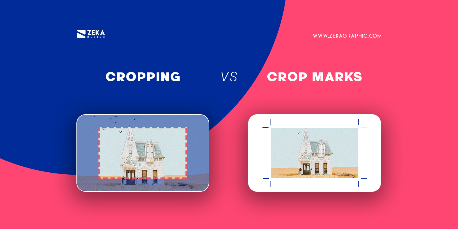
Cropping in graphic design consists of removing some parts of the design or image that are not required by using digital software to give more emphasis on specific parts of the image.
On the other hand, crop marks are used by designers to help printers cutting and framing your artwork or canvas by adding lines on the corners of it.
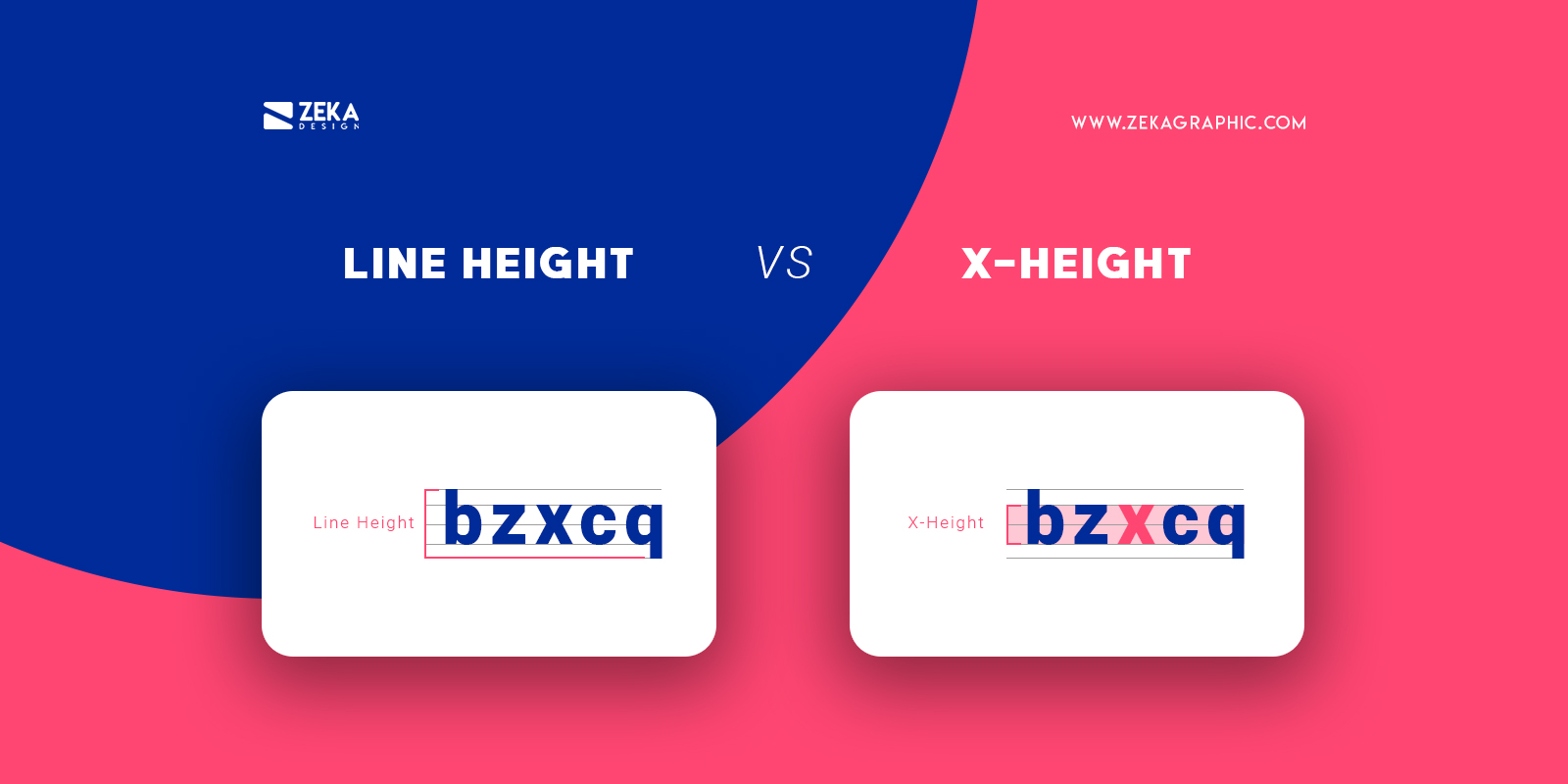
Line height in typography and graphic design refers to the height of any line of text from your design.
X-Height by the other hand refers to the average height of lowercase letters in any font, and is usually exemplified by the letter “x”.
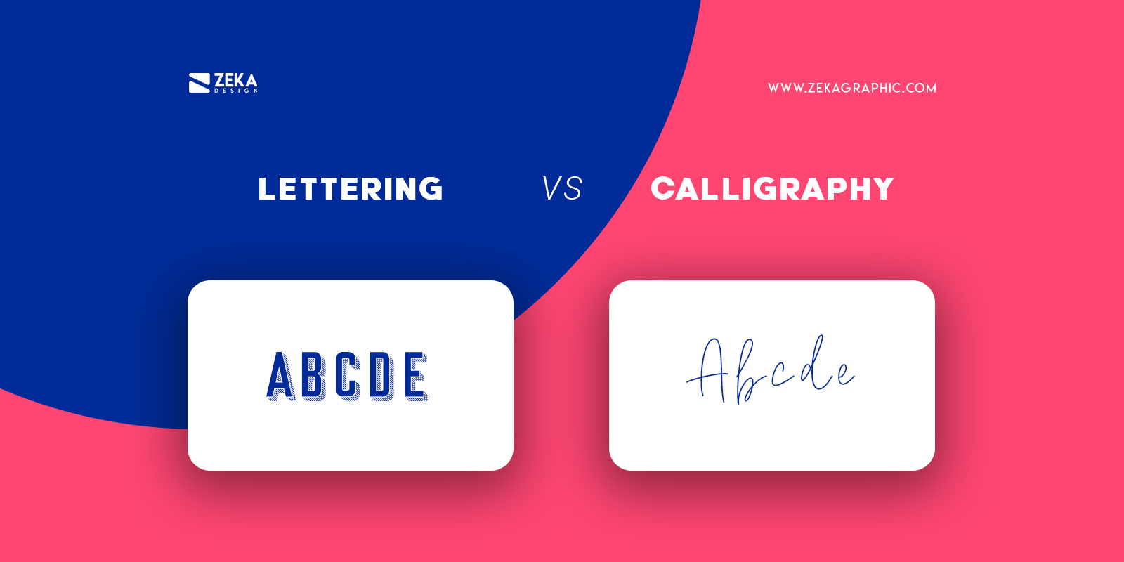
Sometimes designers can get confused by these two terms as they are both visual art forms related to letters, the main difference is about the method.
Lettering is more focused on drawing and illustration of letterforms where we draw the individual letterforms by hand.
On the other hand calligraphy is a visual art focused on writing beautifully, on calligraphy the main emphasis is the writing process.
Advertisment
Hope you find this post useful and don’t get confused by these design terms anymore by knowing the exact meaning and how to use them properly, if you want to know more about graphic design terms you can read these other posts.
If you found this post useful you might like to read these post about Graphic Design Inspiration.
Advertisment
Written by
If you like this post share it on your social media!
Advertisment

Advertisment