Color is one of the most effective tools in graphic design—it defines mood, guides perception, and shapes how a brand or interface is experienced. As a graphic designer, I’ve learned that strong palettes aren’t created by chance; they are built on Color Theory and an understanding of Color Psychology, ensuring that every hue supports the message, mood, and function of the design.
Planning palettes with the future in mind helps avoid redesigns, keeps brands consistent, and supports long-term visual clarity.
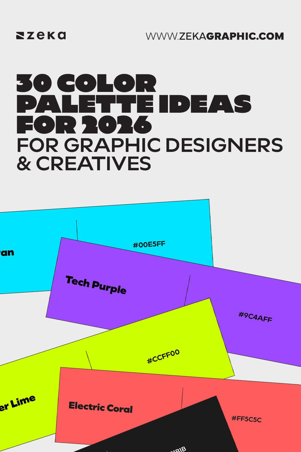
This collection of 30 color palette ideas for 2026 is designed as a visual reference and inspiration resource. The palettes reflect key directions in modern design: grounded earth tones, soft neutrals, expressive pastels, high-contrast neons, and digitally optimized colors.
Each palette is curated to be practical, flexible, and adaptable—easy to save, reuse, and apply to real projects without overthinking.
Advertisment
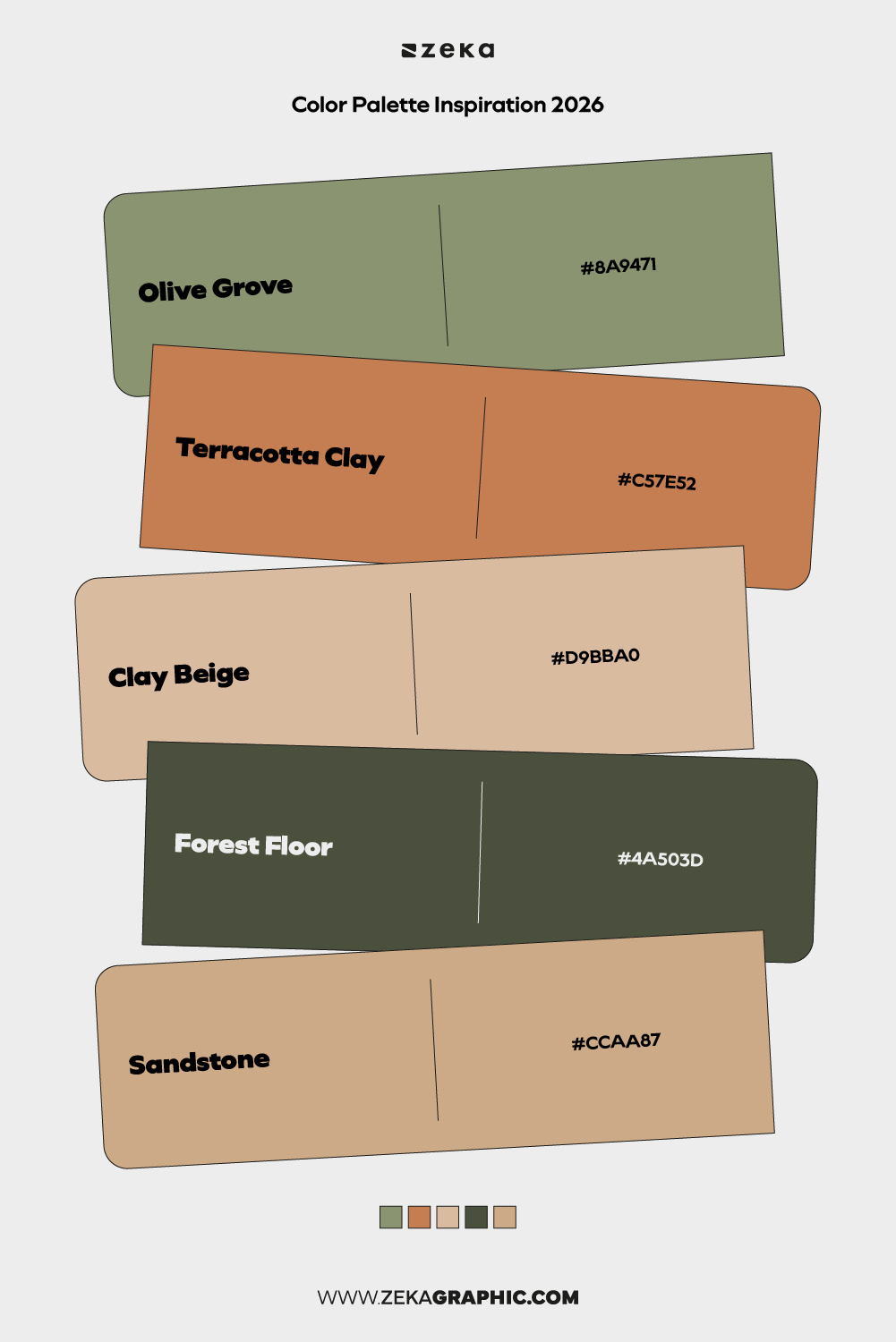
#8A9471 · #C57E52 · #D9BBA0 · #4A503D · #CCAA87
A grounded palette rooted in organic materials and natural textures. Soft greens and warm earth tones create a sense of stability and timelessness without feeling rustic or outdated.
Best for: sustainable branding, editorial layouts, wellness-focused projects
Mood: grounded, organic, calm
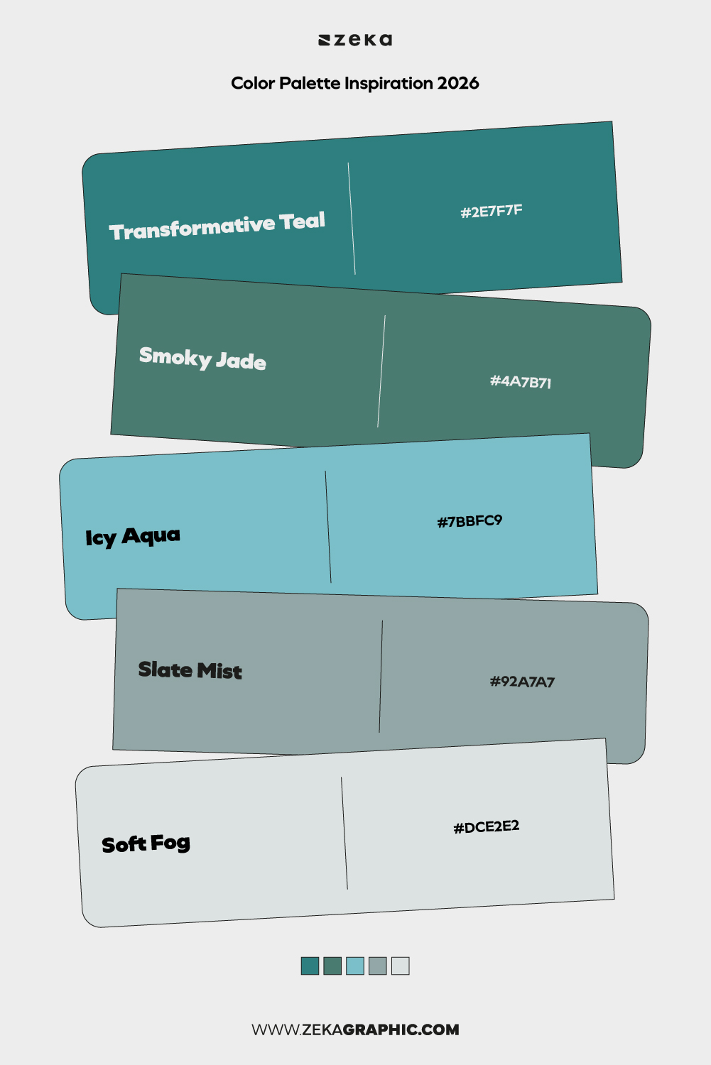
#2E7F7F · #4A7B71 · #7BBFC9 · #92A7A7 · #DCE2E2
Muted teal variations balanced with soft neutrals create a refined, contemporary feel. This palette feels modern but restrained, ideal for digital environments that need calm clarity.
Best for: UI design, SaaS branding, professional portfolios
Mood: composed, modern, clean
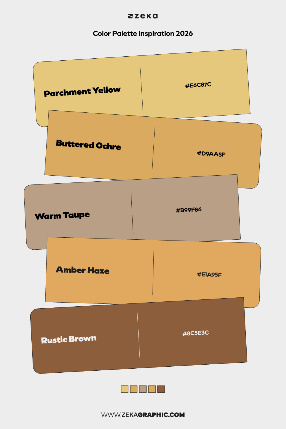
#E6C87C · #D9AA5F · #B99F86 · #E1A95F · #8C5E3C
A warm, reflective palette that leans into softness and subtle richness. These tones feel nostalgic yet polished, offering warmth without heaviness.
Best for: lifestyle brands, packaging, editorial design
Mood: comforting, thoughtful, warm
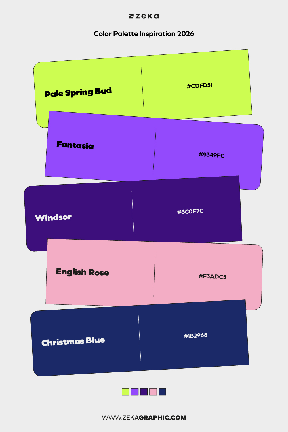
#CDFD51 · #9349FC · #3C0F7C · #F3ADC5 · #1B2968
High-energy neon hues paired with deep contrasts create a bold, experimental look. This palette embraces visual tension and digital expressiveness.
Best for: experimental branding, music visuals, youth-focused projects
Mood: energetic, disruptive, bold
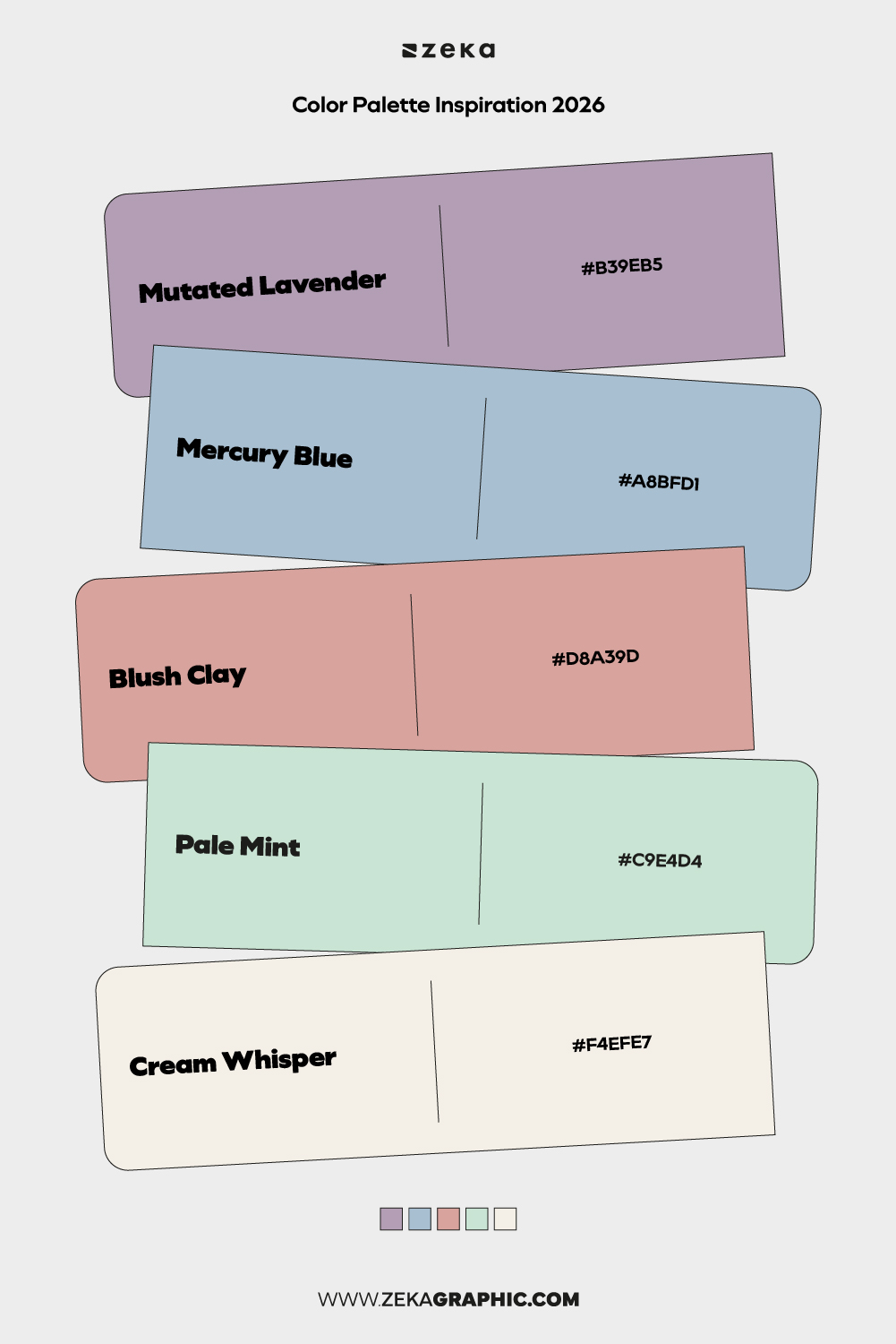
#B39EB5 · #A8BFD1 · #D8A39D · #C9E4D4 · #F4EFE7
A delicate mix of muted pastels that feels airy and approachable. These colors work together without overpowering the layout, ideal for subtle storytelling.
Best for: wellness brands, blogs, gentle UI themes
Mood: soft, calm, approachable
Advertisment
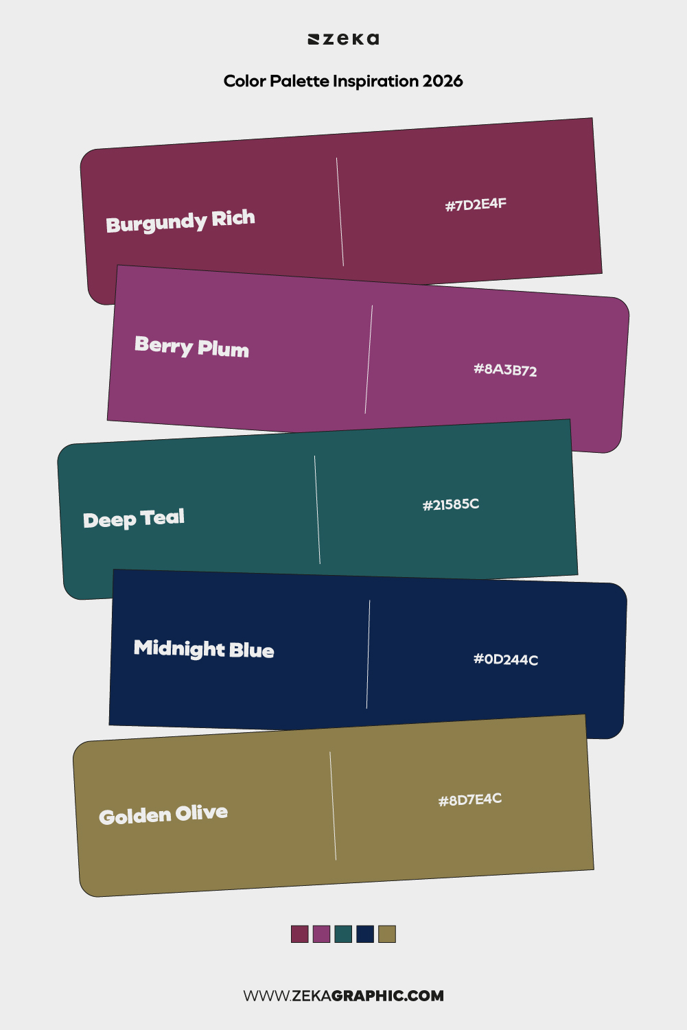
#7D2E4F · #8A3B72 · #21585C · #0D244C · #8D7E4C
Rich, saturated hues inspired by gemstones and vintage luxury. The depth of these colors creates a sense of elegance and drama.
Best for: premium branding, fashion, cultural institutions
Mood: luxurious, dramatic, refined
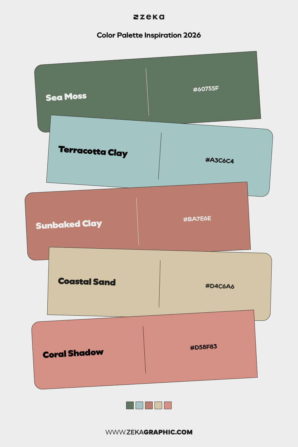
#60755F · #A3C6C4 · #BA7E6E · #D4C6A6 · #D58F83
A natural blend of coastal and earthy tones that feels balanced and human. This palette connects organic warmth with fresh openness.
Best for: hospitality, eco-conscious brands, travel design
Mood: relaxed, natural, harmonious
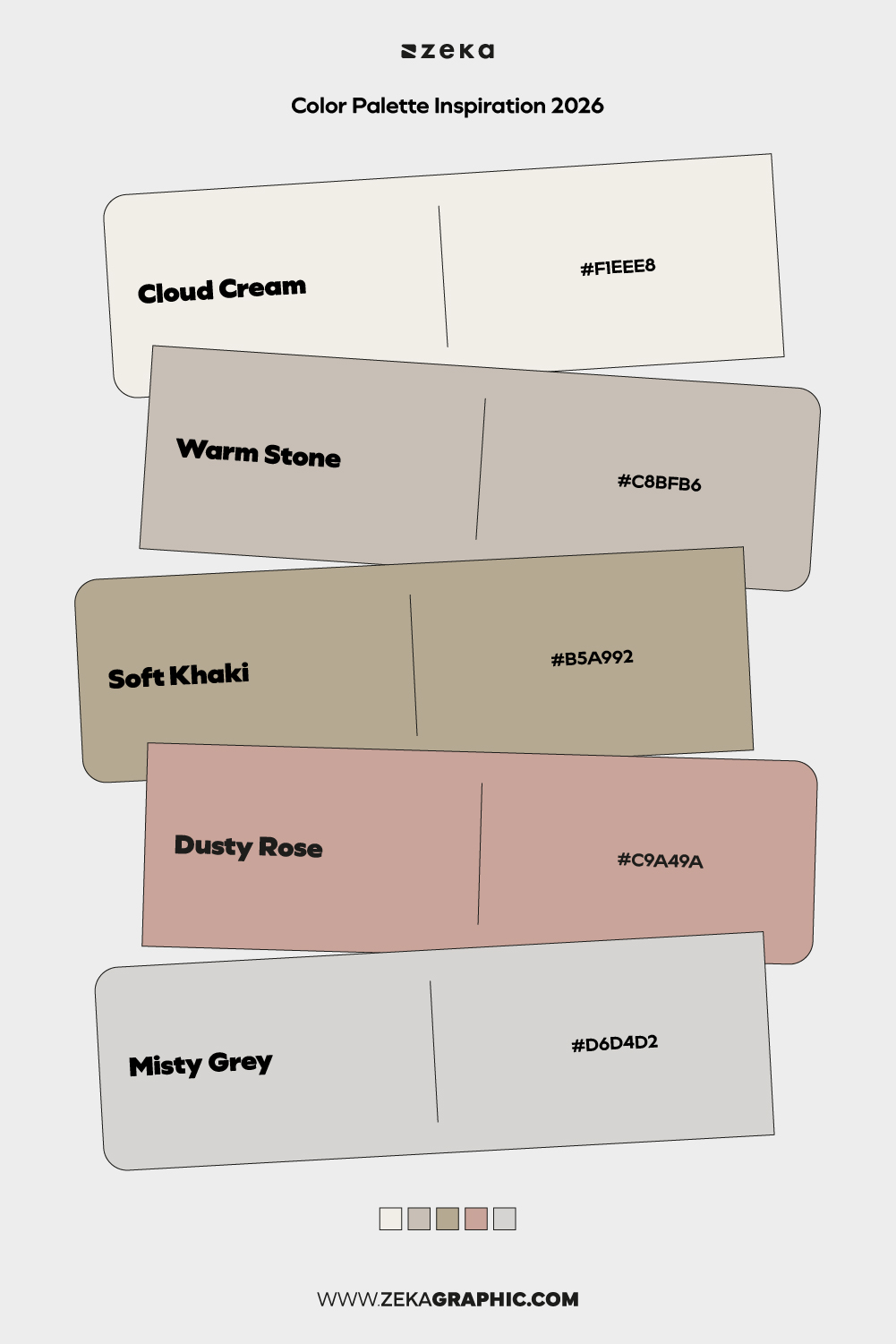
#F1EEE8 · #C8BFB6 · #B5A992 · #C9A49A · #D6D4D2
Soft neutrals with subtle warmth replace stark minimalism. These tones feel intentional and soothing rather than empty.
Best for: minimalist branding, editorial layouts, interiors
Mood: calm, elegant, understated
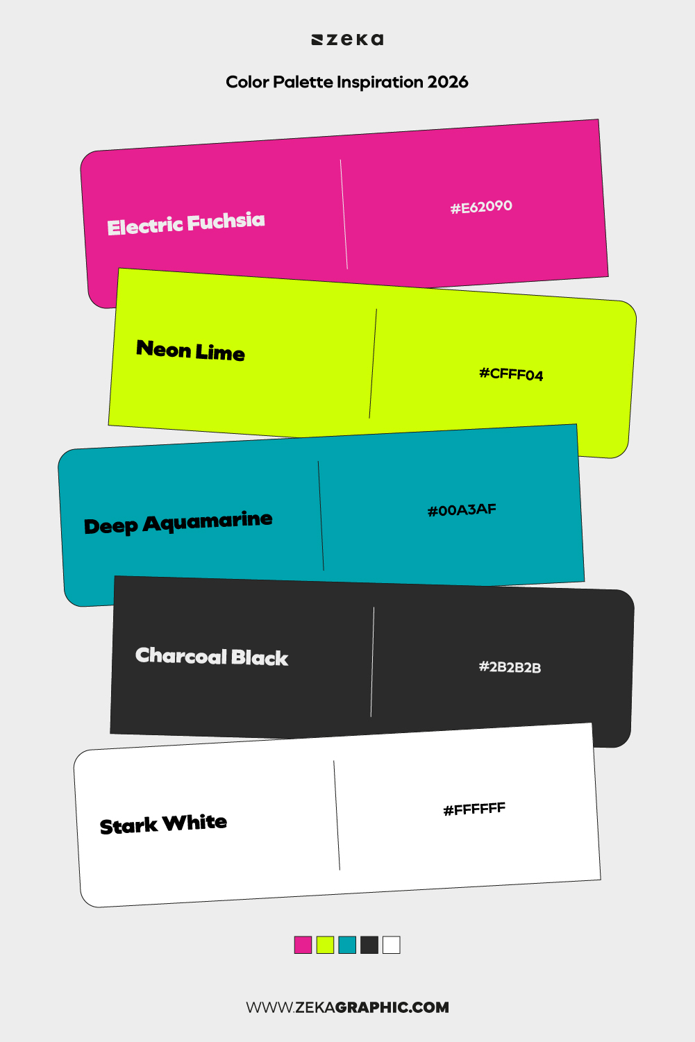
#E62090 · #CFFF04 · #00A3AF · #2B2B2B · #FFFFFF
A high-impact palette built on sharp contrast and visual tension. Bright accents pop against dark and neutral bases.
Best for: campaign design, posters, social media
Mood: expressive, confident, bold
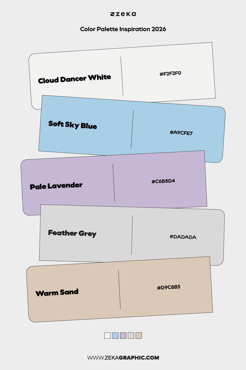
#F2F2F0 · #A9CFE7 · #C6B8D4 · #DADADA · #D9C8B5
Light, airy tones inspired by open skies and soft atmospheres. This palette feels breathable and contemporary.
Best for: editorial design, digital publications, calm interfaces
Mood: light, serene, open
Advertisment
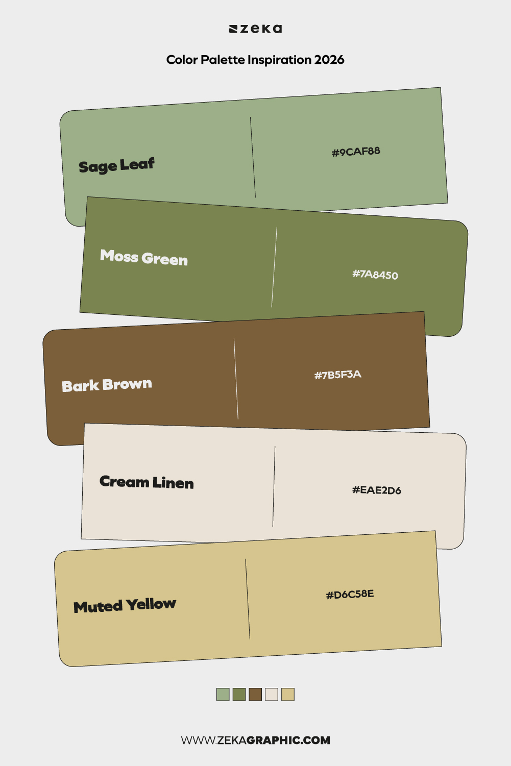
#9CAF88 · #7A8450 · #7B5F3A · #EAE2D6 · #D6C58E
Earthy greens and muted browns evoke a botanical, handcrafted feel. The palette feels rooted and authentic.
Best for: organic brands, packaging, craft-focused projects
Mood: natural, earthy, grounded
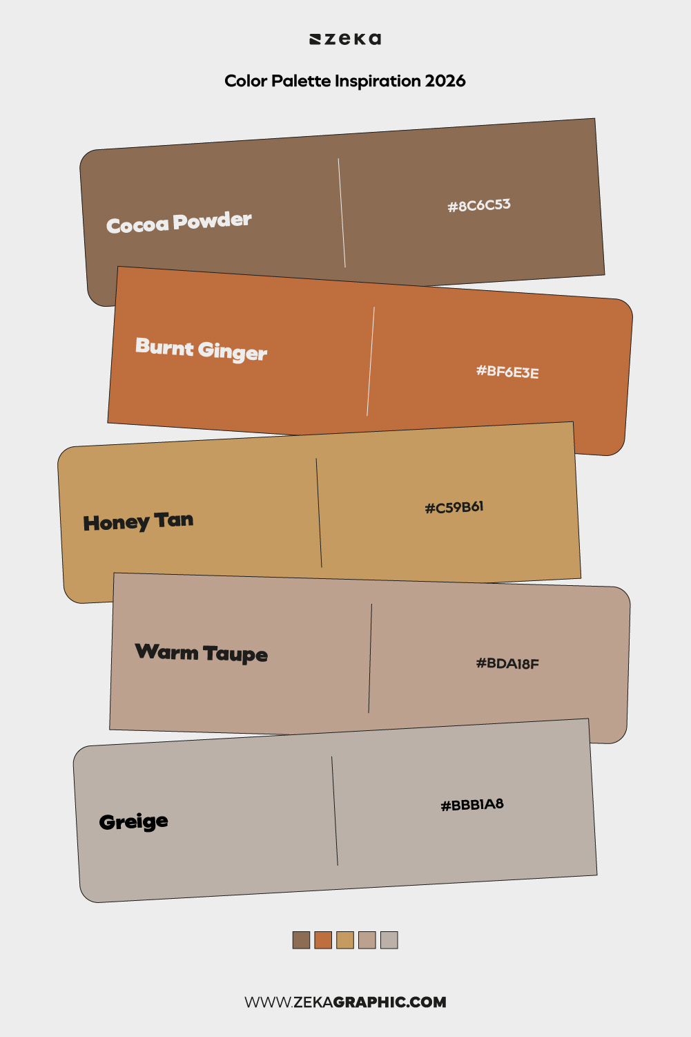
#8C6C53 · #BF6E3E · #C59B61 · #BDA18F · #BBB1A8
A warm, cozy blend of browns and neutrals that feels familiar and inviting. Perfect for designs that prioritize comfort.
Best for: lifestyle brands, interiors, editorial layouts
Mood: cozy, warm, inviting
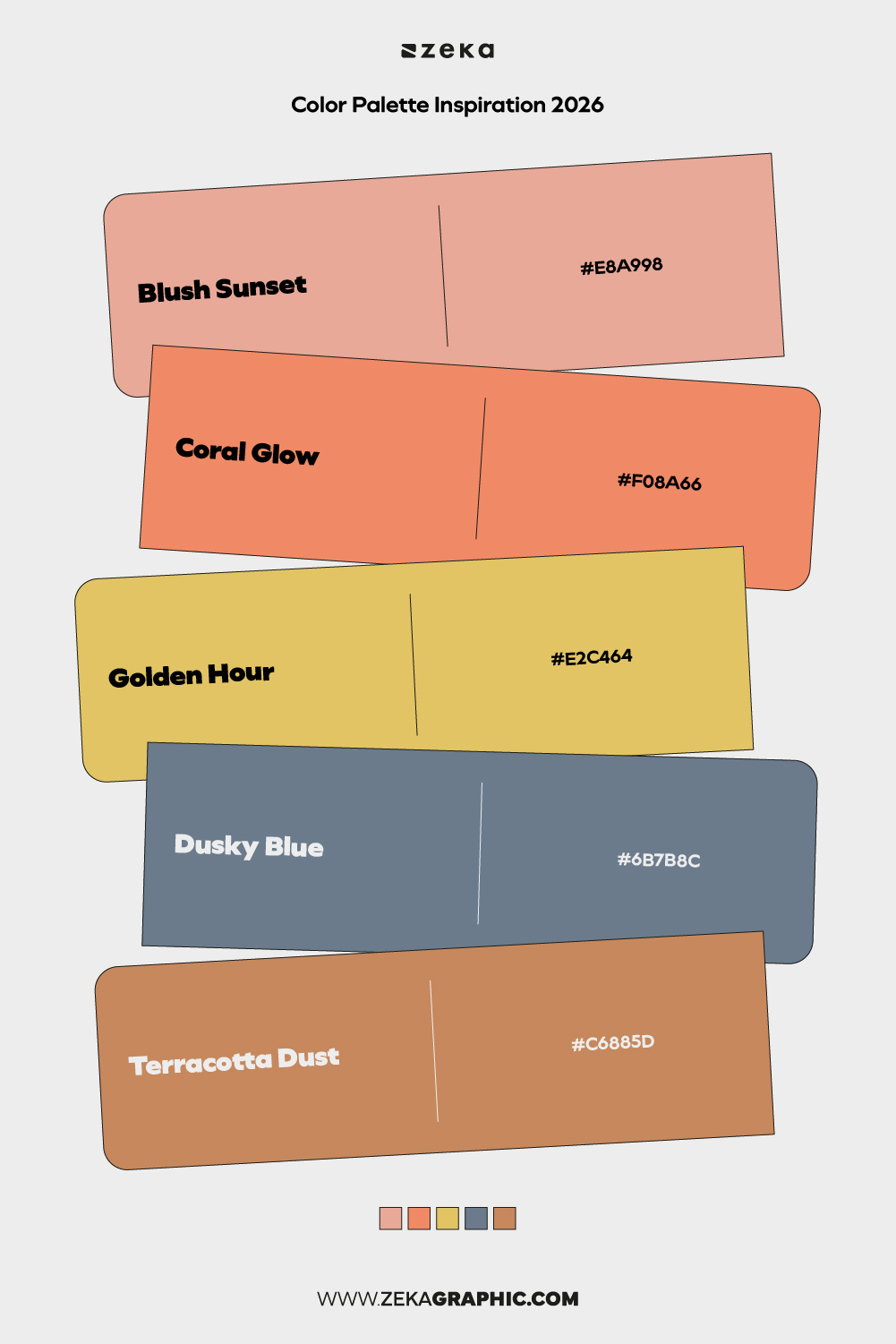
#E8A998 · #F08A66 · #E2C464 · #6B7B8C · #C6885D
Soft sunset tones combined with cooler accents create visual balance. This palette captures warmth without excess.
Best for: branding, photography portfolios, packaging
Mood: warm, optimistic, balanced
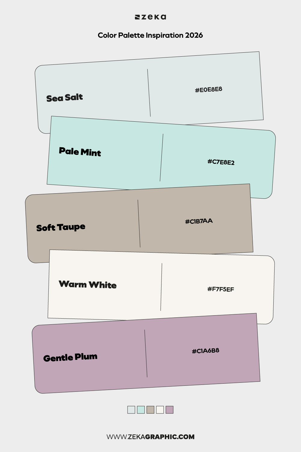
#E0E8E8 · #C7E8E2 · #C1B7AA · #F7F5EF · #C1A6B8
Muted, spa-like tones designed for calm and clarity. This palette feels clean, soft, and restorative.
Best for: wellness apps, healthcare branding, minimal UI
Mood: tranquil, clean, gentle
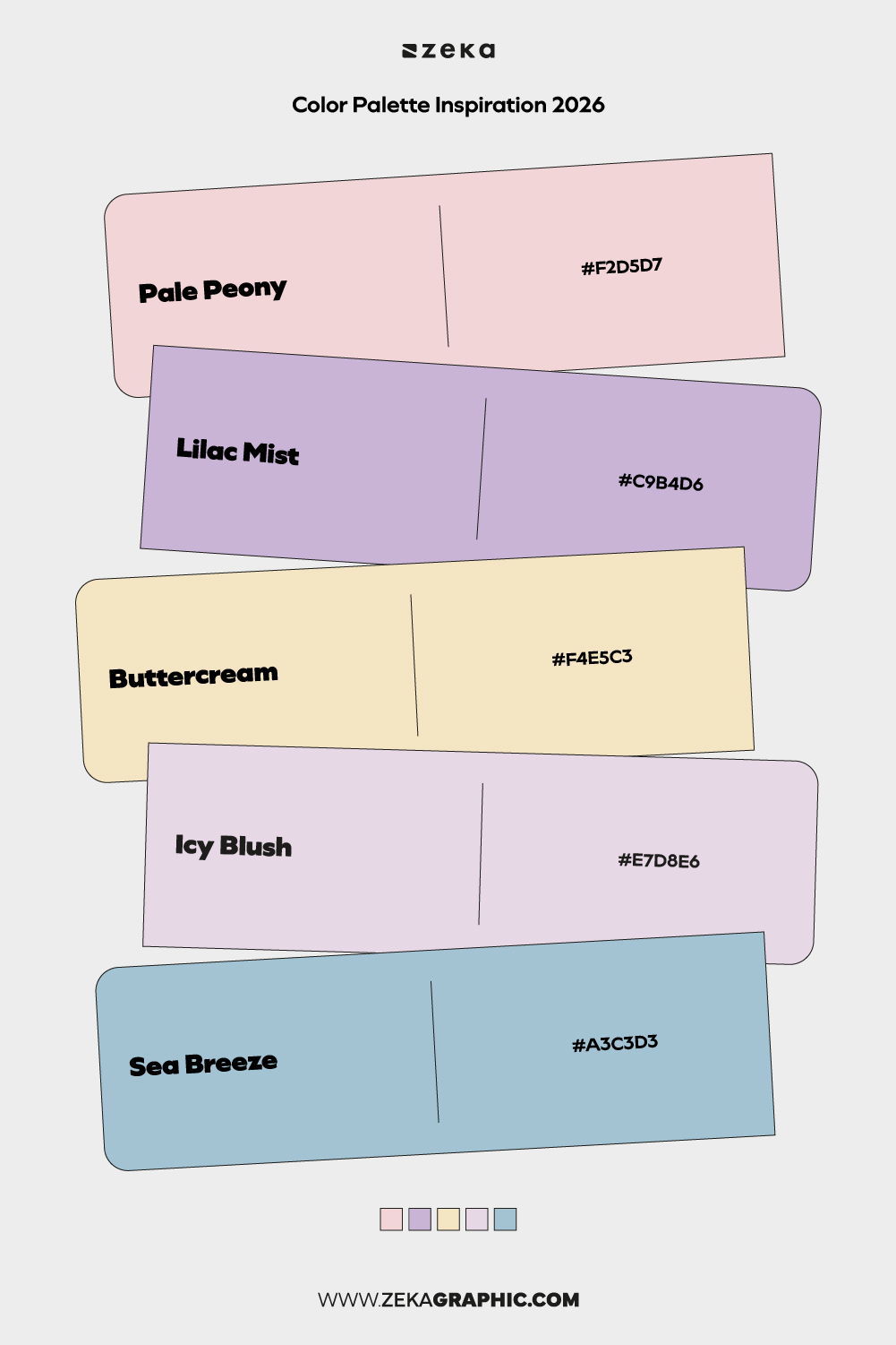
#F2D5D7 · #C9B4D6 · #F4E5C3 · #E7D8E6 · #A3C3D3
A playful yet refined pastel palette inspired by soft florals. Light but not childish, ideal for expressive softness.
Best for: creative studios, lifestyle brands, editorial design
Mood: gentle, creative, optimistic
Advertisment
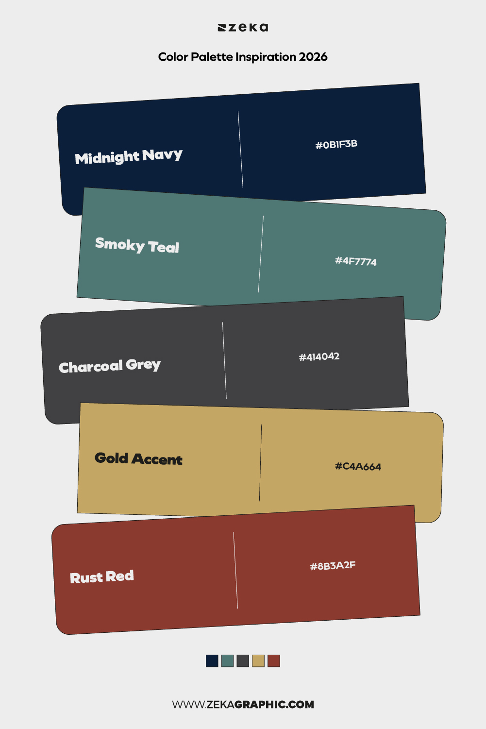
#0B1F3B · #4F7774 · #414042 · #C4A664 · #8B3A2F
Dark, moody tones balanced with warm highlights create a cinematic feel. This palette thrives in high-contrast layouts.
Best for: cultural projects, premium branding, editorial
Mood: dramatic, mysterious, cinematic
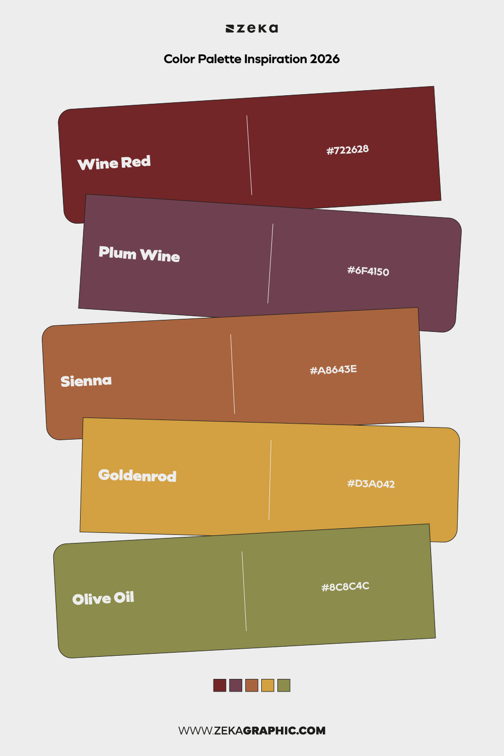
#722628 · #6F4150 · #A8643E · #D3A042 · #8C8C4C
Inspired by autumn harvests, this palette feels rich and grounded with a nostalgic undertone.
Best for: food branding, packaging, seasonal campaigns
Mood: earthy, rich, warm
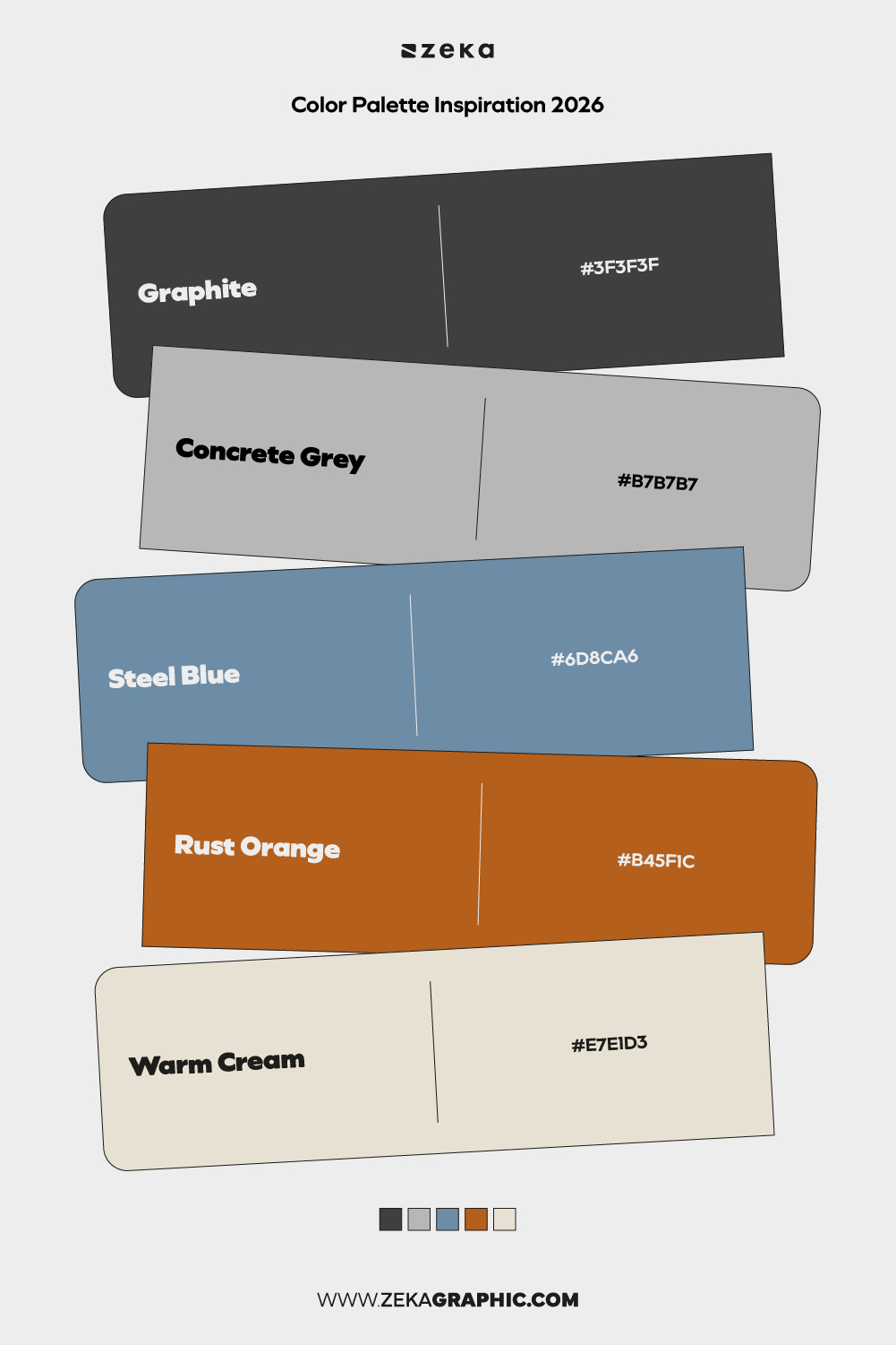
#3F3F3F · #B7B7B7 · #6D8CA6 · #B45F1C · #E7E1D3
Neutral greys paired with subtle industrial accents create a utilitarian yet modern look.
Best for: architecture, portfolios, product design
Mood: functional, modern, structured
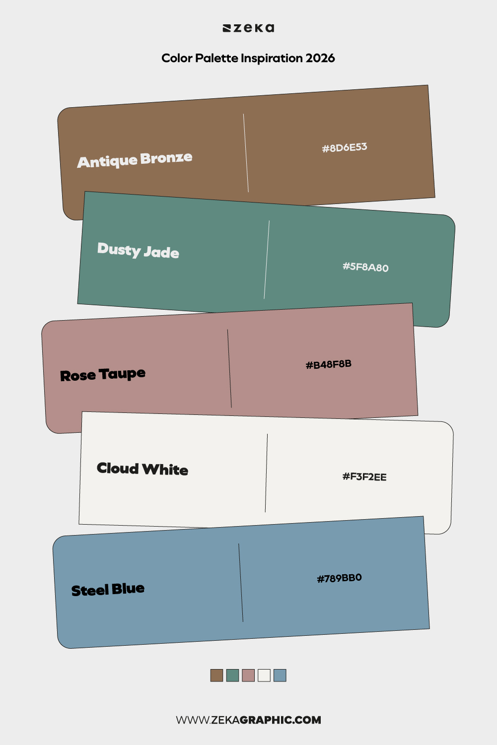
#8D6E53 · #5F8A80 · #B48F8B · #F3F2EE · #789BB0
A blend of nostalgic warmth and cool modern tones. This palette bridges tradition and innovation.
Best for: brand refreshes, editorial projects, identity systems
Mood: reflective, balanced, contemporary
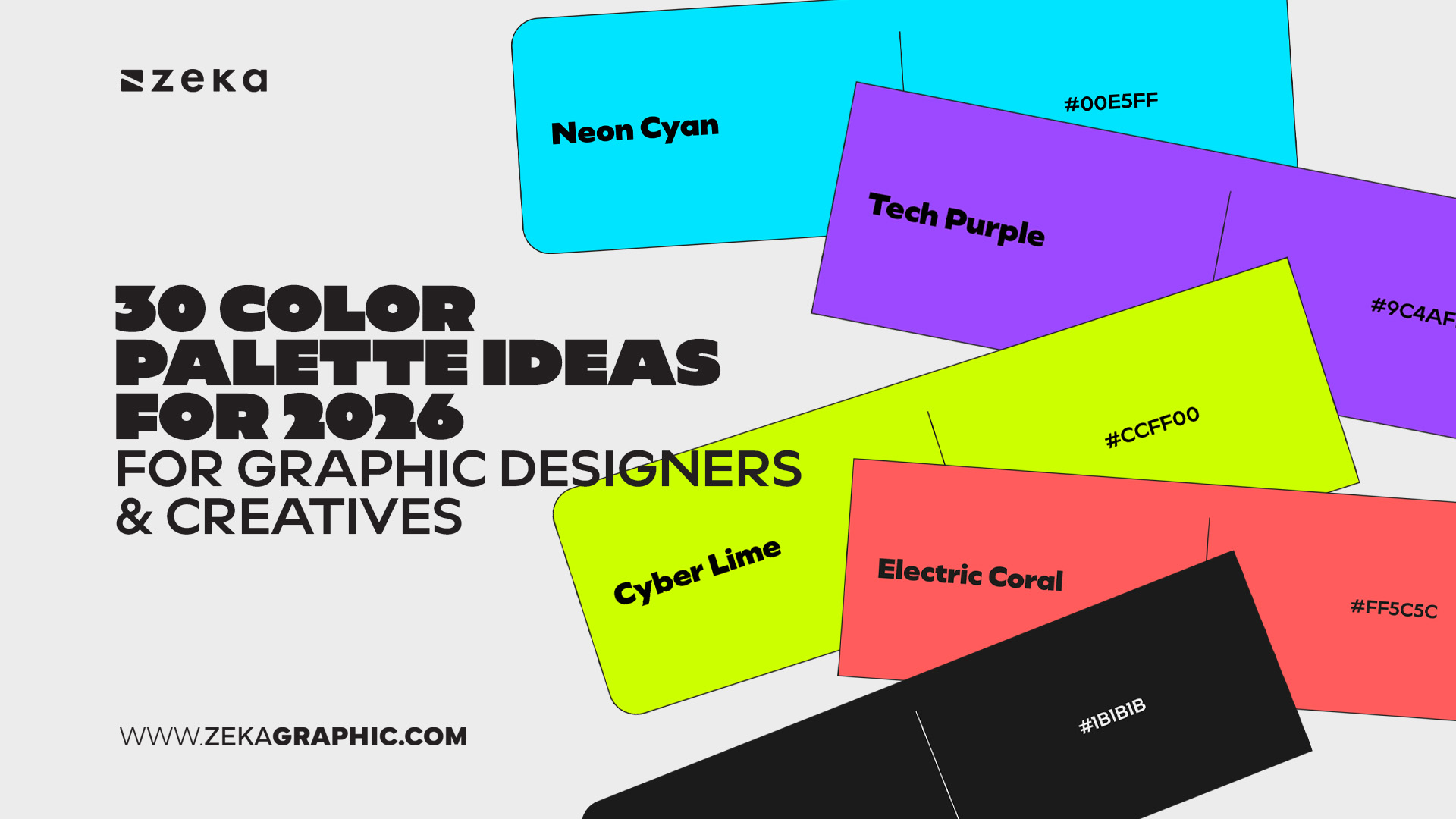
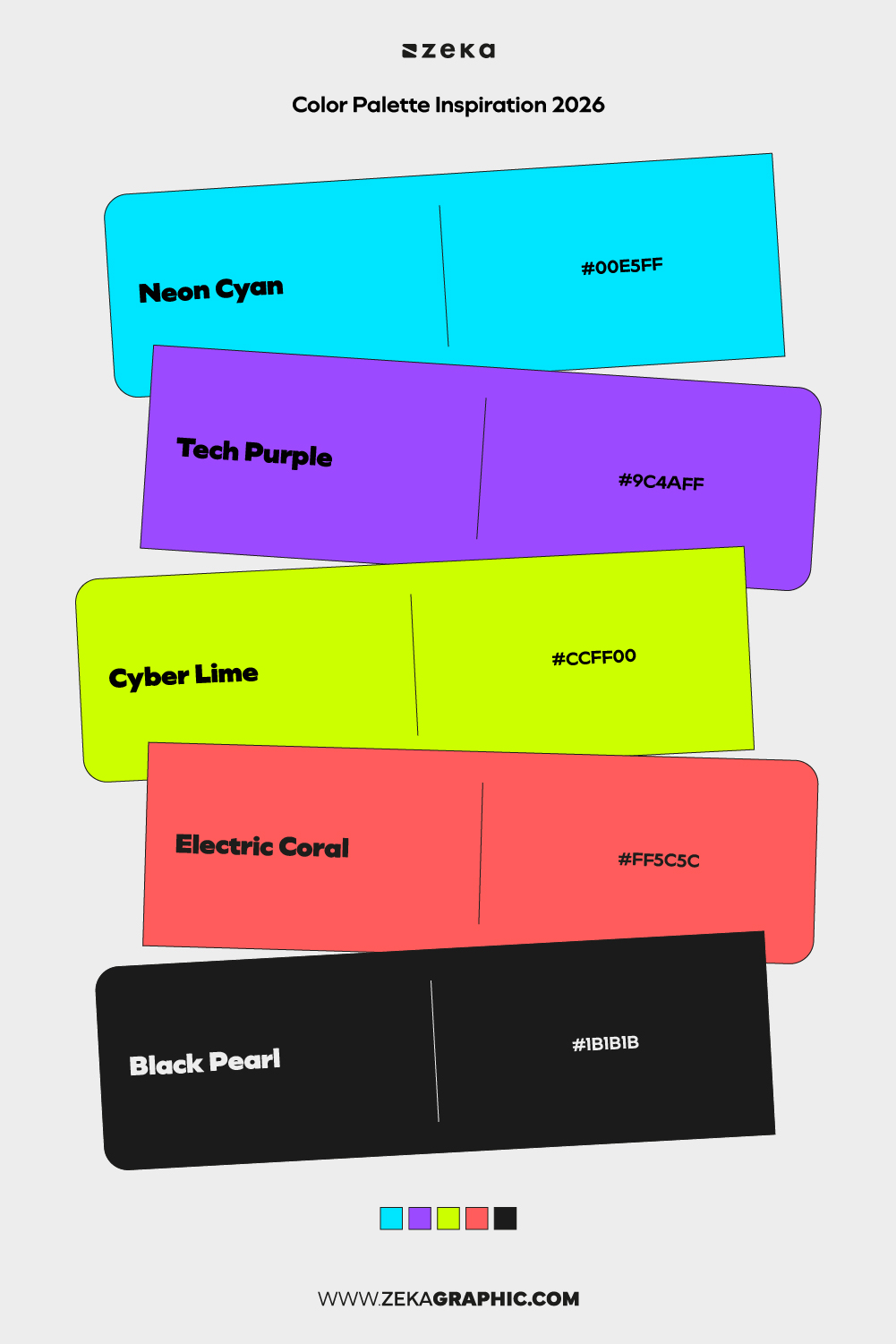
#00E5FF · #9C4AFF · #CCFF00 · #FF5C5C · #1B1B1B
Vivid, futuristic colors paired with dark grounding tones. Designed to stand out instantly in digital spaces.
Best for: tech brands, gaming visuals, digital campaigns
Mood: futuristic, energetic, bold
Advertisment
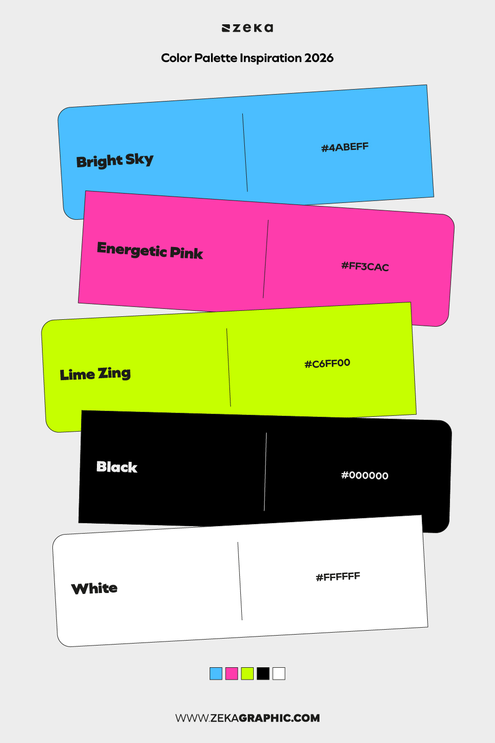
#4ABEFF · #FF3CAC · #C6FF00 · #000000 · #FFFFFF
Optimized for fast scrolling and instant recognition, this palette thrives on contrast and saturation.
Best for: social media graphics, content creators, campaigns
Mood: loud, playful, attention-grabbing
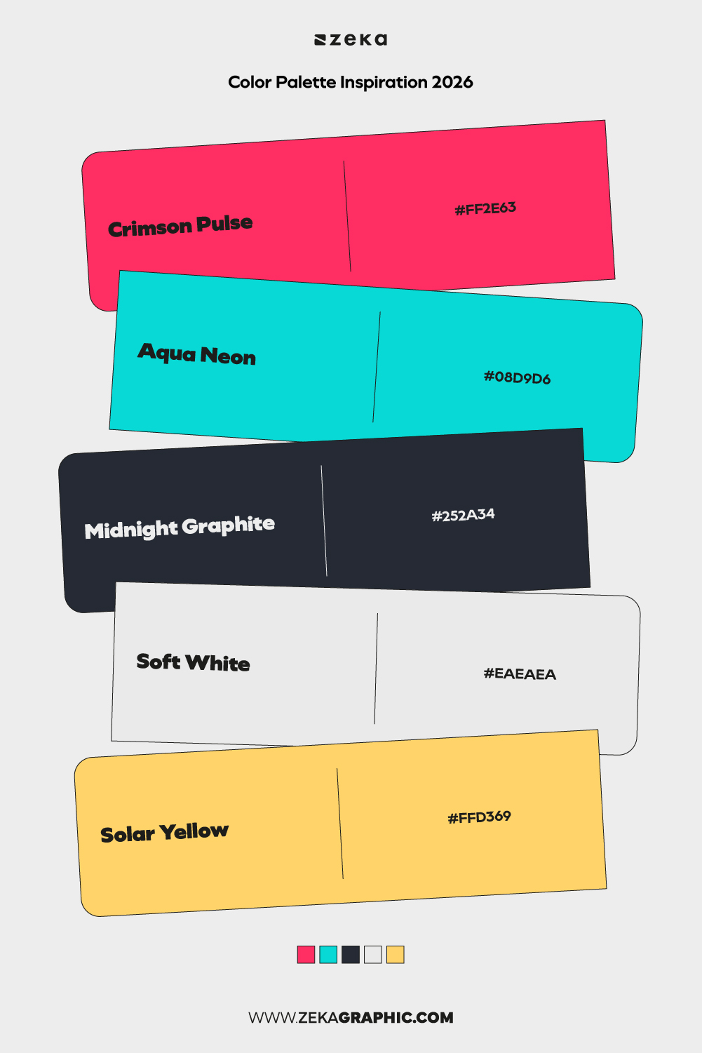
#FF2E63 · #08D9D6 · #252A34 · #EAEAEA · #FFD369
A neon-forward palette balanced by deep neutrals. High energy without visual chaos.
Best for: music visuals, posters, digital branding
Mood: vibrant, edgy, modern
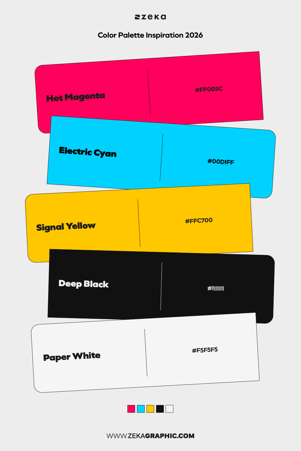
#FF005C · #00D1FF · #FFC700 · #111111 · #F5F5F5
Bright primary accents paired with neutral bases for maximum flexibility across platforms.
Best for: UI systems, digital products, branding
Mood: dynamic, modern, confident
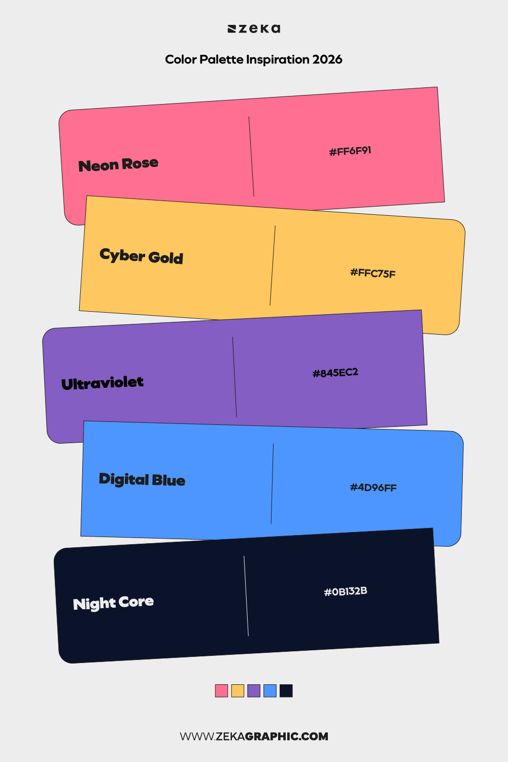
#FF6F91 · #FFC75F · #845EC2 · #4D96FF · #0B132B
A futuristic sunset palette blending warmth with digital coolness. Visually striking and emotionally engaging.
Best for: digital art, motion design, branding
Mood: futuristic, expressive, bold
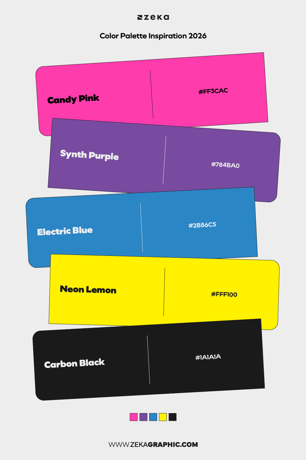
#FF3CAC · #784BA0 · #2B86C5 · #FFF100 · #1A1A1A
Playful, high-energy colors inspired by candy-like saturation and digital aesthetics.
Best for: creative studios, entertainment, campaigns
Mood: playful, electric, fun
Advertisment
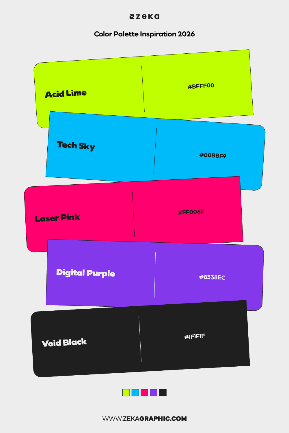
#BFFF00 · #00BBF9 · #FF006E · #8338EC · #1F1F1F
Aggressive, high-contrast colors built for experimental visuals and bold statements.
Best for: experimental branding, music, digital art
Mood: rebellious, futuristic, intense
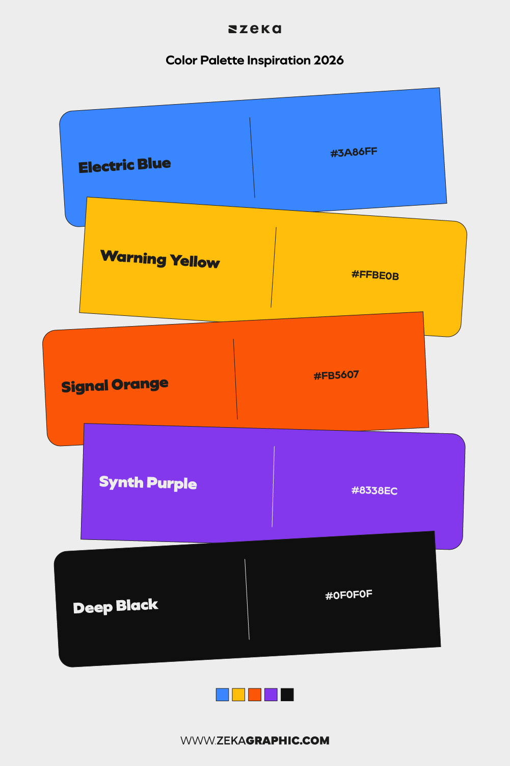
#3A86FF · #FFBE0B · #FB5607 · #8338EC · #0F0F0F
A structured yet energetic palette that balances brightness with dark stability.
Best for: tech startups, event branding, digital platforms
Mood: energetic, modern, confident
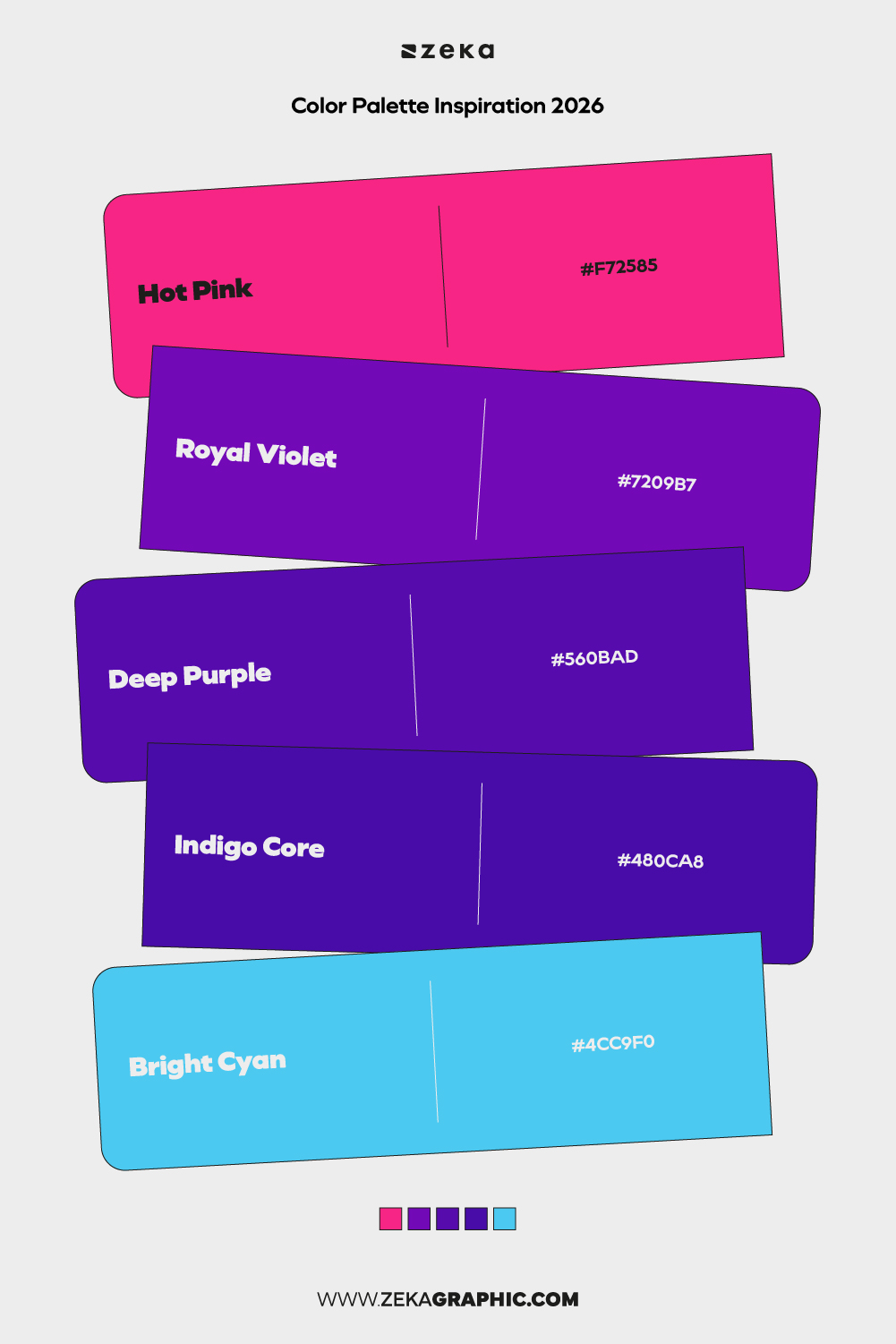
#F72585 · #7209B7 · #560BAD · #480CA8 · #4CC9F0
Bold purples and pinks with a creative edge. This palette feels expressive and unapologetic.
Best for: creative agencies, portfolios, digital art
Mood: creative, bold, expressive
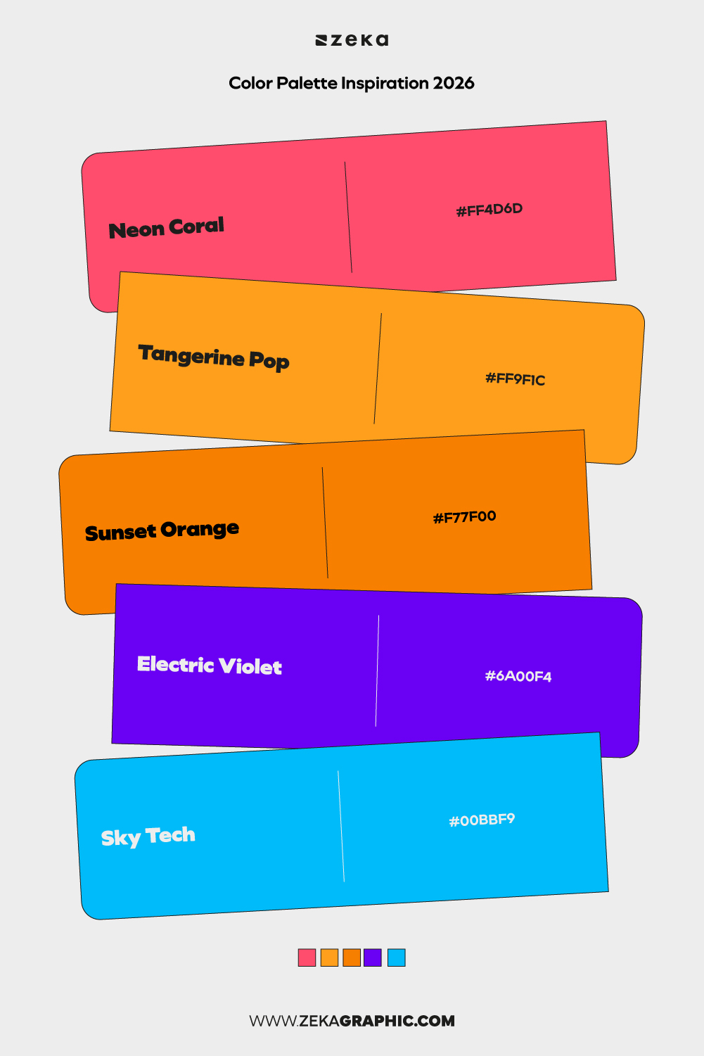
#FF4D6D · #FF9F1C · #F77F00 · #6A00F4 · #00BBF9
Designed for gradients and motion, this palette thrives in dynamic digital environments.
Best for: social content, motion graphics, campaigns
Mood: dynamic, vibrant, viral
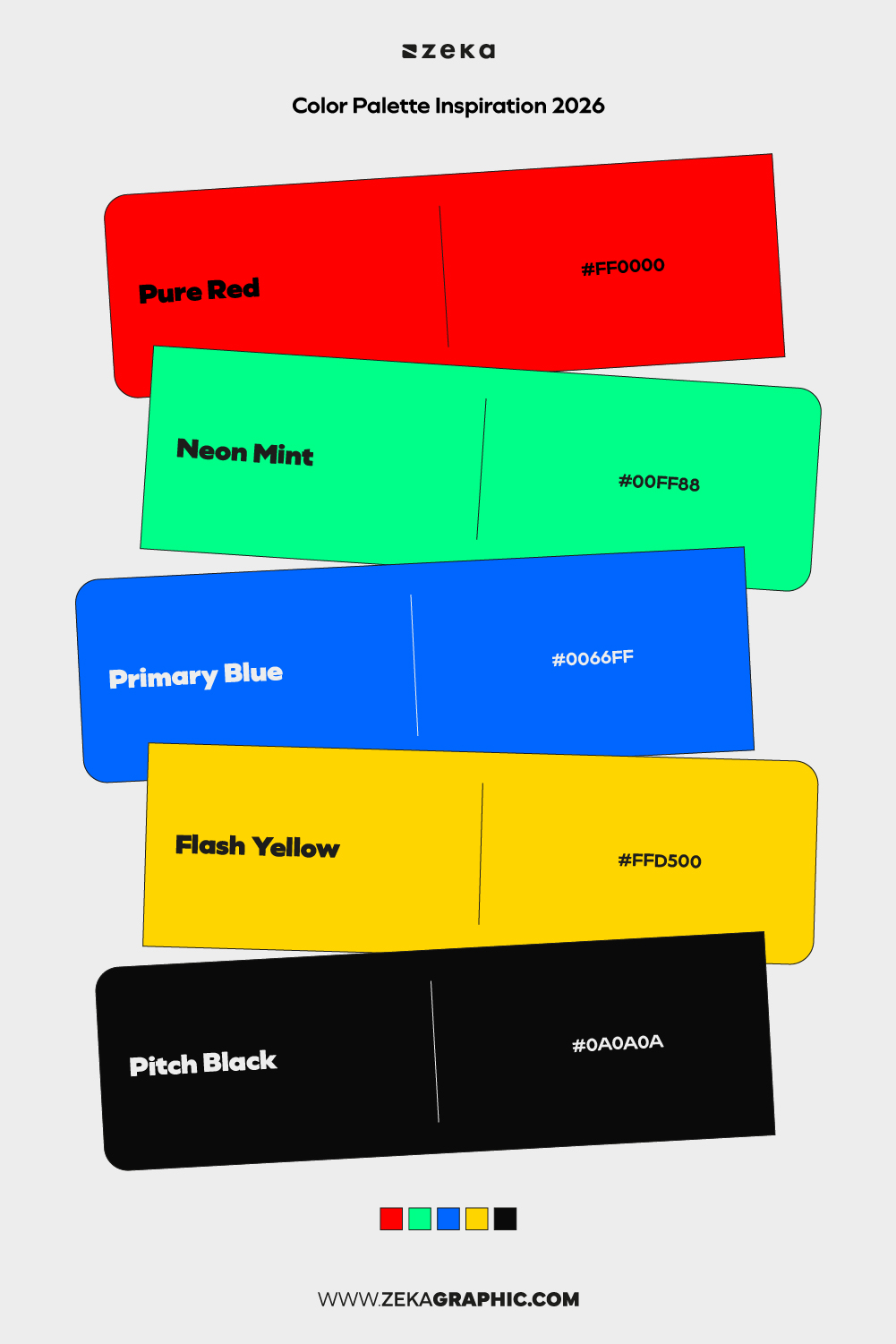
#FF0000 · #00FF88 · #0066FF · #FFD500 · #0A0A0A
Extreme contrast built for instant visual impact. Not subtle, but highly memorable.
Best for: posters, experimental branding, digital art
Mood: intense, bold, unapologetic
Advertisment
Across these 30 color palette ideas for 2026, the focus is clear: balance over excess, intention over decoration. Whether the palette is calm and neutral or bold and high-contrast, the most effective color systems are those that support usability, emotion, and scalability. Good palettes don’t compete with the design—they reinforce structure, hierarchy, and message.
Use these palettes as starting points, not fixed rules. Adjust saturation, contrast, and dominance depending on context, accessibility, and medium. When color choices are made with clarity and purpose, they stay relevant longer and perform better across branding, digital products, editorial layouts, and social content. Save what resonates, test in real layouts, and let function guide aesthetics.
Advertisment
Written by
If you like this post share it on your social media!


Advertisment

Advertisment